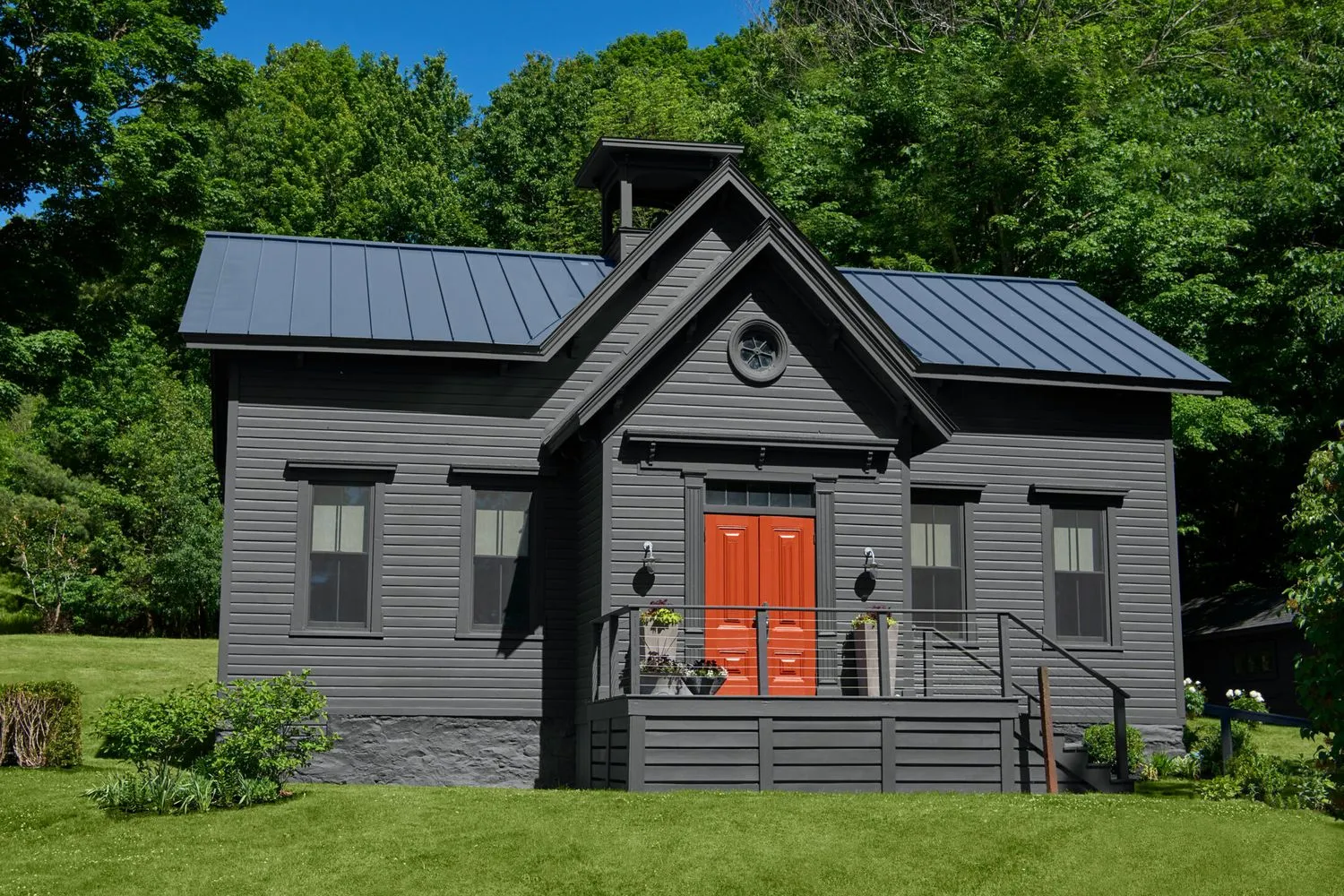
Sometimes finding the right neighborhood is as important as buying the right house. When Drew Evans was trolling New York’s rural Columbia County for a new place to live, he wasn’t searching for good schools or walkable amenities. He was looking for quiet—if not downright silence. And on his very first visit to the place that would become his home, he didn’t need to meet the neighbors to know he would like them.
“As soon as we got out of the car, the Realtor pointed in the near distance and said, ‘That’s the reason this house hasn’t sold,’ ” says Drew, who looked across the road to see an old graveyard. “I later told her that’s the reason I bought it.”
Shown: A circa-1880 schoolhouse is now a snug home with striking gray clapboards, a metal roof, and bright double doors.
Paint: Benjamin Moore’s Wrought Iron (siding) and Merlot Red (doors); Windows: Andersen
Before moving to the small upstate town of Ancram, Drew had spent 14 years in a 400-square-foot studio in a bustling area of Manhattan. After years surrounded by the din of city life, the idea of having a cemetery as a neighbor presented a welcome respite. And while that nearby plot of land was decidedly silent, the structure—a circa-1880 schoolhouse—spoke to Drew loudly and clearly. He was drawn immediately to its small scale and its ties to local history. The challenge of turning it into a comfortable home appealed to him. And the surrounding landscape, with its patches of woods, rolling hills, and dairy farms, reminded him of the English Midlands, where he grew up.
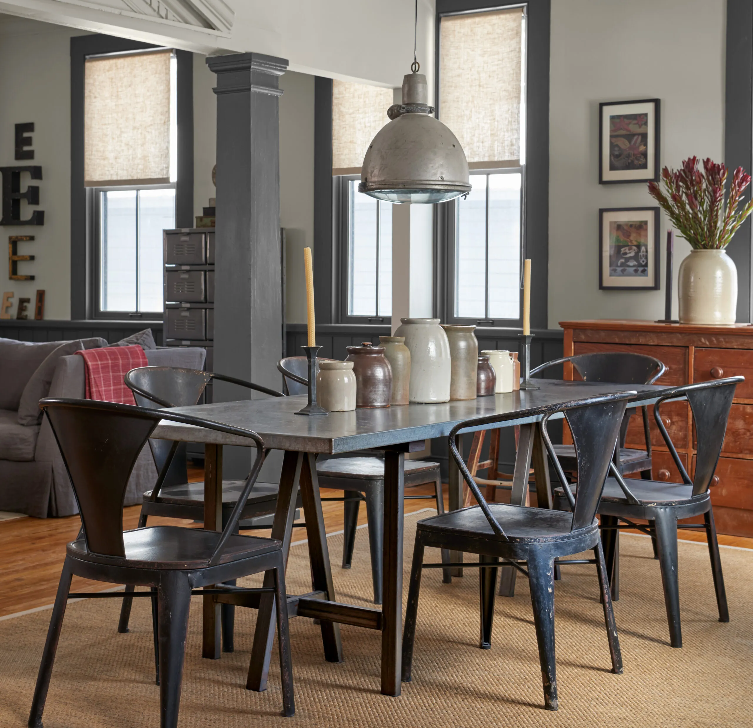
Shown: An overhead beam and a pair of columns added by previous owners separate the living and dining areas. The homeowner removed two nonstructural partitions between the columns and walls to better connect the spaces.
Dining table, chairs, rug, ceiling fixture: Hammertown
“I know this is a cliché, but the moment we pulled into the driveway, I knew that this was the house for me,” recalls Drew, an interior decorator who had friends in the area, and had spent months slogging through what felt like an endless number of properties across the county.
Despite its age, Drew’s chosen home had never actually been lived in. After serving as a schoolhouse until the 1960s, it sat vacant for several years before being repurposed as the local town hall. When a new hall was built in the late 1990s, the building became an antiques store.
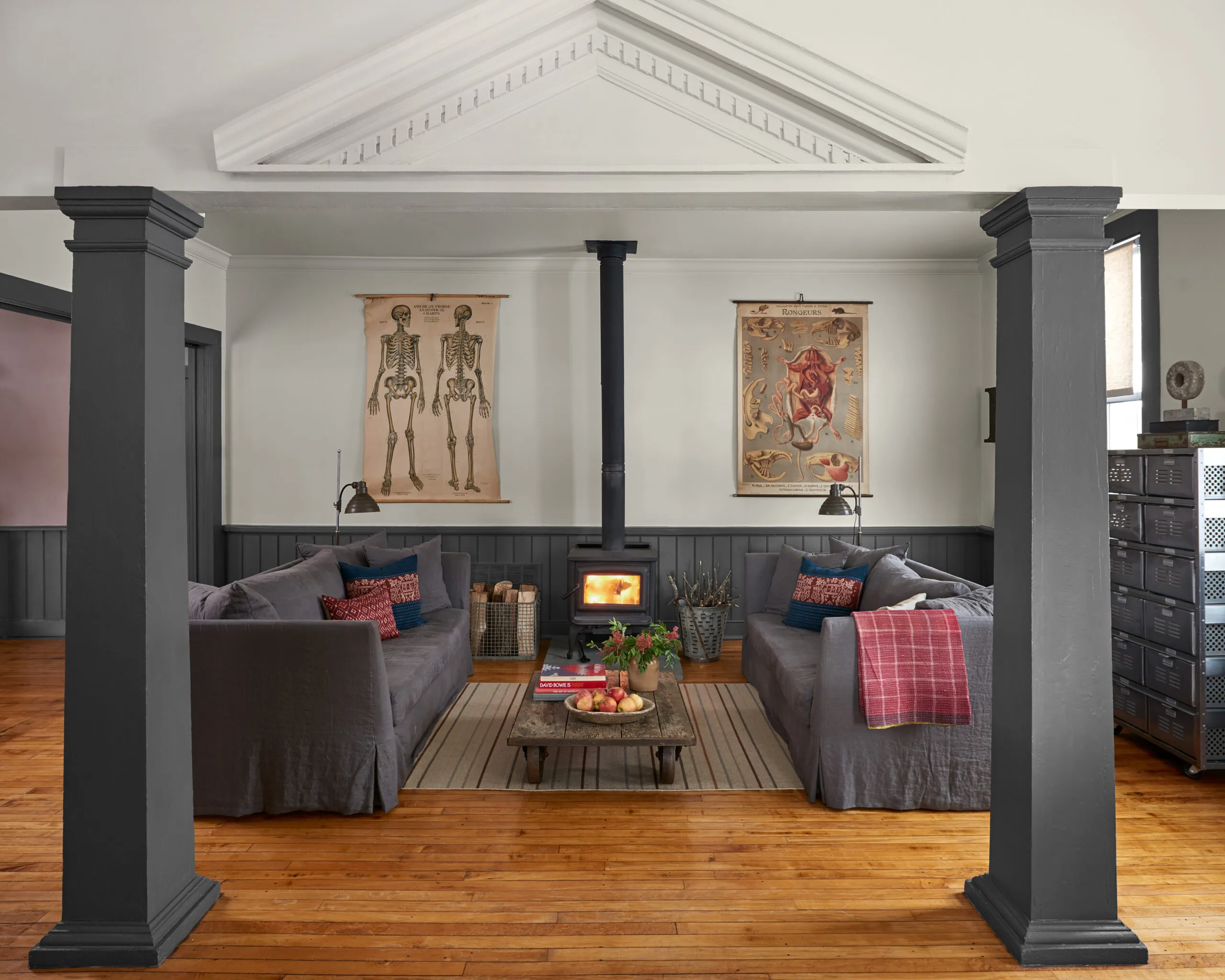
Shown: The homeowner added the living area’s wood-burning stove during his first winter in the house to supplement the old furnace; it now heats the entire first floor. One of two existing columns that divide the living and dining areas is structural, possibly added to support use of the second floor. It’s not known when the decorative pediment was added.
Paint: Benjamin Moore’s Light Pewter (walls) and Gray (trim); Coffee table: Neven & Neven Moderne; Rug, red throw and pillows on the sofa: Hammertown; wood stove: Pacific Energy; industrial dresser: Twenty Gauge
At some point, the store owners built a kitchen at one end of a space formerly divided into two classrooms; a remnant of the divider with a pocket door remains in place. To show the building as a house, they staged a bedroom on the second floor under the roof ridge. Along with a small adjacent bathroom, it was the only upstairs area with enough ceiling height for someone to stand up.
While Drew was willing to take on “a fixer,” as he describes it, it wasn’t until he moved in that he questioned his own “cockeyed optimism.” Having watched countless quick-fix home makeover shows on television, he thought he knew everything there was to know about renovating an old house. “Fact is,” he admits now, “I didn’t have a clue.” Almost as soon as he moved into the house in May, the roof started leaking. “The roof, even though it was metal, had seen a lot of deterioration,” says local contractor Jeffrey Hattat, who came to assess the situation. “Someone long ago had coated the metal roof with asphalt. That was a mistake. The asphalt dried up, and water got under it and rusted the roof away.”
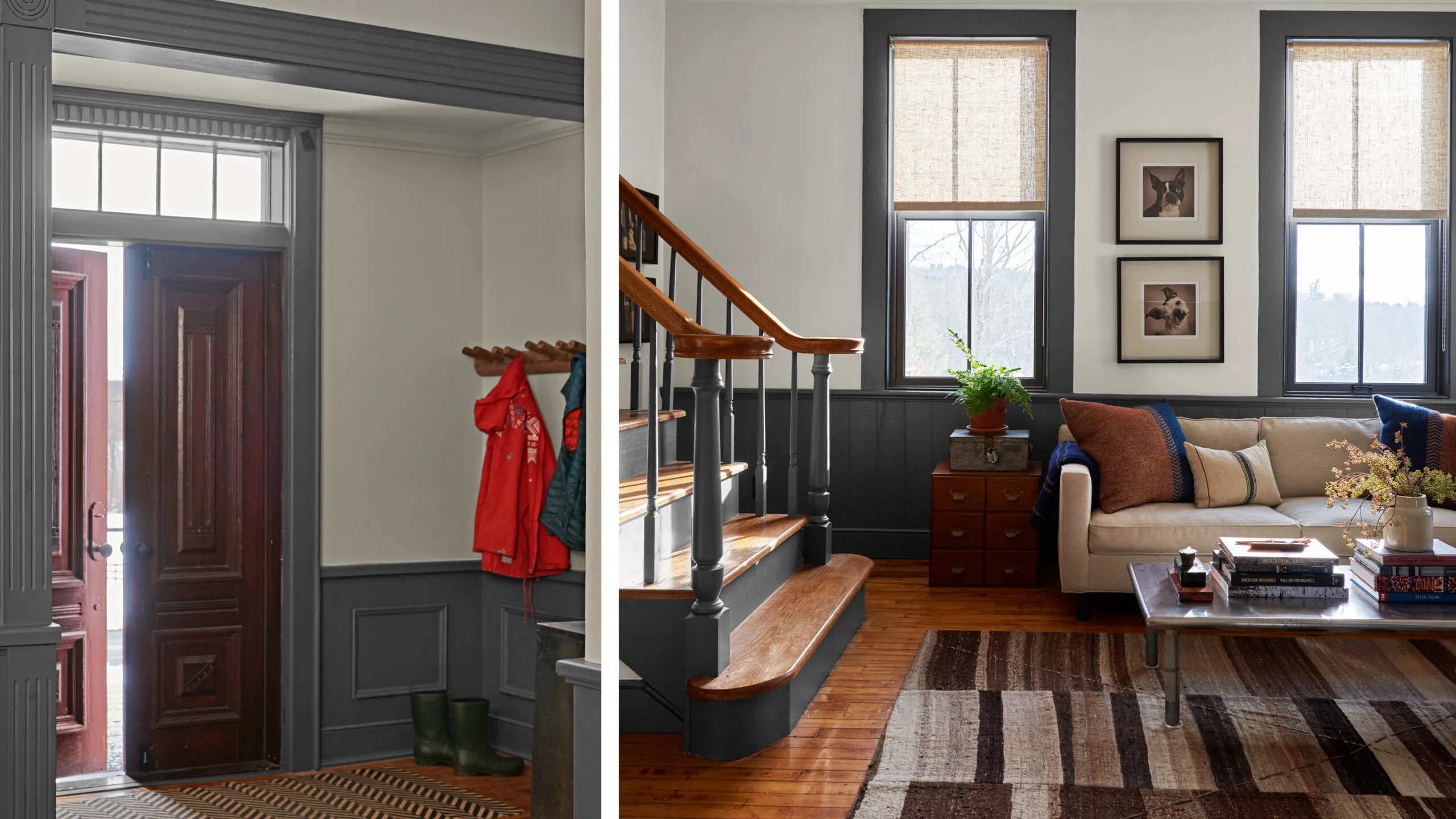
Shown left: The transom and double front doors are original to the house. On the interior side, the elaborate door panels retain their existing stain.
Door mat: Hammertown
Shown right: A staircase installed by previous owners to access the second floor is located in the TV room. The double-pane two-over-two windows are new, chosen for both their historical appearance and modern efficiency.
Sofa: Mitchell Gold + Bob Williams; Coffee table, rug: Hammertown
A more permanent solution to the roof problem, it turned out, would fit neatly with Drew’s vision for the house. From the start, he had hopes of a second floor tall enough to stand up in, with space for two bedrooms—one a master suite with its own bath—and a home office. So he enlisted architect Dalia Eilat, a fellow 19th-century-house owner who lives nearby, for guidance.
“Those of us with old homes know about the challenges we all face,” says Eilat. “The first challenge with this project and every old-house renovation is to create a healthy structure.”
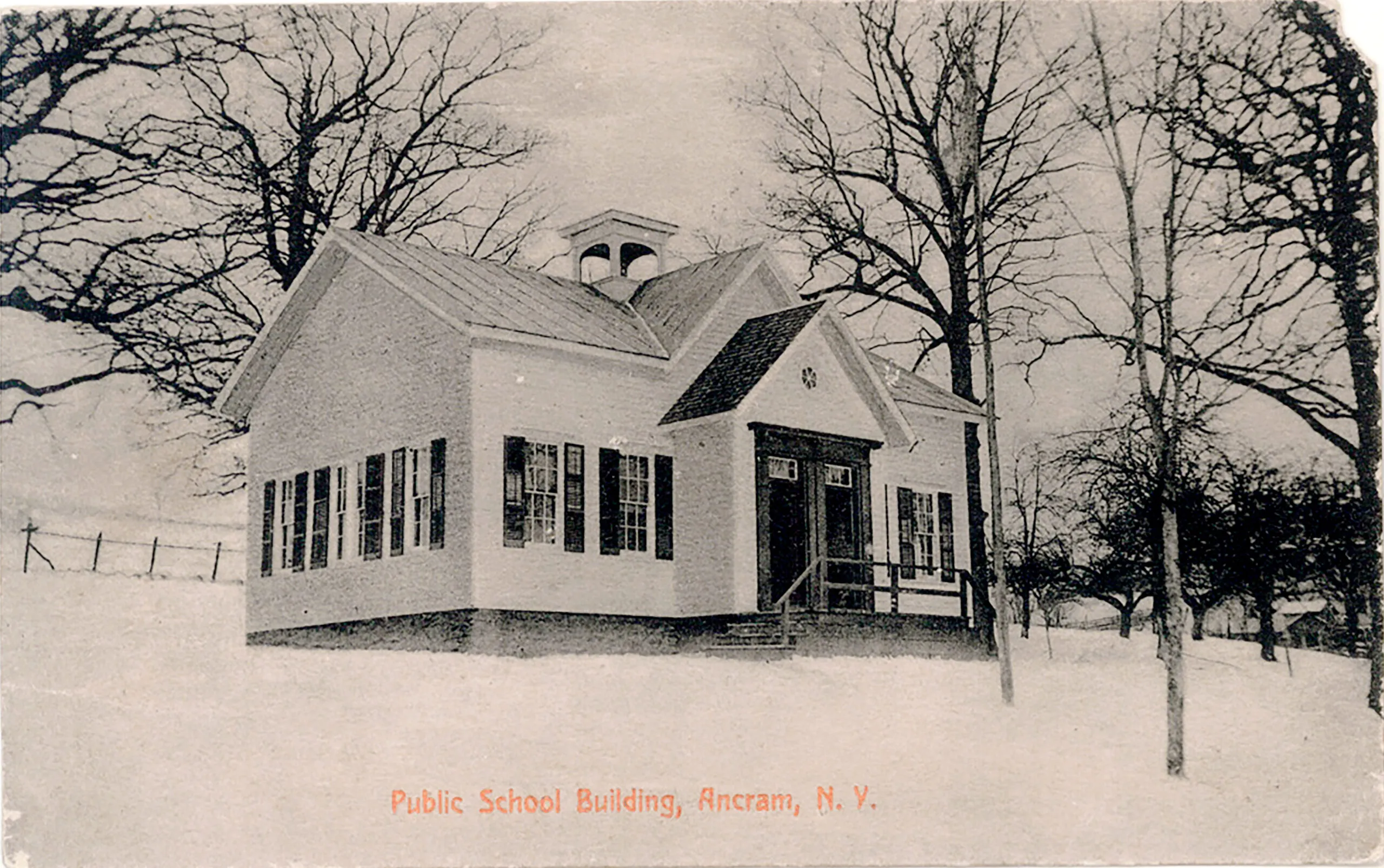
Shown: A vintage postcard features an undated photograph of Drew’s Ancram, New York, home when it was still in use as a schoolhouse.
Mindful of Drew’s desire for a full second floor, and knowing a new roof was a necessity, Eilat designed a modified shed roof—a dormer of sorts—across the back of the house, giving Drew the bedrooms and office he wanted, no stooping required. That November, Hattat began the six-month task of tearing up the old roof and building a new one. In the process, he also rebuilt the rotted schoolhouse bell tower, once used to summon children to class—although the bell itself had been removed long ago and placed on display in Ancram’s town hall.
Drew lived in the house during the construction, sleeping on a mattress on the dining room floor. He had a wood-burning stove installed to supplement the inefficient oil furnace. Ceiling beams prevented the stove from being precisely centered along the living room wall, a small imperfection that troubled Drew, at least in the beginning. “But now I don’t really see that imbalance—or not as much as I used to,” he says.
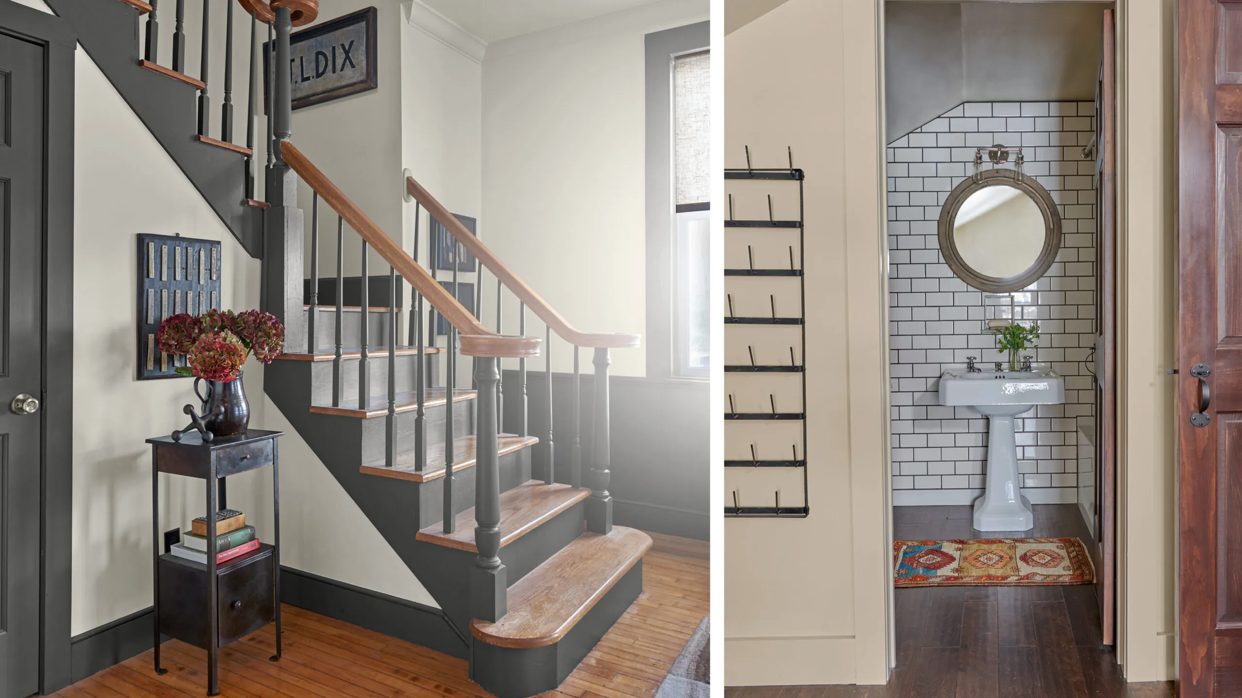
Shown left: The handrails on a staircase installed by previous owners end in exuberant volutes. A storage closet fills the space beneath the stairs. Throughout, Drew has added intriguing remnants of the past: On the walls flanking the stairs is a collection of military-uniform cleaning tags dating from the late 18th and early 19th centuries.
Paint: Benjamin Moore’s Light Pewter (walls); vintage side table: Hammertown
Shown right: The walls of the second-floor guest bathroom are covered floor to ceiling with white subway tiles framed in dark grout. A handy niche in the wall behind the sink holds soap. Drew found the circa-1930s cast-iron sink in a junk store and had the original taps made functional again.
Vintage sink: The Bottle Shop in Hillbrook, NY; Sink restoration: The Painted Otter; Subway tiles: Lowe’s; Mirror, rug: Hammertown; Wall sconce: Restoration Hardware
He also removed two nonstructural partitions with interior windows that had been added by previous owners between the walls and the twin columns on the main floor. One of the columns is structural; Hattat guesses it was added to reinforce the second floor so it could be used as living space. He thinks the second column was added to visually balance the first.
The small footprint felt plenty big to Drew. “When my city friends would come and see my camping arrangement in the dining area, they’d comment on how big the two rooms were—they equaled about the same size as my old apartment,” Drew says. “Meanwhile, people up here who’d never lived in the city would say, ‘How do you manage in such a tiny space?’ ” When he purchased the house, it was listed as 1,415 square feet. Opening up the second floor would add another 384 square feet of usable living space.
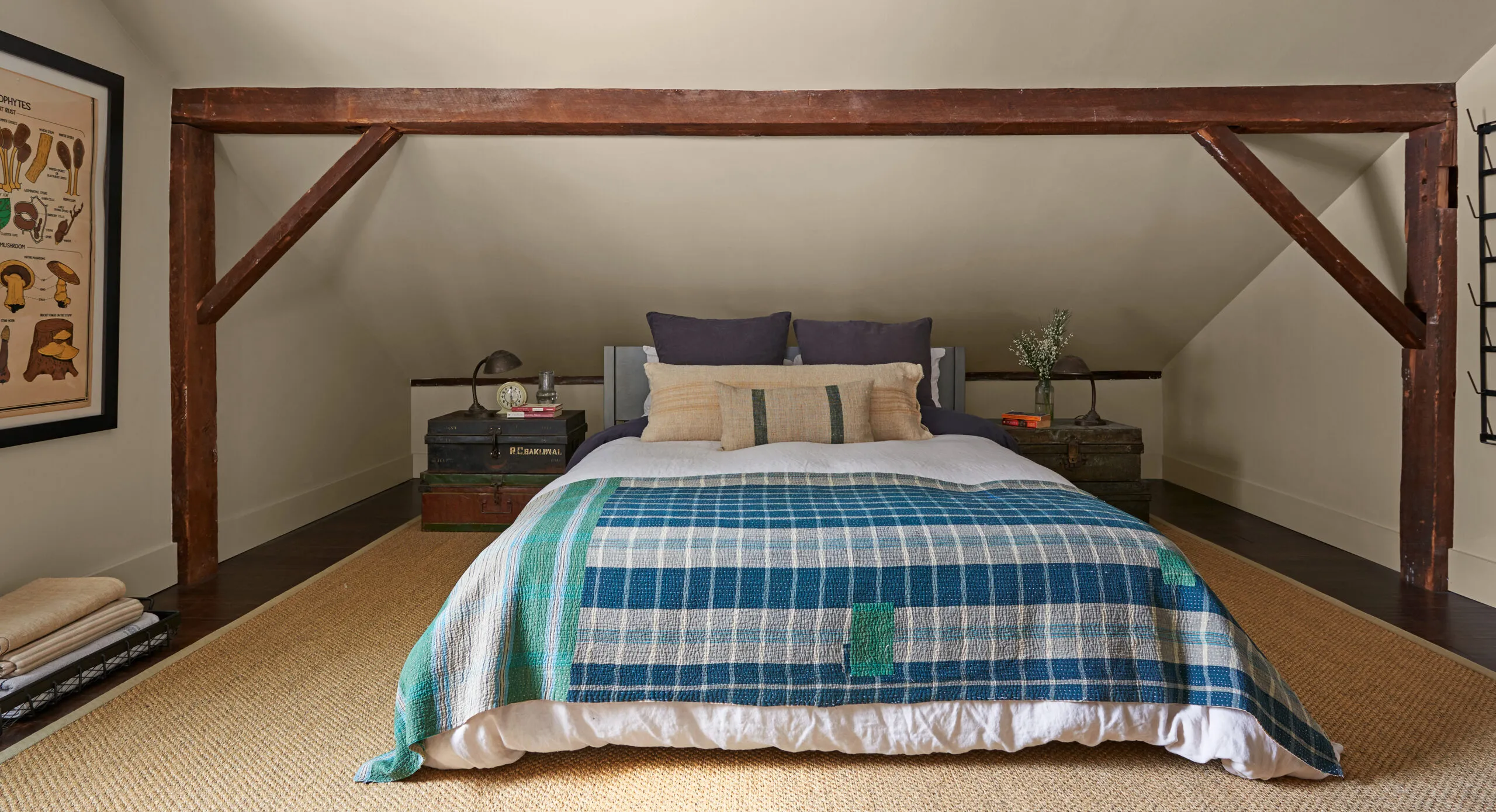
Shown: Decorative beams mark where the contractor pushed back knee walls to add a bit more floor space—if not headroom—in the guest bedroom. The beams were repurposed from elsewhere in the house.
Paint: Farrow & Ball’s Stony Ground (walls); Bed: CB2; Bedding: Matteo; Rug: Hammertown
Once the roof was complete, Hattat and Eilat collaborated on turning the full bath on the first floor into a half bath in order to make room for a new laundry room and a door to the backyard. Drew took on some of the exterior work himself, replacing buckled brick steps with wood forms filled with gravel.
He also had Hattat replace the first floor’s 12 double-hung windows with custom double-pane units. While the existing wood sashes—which likely dated from the 1920s or 1930s—were in fair condition, their pulley mechanisms were rusted, and the ropes had rotted away. “Drew was very concerned about the historical value and appearance of the house,” says Hattat, “so he didn’t want metal or vinyl windows.” As a compromise between authenticity and durability, Drew chose windows with a weather-resistant composite exterior frame married to wood on the interior. Because Hattat was able to install the new windows in the existing openings, the work went quickly.
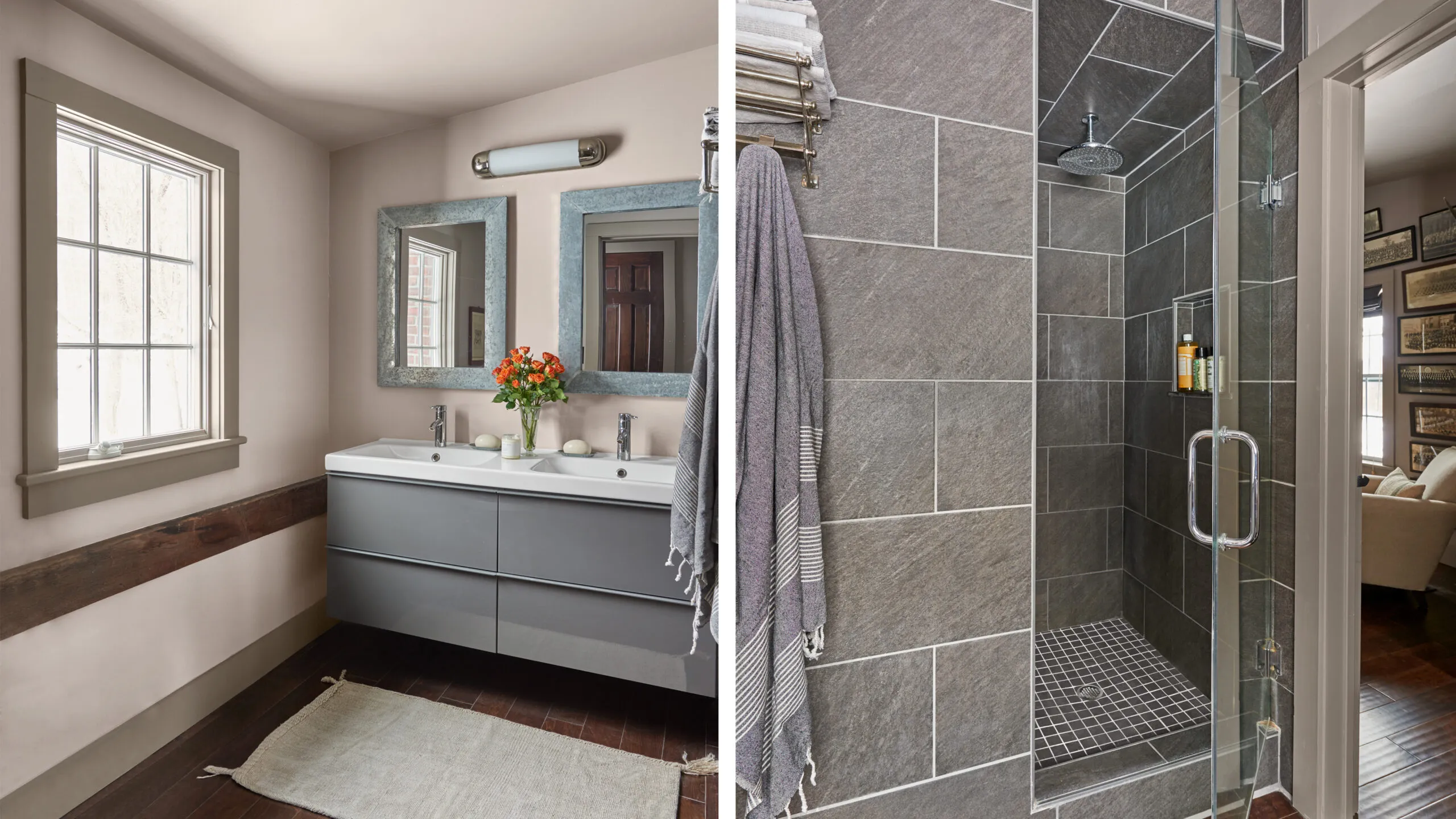
Shown left: The master bath features a modern vanity with deep storage drawers and an existing beam below the window that marks the original roofline.
Paint: Farrow & Ball’s Charleston Gray (walls); Vanity, faucets: IKEA; Mirrors, wall sconce: Hammertown
Shown right: Large-format porcelain tile in the master bath has the look of stone and keeps the gray color palette going for a seamless flow.
Shower tiles: Lowe’s; Shower fixtures: Amazon; Towel rack: Restoration Hardware; Towels: Baltic Linen
“The new windows were a real game changer for me,” says Drew, who had been reluctant to replace the old ones despite needing duct tape to keep them from leaking frigid air in winter and sticks to prop them open in summer. After an upper sash fell and smashed his hand, he says, “my decision was made.”
Just as Drew felt his goals for the house were being realized, he took a good look at the exterior—and noticed the peeling paint. “By the time the house looked really lovely on the inside, the outside was a disaster,” he says. What he thought would be a simple repainting job was anything but. Removing the old lead-based paint required an EPA-certified crew, and the original Dutch-lap siding needed a thorough sanding and smoothing before it could be recoated. The process, Drew says, left his home resembling “a well-scrubbed farmhouse table.” Because the structure was built without sheathing, the siding provided its stability—requiring Hattat to replace the rotted boards carefully, one at a time.
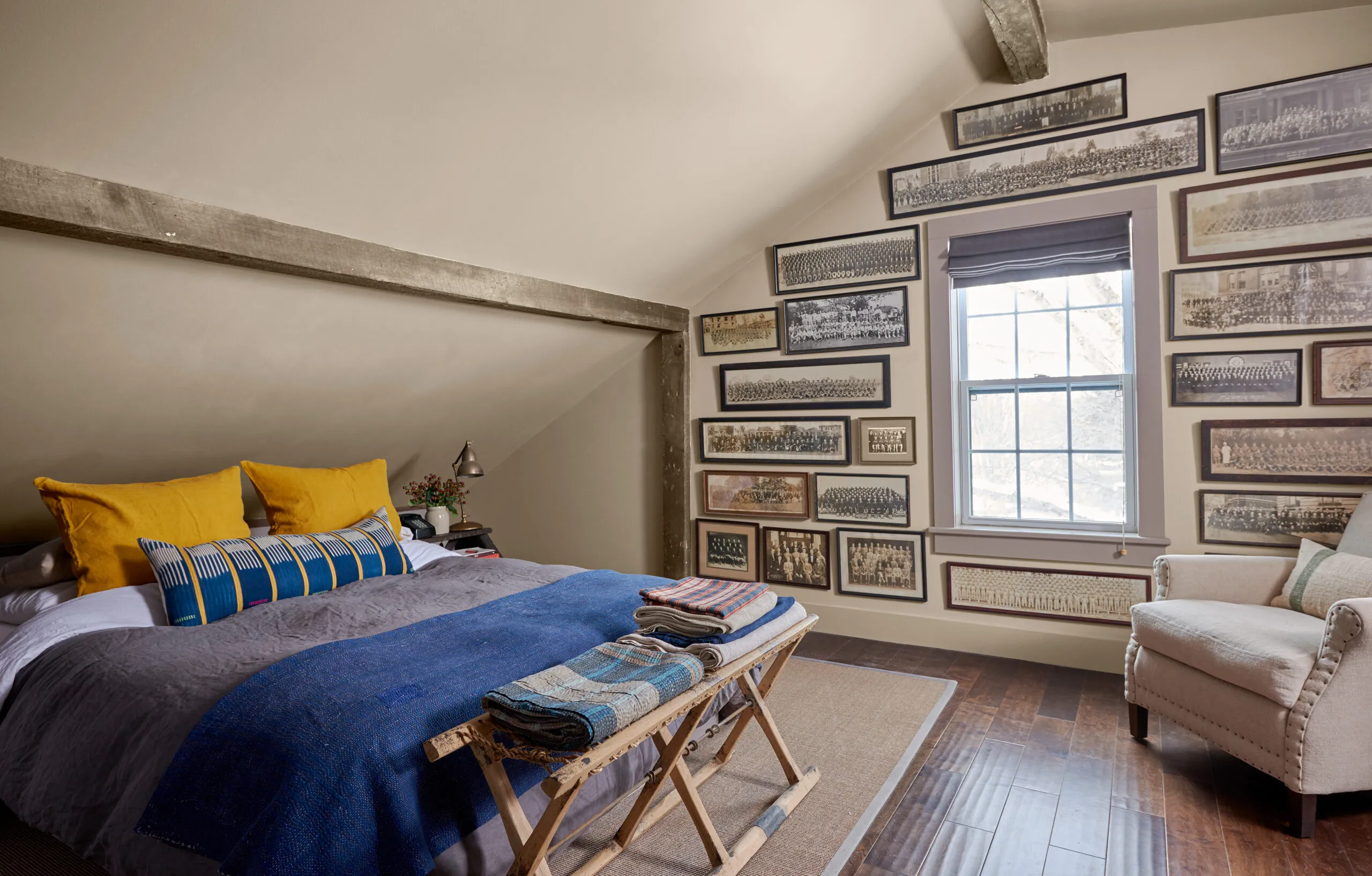
Shown: Repurposed beams in the master bedroom mark the expansion of living space into the eaves. A larger beam accentuates the ridge. Prefinished hardwood floors have a hand-scraped look that “feels very good on the feet,” Drew says. Covering this gable-end wall with a collection of vintage team and school-class photos creates an impact similar to that of wallpaper.
Paint: Farrow & Ball’s Charleston Gray (walls, trim); Rug, bedside lamp: Hammertown
Attached to the framing on the interior were not one but two layers of lath and plaster, “effectively creating double-wall construction with two air spaces,” says Hattat. Injecting spray foam insulation could threaten the entire structure, so together he and Drew decided that the first-floor walls would be left uninsulated. Drew had previously had the underside of the first floor, which is built over a crawl space, insulated with spray foam. With the new insulated roof and new windows, “it became a very comfortable space,” Hattat says.
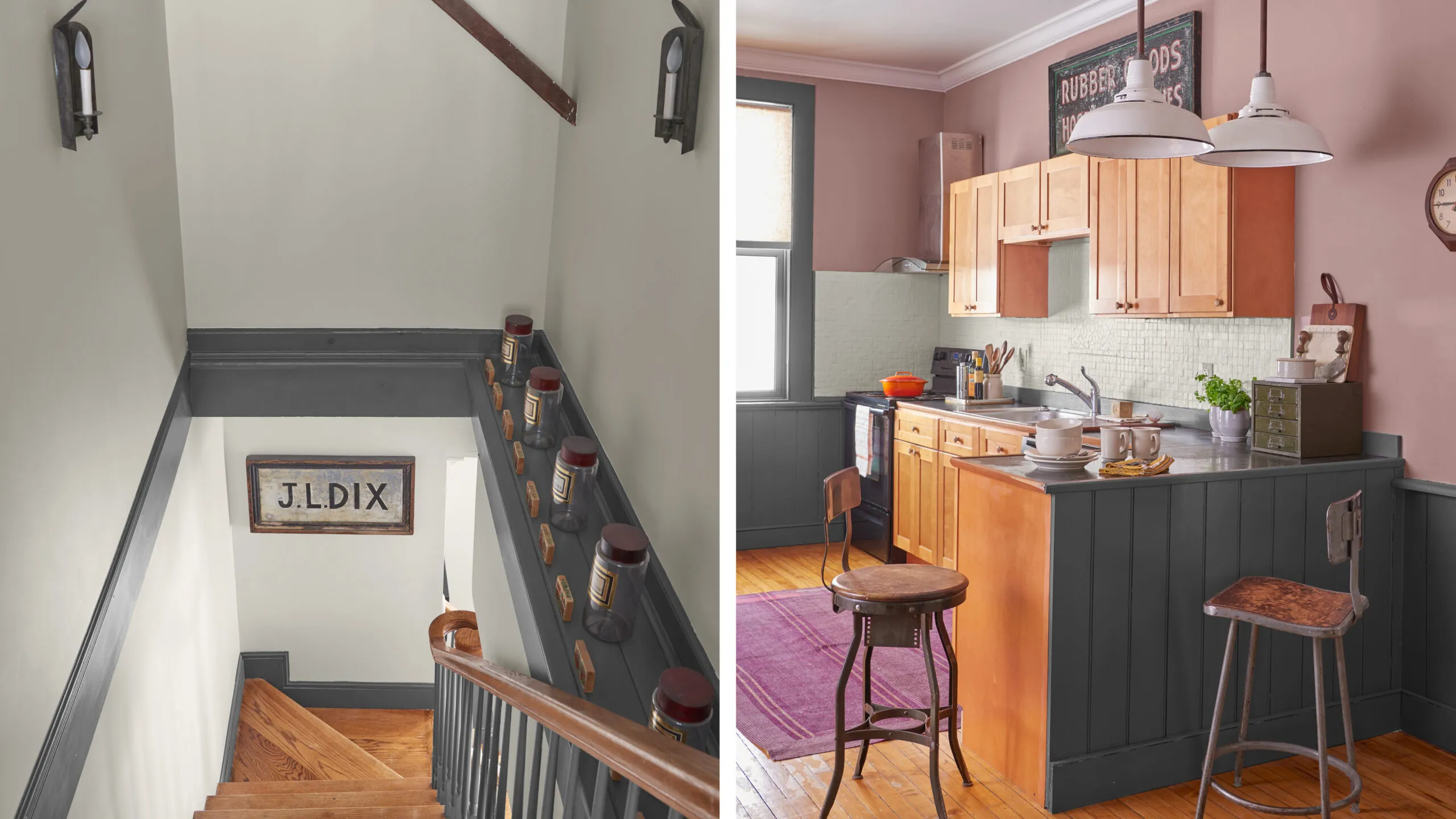
Shown left: French apothecary jars line the stairwell, where original beams emerge from the plaster. The matching sconces are the only existing light fixtures that remain.
Shown right: Drew found the light fixtures over the kitchen’s peninsula in a Manhattan dumpster and had them rewired. The chairs are vintage drafting stools.
Paint: Farrow & Ball’s Sulking Room Pink (walls), Benjamin Moore’s Light Pewter (backsplash tiles); Stove, dishwasher: Whirlpool; Rug: Hammertown
When it finally came time to paint, Drew was drawn to a dark blue-gray hue that he had seen on traditional homes around the county. For the door, he made a bold, personal choice: a vibrant red-orange. “In some ways the main color and that on the door are dramatic, maybe even a bit shocking, but I knew they would look good.”
That may be, but Drew now readily admits that working on—and living in—the former schoolhouse has taught him a lot he didn’t know. “Perhaps the biggest lesson with an old house is that you should never think that you need to get everything done that you want,” he says. “Because with an old house, it’s never going to be ‘done.’ You don’t have to finish, because you can’t finish. Once you realize that, you can really enjoy your home.”
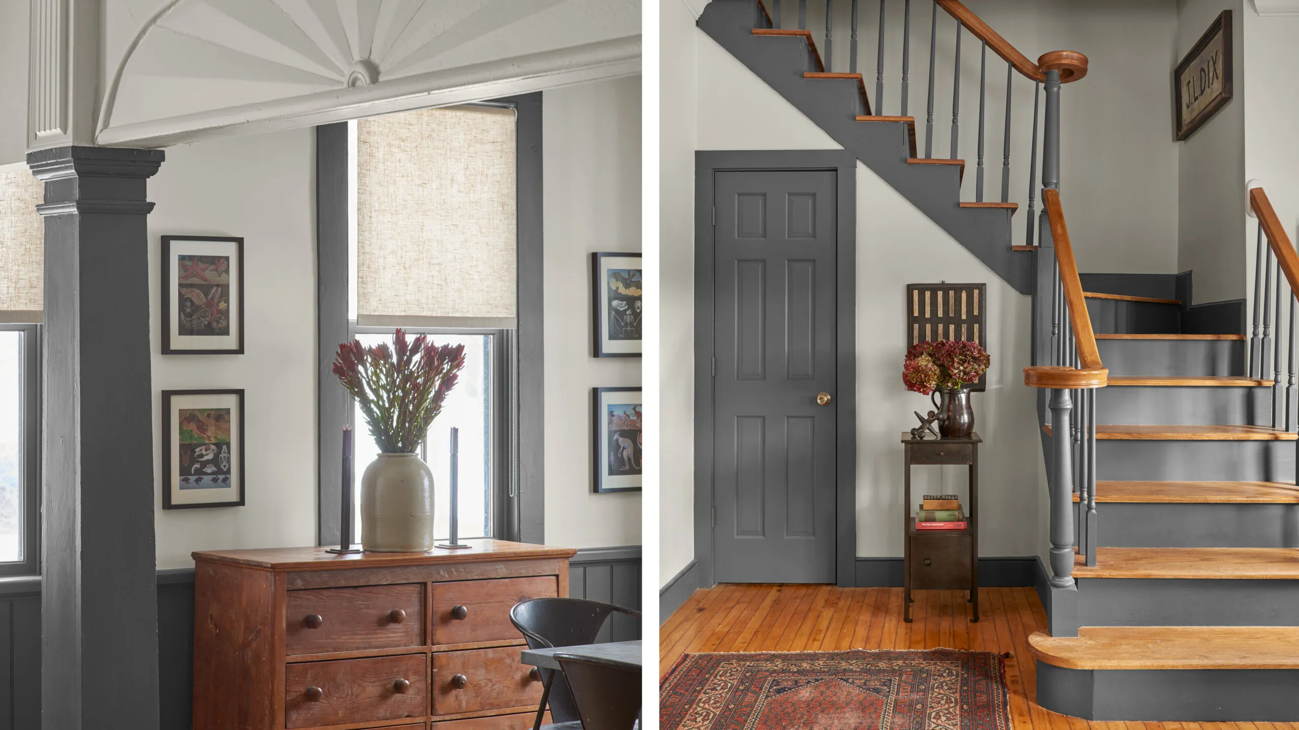
Shown left: Architectural elements such as this decorative fan and a pediment on the opposite side dress up the main living space, though no one knows when they date from.
Shown right: Drew stripped the existing staircase and painted the risers and balusters the same muted gray as the interior doors and trim.
Paint: Benjamin Moore’s Gray (trim)

Renovation recap
THE HOMEOWNER: Drew Evans, an ex-Manhattanite and interior decorator (right).
THE HOUSE: An existing 1,415-square-foot, circa-1880 schoolhouse in Ancram, New York, that served as the local town hall from the 1960s to the 1990s, then as an antiques store. While it had a full bath downstairs and a kitchen, the sole sleeping space was a bedroom in the center of a low-ceilinged second floor where the only usable height was under the ridge beam.
WHY HE CHOSE IT: The 1 2⁄5-acre site had the quiet he was after, and the countryside reminded him of his native England. The house felt spacious after apartment living, and he was drawn to its unusual history. scope of work: Replace the rotted roof, raise it across the back, and claim eaves space to allow for an office, two bedrooms, and two baths upstairs. On the first floor, remove nonstructural partitions to better connect the living and dining areas, and shrink a full bath down to a powder room to add laundry space and a back door. Put in a wood-burning stove, replace old windows, and insulate where possible. Strip the exterior, replace rotted siding, and repaint.
TIMELINE: Work began in six months and was completed in phases over three years.
WHAT HAD TO STAY: The original flooring and bell tower, existing interior columns and architectural details—along with schoolchildren’s graffiti (some from the early 1900s) in attic space above the front door.
LESSON LEARNED: An old house is never really done, says Drew, and that can be one of the joys of living in one.
Floor plans
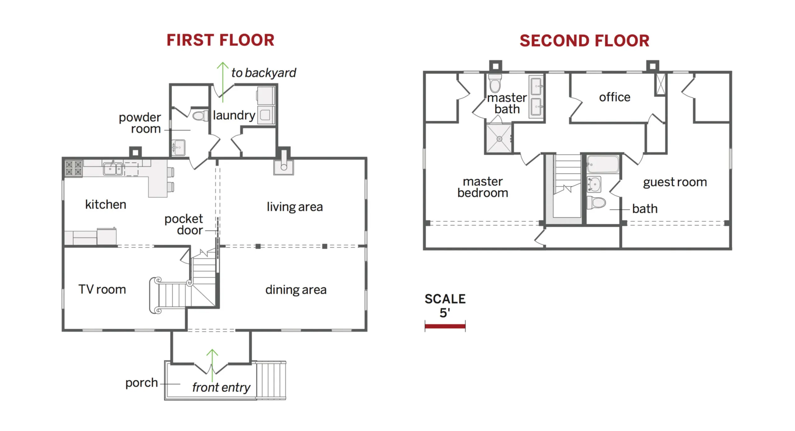
Working within the existing footprint, homeowner Drew Evans increased the livable space from 1,415 square feet to about 1,800 square feet. Raising the roof along the back of the house made space for a master suite, guest room, guest bath, and office upstairs.
On the first floor, removing some nonstructural partitions opened up the living and dining areas. Reducing a full bath downstairs to a powder room allowed for an expanded laundry and a new back entry.
