Upbeat, quiet, daring, mercurial—paint colors are a sure way to bring some personality to your rooms. Uncertain where to start? Designers say you already know what you like. “People are naturally drawn to certain shades—they have visceral reactions to color,” says Washington, D.C.-based designer Zoë Feldman. She and other smart design pros work with those preferences, factoring in the available light, other elements in a room, the home’s architecture, and ultimately, how the homeowner wants to feel in the space—calm or energized, for instance. Whatever the desired mood, the recent trend toward white walls may already be over.
“Post-pandemic, people are looking for ways to make their living spaces more interesting, and color is a part of that,” says Feldman. Ahead: how designers think about choosing and using the just-right shade of paint
Warm Welcome
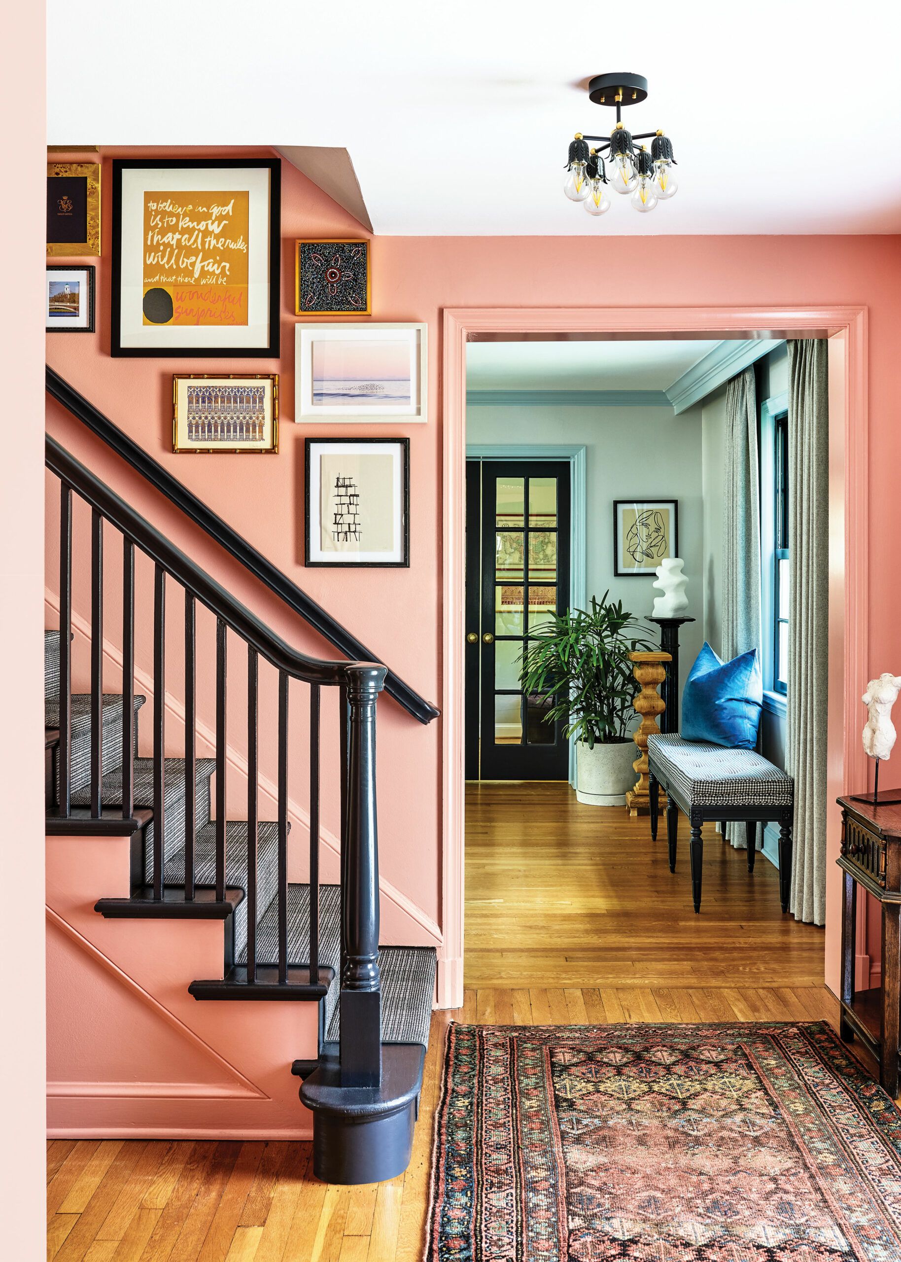
A home’s entrance makes its first impression, and the right colors ensure it’s a positive one. “We went for a vibe that’s warm and playful, classic yet modern,” Feldman says of this entry in a 1947 Colonial Revival in Chevy Chase, MD. The saturated peach that covers the walls feels inviting and brightens a space that receives little natural light. Painting the trim the same shade in a more light-reflective semigloss helps visitors feel enveloped in the space. The blue-black on the stairs offers a dramatic contrast that grounds the look and makes it feel more current.
Of course, an entry is a taste of things to come. “Rooms that open onto each other should feel cohesive,” says Feldman, who treated the walls in the light-starved living room to an ethereal gray-white tinged with blue, and the trim to a true sky blue. She repeated the foyer’s blue-black accent color on the doors and windows. As complementary colors, blue and orange bring out the best in each other and look harmonious together. “But the quietness of the blue keeps the colors from competing,” Feldman adds. The result: an unexpected, updated look that feels timeless.
Soft and Serene
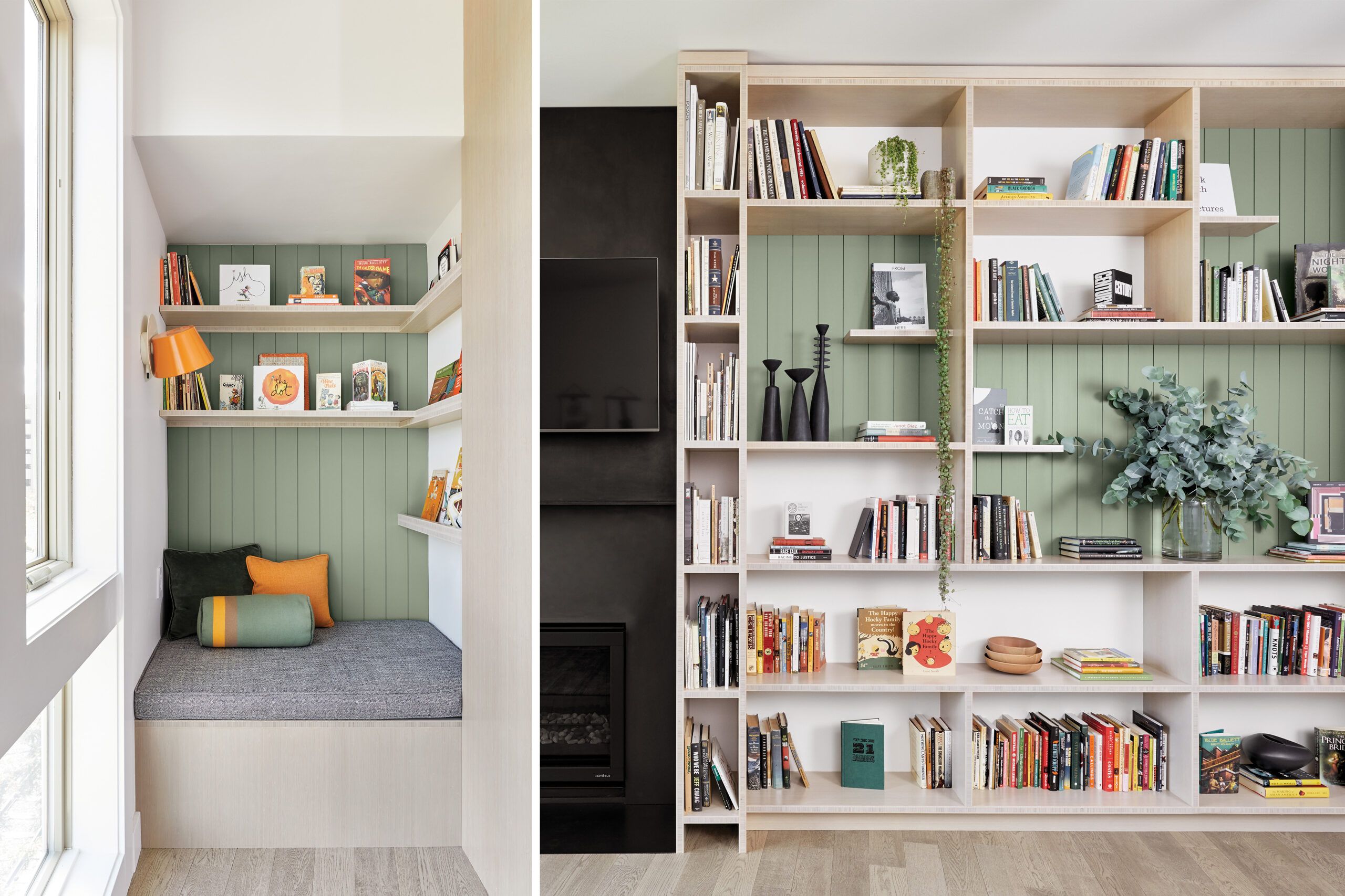
Downsizing to smaller quarters needn’t mean living in a cookie-cutter condo. The owners of this unit—a retired couple in Beaverton, OR— called on Portland designer Stephanie Dyer to make the place “a sanctuary that looks interesting and feels great to come home to,” she says. The challenge, says Dyer, was to find a light, lively shade of paint that wouldn’t close in the unit’s fairly small footprint.
To start, she gave the living room gray-washed white oak floors and added bamboo plywood built-ins in a similar neutral shade, with the fireplace and TV fading into a matte-black recess. But it’s the muted, dusty green that Dyer used to highlight sections of V-groove in the open shelves and reading nook that made all the difference—inspired by a piece of Pendleton fabric that the clients owned and loved, and that now covers a bolster in the nook. “It’s earthy yet fresh,” she says, “the kind of color that adds an element of surprise without overwhelming.”
Organic, Moody Hues
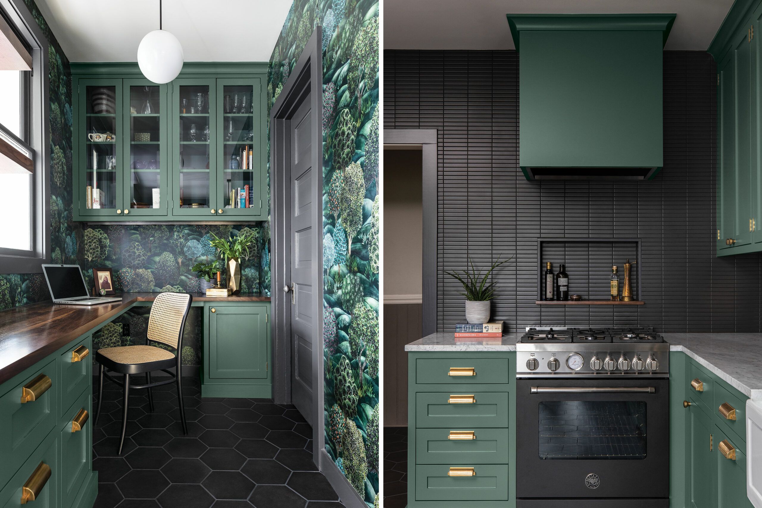
Three factors come into play when Portland, OR, designer Donna DuFresne arrives at a project’s paint-color scheme: the client’s personality, the home’s architecture—and its location. “You probably wouldn’t use them in Miami, but darker, moody colors suit the Pacific Northwest—they simply work with the air and light here,” she says. This kitchen and pantry-turned-office belong to a 1903 saltbox nestled in the woods of the city’s hilly Northwest neighborhood, making the gray-green and charcoal hues a fit with the surroundings.
The saturated mid-to-deep-tone colors also echo the forest wallpaper and the gray hex-tile floor in the office (left) and the linear backsplash (below). Overhead, undercabinet, and pendant lighting keep the spaces comfortable, says Dufresne. “The colors may read dark, but light plays delightfully through this kitchen—it’s like looking through refracted light in a pond.”
Dramatic Twist
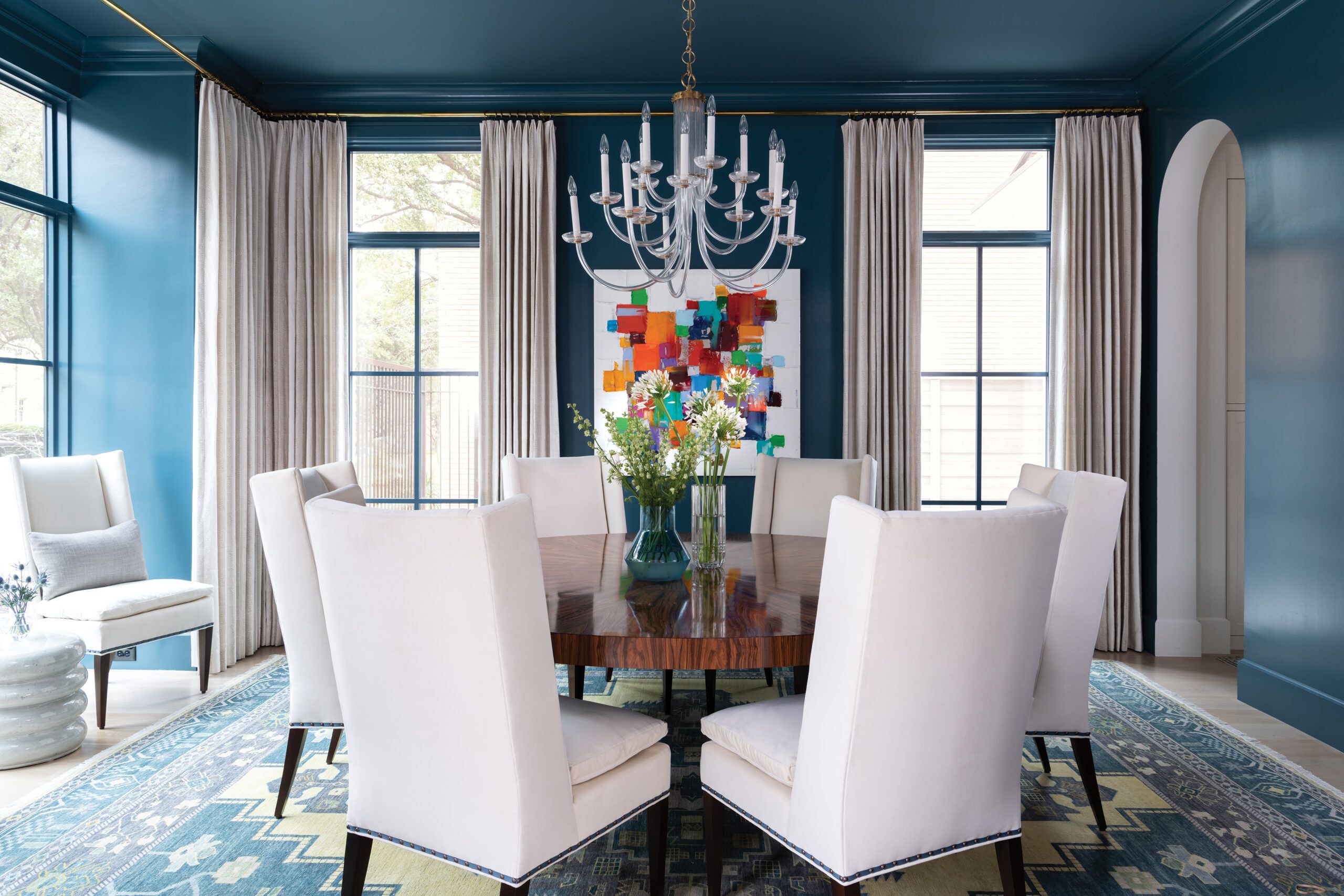
A formal dining room can feel fun—exactly what designer Kara Adam sought to serve up in this transitional Dallas home. “These clients love to entertain,” she says. “They wanted the space to have some drama but also feel accessible for lively, lingering dinners with their family and friends.”
The key ingredient in this dramatic design scheme: is the teal paint color, a rich, green-tinged blue tempered with a gray undertone. “It’s both bold and tranquil—it gives the dining room some soul,” Adam says. Using it to wrap the walls, trim, and 10-foot ceiling, while keeping the furnishings quiet, allows visitors to experience the room as a whole, where a white ceiling or casings would add stark divisions.
But it’s the lacquer-like high-gloss finish that adds a special quality. “The finish really ups the ante, reflecting light to ensure that the space is cozy and romantic but never too dark,” Adam says. “It looks striking by day in natural light, and with the chandelier, the space really glistens at night. It’s magical.”
Bright Ideas
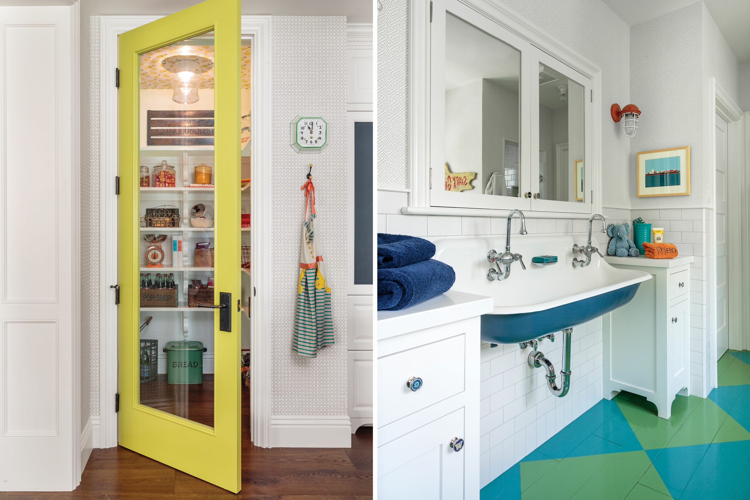
“White is my go-to neutral, but an all-white room bores me,” says Los Angeles designer Alison Kandler, who cures the blahs with hits of vivid color. Whether it’s a citron-yellow pantry door or a green-and-blue checkerboard floor, “bright colors give a space an upbeat, light, and airy feel—they make people smile.”
She begins by getting personal. “The first thing I do is send clients— separately—to the paint store to pick out five to twenty-five colors that make them happy,” she says. “The colors you love reflect your personality, and when you use them in your home, your home shows who you are.”
Don’t go overboard with brights, she warns, or the space can come off as “circus-y.” Kandler uses bright accents in unexpected places—a floor, a door, a sink, a light fixture, a ceiling. She mixes rather than matches, too, using touches of several different colors in a room.
Strong shades are not just for casual cottages, she adds. “A traditional house is where touches of bright color really bring a sense of whimsy, because it’s so unexpected.
Rich and Restful
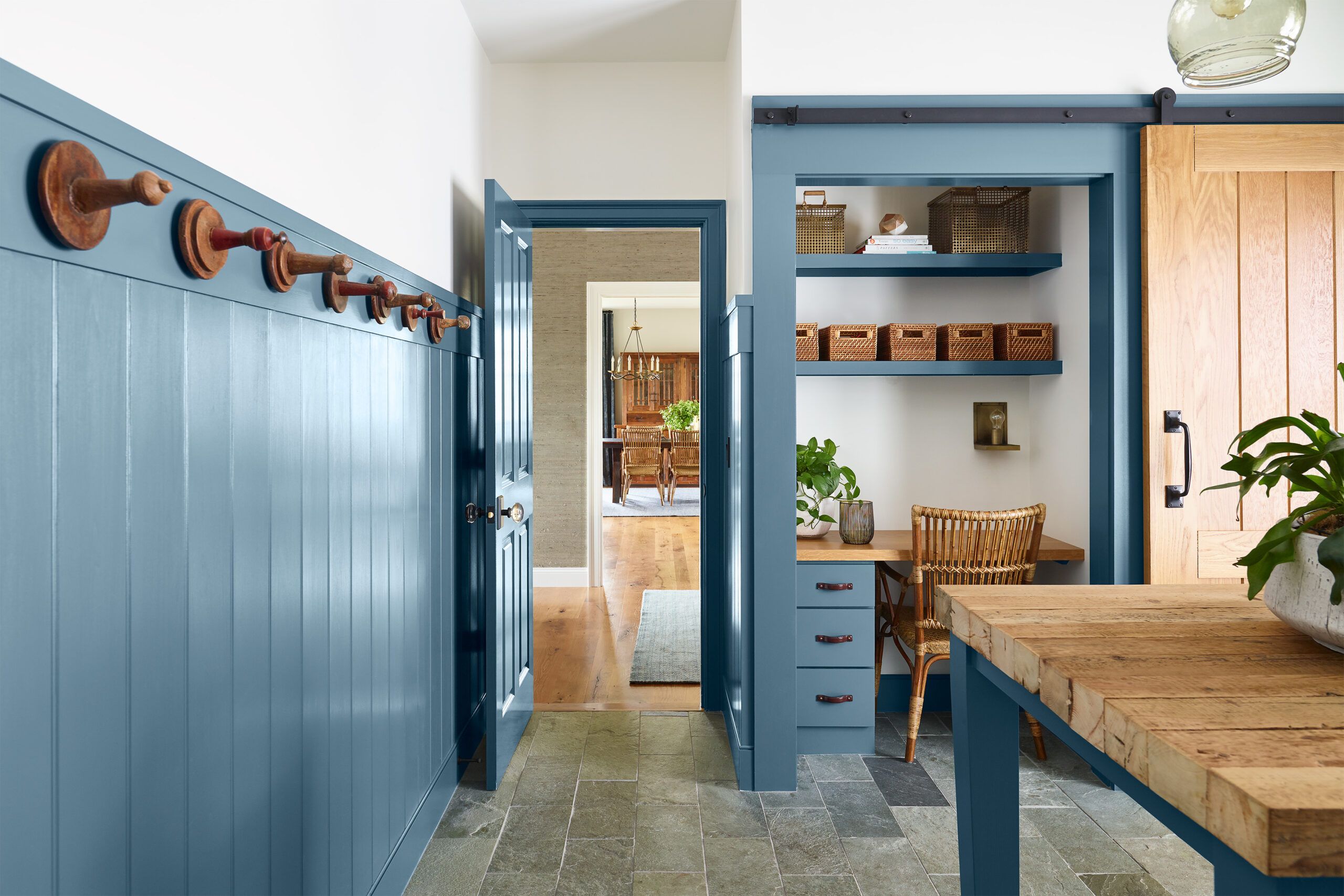
The humdrum mudroom is a thing of the past. “Multiuse spaces are critical now, and people want them to look as good as anyplace else in the house,” says New England-based designer Kristina Crestin. Yet the province of wet dogs, dirty boots, and sports equipment had better be hardworking, too. So Crestin’s mission in this Essex, MA, home was to create a low-maintenance, high-performance space with plenty of style.
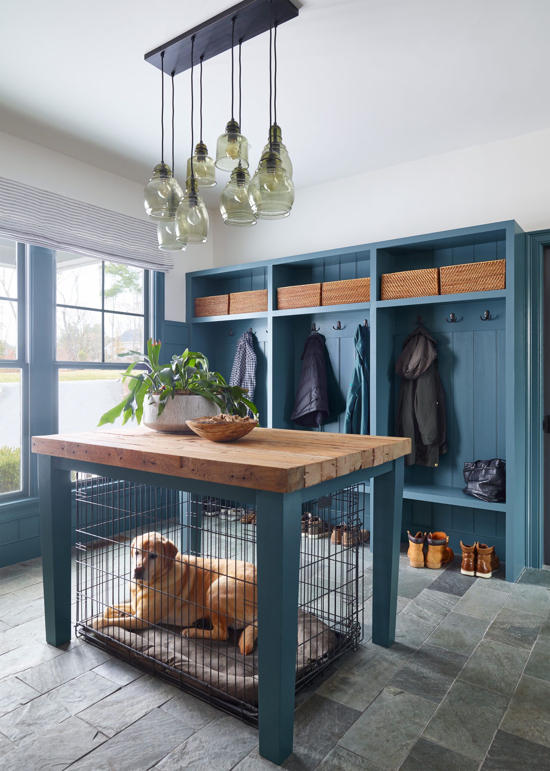
Once the functional aspects—open lockers, a sturdy central table, tall wainscoting that could take a beating—were nailed down, it was time to concentrate on color. After she and the clients considered dozens of different blues, this gray-blue came out on top. “It’s saturated, rich, and deep without being dark or drab,” Crestin says. “It’s a harmonious, restful color, yet has a lot of punch.”
To keep the color from reading too austere, especially against the gray slate floor, Crestin brought in warm woods: a white oak barn door and a tabletop made of reclaimed pine—and blanketed the ceiling and uppermost part of the walls in a gray-tinged white. The effect is equal parts practical and full of panache. As Crestin puts it: “Even if it’s not a public space, if you’re going to spend any amount of time there, you deserve to love how it looks.”
