Waterfront Greek Revival
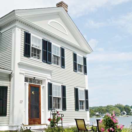
If the theme song of smart real-estate transactions is “Location, Location, Location,” then in the search for a vintage house the chorus is surely Details, details, details. But when Michael Sarasin and Renee Mattison found a Greek Revival gem with everything but the latter, they did not hang back.
The couple had been looking for a waterfront home when they came upon a street in Mystic, Connecticut, lined with 19th-century houses. There, right on the Mystic River, was a four-bedroom, two-bath house with a classic front gable and triangular pediment. Built in 1834 and enlarged to form an L about two decades later, it was structurally sound and ideally located for two people who love small-town charm. And even without improvements, it would have plenty of room for the two of them and Renee’s daughter, Alyssa, now 13.
Pictured: The classic street-facing facade was gussied up with dentil molding and fat corner boards.
Seeing Potential
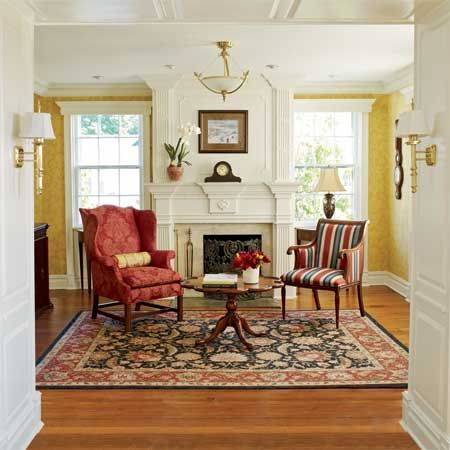
As for the missing details, what Michael couldn’t see he could easily picture. A lifelong woodworking buff who asked for a radial saw for Christmas—at age 11—he had already renovated one other home. “There’s nothing I like better than building stuff,” he says. “I just find it incredibly satisfying.”
As he and Renee toured this house, with its narrow doorways and chopped-up rooms, he envisioned a way to rework the layout—and a chance to add Greek Revival-inspired ornamentation along cornice lines, doorways, and windows. Also on the plus side were four fireplaces and well-preserved heart-pine floors in every room but the kitchen. On the downside, the fireplaces didn’t work and the family craved more light and open space.
Pictured: In the living room, a wide opening was cut in the wall that divided the original twin front parlors, easing the flow of light and traffic.
Crown Molding
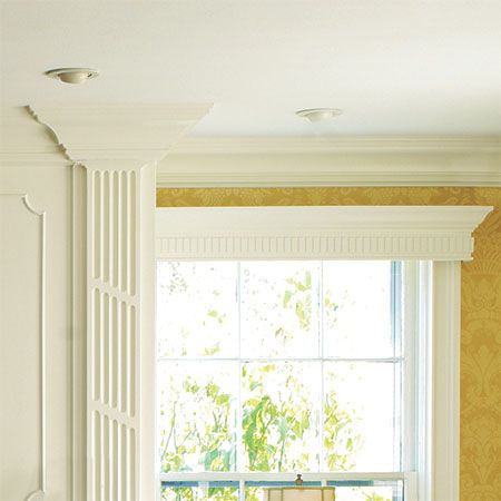
Beefy crown molding in the living room now gives definition to walls and ceilings.
Stock molding:
Fireplace Face-Lift
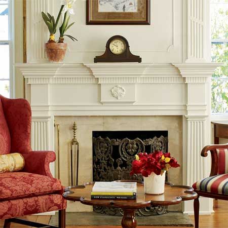
Both parlor fireplaces got face-lifts with a built-up blend of stock pieces and custom ones made by the homeowner in his basement workshop.
Gas fireplace: Mendota
Living room wallpaper: Powell House Damask, The Williamsburg Reserve Collection, F. Schumacher & Co.
Master Suite
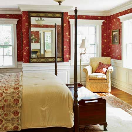
Michael figured that the best way to develop a home’s future was to live with its iterations, past and present. So he began slowly—upstairs. It was a calculated move, for two reasons: First, he could experiment with the floor plan and architectural trim before moving to the showplace areas of the house. Second, Renee would have a haven while he was rebuilding the rest of the rooms. “Let’s face it: Living through a renovation is a pain,” says Renee, who was about to learn that lesson firsthand.
The couple wanted a master suite with a sitting area, so Michael took down a wall between two small bedrooms. In its place he built a partition 20 inches thick with wraparound wainscoting and hidden closets.
Molding and Wallpaper
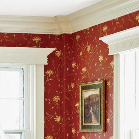
Deep, wide crown molding sets off vintage-style wallpaper.
Wide Room Divider
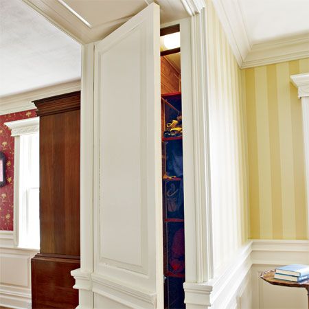
A new partition is thick enough to hold closets, their doors disguised with raised panels.
High Fireplace
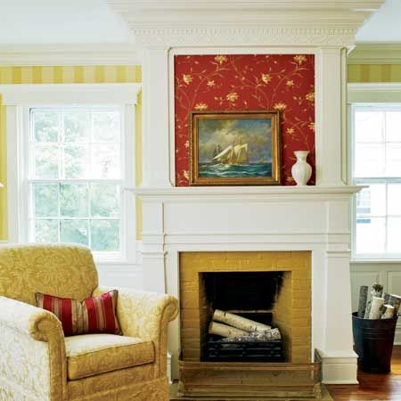
A new double-height mantel frames the fireplace in what is now the master suite sitting room.
Family Room
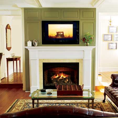
Wide passageways became a motif, repeated downstairs, where the parlors were opened to create one living area, and in the entry from the new mudroom to the future family room. Paneling became a motif too, as did Michael’s two-tier treatment of the bedroom’s fireplace.
Soon, in fact, he had developed a signature approach: Add definition to walls and ceilings with crown and baseboard molding. Descend to basement workshop to make flat and raised panels, window trim, etc. Return upstairs, where handy miter saw is kept. Fit everything in place.
Repeat.
Pictured: The family room’s gas fireplace was finished in a less ornate style than the one used for those in the original portions of the house.
Window Panels
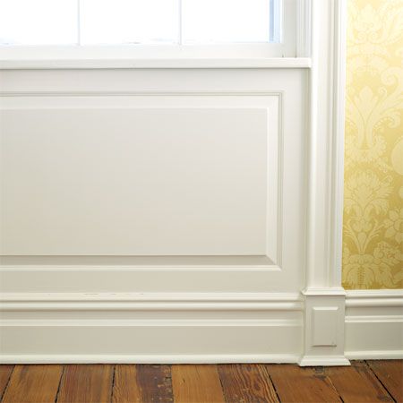
As his panel-making kicked into high gear, Michael experimented with using it to different effects. To accentuate the living area’s 9-foot ceiling, he placed panels under the tall six-over-six windows and integrated them with the casing, creating floor-to-ceiling frames that draw the eye upward. To give the dining room and master bedroom a cozier feel, he installed chair railing and extended the paneling horizontally as wainscoting.
Pictured: In the living room, paneling below the windows meets extended casing to form a vertical unit that adds formality and draws the eye upward.
Window Casing
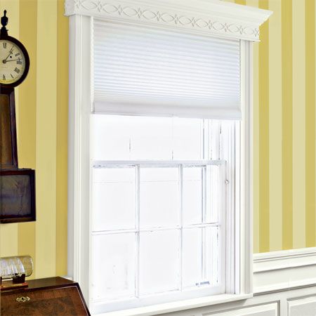
Another whole-house routine took shape: taking exterior walls down to the studs, which allowed Michael to add insulation and upgrade the wiring, plumbing, and heating. Radiators were replaced with forced-air heating and cooling delivered via unobtrusive 2-inch holes in the floors. A chimney crew revived the fireplaces while Michael tackled the surrounds.
Pictured: In the sitting room, windows are finished with stock Windsor casing and built-up cornices, as in the rest of the house. Below the window sill, panels extend horizontally as wainscoting to bring the eye downward and create a feeling of intimacy.
Kitchen
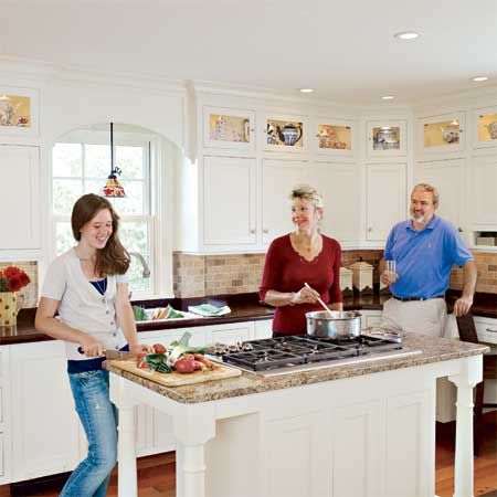
When they were done, the reworked kitchen opened onto the new family room, blending old and new areas of the house. “We wanted to keep this area traditional looking but with a modern flow,” Michael says, pointing to his vintage-style cabinets and wainscoting, and a new floor made from salvaged heart-pine beams.
When he wasn’t adorning walls with molding and paneling, creating a coffered ceiling in the family room, or piling on trim around the fireplaces, Michael was fussing over less obvious details. After installing mahogany countertops in the kitchen, he rubbed on a thin coat of polyurethane “and just kept layering—13 coats, one every 6 or 7 hours,” he says, to create an impervious-to-water surface.
Sink and faucet: Kohler
Cooktop, ovens, and downdraft: Wolf
Appliances (not pictured):
Refrigerator: Sub-Zero
Dishwasher: KitchenAid
Dishwasher drawer: Fisher & Paykel
Kitchen Cabinets
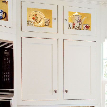
Michael made the Shaker-style cabinets himself.
Kitchen Island
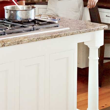
A granite-topped island with turned legs allows Michael, Renee, and Alyssa to rotate from cutting board to cooktop without blocking access to the ovens or fridge.
Overmantel and Salvaged Doors
Because he couldn’t salvage all the interior doors, he installed the old hardware and locksets on new ones, along with glass doorknobs found at flea markets. “Yeah, it’s a lot of work to carve out the mortise, but it would be such a shame to have new doors and hardware—it wouldn’t be right,” he says. He even fashioned lead caps to top the black-painted exterior shutters for period-appropriate protection from rain.
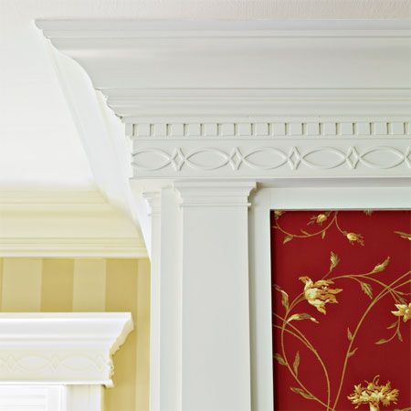
Pitured: Over the master suite’s sitting room fireplace, tapered pilasters topped with dentil molding and a double-fish motif meet the ceiling’s elaborate crown molding.
Coffered Ceiling
Springsteel upgraded the exterior in more visible ways. “Lots of Mystic houses of the Greek Revival era are plain; they are more representative of simple Yankee craftsmanship,” he says. “We dressed up the exterior by building out a flush gable at the back to match the projecting gable on the front, and by adding dentil molding. We also widened some trim boards and enlarged the corner boards.”
Today, one addition and 247 panels later, Renee says she appreciates the effect of all that painstaking attention to detail. She’s even willing to admit that it was worth living with a man so obsessed that he figures he poured 4,000 hours into their home—10 hours every Saturday, 6 or more on Sundays, and 1 hour a night Mondays through Thursdays—for five years.
For his part, Michael says he’s happy with the result and still loves Greek Revival detail. But he readily admits it’s time for a new project. “I’m done with raised panels,” he says. At least for now.
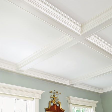
Pictured: The ceiling in the family room was made with a gridwork of poplar 1x6s trimmed with built-up crown molding.
Master Bath
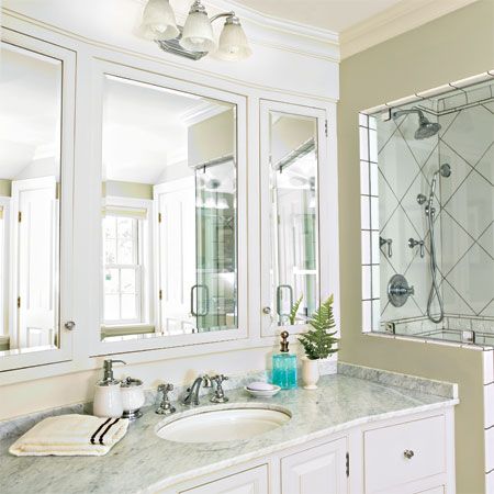
In the bath, a mirror triptych was angled to reflect the window.
Master bath sink: Kohler
Faucets: Rohl LLC
Bathroom Tile
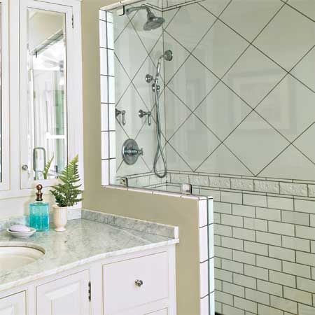
Subway-tile wainscoting helps give the bath its vintage look, while the roomy shower signals modern convenience.
More Space, Better Flow: First Floor Plan
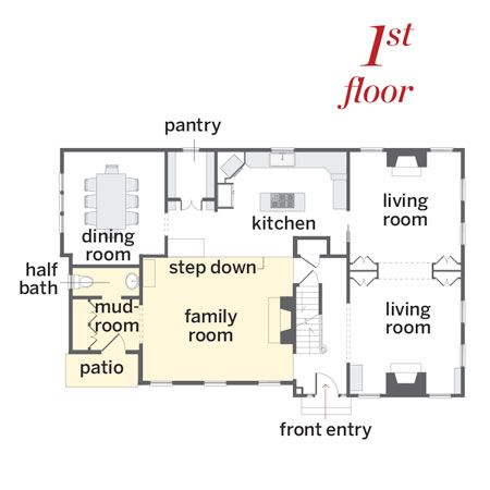
The original two-over-two box, enlarged to a 2,300-square-foot L in the 1850s, was opened up with wide passageways and an addition. The 800-square-foot add-on allows traffic to flow in a circle and made way for a family room, powder room, and mudroom.
Architect: Peter Springsteel
Second Floor Plan
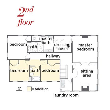
Upstairs now are four bedrooms, three baths, and a laundry room.
