Cottage Kitchen
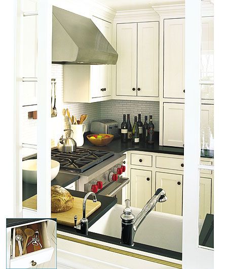
From Home to Stay, This Old House magazine, April 2004
I don’t live in a big place, nor do I want a lot of square footage, so this kitchen is just right for me. It has plenty of counter space so I could cook for guests (with a killer range), and lots of smartly placed storage, but it doesn’t feel like a rambling echo chamber.
This kitchen was built into the 2003-2004 This Old House TV project, a small converted barn in Concord, Massachusetts. Because of its size, TOH general contractor Tom Silva had the luxury to build custom cabinets, including an ingenious angled drawer (inset) created to clear the oven door handle.
Seaside Retreat
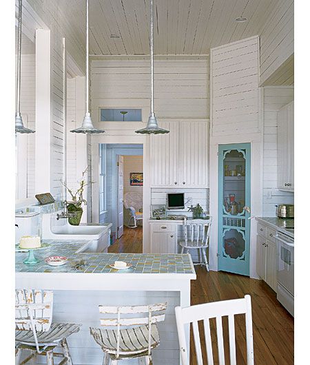
From Seeworthy, July/August 2005
So many people go over the top with kitchens: cabinetry that looks like furniture from the antiques dealer, appliances that are less at home in the home and more at home out, like in a restaurant kitchen. This place has none of that and I love it for it. Simple appliances, a plain sink, lots of white paint that makes for a clean and airy feeling. Seems like a fine place to eat toast, if you ask me.
One of the things I especially like: the exterior screen door the homeowners brought inside for the pantry. It’s a welcome touch of off-beat (and inexpensive) creativity in a world of mass-market design.
—Scott Omelianuk, Editor
What I like about this kitchen is that it reflects the origin of the house and its surroundings. This is a beach house from the turn-of-the-century South. The fixtures are humble and inventive (like the screen door on the pantry); the coloring is very beachy—tans, seafoam greens, blues—without being cheesy; and the glass-tile countertop is beautiful.
—Hylah Hill, Art Director
Hard-Earned
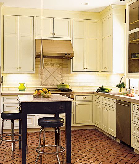
From Polishing Up a Craftsman Gem, September 2006
The owner of this kitchen in Atlanta, Georgia proves to me that a little patience goes a long way. I liked the way he used one coat of linseed oil and three coats of hard wax to make the terra-cotta floor tiles shine. The beautifully handmade copper sink from Greece was a lucky find in one of his many excursions to local antiques markets.
—Natalie Rodriguez, Editorial Assistant
Craftsman Made Modern
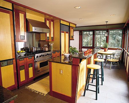
From Contemporary Craftsman, July/August 2004
I love this distinctive woodwork/cabinetry with its updated Arts-and-Crafts look. The cabinets themselves are highly decorative, crafted from a mix of blond maple, reddish mahogany, and ebonized walnut—many with patinated copper insets on the doors. It looks bright and colorful, even though it’s all subdued wood and earth tones. I think it’s a great example of fantastic design and craftsmanship—really a one-of-a-kind look.
—Kathryn Keller, Executive Editor
Man’s Kitchen
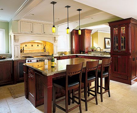
From A Man With a Plan, March 2005
I see this well-appointed kitchen as both masculine and refined. The detail work on the countertops is exquisite. I also love the subtle lighting and beautiful cabinetry.
—Michael Stolper, Assistant to the Editor
It’s All in the Details
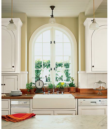
From Details Make the Difference, March 2006
I think the arched windows and cabinets of this kitchen add a charming decorative touch to the bright room.
—Natalie Rodriguez, Editorial Assistant
Salvaged Beauty
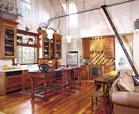
From Special Addition, January/February 2003
Here’s what I think is cool: the owners of this cottage in Fairhope, Alabama, used salvaged wood to make the cabinets and floor. And it’s great the way the stained glass and colored backsplash tiles add a fun and funky note.
—Natalie Rodriguez, Editorial Assistant
Colorful Family Space
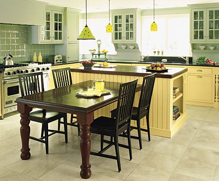
From Fit for the Family, July/August 2006
I think the appeal of this design comes down to a pretty simple idea: yellow flat-panel base cabinets paired with soft green upper cabinets with divided lights. A dark teak T-shaped island and black granite countertops tie the cheerful, soft colors together and give them a sophisticated edge. There are some very nice details: turned leg insets, simple brackets, open shelves, a built-in hutch, a glass-tile inset in the backsplash over the stove. The effect is one of really well-crafted woodwork and warm, bright, happy color.
—Kathryn Keller, Executive Editor
I like this kitchen because it showcases two different colors that complement each other to create an open, inviting space for both family and friends. The fact that the kitchen is a self-contained room, but has access to both the dining room and sun room, is also appealing. What makes this kitchen
extra special are the details—i.e., the custom-built hutch, custom light fixtures and wood carving.
—Colette Scanlon Ortiz, Design Editor
I love the open space and the light coming through the window—a clean-lined, open, yet airy space. And the light-green and yellow cabinets look great set against the black granite countertop, stainless steel range, and limestone floors. Looking out the window makes you want to walk out into the sun after breakfast.
—Susan Ryan, Copy Editor
Raise High the Roof Beams
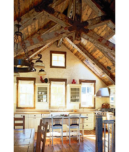
From Mining the Past, March 2006
I love this kitchen for its seamless combination of old and new materials. During the renovation, the homeowners used reclaimed building materials whenever possible. For instance, the ceiling trusses were recovered from an Oregon warehouse and still feature the original bolts. The floors are 300-year-old Eastern heart pine from farmhands’ quarters on a Virginia apple orchard. These elements, paired with a farmhouse sink, distressed cabinets, and rusted hardware, create a rustic and truly cathartic space.
—Kristen Mucci, Associate Online Editor
High Ceilings
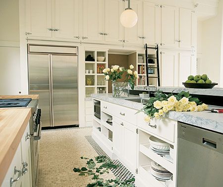
From Amazing Grace, July/August 1998
My all-time favorite kitchen is from the TV show’s winter project house (er, church) in San Francisco, back in 1998. I love the thick white marble countertop, mosaic tile floor, and chunky chrome hardware. The hinges and latches on the upper cabinets remind me of the ones on this enormous turn-of-the-century wooden and zinc-lined refrigerator box that my folks had in the old converted carriage house that I lived in as a kid.
The S.F. kitchen has a crisp and classic look that will never appear dated. Plus, I love how the homeowners took full advantage of the 14-foot ceiling by installing open shelving and super-high storage cabinets that are accessible by a ladder on a metal track. It’s such a great use of space, and it gives you the feeling like you’re in one of those old-school pharmacy/soda shops.
—Amy R. Hughes, Senior Editor
Take it Outside
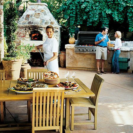
From Inside the Outdoor Kitchen, June 2006
I love this outdoor kitchen—the pizza oven makes the food taste amazing, plus it has a big grill, great counter space and running water. The grape arbor behind it and the view in front make it the perfect place to cook outside.
—Amy Rosenfeld, Design Director
Black and White
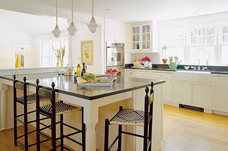
From A Light Touch, September 2004
There’s something just so classic and light and welcoming about this kitchen. This is when I first fell in love with the crisp look of black counters and white cabinets. And the vintage details, like the schoolhouse pendants, the old-fashioned faucet, Shaker-style stools, and the furniturelike legs on the island, are perfect counterpoints to the stainless appliances.
—Leslie Monthan, Copy Chief
Colorful and Modern
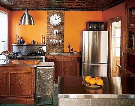
From Small Wonder, January/February 2006
I’m all for color—especially in the kitchen, where I like things to be cheery as I cook. This kitchen is so bright and welcoming that I just want to have parties in it all the time. Plus, the owner perfected the art of “grandma chic”—literally—as she converted her grandmother’s furniture into cabinetry and combined it with modern materials for a warm but useable space.
—Alexandra Bandon, Senior Editor
Zen and the Art of Kitchen Cabinets
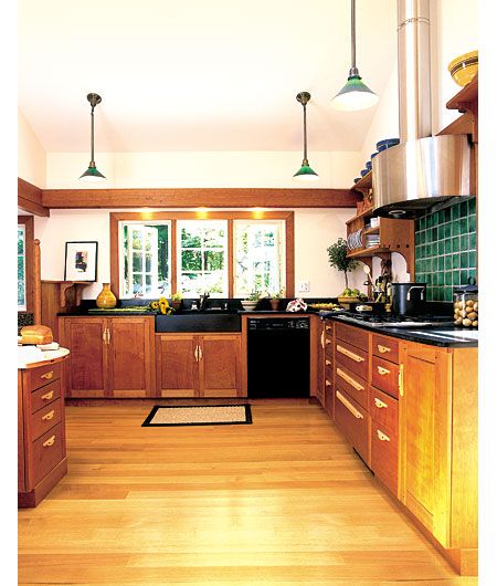
From Into the Wood, October 1999
I love wood, and the Zen simplicity of Greene and Greene design, both of which are captured in this small but lovingly detailed kitchen. The finely crafted inset cherry cabinets with their maple door and drawer pulls and walnut accents are a feast for the eye, while the black slate countertop and farmhouse sink provide a cool and weighty durability that nicely offsets all those warm wood tones. However, unlike a lot of Craftsman-styled kitchens, this one isn’t dark or cramped, in part thanks to its soaring ceiling and cream-colored walls.
—Thomas Baker, Building Technology Editor
Ultimate Cook’s Kitchen
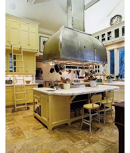
From Cook’s Tour de Force, May 2001
This kitchen is so over the top with its colossal 1,400-pound range hood hovering a Jules Verne rocket ship over a giant cantilevered marble countertop—it’s like something from a movie set. Even the French-made, 8-burner range seems ready for its casting call on The Titanic. But the whole place hangs together in a vaguely fin-de-si�cle old-world way, as a celebration of the art of cooking. I, for one, would give my eye teeth to be able to crank up that stove and spend a weekend there preparing a feast that even Babette would envy.
—Thomas Baker, Building Technology Editor
Vintage-Inspired
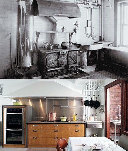
From High Style in a Low Place, September 2005
The inspiration of “then and now” is what makes the Kips Bay Showhouse kitchen one of my favorite kitchens. I loved using the adjacent vintage photograph to compare what original elements were utilized in the new design—such as the pipes, which are no longer working, that were converted to a pot rack.
—Denise Sfraga, Photo Editor
A Clear Division
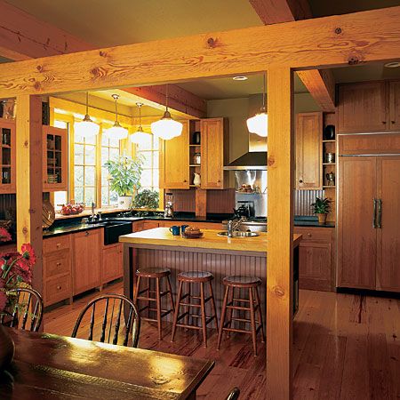
From Chip Off the Old Block, January/February 2006
I like to feed people, I like to entertain. But I don’t want help in the kitchen—I want everyone to stay the heck out. I also don’t want to be alone. The timber framing between the kitchen and dining room in this open layout says “I want togetherness and space at the same time” with way more subtlety than I ever could.
—Betsy Andrews, Online Editor
Out and In
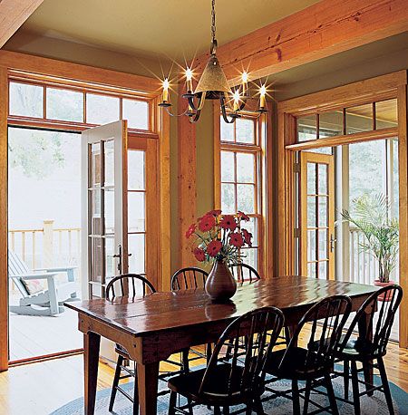
From Chip Off the Old Block, January/February 2006
Along with the perfect balance of company and solitude, I also want light and air and the outdoors coming in. So the French doors opening from the dining room onto the deck and the screened-in porch seal the deal on this dining room/kitchen duo. I love that I’d be able to watch my guests gliding inside and out, wine glasses in hand, grazing on delicious stuff laid out on the dining room table, while my work space and my work surfaces remain completely and utterly mine.
—Betsy Andrews, Online Editor
Seamless Addition
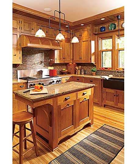
From A Perfect Addition, September 2006, p. 78
The craftsmanship that went into the cabinetry and the architect’s attention to detail in making this addition have the same loveliness as the old part of this 1904 foursquare were impressive. It is not my personal style, but I couldn’t stop admiring every inch of it while I was there when we photographed it.
—Amy Rosenfeld, Design Director
Furniture Built-Ins
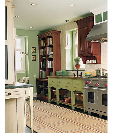
From Mixed Plate, July/August 2005
I find this kitchen appealing because, in addition to built-ins, they added cabinets that look like furniture. There are three different cabinet finishes, but all compliment each other. I also like the fact that they opened up one end of the kitchen with shelving rather than cabinet doors. This is a kitchen that has various zones, i.e., prep zone, clean-up zone, walk-in pantry, eating area and desk area. A very functional kitchen for a family with children.
—Colette Scanlon Ortiz, Design Editor
Piece by Piece
From Mixed Plate, July/August 2005
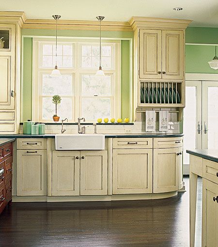
This is a really interesting example of mixing cabinet styles, colors, and furniture-like pieces to create an “added on to over time” look. It also has great details: etched glass pantry door, punched-tin door on a cabinet that has a built-in chalk board on one side. Very well thought-out for what could be an awkward space—sort of a galley that turns a corner.
—Kathryn Keller, Executive Editor
