Forever Home
Bigger isn’t always better. That’s a lesson Linda and Mike Lessner learned the hard way, after building a 5,000-square-foot house outside Austin in 2002. After moving in, the couple realized that it was wrong for them. “My husband wanted to be able to bike to work. I wanted to be able to hop to the store. We wanted to be able to walk to a city park, and we didn’t need all that space,” says Linda.
So within nine months of moving into the new house the Lessners sold it. They found a 1940 tan-brick, Cape Cod–style house on a double lot, in close proximity to schools and shops, and within biking distance of Mike’s dental practice. There was no question the house needed a major renovation: With two first-floor bedrooms, two baths, an outdated kitchen, and a bowling-alley-like attic bedroom, the house was too tight a squeeze for the Lessners, who had three children then and now have four.
Family Plan
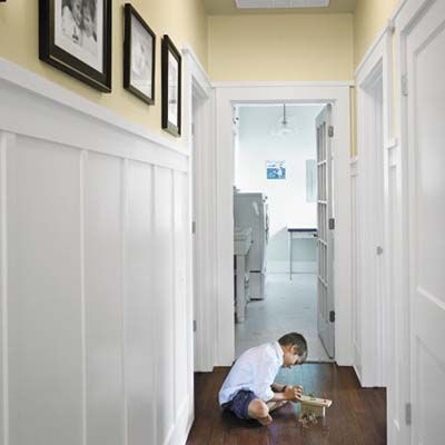
They turned to local architect David Webber, knowing he could deliver a green design that would retain a traditional feel. Starting with the simple, cottage look the Lessners wanted, Webber came up with a plan to increase the size of the house from 2,100 to 3,500 square feet, making room for three kids’ bedrooms (with one cleverly compartmentalized bath to serve them), a master suite, and a nursery, all upstairs, and reconfiguring the first floor into an open-plan kitchen/dining/family room. He drew a second story of steeply pitched gables as a distinctive envelope for the remodeled home, repeating elements of the original 1940 house such as the brick arch on the front exterior and the shiplap paneling on the interior. He also included plenty of features from the homeowners’ wish list, including window seats, a walk-in pantry, interior windows to maximize natural light, built-in bookcases, millwork details, and a second-floor laundry.
Green and Cozy
The 13-month renovation kicked off with a six-week deconstruction, a careful disassembling of the house’s parts to save them for reuse. Linda contracted Austin’s Habitat for Humanity to remove the attic and roof and take the first floor down to the studs. She’d keep and reuse the shiplap paneling, flooring, shelving, kitchen and bathroom cabinets, kitchen sink, bathtub, light fixtures, and doorknobs. Habitat could take the rest to its retail store.
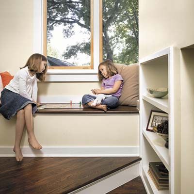
Here, Lucy, 8, and Ella, 5, play a board game on the stair landing’s window seat—one of many built-in features that maximize space in the house and give it a cozy feeling.
Energy-Efficient Home
Green builder Robert Howard started his work on the Lessner house when it was little more than a shell—fortunately, a very sound shell. “The pier-and-beam foundation was in good shape, and we left it basically as it was, adding to it in a few places to carry the load of the second floor addition,” says Howard. He insulated both the attic (with spray foam in the walls and floor) and the crawl space (with 6-mil plastic sheeting on the walls and floor), where the furnace and air-conditioning units would be. “If you keep your heating and cooling ductwork inside the insulated building envelope, it cuts energy loss,” he says. The HVAC includes a dehumidifier, which contributes to the unit’s efficiency by keeping the AC from turning on simply to reduce humidity. Two tankless hot-water units (one in the attic and one in the pantry) supply heated water only as needed, and photovoltaic solar panels on the roof reduce the electric bill by about 30 percent.
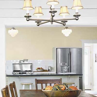
Here, new Energy Star–qualified appliances reduce the amount of electricity used—and the owners’ utility costs even more.
Clean and Simple
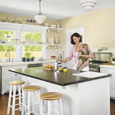
The kitchen reflects Linda’s penchant for good value: The countertops are covered in 6-inch-square white tiles she purchased from the local Habitat ReStore, builder overruns for which she paid a mere nickel each. Her splurge was the Crown Point cabinetry in a white-painted Shaker style. Well aware of habit, she chose only base cabinets and drawers—no uppers. (“I always leave them open, and it looks horrible,” she says.) Everyday dishes are stacked on open wooden shelves. Both baths feature basic white tile. “That way, I can change the look of the bathrooms simply by painting the walls,” says Linda. Sentimentality guided her insistence on reusing the existing cast-iron kitchen sink and kitchen cabinets in the second-floor laundry. “They were perfectly good pieces, and I thought of all the time the former owner surely spent at the kitchen sink, and I just couldn’t get rid of it,” she says. The soapstone-topped center island houses a corner sink where the kids wash up before meals.
Recycled Tiles
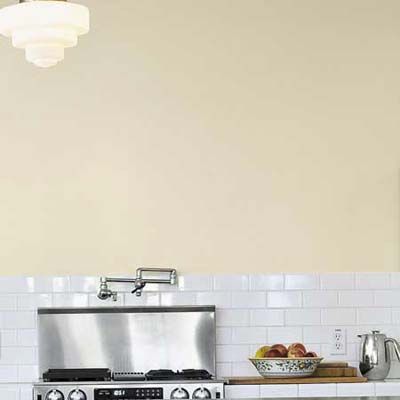
Buying tile left over from another building job helped keep excess construction materials from ending up in a landfill.
Healthy Finishes
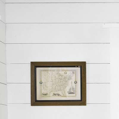
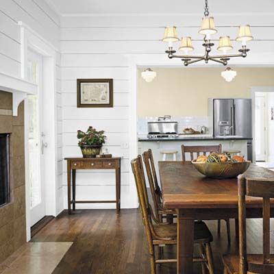
In keeping with the couple’s desire for sustainability, all coatings are nontoxic: The interior paint is no-VOC, and a water-based sealer was used on the floors. Here, the paint coats shiplap paneling that was removed and reinstalled as part of the remodel.
Favorite Spots
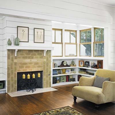
Some of the family’s favorite areas are those designed for efficient use of space and to create a sense of intimacy: a fireplace nook in the family room, the window seat on the stair landing. The Weathershield double-hung windows are in a two-over-one style that the couple chose for its simple, vintage look.
Here Comes the Sun
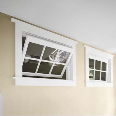
Lots of windows throughout channel sunlight through the interior, lessening the need for electric lamps. Two 1920s schoolhouse transom windows the homeowner found at a salvage yard let natural light from the big stairwell window reach the children’s bathroom.
Salvaged Wood Floors
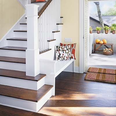
The front door’s interior casing is a good example of the simple millwork found throughout the remodeled 1940 house. Hardwood flooring was removed and reinstalled, supplemented by similar boards salvaged from other remodels. “I got quite familiar with all the deconstruction sites nearby,” says Linda. The couple spent weeks removing the nails themselves before the boards could be reinstalled and refinished with the water-based top coat. The built-in bench makes tidy use of what otherwise might have been wasted space.
Open and Airy
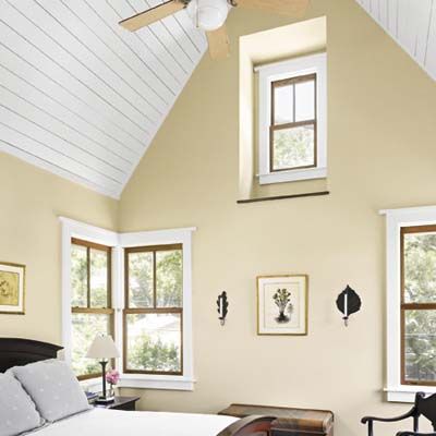
The 13-foot-square master bedroom seems more spacious because of its high ceiling, which is open to the roof peak. New wood boards line the ceiling, echoing the paneling downstairs; extra hardwood flooring was salvaged from other houses in the neighborhood.
The Exterior
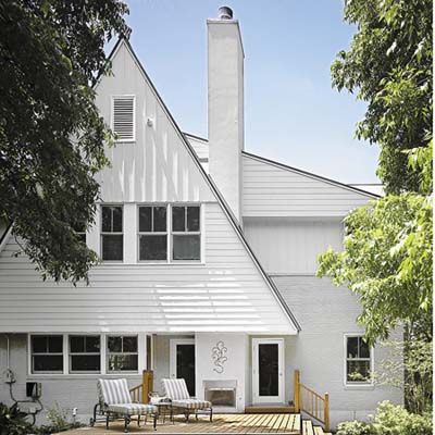
The exterior displays Webber’s eclectic take on traditional Cape Cod style as well as the Lessners’ green choices in materials. The roofline’s steeply pitched gables and shed overhangs are built with at least 1 foot of overhang, 2 to 3 feet in some places—important for rainfall runoff and house shading as well as aesthetics. The standing-seam metal roof is green because of its durability and also because its factory-applied, highly reflective gray finish keeps the house cool. The ground floor’s original brick exterior walls were painted gray-green rather than covered with boards, and the second story is clad in long-lasting, rot-resistant cement-board clapboard and board-and-batten siding. All the windows are energy-efficient, double-insulated, low-e-glass units.
A simple deck made of composite material is a few steps up from the yard. “It’s part of green design to include outdoor living spaces,” says Linda, who was thrilled to learn that their house received a five-star green rating (the top score) from the city of Austin, which took into account everything from the house’s proximity to the grocery store to its use of salvaged doorknobs.
First Floor Layout
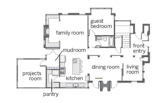
The first floor was reworked so that the kitchen, dining area, and family room are all open to one another.
Second Floor Layout
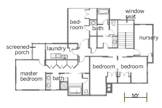
The second floor, once one big, attic bedroom, was expanded to hold three bedrooms that share one multipart bath, plus a nursery and a master suite.