After: Modern Layout, Classic Details
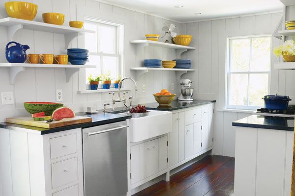
Sometimes the simplest solution is also the best, especially when righting past renovation wrongs. So thought Rina and Brittain Stone after seeking the advice of architect Kurt Sutherland in solving the layout and traffic-flow problems of their 1749 Dutch Colonial’s kitchen in Accord, New York. The kitchen was in a small, closed-off addition put on 100 years after the house was built and was configured in the 1960s as a U-shape with honey-hued cabinetry and marbleized laminate counters. This made the space feel crowded, and it looked dated by today’s standards.
The architect’s plan was straightforward: Bust out the bottom of the “U” to create an efficient galley with prep, cooking, and cleanup stations arrayed along two walls instead of three. By relocating the back door and enlarging the passageway into the adjoining living room so the two line up, Sutherland was able to open up the kitchen to both indoors and out, while rerouting foot traffic away from the main work zone. Period details such as painted cabinets, soapstone counters, and an apron-front sink unite the space with the rest of the 18th-century farmhouse.
Dishwasher: Jenn-Air
Faucet and sink: Waterworks
Windows: Pella
Before: Cramped with Closed Cabinet Space
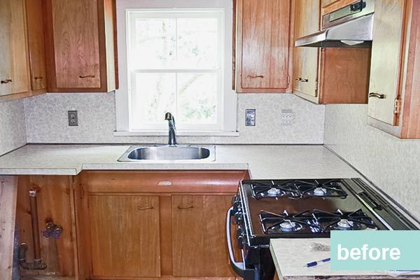
The existing kitchen’s deep-cornered counters were awkward to work in. Closed upper cabinets made the space feel cramped. The installation of two straight countertops offer more usable workspace, and open shelving makes the narrow galley appear more spacious.
Improving the Flow
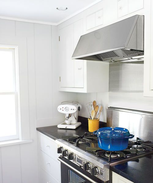
The original placement of the old patio door created traffic-flow problems, with houseguests constantly traipsing through the middle of the kitchen’s work zone to get outside. The U-shape layout made the kitchen’s 8-by-19 footprint feel tight. By moving the exterior door and widening the entry to the living room created a direct path between indoors and out. The galley layout provides more usable counter space.
Lined Up Built-In Storage
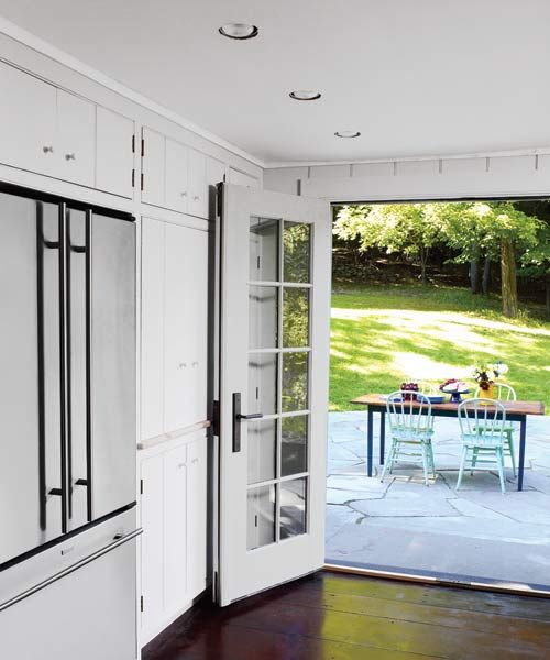
The pantry built-ins are 2½ feet deep rather than the usual 24 inches, creating a flush facade with the standard-depth refrigerator and providing extra stowaway space.
Decked Out Patio for Dining
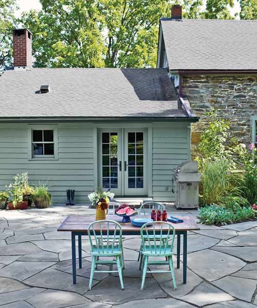
A broken-bluestone patio, decked out with a pro-style stainless-steel grill and table seating, lies just beyond the kitchen’s new French doors. Unlike standard twist knobs, oiled bronze lever handles on the doors can be opened with the downward push of an elbow when hands are full of dishes.
Slide-Out Storage
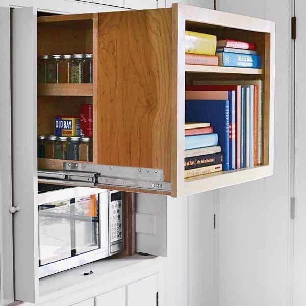
A slide-out storage cube holds cookbooks in the front and a built-in spice rack in the rear. A small microwave in the cubby below is usually hidden behind the cabinet’s “flipper” doors, which open out into the room and then slide back neatly into recesses along the sides.
Cooking Necessities Organized
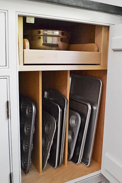
Cabinet dividers keep muffin tins and cookie sheets in order. The full-extension shelf above means no more kneeling and rooting around in a dark base cabinet for the right pot lid.
Everything In Its Place
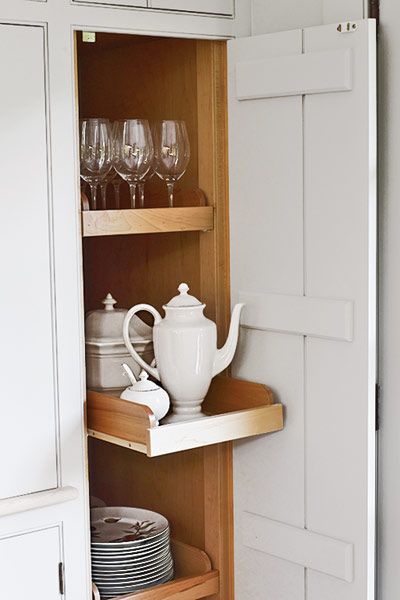
Maple cabinet doors, with board-and-batten detail on the inside, conceal occasional-use serving pieces and wine glasses. Daily-use mugs, plates, and bowls are stacked in open shelving on either side of the sink.
The Floor Plan
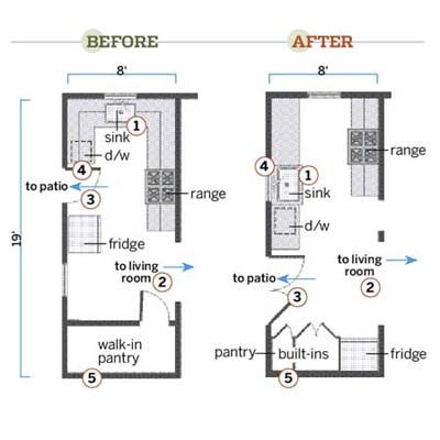
Here’s what they did to create a sleek galley kitchen that opens up to the rest of the house and to the outside.
1. Relocated the sink to a sidewall to free up the floor space beneath the window so the homeowners can use the whole length of two soapstone countertops. The original windowsill was dropped 6 inches below the counters to bathe the prep zone in natural light.
2. Widened the passageway between the kitchen and the living room (the remaining column is structural). This allows the cook to simultaneously monitor what’s bubbling on the range and socialize with guests in the next room.
3. Moved the exterior door to be adjacent to a wall of storage, so the route from the living room to the patio no longer cuts through the heart of the cooking zone. French doors now make it easier to ferry large trays of food from the kitchen to the outdoor dining table in warm months and also provide a cross breeze when swung open.
4. Added a window where the old exterior door used to be and installed a large apron-front sink beneath it. Because the new sink is positioned opposite the range, the couple need only pivot to move a water-filled pot to one of the burners.
5. Installed floor-to-ceiling cabinetry in the space formerly occupied by a makeshift walk-in pantry. The new refrigerator was recessed into a corner beside the built-ins so houseguests can help themselves to cold beverages without entering the prep, cooking, and cleanup zones.
Range: Five Star
Range hood: Faber
Espresso maker: Illy
Enameled pot: Staub
Custom cabinets: Custom Woodworking Furniture Store
Refrigerator and grill: Jenn-Air
Microwave: GE Appliances
French doors: Pella
Door hardware: Whitechapel Ltd
