Rehabbing a Dysfunctional Kitchen
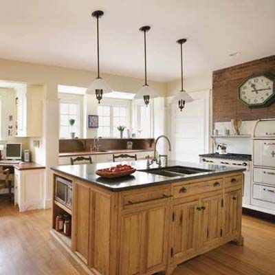
Kitchens are natural gathering places, and the more they cue up feelings of hearth and home, the stronger the pull. But when the owners of this kitchen, Eileen Eisele and Greg Ruccio, moved into their 1906 Shingle-style house with their young daughter, the existing space felt as if it had been dropped into place without regard to early-20th-century architectural traditions or 21st-century lifestyles. It was large enough but lacked a heart. “All the workstations were around the perimeter, with nothing in the middle,” says Eileen, as if to discourage them from grabbing a meal together or working on the mother-daughter craft projects they enjoy.
A professional photo stylist, Eileen knew she could create a warmer mood with just a few changes in the visual landscape.
Before
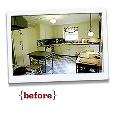
Previous redos had left behind a room with a dysfunctional layout, which had the fridge off in a corner facing the back door—12 feet from the sink and 14 feet from the stove. The last redo, circa 1970, was poorly designed with lots of wasted space.
But Eileen and Greg, who met on a walking tour of old Boston, wanted more than a cosmetic improvement. Yes, they hankered for a better functioning kitchen where everyone could assemble, not only for meals but to take care of bills, school projects, hobbies, paperwork, and all the rest. But they also hoped for a more workable ground floor plan. Greg, a technical projects manager, liked the idea of an adjacent family room where he could hang out within earshot of the kitchen. This, plus a rethinking of the kitchen, could yield one multipurpose open space, where three people could work on separate projects—together. So they called in Martha Penzenik, an architect known in their Arlington, Massachusetts, neighborhood for her work on old houses.
Getting More Function
This one, with its striking seven gables and deep overhangs, caught her imagination because of its “fairy-tale feel,” she says. “But the kitchen didn’t have any of the charm of the rest of the house. It felt like this big empty room.”
Her priority was to step up the function and improve the flow with more prep and storage space, plus room for various activities, while making it a stylistic match to the house. Noticing how the back-door alcove hemmed in the fridge and how the placement of the dining room door made it impossible to add cabinets to its left, she bumped the wall out 3½ feet, squaring off the room. In one blow she rid the kitchen of its back door and moved the fridge nearer the stove.
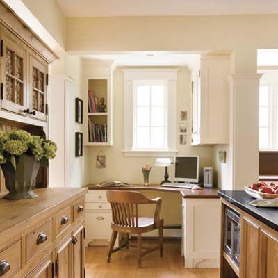
The bumpout, with four sunny windows, also made space for two alcoves and, in effect, three rooms in one, with a crafts center and office nook alongside the cooking area. “I started out by establishing circulation patterns,” says Penzenik, who recessed the workstations to keep them out of the flight path to the dining room.
Efficient Island
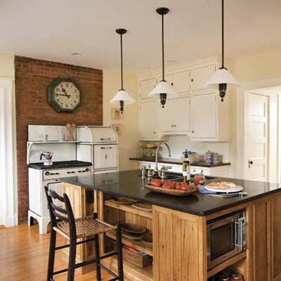
Eileen loved the idea of using reclaimed wood for its timeworn patina, so Penzenik used it for an island that marries modern efficiency and vintage styling. The dishwasher and pullout trash bin are totally concealed behind wood panels. Open-shelf storage allows access to the microwave on one side and, on another, provides a foothold for anyone who wants to sidle up to the counter for a snack or keep the cook company.
With its warm finishes and artful details, the once yawning room is now as intimate and familiar as the kitchen in Penzenik’s grandmother’s house. It’s also busy as a beehive. “I can be at the computer and Joji can be doing homework at the island, and Greg can be watching TV on the other side of the hutch,” says Eileen. “It all functions as intended.”
Unique Hutch
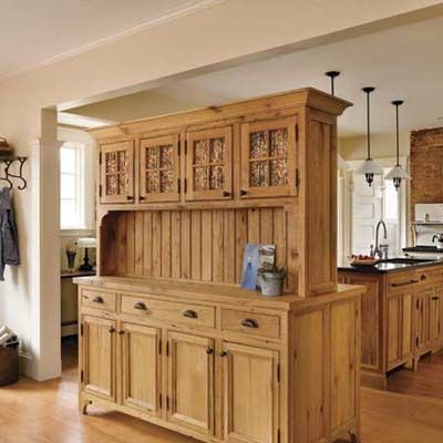
Her next big decision was to remove the sink wall to open the kitchen to a new family room addition. Warm maple flooring would unite the rooms. Penzenik’s first suggestion was a pair of half-walls to delineate the spaces but preserve open sight lines. Eileen had different ideas, presenting Penzenik with her rendition of the kitchen hutch. Penzenik, with fond memories of her own grandmother’s stenciled hutch, was intrigued. And as the two women talked, they hit on the idea of a hutch with an unusual twist: With cupboards opening on both sides, it could serve as a room divider while adding back the storage that was sacrificed when the old sink wall—and its cabinets—came down.
Reclaimed white oak planks and beadboard help make the newly built piece look old. “It’s resawn from timbers that were inside an old barn,” says Marc Poirier of Longleaf Lumber, supplier of the oak. “Exposure to the elements gives the wood its character.” Architect Martha Penzenik designed the hutch, giving it furniture-style feet, shelf brackets, and bronze hardware. It is capped by a cornice that sits level with the casing on the sides of the open wall that frames it, giving both a finished, cohesive look.
Glass-Front Upper Cupboards
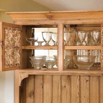
A sheer vintage-look floral material, found by the homeowner
in the bargain bin of a fabric store, adds a bit of color to the glass-front upper cupboards. What makes this hutch modern, of course, is the way it straddles two rooms, serving as a porous divider in an open plan. The upper cabinets open on both sides with shelves reachable from either room, while the base cupboards are separated, and a wraparound counter gives the piece its unified look.
Furniture-Like Storage
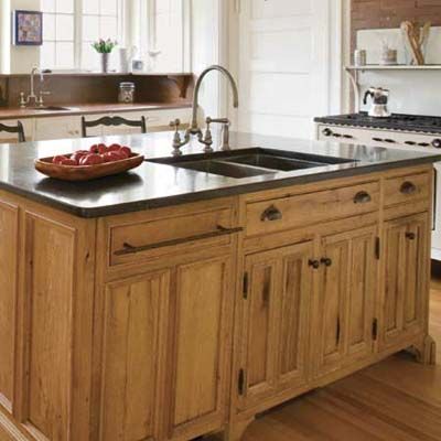
Freestanding pieces soften the edges of a new kitchen and recall an era before built-ins ruled. Made from salvaged wood—with curved feet and bronze knobs, pulls, and hinges from Rocky Mountain Hardware—this hutch and island underscore the vintage look.
1930s Stove
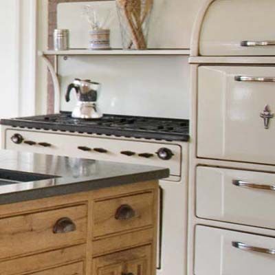
When a 1930s Wedgewood stove popped up on eBay, Eileen made the winning bid, dispatching her find to a nearby restorer, then storing it in the garage. This leggy white enamel Wedgewood sets the scene while serving a busy cook with two ovens and built-in pot storage.
Modern Layout
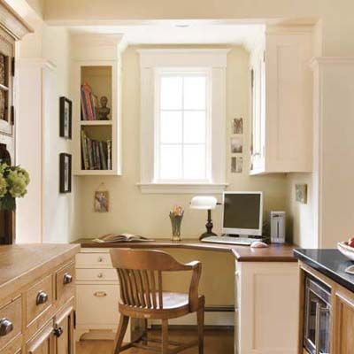
This alcove, once made to hold a hutch or a workhorse of a range, fits in an office and a hobby area, so that the kitchen becomes a multipurpose space for the whole family. To set off an alcove for a computer station, crafts center, or potting area, lower the ceiling height. Together with a partition wall, this instantly separates the space, even if it remains open to the kitchen.
Paneled Doors and Beadboard
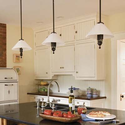
Two types of period paneling
multiply a kitchen’s charms. Here, upper
and lower cabinets have Shaker-style doors, while beadboard covers the small pantry
units lining the top as well as the backsplash.
Old-Time Accents: Hardware
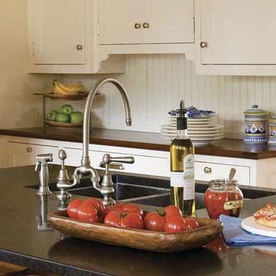
Varying hardware finishes add another layer of interest. Nickel knobs, latches, and hinges from Pottery Barn—as well as a curvy, high-necked bridge faucet from Sigma—complement white cabinetry here and in the crafts area. The sink shown here is from Blanco.
Old-Time Accents: Lighting
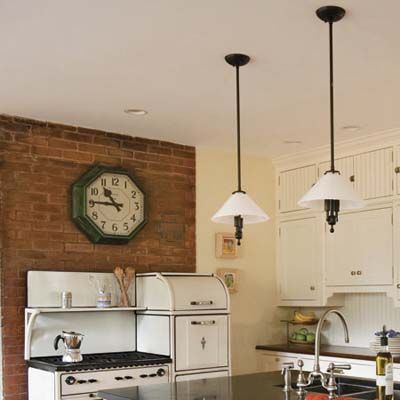
Reproduction worktable task lights from Lucid Lighting and a wall clock based on old train station timekeepers from Restoration Hardware complete the look.
Stone Counters
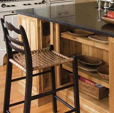
Marble or soapstone make for
true-to-period countertops. Here the
homeowner approximated the latter
choice with blue-black Irish limestone from Irish Natural Stone Inc.
The stool shown is from Hanna Wingate.
Molding Details
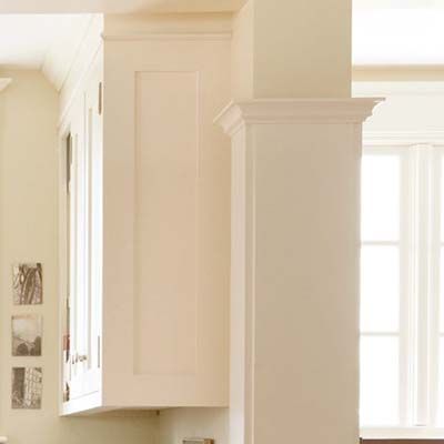
Detailed casings, staples of earlier eras, further define an alcove. The pilaster detail here is echoed in the window trim and cabinet cornices, as well as in the opening to the family room.
Updated Storage
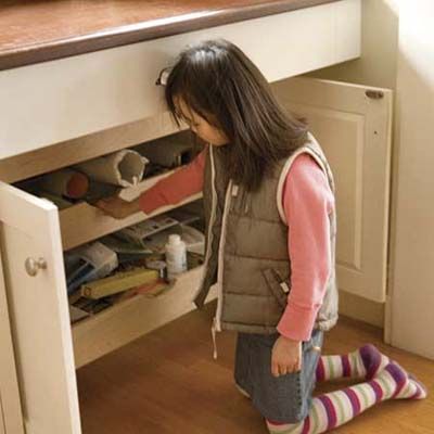
Slide-out drawers are a good storage solution. The ones here allow daughter Joji easy access to crafts supplies. Cabinets and counters are from Custom Woodworkers.
Wood Counters
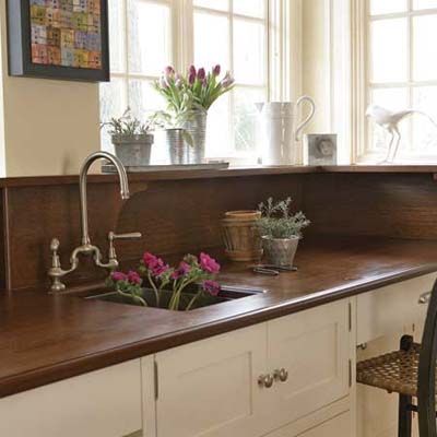
Different countertop materials designate special activity areas. Mahogany counters in the office and crafts area set their white cabinets apart from those in the kitchen. All that wood also adds another echo of the furniture-filled period kitchen, with
a wraparound backsplash detailed with brackets. Three coats of marine varnish protect it from water damage.
Floor Plan: Before
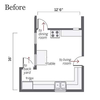
A bumpout squared off the 12½-by-16-foot kitchen and made room for an office and crafts area.
Floor Plan: After
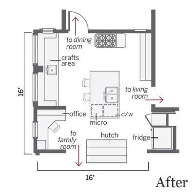
With the fridge recessed into a niche stolen from the living room, an island now anchors the cooking space and a hutch adds storage lost when the old sink wall came down.
