Image is Everything
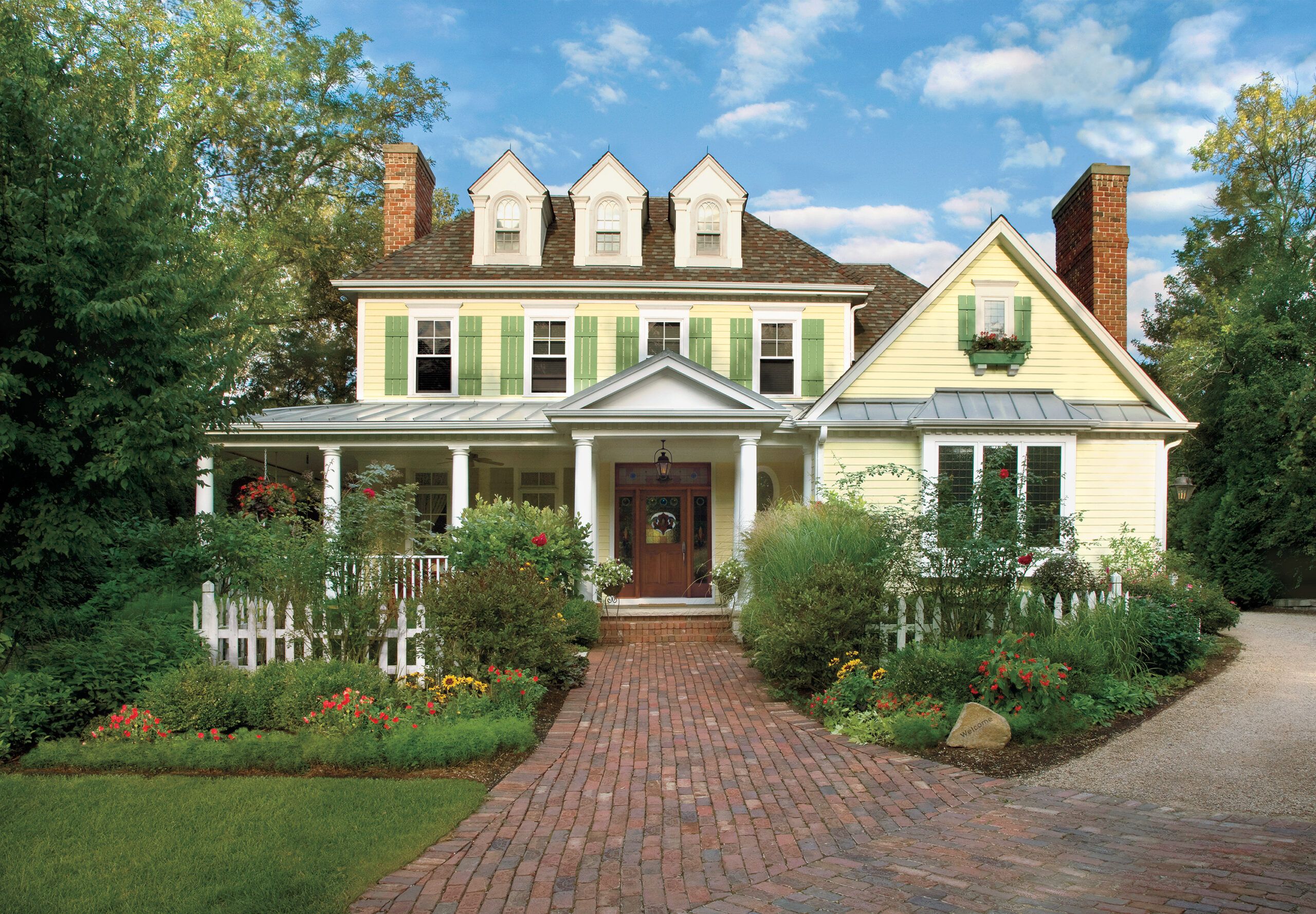
Here at This Old House, we believe that a handsome front facade ranks right up there with a solid foundation and good bones.
Sure, there’s the satisfaction you get in showing passers-by that yes, indeed, you’ve got a gem on your hands. But more important, it’s about how appealing details such as cheery blooms, a crisp white fence, and eye-catching shutters create a welcome sight for you and your family to come home to each day.
On the following pages, see nine stunning exterior transformations, including some from fellow readers whose homes were among the worst-looking in their neighborhoods. Through smart investments and, often, sweat equity, their diamonds-in-the-rough soon caught up to—and even surpassed—the rest of the block. Read on to see how these readers, as well as other inspiring homeowners, did it.
A Welcoming Walk
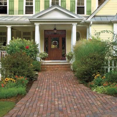
Winding through garden beds or going straight to the street, a brick or stone path can make the stroll to your door look and feel like an event.
Lush Landscaping
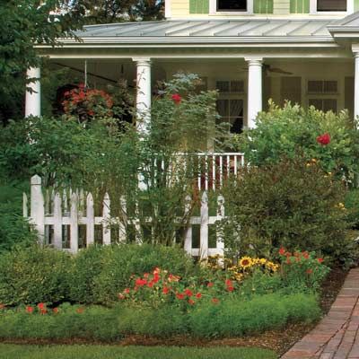
This adds vibrant color and multilevel focal points that create a winning first impression of your home from the sidewalk.
A Covered Entry
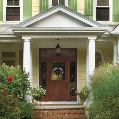
Play up a cozy portico or expansive wraparound porch; the shelter can act like an architectural embrace.
Shipshape Siding
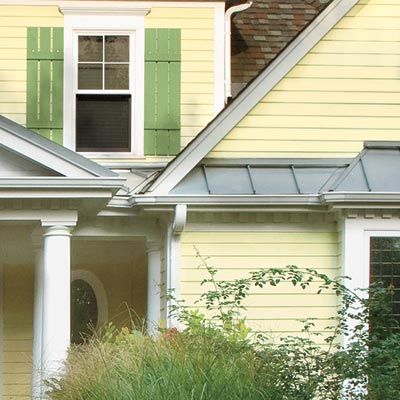
Keep clapboards, shingles, or masonry sheathing in top condition to add color, texture, and polish to your home’s exterior.
A Refined Roof
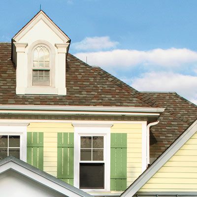
Whether wood shakes, standing-seam steel, or asphalt shingles, make sure your roof is well kept and matches the style of the house.
Star Openings
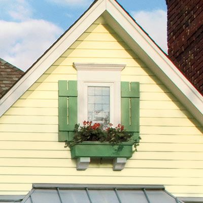
Grab attention with shutters and flower boxes around windows, and with sidelights, a transom, or a new finish for your door.
Case Study 1: Before
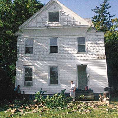
The “stickwork” on the front gable and the elegant fish-scale shingles enticed neighbors Malcolm Bender and Aaron Bort to buy this 1886 Stick-style house in upstate New York.
Case Study 1: Focus on the Details
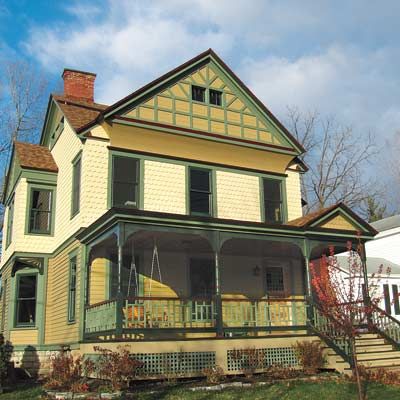
But the monotone paint scheme hid the details from anyone standing more than 6 feet from the facade. The sheared-off front porch also made for an uninviting entry.
Paint
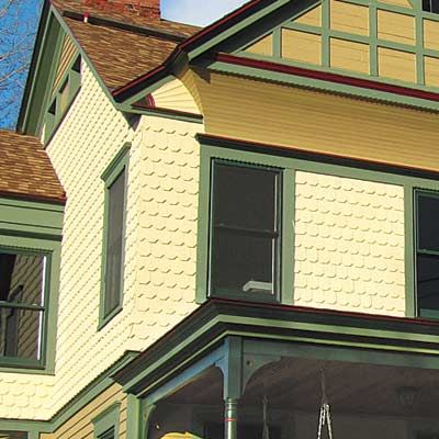
A five-color palette now highlights the home’s architecture. Pale yellow on the fish-scale shingles and tan on the clapboards below and on the front gable distinguish the mix of sidings. Two shades of green make the trim and stickwork stand out, while dark cranberry accents add pops of saturated color.
Entry
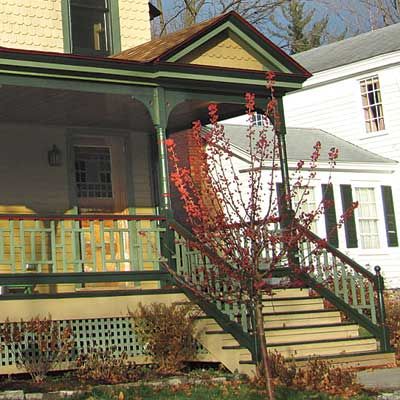
Working off old photos, the co-owners rebuilt the porch, adding a code-friendly redesign of the original lattice railing. Other touches include a beadboard ceiling, turned porch posts, and gingerbread corner brackets.
Roofing
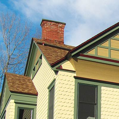
New asphalt shingles with gradient color evoke cedar shakes and preserve the home’s traditional style at an affordable price.
Case Study 2: Before

This 1870s San Francisco townhouse’s distinct architectural features were lost in a wash of white.
Case Study 2: Restore a Historic Palette
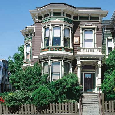
Veteran painter Bob Buckter helped bring them to the forefront with a modern take on the Italianate palette of earthy grays, browns, and blues.
Paint
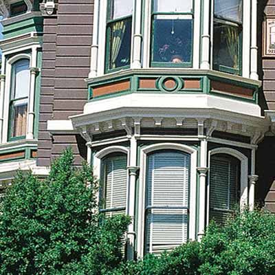
Five new colors enliven the facade. Gray-brown on the body sets off creamy white trim. A soft-green band tops the projecting bays and surrounds the recessed panel motif under the eaves and second-story windows. The panel moldings are dark green and the recess is ochre. “Such accent colors are like Tabasco sauce: Sprinkle just a couple of drops or you’ll lose good taste,” says Buckter.
Roof

Two coats of charcoal-colored acrylic paint were rolled onto the worn cedar roof shingles. In addition to tying into the new color palette, the paint added as many as three more years to the life of the roof.
Case Study 3: Before
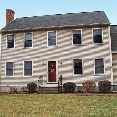
Before homeowner Scott Wisner got his hands on it, this 1995 Colonial Revival in Old Lyme, Connecticut, epitomized “builder grade,” with vinyl siding, a slab-style steel entry door, and a dull concrete stoop.
Case Study 3: Spruce Up with a Porch and New Siding
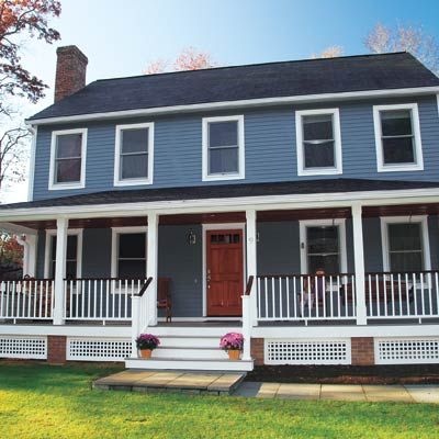
His improvements added charm where there was none.
Entry
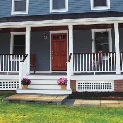
A new bluestone walk leads from the driveway to an 8-foot-deep porch, where Scott now enjoys his morning coffee. Crisp white PVC-clad wood porch posts and AZEK rails never need repainting, and an ipe handrail needs only the occasional coat of a teak oil with UV inhibitors to preserve its rich color.
Siding
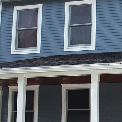
Scott replaced the bland beige vinyl siding with robin’s-egg-blue fiber cement on the second-story facade and the sides of the house. He used pricier cedar clapboards just on the portion of the facade that’s sheltered by the porch. “From 5 feet back, you can’t tell the difference between the two materials, but on the porch it adds to the home’s traditional flavor.”
Door
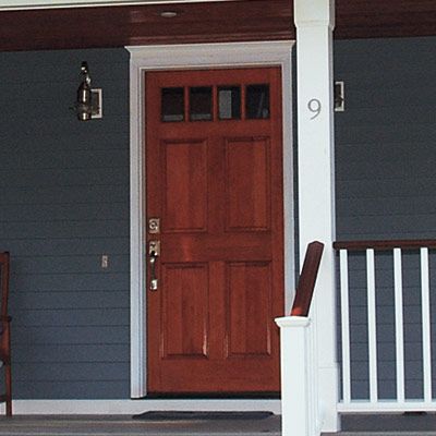
A new wood door with raised panels and divided-light windows creates vintage appeal. Its brushed-nickel hardware coordinates with the sconces that flank the door and the house number on the porch post.
Windows
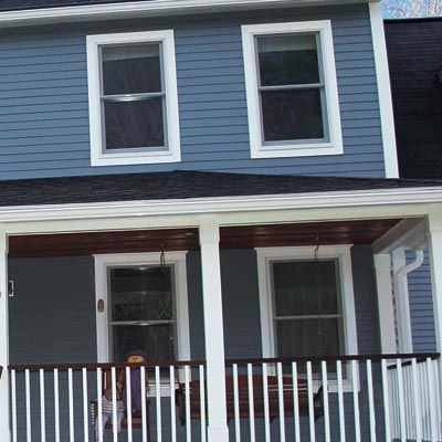
New energy-efficient double-hungs replace the drafty originals. For a more substantial look, Scott built out the first-floor lintels with AZEK trim.
Case Study 4: Before
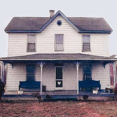
This farmhouse in Hanover, Maryland, had been in Kenneth Simms’s family since 1914. But by the time Kenneth inherited it, the lawn was a dirt pit and the home’s exterior a shell of its former self.
Case Study 4: Make a Red-Carpet Entrance
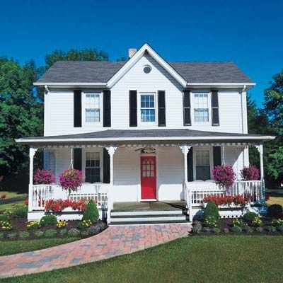
With a bit of sentimentality and lot of sweat equity, he not only restored the home’s old splendor but also added new sparkle.
Landscaping
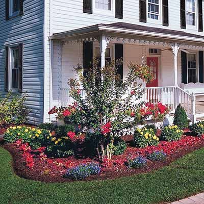
A new brick-hued paver path has a tumbled finish to impart an appropriately aged look. Like artwork on white walls, layers of greenery and bright blooms—at the foundation, in planters at the base of the porch, and in hanging baskets—add welcome doses of color.
Entry
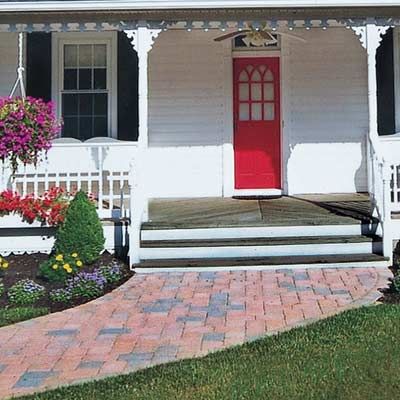
A new white railing defines the borders of the rebuilt porch, and gingerbread trim skirts the roof, giving the space distinction. Made of PVC, they require little maintenance.
Siding
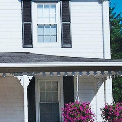
Kenneth replaced dingy asbestos-laden clapboards with bright white vinyl that shines from the street.
Roof
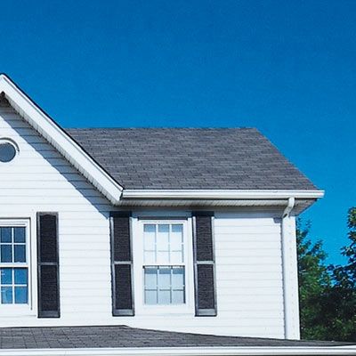
New gray asphalt shingles replaced rotting cedar shakes, creating a well-groomed and watertight topper for the house.
Door
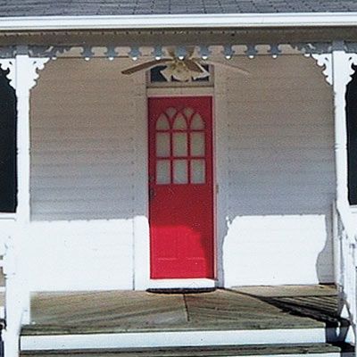
Kenneth built the pine door himself. Its curved divided lights and bright red hue draw the eye to the entry.
Windows
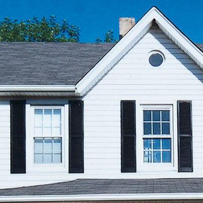
Divided-light double-hung replacements keep weather at bay. New black shutters frame the window openings and add dimension to the facade.
Case Study 5: Before
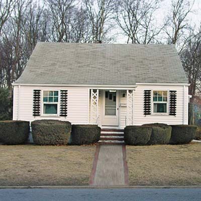
When Greg Cormier bought this 1951 Cape Cod, its black-and-white color scheme made a forgettable first impression.
Case Study 5: Refresh the Front
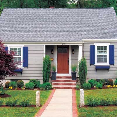
His goal: Make a statement with cheery plants and paint.
Landscaping
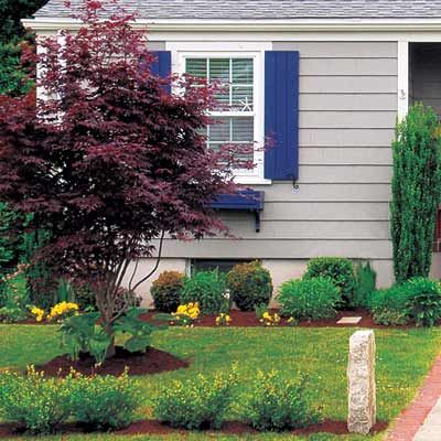
Replacing dreary hedges are perennial shrubs and evergreens of varying heights. A red-leaf Japanese maple adds three-season color; salvaged granite posts set off the walkway.
Siding
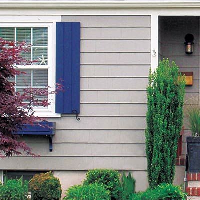
Greg peeled back the old vinyl to reveal tightly butted red cedar shingles. They needed only a good cleaning and a few patches to prep them for paint.
Paint
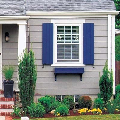
A smoky-gray body color recedes behind the white trim, creating depth and de-emphasizing the home’s boxy shape. Blue paint on the new salvaged shutters and on the window boxes highlights these architectural accents.
Entry
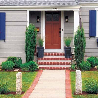
A fiberglass column replaces a pair of unremarkable lattice panels, making the portico a focal point. Greg stained a new low-maintenance fiberglass door to resemble natural wood and added an entry handle set and sconces, both in oil-rubbed bronze, to cap off the classic look.
Case Study 6: Before

Without any garden beds or colors other than green, a lackluster lawn detracted from this home’s curb appeal.
Case Study 6: Liven Up the Landscape
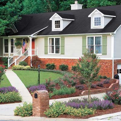
By revamping the landscape and freshening up the paint, the owners of this neo-Colonial cottage have new reason to smile each time they pull into the driveway.
Landscaping

By clustering plants with similar colors, the homeowners maximized their impact with lush waves of chartreuse, purple, and red. Curving flower beds follow the line of the existing brick retaining wall that swings out from the garage, and they soften the look of the stick-straight concrete walkway. By planting both sides of the driveway, the homeowners reclaimed a portion of their property that previously appeared to belong to the neighbors.
Paint
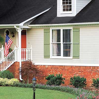
Harsh black paint on the shutters was traded for a gentler silvery-green hue that complements the soft gray siding. A vibrant orange door echoes the bright flowers in the front yard garden.
Case Study 7: Before
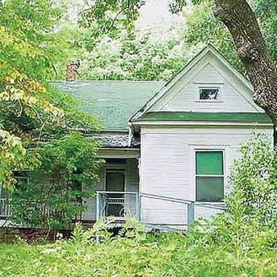
When Joe and Betty Lambright moved into this early-1900s Folk Victorian, its 1-acre lot was so overgrown that part of the house was hidden.
Case Study 7: Clean Up a Charmer
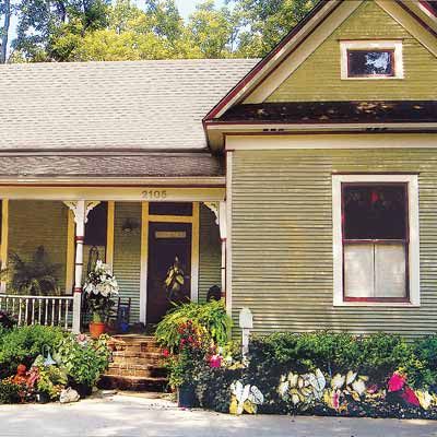
By clearing away the brush, they revealed a pretty front porch, wavy-glass windows, and a transom-topped front door.
Landscaping
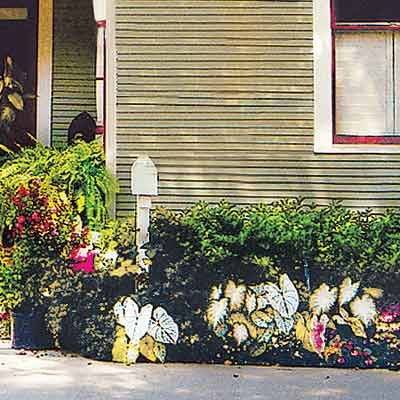
In place of the brambles and a tree that was blocking the house, the Lambrights planted flower beds filled with azaleas, other shrubs, and caladiums. Using annuals allows Joe and Betty to rotate in new colors and shapes, constantly refreshing their home’s exterior.
Entry
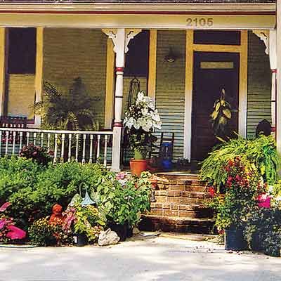
After demolishing a rickety wheelchair ramp, the Lambrights began rebuilding the front porch. Its floor was rotted, but
Paint
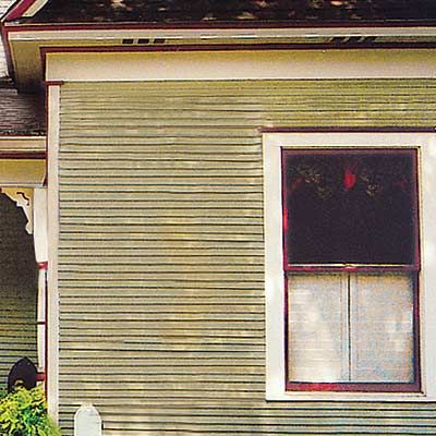
A pale green body color reinvigorates the old wood lap siding. Rich red paint on the window sashes and muntins makes them pop within their creamy white casings. Stripped, sanded, and varnished, the original wood door takes center stage.
Roof
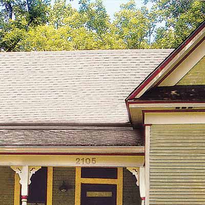
Earthy-brown architectural asphalt shingles, which are thicker and more textured than the standard three-tab type, replace worn green ones.
Case Study 8: Before
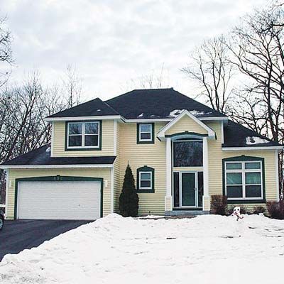
A two-story portico with a massive plate-glass window made this suburban 1993 Minneapolis home look like a McMansion.
Case Study 8: Make More with Less
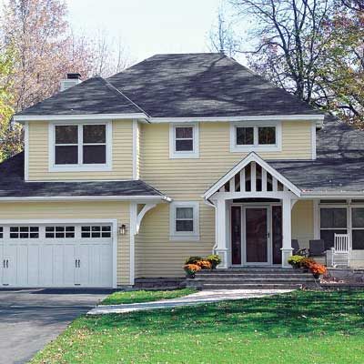
Wanting a more traditional aesthetic, the new homeowners swapped over-the-top details for ones with more modest Craftsman styling.
Entry
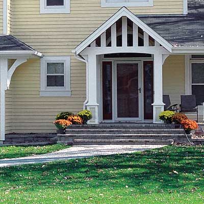
The towering portico came down one level with a slatted pediment that allows sunlight to filter through a new arched window above the door. By extending the first-story roof line, the homeowners gained a porch.
Garage
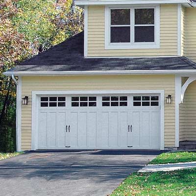
A double-wide carriage door with divided-light windows and recessed paneling turned an eyesore into a focal point. The extended roof line is accented with a decorative bracket on one side.
Windows
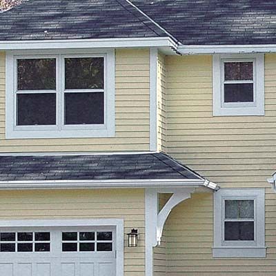
Removing the keystones above the first-story windows softened the look of the lintels. A new pair of second-story windows creates symmetry with the existing windows above the garage.
Case Study 9: Before
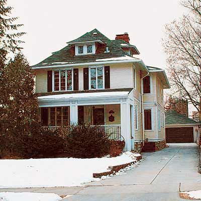
Bushy shrubs, oversize columns, and an awkward side entrance to the porch obscured the front of this 1909 Colonial Revival in Minneapolis, putting the focus on the driveway.
Case Study 9: Reorient the Entry
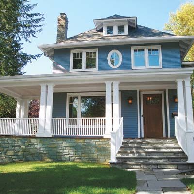
Working with local architecture firm Sharratt Design & Company, the homeowners opened up the entry, making it the focal point.
Entry
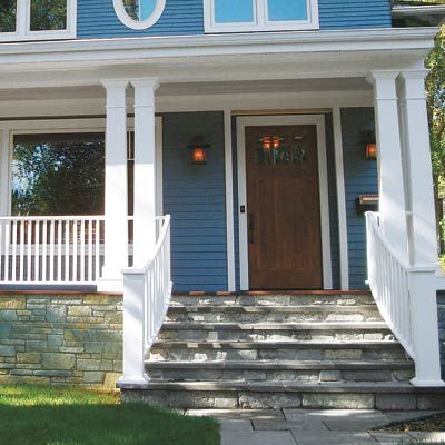
An airy porch now wraps around the side of the house opposite the driveway, shifting attention to an area formerly hidden by greenery. Paired porch posts flank wide stone steps that lead from a new walkway to the front door.
Siding
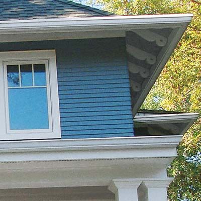
The homeowners kept the original cedar lap siding, which sports wide boards on the first story and narrow ones on the second. It’s a graduated effect that draws the eye all the way up to the dramatic dormer window punctuating the attic. Blue paint, a traditional color for Colonial Revivals, protects the siding and boosts the home’s historic appeal.
Windows
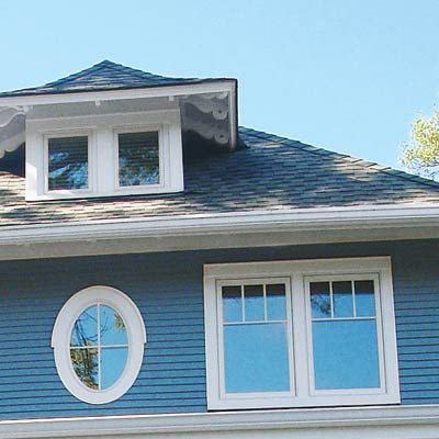
Two pairs of casements on the second story replace the lopsided combination of three windows on one side and two on the other. An oval accent window centered between the casements creates symmetry with the dormer directly above it.
