Bungalow in Front
Remember that popular musical with the catchy title I Love You, You’re Perfect, Now Change? That conundrum turns out to apply to not only many couples but also more than a few homeowners. Like Jason and Tera Starr.
“After having toured about a half-dozen homes over the course of several months, we came upon our current property,” says Jason, referring to the 1,392-square-foot rescue house he and his wife, Tera, discovered while scouting one of Houston’s coveted neighborhoods. “We immediately fell in love with it.”
But. “With a growing family, having enough space was important.”
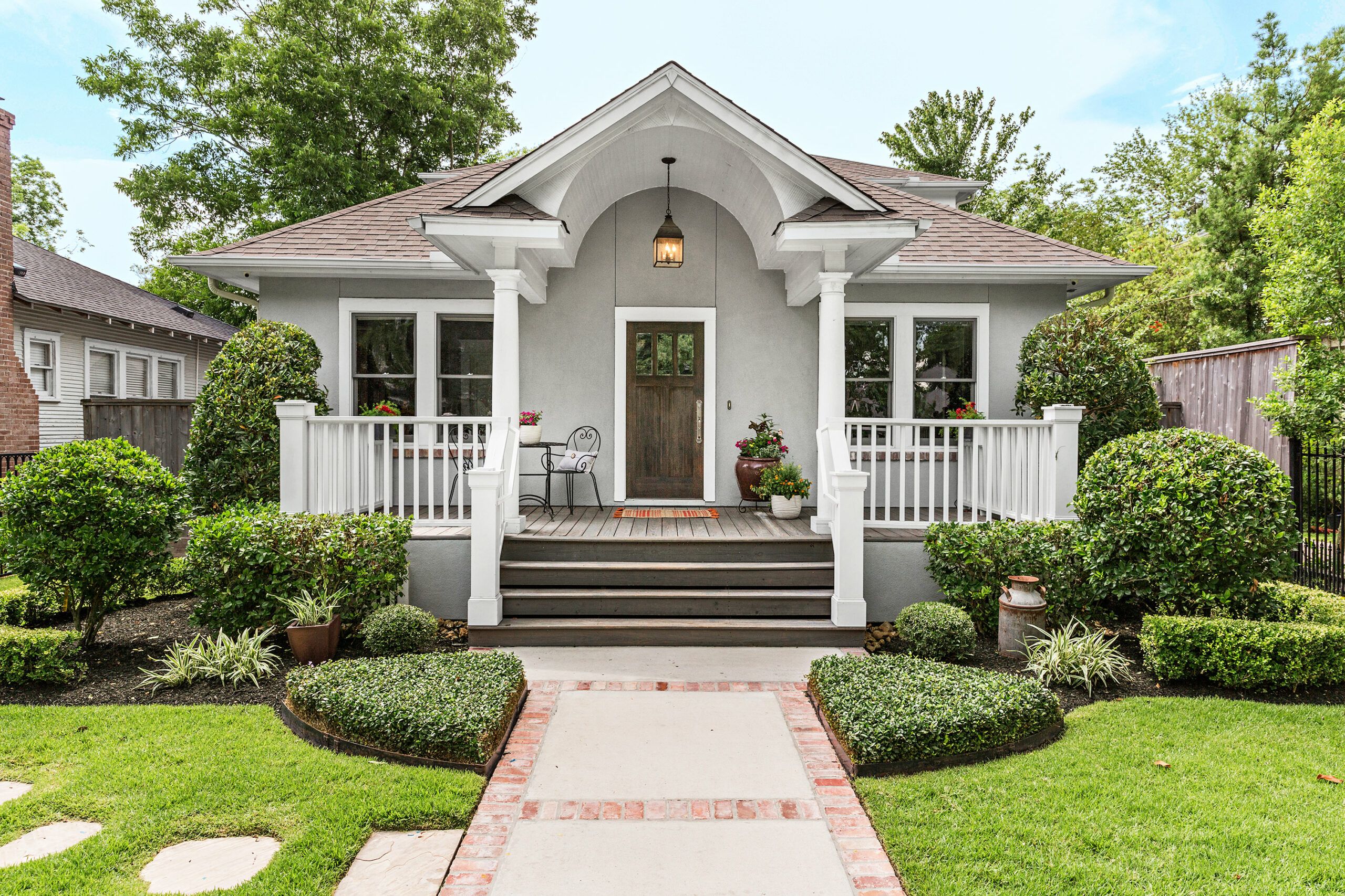
Shown: The front of the house still suggests the 1920s one-story bungalow the homeowners fell in love with.
Paint: Sherwin-Williams’ Spalding Gray (siding), Extra White (trim), City Loft (windows)
Front door finish: Minwax
Expansive Kitchen
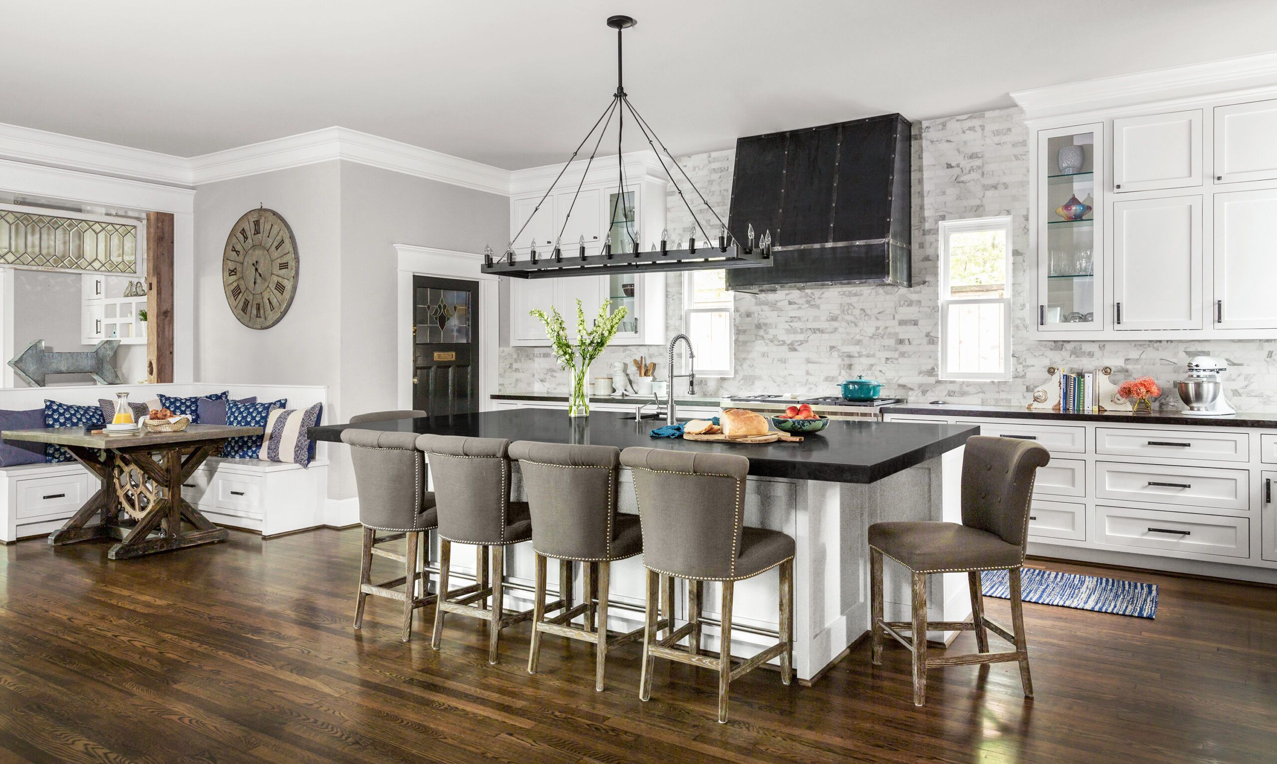
And about its claustrophobic cooking space: “In our old house everyone wanted to be in the kitchen,” says Tera. “I wanted a big island with a lot of chairs.”
The couple also craved a master suite. And an attached garage. Not to mention an open plan with a family room where a kid could raise Cain within eyeshot of that island.
Shown: A rear addition holds the expansive new kitchen, which shows off some of the salvaged materials used in the remodel, including the oak floors, a leaded-glass window framed by barn-wood posts, and a breakfast table made with a gear and horseshoes.
Paint: Benjamin Moore’s Smoke Embers (walls), Eagle Rock (island), Sherwin-Williams’ Pure White (cabinets),
Porch Gathering
The cottage they fell for still had its 1920s hipped roof, gabled portico, and wood windows, and some of the original shiplap inside was shipshape. Says Jason, “The charm was still very much alive.”
So it was perfect—now it just needed to change. Never mind extra legroom. The roof was a goner, the floors were ruined, the wiring and plumbing were obsolete. Many of the old double-hungs no longer moved up and down: The sash weights were missing. And naturally nothing was level or plumb.
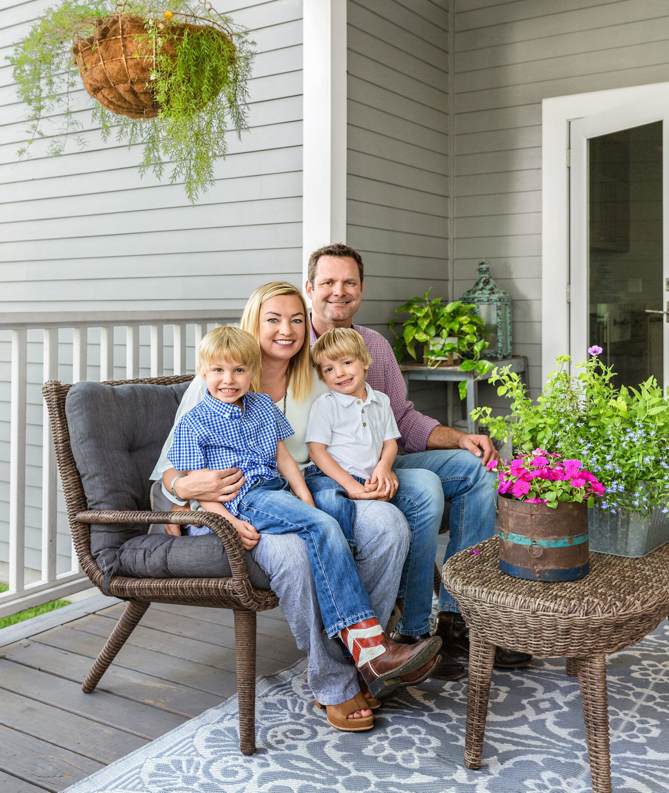
Shown: At home in the city: Tera and Jason Starr with Ryder, 5, and Stone, 3.
Porch furniture: Hayneedle
Siding: James Hardie
Pass-Through Dining
“I’d raze it,” said the owner of a 1901 house next door at a city meeting, pointing to water damage, evidence of rodents, and weeds run amok—and expressing awe that the couple had decided to build the place back up.
Literally. They envisioned a two-story addition piggybacking on the original two-bedroom, one-bath house, allowing more air and light along with a total of four bedrooms, four and a half baths, a garage, and ample living space for what would soon be a family of four, plus a whippet named Barkley.
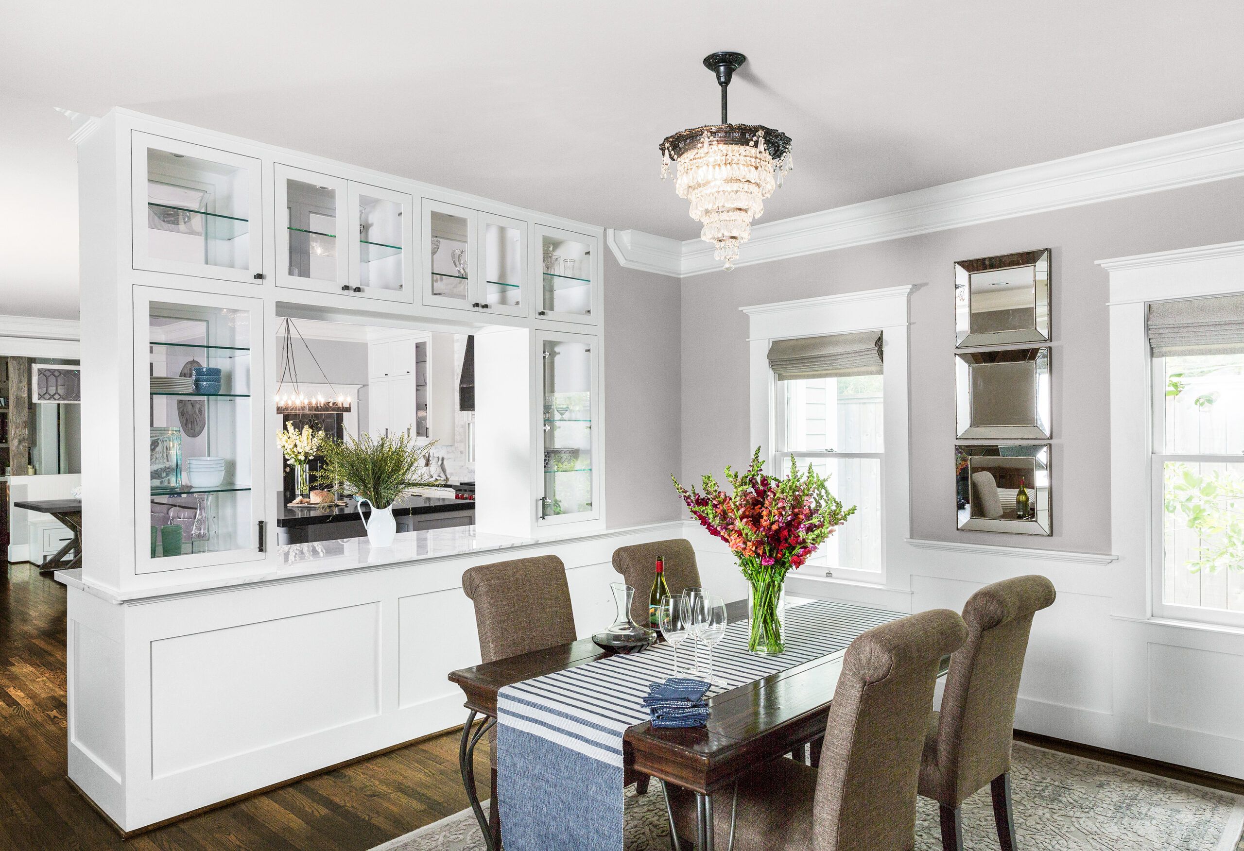
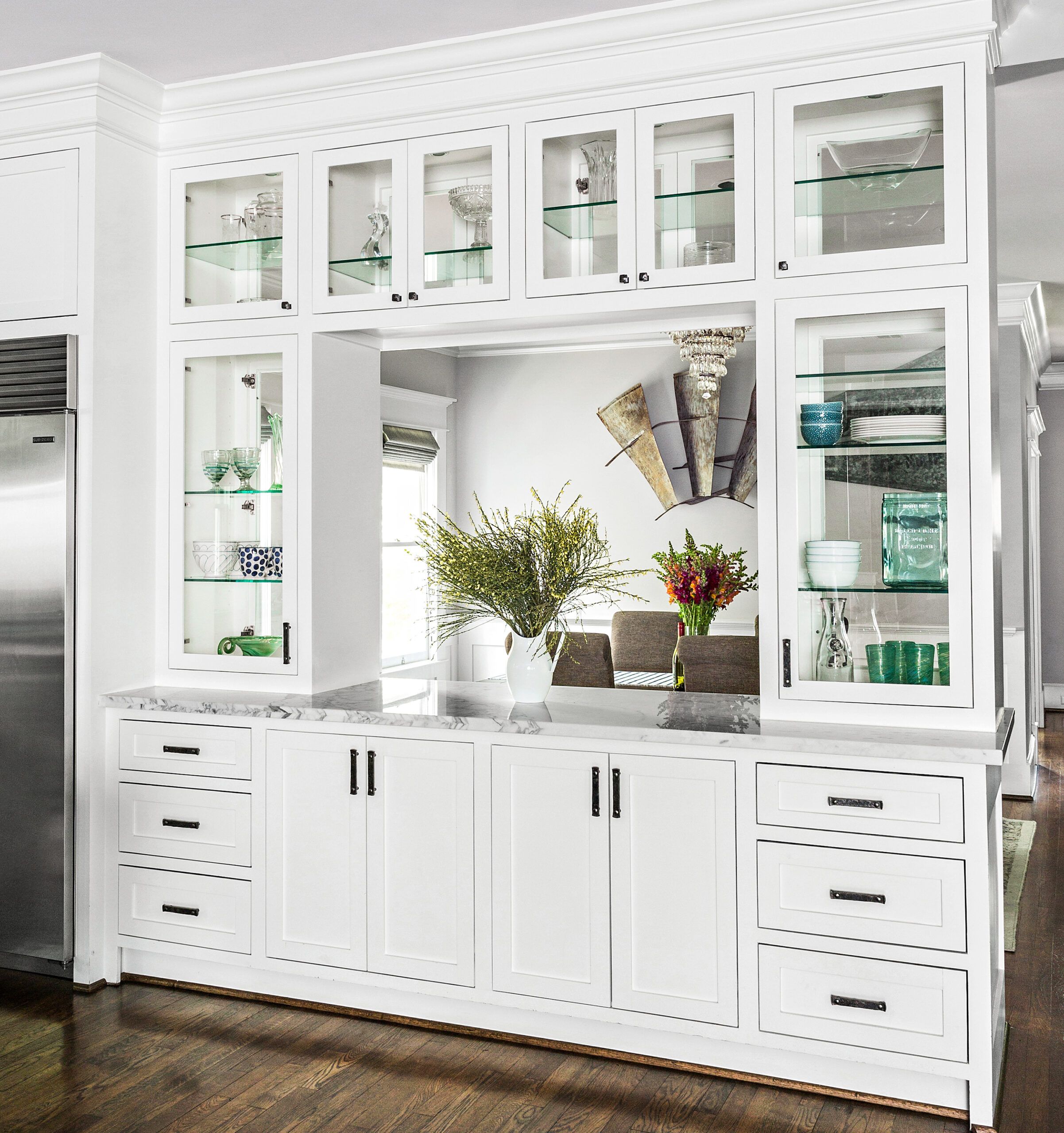
Shown: A custom built-in sets off the dining area. The wainscot and crown molding are also new; the chandelier is a vintage find.
Table runner: Pottery Barn
Concealed Addition
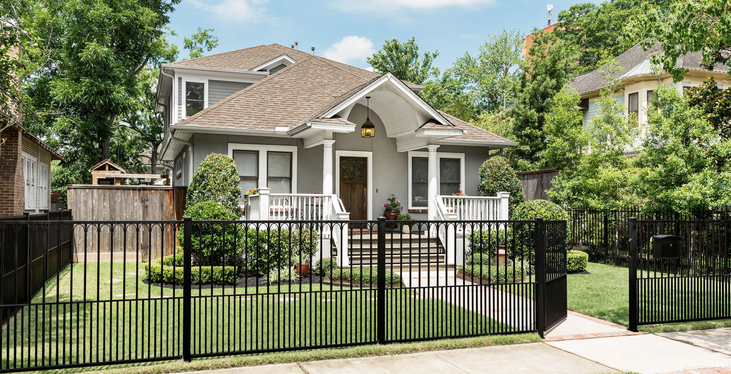
It was right where they wanted to be, in Houston Heights, a rapidly gentrifying historic district prized for its early-20th-century houses and more-recent-vintage restaurants, coffee shops, and bike trail.
The scope of the remodel would be daunting to some. “But I like the charm of older homes, so I was excited,” Tera says. “The house had character and history.”
Shown: The addition is set back and deeper than it is wide. Its new windows were matched to the originals in front.
Landscaping: Texas Design Source Landscaping
Roofing: Owens Corning
Windows: Jeld-Wen
Living Room
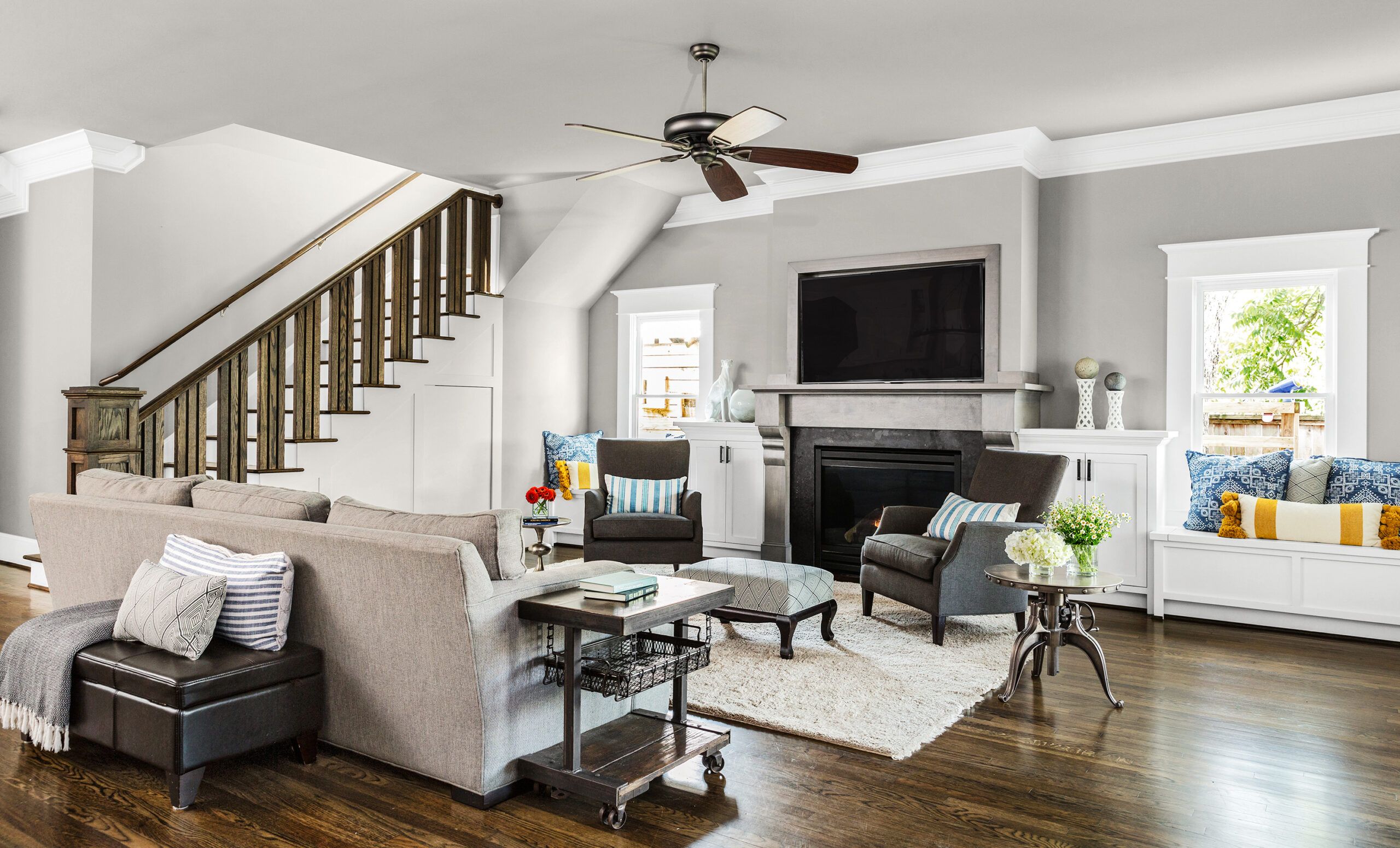
Its path from A (anachronistic) to P (present day) did not run easy, as it rarely does when a 90-something-year-old house needs to be drawn out of its funk and into the 21st century.
But the job yielded unexpected pleasures. “For Houston, 100 years is super old,” says the couple’s general contractor, Conor Thompson, who does a lot of work in the neighborhood. “It’s cool to see how they built then, and to see a house that’s still standing strong after however many hurricanes and changes. It’s fun to add in modern AC and good insulation while retaining many of the architectural elements—and a whole lot more interesting than building something new.”
Shown: The living room was finished with a new gas fireplace and a pair of window seats. Homeowner Tera Starr had a hand in the design of the stairs’ newel post and oak balustrade. The rolling end table, found at an antiques fair, started out as a mining cart.
Ceiling fan: Ellington
Furniture and rug: Arhaus
Yellow stripe pillows: Anthropologie
Other pillows: Marshalls
Heavily Frequented
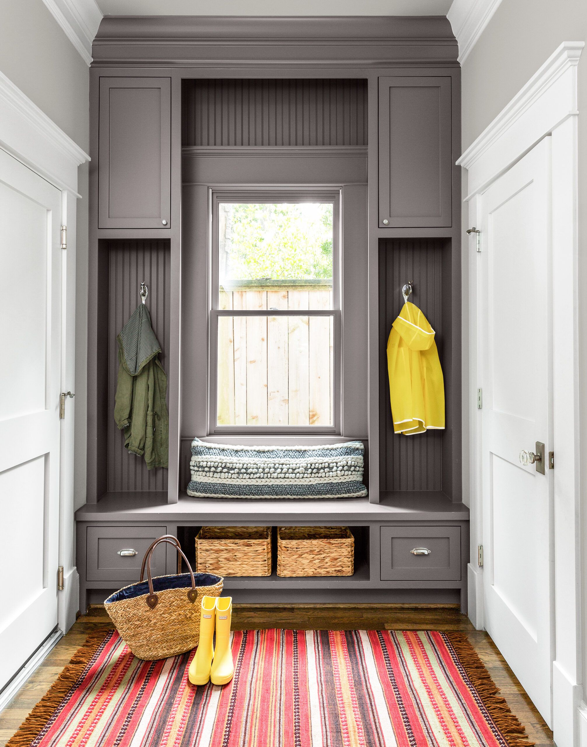
Standing strong in this case being a manner of speaking. The house was sitting uncertainly on cinder blocks and had to be lifted up long enough for them to be replaced with reinforced concrete footings. “The footings have to be perfectly aligned and the elevation set, then you slowly lower the house down,” Thompson explains, a hair-raising undertaking that, he calmly notes, “gave us a new, solid, level foundation to start with, and that helps.”
Shown: The most heavily frequented entrance, at the back of the house, leads to a mudroom with built-in storage for outerwear and kids’ gear.
Pillow: Anthropologie
Paint: Benjamin Moore’s Smoke Embers (walls) and Gray Mountain (built-in), Sherwin-Williams’ Pure white (door)
Roomy Customs
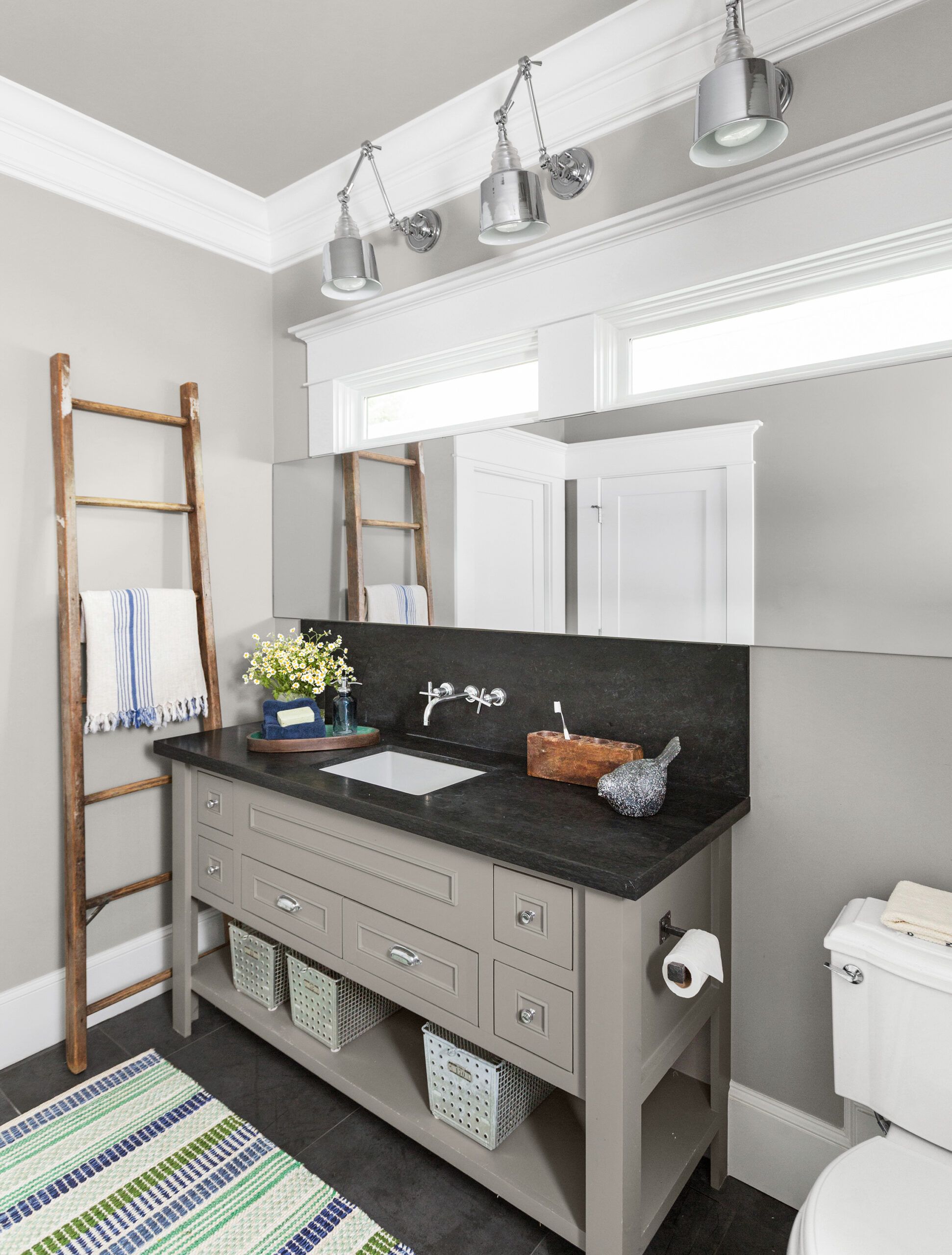
Equally hair-raising was the discovery of asbestos in the stucco siding. Removing it would entail “a very detailed process,” in Thompson’s words, not only because it would alter the historic exterior but because the house would have to be tented, ventilated, and treated by a licensed abatement company.
There was meanwhile the business of tearing off the rear exterior wall plus a bit more so the addition could sidle up and form a seamless bond. And there was a hitch.
Shown: A new first-floor bath has a roomy custom vanity, a trio of library lights, and a towel rack that did time as a ladder in Tera’s grandfather’s house.
Sink and faucet: Kohler
Wall lights: Heights Lights & Things
Rug: Target
Ryder Room
Before any of the work began the city’s Archaeological and Historical Commission took a close look at the plan, which would remove 30 percent of the original structure, swapping in an addition 6 feet wider and double the cottage’s length. While a staff review said the plan met all 11 of the criteria for such renovations at the time, the commission voted 6 to 4 to shut it down. Along with the loss of old materials, there was the matter of the addition’s sheer bulk.
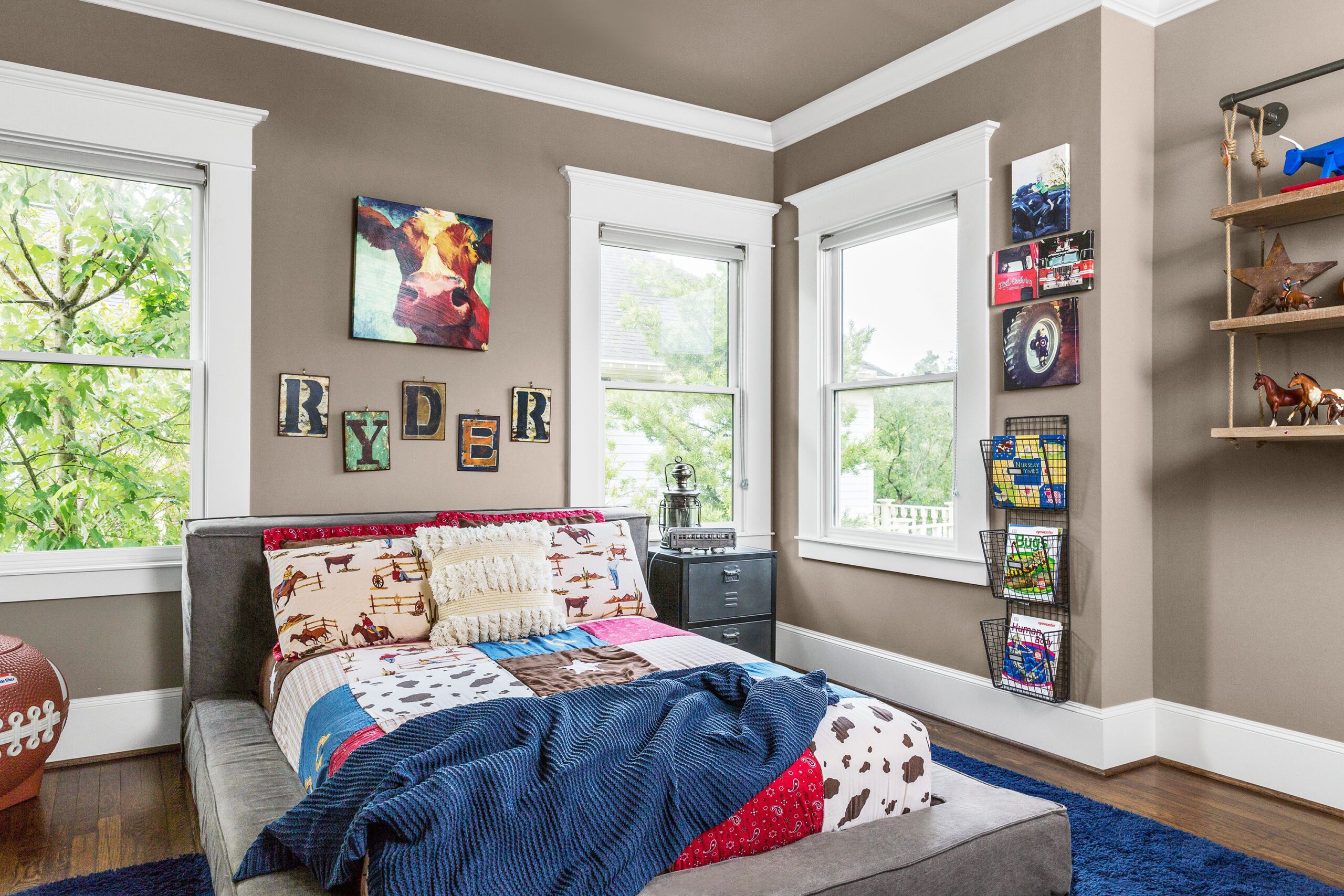
Shown: Artful letters spell out the name of the boy who nests in this bedroom.
Letters and cow painting: Hobby Lobby Arts & Crafts
Bedding: Target
Paint: Sherwin-Williams’s Mega Greige (walls) and Pure White (trim)
Rustic Master Bedroom
The homeowners’ architectural designer, Sam Gianukos, was stunned but not unprepared. He has lived in the neighborhood since 1976 and has worked on old and new houses there for 25 years, or long enough to have heard it all, including commissioners who conclude, he says dryly, “You met all the criteria, but I just don’t like it.” He took the case to a higher court, namely the city’s planning commission, where over the years, he says, he has managed to turn around 11 of 12 rejections, including this one. (The commission has since been disbanded in favor of a new appeals board, and some historic guidelines have changed as well.)
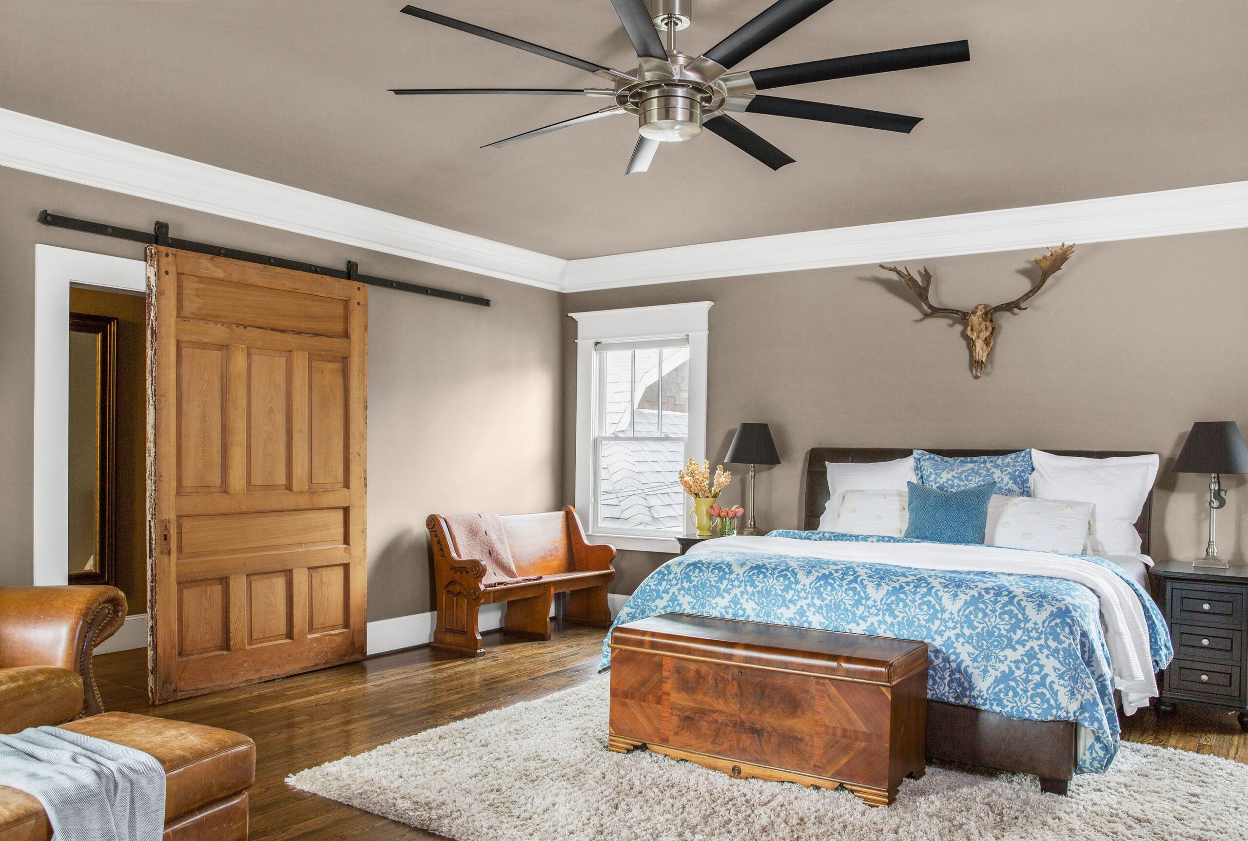
Shown: In the master bedroom, a salvaged door mounted barn-style leads to a walk-in closet and master bath.
Lighted ceiling fan: Heights Lights & Things
Pedestal Tub
The maneuver may have cost the homeowners whatever capital they had banked with the historical commission, but they forged ahead—gingerly. As Jason diplomatically puts it, “We found the process of obtaining our Certificate of Appropriateness to be extremely challenging and unpredictable.”
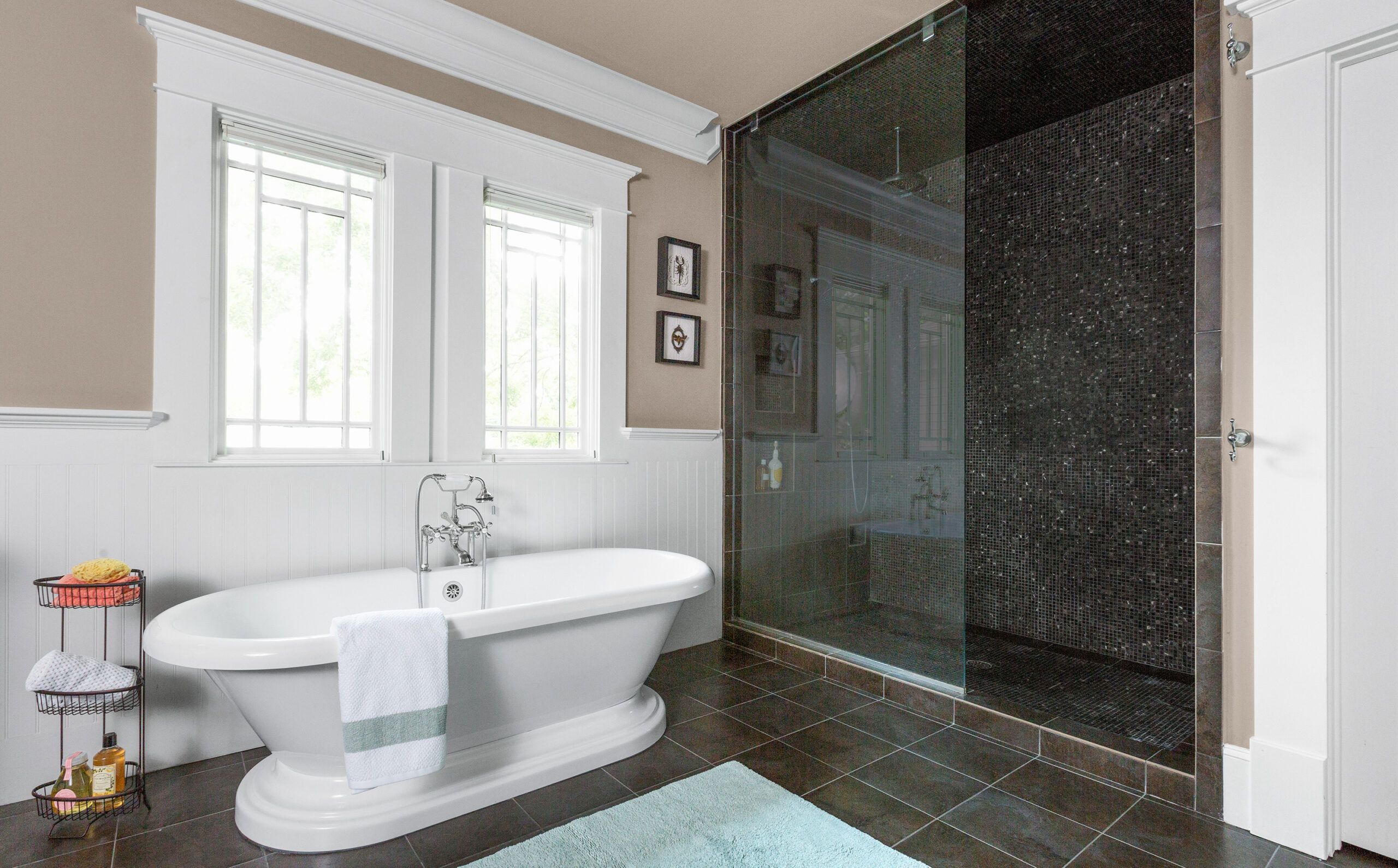
Shown: In the master bath, an acrylic pedestal tub with old-fashioned fittings pays homage to the house’s past.
Tub and faucet: Randolph Morris
Floor tile: Crossville Studios
Bath Built-Ins
The project progressed slowly. “The old structure took a lot of work, to level everything up and square walls and fit ceilings so they tied into the new structure the way we wanted,” Thompson recalls.
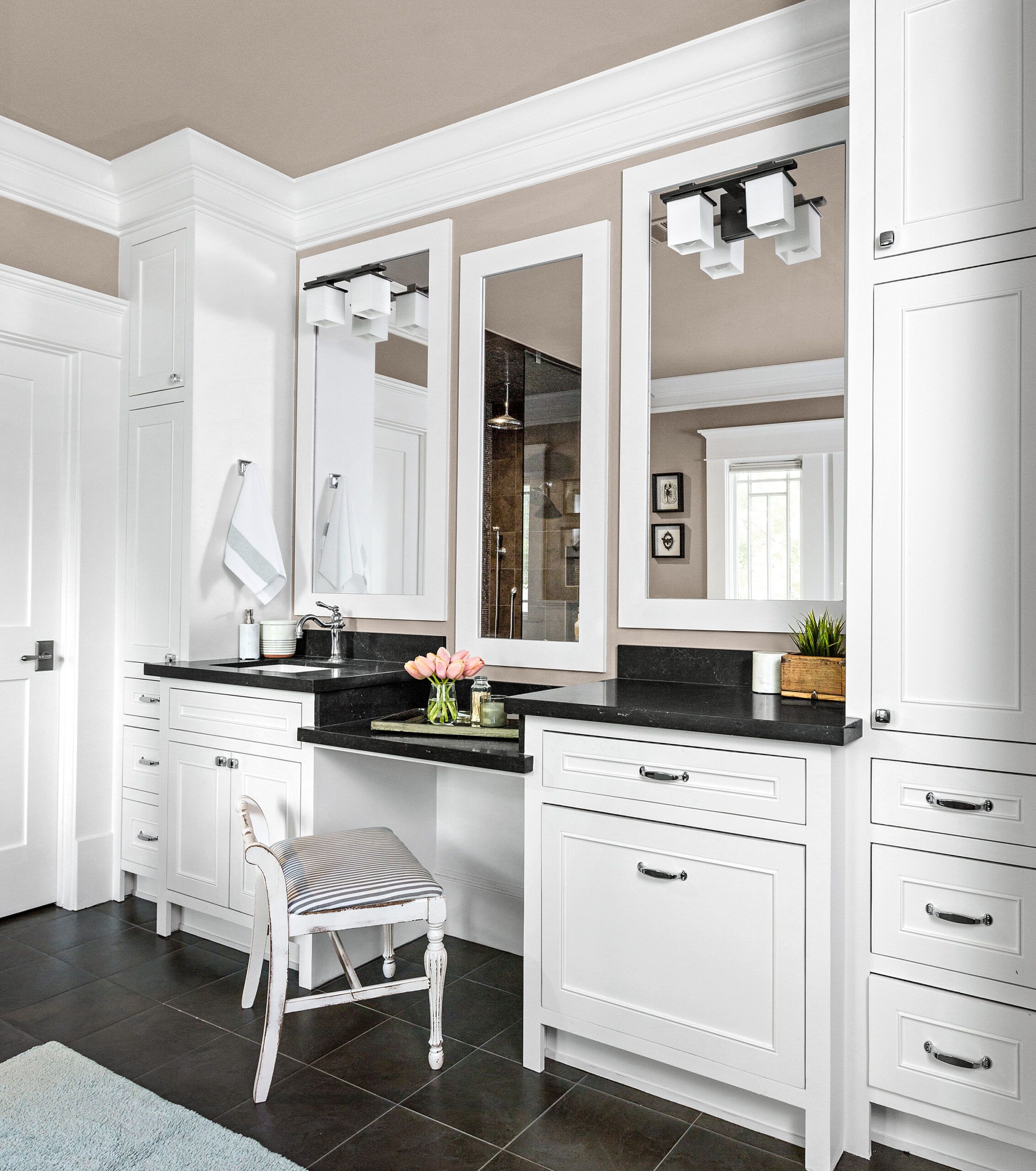
Shown: Built-ins keep the master bath serene and clutter-free.
Faucet: Brizo
Vanity top: Caesarstone
Breakfast Nook
Sandwiched between the new foundation and roof came a new HVAC system and a gas fireplace, new plumbing, wiring, and insulation—plus two water heaters and an additional 2,604 square feet of space. During the 20 months it all took, from permitting to completion, the family hunkered down in their old place, a townhouse about three miles away.
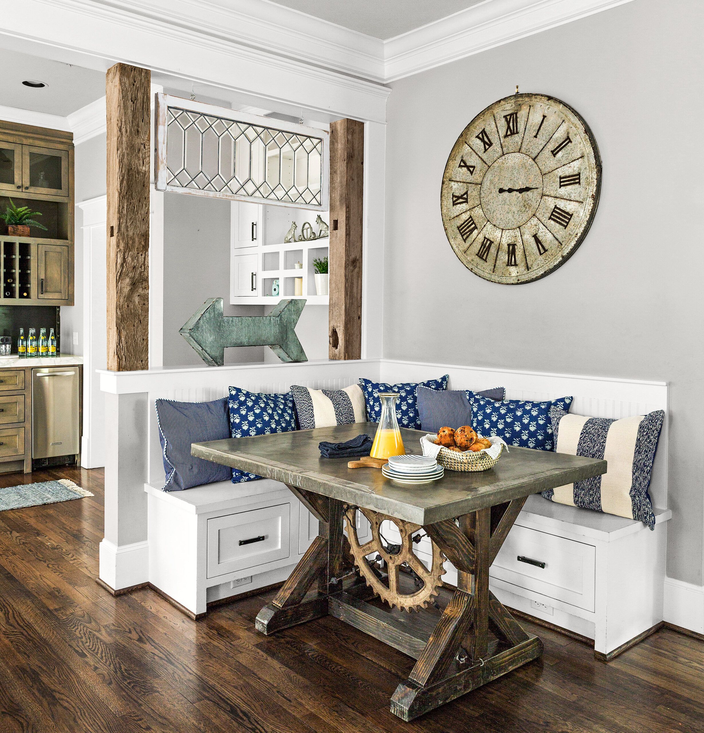
Shown: The breakfast nook holds a vintage leaded-glass window and a custom table with a concrete top and a salvaged gear.
Table: Artisan Concrete Concepts
Paint: Sherwin-Williams’ Pure White (banquette), Benjamin Moore’s Smoke Embers (walls)
Built-In Divider
Once the cottage-plus was up and humming, Tera plunged into the question of finishes. She consulted with interior designer Andra White, then brought in her top adviser—her mother, Lexine Goehring, who lives in Delmont, South Dakota. Growing up, Tera recalls her mom enthusiastically hanging fresh wallpaper and changing paint colors, often inspired by This Old House magazine—when not helping to run the family farm. Pitching in here, Lexine packed up an 1880s window from a cousin’s farmhouse, and Tera’s father installed it over the new breakfast nook, furnished with a concrete-top table made by a friend back home.
“That little nook, that’s my boys’ disaster area,” says Tera, proud mom of Ryder, 5, and Stone, 3.
Shown: The dining area built-in doubles as a room divider in the open plan, with a pass-through from the kitchen.
Back Porch
Built-ins designed and constructed on-site; reclaimed beams, doors, and floorboards; and the surviving shiplap give the new spaces a broken-in look. A front porch railing now sets off the painstakingly restored windows and barrel-vaulted portico.
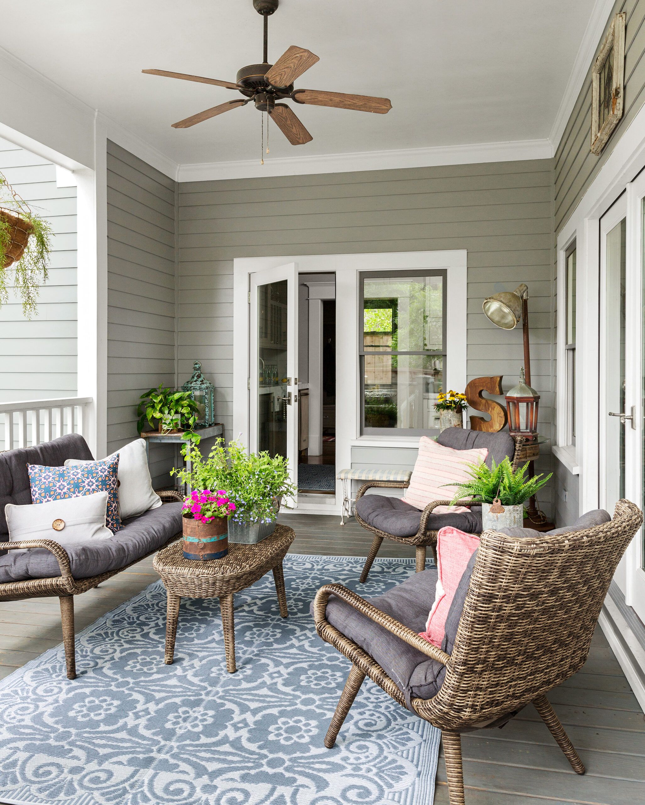
Shown: The breezy back porch is a favorite gathering spot.
Furniture: Hayneedle
Laundry Room
The addition’s wood windows were custom-made to meet historic guidelines, but the fiber-cement siding doesn’t pretend to be vintage. As Matthew Kriegl, of the city’s Planning & Development Department, explains, while the goal is to mimic the same “massing” and the existing elements, the focus should remain on the historical details. In other words, let the new construction say it’s new.
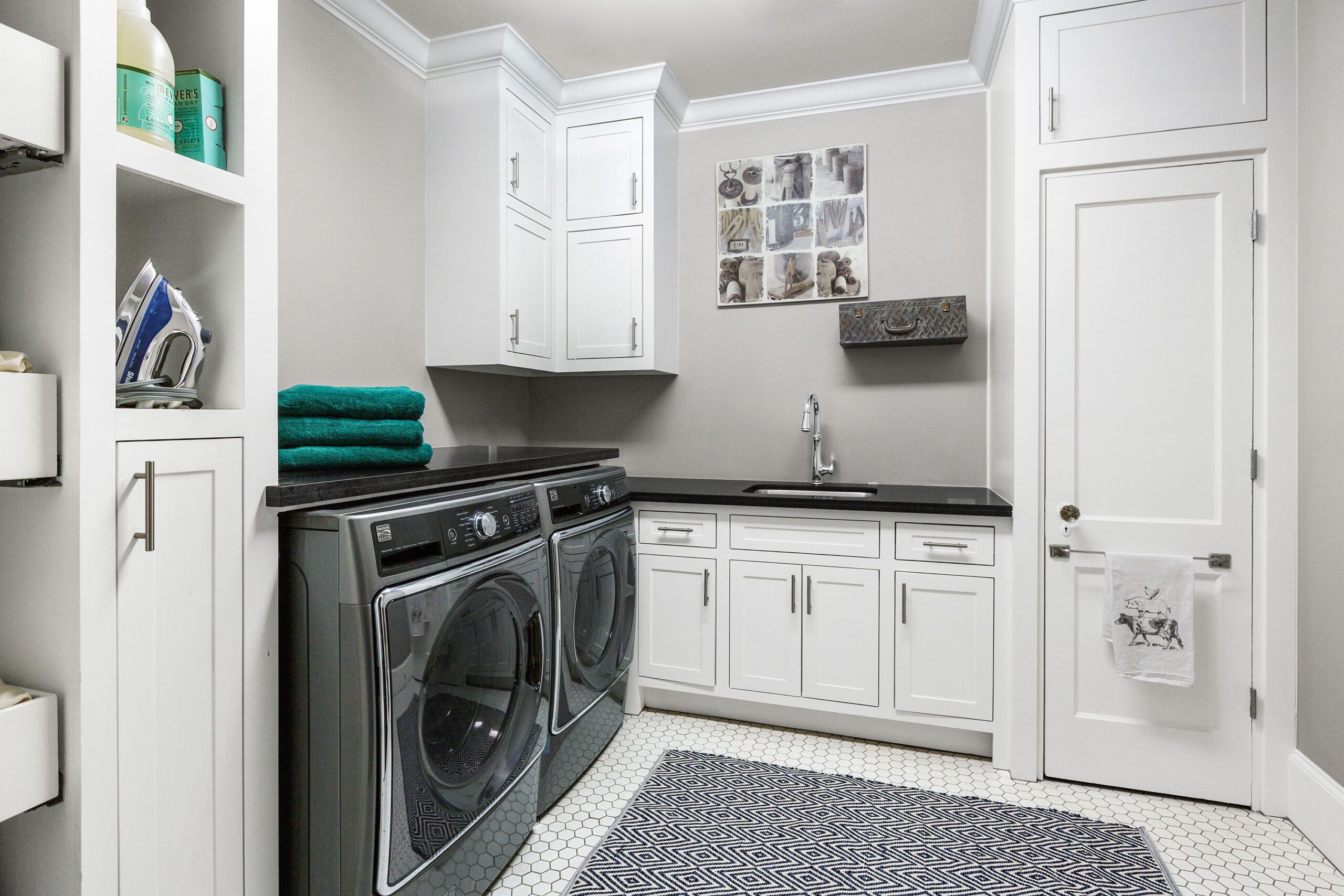
Shown: The homeowners moved an original bathroom door, along with its 1920s glass knob, into a new laundry room finished with traditional hex floor tile.
Washer and dryer: Kenmore
Tile: Daltile
Paint (walls): Benjamin Moore’s Gray Huskie
Custom Kitchen Details
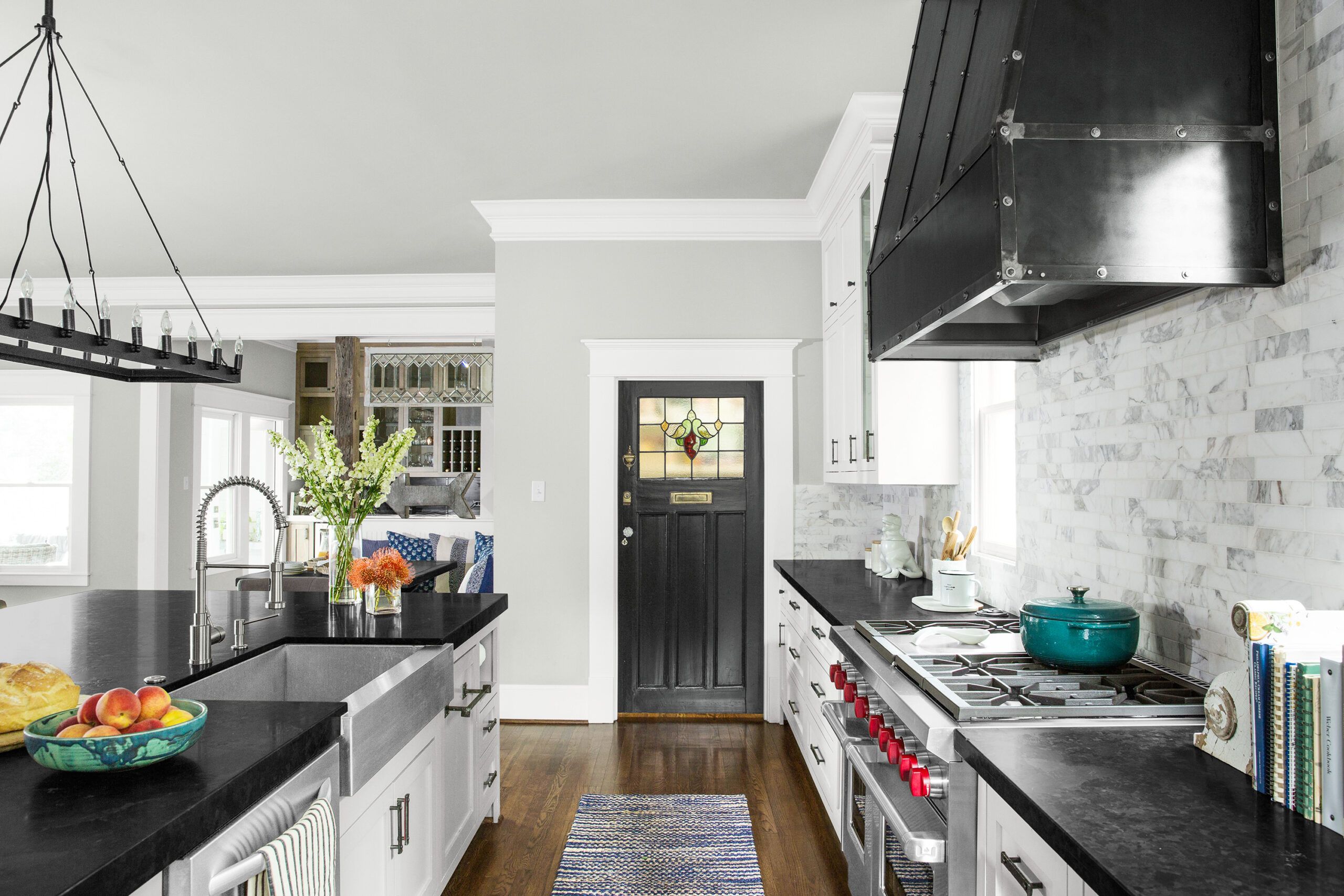
And it’s in that airy new structure that most of the action takes place. An alley behind the house allows the family to pull into the garage and head inside. As Tera predicted, everyone goes right for the kitchen, the heart of the house and her favorite spot.
Shown: A custom steel vent hood hangs over the pro-style range in the open kitchen. The backsplash is tumbled Calacatta Gold marble tile in five sizes. A vintage door with leaded and stained glass closes off the pantry.
Range: Wolf
Vent Hood: Iron Accents
Sink: Kohler
Faucet: Blanco
Island Supersized
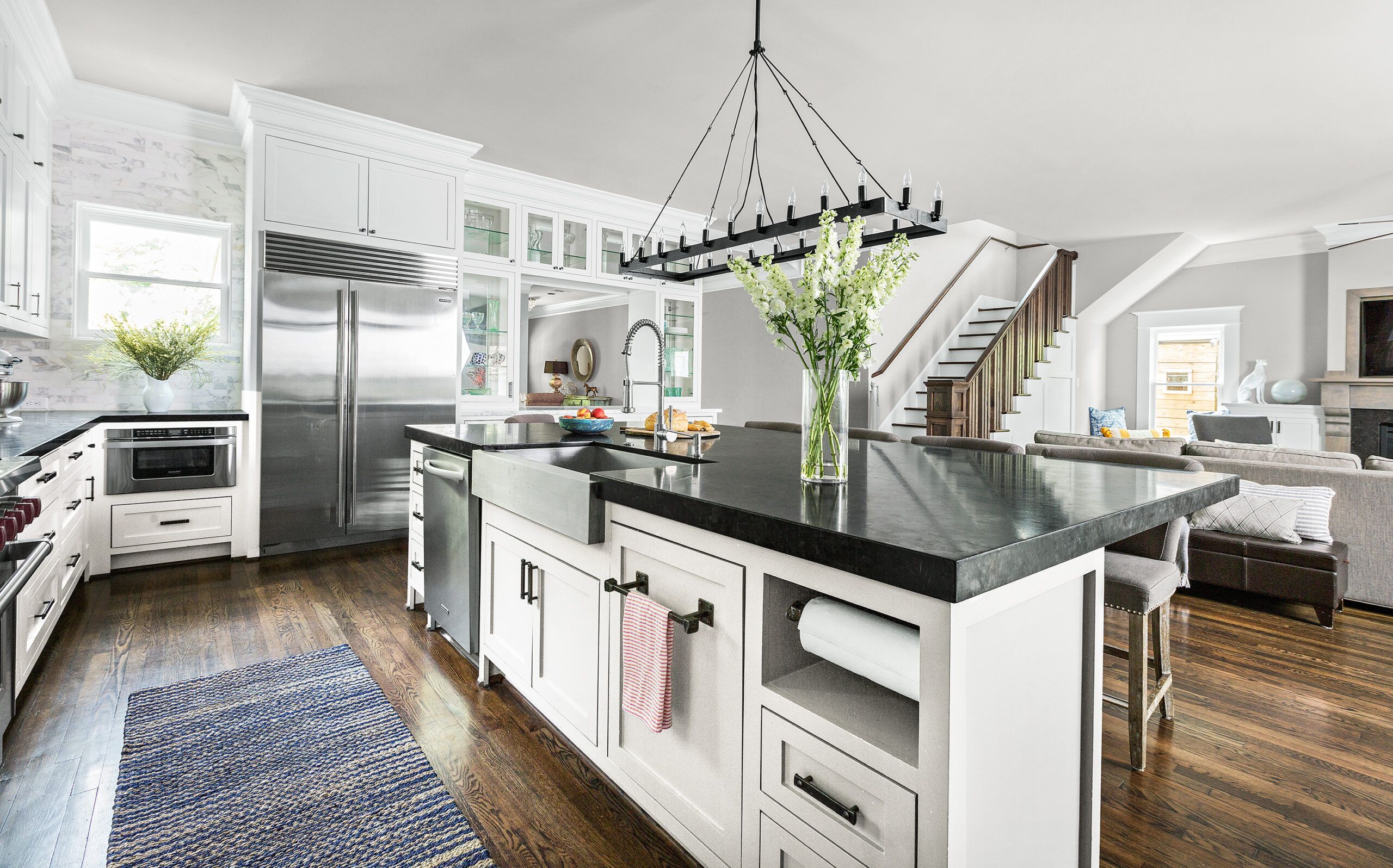
But the thing she thinks is best of all, right up there with the great neighborhood? “It still looks like a bungalow from the front.”
Shown: A supersized island, topped with leathered granite, allows the kitchen to double as entertaining space.
Refrigerator: Sub-Zero
Dishwasher: KitchenAid (discontinued)
Light fixture: Restoration Hardware
Sink: Kohler
Mudroom Built-Ins
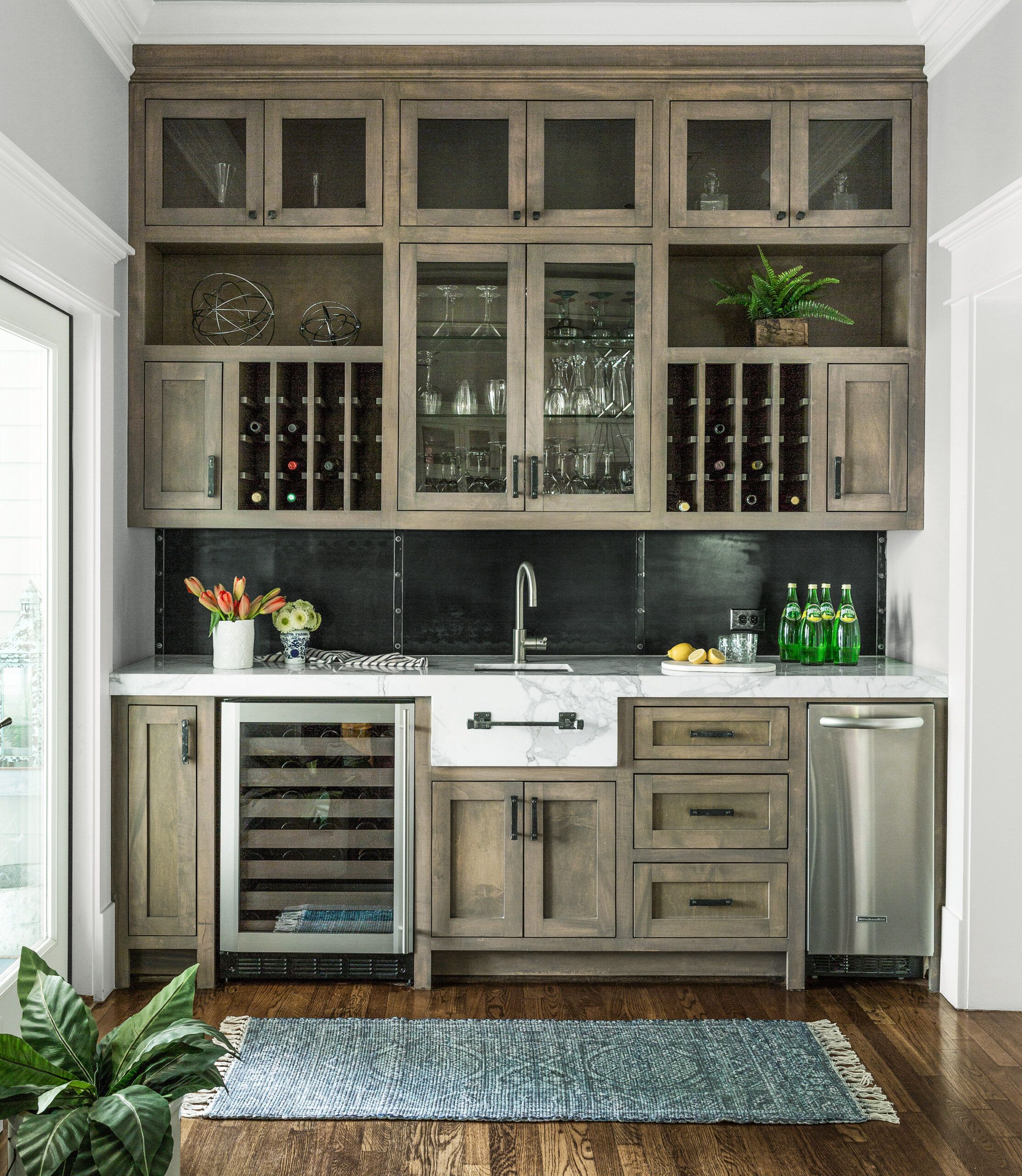
The mudroom incorporates a built-in bar with a white marble countertop, a wine fridge, and an ice-maker.
Fridge: GE
Ice-maker: KitchenAid (discontinued)
Sink: Kohler
Faucet: Blanco
Floor Plans
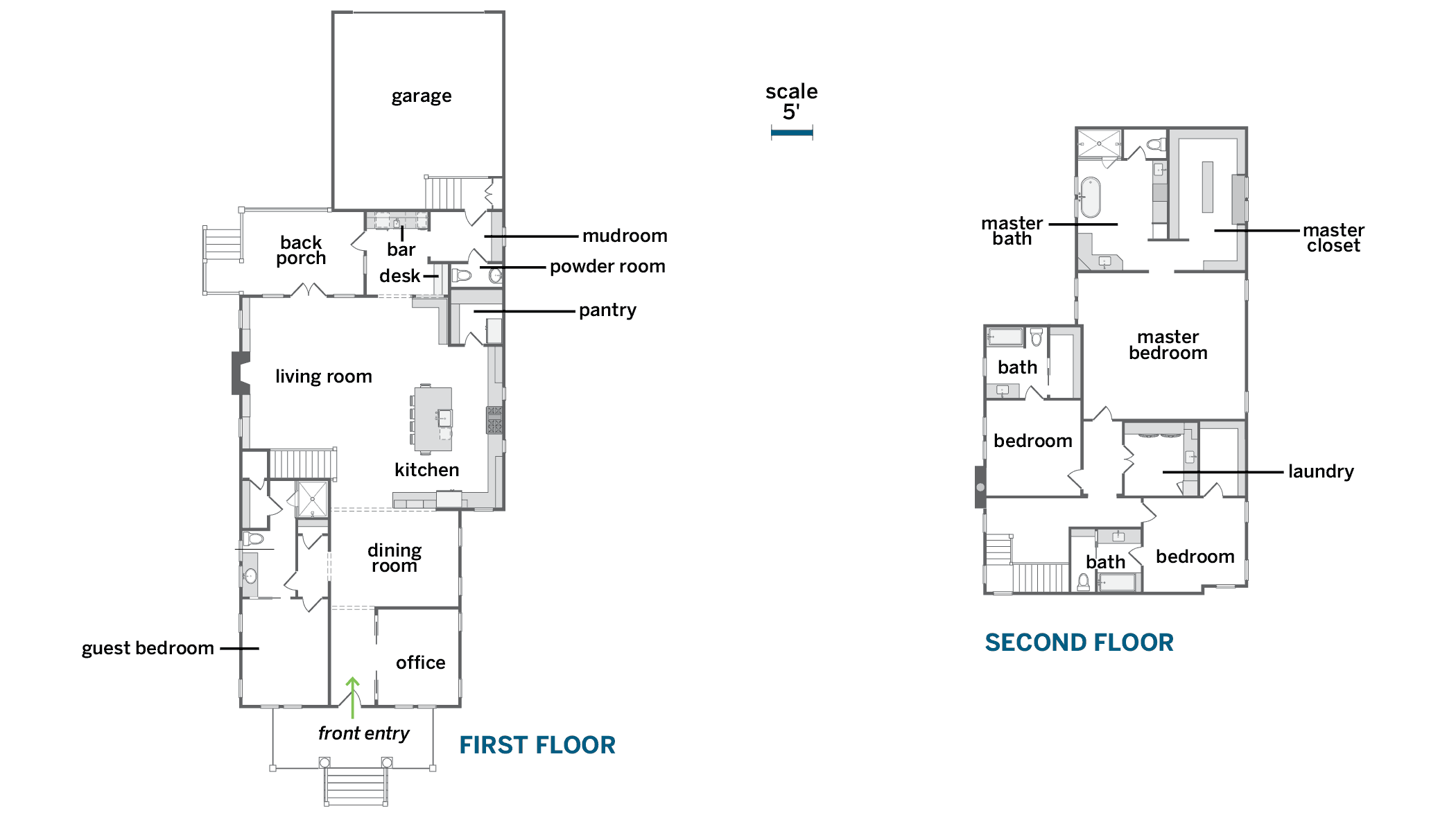
About 30 percent of the existing 1,392-square-foot, two-bedroom, one-bath 1920s house was sacrificed to allow for an additional two bedrooms, three and a half baths, and 2,604 square feet of space in a two-story rear extension. The foundation, front and back porches, and attached garage are also new.
