Pale Gray to Go

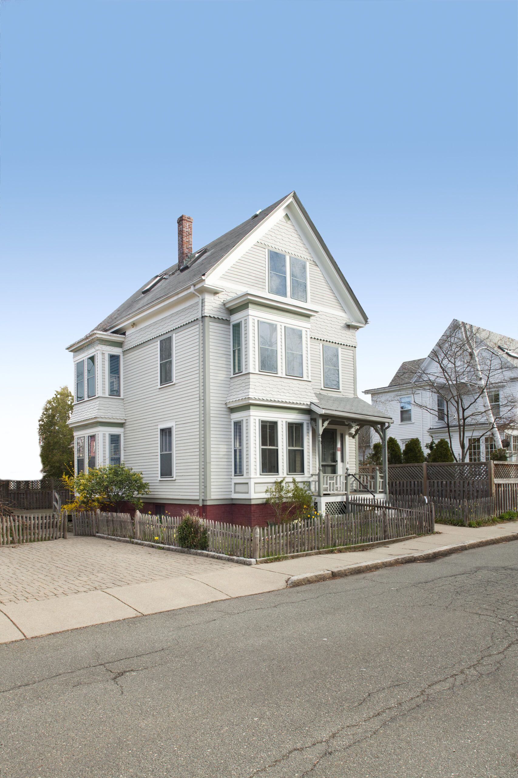
Choosing exterior colors for your house can be daunting. Choosing them for a 125-year-old home that’s smack-dab in the middle of a community obsessed with historically accurate color schemes can be downright intimidating. That’s what John Stone and Sally Peterson, owners of the latest TOH TV project house, found out when selecting colors for their clapboard-and-shingle 1887 Queen Anne, in the Avon Hill neighborhood of Cambridge, Massachusetts.
When they bought the house for themselves and their two young daughters last fall, they agreed on a couple of things: that the dated, awkward interior needed to be revamped and modernized, and that the house’s pale-gray paint had to go. John, more concerned with interior carpentry than exterior color, was indifferent about the options. “He expressed an interest in green, and when I said no, he changed his tune to ‘whatever you want,'” says Sally, who wanted a scheme that felt “fresh and exciting.”
Shown: The house was painted a light gray when John and Sally bought it. “This wasn’t a common color for siding at the time this house was built,” says Maycock.
Keep It Simple

At the same time, her goal was to avoid overdoing it. “It seems like many houses from this period have every part of the facade painted a different color,” she says. “Our house is pretty simple, and its details are straightforward—and we want to keep it that way.”
Shown: TOH TV general contractor Tom Silva (center) discusses paint options with architectural historian Susan Maycock (second from left) and owners John Stone and Sally.
The Red Scheme
To help them envision the right hues, the couple turned to Susan Maycock, an architectural historian and a color specialist with the Cambridge Historical Commission. Such experts are invaluable resources for owners who want to maintain the historic character of a house, says TOH general contractor Tom Silva. “In addition to being familiar with the history and customs of the neighborhood, these folks often have access to drawings, photos, or documents from when a house was built,” he says.
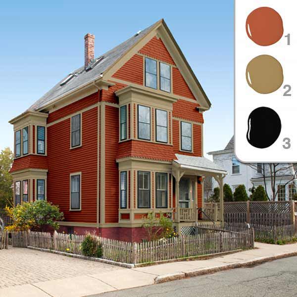
Shown: Color consultant Susan Maycock first suggested brick-red siding with taupe trim and black accents. But the homeowners weren’t smitten. “The red felt a little too ‘Victorian’ for us,” says Sally. Benjamin Moore’s Baked Clay (1), Baked Cumin (2), and Black (3)
The Sage Scheme
For Sally and John’s house, there was no such documentation. So Maycock dug up other resources, showing the couple paint-company brochures from the 1880s and 1890s with color illustrations of period houses. “The colors that were popular then were deep and rich—lots of golds, russets, and olives,” says Maycock. There was a huge array of paint colors available at the time, thanks to the growing availability of ready-mixed paints that could be shipped via the railroads. “Pale colors, like the gray of this house, were very rare during the Victorian era,” says Maycock. “Such colors didn’t come back into vogue until the 1890s.”
After hitting the books, Maycock presented a variety of color schemes. Her suggestions for the siding ranged from brick red to sage to a deep mustard yellow, each with a complementary color for trimwork and an accent color or two for movable parts, such as windows and doors.
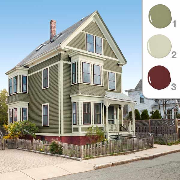
Shown: John was a big fan of this green base color, paired with off-white trim and red accents. Sally was not. “It was too muted,” she says. Benjamin Moore’s Rolling Hills (1), Grant Beige (2), and Cottage Red (3)
The Mustard Scheme
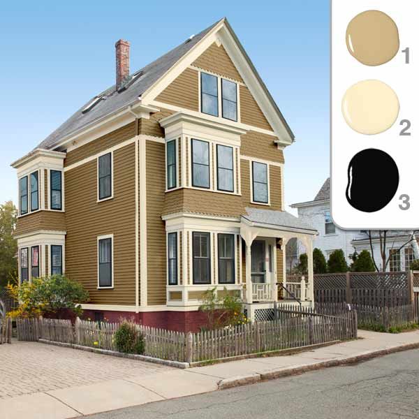
Of all the options Maycock presented, Sally was most taken with the mustard scheme, which was paired with cream-colored trim and black accents. Wanting to get a better sense of what it would look like in real life, Sally had the colors applied to a digital picture of her house, using photo-editing software. “That was a big help,” she says. “It gave us a sense of the direction we wanted to go in.”
The result? “I didn’t like it,” Sally says. “It looked, well, sickly. Mustard may have been popular back then, but I wanted something brighter.” Since there are houses of similar design in the neighborhood, she and John hit the streets in search of inspiration for a color scheme that suited their tastes.
Shown: Sally and John both liked this palette of deep mustard, cream, and black, but wanted a yellow with a bit more pop. Benjamin Moore’s Camel Back (1), Montgomery White (2), and Black (3)
The Winning Yellow Scheme
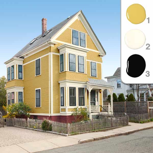
That inspiration ended up coming from a nearby house, which happened to be painted yellow. “It was a much different hue than the mustard tone we’d been looking at,” says Sally. “It was brighter and more cheerful, and to us it felt right for the house.”
After she and John told their painter, Mauro Henrique, about the place they’d seen, he snapped a photo of the house and took it to a local paint store for a color match. Then, armed with two slightly different color samples, he painted large swatches on the house’s siding so that the couple could compare them. This is something Maycock always recommends, making sure that swatches are big enough (about 2 by 3 feet) to get a good idea of how each color will “read” in different light and weather conditions. “Computer visualizers are great, but screen colors aren’t accurate,” she says. “A color might look nice on your laptop, but once you put it on the siding, it’s a whole different story.”
Luckily, John and Sally’s story has a happy ending. Though they didn’t go with Maycock’s recommendations, they say her advice helped tremendously, and they are confident that the palette they picked suits their home and neighborhood. The base-color yellow is warm and sunny; cream highlights corner boards, columns, and eaves; and black window sashes conform to the darker accents of Victorian times. “To mix things up, we might paint the front door red,” says Sally. “But we’re still trying to find the right shade.”
Shown: A house in their neighborhood with a similar paint job led the couple to select this cheery palette. Benjamin Moore’s Marblehead Gold (1), Navajo White (2), and Black (3)
Digital Aids for Choosing Color
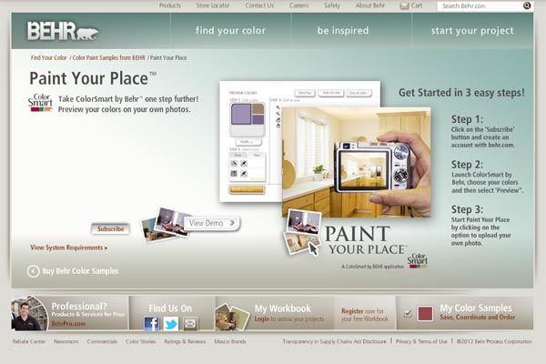
You don’t need to hire a color expert or learn Photoshop to find the right hues for your house. If you have no clue where to begin, use one of the many free or low-cost online color visualizers out there. Nearly every paint company has one, and technological improvements have increased their usefulness dramatically in the past couple of years. Here are three we like.
Paint Your Place
Behr’s online helper lets you upload your own pictures, “paint” them to your liking, save them to a workbook, and order color samples right from the tool. Free; behr.com
ColorClix

Olympic’s website tool and mobile app work hand in hand, so you can create and save color schemes at home or on the go. Can’t decide on a favorite palette? Post the options to Facebook or other social-media sites and let your friends cast their votes. Free; olympic.com
Colorjive

This online tool catalogs the offerings of several major paint manufacturers, so you’re not limited to a single company’s palette when trying out colors on your photos. Free 30-day trial, then $12 per month; colorjive.com
Beyond Exterior Paint: Projects Underway Inside The House
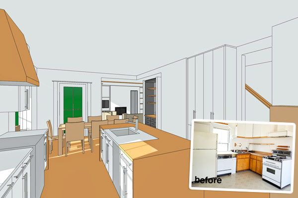
A renovation as drastic as the exterior color change is taking shape in Cambridge—see the action via webcam.
Relocating The Kitchen
Before: The outdated kitchen was located, inconveniently, on the second floor.
In The Works: This room is being moved to the first floor, where it will occupy an area that had been a bedroom facing the street. The island and range hood will be clad in wood.
Creating a New Living Area
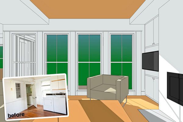
Before: An oversize laundry room and a minuscule powder room occupied the rear of the first floor.
In The Works: A comfy, bright living room is being built in this space, complete with floor-to-ceiling windows and a wood-burning fireplace.
