Before: Dark and Cluttered
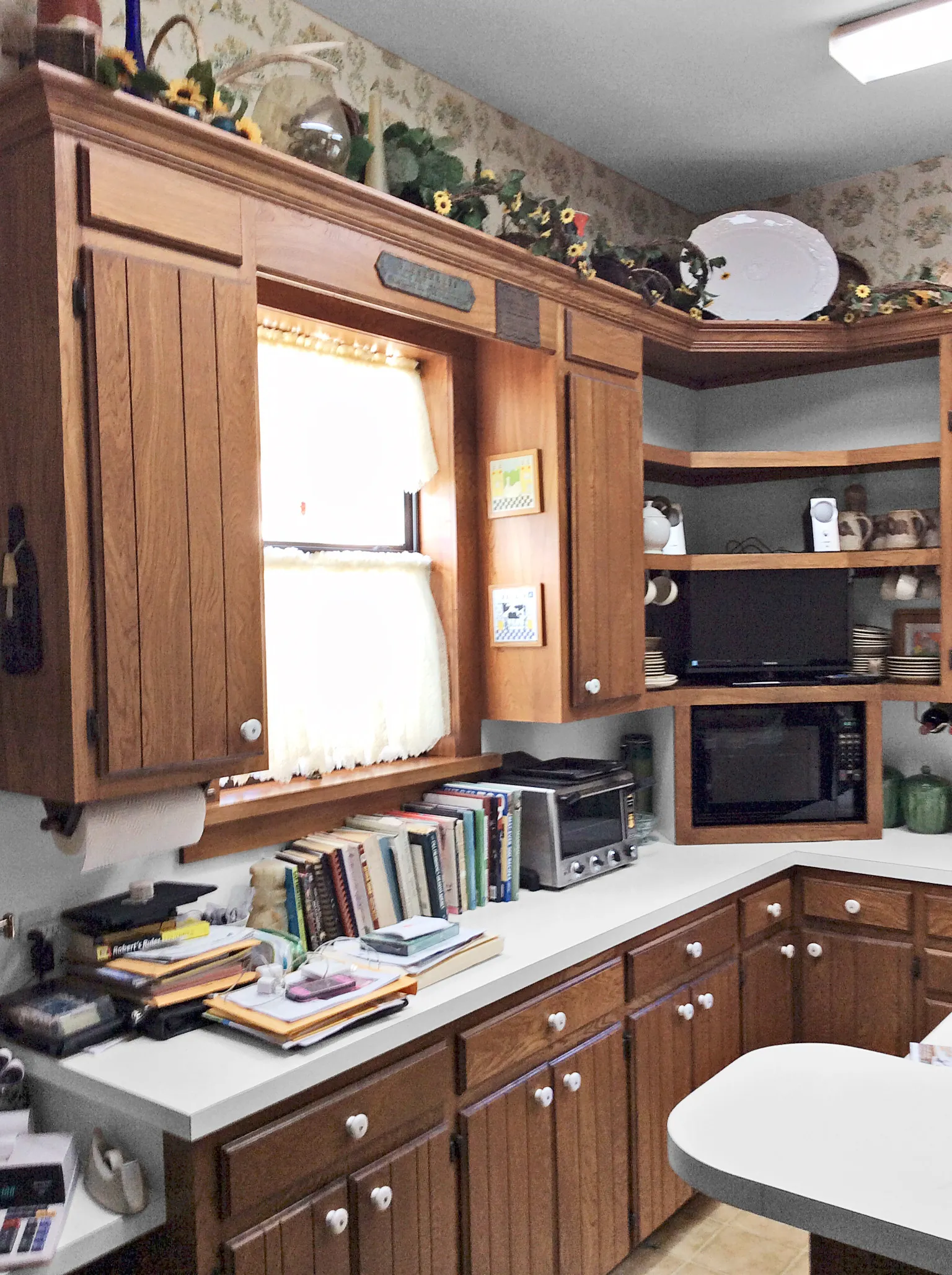
Run a successful restaurant for 47 years, and you learn what makes a kitchen work. So when Harvey and Diana Kloesel, owners of a 250-seat steak house in Moulton, Texas, were ready to remodel their home cook space, they drew on their pro experience. “We wanted easier access to the dining room, and an island where we could prep, cook, serve, and eat,” Harvey says. The kitchen demanded a style upgrade, too—this time, one that truly suited the Kloesels’ 1903 Queen Anne.
Shown: though sturdy, the stained-ash cabinets were dark and required a lot of bending and searching. The space also wanted for uncluttered prep surfaces.
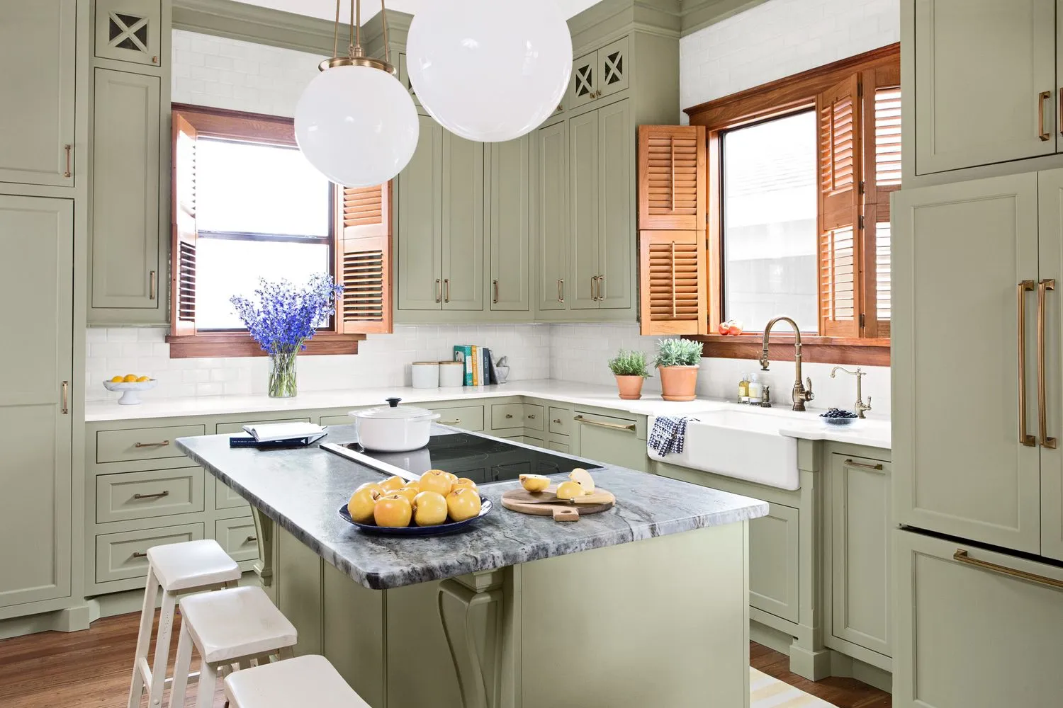
After: Bright and Reachable

The couple worked within the existing footprint by first demolishing a walk-in pantry. That allowed a wide-open connection to the dining room and revealed a double-height window that bathes the room in light. They swapped an awkward bi-level island with a traffic-stopping oven for one countertop height, all one level, with an induction cooktop—now they can work at the island without getting in each other’s way. Designer Sarah Stacey suggested ceiling-height cabinetry and a pull-out pantry, so the Kloesels don’t miss their walk-in one bit. A soft-green color palette and stained woodwork create just the right old-house look. “Now the kitchen feels open, airy, comfortable, and bright,” Diana says. “We love it!”
Shown: new converts to painted cabinetry, the Kloesels love their bright look, plus the ample storage in ceiling-high uppers with back-saving lower drawers.
The pull-down faucet and the apron sink are both period-pretty and practical.
Pull-down faucet: Waterstone Faucets
Apron sink: Kohler
Corner Store
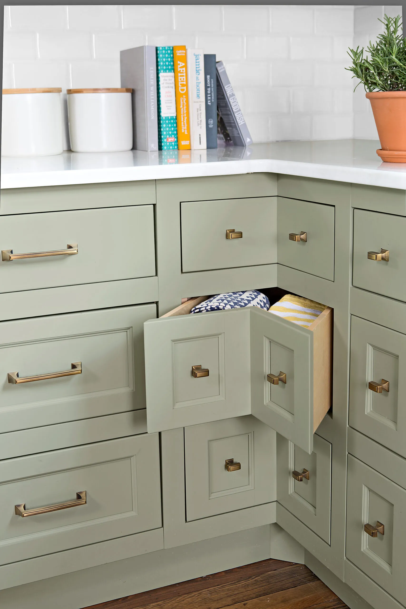
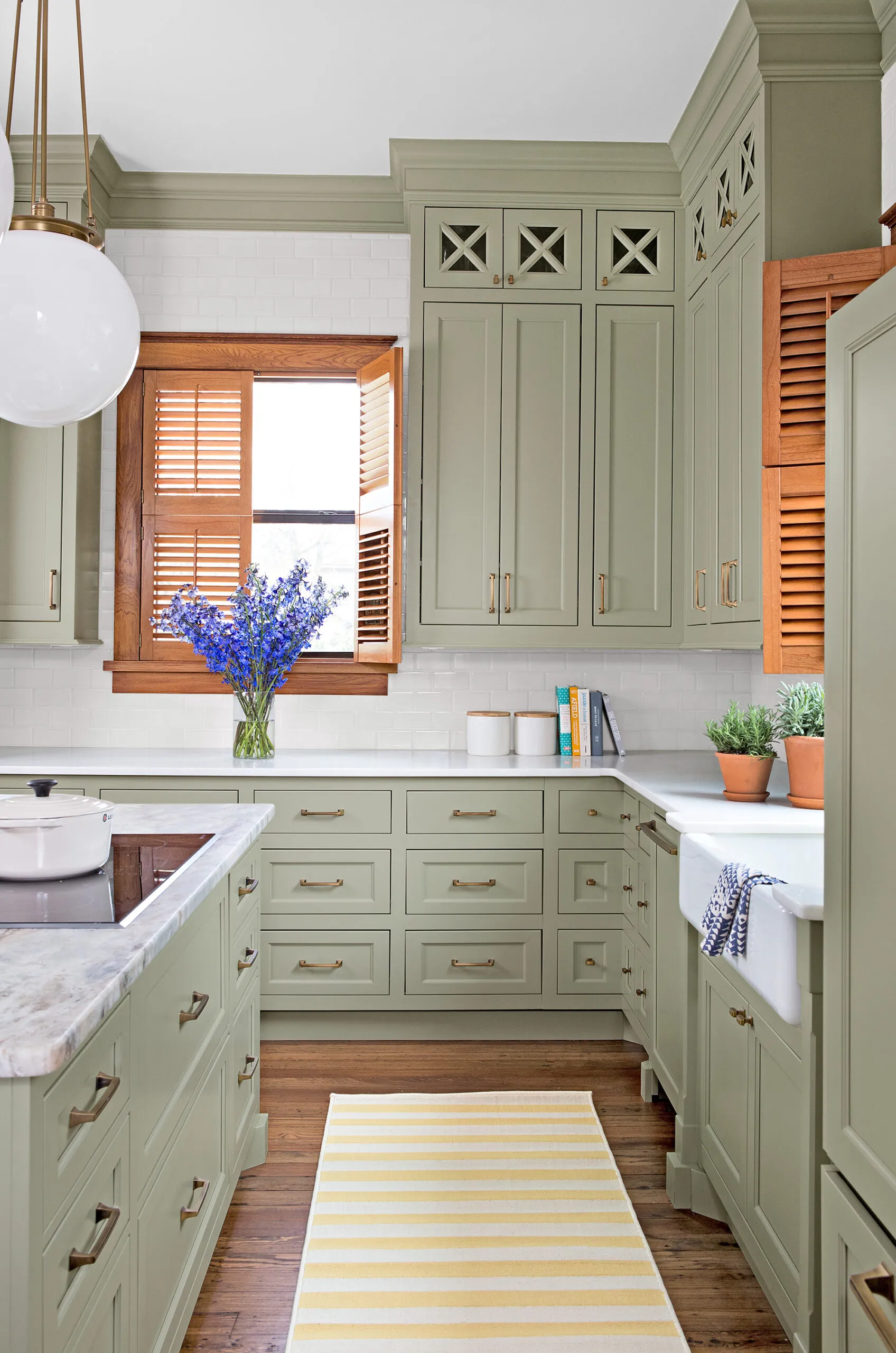
Sick of searching for items languishing in the back of lower cabinets, the Kloesels replaced them all with drawers. The corner units are especially efficient, utilizing every inch of interior cabinet space. “They’re ideal for towels, bags, and anything on a roll, like foil,” Diana says. Polished white-marble counters offer a clean, bright look.
Cabinet paint: Sherwin-Williams’s Clary Sage
Pulls: Amerock
The Kloesels
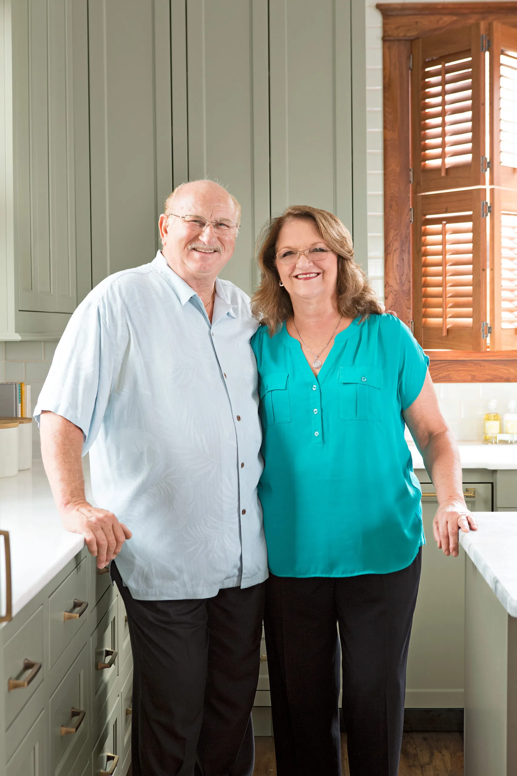
At their restaurant, Harvey is in charge of the kitchen, while Diana oversees the front of the house.
Marbled Marvel
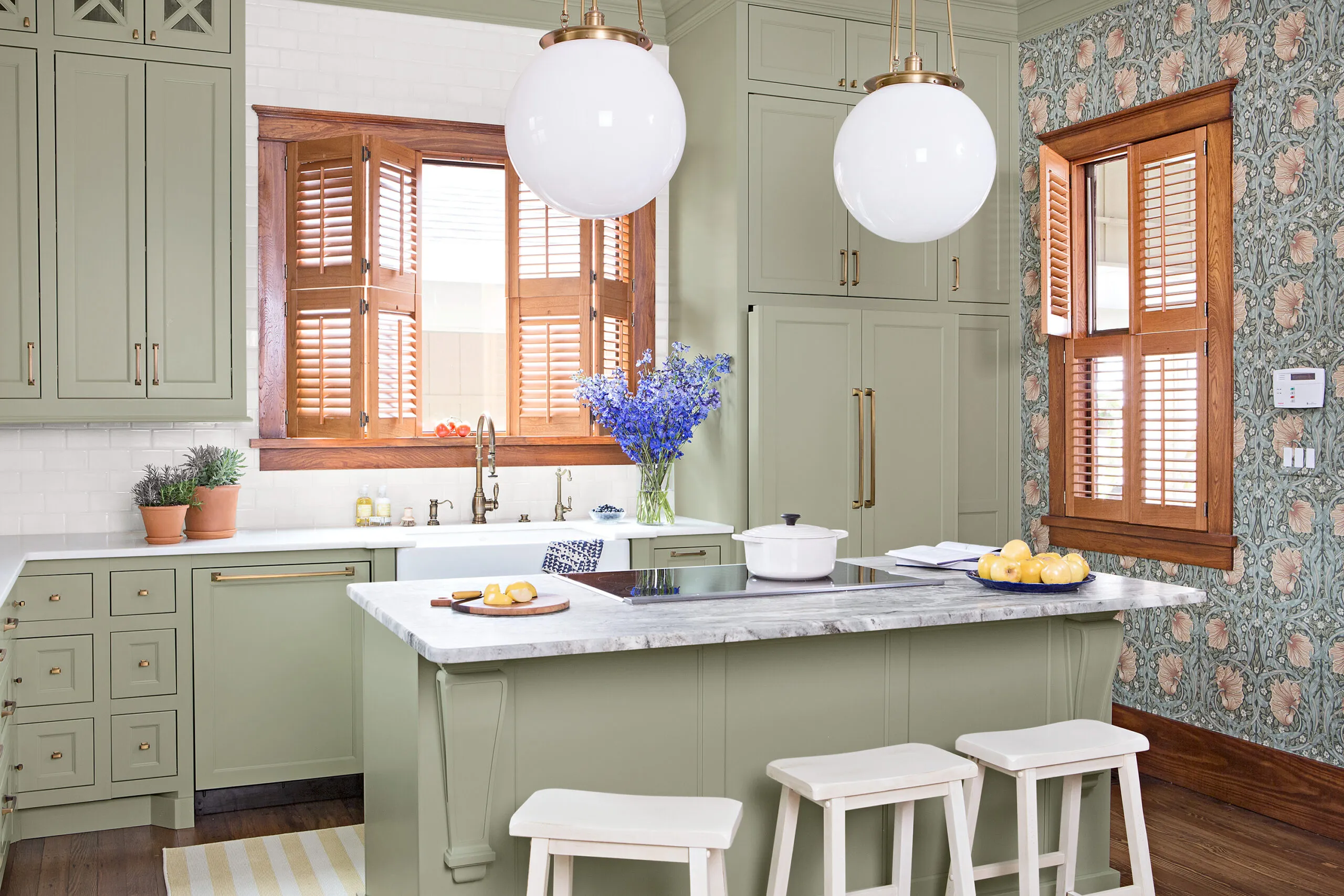
Just a few inches smaller than its predecessor, the new island is all one level. At 37 inches high, it’s more comfortable to sit and stand at, and the overhang makes a perfect breakfast spot. The veined-marble island top has a honed, leathered finish that resists scratching and etching.
Pendant lights: Rejuvenation
Cooler Cooking
Moving the oven out of the island allows for better circulation. The induction cooktop boosts safety—and convenience. Diana says, “It cools down quickly, so we don’t have to worry about the grandkids getting burned. It’s also easy to care for, and the surface can be used as a serving station.”
Cooktop: Jenn-Air
Sunny Seating
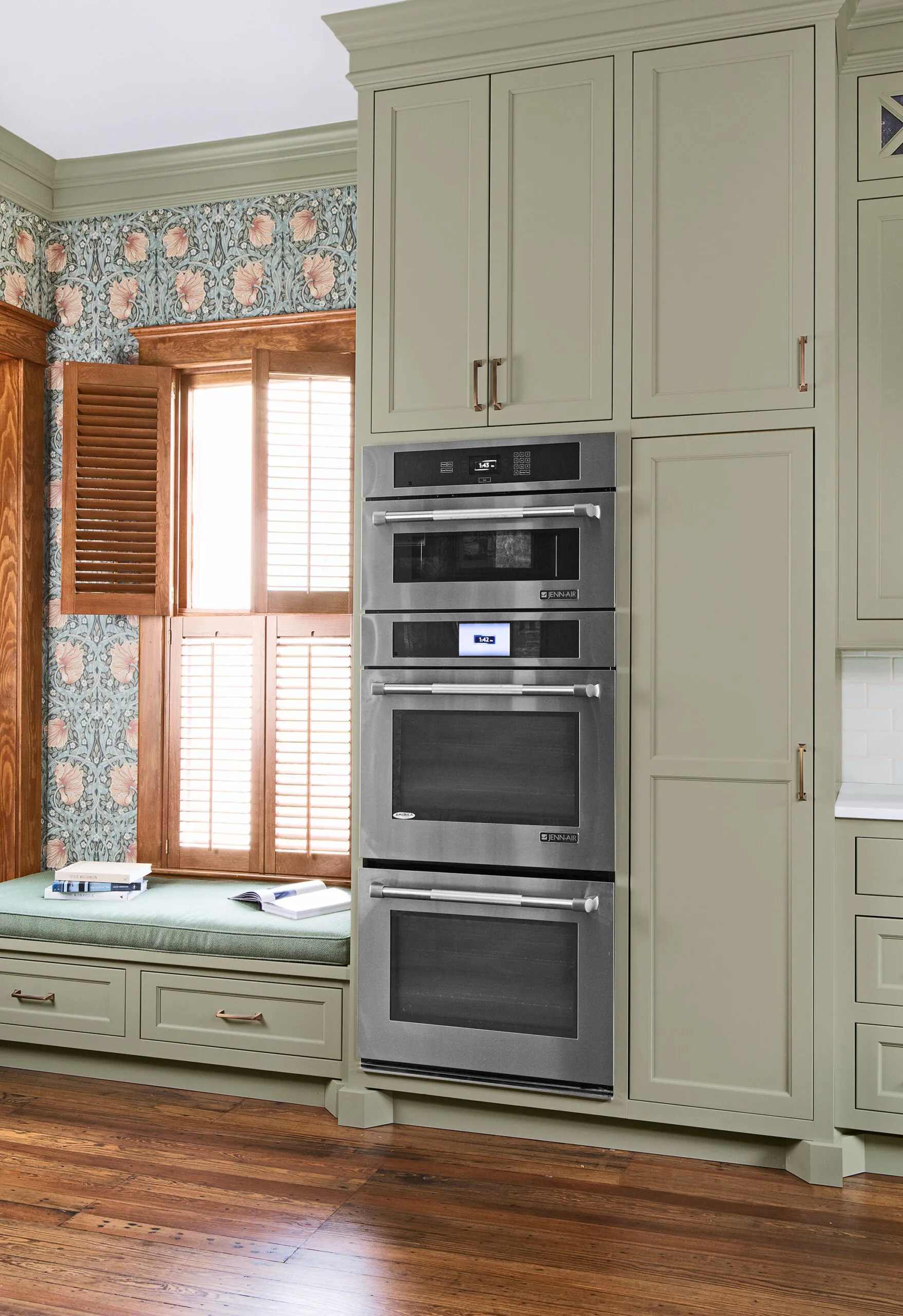
The window seat is a favorite hangout for the couple’s five grandkids—and the Kloesels appreciate being able to keep an eye on them when cooking. Under-seat storage is devoted to plastic containers, so little ones can tidy up after themselves when snack time is over.
Wallpaper: William Morris’s Pimpernel
The kitchen gets tons of sun, so louvered shutters offer good light (and heat) control.
Fan Favorite
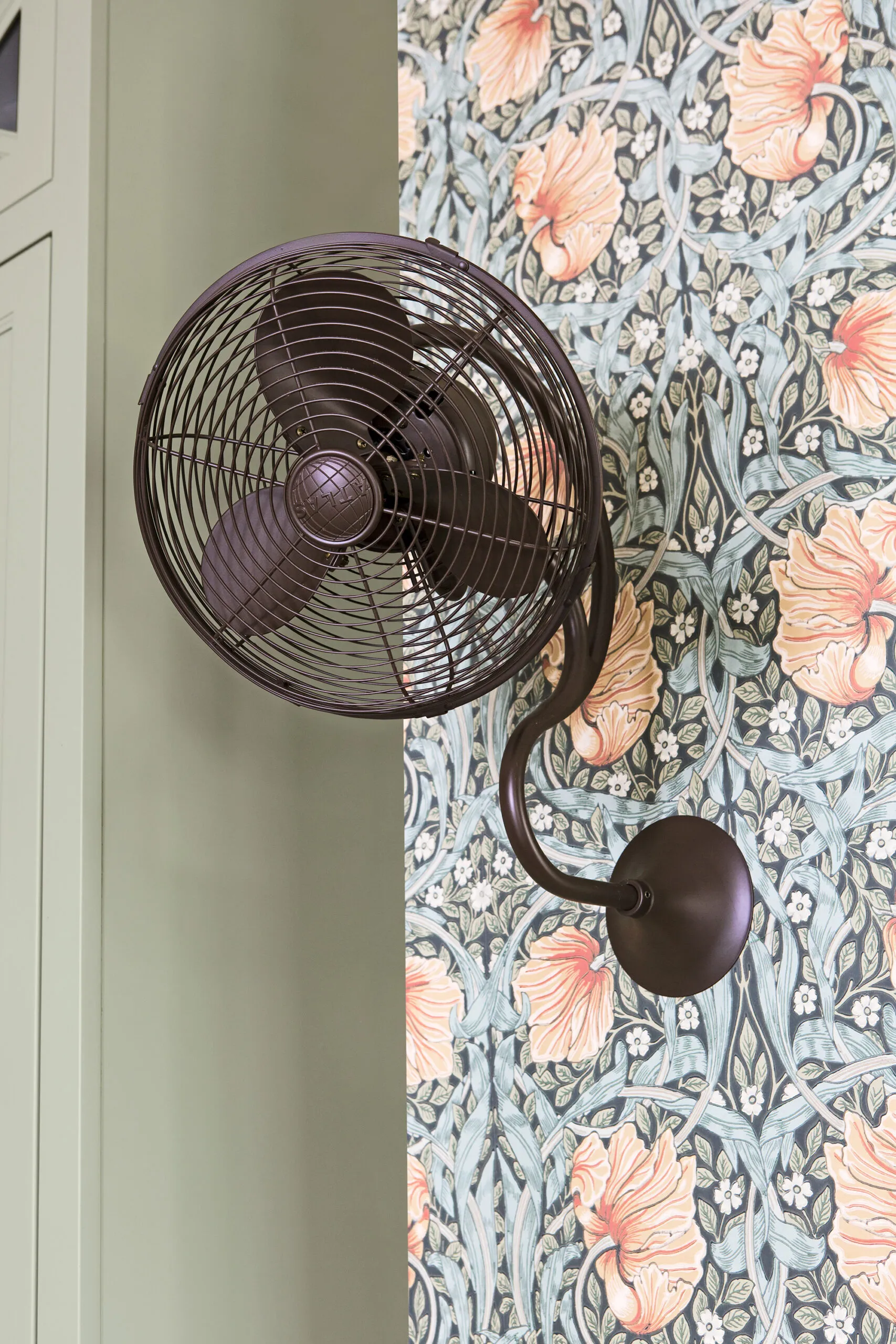
Fans on opposite sides of the kitchen and bold floral wallpaper lend vintage charm. The fans also help cool the room when the ovens and cooktop are cranking.
Fan: Matthews Fan Company
Drinks Station
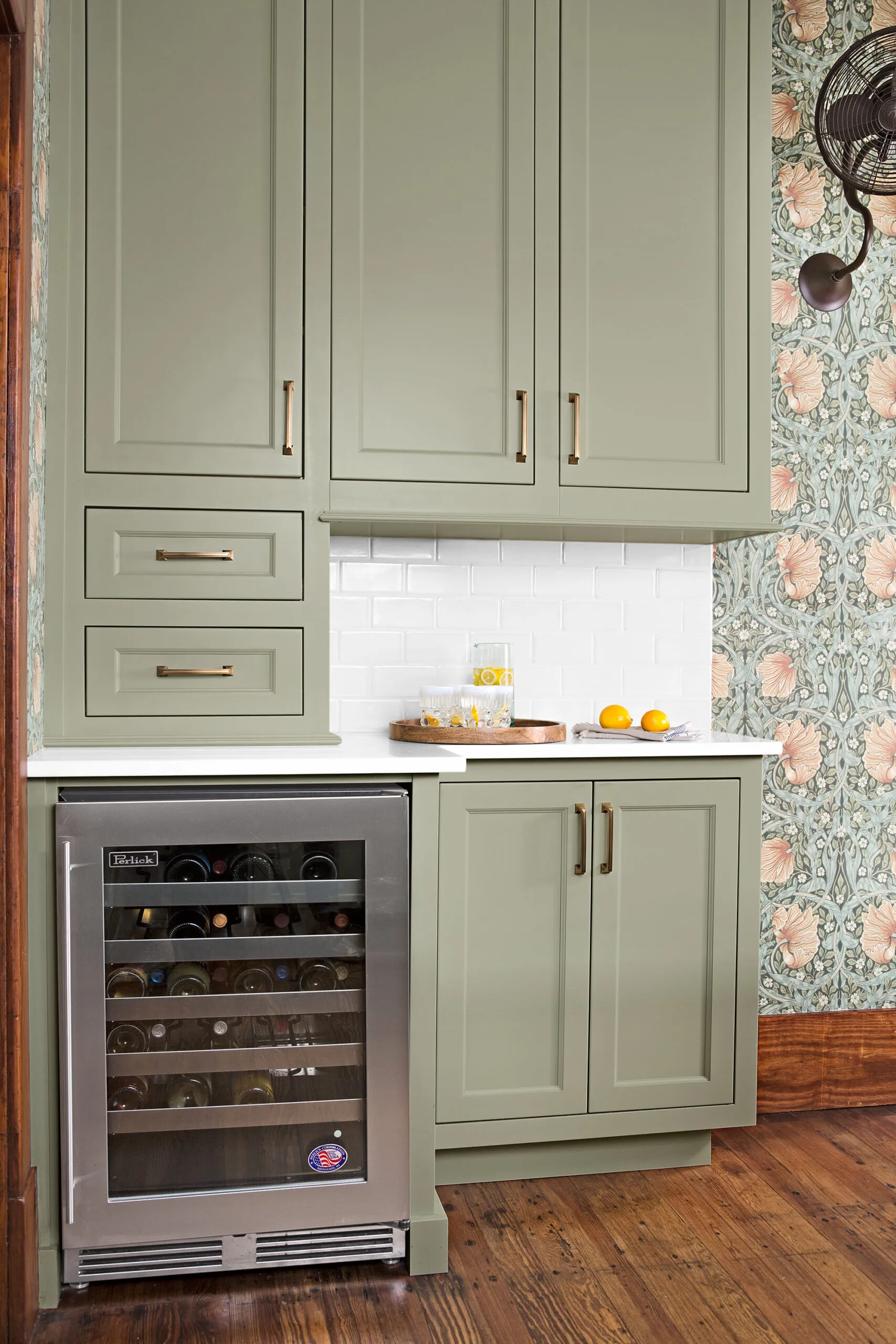
Why trek all the way to the fridge when you want to wet your whistle? A wine cooler and serving area built into one corner makes bartending a breeze. The stepped-back counter eases traffic flow around the island.
Wine fridge: Perlick
Floor Plans: Before
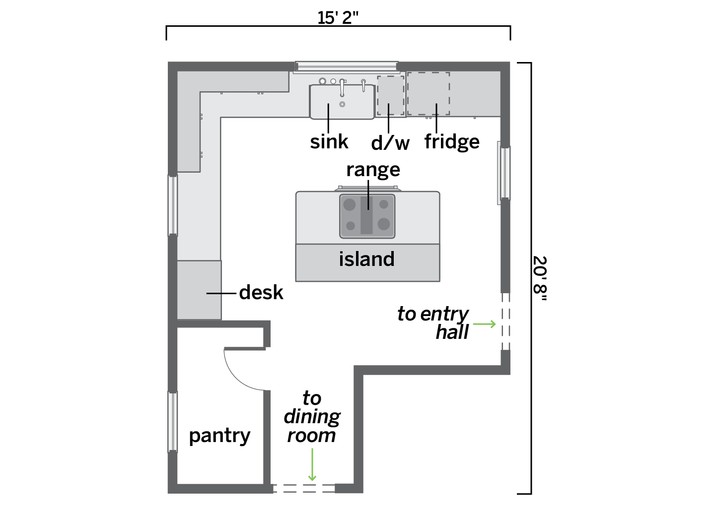
The walk-in pantry hid a window and cramped the entry to the dining room.
Floor Plans: After
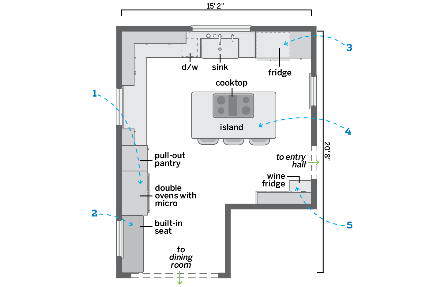
Annexing the pantry and moving the oven boost storage and circulation
1. Removed a desk to make room for stacked wall ovens topped with a microwave. A pull-out pantry cabinet went in alongside them.
2. Gutted a pantry to allow for a wider opening to the dining room and a built-in bench seat beneath the now exposed window.
3. Relocated the dishwasher to the other side of the sink to fit in a larger refrigerator.
4. Replaced a bi-level island with one that’s countertop height and added a glass cooktop.
5. Tucked a dry bar with a wine fridge into a corner of the kitchen off the entry hall.
