Arts and Crafts bungalows are known for their rich wood details—and the dark interiors that go along with them. Leon Irish and Karla Simon’s 1910 Craftsman home was no exception. So when the eastern Maryland couple decided to update their kitchen and dining room—which had last been renovated in the 1960s—they knew the rooms had to stylistically reflect the rest of their vintage home, but they longed for lighter, brighter spaces with a contemporary feel. “A modern approach to Craftsman,” says Leon.
They found the perfect person to interpret their vision in local architect Shorieh Talaat. “We had admired Shorieh’s work on a friend’s contemporary house,” says Leon. Although Talaat’s distinctly modern sensibility may have seemed an odd choice for a nearly century-old house, his appreciation for fine woodwork details, colors drawn from nature, and visible structural elements is definitely in sync with the Craftsman ideal. “In these old houses you see the mark of the hand and revel in the natural qualities of the materials and their assembly,” says Talaat. “I simply set out to reinterpret a period style.”
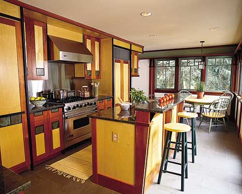
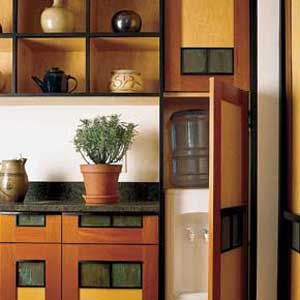
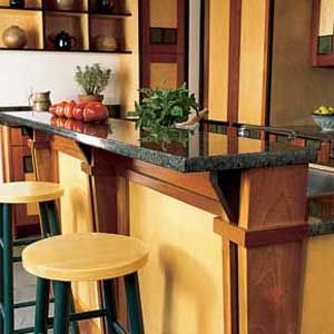
The result is a contemporary vision of Craftsman in which every detail pops. Gleaming cabinets of blond maple trimmed in red Honduran mahogany and ebonized walnut are the central features of the new kitchen. The face of each drawer and door is decorated with patinated copper inlays, which harmonize with the green granite counters and gray-green slate floor. Mark Moeller, a master woodworker from the area, spent some 2,200 hours turning Talaat’s stile-and-rail designs into furniture-quality cabinets that house everything from pots and pans to a microwave, TV, and water cooler. “Leon and Karla wanted the space to convey a clean and ‘unkitcheny’ look, so everything except the stove is hidden behind cabinets,” says Talaat.
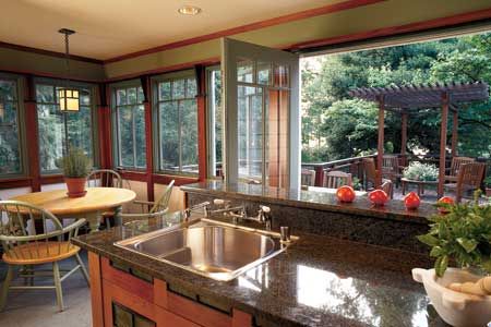
The couple also wanted to open up the cramped work area without the expense of expanding the room’s footprint. Talaat made the room feel more spacious by enlarging two passageways and eliminating an awkward butler’s pantry that zigzagged into the the dining room. A third passageway was sealed up to create a storage-packed range wall. He also created a more efficient work triangle anchored by a new multipurpose island, plus a larger eating area. Six new casement windows and a pair of French doors bring in lots of light and backyard views.
Another challenge Talaat faced was how to better integrate the dining room—which was tacked on in the 1930s—with the rest of the house. His solution was to create a 9 1/2-foot-long columned half-wall, a classic Craftsman feature, that serves as a sideboard and pass-through. Flanked by passageways into the kitchen and the living room on either end, the built-in defines the space while opening up sight lines and letting in more natural light. Vaulting the ceiling in the dining room exposed its original beadboard ceiling and gave the space a soaring airiness. Wrapping a deck around the kitchen and dining room, accessed by French doors from both, further links the two rooms.
The 650-square-foot project took a little over a year and cost about $300,000. Leon thinks that Gustav Stickley, whose magazine The Craftsman in all likelihood published the design for their early-20th-century house, would approve of Talaat’s 21st-century interpretation. “It’s just the kind of elegant construction he favored,” says Leon. “We went from the world’s ugliest kitchen and dining room to the most beautiful.”
What They Did
Gutted: The old kitchen was torn out, including a butler’s pantry that led into the dining room; the passageway between the two rooms was enlarged. Sealing up another passageway to the basement door created more counter and cabinet space along the range wall. And enlarging a doorway off the eating area allowed easy access to a new mudroom.
Added an Island: To create a more efficient work triangle, a dual-height island fitted out with a sink and dishwasher was installed opposite the range/refrigerator wall.
Opened up the Dining Room: Removing the old butler’s pantry improved traffic flow between the kitchen and dining room. In addition, a wall between the dining and living rooms was replaced with a columned half-wall that functions as a built-in sideboard and pass-through.
Let in More Light: Increasing the number of windows to six in the kitchen and six in the dining room, as well as adding two new sets of French doors, brought in more natural light and backyard views.
Added a Deck: Wrapping a new deck around the back of the house further links the kitchen and dining room.
