Even when a great old house manages to survive the decades intact, the kitchen rarely makes it through unscathed. Family demands on the space mean it’s usually the first room to get “modernized,” often with mixed results. After all, what seemed like a groovy kitchen remodel in, say, 1975, might not look so hot in 2006.
In Richard and Gail Rapson’s 1904 Minneapolis foursquare, walking from the dining room into the kitchen was sort of like emerging from the wood-paneled library of an Ivy League college and stumbling into the neighborhood medical clinic. While most of the home’s rooms were lined with original wainscoting and millwork in burnished oak or warm mahogany, the sterile white kitchen’s most notable feature was Jimmy Carter—era laminate cabinetry. It wasn’t the kind of kitchen in which the family of four could do any sort of kitchen-table bonding, either, since its eating area was shoehorned into a converted butler’s pantry, and a space-hogging island made navigating the 13-by-15 room awkward, treacherous even. “We were always slamming into each other,” says Gail.
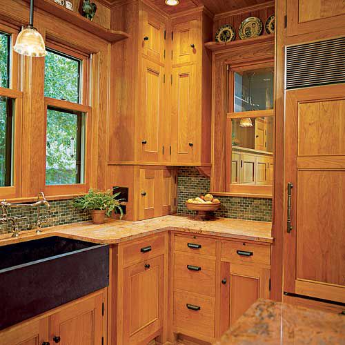
After years of ignoring the room’s cramped confines and incongruity, the Rapsons finally decided to give the house the kitchen it deserved. They envisioned cabinetry on a par with the millwork found in the rest of the house, as well as some 21st-century luxuries, including granite countertops, a built-in recycling center, pro-grade appliances, and recessed lighting—with minimal alterations to the room’s footprint. They also wanted to add some adjoining spaces: a separate, kid-friendly breakfast room with a workstation where their two children, 8 and 12, could do homework, play computer games, and stay out of their parents’ way while they prepared meals. And to keep the house free of tracked-in grime, they planned a storage-packed mudroom, where the family could deposit snowy coats and sopping-wet boots. “Every house in Minnesota needs a mudroom,” says Gail.

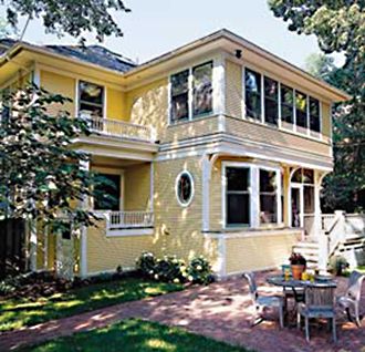
But unlike some, who try to Xanadu their homes with additions the size of airplane hangers, the Rapsons were in the market for something that respected the scale, style, and, most of all, the painstaking craftsmanship of their house. They needed a designer well versed enough in historic architecture to do the job right. Enter David Heide.
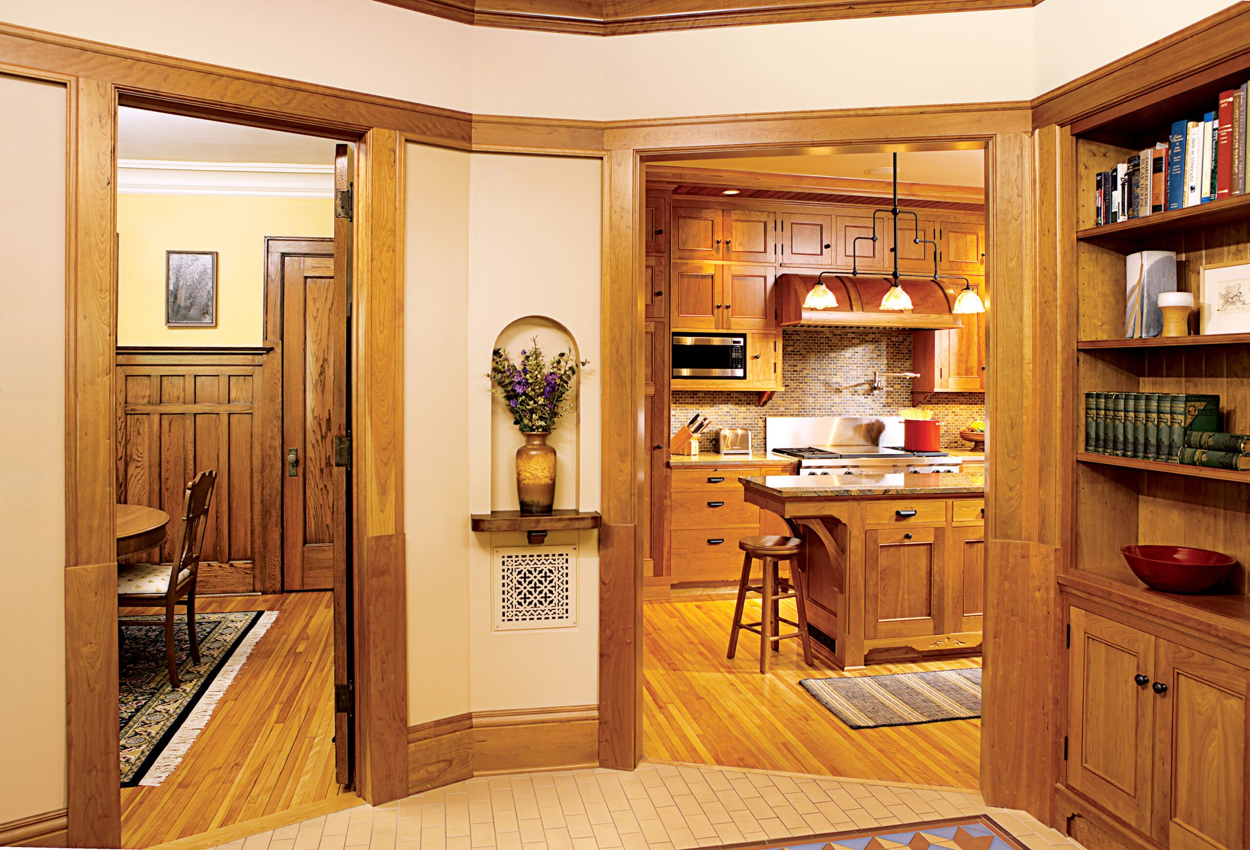
When planning remodels or additions for older homes, Heide tries simply to further the original architect’s vision. For instance, he knew that back when the Rapsons’ house was built, the kitchen played second fiddle to its more formal dining and living areas, so he didn’t want to upstage them. He respected the Rapsons’ desire to keep the scale of any additions in line with that of the home’s other rooms, and went even further by suggesting they install bronze-finished light fixtures in the kitchen that wouldn’t outshine the elegant brass ones used in the front of the house. “Historically, simpler fixtures would be used in the kitchen, while more elaborate brass ones would be used in the formal rooms of the house,” says Heide, whose studio designed all of the new light fixtures, save a salvaged chandelier in the breakfast room.
To fabricate his cabinetry and millwork designs, Heide turned to St. Paul cabinetmaker Jon Frost, a frequent collaborator on the historically accurate additions and remodels he tackles. “What David does as a designer makes us really well suited for one another,” says Frost. “We have both been students of period cabinetry for a long time, and there are not a lot of architects or designers as interested in, and as well educated about, the interior details of old houses as David is.” While Frost has worked on many a Minnesota foursquare in his day, he calls the Rapsons’ house a gem. “It’s just so nicely proportioned in terms of its woodwork,” he says.

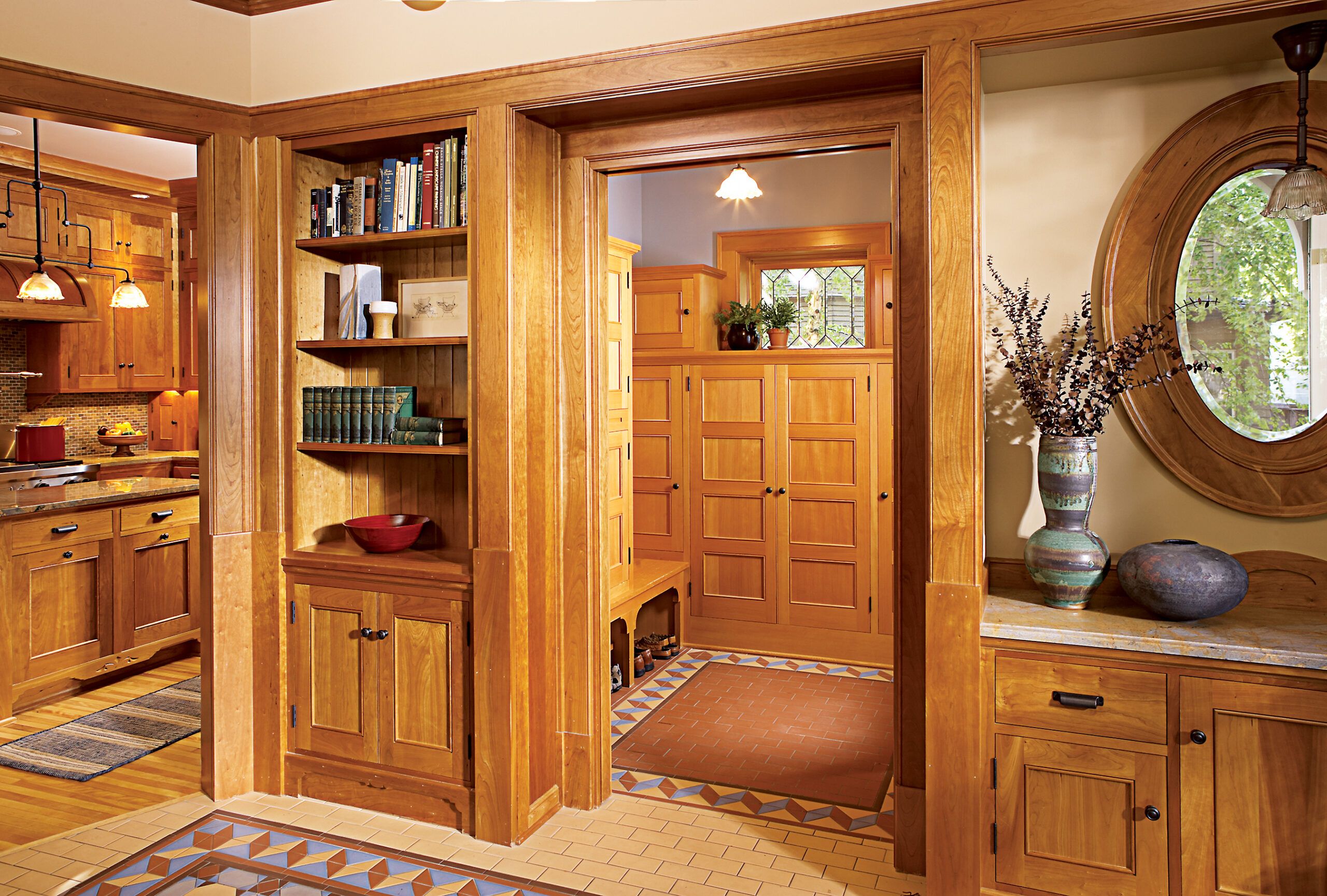
The Rapsons chose warm cherry for the cabinetry and millwork in the kitchen and breakfast-room addition. Not only does it blend perfectly with their new granite countertops, which are speckled with indigo, gray, and salmon accents, cherry also darkens dramatically with age, so over time, it will fit right in with the rich oak and mahogany used in the other rooms. For the mudroom they chose Douglas fir with a vertical grain—pricey today, but relatively inexpensive 100 years ago, when it was often the material of choice for informal kitchens and back entries.
Instead of a simple desk in the breakfast room, Heide created an elaborate media workstation with designated spaces for a computer, a television, two large filing cabinets, a mail station, and plenty of cubbies for the kids’ school materials and Gail’s art supplies. In designing the built-ins, Heide tried to replicate the simple look of freestanding furnishings that would have been popular during the turn of the 20th century. “We took the language of the period and used it to conceal modern technology,” he says. “That allows the period style of the room to prevail.”
But designing a historically respectful addition doesn’t mean you can’t improvise a little. One of the most eye-catching aspects of this project is the encaustic porcelain floor tile in the breakfast room and mudroom. Set in a Victorian mosaic pattern for the former, and a simpler pattern for the latter, the tile adds a burst of color that enlivens the more subdued wood tones that dominate the house. While not usually found in turn-of-the-century living areas, such elaborate tilework does adorn the front entryways of residential and commercial buildings of the time.
In the end, despite their initial nervousness, the Rapsons got exactly what they were after: a bigger, more modern space in which they can spend more time together as a family, and one that doesn’t conflict with the historic elements that made the house noteworthy to begin with. “We took a chance, and it turned out beautifully,”?says Gail.

Secrets of Seamless Renovations
Minneapolis designer David Heide is often called upon to design modern renovations and additions that don’t contradict a period house’s original style. Here are some things to keep in mind if you’d like to do the same.
+ ARCHITECTURAL STYLE: School yourself on your house’s history and architecture. Look at, or read up on, similarly styled houses from the same period for ideas; local house tours also can be a good source of inspiration. If you want to add a porch, for instance, look at period porches in the same style to see how they’re done. “Get a handle on what kind of house you have and what the prevailing aesthetic principles are so you can work in the language of that style,” says Heide.
+ SCALE &?PROPORTION: Don’t let that new addition dwarf the rooms you already have. After all, a modern, 800-square-foot great room will look silly tacked on to a 1,500-square-foot bungalow. Also make sure the scale of your windows, entryways, and ceilings don’t contradict the ones found throughout your house. Says Heide: “Your house will tell you how high the ceilings, doors, or windows need to be.”
+ APPROPRIATE FINISHES: A good renovation usually means introducing modern elements such as more elaborate cabinetry, hardware, and lighting. If you don’t have time to scour salvage yards for period-appropriate versions of these things, be sure the ones you buy make sense in the context of your house. “Avoid stylistic trends,”?says Heide. “Don’t use Tuscan-style hardware or fixtures in a Colonial-style house. They have nothing to do with each other.”?
