Added Space, Kept the Scale
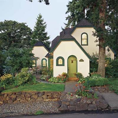
Known among its Salem, Oregon, neighbors as the Tulip Cottage because of the floral motif on the stained-glass front window, the 1927 house looked perfect, Randy Fishfader thought—if only it were just a little bigger. When she heard from a friend that the cottage was going on the market, she decided she had to go for it. But before putting in her offer, she called contractor Robert Kraft to do the walk-through—and a reality check—with her. Randy wanted a ground-floor bedroom and bath that could serve as a guest suite for the present and as a master suite later, when she no longer wanted to climb the stairs each night. But getting that would be tricky.
Kraft called in local architect Karl Anderson to devise a plan to straighten out the awkward spaces and add a gentle enlargement that would be in keeping with the scale and style of the cute-as-a-button cottage.
Living Room’s Bumped-Out Bay Window
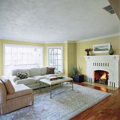
Anderson let the home’s original details and proportions guide him, repeating the rooflines and arch motif in his plan. In the living room, which felt barely big enough to seat Randy and three close friends, he bumped out the exterior wall with an almost floor-to-ceiling bay window. This alcove now holds an overstuffed sofa and gave the room a more pleasing shape as well as size. “It was just enough to turn it into a totally different space, allowing furniture to fall in place,” says Anderson. “Widening the room, even by a bit, also makes the fireplace feel more centered.” To give the red-brick mantel a more finished look, he added a wooden shelf with brackets and a space-enhancing coat of white paint.
Dining Room’s Dressed-Up Fireplace
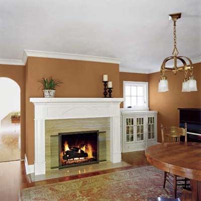
The dining room, which had been used as a family room, needed surgery of its own. After removing the wood-burning stove, the fireplace brickwork was clad with light-reflecting travertine marble and framed with a white mantel. A low glass-front cabinet to the right of it would provide needed storage.
Guest Suite’s Opened-Up Interior Views
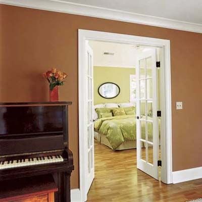
To give Randy her guest suite and make the entire ground-floor feel roomier, Anderson sited the addition off the dining room, establishing a sight line from the kitchen through the room’s interior French doors and into the new bedroom.
Improved Outdoor Living Space
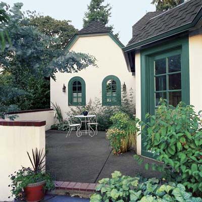
From the outside, the 13-by-26-foot addition looks like a scaled-down version of the main house grafted onto the house’s side with two arched windows facing the street, giving it a wide-eyed look similar to that of the front entry.
Patios and porches make the whole interior feel more expansive by leading the eye outside and offer nearly year-round outdoor living in Oregon’s mild climate. The dining room opens onto an original patio, and the living room’s bay window now overlooks another patio that was remodeled to resemble the existing one. Both areas are enclosed by brick-capped stucco walls, making them feel like extensions of the rooms inside. The new bedroom has its own small porch, which faces the morning sun.
Guest Suite’s Gradual Transition from Bed to Bath
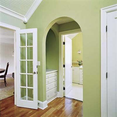
Inside, the bedroom and bath are separated by an elongated passageway that holds a built-in dresser—a gradual transition space that makes the whole suite feel more spacious.
Guest Bedroom’s Raised Ceilings, Added Windows
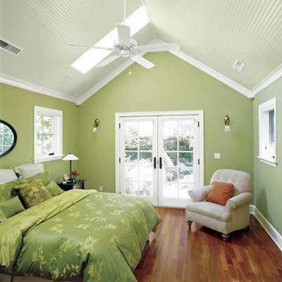
Along with three windows and French doors, the bedroom has a vaulted ceiling with two skylights. “Anytime you raise the ceiling of a small room, and especially if you add skylights, it makes the whole room feel bigger and brighter,” says Anderson.
To unify the ground floor, Kraft installed crown molding and engineered-wood flooring throughout, and stuck to a paint palette of Randy’s favorite peaches and greens. The special trim around the vaulted beadboard ceiling in the new bedroom actually serves a purpose. “When you install crown molding on a raised ceiling, the corners can be a problem,” says Kraft. “Adding trim blocks where the pieces meet will give you a clean transition.”
Guest Bath’s Built-In Storage
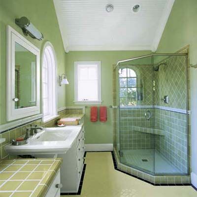
The roomy bath has a period-appropriate pedestal sink flanked by two built-in bureaus—helpful storage for when Randy moves downstairs and a nice bonus for guests in the meantime. The room’s ceramic tile is a 1920’s-style touch that echoes the look of the previously renovated kitchen.
Guest Bath’s Arched Windows
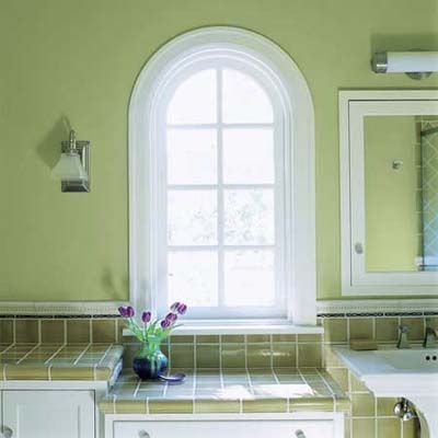
Windows and interior passageways in the addition repeat the arches found in the original portion of the house, making new spaces blend seamlessly with the old ones.
Master Bedroom’s Balcony Garden
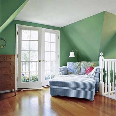
The existing master bedroom has a cozy feel, thanks to its slanted, under-the-eaves ceilings. Keeping the French doors drapery-less and filling the sliver of balcony with flowers was one more way of letting in light and opening up rooms to views of the outdoors.
Before Renovations
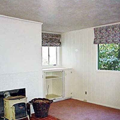
At 1,650 square feet, the house wasn’t tiny, but the two main rooms were so poorly laid out that Randy didn’t think she could fit her sofa in there, much less a party. “And I do love to have people over,” she says. More glaring, the biggest rooms were shortest on the home’s signature charm. The living room’s hardwood flooring was patched in places and sloping, and its brick fireplace was awkwardly off center. The dining room, which appeared to be a 1960s addition, was an afterthought, with metal-frame windows, painted-pine wall paneling, and a concrete-slab floor covered with salmon-colored carpet. Its raw-looking brick firebox was colonized by a wood-burning stove.
First-Floor Plan
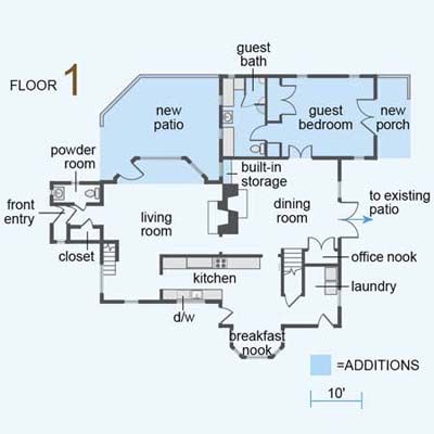
The 1927 house was added onto once before, where the dining room now stands. The new addition opens that room up to a guest bedroom and bath. A bay window improves the flow of the living room, and a new patio and porch add outdoor living space.
Second-Floor Plan
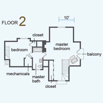
The original house was not without its charms: arched windows and doorways, and two cozy upstairs bedrooms and a bath tucked under the eaves.
But the new guest suite has become—no surprise—a kind of destination.
