View to the Washington Monument
People buy houses for different reasons: location, size, price, style, as an investment, or because they fall in love with a room, a fireplace, a staircase, or a porch. For Terry Gaw and Mike Mullins, it was all about the view.
On a spring Sunday several years ago, Mike drove by a sign for a real-estate open house at a sturdy American Foursquare, just three blocks from their townhouse in the Cherrydale neighborhood of Arlington, Virginia. He went back to get Terry, declaring, “Let me take you to the house we’re going to buy.” Later that afternoon, the two climbed to the top of the old house, up a rickety wood ladder, to an attic thick with dust. And there they discovered, much to their surprise, a view of the Washington Monument, some three miles distant, from an east-facing dormer. That view sealed the deal.
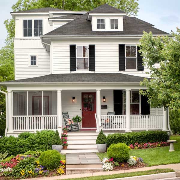
Shown: As part of the renovation of the existing 1915 foursquare, the front porch was extended to wrap the house on one side.
Architect: Charles Moore, Moore Architects, PC, Falls Church, VA; 703-532-1192
Contractor: GN Contracting, Falls Church, VA; 703-801-8500
Front door and windows: Kolbe
Storm door: Vintage Woodworks
Rebuilt Front Porch
Built in 1915, the symmetrical house had the classic configuration of four rooms downstairs and four up, plus a dormered attic under a hipped roof and an ample front porch. But it was in pretty shabby shape. “There was green shag carpet everywhere,” says Terry. “The kitchen was outdated, the bathrooms were dingy, and the porch was headed downhill because the pilings were falling out from under it.” At some point in its mostly unimproved history, a two-story porch-like addition had been slapped onto the back of the house, held up by a brick foundation.
“It was poorly cared for, but it had good bones,” says Charles Moore, the local architect the couple hired to transform the fixer-upper. “Under current zoning laws, you could never build this house today,” he adds. “Setback requirements would have the sidewalk running halfway through the living room.”
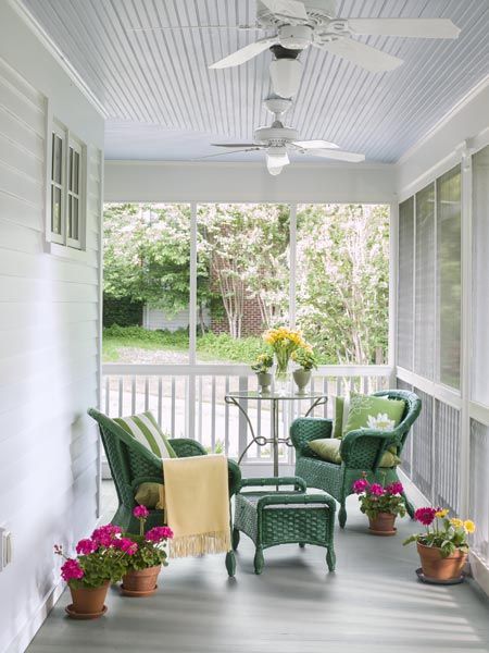
Shown: A side portion of the rebuilt front porch, added during the renovation, is screened to allow the homeowners to enjoy insect-free summer evenings alfresco. The porch ceiling is painted a traditional blue.
New “Figure Eight” Floor Plan
It was Moore’s special interest in historical houses that appealed to Terry and Mike in their search for just the right person to help them graft on the large, open chef’s kitchen, gracious master suite, and top-floor lookout they were after, all while burnishing the house’s original charms. To round out the renovation team, they called in Falls Church, Virginia, contractor Gabriel Nassar, who worked frequently with Moore.
The renovation of the existing structure, which rose from a 20-by-25-foot rectangular footprint, was to consist of a new circulation plan for the main floor, widened doorways between rooms, and new doors and windows throughout. Walls would be stripped down to the studs; the baths would be completely overhauled. Adding another layer of concern, the house still had its original knob-and-tube wiring, with much of the insulation fabric visibly frayed. “Someone tried to screw in a lightbulb and got fire instead of light,” says Terry.
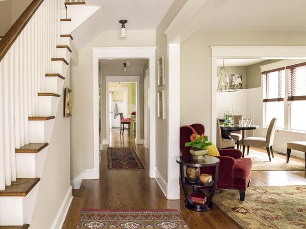
Shown: The tower addition required shifting and widening the center staircase, which created a corridor closer to the middle of the house. The resulting “figure eight” circulation plan means that there are no dead ends in any of the public rooms on the first floor. New ceiling fixtures bridge the old and new spaces.
Interior doors: TruStile Doors
Masculine Touch for the Family Room
This would be no historical restoration, but Moore is known for going to some lengths to conceal modern-day intrusions.”Our goal was to create a house that would be relevant for the next hundred years,” he says. “In a house of this character, I try to hide everything to do with the mechanicals. In the upstairs hall, we designed a coffered ceiling that looks like a pure design feature, but I did it to hide ductwork. I like those kinds of solutions: things that look like they were done for aesthetic reasons but that secretly solve a problem.”
Moore also likes to replace materials in kind, where it makes sense, “for a more seamless integration of old and new.” That meant using wider 4¼-inch trim boards around the new windows instead of more common 3½-inch trim, and 2-inch window stools instead of 1¼. While Mike and Terry were proponents of fiber-cement siding, Moore convinced them to go with more faithful cedar clapboards on the exterior, accented with operable wood shutters. “They make their decisions from the perspective of what they believe is best for the house,” says Terry, of working with Moore and Nassar.
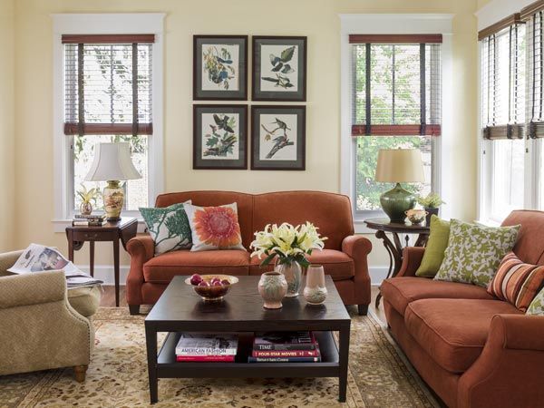
Shown: The homeowners chose dark wood blinds for the family room—and all the rooms in the house. “They’re masculine and unfussy,” says Mike, “so they feel appropriate to the house.”
Cozy, Open Dining Room
Two additions would increase the living space from 1,810 square feet to 3,054. One would consist of an expansive kitchen-family room with a master suite above it, in place of the flimsy back porch; the other, an innovative tower on the east side of the building, connected to the front by the rebuilt porch, would contain a small library on the main floor, a new upstairs hall bathroom, and a lookout room, to maximize the view that sold the couple on the house in the first place.
Arriving at a plan everyone could agree on took a little time. “The way Charlie and Gabriel worked together,” says Terry, “was to wear us down. They would just ignore us until we came around to their way of thinking. And they didn’t always agree with each other, which was fun to watch. Usually the decision that was ultimately made was the one that cost the most.”
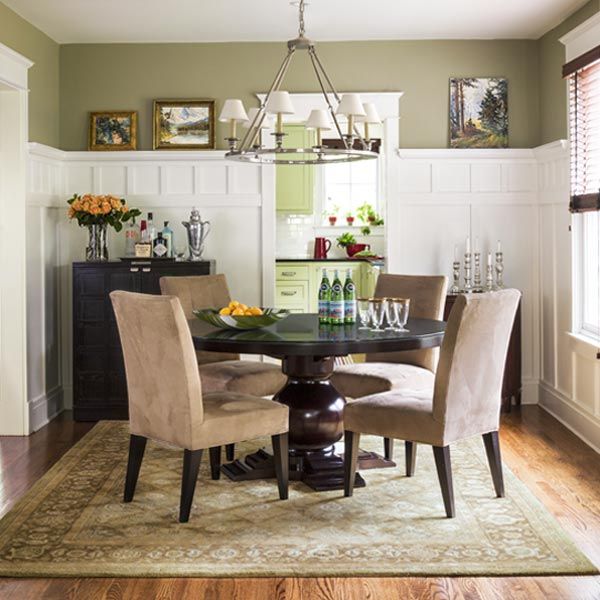
Shown: The dining room got new wainscoting with a high plate rail to showcase the homeowners’ artwork. The opening to the living room (in the foreground) was widened for better circulation. Painting all the millwork white helps keep the interior light and airy.
Balanced Contemporary With Historic
“That’s kind of true,” says Moore. “I mean, we did listen to them, of course—they were outstanding clients. But sometimes the first idea a homeowner has to solve a problem is not the best one. The tower, for example, was a way to access that view of the Mall. Their original idea, a screened porch—which they could only use for half the year—wasn’t the best way to provide what they wanted.”
As in nearly all renovations, there were some unhappy surprises during the 15-month process. “I got a call one day that they were working on the foundation and part of the wall fell down,” says Terry. “When we got to the house, it was being held up by a single 2×4.”
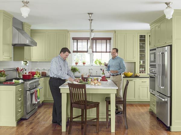
Shown: Mike Mullins (left) prepares dinner in the new kitchen, while partner Terry Gaw cheers him on. Spring-green cabinets give the kitchen a spritely personality. Honed Carrara marble tops the island; the rest of the counters are honed Absolute Black marble.
Dishwashers, range hood and ovens, and microwave: Thermador
Refrigerator: Jenn-Air
Upbeat Green Kitchen
“That was not a good thing,” says Moore. The existing basement was poured-in-place concrete rather than block, which was a relatively modern innovation at the time the house was built. But the foundation did not have much engineering in terms of steel reinforcement. When they were pouring the foundation for the addition, which went deeper than the original, the back wall of the old foundation fell into the new one.
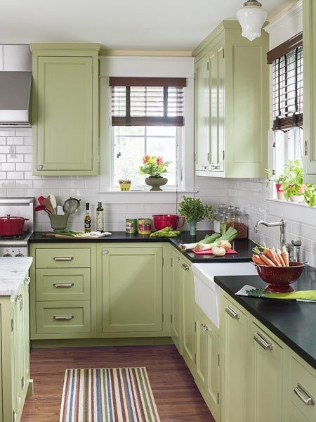
Shown: A shepherd’s-crook faucet, apron sink, and paneled dishwashers complete the room’s traditional styling.
Faucet and sink: Rohl
Replicated Millwork Details in the Master Bedroom
For Moore and Nassar, the most challenging aspect of the project was achieving the necessary headroom in extending the main staircase to the new tower lookout room and attic office. The solution needed to solve the practical issue of access, bridge the new spaces and the existing roof, and be visually pleasing. The architect came up with what he describes as “stepped dormers,” adjacent to the new tower, which replaced the existing east-facing dormer. “This is clearly a modern assembly,” says Moore, “but I’m very pleased with the horizontal roof lines you see in the front, and the three interconnected peaks you see from the east.” The seeming ease of this intersection of old and new belies just how complex an issue the actual fabrication was.
Similarly graceful solutions inside the house pay homage to the original structure while making the home livable for today. “One of the things we like most about the renovation,” says Terry, “is the way Charlie managed to respect the proportions of the original rooms even while making the pass-throughs wider and adding a kitchen space that is much bigger than any foursquare would have had.”
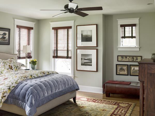
Shown: The new master bedroom is located above the family room in the rear addition. Interior millwork details were replicated in historically correct proportions to stay true to the home’s age and architectural style.
Period-Loyal Master Bath
“With a modern kitchen in an old house,” says Moore, “you inevitably wind up with a ‘transitional’ space, and you need to balance the contemporary with the historic, the stainless steel, say, with the custom millwork. We didn’t attempt to hide the stove or the refrigerator, but we did panel the dishwashers, in order to have consistency in the lower cabinets. In a house of the period, of course, you would not have had a single, open space without any separation between the cooking area and the family room. We wanted to respect the house and its history, but we also wanted it to be practical.”
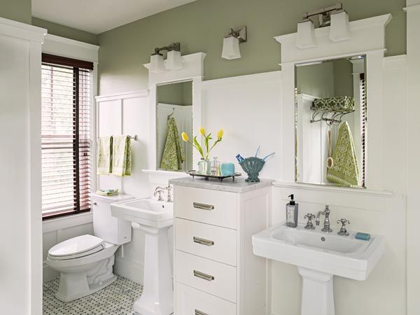
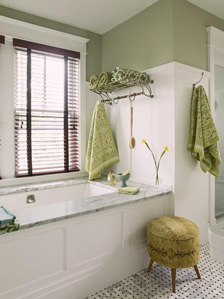
Shown: The new master bath evokes a time gone by with pedestal sinks, built-in storage, marble mosaic tile, and period-style paneling.
Toilet: TOTO
Relaxing, Generous Bath
As for the tower, it is hardly an accurate period element, but it is not without precedent, either. “I had seen a house in New England that had a kind of tower,” says Moore. “It was probably more Italianate, probably Victorian, but it gave me the idea of a way to provide the room with the view on top and at the same time provide extra space on all the floors.”
So what surprise pleasures has their newly expanded and upgraded home yielded? “Sitting on the front porch and chatting with our neighbors walking their dogs at night,” says Mike, adding that the house has been on a couple of house and garden tours, “which has really given us a sense of belonging to a community.”
Tub: American Standard
Sink: Porcher
Lookout-Tower Sitting Room
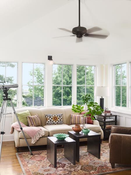
But it’s the tower room that’s the incomparable something extra, offering an overview of the neighborhood through the treetops, a glimpse of the city skyline at night, and a perfectly framed view of the Washington Monument. It has another advantage, too, during the area’s sultry summers. Says Mike: “When it’s 90 degrees out, with 90 percent humidity, it’s perfect for watching the Fourth of July fireworks.”
Shown: A lookout-tower addition to the Arlington, Virginia, home is crowned with a sitting room that is ringed with windows and provides glimpses through the trees of the Washington Monument.
Floor Plan: First Floor
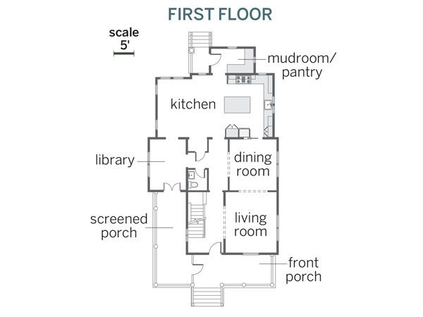
A spacious kitchen was added in the back of the first floor.
Floor Plan: Second Floor
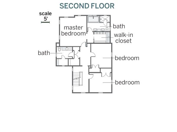
The house gained a master suite and second-floor bath with the tower addition.
Floor Plan: Third Floor
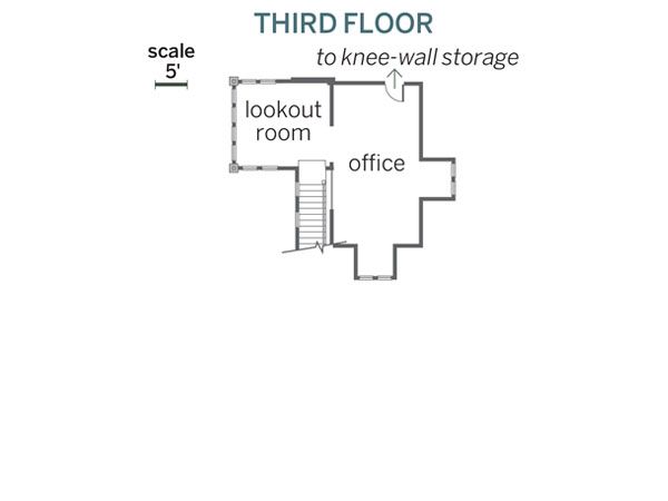
The tower addition holds a top-floor lookout room, which connects to an office carved out from former attic space.
