Shore House with Charm
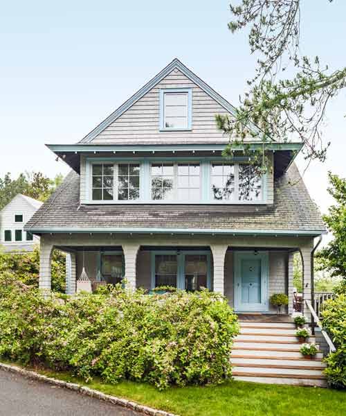
It was a serious case of water on the brain. For 10 long years, a Boston-area couple had looked for a house right on the shore without finding anything they loved. Turned off by the charmless McMansions multiplying on Cape Cod and Boston’s North Shore and by skyrocketing prices for the area’s waterfront property, they simply kept looking.
Shown: The facade looks largely as it did in 1910, but for the addition of windows on the second and third floors.
Interior designer: Jennifer Palumbo, Jennifer Palumbo Interior Design, Newton, MA; 617-332-1009
Kitchen designer: Donna Venegas, Venegas and Company, Boston, MA; 617-439-8800
Contractor and carpenter: Chris Monaco, Monaco-Johnson, Salem, MA; 978-745-0606
Built-ins: Dionne’s Cabinetry, Salem, MA; 978-740-5922
Paint: OC-17 White Dove (living room, kitchen, dining room, and third-floor bedroom walls), Benjamin Moore
Pine flooring: Saulnier Hardwood Floors, Peabody, MA; 781-595-7232
Original Entryway Details
What they found in Gloucester, a historic town on Cape Ann, the rocky mass of land at the northern edge of Massachusetts Bay, quickly cured their waterfront obsession. In fact, it convinced them that life could be good—maybe even better—away from the water’s edge.
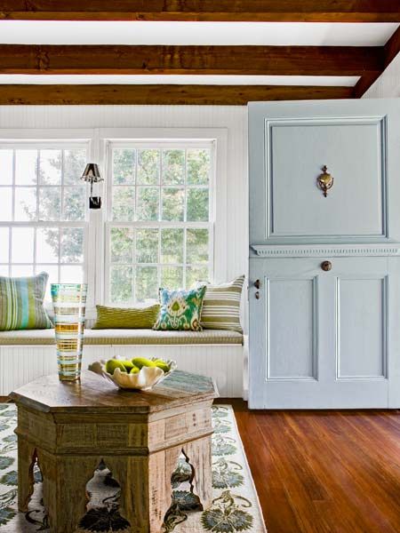
“I loved the house right away,” says the wife, about this early-1900s gray-shingled home in Annisquam, a neighborhood of late-19th- and early-20th-century structures. The three-story house, which they bought from a family who’d lived in it for 50 years, had its original Dutch door, complete with skeleton key. Behind it lay five bedrooms, acres of beadboard, exposed beams, and a rambling attic just waiting to be transformed into a hangout for the couple’s two sons, ages 14 and 16.
Shown: The front entry’s Dutch door is original, as is the built-in window seat nearby.
Old Meets New
The place was a find, for sure, but one in need of updates. While the house had been enlarged in the 1980s with a second-floor addition over the garage and had plenty of room—and rooms—it also had shortcomings. At the top of the “needs work” list: a closed-off, chopped-up kitchen, and bathrooms that had seen better days. “The homeowners liked the old architecture and the patina that had come with the years,” says Jennifer Palumbo, the interior designer they hired to drive the renovation. “Our goal was to make the house feel current and suit their needs.” That unfinished attic had a long way to go: Though a treasure trove of square footage with loads of potential, it was stuffy, uninsulated storage space with dark, unpainted beadboard walls, tiny windows, and nailhead-speckled floors.
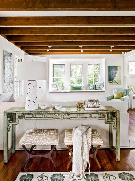
Shown: Throughout the home, original exposed ceiling beams necessitated simple track-lighting fixtures mounted directly on the timbers. The living room includes a media center in a corner cabinet (at left, far end) and a window seat; the floors are new, constructed of reclaimed heart pine and matched to the home’s originals.
Console: Treasured Sage Chinese Console, Wisteria
Lamp: Myla Table Lamp, Arteriors Home
Tucked Away
The work would begin with opening up and renovating the kitchen. From there the team would move to the third floor, transforming the attic into a bunk room with a new bathroom for the boys. The bath redos—three on the second floor and a powder room on the first—would follow. A whole-house systems upgrade was in the plan, too, swapping outdated mechanicals for new, energy-efficient heating and cooling units.
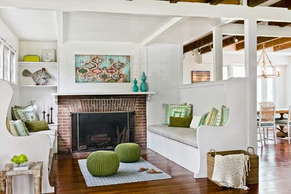
Shown: An original living room inglenook, defined by built-in benches, surrounds the home’s brick fireplace; the area was opened to the dining room by taking the interior wall above one of the benches down to its framing. A dropped ceiling overhead contains ductwork and wiring for an upstairs bathroom.
Practicality vs. Charm
For every part of the project, the biggest challenge was also a primary source of the place’s charm: The house did not have conventional interior walls. “The walls were ¾-inch tongue-and-groove beaded boards, and every ceiling showed exposed-beam frame structure,” says contractor Chris Monaco. “That’s common in cottages here. It makes it difficult to hide plumbing and electrical lines.” The solution was to strategically add sections of dropped ceiling and box out other areas throughout the house to act as cover for ductwork, plumbing, and wiring.
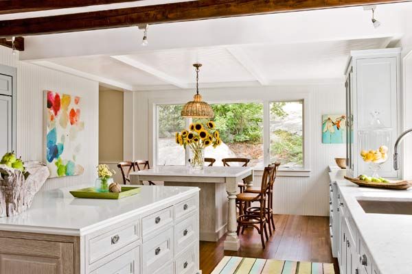
Shown: Two islands—a prep station (foreground) and a mingling and eating bar—help the extended kitchen function for a crowd. The cabinet colors are a friendly mix of white, seafoam blue, and driftwood.
Island: Premier Custom-Built
Stools: Constance Counter Stool, Ballard Designs
Pendant light: Jamie Young Company Udaipur Pendant, Wayfair
Cook’s Quarters
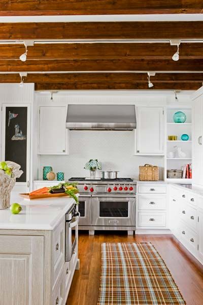
With a plan for hiding the unsightly and staying within the house’s existing footprint, Palumbo and kitchen designer Donna Venegas got to work on the first floor, creating a bright, spacious cooking and entertaining area where there had once been “lots of beadboard and a bad use of space,” says Palumbo. Knocking down walls and annexing several awkward areas—including a dark hallway and a rear entry—they opened up a 19-by-28-foot room. In the process, Monaco found a few rotten timbers, which he shored up with an engineered beam. The layout changes extended the kitchen out to the house’s exterior walls on two sides, where new windows went in, while others were enlarged for more natural light and to provide a glimpse of one of the area’s hallmarks: a craggy landscape of ledge rock.
Shown: The kitchen’s prep island is equipped with an undercounter refrigerator and microwave oven and provides easy access to the six-burner double-oven range.
Cabinets: Signature Custom Cabinetry
Entertaining Overflow
On the inside, the objective was to turn the room into a food-prep area and a prime entertaining spot. “The kitchen is a terrific example of the trend toward making it a family space,” says Venegas. The homeowners wanted the house to be a place where they could really spend time with their boys; the family loves to throw parties for the entire hockey or lacrosse team—parents and children—so they might have as many as 30 adults and 15 kids in the house at one time. To create a mixing and eating spot for the whole crowd, Palumbo designed two marble-topped islands, one for fixing or serving food and the other for those enjoying it to gather, sit, and share. An area of dropped ceiling above the social island was built from tongue-and-groove fir beadboard, to match the room’s original walls, and houses ductwork and wiring. Surface-mounted track lighting lines the kitchen beams that remain exposed, illuminating cooking tasks.
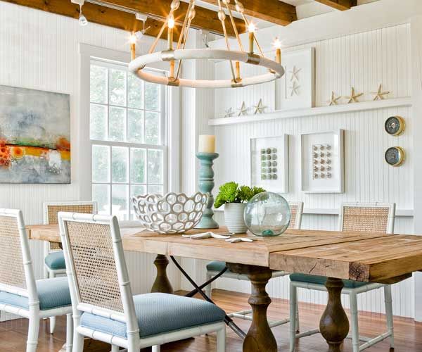
Shown: Guests can spill from the kitchen through a swinging door to the dining room’s long table. The room’s heart-pine floors, beadboard walls, and ceiling beams are all original.
Dining table: Vintage Farm Tool Dining Table, Restoration Hardware
Chairs: Aubrey Chair, Bungalow 5
Chandelier: Dean Chandelier, Made Goods
Old-Style Dining Service
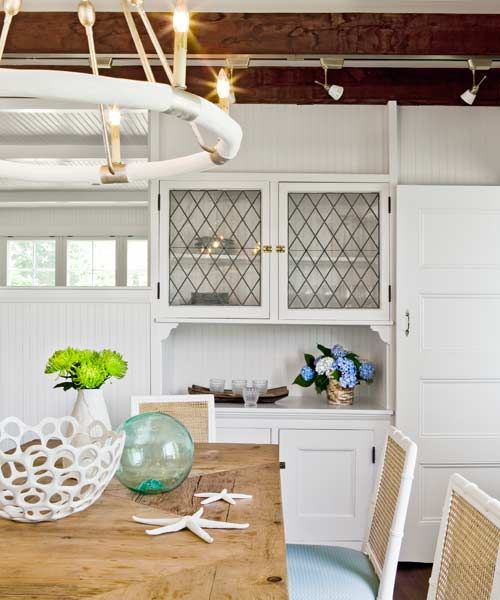
The dining room, adjacent to the kitchen and connected by an existing swinging door, was hardly touched: The walls, beams, and heart-pine floors are all original. To improve the flow of light between the dining and living rooms, Palumbo wanted to remove an interior wall—a controversial call, since it served to enclose an original inglenook flanking the house’s fireplace. In the end, the wall directly above one of the built-in benches was opened up, with the supporting posts left intact; the revision not only lets light shine through from windows on both sides but also successfully unifies the two rooms.
Shown: An original built-in cabinet was refreshed with white paint, and new shelving was added behind the base-cabinet doors. The swinging door between the dining room and kitchen is also original.
Creating an Attic Retreat
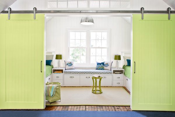
Next up: the large-scale renovation of the third floor’s undefined attic, where slanted walls, few windows, and floor-to-ceiling original unfinished beadboard left it feeling dark and airless. The homeowners envisioned it as both a private and a social space for their teenage sons, complete with built-in beds and a furnished area where they could kick back with their friends. “They wanted it to be lively and fun,” Palumbo says, “while respecting the historical nature of the house.”
Shown: Beadboard-fronted built-ins, barn-style sliding doors, and a fresh color palette enliven the new attic retreat.
Bench fabric: Zig Zag in Azure/Peridot, Mally Skok Design
Paint: C205 Retro Lime (sliding barn doors), C2 Paint
Slide for Privacy
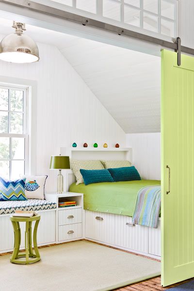
Throughout the space, the beadboard was pulled up so that spray insulation could be added; the boards were then reinstalled, and the ceilings and walls were painted white. Barn-style sliding doors, painted a lively lime green, were added to the newly windowed bedroom alcove; transom windows above the doors help natural light flow to other rooms. A new bath sits across the hall. The hanging-out area, which got a larger window and a room-width window seat, is nestled inside the home’s front gable end. Altogether it’s a space the kids and their friends gravitate to, playing knee hockey in the long, open center space and rolling out sleeping bags at night.
Shown: Sliding barn doors with stainless-steel hardware add definition and a touch of whimsy to the bedroom. More transom windows above the doors allow light to flow from one end of the third-floor space to the other.
Up and Away
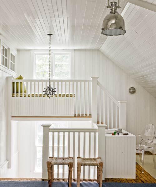
With the two big projects complete, the rest felt more like cleanup than major construction. The stairway leading from the second to the third floor got a rebuilt railing. Second-floor bedrooms got fresh paint; and those bathrooms received their redos. “Simple and neutral was the idea,” says Palumbo, who used white fixtures, natural slate and limestone for the floors, and more beadboard for walls and vanities.
Shown: An original third-floor staircase leads to a new built-in seating area opposite the one window in the house that offers a water view. Transom windows (on the left) channel light into the new bathroom.
Clean and Tidy
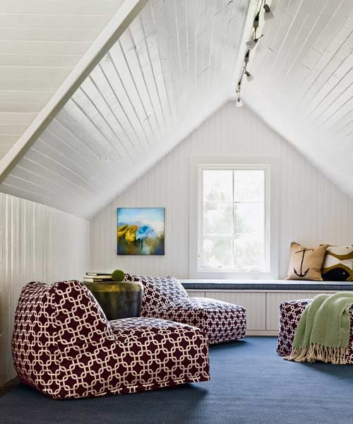
That same easy-going spirit is found throughout the home, a place with room for everyone. The wife says she feels as relaxed with a house full of guests at holiday time as she does on a quiet summer weekend with just the family. “The house had a wonderful, happy warmth to it and a genuine historical look,” she says, noting what sold her on the place from the start. Then she sums up the real success of the reno: “And it still does.”
Shown: The open lounge area on the third floor includes a wall-to-wall window seat and low-slung beanbag chairs.
Beanbag chairs: Bean Bag Chair in Links, OC Fun Saks
Unfussy Bath
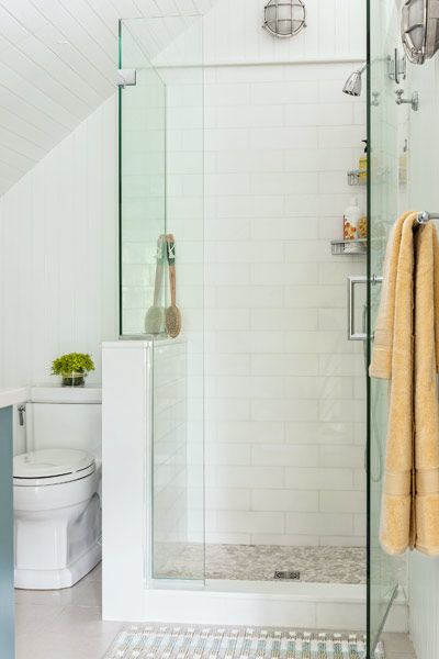
The new bathroom in the teen quarters is unfussy and functional. The subway-tiled shower is enclosed with frameless glass.
Shower doors: Jenka Glass LLC; 978-276-3066
Dose of Teal
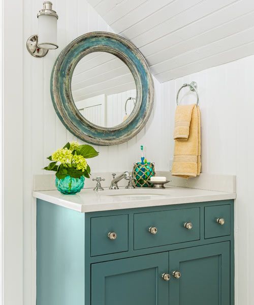
The mirror and vanity offer a hit of teal-blue color in the new bath.
Low-Key Palette
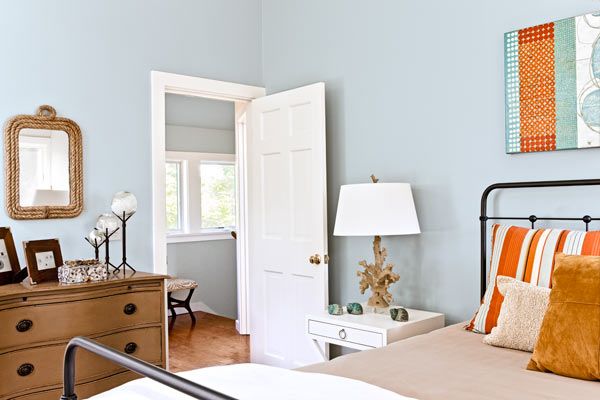
Two bedrooms in the 1980s over-the-garage addition were upgraded with new wall finishes, including this driftwood hue.
Rooms to Spare
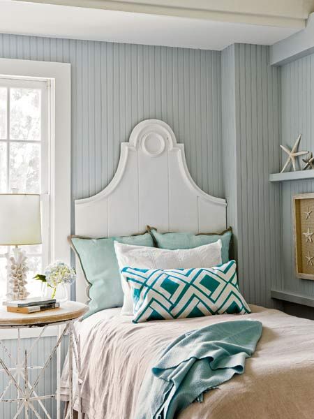
A second-floor bedroom in the original part of the house was updated with newly painted beadboard walls in a cool gray-blue.
Original Covered Porch
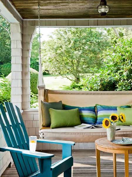
The existing covered front porch was left intact, and the floor and ceiling were refinished. A new porch swing is a favorite reading spot.
Porch swing: York Harbor Porch Swing, Penobscot Bay Porch Swings
Great Outdoors
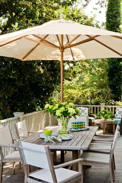
The new deck, which extends from the side of the front porch to wrap around the house, was built with fir planks, keeping the footprint from a decrepit previous structure. The eating area can be easily accessed from the dining room.
Floor Plan: First Floor
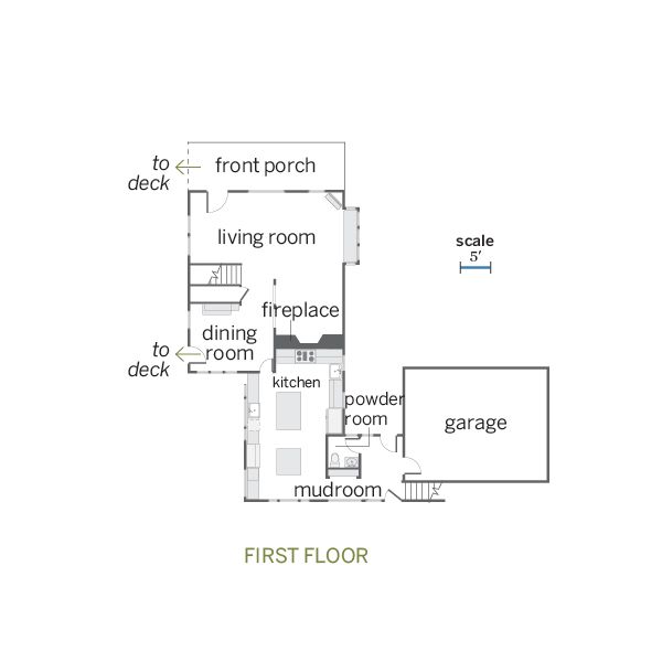
Inside, the new, expanded kitchen stretches from the back of the existing fireplace to the far exterior wall.
Floor Plan: Second and Third Floors
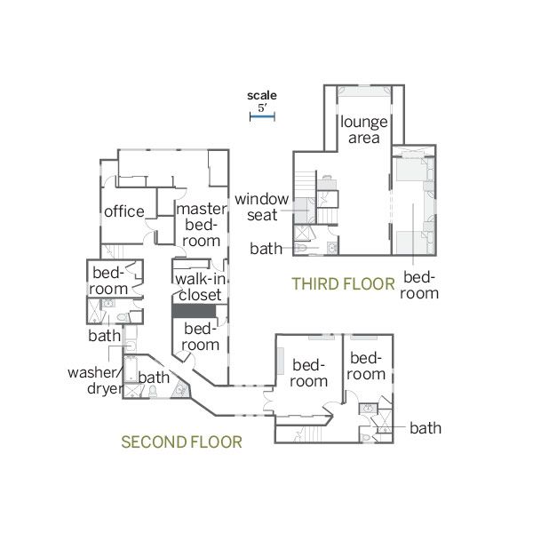
A bedroom, a bathroom, and two seating areas were carved out of the former attic.
