Lots of Storage for a Happy Family Home

Luxury means different things to different people. Take, for instance, Christian and Erika Loubek, who live in a revamped 1914 home in Venice, California. When asked to single out a favorite new feature, Christian raves about a built-in sponge drawer next to the kitchen sink. A sponge drawer? “It may sound silly, but we get such joy from having places to put away everything we use,” he explains. “Of course, we need a sponge to wash our dishes, but we don’t need to see it sitting out on the sink when we’re done. Having a drawer to hide it in feels downright extravagant.”
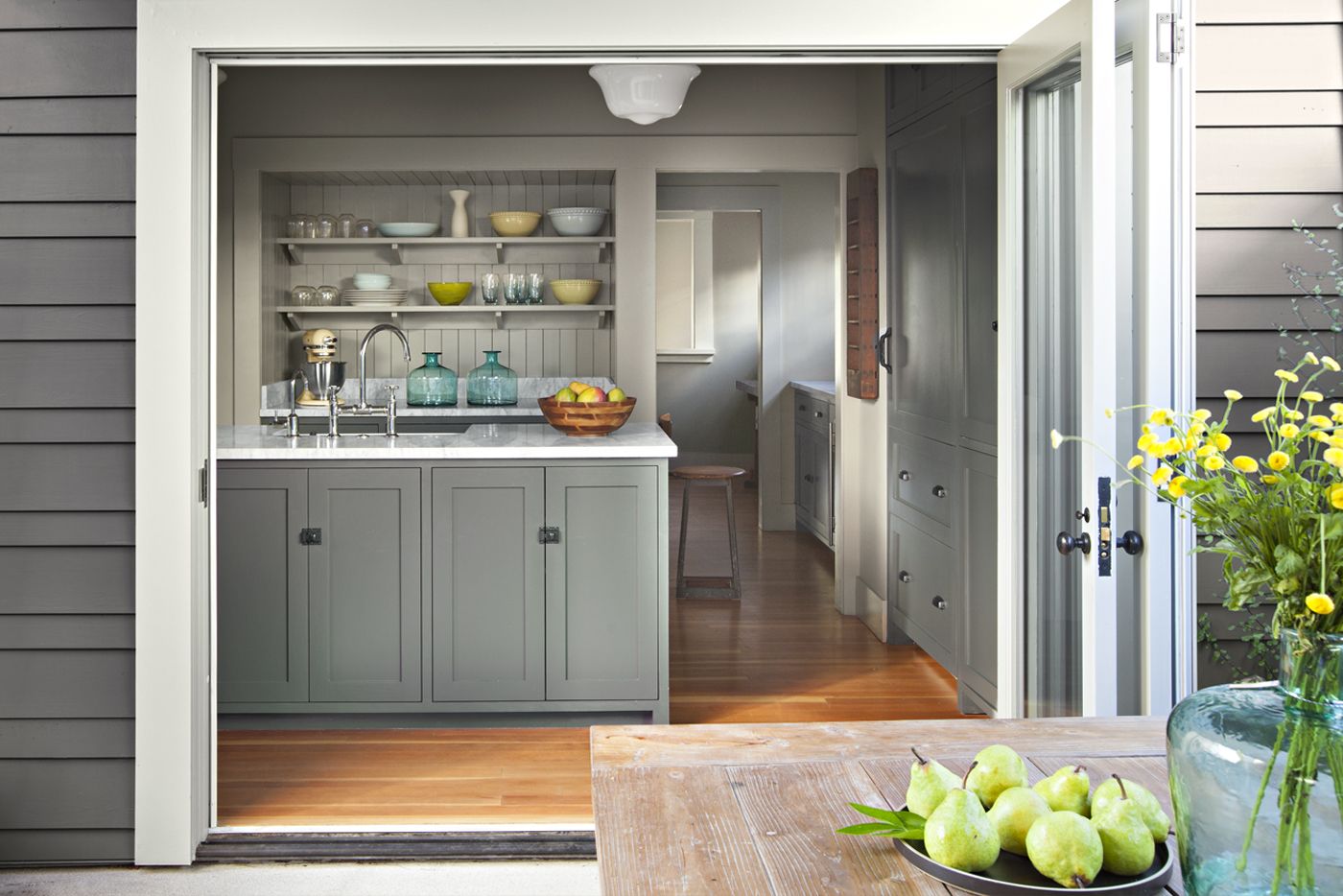
Shown: Christian and Erika Loubek, with their 2-year-old daughter, stand by the back door that leads to their kitchen. The Dutch door, original to the house, was moved from the laundry room.
Pedestrian Street-Facing House
This handy feature, like many others, was the inspiration of their architect, Kirk Blaschke, who has worked on many of the area’s period houses and once owned this particular home himself. The remodel he designed for Christian and Erika expanded the house to just 1,978 square feet of living space—hardly a castle. But a clever layout and highly functional spaces, with plenty of built-in storage and smart details like the sponge drawer, provide the features that the couple find so luxurious.
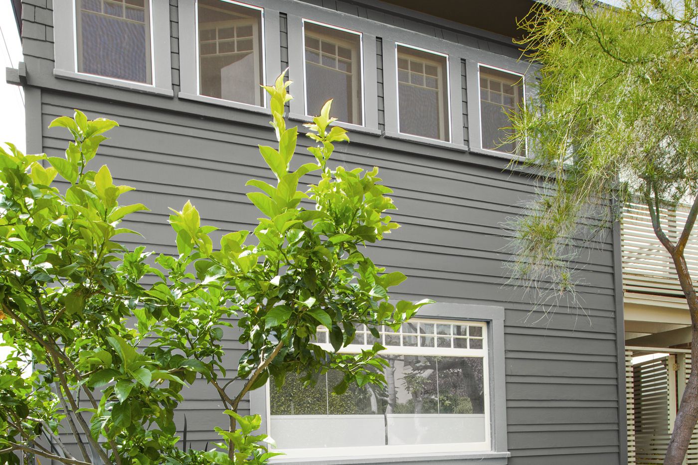
Shown: The front of the house faces a narrow, pedestrians-only street; the main entry is on the side. The original portion features a mix of architectural details, including a Prairie-style horizontal band of windows and cottage-inspired shingle siding.
Architect: Kirk Blaschke and Jeff Morrical, Lot 05, 1024 Harding Avenue, No. 202, Venice, CA; 310-663-6692
Paint: Benjamin Moore’s Steel Wool Steel Wool (exterior walls)
Charming Front Porch for an Easy Side Entrance
When Christian bought the house, in 2007, he didn’t imagine transforming it so radically. Back then, he lived in New York City, traveling often to his native Southern California for jobs directing commercials and films, and wanted “a place to touch down when I was working here,” he says. Usually a fan of dramatic, modern spaces, he nevertheless found himself drawn to this modest, 400-square-foot house on one of Venice’s coveted pedestrians-only streets. The boxy, two-story home was in good shape thanks to the renovation its then-owner, Blaschke, had completed three years earlier. “Kirk modernized it, updating the electrical and plumbing and opening up the stairway as well as the space between the living and dining rooms, without stripping away the details that give it charm,” says Christian, pointing to divided-light windows in the living room and column-topped half walls between it and the dining area, which remain intact.
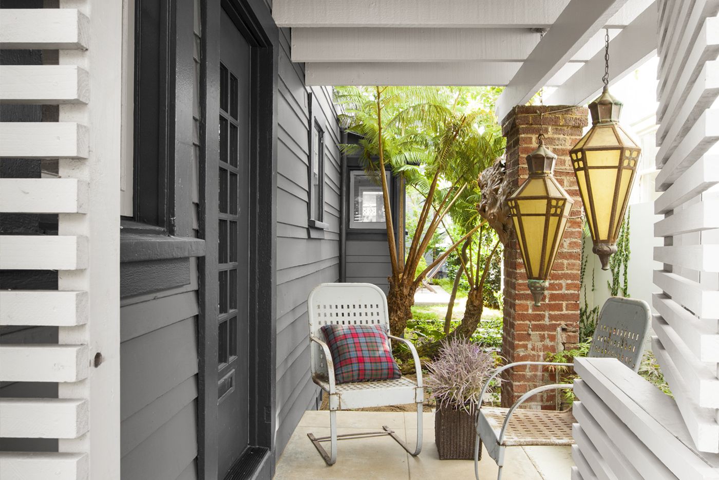
Shown: The covered front porch creates a transition from the street to inside. Its Dutch door–style entry (foreground) is made from slatted panels for privacy. The Art Deco–era pendant fixtures originally hung in a church.
Paint: Benjamin Moore’s Sea Haze (slatted panels); custom color, courtesy of Cox Paint (door, doorframe, window trim)
Art Deco–era pendant lights, metal pendant fixture: Obsolete, Inc.
Original Entry Left Intact
Then Christian met Erika, an actress, and began to see the house as more than just a short-term landing spot. The couple started to talk about living in Venice full-time and how they might change the home to suit their needs. Eventually they fleshed out priorities for a next-wave renovation: a master suite that offered privacy; a TV room separate from the main living spaces; a home office; and a garage for two cars, a rarity in a beachside area where parking is a premium. “Basically, we wanted our space to live twice as large,” says Christian. It was a tall order for a house on a small lot, with clearances of as little as 11 inches from the property line.
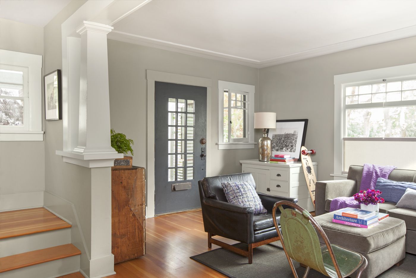
Shown: On the first floor, the original entry door, windows, and half walls topped with columns were left in place during the remodel. New vertical-grain Douglas fir floors add warmth, and a cream-and-gray paint palette serves as a quiet backdrop for eclectic furnishings.
Paint: Farrow & Ball’s Lamp Room Gray (walls, trim); Benjamin Moore’s Titanium (windows, trim)
Carpets (dining room, bedroom, and nursery): Tumblweed & Dandelion
Dining Area Defined by Original Molding
Not surprisingly, of the half dozen proposed designs they got from architects, it was Blaschke’s that hit the mark. His plan gave them the features they wanted while increasing the indoor square footage by about 40 percent. The existing half bath/laundry on the first floor and the sunroom above it—an earlier addition and structurally unsound—would come down. In their place, Blaschke proposed an 8-foot-deep bumpout spanning the house’s full width, with a generous-size kitchen downstairs and a laundry and reading nook upstairs. He placed a separate building at the rear of the property for a garage with a master suite above it. Then he connected the two structures with a glassed-in bridge, which looks down onto a new 425-square-foot courtyard with dining area. This unusual floor plan lets sunlight pour into the house from many angles, and the courtyard can be used year-round.
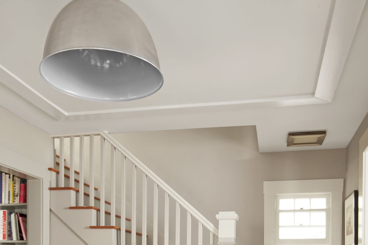
Shown: A frame of molding on the ceiling above the dining room is original to the house and helps define this area next to the living room. The metal pendant fixture over the dining table was found at a local antiques store.
Tidy Office Niche
Some parts of the remodel required more thought than others. The living room and adjoining dining area remained intact except for a fresh paint job and new hardwood flooring. It was also a no-brainer to move the kitchen to the back of the house so it could open onto the courtyard, and to nix the second-floor sunroom to make way for a staircase landing.
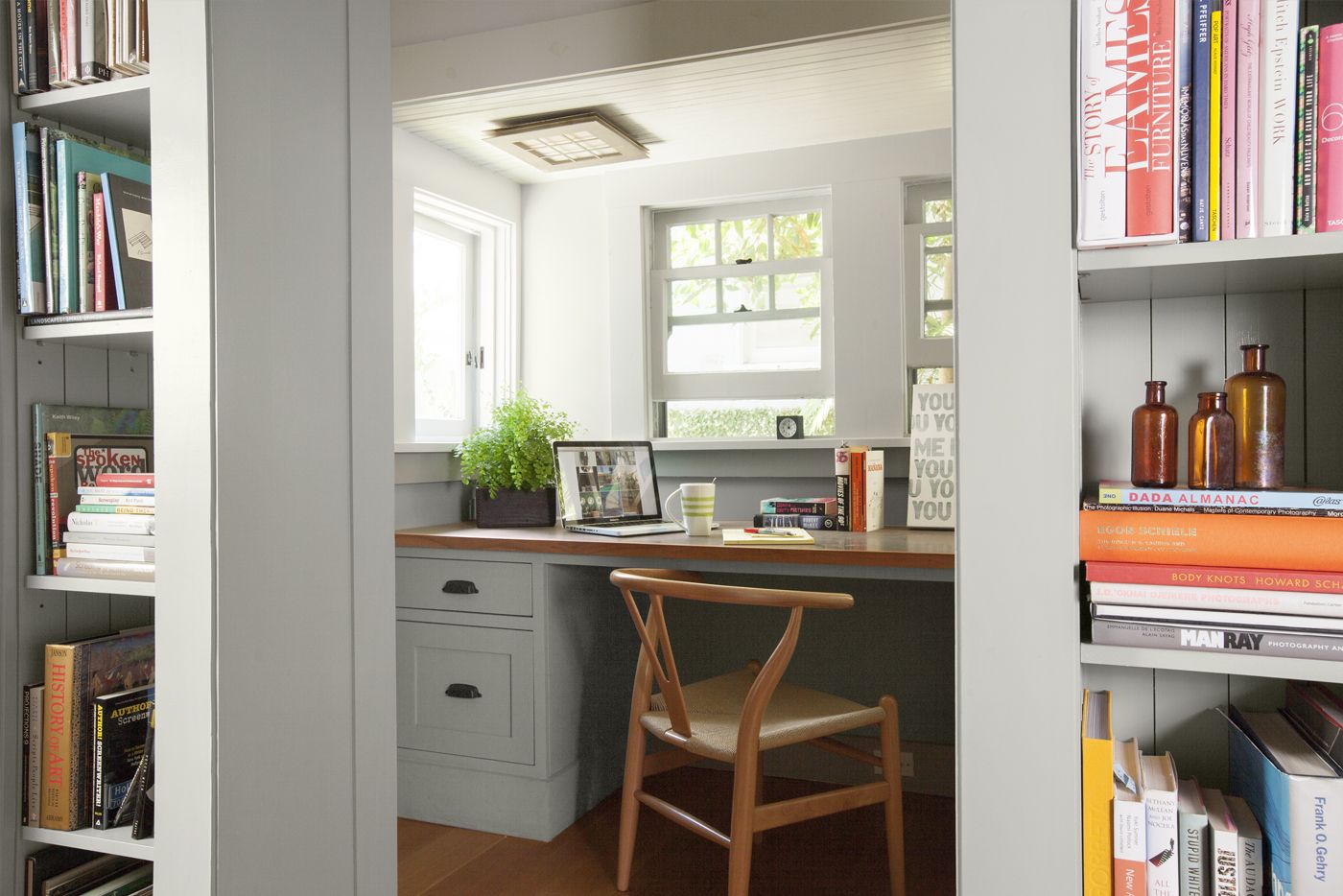
Shown: Christian’s office, off a hallway between the dining room and the kitchen, features a built-in zinc-topped desk. Electrical outlets are hidden below the desktop, and a printer, used only occasionally, is tucked inside a cabinet.
Office chair: Hans Wegner
Sleek, Useful Butler’s Pantry
For other spaces, the back-and-forth discussions were, in a word, spirited. “I renovated a rowhouse in Brooklyn, plus I’m a director, which means I’ve got the potential to be a nightmare client,” Christian says with a laugh. “And Erika and I didn’t always see eye-to-eye creatively, but Kirk became our de facto arbitrator.” Blaschke drilled deep into the couple’s lifestyle in pursuit of making the most of every square foot. He used the details he extracted—from where they liked to sit to eat breakfast to the heights of their books and the types of cookware they would store in every kitchen cabinet—to fine-tune each space. “The more information, the better the design works,” he says.
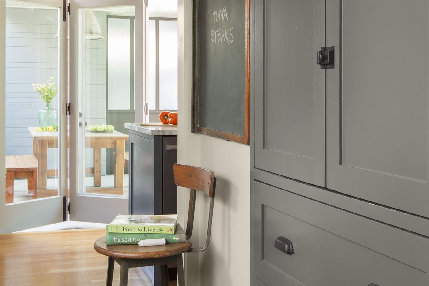
Shown: The new butler’s pantry connects the dining room and the kitchen. “It’s a perfect spot for setting up an open bar when we’re entertaining,” says Erika of the countertop opposite these cabinets.
Paint: Farrow & Ball’s Down Pipe (cabinets)
Vintage Stove as Kitchen Focal Point
The rooms, though modest in size, are packed with function. Numerous niches and alcoves with shelves or built-ins recall the house’s Craftsman-era roots and help to visually marry old and new spaces. The new master bedroom isn’t much bigger than the bed itself and features built-in dressers and sliding beadboard doors that disguise closets. Downstairs, two parallel hallways leading from the dining area to the kitchen serve as destinations as well as transitional spaces. One is a butler’s pantry. The other holds a half bath and Christian’s writing nook.
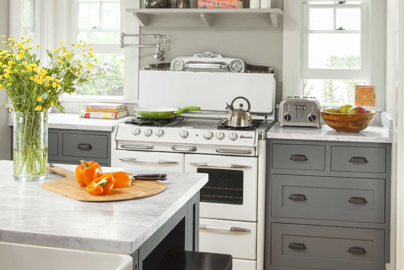
Shown: Windows flank the area above an O’Keefe & Merritt stove that came with the house, making it a focal point in a room that brings together vintage flair and modern conveniences. A pot filler and an open shelf keep necessities within arm’s reach and away from a toddler’s curious hands.
Pot filler: Axor Montreux; Hansgrohe
Countertops: Carrara marble
Kitchen sink: Franke
Flush Features for a Compact Kitchen
At one point the couple considered making the second-story bridge an open-air walkway, and initially Christian wanted it to extend in a straight line from the landing to the master bedroom. Ultimately they settled on a glassed-in design that doglegs left off the landing, leaving room at the top of the staircase for a comfy, L-shaped window seat with storage. “It’s a perfect spot for reading with our daughter,” Erika says.
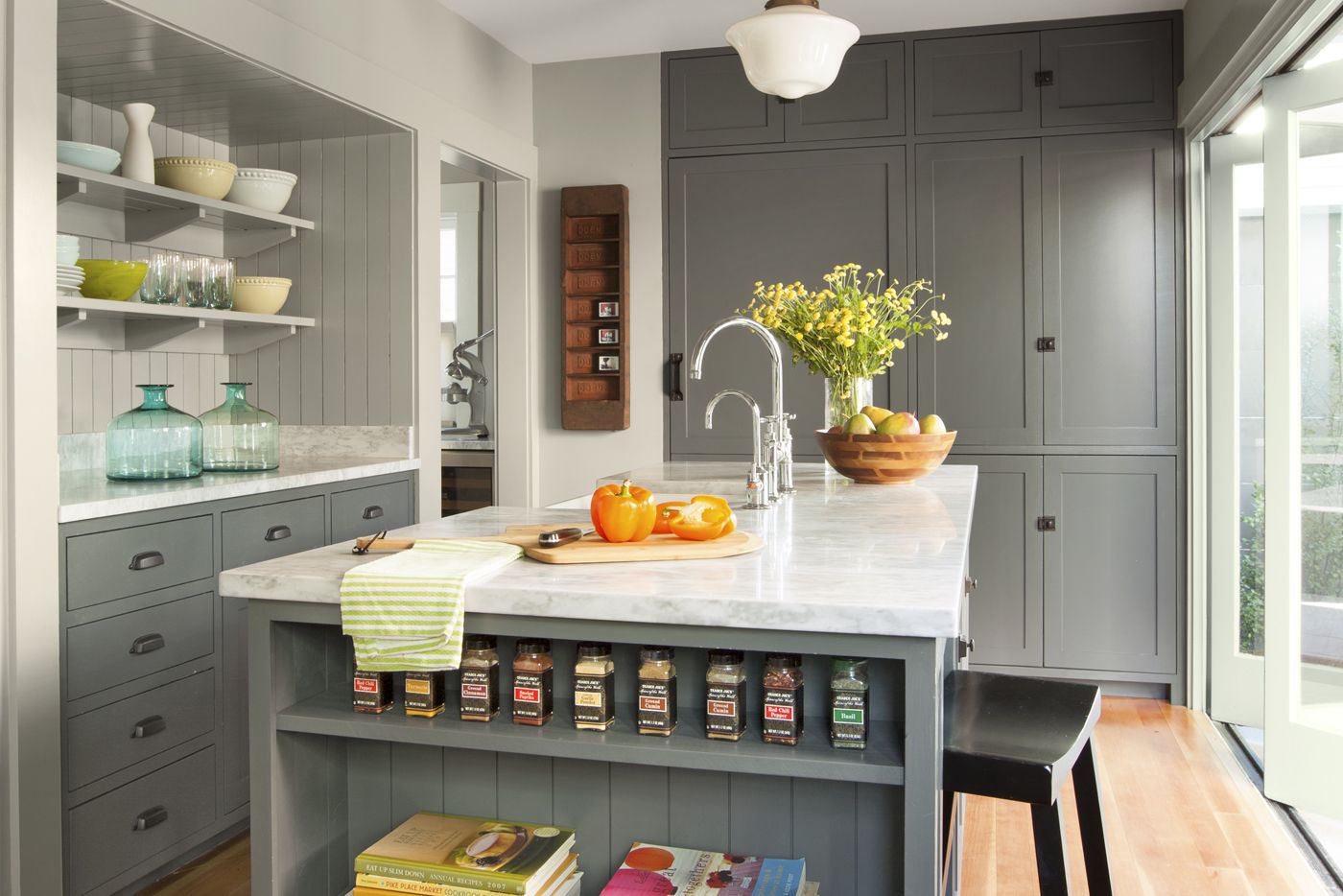
Shown: The compact kitchen is just 8 feet wide. Recessed shelving, loads of drawers, and a paneled fridge that sits flush with full-height cupboards on the back wall keep the space uncluttered and efficient.
Refrigerator: Sub-Zero
Dishwasher: BOSCH
Kitchen Meets Outdoor Dining Area
Construction went relatively smoothly due to Blaschke’s “planning every detail down to the last screw,” say the couple, and the building team, who got them out of a few jams. When a web of overhead power lines made it impossible to use a crane to hoist a 500-pound heat pump onto the roof, the crew improvised a low-profile block-and-tackle system of ropes and pulleys for the job. And for the courtyard fireplace, vintage bricks of the correct proportions were beyond the couple’s budget, so the contractor found larger, used bricks and cut them to size on-site.
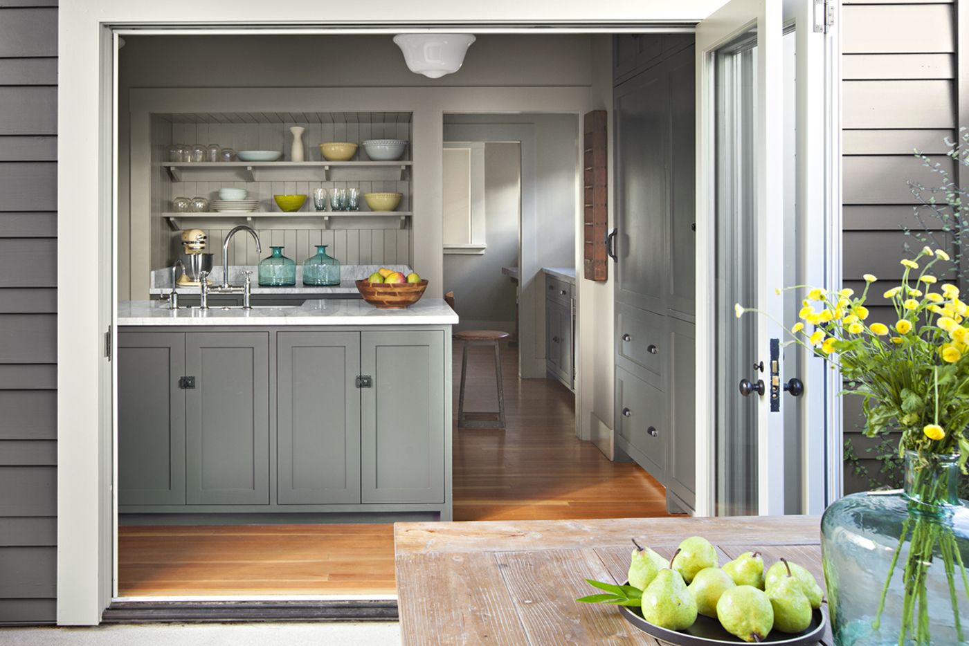
Shown: A folding patio door retracts to seamlessly connect the kitchen to an outdoor dining area right beneath a second-story “bridge.” The remodel brought in lots of built-in features as well as appliances concealed behind Shaker-style cabinet doors.
Courtyard with New Lofty Bridge
Christian and Erika had been married all of two days when they tossed their keys to the contractor. The project was finished a year later, and by the time they moved back in, Erika was pregnant. For now, their daughter sleeps in a nook on the bridge near the master bedroom, the only space in the house that didn’t have a clear purpose before the renovation started. “Life decided for us in the best possible way,” says Erika.
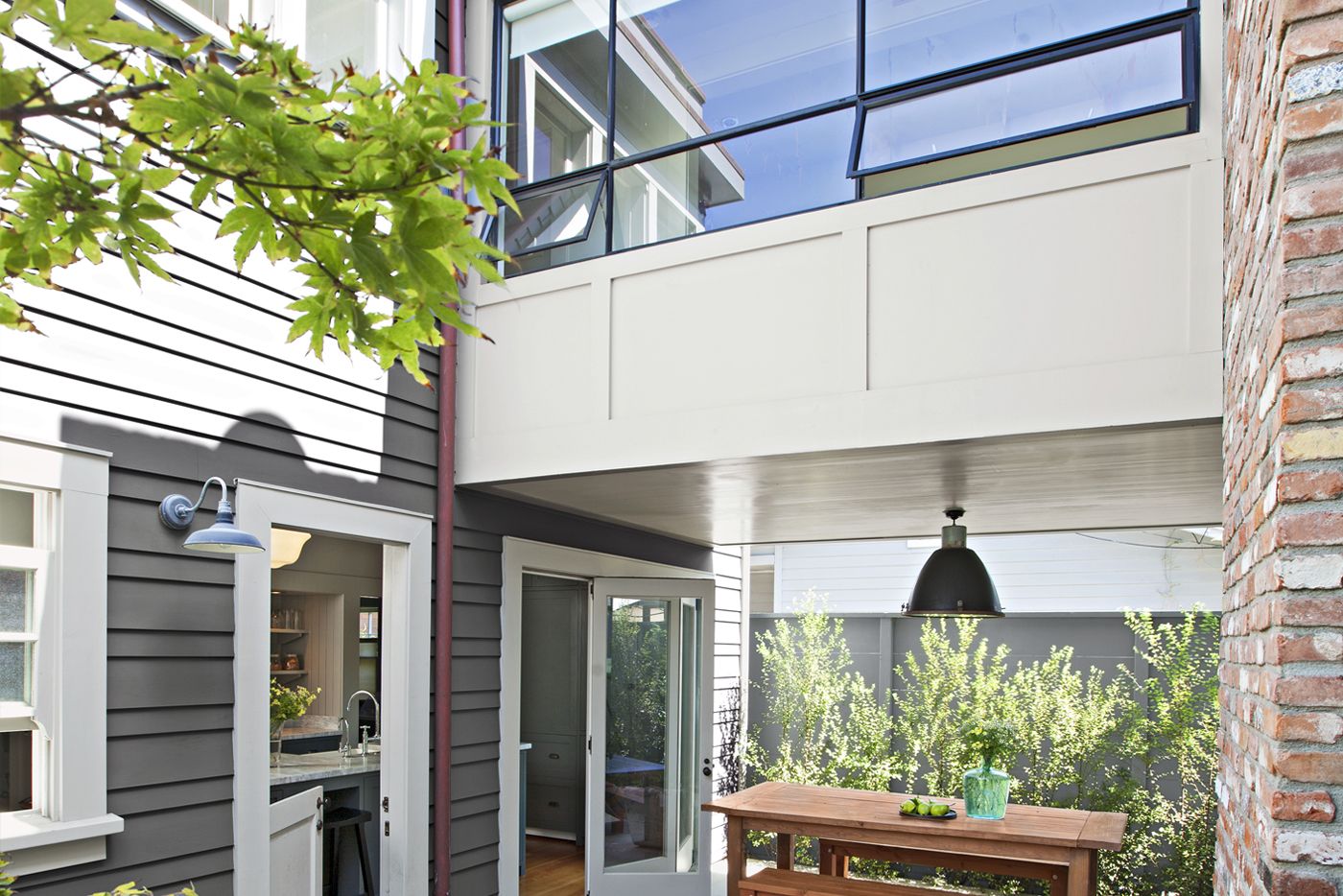
Shown: The courtyard is sandwiched between the bumpout and the new garage/master suite. The glass-enclosed bridge lets in lots of natural light. The original 1914 house was reinforced structurally and given a partial new foundation to handle the bridge’s weight.
Siding: Nusku Fireblocker
Patio chairs: Willy Guhl; vintage
Second-Floor Landing Window Seat
The couple hope their little one will grow up to share their love of the house’s whimsical touches, like the vintage OCCUPIED sign above the half bath’s doorway that lights up when someone flips the interior switch. Or the dual entrances to the garage, which have HIS and HERS stamped into the concrete. Or the second-floor bath, where an original window from the old house is installed on an interior wall. “Our daughter locked herself in the bathroom once,” says Erika, “and we just climbed in through the window to set her free.”
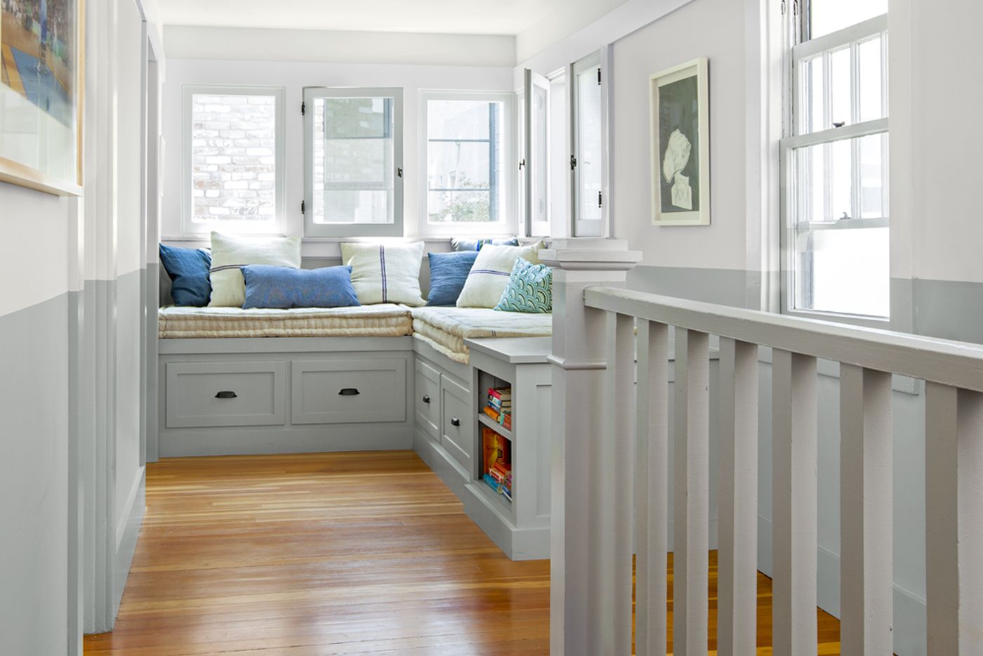
Shown: On the second-floor landing, a deep L-shaped window seat was built using parts of a bench from the sunroom that previously occupied this spot. The half-gray, half-cream wall color in the stairway was continued to the newel post, railing, and window trim. “It was an offbeat choice, something fun,” says Christian.
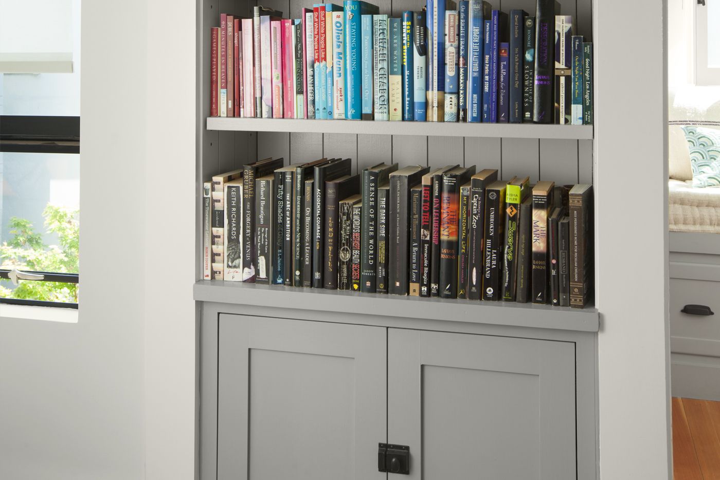
Storage-Savvy Recessed Bookshelf
More than anything, the couple appreciate how the revamped house has changed their lifestyle for the better. “We cook at home more often now, and we spend more time outside, reading or relaxing in the courtyard,” Christian says. He loves the view at night from the master bedroom toward the front of the house. “It feels like I’m in a turret, looking across the courtyard to another wing far away,” he says. “Which is funny, since the house isn’t very big.”
Size isn’t everything. Turns out they live in a castle after all.
Shown: Blaschke tucked extra storage into every nook and cranny, such as this recessed bookshelf and cabinet in the wall between the bridge and the L-shaped window seat.
Hidden Closets in the Master Bedroom
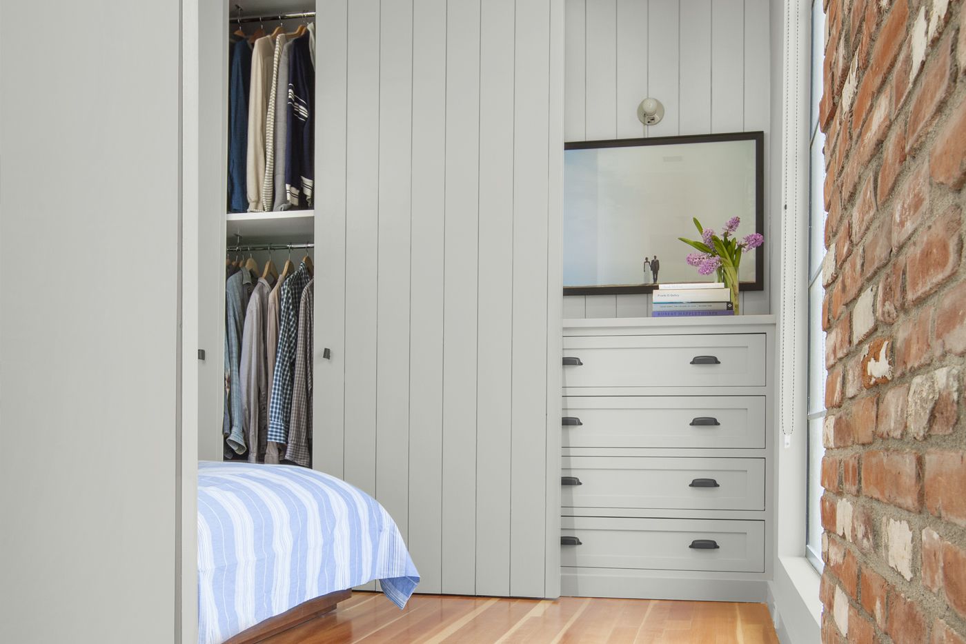
In the master bedroom, built-in bureaus and his-and-hers closets concealed behind beadboard sliders line the walls that flank the bed.
Vintage Touch in the Master Bath
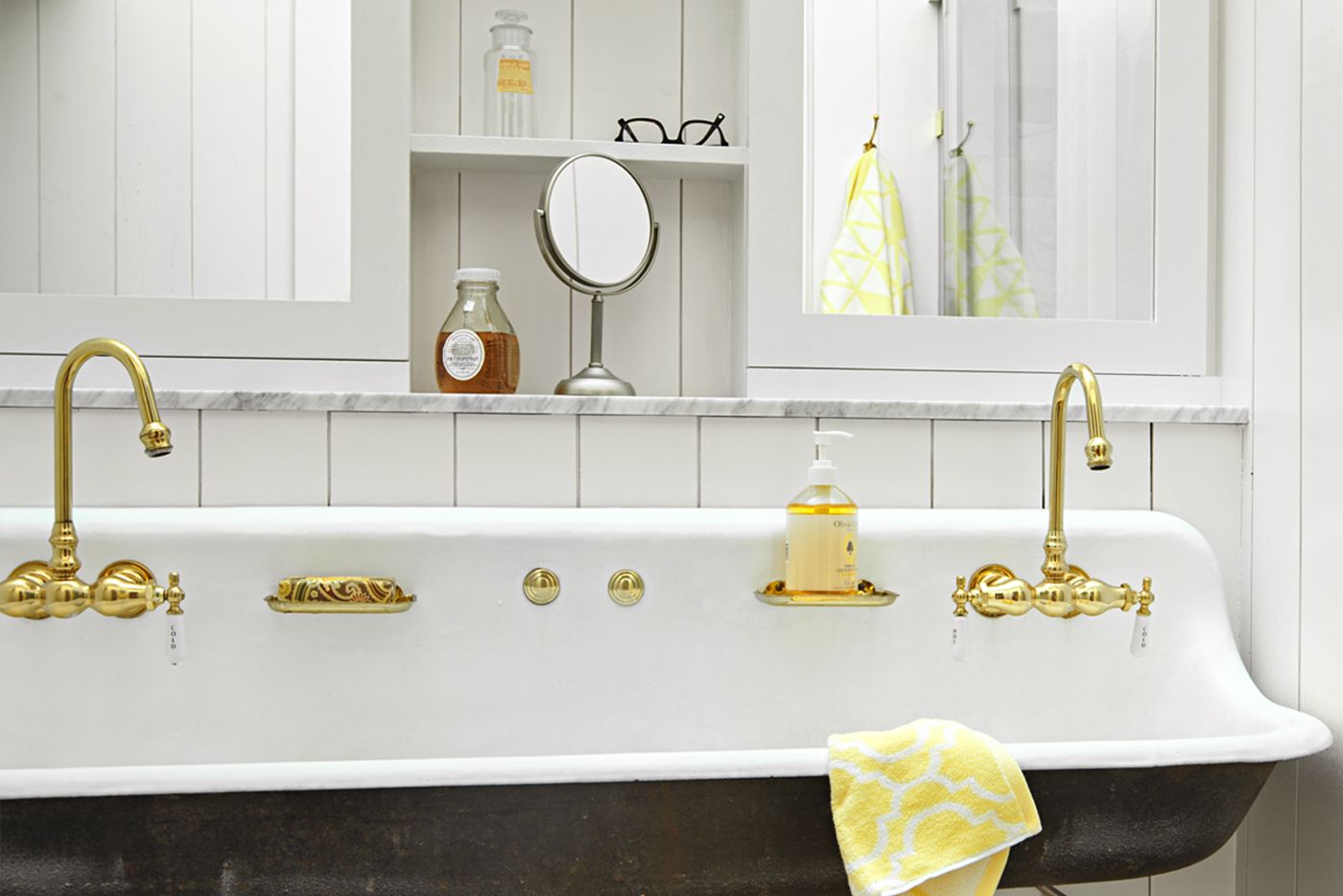
A wall-mounted 5-foot sink lends a vintage touch to the master bath. Above it, mirrored door panels flank recessed shelves.
Sink: Kohler
Faucets: Sign of the Crab
Master bath sconces: Olde Good Things
Interior Bridge with Room for a Nursery
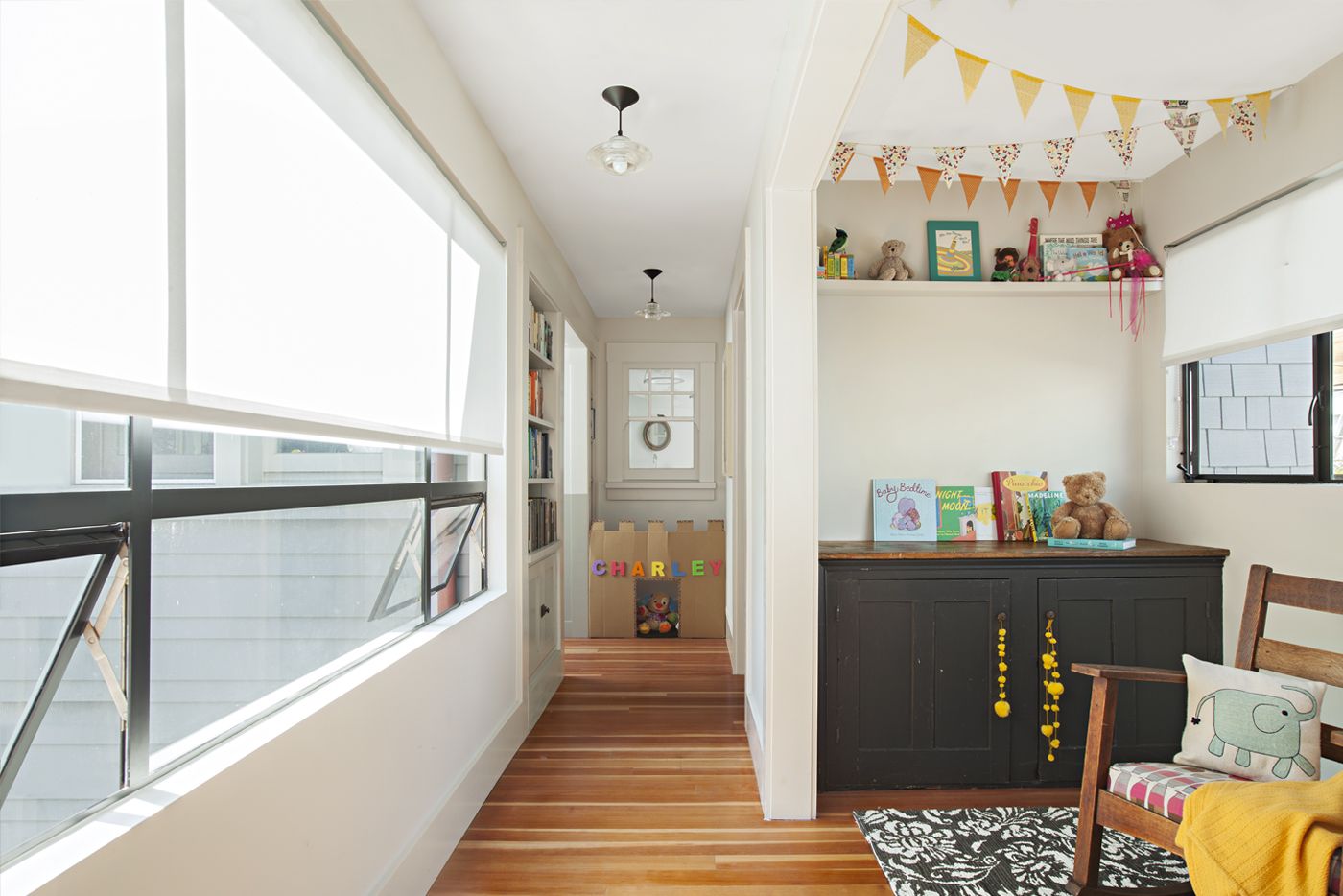
From the master suite, the bridge looks toward an interior wall of the guest bath, where an original window from the old house was installed. The couple’s daughter plays make-believe in the space beneath it. The nook on the bridge that became her nursery was, by chance, just wide enough for a crib on one side and a changing table with storage for baby clothes on the other.
Metal-frame windows: Metal Window Corporation
Easy-Access Nursery
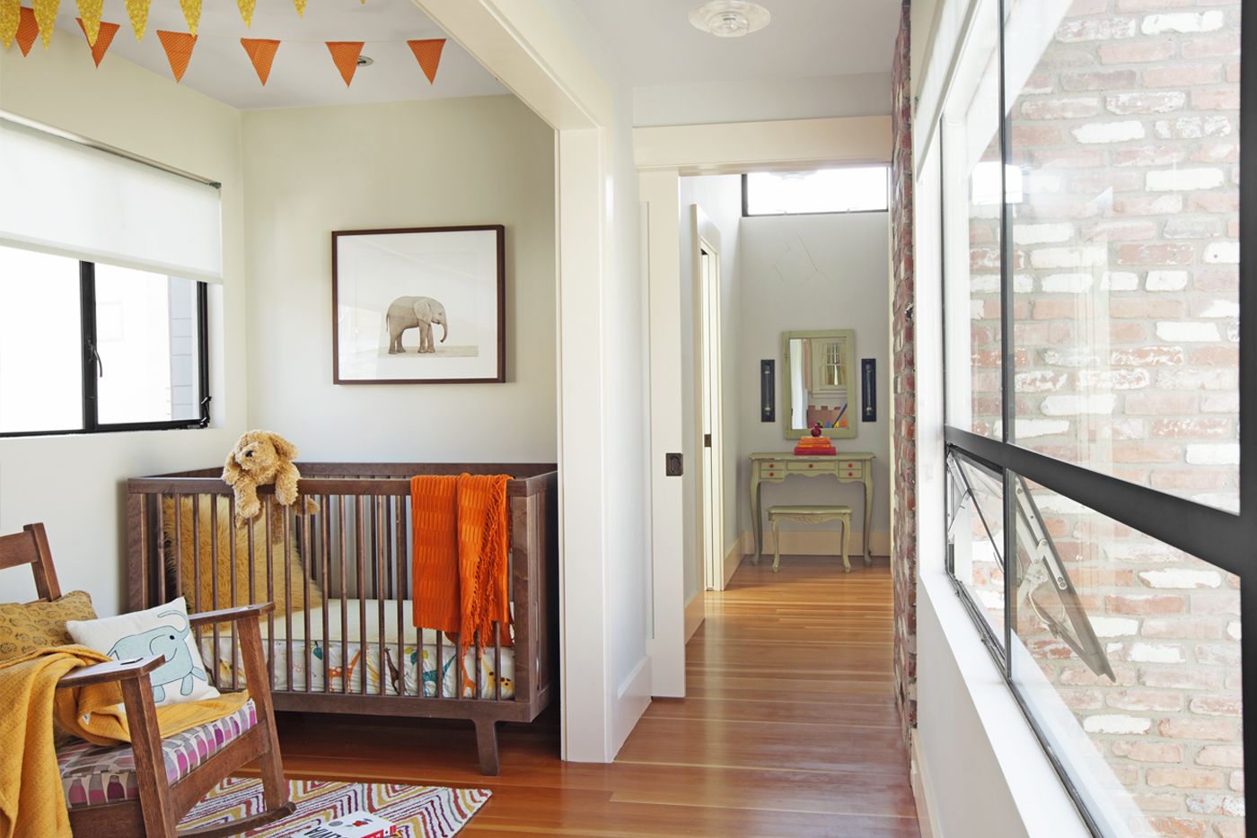
The nursery nook, a few steps from the master bedroom, is just large enough for a crib, rocking chair, and changing table (not visible). Down the short hallway, a vintage dressing table finds a place between the master bath on the left and a closet on the right. When needed, a pocket door closes off the master suite.
Bumped-Out Space: First Floor Plan
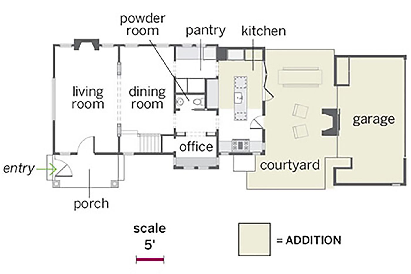
The two-story house grew by about 40 percent, from 1,400 to 1,978 square feet of living space. The first-floor addition became the new kitchen, which opens onto a courtyard with a dining area and, just beyond, a new garage. The original kitchen became a butler’s pantry on one side and a home office on the other.
Multi-Use Bridge: Second Floor Plan
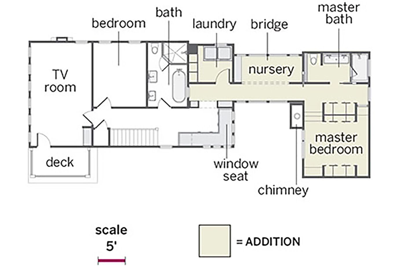
On the second floor, a bridge, now the nursery, was added to connect the new master suite to the existing bedrooms, one of which became a TV room. The laundry room moved upstairs next to a reading nook with a window seat, where a sunroom had been.
