An American Antique
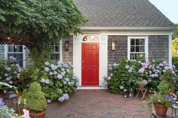
As American houses go, they don’t get much older than this. Its original portion is one of historic Provincetown, Massachusetts’s earliest survivors, built facing the bay to greet travelers who made their way to its front door by sea or along the “shore road,” as the beach was sometimes called.
“Unfortunately, most of the town records were destroyed by a fire in 1850, so we don’t know exactly how old the house is,” says interior designer and co-owner Kevin O’Shea. “But we know it was already here in 1750.” Martin House, as it is known locally, after the last restaurant that operated on the premises, now backs up to Commercial Street, the resort town’s main road. And it is once again a private home after life as a birthing house, a nursing home, and a series of local-landmark eateries said to have been visited by the likes of Al Gore and Jacqueline Kennedy Onassis.
Shown: Framed by neoclassical pilasters and a simple fanlight, the original entry faces the beach. The house came with an expansive brick patio, lined with thriving hydrangeas, that had been used by the restaurants for patio dining. Today it holds a series of outdoor rooms.
Interior designer: Kevin O’Shea Designs, Provincetown, MA, and New York, NY; kevinosheadesigns.com
Added Onto Over The Years
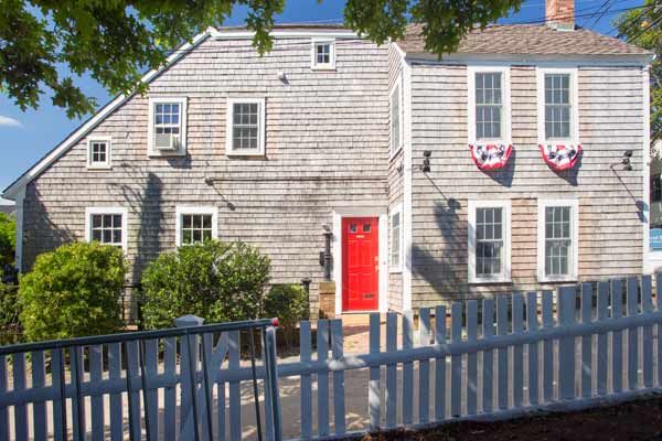
Kevin and his partner, David Bowd, weren’t even in the market for a new home when they were looking for investment rental properties back in 2010. “But that idea went right out one of the pre-Revolutionary War windows once we walked through the door,” says Kevin, and the duo decided to move in, whatever it took.
Shown: The original part of the house is to the left of the red door. The bar is to the right of the door, in the late-18th-century addition. Bunting hangs under the windows of the master bedroom.
A View of The Harbor
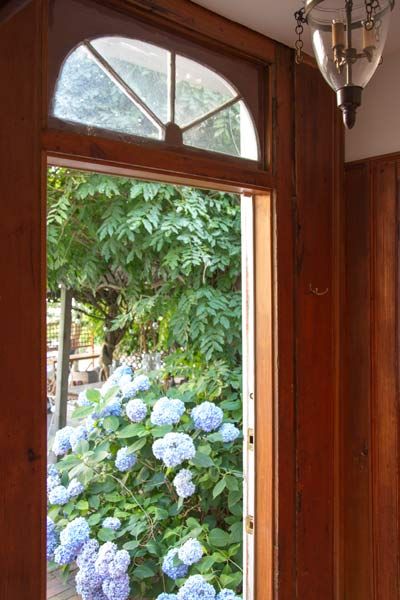
The house they fell for had been constructed in three stages. The original section was a classic three-quarter Cape Cod, with two windows to the left of the front door and one to the right. It was enlarged in 1790 with a two-and-a-half-story ell, which added upstairs bedrooms. The newest part of the building, a one-story “shed” containing a commercial kitchen, had been slapped onto the side of the ell addition when the property was converted to dining use in the 1960s.
Shown: The original entry, with its simple but elegant pine woodwork, looks out onto the harbor at the end of Cape Cod.
Evocative Details
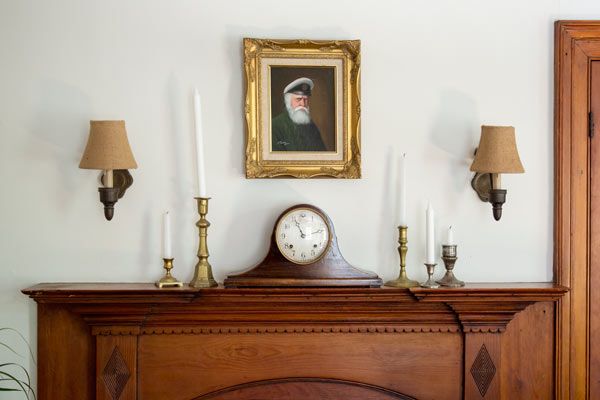
Although the last dessert had been served to patrons of Martin House five years earlier, Kevin and David found themselves in a restaurant that looked “as if they just shuttered the windows and walked away one day,” says Kevin. “The jars in the spice rack were still full.” The original pegged wide-plank pine floors were there, though they were heavily gouged from the constant scrape of restaurant tables and chairs. Some of the windows had been replaced over the centuries, but others allowed the gusting coastal winds full access to the interior.
Shown: The fireplace in the living room is original. The objects around it, including Kevin’s grandfather’s mantel clock, are all antique or vintage. The portrait is known as “the captain of the house.”
Calling on Historical Cues
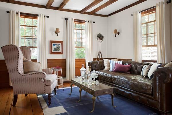
Despite the obvious issues, the place had an aura. “I loved all the historical details,” says Kevin. “And we were both attracted by its quirkiness. I relished the idea of carving out living spaces from this somewhat bizarre house. We saw it for the first time in the morning, and by afternoon I was sketching floor plans.”
Shown: The living room is in the oldest part of the house, with a pair of windows facing the harbor where the Mayflower Compact was signed. The beams, wainscoting, and floors are all original.
Sofa: restorationhardware.com
Cocktail table: 1stdibs.com
Rug: madelineweinrib.com
Wing chair: mgbwhome.com
Wing-chair fabric: duralee.com
Floor and table lamps: arteriorshome.com
End table: wisteria.com
Cohesive Design for Comfort
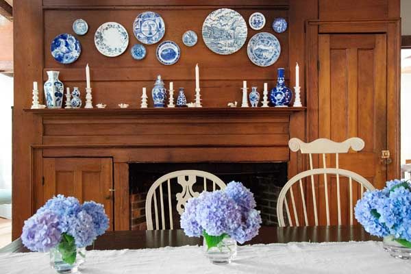
The project would be what Kevin now calls “an additive renovation,” meaning that walls would not be torn down but put up. “I’m not really fond of open-plan living,” he says. “I like the enclosure of rooms, the comfort and intimacy.” Previous owners had gutted the second floor, removing the bedrooms to create open dining space. Three bedrooms would go back in, along with two new baths. The kitchen, which Kevin describes as “a bleak industrial space,” would have to be brought into some kind of harmony with the older areas of the house. Parts of the place needed minimal work, others required significant repair and restoration, and it all had to add up to a cohesive whole.
Shown: The dining room mantel and the wall above it hold a collection of blue-and-white pottery from Staffordshire, England, a tribute to where homeowner David Bowd grew up. Handmade Windsor chairs in various styles are united by a coat of off-white paint.
Homemade Mirrored Bar
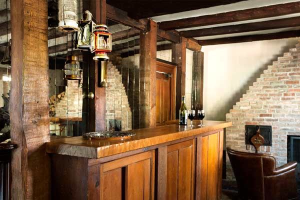
“What we walked into,” says general contractor Mark Nickerson, “was a can of worms.” In addition to the decades of scratches covering the old pine floors, the pine wainscoting had been nibbled on by some unidentified critter, and the electrical and plumbing systems needed to be expanded, particularly with the addition of two bathrooms upstairs.
Shown: Homeowner Kevin O’Shea designed the mirrored bar back—made from 175 individual pieces—to give the space a more expansive feeling. The nearby chimney’s unstable brickwork was encased in salvaged brick.
Restaurant Leftover Doors
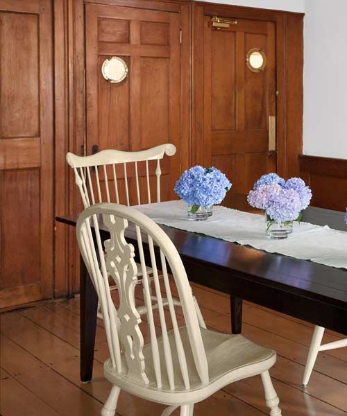
Among the challenges of the renovation were the ancient chimneys. There are two in the house, including a rare one in the original building that vents three fireplaces. Behind their brick mass is a “snug harbor,” a space big enough for several people, that has an opening opposite the original front entry. Apparently it was used by early settlers to warm up quickly after braving the icy Atlantic winters, but it is also rumored to have been used to hide escaped slaves before the Civil War.
Fortunately, the snug harbor was in good shape, but the chimney in the 1790 addition, which had one of two period beehive ovens, was another matter, and Kevin was told that it ought to be demolished. Unwilling to let the piece of history go, he turned to mason Galileo Bonfini, who had moved to the area as a boy and knows as much as anyone about Provincetown’s oldest houses.
Shown: The dining room is used mainly for dinner parties. The portholes in the swinging doors are left over from the home’s restaurant days.
Dining chairs: ashlen.com
Scene Setters
“Some of them were actually built from the timbers of old sailing vessels, and are as tight as ships,” Bonfini says. “Some were even floated to their current sites. When you work under one of these houses, it’s like an archaeological dig. You never know what you’re going to find.” As for Martin House, he says, “the place had been gutted in the 1970s, and it looked like they tore off the outer layer of the chimney and never replaced it.” Bonfini wrapped what was there in a jacket of salvaged brick that preserves the historic construction underneath.
Kevin and David wanted to respect the history of the home, but they also wanted a place that they could live in comfortably. “We wanted to create a sense of evolution over the years, not a frozen moment in time, so that Victorian and even modern elements wouldn’t seem out of place,” Kevin says. “I did want everything to have some age to it, some wear, and both the construction and the decor follow that principle.”
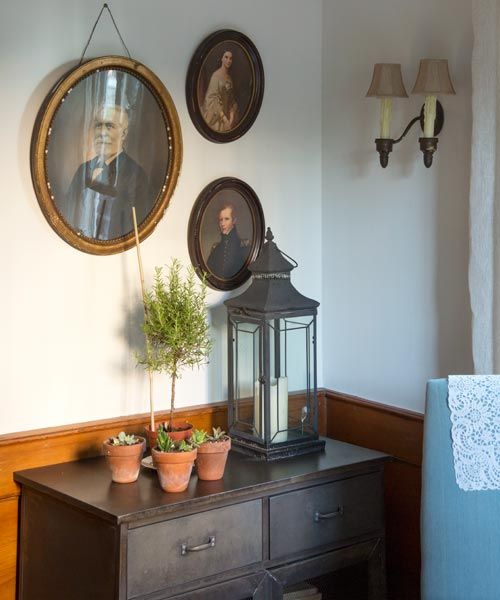
Shown: A trio of portraits in oval frames hangs in a corner of the study.
A Toast to The Past
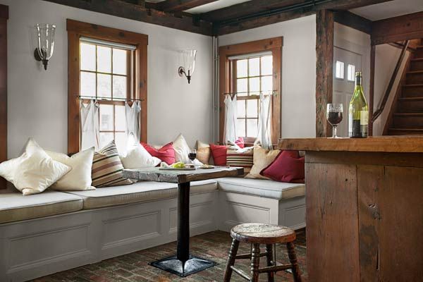
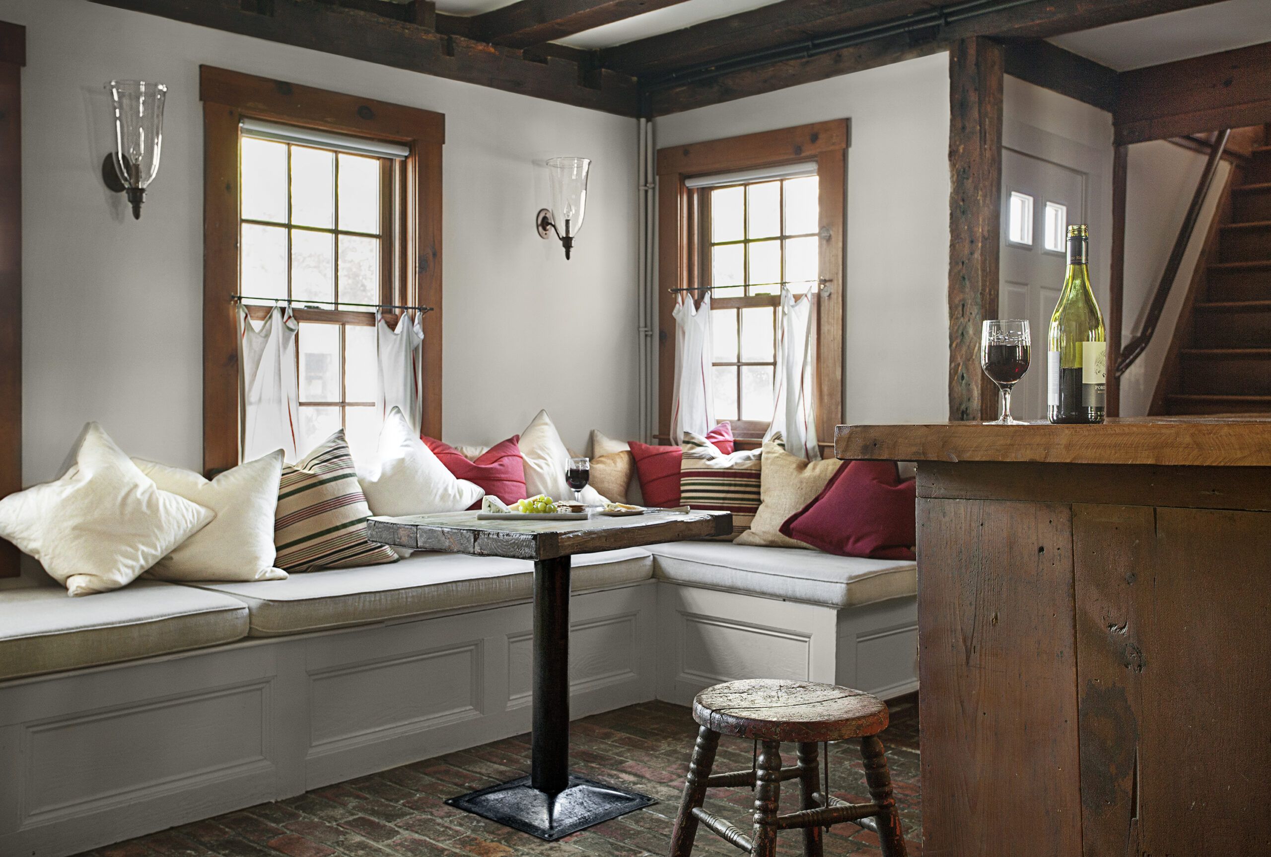
Kevin had wanted to gut the bar, which occupies the ground floor of the early addition, but David talked him into keeping it. “I was stuck on the image of a basement bar in a suburban tract house, with neon beer signs on it, so I had to bring myself around to thinking of a bar in our house—and now it’s one of our favorite rooms,” Kevin says. “We left the brick floor and the bar itself, which is partly made from old doors. I saved one of the restaurant tables because the top is made from the hatch cover of an old ship. And I’m told it was Norman Mailer’s favorite table.”
Shown: The old bar still takes up the first floor of the 1790 addition. It retains its original brick floor and a table made from the hatch cover of an old ship, its iron handles still attached on the underside.
Banquette cushions: Cushions fabricated by Imperial Decorating, Queens, NY; 718-849-3383
Linen fabric: graylinelinen.com
Professor’s chair: restorationhardware.com
Kitchen Addition
Upgrading the kitchen was problematic, says Kevin
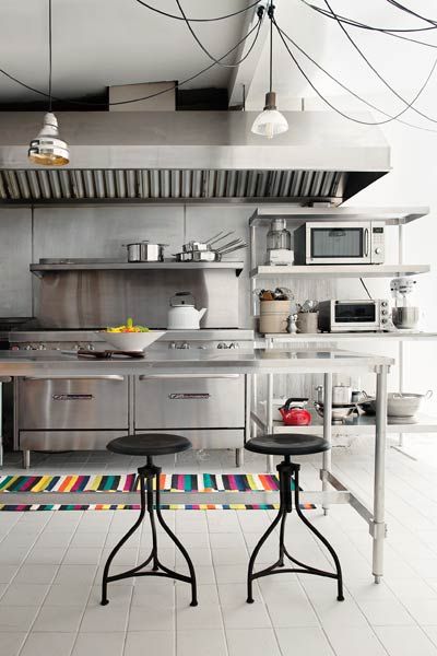
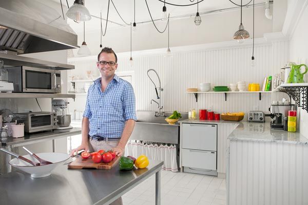
“It needed to be brought back in time but still remain a usable, modern kitchen,” he says. “It just didn’t need to be a commercial kitchen without a soul.” So as a nod to the room’s previous use, he installed commercial-grade stainless-steel appliances and fittings but cleverly hid new electrical lines and heating pipes in the moldings and turned the old walk-in refrigerator into a china cupboard. He then created unique ceiling lighting. “I had collected fixtures as we were shopping for the house,” he says. “Some were complete, some were just pieces. Then I rewired them all and put them together with some reproduction cloth-wrapped electrical cord I found. I had Mark install a large square of outlet strips on the ceiling and then created a modern installation made out of old parts.”
Shown: The kitchen occupies what is essentially a shed appended to the house when it was turned into a restaurant in the 1960s.
Stools: wisteria.com
Dishwasher drawers: fisherpaykel.com
Homage to Commercial Past
Since the upstairs bathrooms did not previously exist, Kevin chose salvaged pedestal sinks as well as a vintage bathtub to suggest a past. The space that was turned into the master bathroom had been a service bar in the restaurant, with the original lath ceiling and a set of very narrow stairs. Those were the only things from the 18th century that were removed in the renovation.
Three years after the purchase, the house keeps growing on its owners. “It’s peaceful and private and has the sense of a quiet enclave about it,” says Kevin. “Still, it’s at its best when we’re entertaining, gathering around the bar and soaking up the memories of people who had spent time there, or having formal dinner parties in the dining room. In summer we host groups of friends out on the patio.” And so, almost three centuries after it first went up, the old house continues to evolve, absorbing the voices of its inhabitants and visitors—and adding a new layer to its remarkable history.
Shown: Designer Kevin O’Shea wanted to pay homage to its days as a commercial kitchen while cleaning it up with new beadboard and white paint—even on the brown ceramic-tile floor. The lighting is an invention of his own, made largely of vintage parts. The molding above the beadboard serves as a duct for wires and pipes.
Nautical Touch
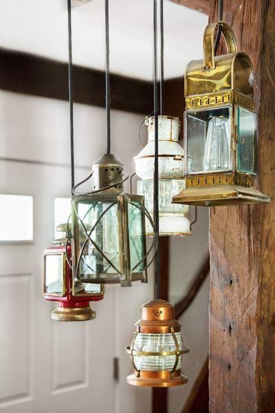
The assemblage of electrified lights over the bar is a creative repurposing of old candle and oil lanterns that reflect the house’s seaside history. This side door is now the main entrance to the house, as it was for the succession of restaurants that operated here.
Master Suite Retreat

The master is one of three bedrooms added to the second floor, which had lost its partition walls but retained its beams and rafters. The chimney is an extension of the one in the bar, with a layer of salvaged brick added partway up to the roof.
New Master Bath with a Historical Touch
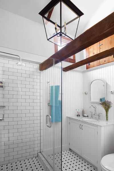
The master bath one of two new ones upstairs, has a vintage look, with beadboard, subway tile, a black-and-white mosaic floor, and a newly vaulted ceiling. “I wanted the baths to look like they had been added at some point in the history of the house,” says Kevin. The salvaged pine doors over the sink open to a storage void in the wall.
Airy Aerie
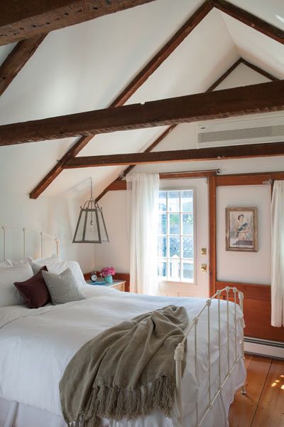
The windowed door of the larger guest room opens onto a small deck with its own entry stairs.
Vintage Look Guest Bath
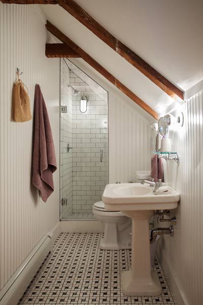
The second upstairs bathroom serves both guest bedrooms. In addition to vintage-inspired tile on the floor and the shower walls, and beadboard walls up to the ceiling, Kevin chose a salvaged pedestal sink as a gesture of period authenticity.
Sitting Pretty
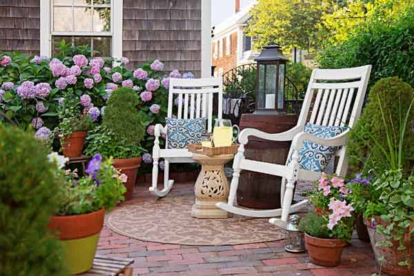
“All we did to the patio was furnish it,” says Kevin, modestly. In the process, he and David turned a large brick rectangle that runs the width of the house into a series of outdoor rooms that greatly expanded their summertime living space. A pair of rockers forms an intimate conversation spot.
Outdoor Lounger
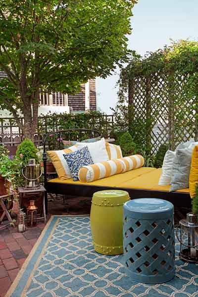
A double bed in weather-resistant black-painted iron is made comfy with an abundance of outdoor cushions. Ceramic garden stools stand ready to hold a cold drink, a book, or an extra party guest.
Dinner-Party Central
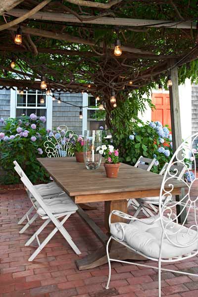
A wisteria-draped pergola on the harbor side of the house came as a built-in bonus. Just outside the living room, it’s a favorite gathering spot for meals all summer long.
Cape Cod Floor Plan: First Floor
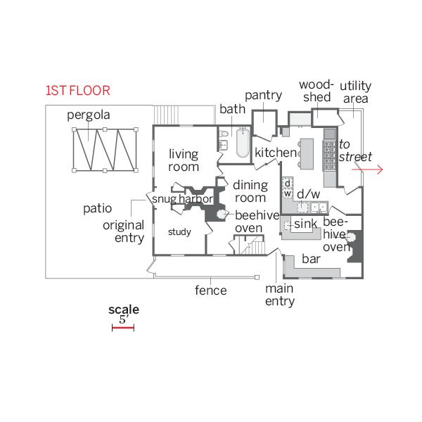
The first floor remained largely intact, although plenty of work was needed.
Cape Cod Floor Plan: Second Floor
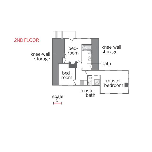
The second floor was carved into three bedrooms and two baths, with attic storage.
