Bright-Blue Trim for a Texas Limestone Facade
Buying a first house is a personal landmark that often signals the beginning of adulthood. But at 26, Brenna Byerlotzer didn’t have homeownership on her mind when she came upon the small stone house that she would claim as her own. In fact, she decided in a split second to take the major domestic step. Despite that sudden start, nothing else in her home-owning saga would move fast.
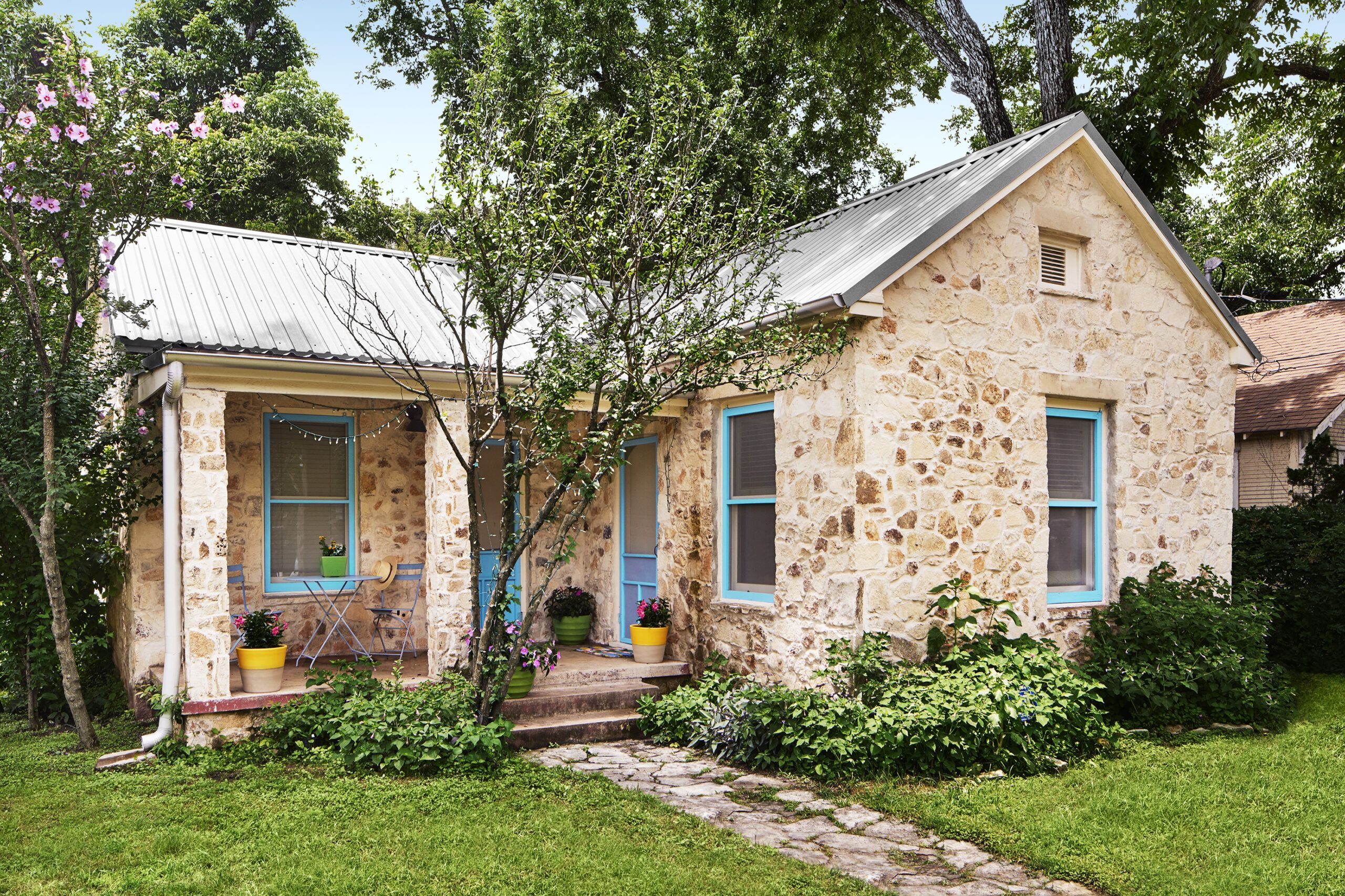
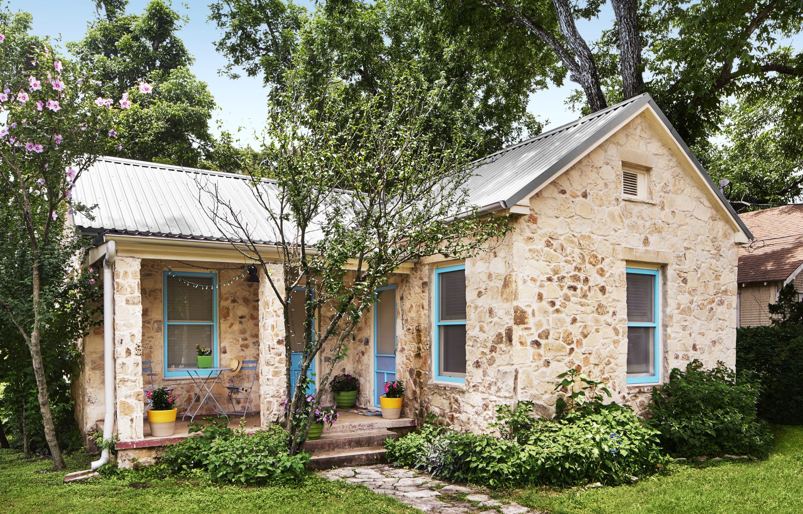
Shown: She kept the native Texas limestone facade, which had been brightened with a thorough power-washing just before she bought the place. She added the bright-blue window and door trim.
Big Enough for Brenna and Two Rescue Dogs
This was 10 years ago, when Brenna was living nearby with her parents, an arrangement that suited everyone—though she worried that her two rescue pups were wearing out their welcome. One night, fate made a move. “I was riding my bike through the neighborhood when I noticed a FOR SALE sign,” explains Brenna, a restaurant manager. She wasn’t planning to buy, but taking in the compact size and rustic exterior that reminded her of the little Texas Hill Country houses that she loved, “I had a flash this was the right place for me,” she says now. The 1,050-square-foot stone structure stood out from the other houses on the street in East Austin, a neighborhood of once-grand Victorian-era homes shoulder to shoulder with neat wood-frame bungalows that was being rediscovered by artists, retirees, and young professionals.
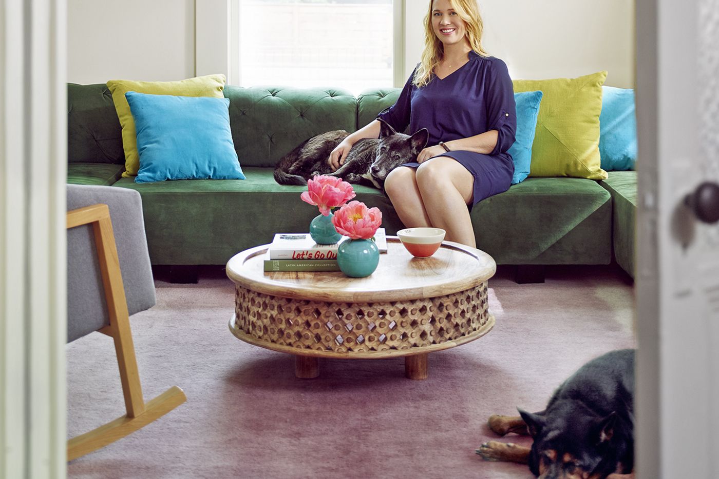
Shown: The green sectional Brenna chose just happened to fit the room’s dimensions exactly. Little B enjoys a rare moment on the sofa with her, while Lucy naps nearby.
Sectional, coffee table, rug: West Elm
Orange bowl: Mockingbird Domestics
Quirky Details like Six-Light French Doors
The house’s quirky charms diverted Brenna from its structural challenges. A front porch cut into the boxy dwelling suggested a place to linger; a door on the porch’s right side led to a room that was being used as a bedroom but would be well suited to serve as the living room, with the dining room and kitchen lined up behind it. On the back wall of the porch, another door opened onto the designated living room; a bathroom connected it to the master bedroom. Its ricketiness hinted that the bedroom had been tacked on at some point.
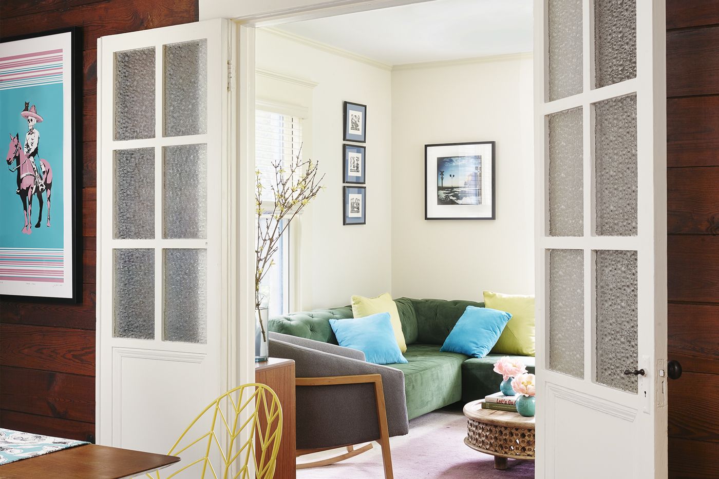
Shown: The six-light French doors are original to the house. The shiplap boards were discovered as drywall was removed during the renovation.
Chairs: West Elm
Sheepskins: IKEA
Rug: Safavieh; One Kings Lane
Original Shiplap Exposed in the Dining Room
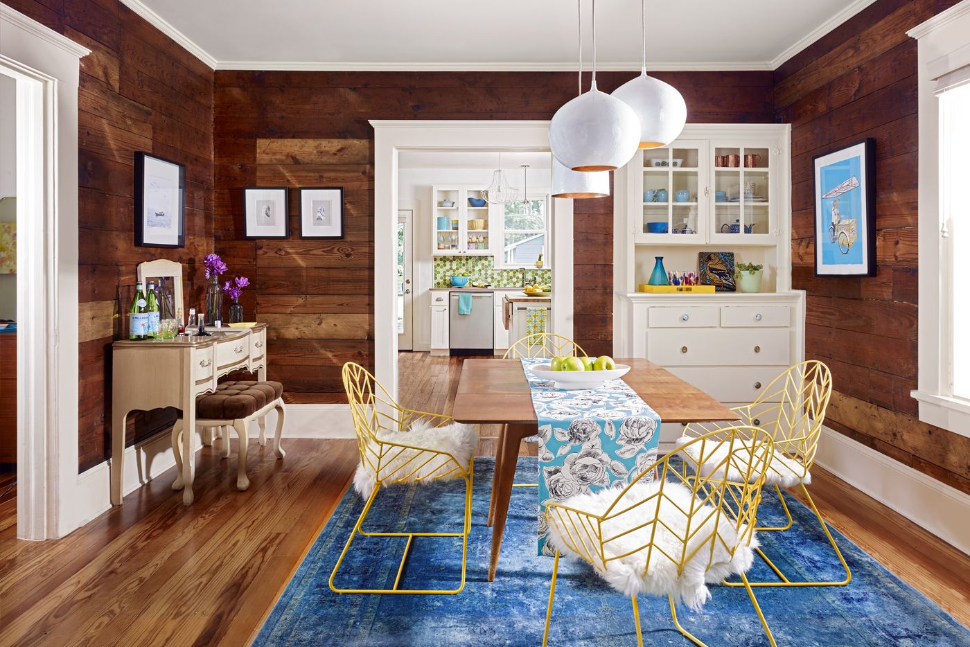
Brenna loved what she saw, even if there were aesthetic shocks, too. “The walls and the ceilings were covered in this terrible popcorn texture,” she says. Other issues surpassed the cosmetic, and that’s when Brenna called on architect Rebecca Devine, a member of her soccer team. “There wasn’t a lot of inherent value in the structure,” says Devine. The inspector’s report sounded dire, too. “He noted the bad addition, that the house needed new wiring and plumbing, the roof was dodgy, and the stone veneer was cracking,” she adds. Despite the flaws, 9-foot ceilings, stately door casings, glass-paned French doors, and a built-in dining room hutch encouraged the newbie home buyer. Brenna bought the house, optimistically ignoring the holes in the kitchen floor that gaped to reveal dirt below.
Shown: In the dining room, Brenna left the shiplap exposed for dramatic effect, as well as a tribute to the original structure of the little house.
Table: vintage
Pendants: Silvia Bell & Ball Pendants; Crate & Barrel
Dining Room Hutch Packed with Personality
In the meantime, contractor David Wilkes—also a soccer player who had served on coed teams with Devine—began work on an addition to Brenna’s parents’ house. Talk naturally turned to the improvements needed at their daughter’s house. Then the economy tanked and everything was put on hold.
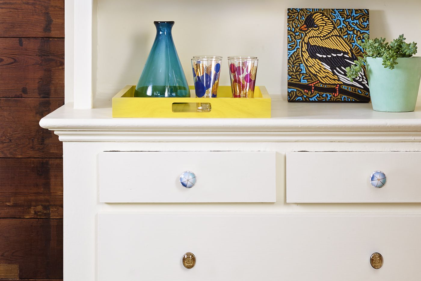
Shown: The dining room hutch is original to the house. Brenna gave it personality by adding unmatched ceramic and glass knobs.
Knobs: Anthropologie
Yellow tray: Nannie Inez
Vintage Vanity Table as a Bar
Five years in, with the economy picking up, the time was finally right to start work on the kitchen. Wilkes’s biggest task: to stabilize the 13-foot-by-15-foot cook space. “My concern,” he says, “was how well the house was framed.” The reality presented by the rotted cedar-post foundation was scary.
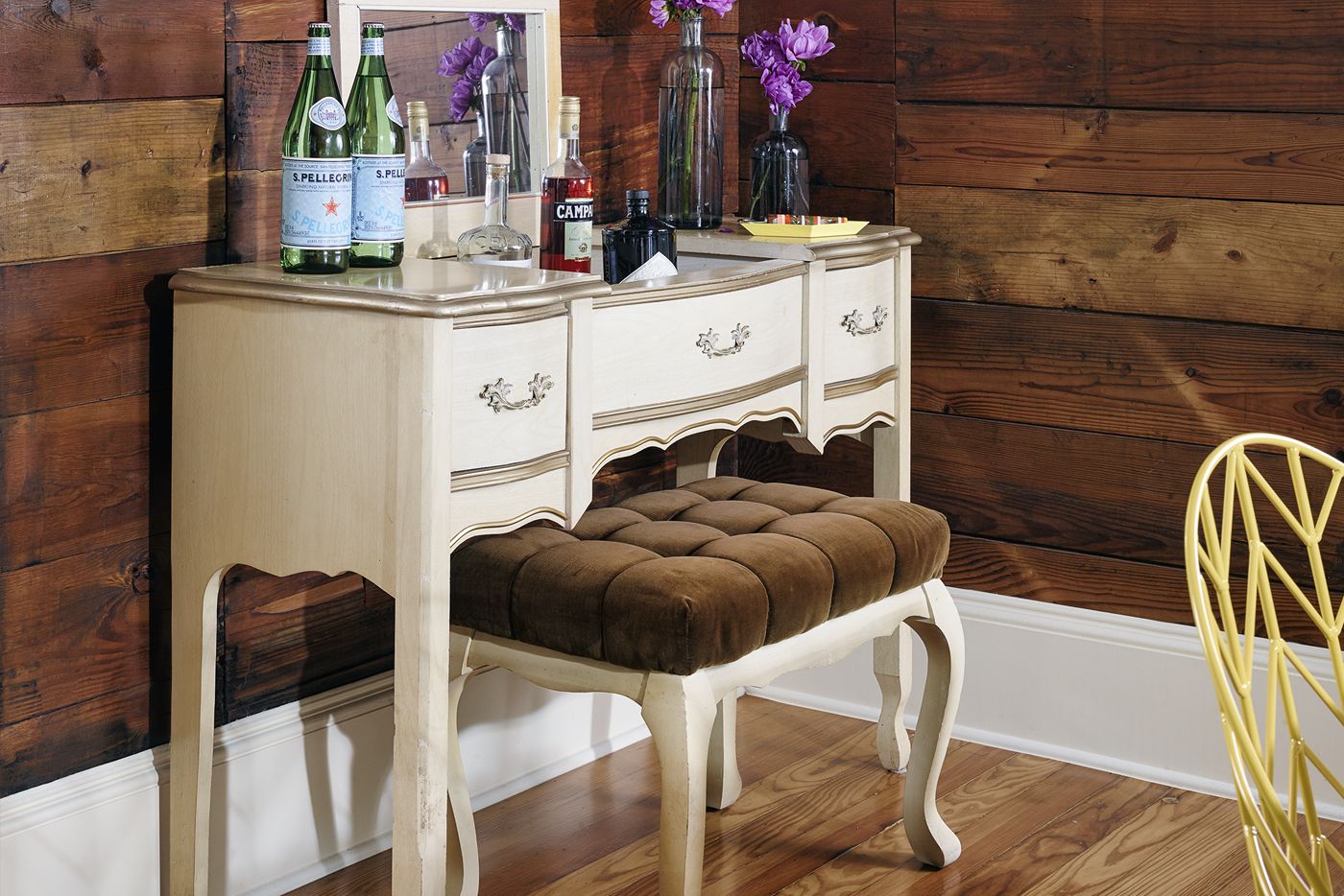
Shown: Brenna often stops at garage sales when she goes out for bike rides. One of her scores is this vintage vanity table, which sits in her dining room and is used as a bar.
Decorated with Mix of Castoffs and Travel Finds
But Brenna was all in at that point, and not about to turn her back on the little house. The foundation concerns did nix any hopes she had for a second floor master suite, however—which was okay with her. After living in the house, Brenna realized, “I really only used three rooms, so I decided to keep the house the size it was.”
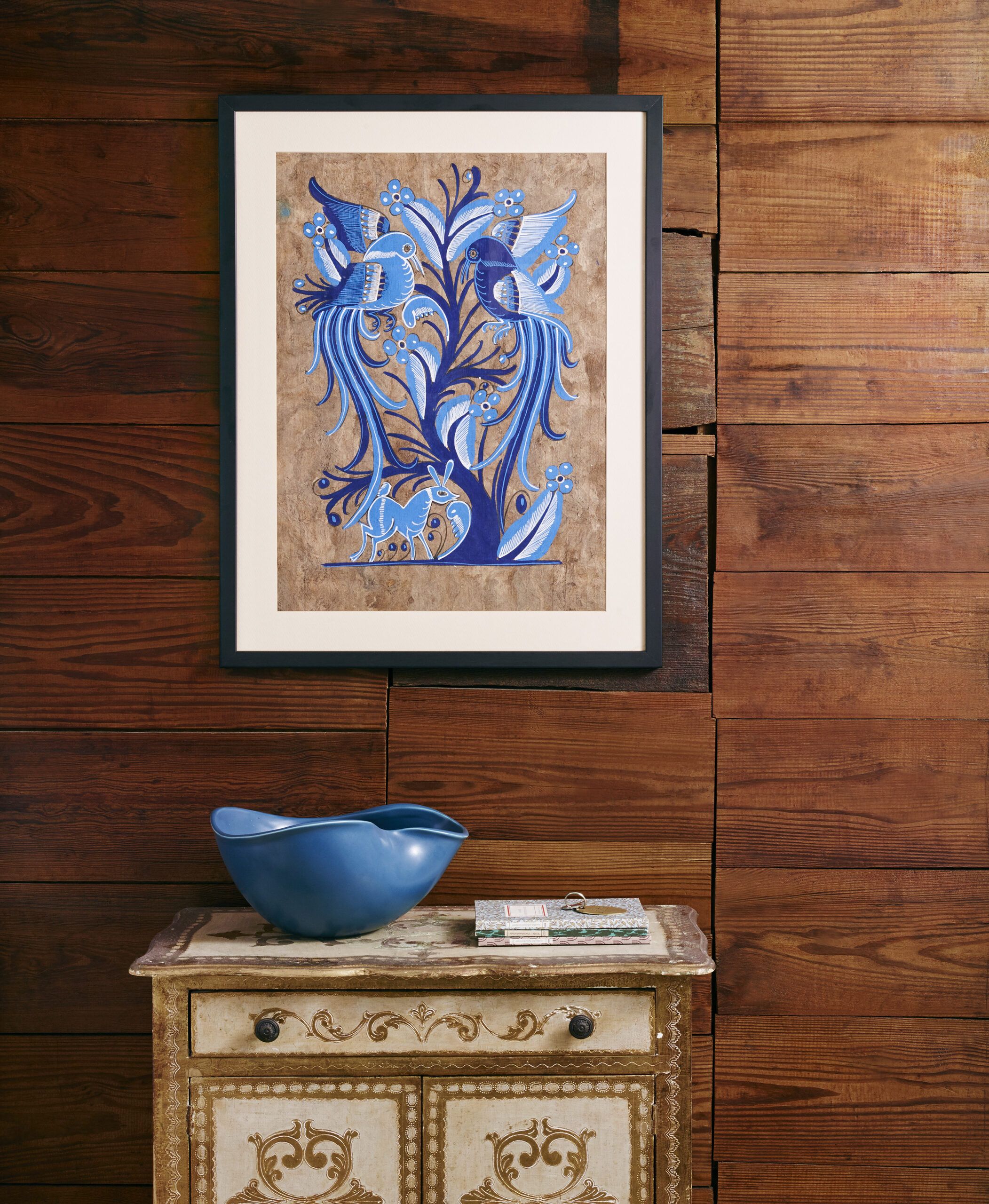
Shown: This dainty gold-and-white cabinet is a friend’s castoff that Brenna intercepted on its way to Goodwill. It sits in the dining room under a bark painting she purchased on a trip to Oaxaca, Mexico.
Pre-Redo Backsplash Tile Purchase
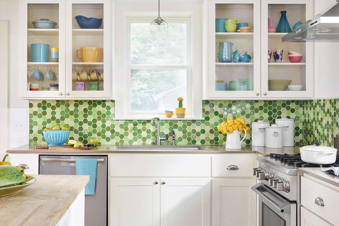
Wilkes proceeded, shoring up the shaky structure with 12 concrete piers. He also ripped up the kitchen floor to add a subfloor. “We could only save part of the floor,” he says, so he found reclaimed longleaf pine from an outside source and toothed in pieces he could salvage from the original floor. New electrical replaced insulated-cloth wiring, and all the plumbing was replaced with PVC. Double-pane low-e windows and spray-foam insulation in the attic and in the walls weatherproofed the house. A bonus: “Even though we were just doing the kitchen,” says Wilkes, “it affected as much as 20 to 30 percent of the rest of the house because we upgraded systems and the foundation.”
Shown: Brenna had purchased the backsplash tile four years before the renovation project began. When it was finally time to tackle the kitchen, the addition of extra counter space meant that more tile would be needed. Although the dye lots weren’t a perfect match, the contractor mixed in the new pieces so that the subtle color differences aren’t noticeable.
Tile: Architerra
Cabinets and flooring: custom by Bruce Mende
Refrigerator and vent hood: KitchenAid
Stove, refrigerator: Kenmore
Double-Hung Windows for a Bright Kitchen
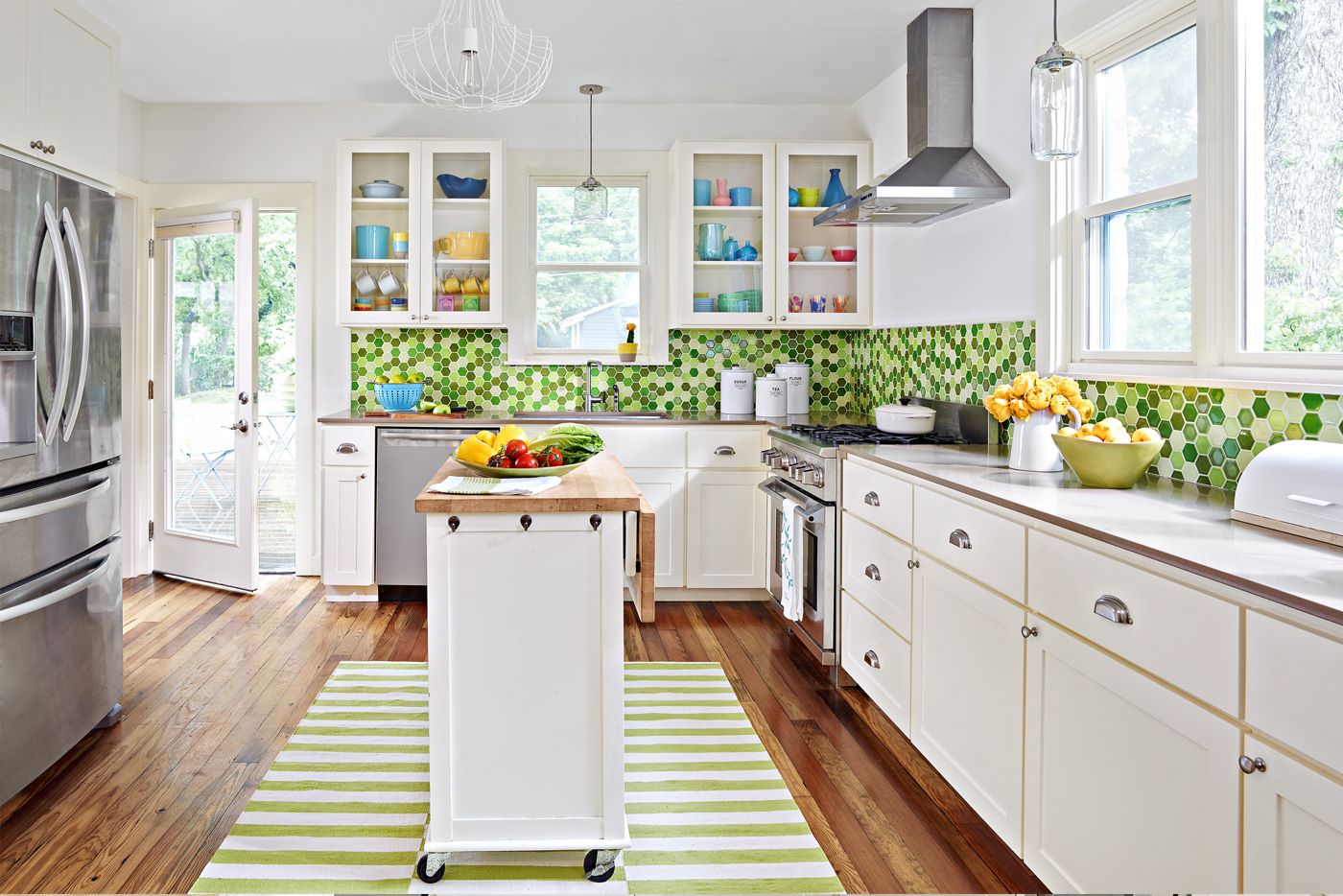
An unexpected complication to the renovation arose when Devine moved to New York and had to bow out of the project. So Wilkes enlisted Austin architect Rose Bartush to work on the plans to untangle the graceless spaces on the left side of the house. Just getting to the bedroom in the back was a trek: The only existing route was via the former living room and through the bath.
Shown: The window on the range wall was too low to allow for 32-inch-high base cabinets, so it was replaced with two double-hungs set higher and flanking a fixed pane to bring in more light.
Pendants: West Elm
Island: Crate & Barrel
Corner Sacrificed for Counter Space
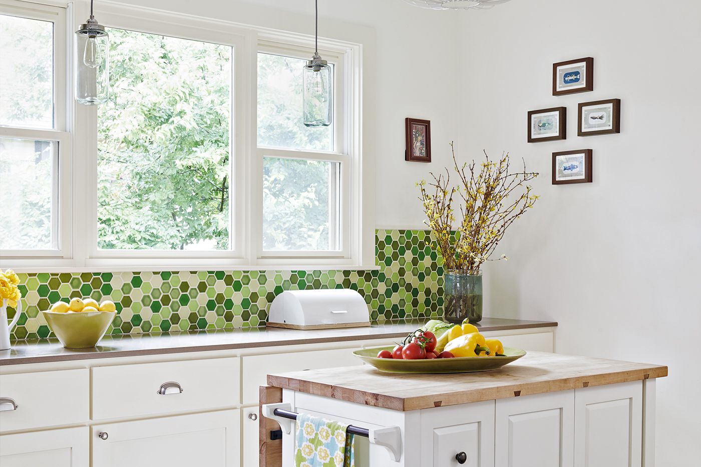
The changes were organized along a short hallway that slices from the front bedroom (the former living room) to the office/guest room (the former master bedroom). Shallow closets in each bedroom were closed off to merge them into a walk-in closet accessible from the hallway. Then the bathroom was reoriented so that it opens onto the hall across from the closet, a vast improvement over its former double life as passageway to the back bedroom.
Shown: The washer and dryer once stood in this corner of the kitchen, now used more efficiently for counter space. The wheeled island contributes a staging area for dishes en route to the dining room.
Rug: World Market
Home Office with a Sliding Barn Door
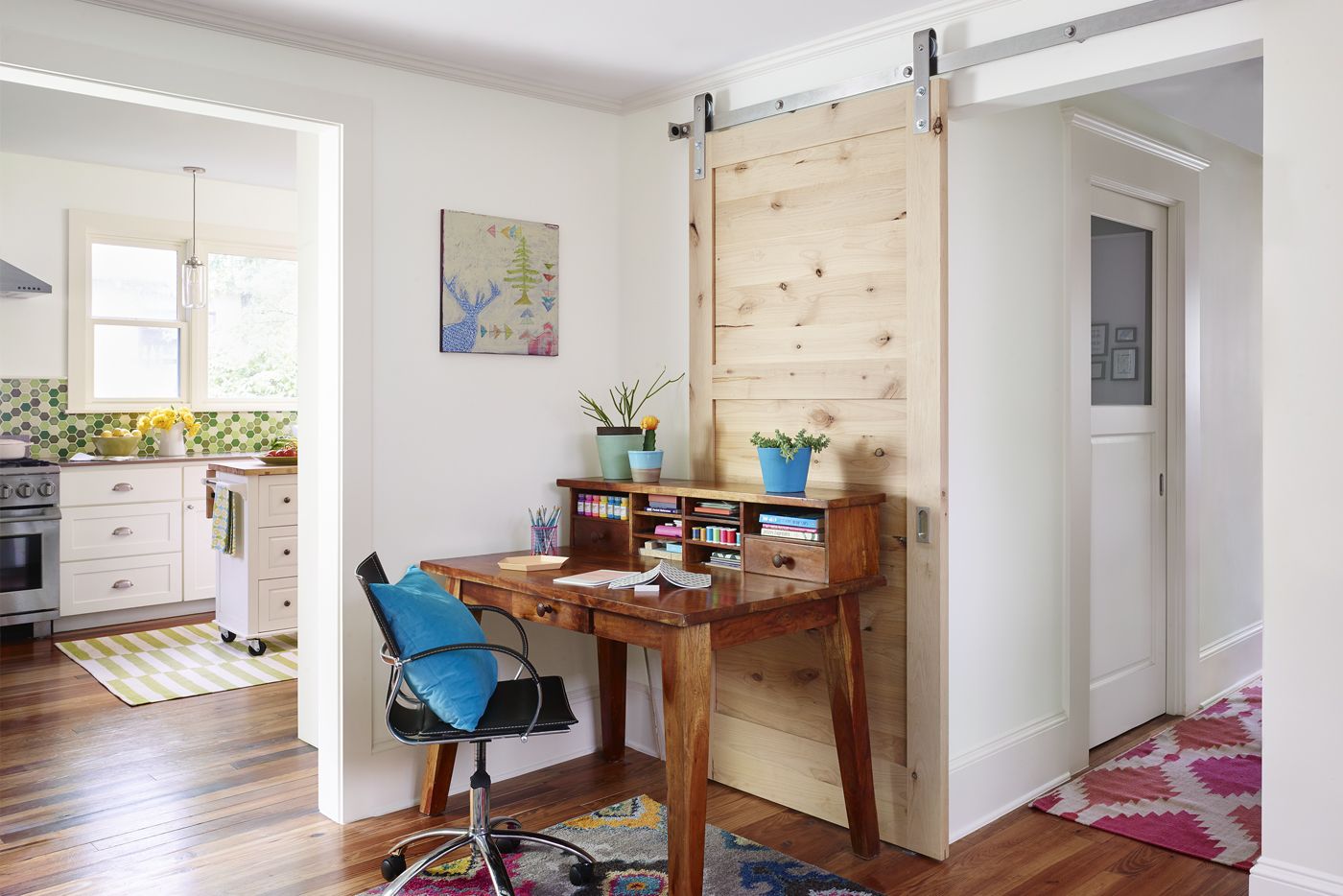
Brenna, who has now lived in the stone cottage for a decade, has no regrets about a result that was a long time coming. She’s been able to furnish the cozy abode slowly, with a mix of old pieces and new finds, vintage and modern. “When I bought this house, I didn’t know what my style was,” she says. “I would have chosen the wrong things.”
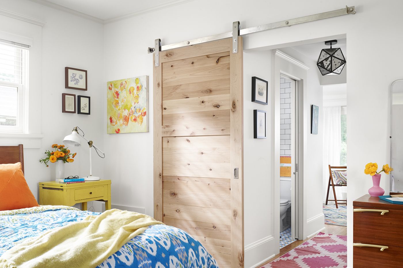
Shown: The office (and sometime guest room) was formerly the master bedroom. Contractor David Wilkes suggested the alder-wood barn door on a steel track for aesthetic as well as space-saving reasons. Pocket doors to the closet and the bathroom, both off the hall, also free up space.
Multicolored rug: One Kings Lane
Desk: Vintage
Blue pots: Nannie Inez
Charming Bedroom with Mid-Century Style
She is especially grateful that she had a good team to work with: “It’s been nice having people who know what I’m like help me.” The combination of Brenna’s flair, Devine’s support, and Wilkes’s unflappability has made for a winning outcome. “I understand myself and my house better,” says Brenna. “It was worth the wait.”
Shown: The bedroom—with a view onto the front porch—is furnished with mid-century-style pieces such as the chest of drawers Brenna inherited from her grandmother. A vintage sewing-machine table serves as a nightstand. The barn door and steel track match those in the office/guest room at the back of the house.
Bed, pink-and-white rug, hall pendant: West Elm
Nightstand: Vintage
Cactus art: Anna Kamburis Design
Showstopping Ceramic Tile for a Tiny Bath
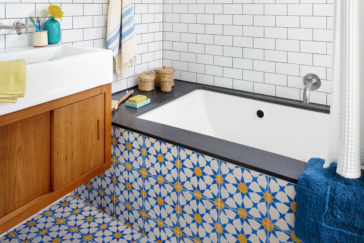
The tiny bathroom appears larger thanks to a wall-hung sink cabinet, floating shelves, white walls, and splashy patterned ceramic tile that continues from the floor to the tub surround.
Surround, open shelves: Caesarstone
Tub, fixtures: Kohler
Tile: Architerra
Wall-mounted cabinet: Lacava
Floor Plan: Smart Room Swaps
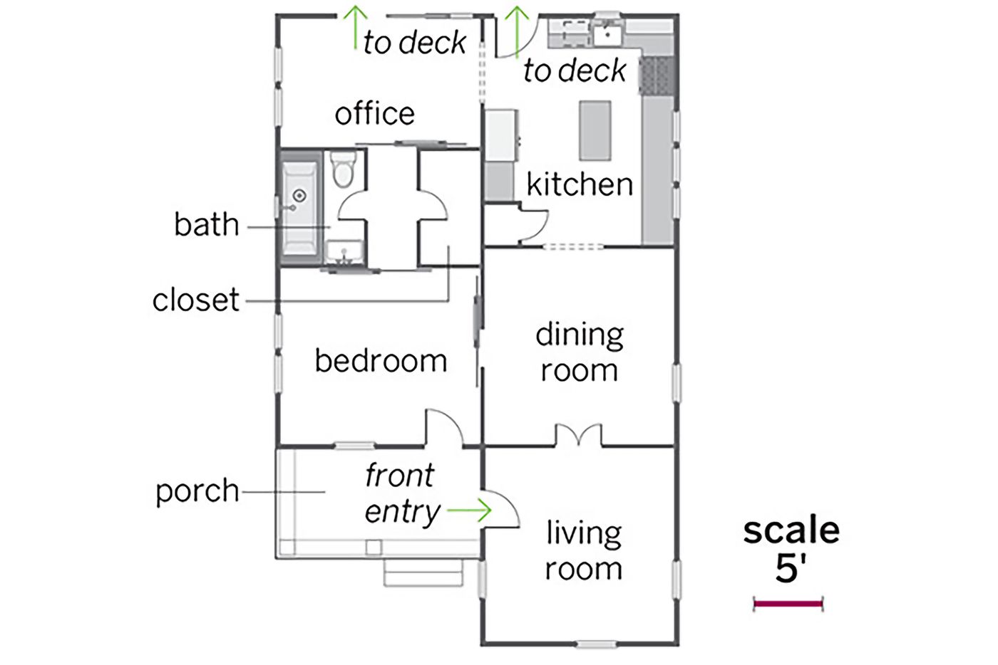
Before the redo, the 1,050-square-foot, two-bedroom house included a master bedroom that could be reached only by going through the bathroom from the living room. With the remodel, the kitchen and dining room remained in place, while the living room and front bedroom swapped places. The result: The relocated bedroom has immediate access to the bath, which gained a few precious inches from the former master bedroom, now the office/guest room.
