In Fine Detail
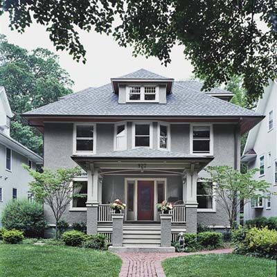
The urge to feather one’s nest is a basic human instinct. But while many people choose to go grandiose when renovating a home, it helps to remember that nests are cozy and small. Regina Stilp knows this well. A few years ago, nine months pregnant with her third child in three years, she and her husband, Sam, a commercial Realtor in Chicago, were living in tight quarters with their two toddlers. The couple knew they needed to buy a bigger place, where they and their growing brood could spread their wings, or at least the kids’ toys.
But Regina resisted; moving just seemed like too much of a hassle at that point. Inexplicably perhaps, she perked up one morning at work when her e-mail inbox pinged with photos of a house her husband was looking at that very second in East Wilmette, the gracious North Shore neighborhood where the couple grew up. Sam had taken the snapshots with his mobile phone. Regina, who works for a real-estate development firm, scrolled through the pictures of a circa-1910 American Foursquare with a drab stucco exterior. She e-mailed her husband two words: “Buy it.”
Entryway
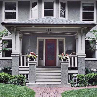
The first project the couple tackled was re-creating a gracious front entryway. The original entry porch had long ago been enclosed, blocking sunlight to the interior and robbing the home of its once lovely facade. The new porch, crafted by Plewa and his workers, includes a stained beadboard ceiling, sturdy wooden posts trimmed with tile, and a stucco finish that marries the new entry to the rest of the house.
Dining Room
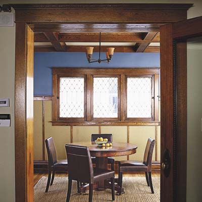
Inside, every inch of floor seemed to be covered with pink wall-to-wall carpet. Dark 1970s paneling covered the dining room walls. The galley kitchen was a hovel, and much of the original oak trim had been buried under coats of paint. Still, there were touches of grandeur that whispered to Regina from across the century. Egg-and-dart trim on a door. Leaded windows. A staircase that, beneath layers of grime, displayed the tight grain that is a hallmark of fine quartersawn oak.
Her decision may have seemed precipitous, but her feelings didn’t change when she saw the house in person. Sure, it needed work, but there was so much to work with! One of the best clues to the house’s lineage was located above their heads in the dining room, once the most ornate room in the place. There the ceiling was coffered, which lent the room a feeling of warmth and elegance.
Shown, the windows are original; the wainscoting is new.
Reading Nook
With her long history in the real estate business, Regina had developed an instinct about houses. This one, she felt, was crying out to be a full-fledged Craftsman, which delighted her. A major fan of the style, she had, over the years, amassed a sizable collection of signed Stickley furniture. The Stilps knew enough about trends in interior design to know that, as Regina puts it, “nobody does ‘oaky’ anymore.” Many people feel that too much wood can overwhelm a house, making it seem too dark, too claustrophobic, too…woody. Regina scoffed at the idea. Cheesy paneling was one thing; quartersawn oak was another. In the ensuing gut rehab, they would hew closely to the American Foursquare’s stylistic roots. “You couldn’t have done anything else,” Regina says now. “I feel strongly that you have to design for the house.”
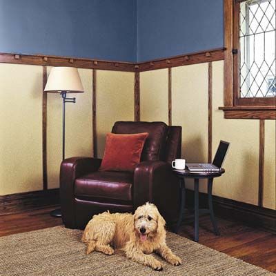
Here, a corner of the dining room is set up as a reading nook, showcasing the new wainscoting and paint colors. Above the rail is a rich blue found in Rookwood pottery of the Arts and Crafts period. Below is a soft yellow-gold. The leaded-glass windows throughout the room are original; a few required some repair.
Fireplace
But to take the house’s voice to heart, they had to strip away layers of ugliness. And to make room for their growing family, they needed to figure out a way to gently insert an additional 900 square feet into the 2,000-square-foot house. Over the course of a year, with the help of kitchen designers Mary Beth Shoemaker and Todd L. Atkins and contractor Marian Plewa, a Polish-born woodworker with a flair for old-home restoration, the Stilps transformed the pink, paneled palace into an authentic early-20th-century house that celebrates the glory of old wood.
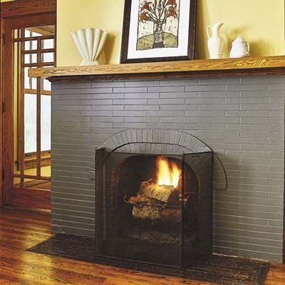
The door to the left of the living room’s pared-down original fireplace leads to the new family room.
Family Room
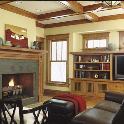
The family room is part of the two-story addition. Its coffered ceiling conceals steel beams that support the upstairs master bedroom. The three-over-one windows echo those elsewhere on the house. Handmade tiles—several with a motif taken from a downtown Chicago building designed by architect Louis Sullivan—form the fireplace surround. The box bay occupied by the media cabinet is about the same size as the bay at the
front of the house.
Technically, the Stilps’ architect was Graham Anderson Probst and White, an architectural firm that was a successor to Burnham & Root, which designed many historic structures in Chicago, including the Wrigley Building. But since the Stilps were old hands at renovation—they had previously rehabbed an 1880s home in the Ravenswood section of Chicago—they did much of the design themselves, using hand-drawn sketches and design software. The architects polished up the Stilps’ work and rendered the official construction drawings.
Master Bedroom
The balance of the job would be far more complex. The Stilps longed for just a bit more space at the rear of the house. They wanted to expand the 10-by-10-foot kitchen, insert a breakfast nook, amplify the rear entrance with a mudroom, and add a more spacious family room that could accommodate a large-screen TV. Upstairs, the couple had their sights set on a true master suite, complete with a walk-in closet in the bedroom and a double vanity and separate shower and tub in the bath. The only way to pull all that off was to demo a family-room addition that had been tacked on the back of the kitchen and build a two-story, 900-square-foot bumpout that would square off the rear of the house. That meant digging a new partial foundation. The addition gave them plenty of room for the master suite, but the kitchen called for some tough decision making.
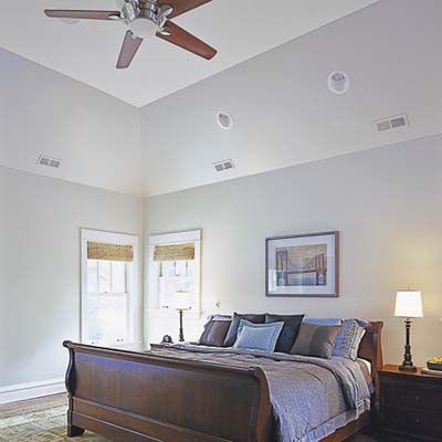
The hip roof over the new master bedroom allows for a tray ceiling that gives added height and airiness.
Bathroom
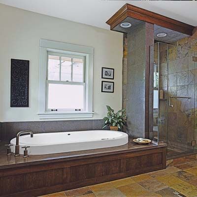
The master bath has a Japanese-Craftsman look, with a Neptune soaking tub that has a pronounced lip, a sleek Kohler tub faucet, and modern tubular light fixtures over the sinks. The shower, like the floor, is lined with multicolor slate tile for a rich, earthy look.
Vanity
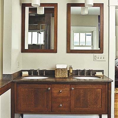
The furniturelike vanity provides under-sink storage and is topped with limestone. Framed mirrors complement the rest of the deep wood tones in the room.
Kitchen
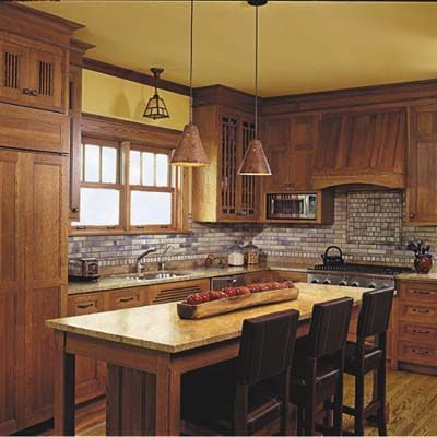
No matter how they sliced it, the kitchen was going to be long and narrow—especially if they inserted an island in the middle of it. The Stilps considered doing away with the staircase between the kitchen and the family room to buy some space, but simply couldn’t do it. “The house would no longer be a foursquare if we did that,” says Regina. The decision was crucial: A back staircase, leading upstairs from the mudroom, certainly improved traffic flow. Remove it, and they’d be left with a great room—a combined kitchen and family room—at the rear. Some people would have cheered at the notion, but large, multipurpose rooms leave Regina cold. “I hate the idea of hearing someone putting away the dishes while I’m watching TV with the kids,” she says. So the staircase stayed. The kitchen designers would have to work their magic to make the place feel roomy.
Quartersawn white oak cabinets wrap the kitchen, with matching panels to conceal the 48-inch Sub-Zero fridge. Slatted doors, chamfered posts on the island, period-style lighting, a handcrafted-tile backsplash, and thick slabs of green granite complete the look.
Breakfast Area
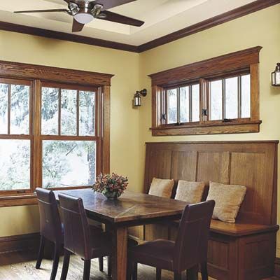
“It was a challenge,” recalls Chicago designer Todd Atkins of reconfiguring the kitchen. “We had to fit in an island, a banquette, and appliances—and new, modern appliances take up a lot of space. The staircase was right where I might have placed cabinets.” Building a simple pantry in the void under the staircase helped greatly.
The new breakfast area, featuring a built-in banquette, now sits where a family-room addition, built on a slab, had been tacked on to the old kitchen.
Staircase
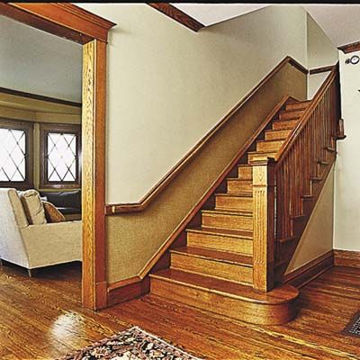
When the Stilps first bought the place, they expected to salvage a lot of materials. Though the sellers had removed many original details, such as pocket doors, door trim, and hardware, they had tucked them away upstairs. But when the Stilps took possession on closing day, they were greeted by an empty attic. “The owner thought he was doing us a favor by cleaning out all the ‘junk,'” she says with laugh. Despite the initial setback, the couple persevered. One pair of pocket doors survived the purge, and Plewa’s crew took their cues from the home’s surviving woodwork, measuring, cutting, and crafting needed trim on-site. A little web surfing and antiquing helped Regina round out the details. They selected fixtures, paint colors, fabrics, and furnishings to complement the architecture. The resulting house is far from dark and drab, largely because Regina chose a color palette that sets off the wood nicely. Moss-green runs up the staircase, rich blue presides over the chair rail in the dining room, and gold adds life to the family room.
Oak Railings
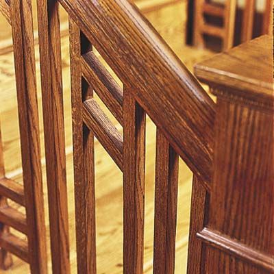
The quartersawn oak railing on the new back stairway was crafted from a design the homeowner found in a book on Arts and Crafts houses; she drew it on a napkin for the carpenter to replicate.
Patio
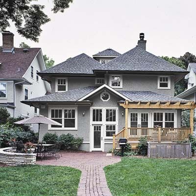
Intersecting rooflines at varied heights blend the rear addition into the modest foursquare house without overwhelming it. The new back deck steps down
to a brick paver patio surrounded by a low sitting wall—a perfect spot for dining outdoors with family and friends.
What They Did:
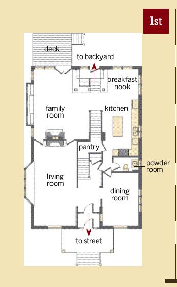
The original circa-1910 house ended along the living-room fireplace wall; a previous addition occupied much of the kitchen/breakfast area. The new two-story, 900-square-foot bump-out allowed for a family room, a mudroom, and a larger kitchen downstairs, plus a master suite upstairs. A straight run of stairs in back helped the house retain a traditional foursquare layout, with two rooms front and back. The two entry porches are also new.
The Result
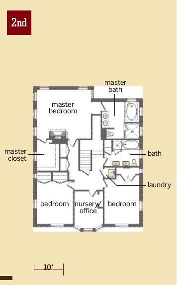
Overall, the addition doesn’t seem to have altered the house’s proportions or its feel. The three Stilp children are now happily at home in a nest that seems built with them in mind. With the exception of modern appliances, the house looks much as it might have in its heyday. “It’s one of the warmest houses I’ve ever been in,” Regina says of the final result. “We certainly got what we wanted: a comfortable place with great little rooms. It’s not just a house, it’s a home.”
