Like Old Times, Only Better
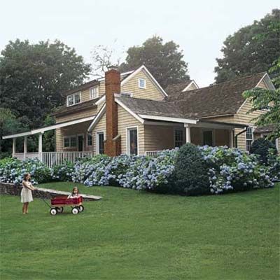
Here’s one way to describe a dream house in 10 words or less: cedar-shingled summer cottage short bike ride from ocean. David and Tracy Gavant bought just such a place in Amagansett, New York, in 1999, and treasured it as the perfect getaway from their high-stress city jobs.
They loved the cottage’s history: The core of the structure is believed to date from the early 1700s, when it was little more than an outbuilding for a nearby house. And they loved its charm: Rooms had evolved in quirky, make-do fashion over the years—some with shed roofs and 7-foot-high ceilings. Making improvements those first few years—updating a guest bath and replacing the furnace and septic system—the couple enjoyed their summer place and celebrated the birth of two daughters, now 4 and 9.
Then Tracy voiced a simple request that led, as can happen with old cottages, to a near-gut rehab of the whole place. “I just wanted to get rid of the stove,” she recalls.
New Addition
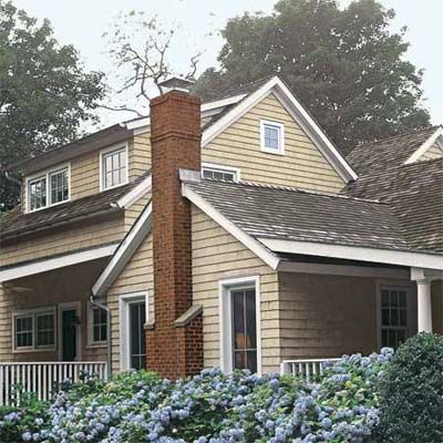
In discussing ideas with contractor Robert Biondo and architect Erica Broberg Smith, the couple embarked on a series of “it made sense” decisions that eventually transformed their cottage from 1,500 square feet of ramshackle construction to 2,800 square feet of sound, high-functioning living space.
It made sense to bump out space for a dedicated kitchen. And while they were at it, it made sense to redo the bedrooms; the master had no foundation and the girls’ room was barely big enough for one daughter, let alone two. “And once we decided to add on a downstairs master suite, it made sense to add a second floor for the girls’ bedrooms,” says David.
Perhaps the most challenging aspect of keeping the old rooms intact while adding new spaces was reconciling the rooflines. Because the cottage had evolved somewhat haphazardly, new areas needed to look as though they had, too. “We ended up with 10 different roof elements,” says Broberg Smith.
Rooflines
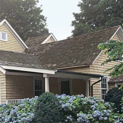
The gable over the new two-story master bedroom addition opens up with shed dormers front and back and a shed-roofed porch (previous image).
The gable topping the original one-story living room, with its brick chimney, continues over the family room on the other side of the house, with a shed roof over the dining area (not shown). The existing front porch also has a shed roof.
Slightly higher is the existing gable that tops a newly finished attic over the existing front hall. A lower gable (partially seen) covers the guest bedroom.
Front Hall
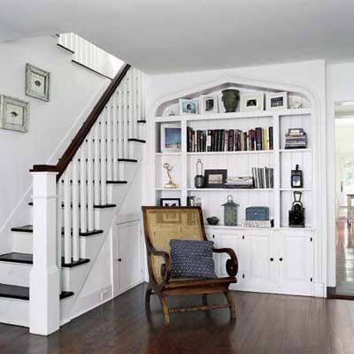
Inside, all those additions meant a mix of flooring—narrow oak here, wide mahogany there—that needed to be unified. Biondo got wide-board Douglas fir for the new kitchen and master suite, as well as the new second-floor bedrooms and hallway, then every wood floor in the cottage was stained the same dark hue.
The existing downstairs hall stayed intact, its charming built-in features providing templates for details added in the new spaces.
The arched outline of the built-in bookcase was replicated in an alcove in the new master bedroom.
Room Divider
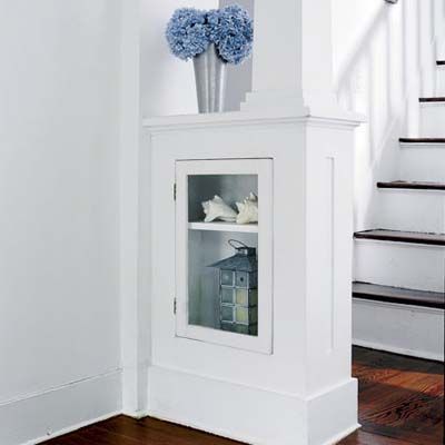
Two half-wall dividers hold glass-front display cases and mark the entry to the living room. Their square columns served as a model for the double columns in the new kitchen.
Dining Room
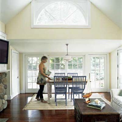
The eating area, a long-ago shed-roofed addition, is located at the far end of what is now the family room. The Gavants chose to retain the cozy 7-foot ceiling height and had 6-foot-tall insulated glass French doors made to replace four windows. They lead to the newly expanded deck.
The existing half-round window above the dining alcove lets even more light into the vaulted-ceilinged family room.
Doors: Marvin
Kitchen
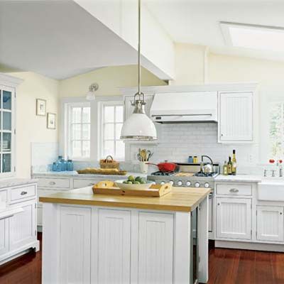
The size and shape of the kitchen bumpout was determined by traffic corridors and function. “In a beach house where there’s lots of entertaining, I like to allow a 4- to 4½-foot traffic corridor versus the more conventional 3½-foot corridor,” says kitchen designer Scott Smith, the architect’s husband, who worked with her on the project.
The 13-by-14-foot room includes zones for cooking and cleaning deep within the kitchen along the exterior wall, a center island with an undercounter fridge so that kids can easily grab a juice, and a snack counter on the family room side of a half wall to keep guests nearby but out of the work area.
A built-in storage unit has the furniture look of an antique step-back cupboard, complete with bin pulls and a marble work surface. Beadboard doors, nickel hardware, subway tile, marble counters, an apron-front sink, and old-style work lights give the all-white room its vintage style. A white enamel finish allows the modern range and hood to fit right in.
Cabinets: Crystal Cabinet Works
Drawer pulls: Restoration Hardware
Lights: Hudson Valley Lighting
Appliances: Viking
Sink, faucet: Kohler
Snack Counter
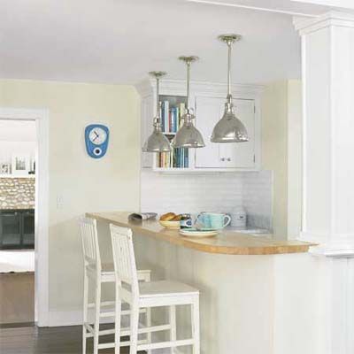
A snack counter on the family room side of the kitchen keeps guests and kids out of the food-prep area; its butcher-block top echoes the one on the kitchen island.
One element speaks to the extensive structural work the cottage required: The square columns to the right of the counter is one of a pair that echo existing columns at the living room’s entry. They conceal steel posts that support 28-foot-long load-bearing laminated veneer lumber (LVL) beam, created by pairing two 14-foot beams, that spans from kitchen to family room.
Bar stools: Crate & Barrel
Master Bedroom
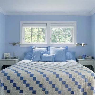
An addition holds the new master suite, as well as a private porch and office. Awning-style windows in the bed alcove preserve privacy and let in cool night air.
Master Bedroom Wing
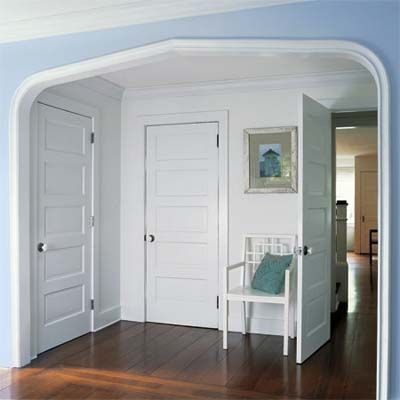
To give the young family the bedroom space they needed, Broberg Smith designed a two-story wing to replace an existing poorly built bedroom on the back of the house. The first-floor master suite also includes an office and has a private porch.
To evoke the feeling of the old house, Biondo built an archway in the master bedroom that mimics an existing built-in bookcase in the entry and also defines the dressing area. The closets have salvaged five-panel doors, to match those in the rest of the rooms.
The wing’s second floor, which holds the children’s bedrooms and a bath, includes such cottage details as beadboard paneling, wooden medicine cabinets, and awning windows that bring in ocean breezes.
Master Bath
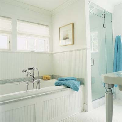
Old-fashioned details help disguise modern-day amenities:
Beadboard paneling and a Victorian-style tub filler surround the new air-jet tub.
Hexagonal floor tile paves the way to the steam shower.
Tub, faucet, sink: Kohler
Porch
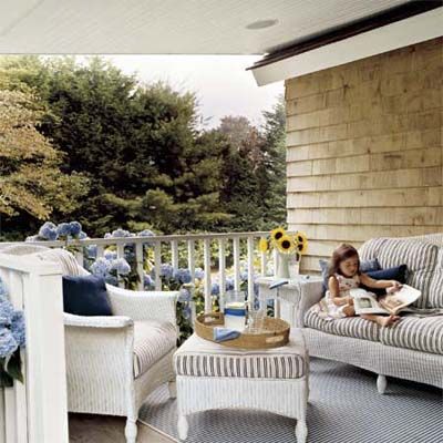
The existing front porch is a peaceful spot for curling up with a book, as 4-year-old Carly does here, or enjoying a cool drink.
To unify the additions with existing areas, the entire house was wrapped in new stained cedar shingles.
The simple white-painted railing provided a template for the one built to enclose the porch off the new master
suite addition.
Kids’ Room
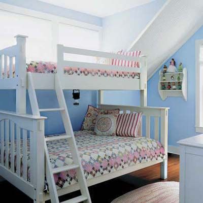
Biondo repaired the existing stairway, keeping the original balustrades, and transformed an attic area—which had old shutters and doors for floorboards—into a finished playroom, complete with beadboard ceiling, knee-wall storage, and a fanciful interior window that overlooks the family room and kitchen. “From that window, the girls lower notes down to us while we’re cooking, using a jump rope and basket,” says Tracy.
Two children’s bedrooms sit above the new master suite, just down the hall from the attic-turned-playroom.
Slanted ceilings that follow the lines of the eaves add a quirky old-house feeling to 9-year-old Maya’s bedroom (shown here) and other second-floor spaces.
Bunk beds: Pottery Barn Kids
The Happy Family
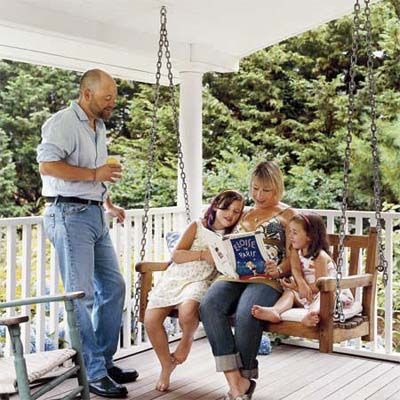
The seamless result leaves visitors wondering where the old part ends and the new spaces begin, all while enjoying the many places for relaxing. “It’s nice to have a house open up in many directions,” says Broberg Smith. For the Gavants (who are shown here with their daughters Maya, 9, and Carly, 4, on the new side porch), that means coffee on their suite’s porch and cookouts on the deck, while the girls have their domain upstairs.
“The house is full of cozy places to just hang out in,” says David. A few more words to add to any dream house description.
Though the renovation was much more complex than they could ever have imagined, the Gavants don’t regret a thing. “I love history,” says David. “Even though many people told us we would’ve been better off tearing the place down and starting over, we didn’t want to.”
Floor Plan: Downstairs
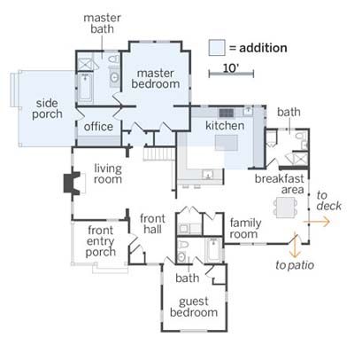
The master suite addition has an office and private porch downstairs. A bumpout holds the new kitchen, with its former space now the family room. The existing master bedroom became the guest room.
Floor Plan: Upstairs
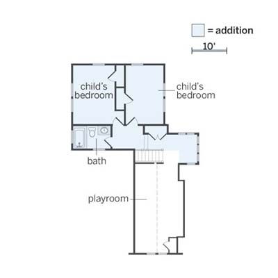
Two children’s rooms and a bath are upstairs. Existing attic space became a playroom.