Hidden Treasure in a Desirable Area

People don’t buy just a house—they buy a whole package. How are the schools, what’s the commute, and what will it really cost to update that bath? Then, after thoughtfully weighing all the pros and cons, they close their eyes and hope for the best.
It was no different for Gigi Pedraza and Omar Rodriguez. Careful perusal of the many possibilities in their target zone, a historic area near downtown Atlanta, nonetheless led them to a plain brick house whose main attributes weren’t even inside.
Blame the setting—and wishful thinking. Along with “a fantastic neighborhood full of happy kids,” as Gigi put it later, in a blog devoted to the inevitable redo, the house had “a beautiful magnolia tree that we could turn into a playground with ropes” and “an unbelievable cherry tree right by the door that makes every spring look and feel as dreamy as possible.”
Architect: Ton-Lo Design, Norcross, GA; 917-215-6184
General contractor: South Peak Construction, Atlanta, GA; 404-983-4807
Structural engineering: Palmer Engineering Company, Tucker, GA; 770-908-9908
Paint: Sherwin Williams‘s 7590 Red Obsession (front door), 7505 Manor House (windows and shutters), 7757 High Reflective White (siding and exterior trim)
They Knew What They Wanted

Note no rhapsodizing about the house’s great bones, fantastic flow, or unique period style: In dry historic-district parlance, the house was a “minimal traditional.”
Gigi, who craves lofty open interiors, and Omar, whose taste runs toward rustic barn doors and exposed trusses, had purchased a one-story house with none of the above—just two bedrooms and a bath on the main floor, a bedroom and bath in the finished basement, and an unfinished attic attainable only by pull-down stairs.
Shown: Homeowners Omar Rodriguez and Gigi Pedraza relax in a new outdoor room off the deck.
Pouring on the Charm
But after nearly three years in the house, the couple, parents of two young girls and busy professionals with a passion for travel and entertaining, were hardly in the mood for a budget-wrenching redo.
What they had in mind, they told architect Pauline Ton-Lo, was turning about 200 square feet of dead attic space into a lofty playroom—connected to the first floor by stairs and a slide. “Not just for the kids,” Gigi says of the latter, “but for the adults—after a party!”
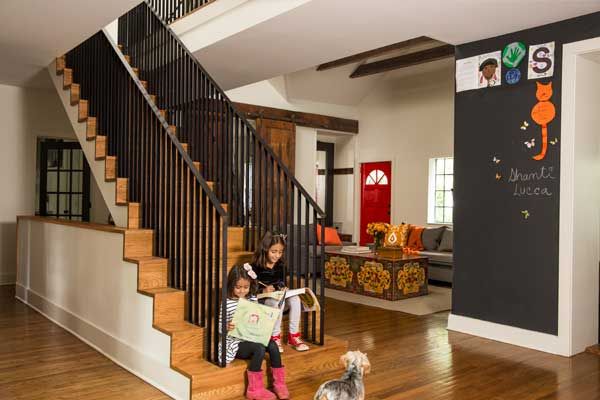
Shown: Lucca, 6, left, and Shanti, 8, dogged by Coconut, enjoy near-360-degree views from the new oak-and-steel staircase; knee walls frame steps to the basement.
Floor stain: Varathane
Loftier Living Space
“Pauline was like, ‘There’s no code for interior slides—we don’t have a lot of people in Georgia who do them!'” recalls Gigi, whose exuberance bubbles up even when the topic is as mundane as leaky pipes. “Then we thought, A firemen’s pole….”
Luckily, the two women had been friends for several years, since the day both arrived at the playground, sleep deprived and with toddlers in tow, and began to talk.
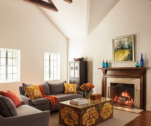
Shown: Vaulting the ceiling and removing several walls dramatically altered the living space, where finds from the homeowners’ travels now mingle comfortably with the original fireplace and casement windows.
Sofas: West Elm
Long Way to a Dream Kitchen
As Gigi noted in her blog, she and Omar had fantasized about their “dream house” for years. This one had taken them halfway there simply by being in Druid Hills, a historic district near Emory University. “You can walk everywhere,” Gigi says. “We have all the different styles of American architecture in the 20th century.”
But the 1940 spec house they nabbed didn’t pack a lot of charm. An earlier redo had moved the kitchen from the back of the house to former garage space along one side. Some windows had been plugged with glass block, and deferred maintenance had left the new homeowners holding a lengthy must-do list.
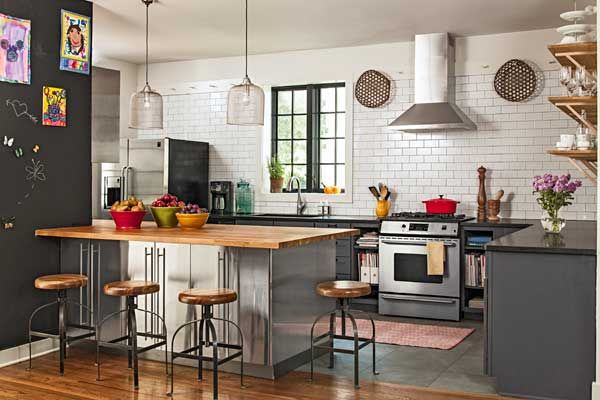
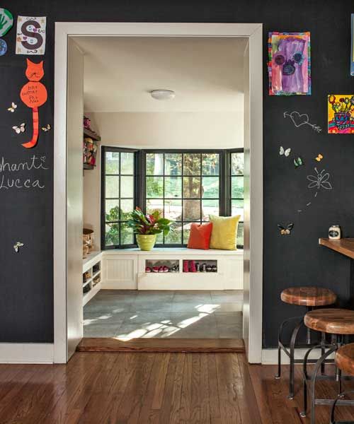
Shown: Existing base cabinets were painted gray and paired with a peninsula made from steel-laminated cabinets. Specialty paint turned one wall into a magnetic chalkboard.
Subway tile: Color Collection; The Home Depot
Knobs and pulls, peninsula cabinets, and butcher-block top: IKEA
Range: Frigidaire
Pendant light fixtures: Kudzu Antiques, Decatur, GA; 404-373-6498
Sink: Blanco Precis; faucetdirect.com
Faucet: Delta DeLuca
Stools: Cost Plus World Market
“Diamond” floor runner: Dash and Albert
Reproduction cheese baskets: 1803 Ohio Farm Baskets
Opened-Up Kitchen Storage
“The pipes were perforated in places, so the crawl space got full of bathroom water,” says Gigi. “Which we didn’t know until a handyman was down there and my daughter flushed the toilet, and you can imagine what happened. We were so embarrassed, we never called him again.” Pause. “I’m sure he remembers us.”
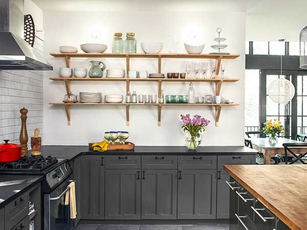
Shown: The homeowners replaced upper cabinets with open shelves and made bold use of inexpensive materials like standard subway tile, highlighting the existing chimney-style range hood and splurges like the honed black-granite countertops.
Cabinet paint: Sherwin-Williams‘s Peppercorn
Countertops: Daltile
Handy Cookbook Niches
Then a storm tore a tree out of the yard, slamming it down on a skylight over the stove. The couple repaired the damage while imagining how nice it would be to replace the kitchen—and have that play space.
Gigi fed her fantasies by clipping magazines and posting on Pinterest, where she revealed a weakness for the raw-steel, reclaimed-wood, sliding-barn-door, industrial-farmhouse school of interior design.
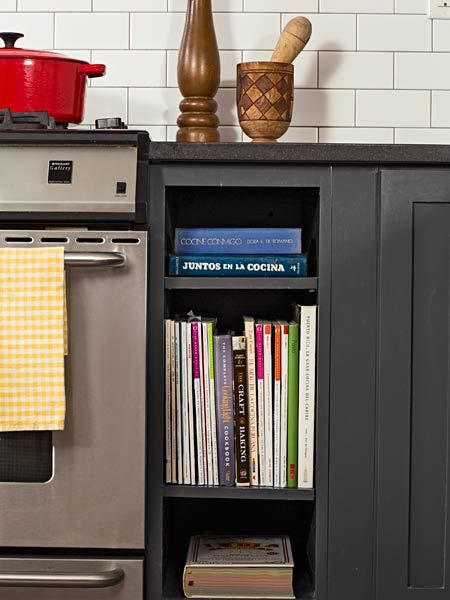
Shown: Niches flanking the existing range are a handy spot for cookbooks and magazines.
Subway tile: The Home Depot
New Period-Style Bay Window
Ton-Lo listened to her friend talk about that slide, then quizzed her some more before batting back a bigger idea: Tear out a half-dozen interior walls and turn the entire first floor into a loft, with a vaulted ceiling. Erect an open staircase to a catwalk running across the house, with bedrooms and baths at either end. “Instead of a slide, I’d give them a balcony,” says Ton-Lo, picturing the girls playing Juliet as they called down the open stairs.
To achieve more standing room upstairs, all they’d have to do is push the roof ridge back, allowing it to rise, and pop in a shed dormer facing the street—after, of course, rewiring, replumbing, and insulating the whole shebang while expanding the HVAC and redoing the kitchen and downstairs bath.
Shown: A generous new opening connects the kitchen and the mudroom. The front-facing bay was rebuilt under the watchful eye of the local historic district.
Window paint: Sherwin-Williams‘s Caviar
Bumped-Out Mudroom
Why stop there? A one-story addition could sidle up to the rear. Shaped like a lopsided A-frame, with a vaulted ceiling and lots of glass, it would give the nebbishy house a secret stylish identity—plus a new light-filled dining space.
The couple found the plan hard to resist. Expats from Peru (her) and Puerto Rico (him), they craved more sun and a better connection to the wooded yard. They both liked the idea of an open plan, too. As newlyweds, they had lived in a loft in Atlanta, carrying this early imprinting with them during a stint abroad and gravitating to another loft upon their return. The design conjured the familiar airiness of those earlier homes.
“I couldn’t say no,” Gigi says with a smile. The design was perfect—if a little pricier than what they originally planned.
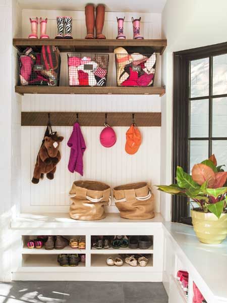
Shown: The mudroom, off the front-facing side entrance, was enlarged and has a new, period-style bay window. Gym baskets and shoe cubbies keep kids’ wear under control.
Mudroom: Specialty Chalk Board (accent wall); Rust-Oleum
Dining Room With a View
Ton-Lo balanced the cost of the investment with budget-minded touches and trade-offs. Gigi reluctantly let go of her wished-for second-floor laundry room and also agreed to keep the old kitchen cabinets and appliances. To amp up meal prep, Ton-Lo suggested painting the cabinets, adding a peninsula, and creating a backdrop of to-the-ceiling tile.
“We had to find creative ways to get an impact but at a low cost,” says Ton-Lo. “The materials were off the shelf but used in interesting ways. Instead of attaching a value like ‘this is marble from Italy,’ you use commercial-grade materials but in an unexpected, understated way.”
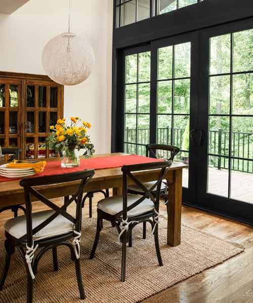
Shown: Oversize aluminum-clad patio doors echo the casements while framing the view.
Windows and patio doors: Ply Gem
Table: Pottery Barn
Chairs: Restoration Hardware
Pendant light fixture: directfurnitureatlanta.com
Rustic Barn Doors
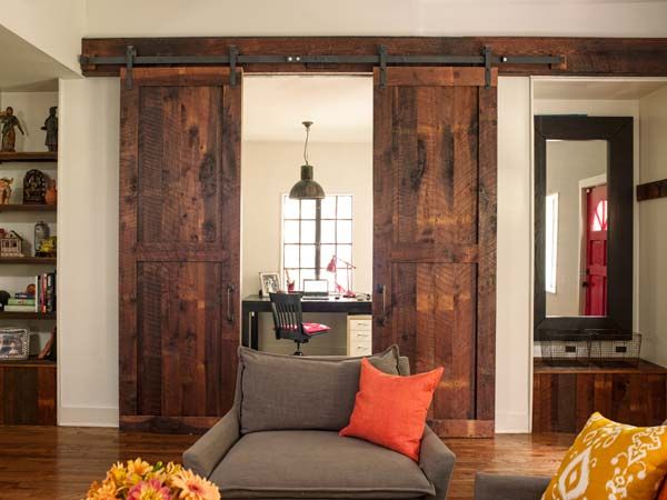
The demolish-rebuild-and-retrofit team included general contractor James Lane, who worked with Ton-Lo in getting revisions past the local historic-district commission. The commissioners had no problem with rebuilding the front porch—the existing one was more 1970s than 1940s—but were less enthusiastic about replacing drafty window panes with thermal glass. The blueprint’s raised ridge and front-facing dormer sparked much conversation, as did the original plan for the second floor, which would have exceeded required setbacks—the first floor was grandfathered—while also taxing the homeowners’ budget. As time ticked by, everyone tried to go with the flow, but when one commissioner questioned the standing-seam roof on the rebuilt bay window, Gigi fought back. The roofing stayed.
Shown: Rustic wood touches include the custom barn-wood doors that set off Omar’s first-floor office.
Door hardware: Real Sliding Hardware
Pendant fixture: Kudzu Antiques, Decatur, GA; 404-373-6498
Cozy Gabled Master Suite
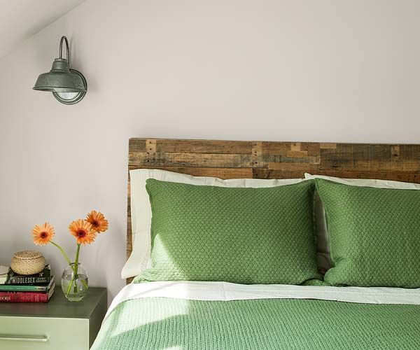
“Maybe he was giving her a hard time because the back of the house has such a modern addition—it’s awesome,” Lane says of the one alteration outside the commission’s purview. Ton-Lo designed it as “a contrast with the historic nature of the front, a juxtaposition of modern features with an old house.” She adds: “I didn’t want it to blend in.”
Lane’s bigger concern was how opening up the first floor would play out inside. “The catwalk had to be structurally tied to the existing front gable, so we had to run this huge beam from the front of the house to the back to support it,” he explains. Ton-Lo, working with a structural engineer, looked for a way to avoid erecting a column to support the point where the front gable and main roofs would intersect. To maintain the openness of the vaulted ceiling, she added a hidden rafter that ties in to a second-floor beam. “That was tricky,” she says.
Shown: The new master suite is tucked under a gable in former attic space.
Sconce: Barn Light Electric
Bedspread: L.L. Bean
Barn-Style Bath Door
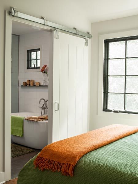
Then there was the dramatic floating staircase, treads and risers meeting flush with no overhang on the sides or front edges, knee walls framing it as well as the basement stairs below. Metalworkers had to weld and install two steel handrails in place without burning the place down.
Shown: A sliding barn-style door closes off the bath in the master suite. New windows were matched to the 1940 originals.
Door: Masonite
Sliding-door hardware: Amazon
Tub caddy: Signature Hardware
Bright Bath Finishes
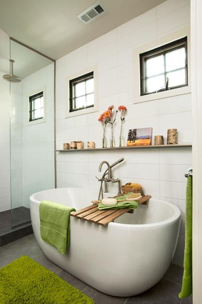
The redo timeline stretched to six months. Gigi, a self-described “control freak” whose job as a consultant involves project management and budget-shaving, bird-dogged the architect and building crew. “To me it’s important to have a consistent look across the house,” she says. “I wanted the materials to be subdued and natural.” The team used barn wood to make the door to Omar’s home office, repurposed attic joists as decorative trusses, and united the flooring with a contemporary dark stain.
Shown: Budget-minded bath finishes include an aluminum picture rail, porcelain floor tile, a small acrylic tub, and oversize wall tile in an updated pattern.
Wall tile: Calypso Blanco Ceramic Wall Tile, 6″18″; flooranddecor.com
Tub: Boyce Acrylic Tub, 61″; Signature Hardware
Shower fixtures and sinks: American Standard; The Home Depot
Glass shower wall: Echols Glass and Mirror, Inc.
Picture ledge: Metal Picture Ledge, 4 feet; West Elm
Towels: Antique Pine, L.L. Bean
Teak bathtub shelf: Signature Hardware
Birch bark candles: Black Forest Décor
Oil painting: Nancy Merkle
Salvaged Wood Vanity
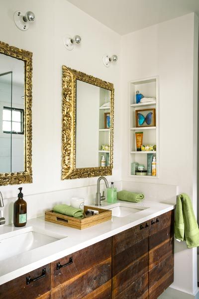
“From the street, you think it’s a two-bedroom bungalow, very small and old, then you walk in and everybody’s like, ‘Wow,'” says Gigi. “It’s completely open, so different from the other houses in our neighborhood.”
She adds, “Our house is not huge, but we use every single space. The girls have desks in my office so we can work together. Everybody hangs around the kitchen. We have dinner in the dining room every day.”
Shown: The custom vanity has a salvaged-barn-wood base and a Silestone top. The homeowners bought the ornate frames in Peru and asked their general contractor to add the mirrors.
Faucets: Danze Amalfi; The Home Depot
Cheerful Playroom
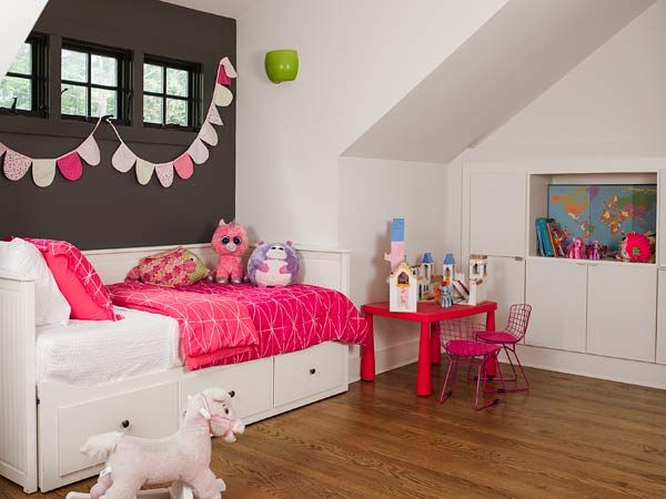
As for the playroom, the family finally got that too. It fits snugly under the new dormer, one more secret in a house whose facade still harks to another time.
Shown: Brightened by a new shed dormer, the second-floor play space has a guest-ready daybed with drawers for toys and linens.
Paint: Sherwin-Williams‘s Peppercorn (window wall) and Zurich White (other walls and trim)
Floor Plan: First Floor
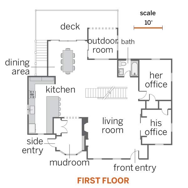
The roof ridge rose 3 feet, allowing a shed dormer in front and a master suite and another bedroom, a bath, and a playroom—connected by a catwalk—in the former attic space. The first floor was opened up, the dining area was pushed out about 12 feet, and a deck and an outdoor room were added in back.
Floor Plan: Second Floor
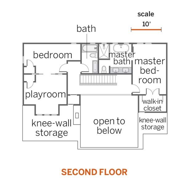
These two floors went from 1,370 square feet of living space to 2,370.
