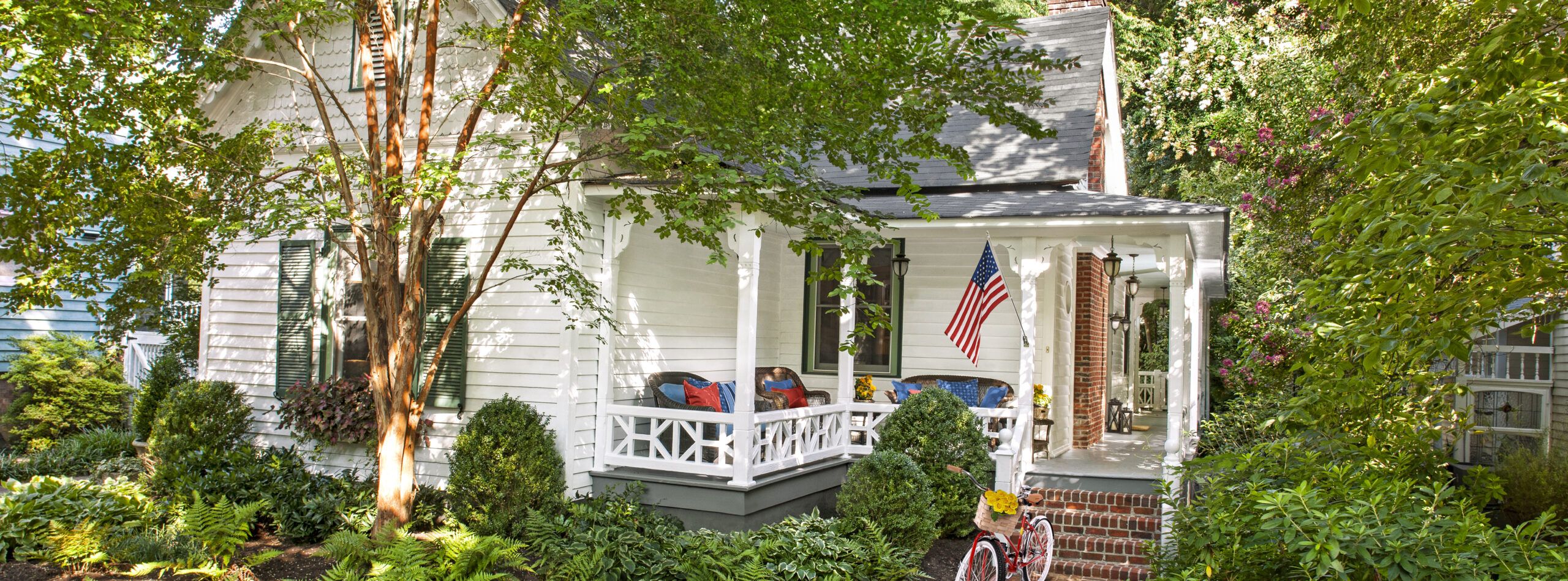
Period Details Back Again
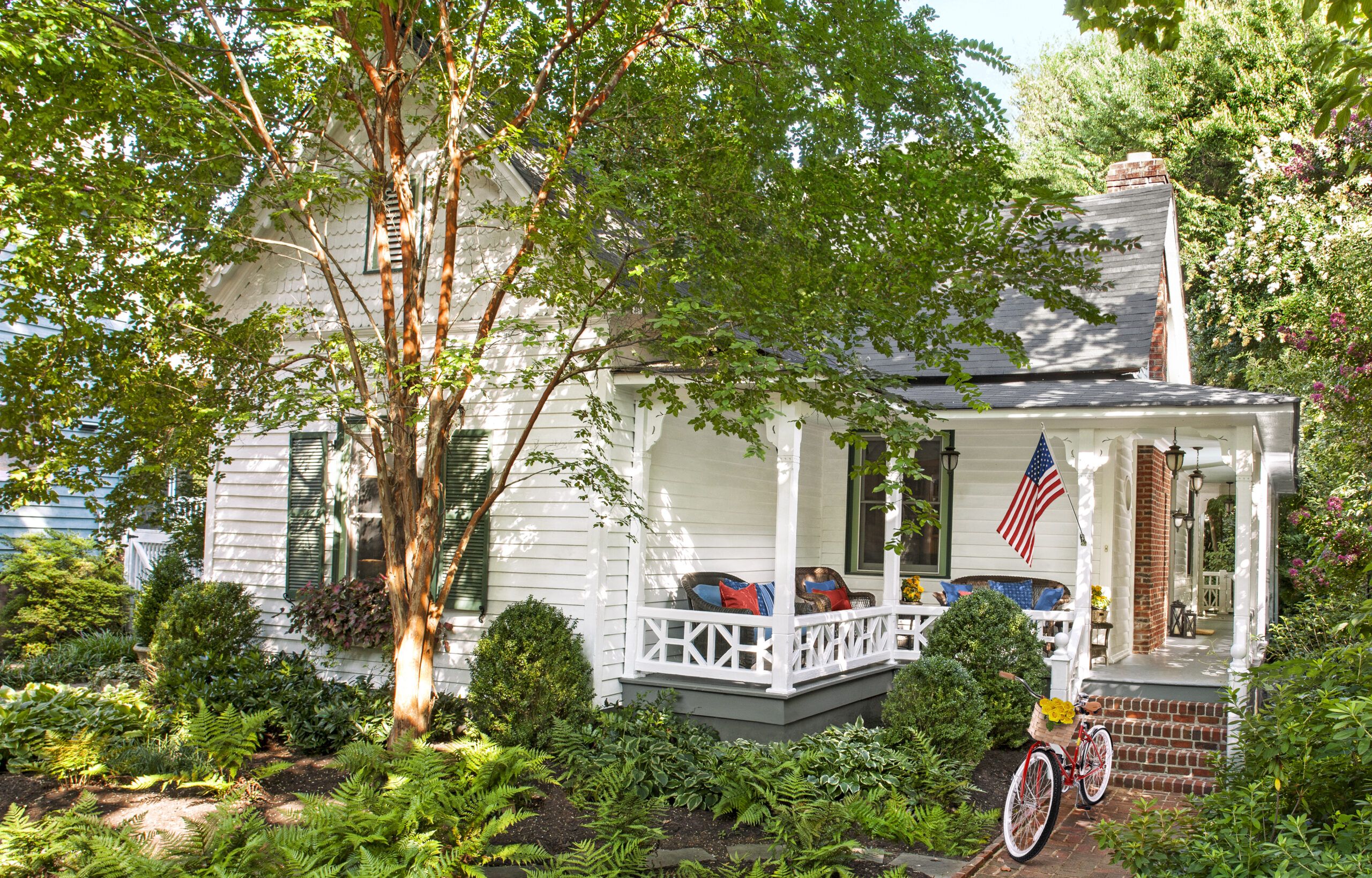
You wouldn’t know from its wholesome exterior, but this little white house, with its wraparound porch and leafy front yard, has a checkered past. Built in 1900 in the Fourth Ward, a historic district of largely Victorian-era homes in Charlotte, North Carolina, it witnessed the area’s gradual postwar decline and its rebirth in the 1970s. The house avoided demolition during the neighborhood’s redevelopment when it was moved from its original site nearby to its current, narrower lot, which required a 90-degree turn that put the front door to the side. During the early 1980s, it underwent a gut renovation that removed most of its historical details and introduced modern touches, like track lighting and a sleeping loft. At the time, that sort of makeover was as stylish as women’s shoulder-padded power suits; neither look, as it turned out, stood the test of time.
Shown: A wraparound porch shelters the house’s main entrance, located at the side.
Architect: Tony Ward, Ward Design, Charlotte, NC
Landscape designer: John Byrd, John Byrd Garden Design, Charlotte, NC; 704-441-1537
Landscape designer: Aaron Gay, Commonwealth Landscaping Management, Charlotte, NC
Bamboo shades: Smith + Noble Window Treatments
History Buff Homeowner

Happily for the house, its next owner was Greg Johnson, a traditionalist and history buff. Armed with pages torn from This Old House and other magazines, he hired architect Tony Ward, whose work he’d admired at friends’ homes, including several in the neighborhood. Greg, who used to manage real-estate operations for a major bank, was glad to have Ward to help him navigate this project. “Between us, I felt as though we knew what we were doing and would avoid rookie mistakes,” Greg says.
Shown: Homeowner Greg Johnson, pictured with his godchildren, Fritz and Kathryn, wanted to return architectural details to his house, many of which had been taken out during an earlier renovation.
Well-Defined Architectural Goals
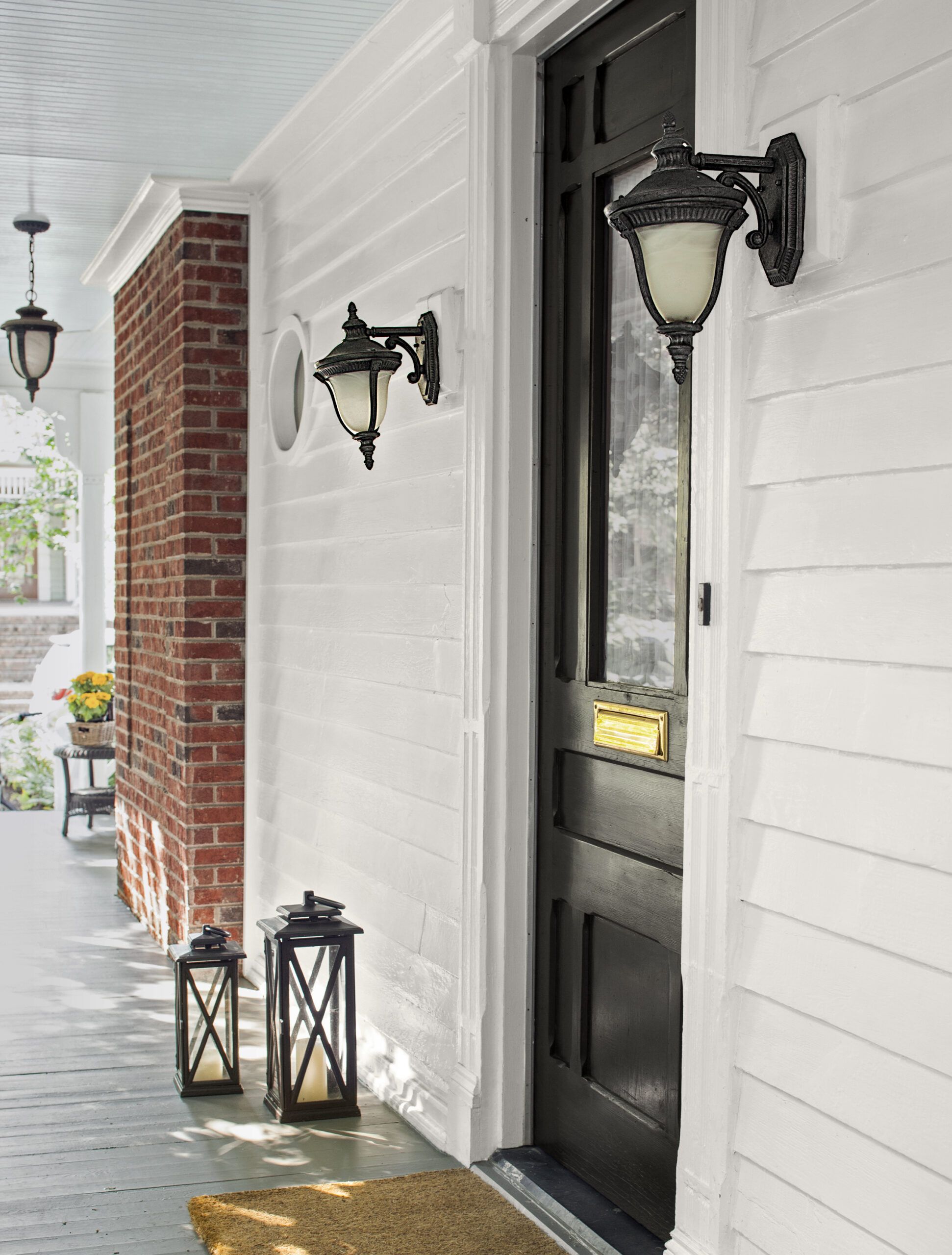
Returning architectural integrity to the house would be the starting point. “We wanted the interior to fit the house and Greg’s taste,” Ward adds. “The house is small and cozy, so the changes had to be cohesive.” And Greg knew the project should have well-defined goals. “I wanted to restore some period feeling without slavishly trying to re-create a Victorian interior,” he says. “I also wanted to open it up to improve the flow between the rooms.”
Shown: During the renovation, the fireplace was moved to the outside wall. The exposed brick is framed with molding in the manner of nearby homes of the same vintage.
Wicker furniture: restorationhardware.com
Lights: Efirds Interiors
Improved Room Transitions
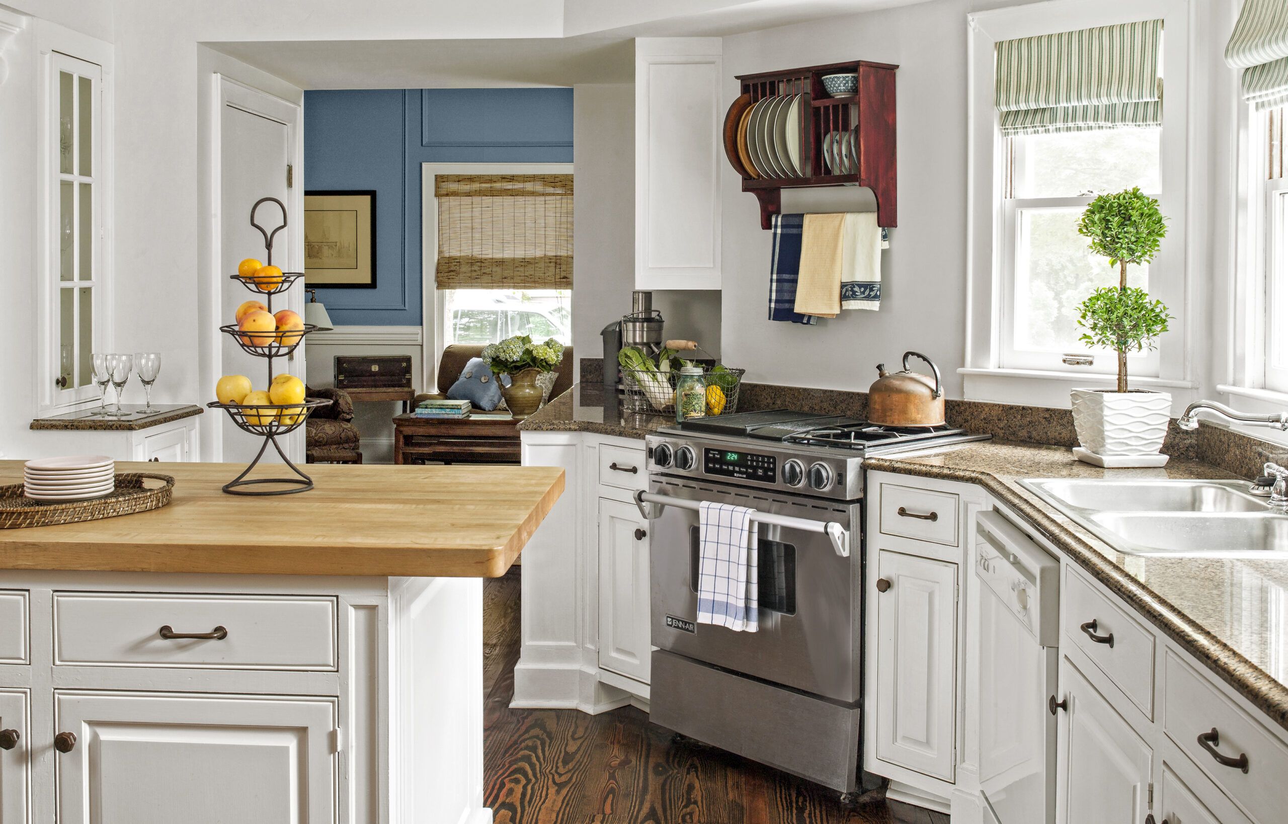
So the team jumped right in, reconfiguring the first floor. Taking out the living room fireplace, they built a new one on the opposite, exterior wall to clear the way for a wide opening to the kitchen. “That probably had the biggest impact in the renovation,” Greg says. Now, handsome rectangular columns support an enclosed, load-bearing beam and help define the transition between the rooms.
Shown: A new passageway to the dining room/study replaced a wall of kitchen cabinets.
Granite countertops: Tropic Brown, Harkey Tile & Stone, Charlotte, NC
Range: Jenn-Air
Dishwasher and sink: GE
Cabinetry hardware: The Home Depot
Tea towels: Pier 1
Refreshed Kitchen
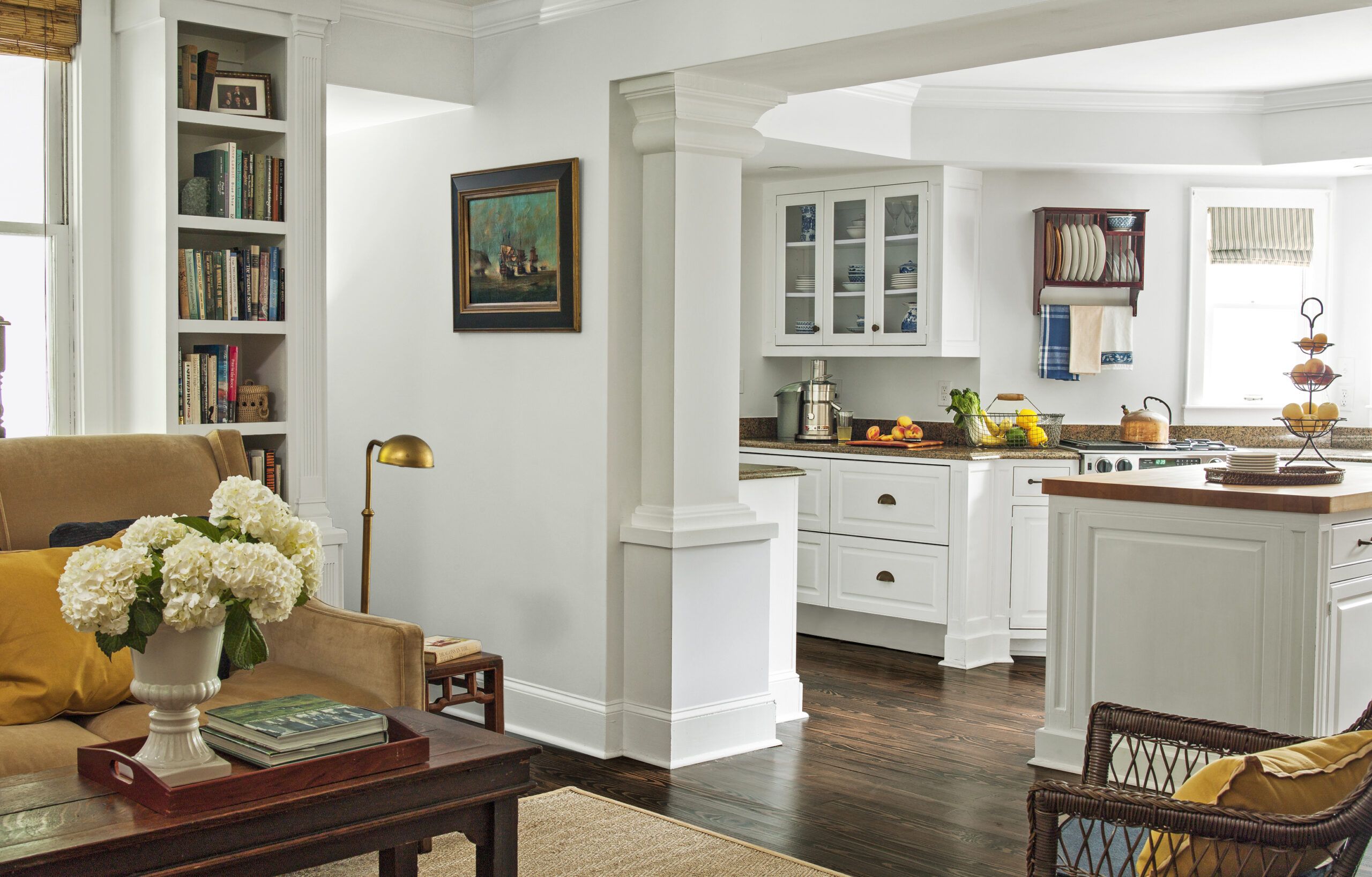
In the dark and dated kitchen, a new doorway was opened to the dining room/study. The kitchen was gutted and updated with a butcher-block-topped island and custom cabinets with granite countertops. New hardwood floors went in throughout the first floor. “I wanted to keep the old heart-pine floors, but there were too many holes where the fireplace, walls, and kitchen cabinets had been,” Greg says. “So we floated hardwood throughout to tie it all together.
Shown: The former living room fireplace wall is opened up with a wide passageway to the kitchen; rectangular columns help shore up an enclosed support beam.
Settee: Restoration Hardware
Relocated Living Room Fireplace
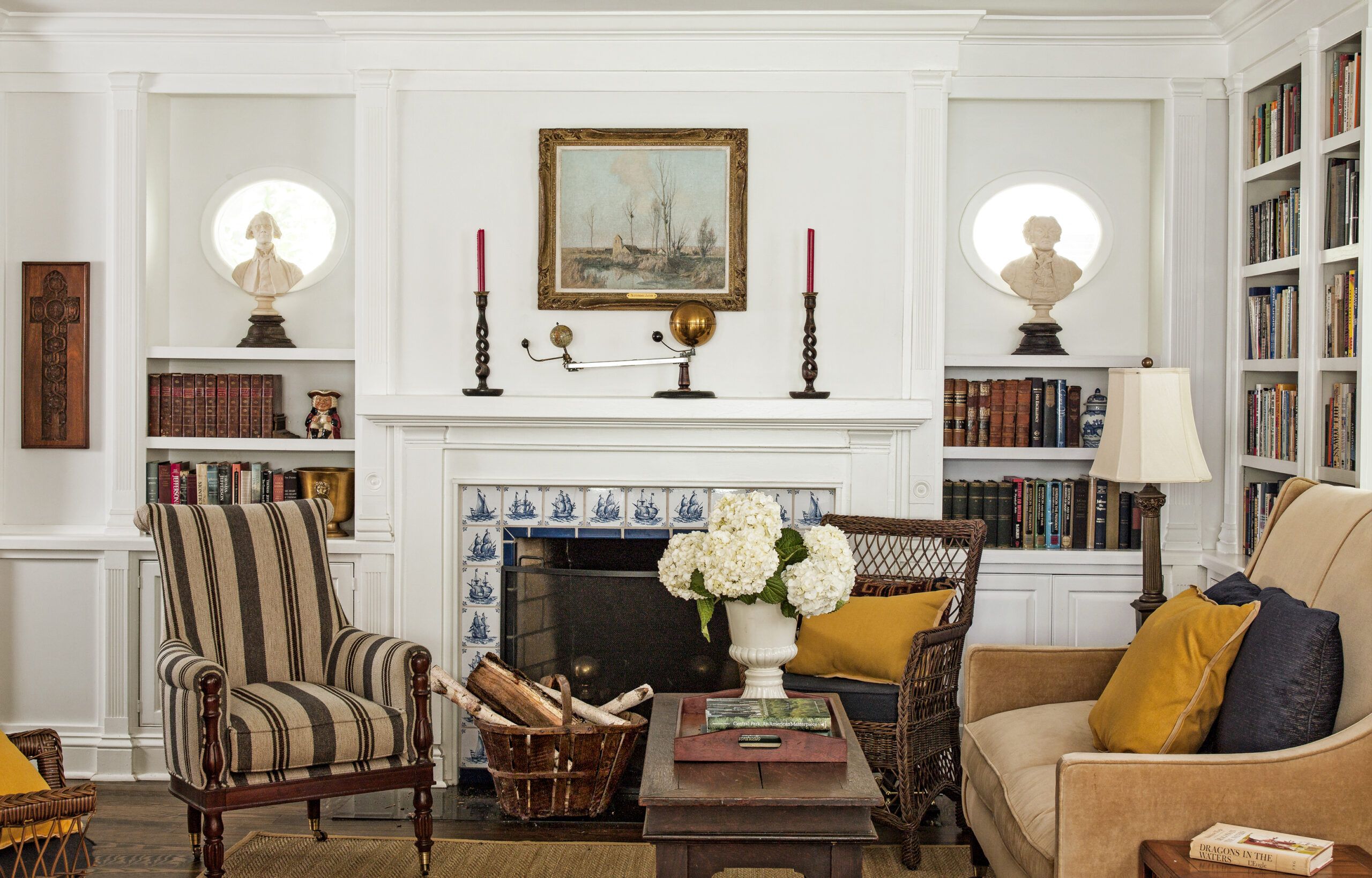
In the living room, at Greg’s request, Ward designed a clean-lined fireplace framed by a band of Delft tiles—”real ones, ordered online from Holland,” says Greg. Relocating the fireplace meant losing a window, which the architect replaced with two small oval ones.
Shown: The new fireplace wall in the living room is punctuated by two oval windows framing busts of Thomas Jefferson and John Adams atop low bookcases.
Armchair: Hickory Chair
Fireplace tile: Dutch Delft Tiles
Busts: Williamsburg Sculpture
Vase and tray: Pottery Barn
Pillows: Target
Delft Tile Fireplace Surround
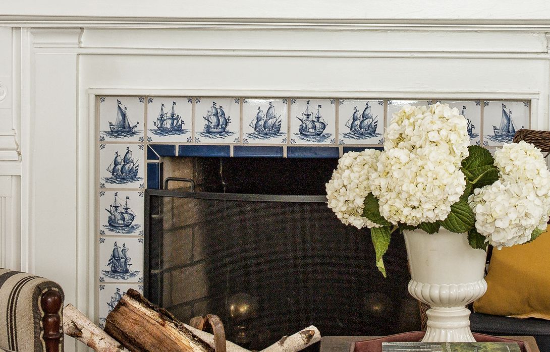
“Members of the neighborhood design committee questioned them until I showed them similar windows in other period houses nearby,” Ward says. Today they frame busts of Founding Fathers Thomas Jefferson—Greg’s favorite architect—and John Adams.
Shown: Classic Dutch Delft tiles, ordered online, were used to create a traditional fireplace surround.
Bumped-Out Master Bath
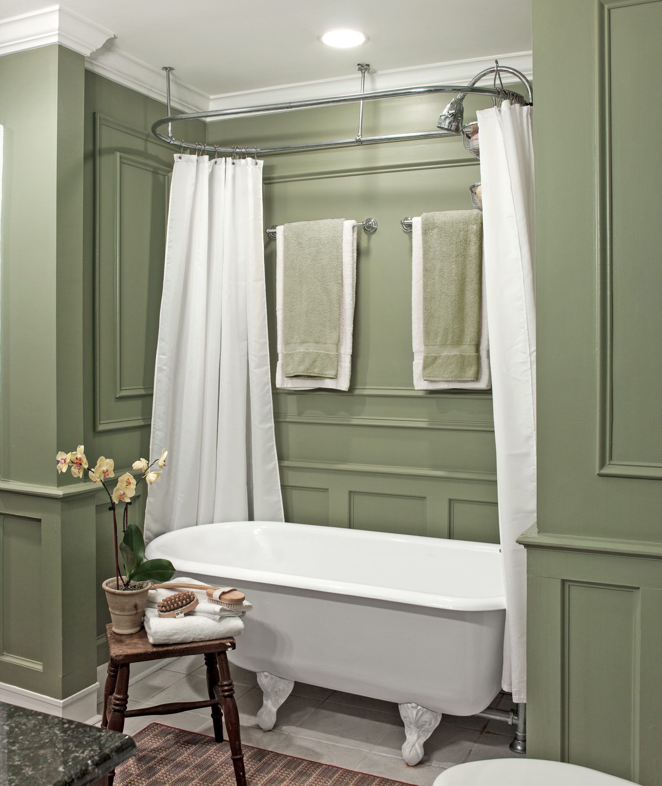
While the master bedroom’s footprint remained the same, the architect enlarged the narrow master bath by incorporating a redundant hallway and part of a laundry room and rerouting the plumbing. The addition of a big claw-foot tub as well as molding on the walls gives it a Victorian feel. “I’m a fan of white paint and dark wood,” Greg says. “I went out on a limb with the green in the master bath.”
Shown: The master bath was enlarged by stealing space from an adjacent hallway for an alcove with a vintage claw-foot tub and new moldings.
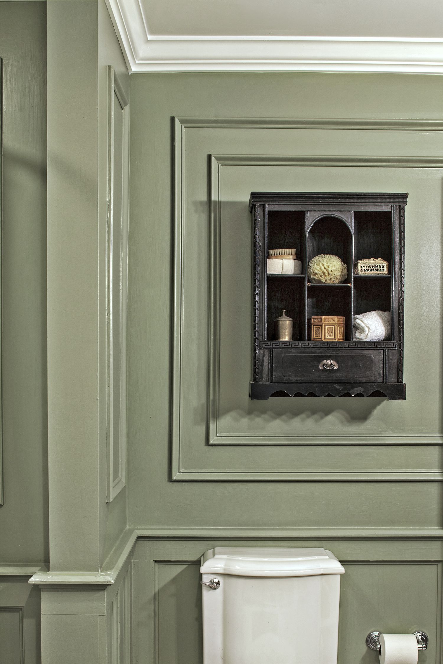
Paint (walls): False Cypress, Behr
Towel and scrub brush: Pier 1
Vintage Cabinet Bath Vanity
The earlier renovation had removed part of the second floor, so the living room had a double-height ceiling with a loft upstairs. Restoring the original ceiling created one long second-floor space furnished as a guest bedroom at one end, a home office at the other. The previous renovation’s space-saving spiral staircase remains in the entrance hall.
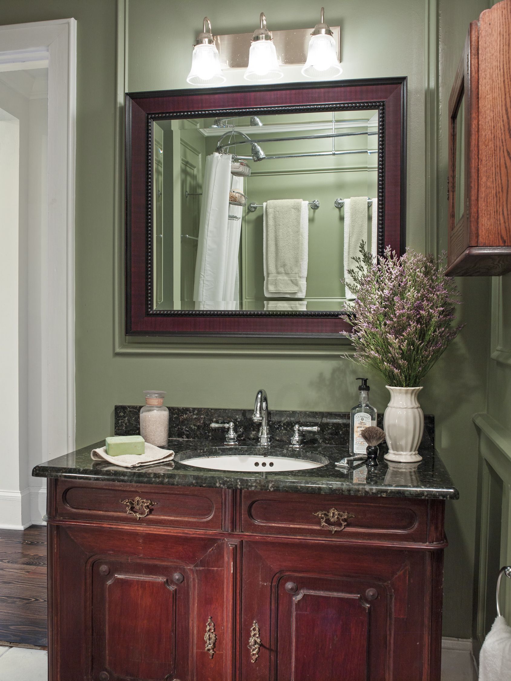
Shown: In the master bath, a vintage cabinet was converted to a vanity and paired with a mirror framed in a matching finish.
Detailed Master Bath Panels
Though he’d successfully managed scads of commercial projects, Greg admits that his own project was afflicted by a common bug: delays. “In the commercial world, I was always the contractors’ biggest customer, so they’d drop things for me,” Greg says. “My house was one of several projects my contractor was juggling.” He overpromised on the schedule (it was supposed to take four months and took seven), “but, fortunately, the workmanship was good.”
Shown: Architect Tony Ward designed the panel details in the master bath. The wood wall cabinet is a family piece.
Late-Addition Built-In Bookcases
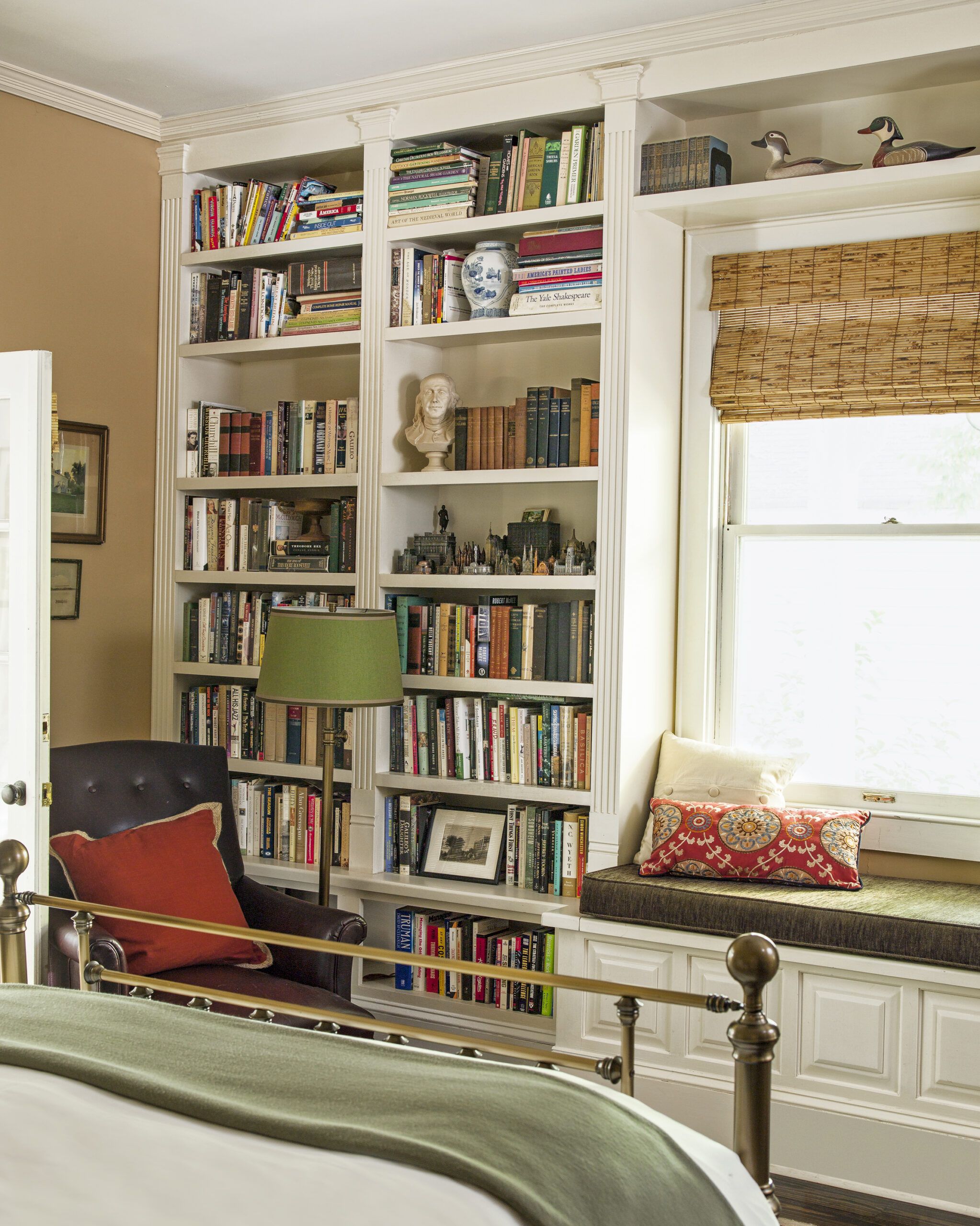
That experience didn’t dissuade Greg from doing more work once he’d moved in. “After living here, I found I still needed to add a couple of things.” More bookshelves for one, which Ward designed to fill the wall around the master-bedroom window and include a cushioned window seat.
Shown: New built-in bookcases and a window seat frame the one window in the downstairs master bedroom.
Paint (walls): 3005-7C Woodlawn Lewis Gold, Valspar
Bed: Restoration Hardware
Snug Window Seat
But what Greg really wanted was to improve the backyard and the house’s connection to it. French doors already linked the master bedroom to a rear deck, which wrapped around the house to the porch. This, Greg realized, was a perfect place to extend the house with an airy sunroom.
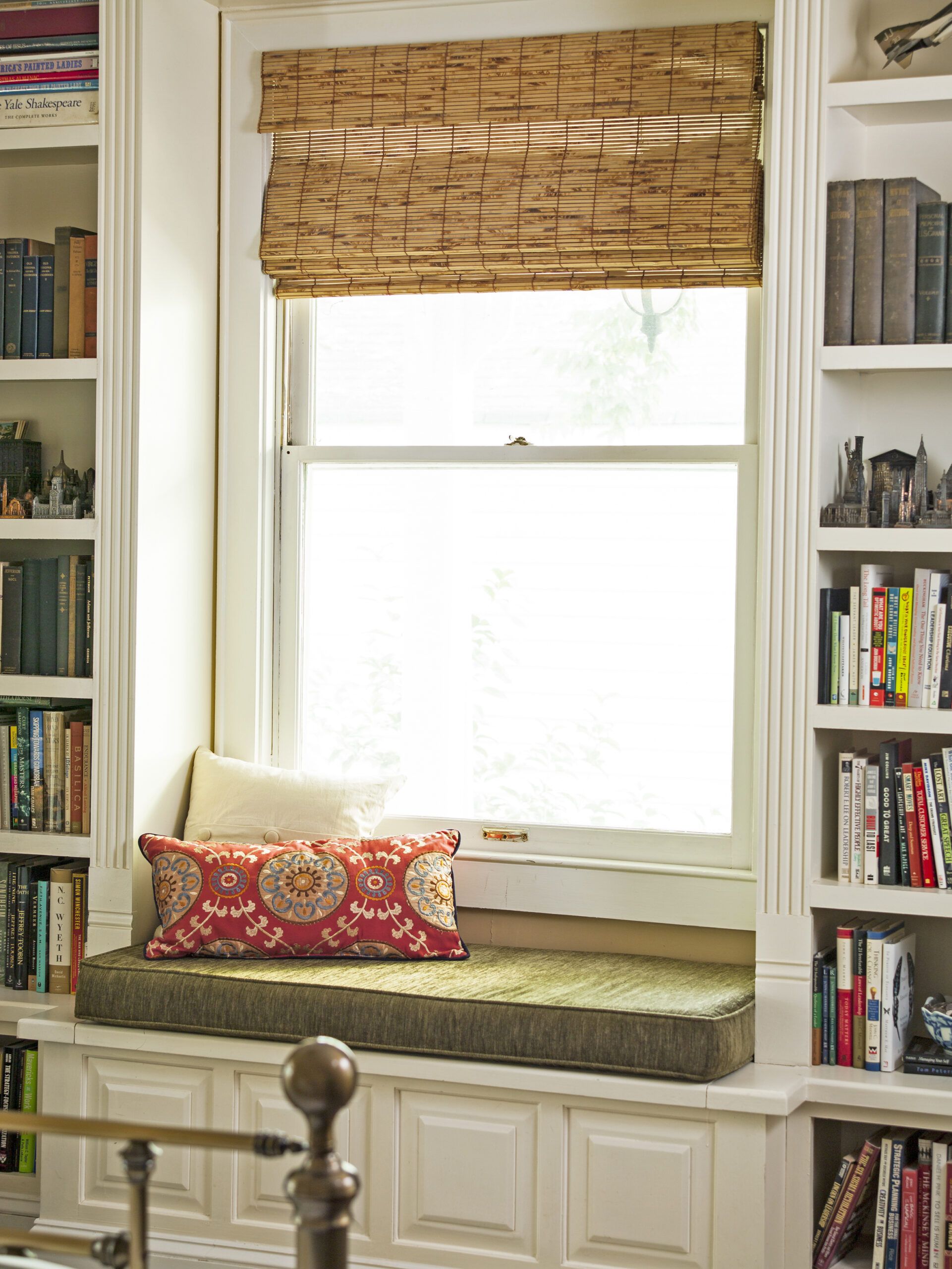
Shown: Adding bookshelves in the master bedroom created a snug spot for a cushioned window seat.
Cozy Guest Room and Office
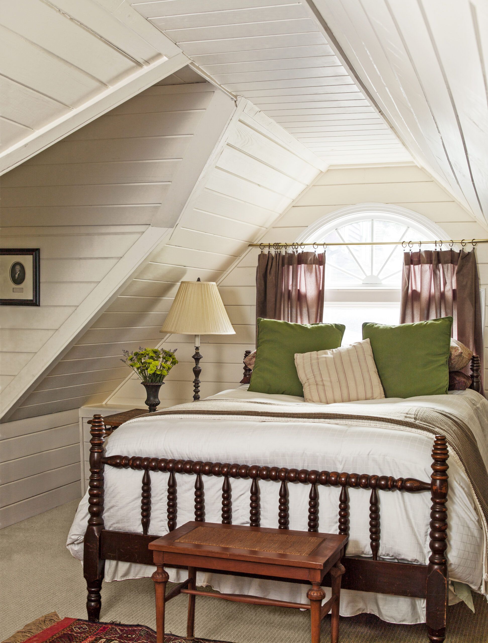
“He originally wanted a screened porch,” Ward recalls. “I suggested making it a year-round room with large, screened casement windows. You can open them and have the feeling of a screened porch or close them to enjoy it in any season.” In a nod to Jefferson, the five-sided room echoes the octagonal dome at Monticello. Side doors open the room to a new deck.
Shown: Tongue-and-groove paneling now dresses up the guest room and office area upstairs.
Green pillows: HomeGoods
Sun(ny) Room
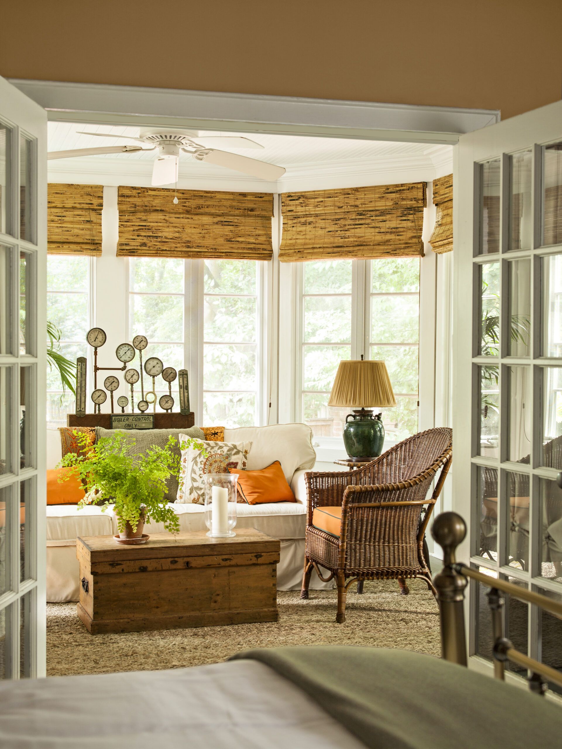
In the renovation’s final phase, the backyard became an inviting outdoor living and dining area. Out came the patchy lawn, in went brick paving and a large stone fireplace. In the front, Greg reduced and relocated a concrete parking pad to make more room for greenery. The garden’s hydrangeas, azaleas, dogwoods, and other Southern favorites suit both the house and the climate.
Shown: For the sunroom off the master bedroom, the architect used the biggest stock casement windows he could find. They backlight an art piece fashioned out of antique gauges and valves displayed behind the sofa.
Sofa: Pottery Barn
Art piece: Big Daddy’s Antiques
Tangerine pillows and candle: HomeGoods
Full of Old Family Pieces
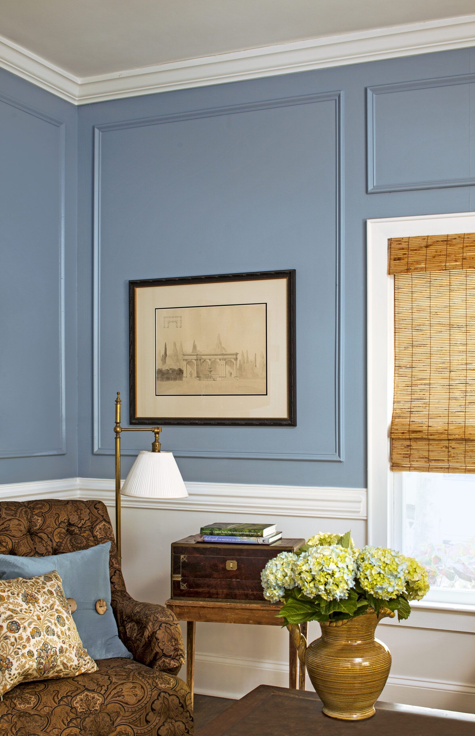
“The backyard is a little sanctuary,” Greg says. “You forget you’re in the city, and the shade makes it 10 degrees cooler. I’ve had some really great parties there, both large and small.”
The renovated house seems larger than its 1,800 square feet. Somehow, despite losing a vaulted ceiling in the living room, it feels more spacious than ever. “The rooms feel generous now,” Ward says. “Before, they didn’t.”
Shown: A two-piece chair rail, wall frames, and a dusky blue paint color impart character to the dining room/study, which had been a bedroom. The warm, traditional furnishings are “mostly old family pieces,” says the homeowner.
Paint (upper walls): Colorado Springs, Behr
Paisley chair: Hickory Chair
Floor lamp: Restoration Hardware
Pillows: HomeGoods
Outdoor Entertaining Hot Spot
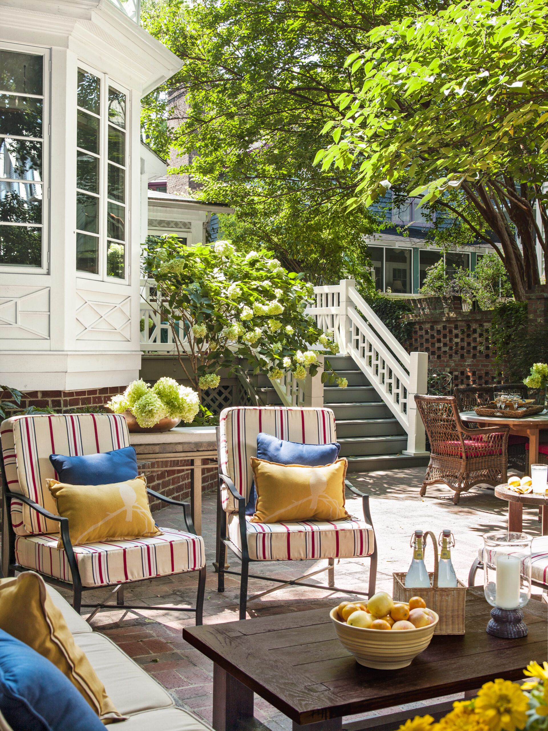
“The kitchen was kind of closed off,” adds Greg. “Now it’s the heart of the house.” And the exterior improvements serve as true outdoor rooms.
It’s a short walk to Greg’s current job, at Envision Charlotte, a nonprofit that promotes sustainable practices in the city. “Historic preservation is really another element of sustainability, whether it’s a house or an office building,” Greg says. “It’s saving something old and making it more livable for today. Restoring an old house is inherently green.” And thanks to his discriminating eye and careful stewardship, this one stands ready for another century of gracious living.
Shown: Because of the area’s balmy weather, the backyard space can be used for outdoor entertaining most of the year.
Outdoor furniture: Summer Classics
Pillows: Target
Back Patio Stone Fireplace
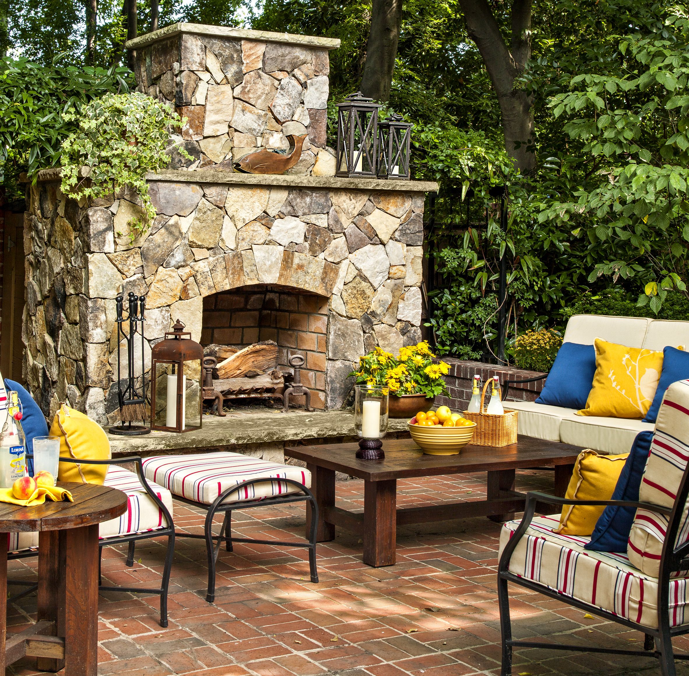
With its handsome stone fireplace, the back patio “is a great place to sit with friends, have a glass of wine, and watch the fire,” Greg says.
Lanterns: Pottery Barn
Room for Outdoor Dinner Parties
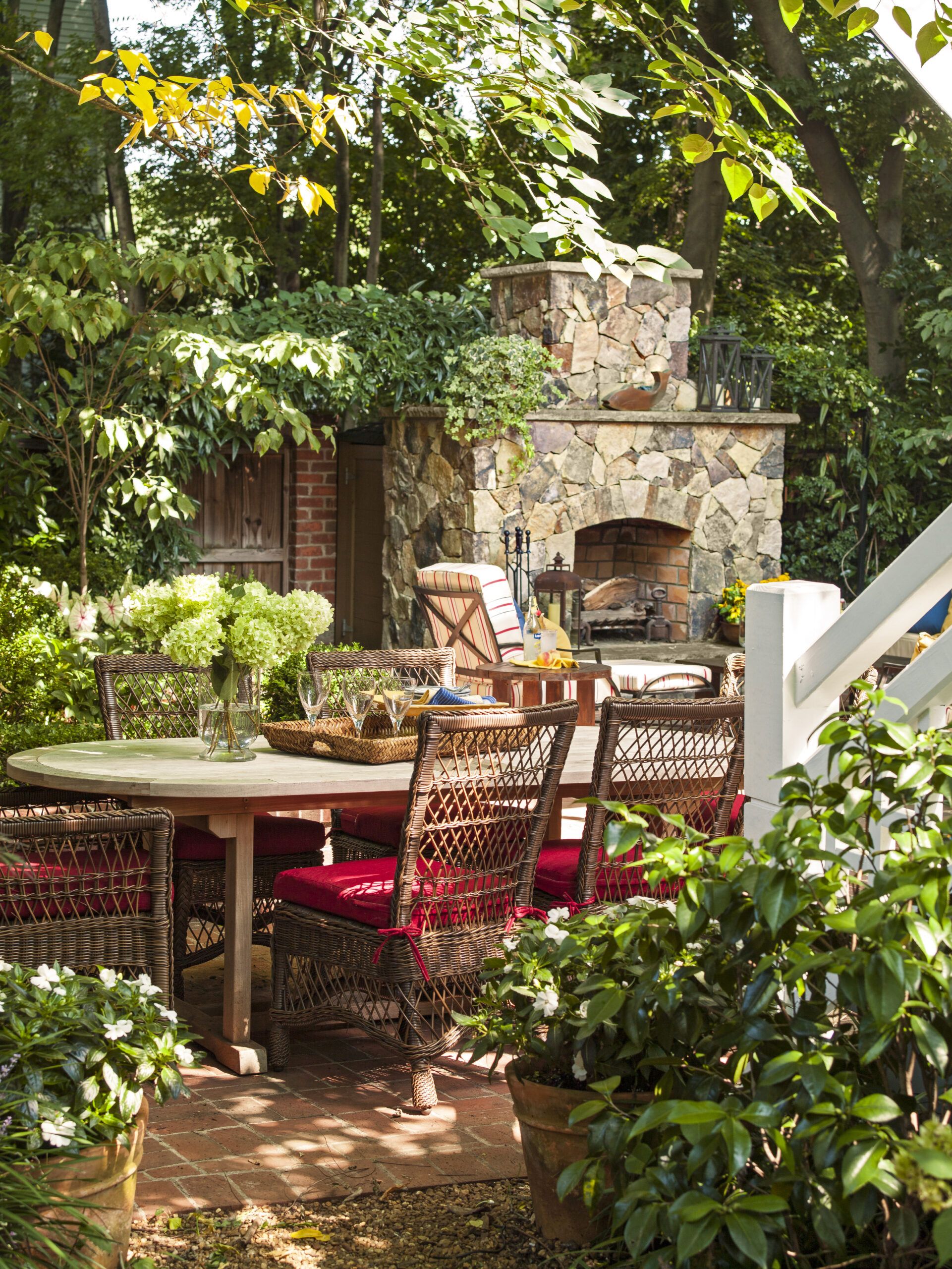
The brick patio is large enough to fit a full-size dining table and chairs, where the homeowner likes to host dinner parties.
Wicker dining chairs: American Country
Floor Plan: First Floor
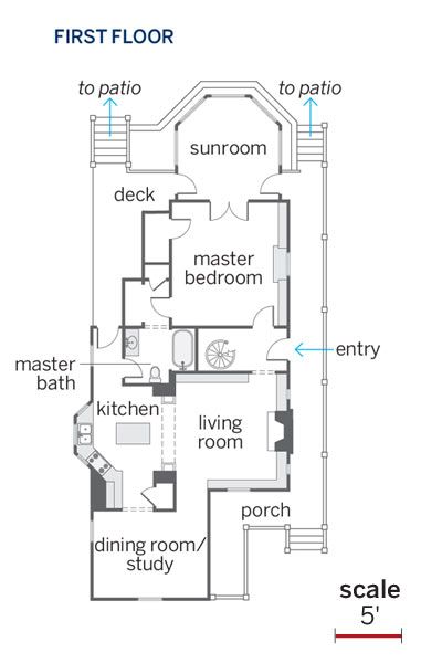
The redo improved the flow of the 1,800-square-foot house’s first floor by opening up the kitchen, dining room, and living room to one another.
Floor Plan: Second Floor
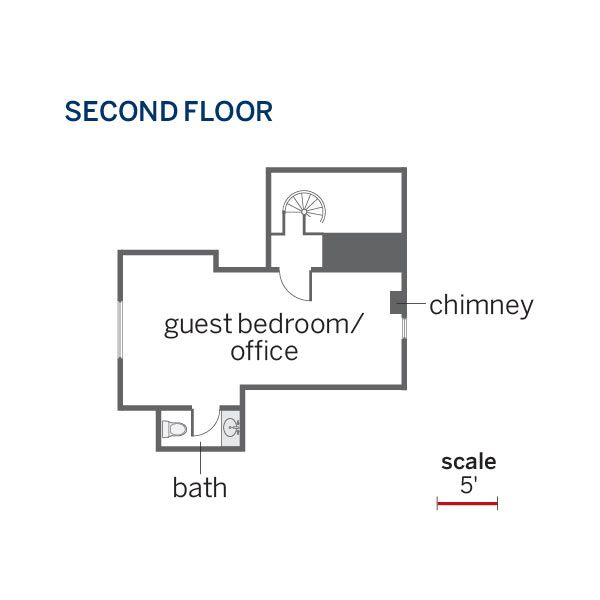
A new sunroom provides access to the expanded outdoor living space. The existing spiral stairs lead to the restored second floor, now an enclosed guest room and office space.
