A Seasoned Remodeler
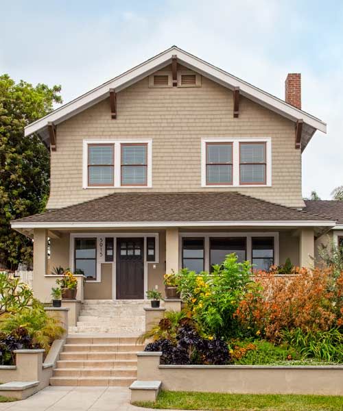
For serial remodelers, the “next one” always holds the promise of being the “best one”—a chance to learn from past mistakes, improve DIY techniques, and reap the satisfaction of a glorious end result. For Aaron Cover, a Web designer who has renovated seven houses in 13 years, the redo of this 1916 Craftsman was definitely his biggest undertaking to date. And deciding to do all the cabinetry himself nearly did him in.
It seemed like a good idea at the time. With four Dallas house renovations and two San Diego, California, redos under his belt, he set his sights on the two-story stucco-and-shingle Craftsman with its compelling location—directly across the street from a golf course, overlooking Balboa Park and, in the distance, the San Diego harbor. The house was a hard-luck fixer-upper: Previous owners had chopped up the layout in order to rent rooms to college students.
Shown: The 1916 Craftsman’s facade has its original cedar shingles, which had been preserved under aluminum siding, on the upper story. The stucco covering the first floor needed repair; the street-level walls are new.
Original Open Plan
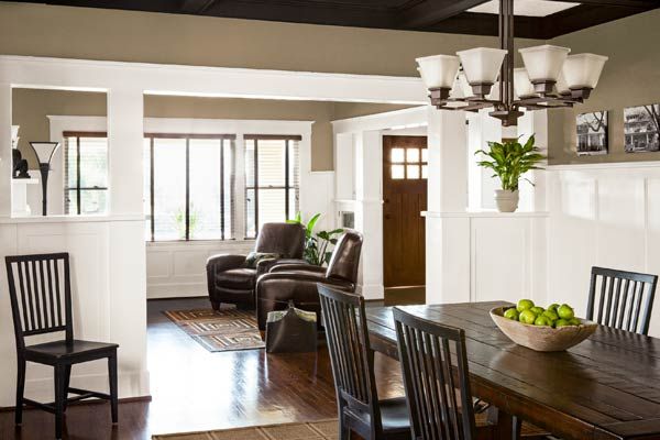
Aaron saw the possibilities immediately, envisioning a house that combined the authenticity of original architectural details with newer open spaces that suit today’s lifestyle. He figured that he already had most of the skills and the tools for the work that was needed. He could repair and refinish the wainscoting and the boxed-beam ceilings in the foyer, living room, and dining room. And he could deconstruct and remove the warren of small bedrooms and bathrooms that the previous owners had created to rent out rooms. Having done plenty of tile work on previous renovations, he could do the tiling that the new baths would require. And he had mastered the art of low-cost concrete countertops.
But the two things Aaron wanted most would stretch his skills and his budget: a big, airy kitchen with plenty of storage, natural light, and traffic flow for entertaining; and a second-floor master suite with ample closet space and a spa-like bath. A wild thought took hold: To compensate for the cost of the two-story addition—a pro job that in California would involve adhering to earthquake code—he’d make all the cabinetry himself.
Shown: All the trim, door and window casings, wainscoting, and half-height built-in bookcases—which form partitions from foyer to living room to dining room—were repaired and refinished with white paint, which adds to the fresh, updated feel of the spaces.
Ready for Guests
“I’m not sure what I was thinking,” Aaron says now, with a laugh. “But with every house I remodeled, I saw the price of semicustom kitchen cabinets get 20 percent more expensive and the quality get worse. So I thought, I can do this.
Aaron created all his design drawings for the floor plans and the cabinetry in Adobe Illustrator, software he used extensively in his Web-design business; he exported his drawings for the addition into CAD (computer-aided design) software to send to a structural engineer, who specified a steel beam in the new kitchen ceiling to satisfy building and earthquake code. For the addition’s foundation and framing, he hired contractors. Then he rolled up his sleeves.
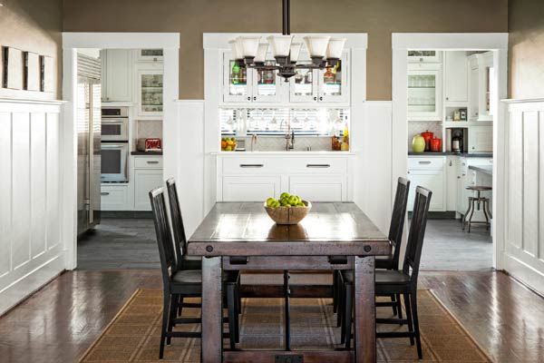
Shown: To ease entertaining and channel natural light between the existing dining room and the new kitchen, the homeowner built a pass-through where an exterior wall once stood. Double doorways are located where two windows had been. The kitchen side of the pass-through holds a wet bar with refrigerator drawers and wine storage.
Self-Designed, Updated Cook Space
To start the cabinetry, he bought a jig and a router, setting them up with his old reliables—table saw, miter saw, sanders—in a makeshift workshop under a tent-pole cabana in the backyard. Relying on books and online tutorials, he went through “lots of trial and error” to make the first full-inset dovetail-drawer prototype. “I found out then why people more often do overlay doors and drawers,” Aaron says now. “It’s a lot easier!”
In retrospect, the sheer volume of work was staggering: He crafted every kitchen cabinet and drawer, including lots of custom pullouts and appliance garages and, later, all the bathroom vanities, every master-closet organizer, a media wall, and a full mudroom of built-ins. Meanwhile, for nine months his “kitchen” consisted of a refrigerator in the dining room and a stove in the middle of the new concrete slab.
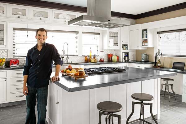
Shown: Homeowner Aaron Cover relaxes—at last! in his new open and airy 15-by-20-foot kitchen, surrounded by proof of his DIY chops.
A Little Buck for a Lot of Cabinetry
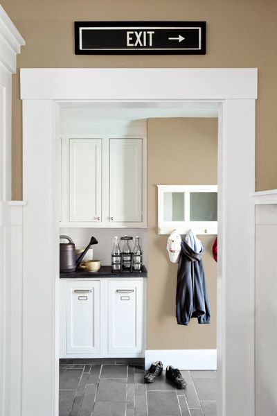
On the plus side, Aaron estimates he spent only $4,000 to $5,000 in cabinetry materials for the kitchen—birch plywood for the boxes and drawers and solid maple for the fronts. On the minus side: “I had no idea how much sanding there would be. My arm and hand went numb some days,” he says. His image of the ideal kitchen—”a classic white kitchen with dark countertops, a subway-tile backsplash, and a slate floor”—was taking shape through sweat, grit, and sawdust.
Shown: Base cabinets in the mudroom hold tilt-out recycling bins. Handcrafted and installed by the homeowner, the drawers and random-pattern slate floor continue from the adjacent kitchen.
A Twist on the Traditional
Aaron then put another of his skills to work making the concrete counters—pouring them into a plywood mold and then turning them out like a cake—a technique he had mastered in previous renovations. “The key is having a number of large, strong friends who can help you turn the mold over and carry the countertop into place,” he says. He also installed the backsplash and the floor—cutting 16-by-16-inch slate tiles into a pattern he created using Illustrator. “I wanted a twist on the traditional slate floor,” he explains.
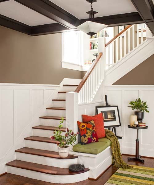
Shown: In the foyer, original elements blend with updates. The existing stairway, wainscoting, and box-beam ceiling were cleaned up with paint and the stair treads refinished. New oak floors were stained a dark English chestnut.
If at First You Don’t Succeed…
Turning his attention to other parts of the house, Aaron worked to instill a new Craftsman sensibility by restoring and re-creating original details. One of the tasks that he had been confident about when he first saw the house, however, turned into something of a nightmare. After rebuilding the half-wall bookcases between the living room and the foyer, all the columns, and the sections of wainscoting that had been damaged, he set about refinishing them. “But every stain I applied made the wood look like tiger-striped plywood,” he recalls. “Even after sanding, an orange color came out, no matter what I did.” In the end, he painted the half-wall dividers and wainscoting off-white, which he realized would help marry the new and old wood and give the house a more modern feeling. When he found that the box beams also didn’t take stain well, he painted them dark charcoal.
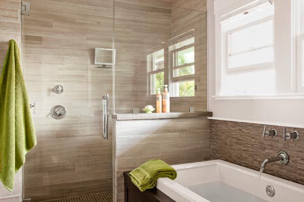
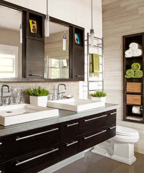
Shown: Limestone tile lines the master-bath walls and shower. The homeowner installed all the tile himself and made the vanity, medicine cabinets, and concrete counters.
It’s the Small Things
There were unexpected bonuses. Although the first floor’s existing oak flooring, only ⅜ inch thick, could not be salvaged due to termite and water damage, Aaron was thrilled when the second floor’s ¾-inch-thick Douglas fir flooring turned out to be in excellent shape, thanks to years spent hidden under carpeting.
Shown: Quartzite tile that the homeowner installed covers the floor.
Restored Craftsman Sensibility
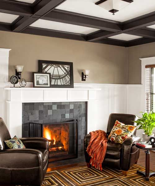
Some remodeling decisions were driven more by pragmatism than by historical authenticity. In the living room, he made the existing fireplace more prominent by adding a layer of slate to the surround and boxing out the mantel with wood. An extra layer of brick had already been added by previous owners, and Aaron feared he would pull the entire assembly off if he tried to remove it. “Adding the slate makes the fireplace a little grander and in keeping with the proportions of the room,” he says. In the adjacent media room, a living area that had been added in the 1940s, he camouflaged the back of the fireplace chimney by fashioning a wall of built-ins surrounding a wall-mounted flat-screen television monitor.
Shown: The living room fireplace got a new slate-tile surround and wood mantel over formerly built-up brick. Light fixtures throughout the house are Craftsman-style reproductions.
Restful (for Now) Serial Renovation
The renovated Craftsman incorporates today’s technology in other ways, as well. A new HVAC system—with ductwork ingeniously positioned in closet corners and wall cavities where opportunities presented themselves—ensures efficient heating and cooling, and an array of 36 photovoltaic panels was installed on the south-facing slope of the gable roof. “I basically don’t have an electricity bill,” says Aaron, who is as happy about that bottom-line benefit as he is about the overall look and feel of the two-year-long remodel. He is applying for historic status for the house and, while he awaits the verdict, is looking forward to celebrating its centenary, in just three years. Says the reformed—for now, anyway—serial renovator: “I’m here to stay.”
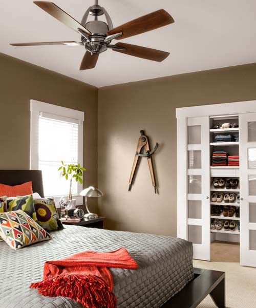
Shown: About half of the 12-by-16-foot master bedroom is new square footage in the two-story addition. The master closet, with five-light frosted-glass pocket doors, is fitted with the first test-run cabinets Aaron made for the house; he reckoned that any mistakes wouldn’t be on display in there.
Beauty’s in the DIY Details
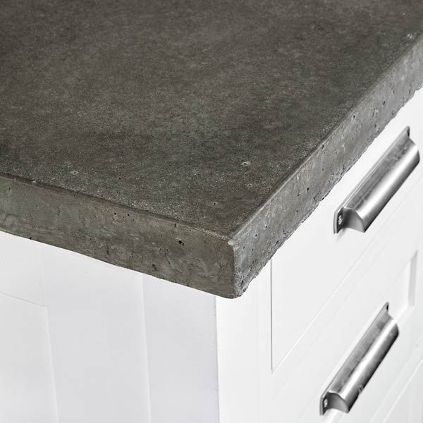
The homeowner made every cabinet and drawer, poured and installed the concrete counters.
Self-Installed Tile Surfaces
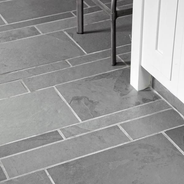
The homeowner also designed, cut, and laid the slate-tile floor (shown); and installed the subway-tile backsplash.
Floor Plans: First Floor
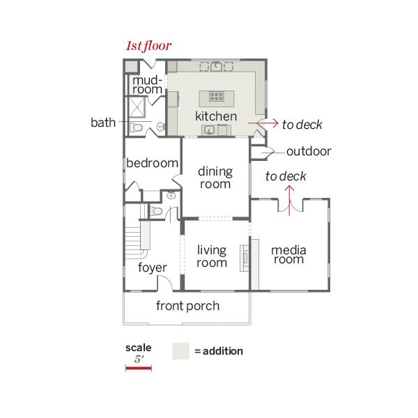
“I wanted a big, open kitchen where friends could gather.” —Aaron Cover, homeowner
Floor Plans: Second Floor
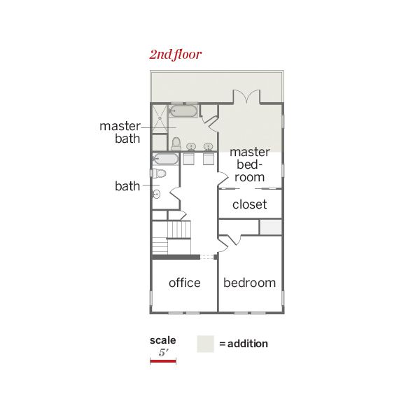
The nearly 500 square feet of living space added in back is split between the kitchen and the upstairs master suite, which also has a full-width balcony.
