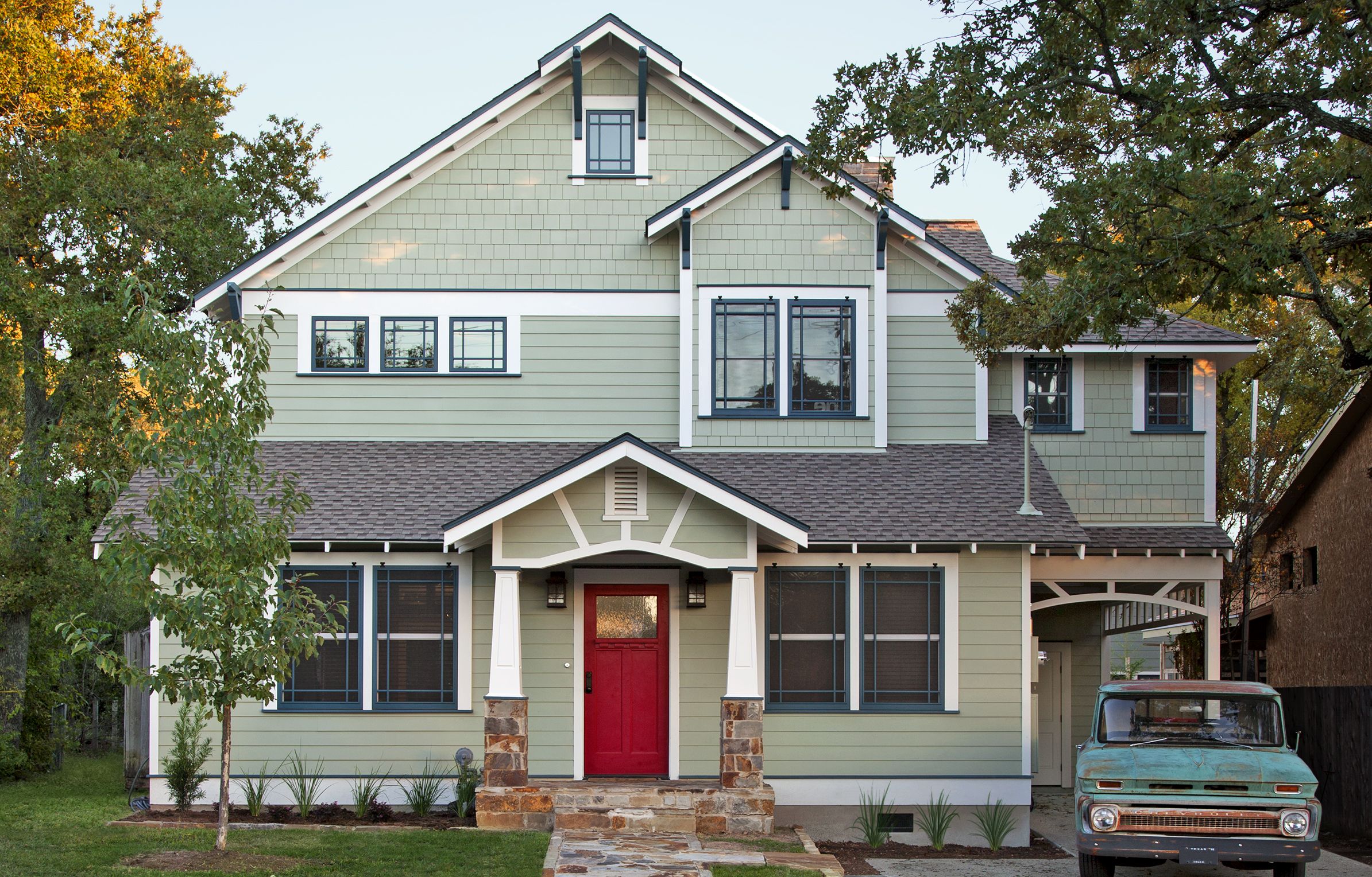
House Love at First Sight: After

If you find the perfect house—all 844 square feet of it—and buy it on the spot, it’s safe to say that coziness and charm pack a powerful one-two punch. When the former Nadia Khan saw the online listing for the pert two-bedroom, one-bath Craftsman bungalow, built in 1941, it reminded the recent Austin transplant of the houses she loved growing up in New York’s Westchester County. “I called my Realtor and said, ‘That’s my house.’ ” A front-entry porch flanked by two sets of windows and capped with a pitched roof radiated what “house” meant to her. “I was single, and it was perfect for me,” she says.
Shown: The design-build firm preserved as much as they could of the first floor’s original details, using them as a point of departure for the rest of the facade.
Siding: HardiePlank and HardieShingle, JamesHardie
Front step: NLC Masonry, Austin, TX; (512) 447-2849
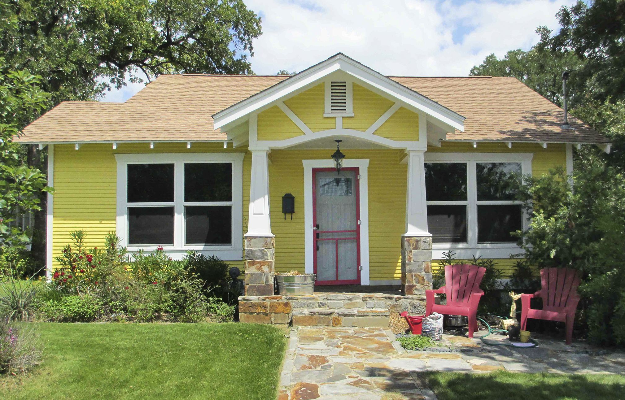
Smaller Craftsman Bungalow: Before
But things happen fast in Nadia’s world—within a year, the preschool teacher had married her boyfriend, Aaron Blair, a chef. The following year, the couple had a baby, Townes. As the Blair family expanded, it became obvious the house wasn’t measuring up, literally: The living room was minuscule, there wasn’t room to seat many guests in the dining room, and the kitchen was too small, especially after Aaron bought a commercial range. “I wanted to cook on something comparable to what I was using professionally,” he says. Space was at a premium outside, too: Aaron had no covered protection for his beloved classic car, an aqua 1959 Chevy Bel Air.
Shown: Once a cozy 844 square feet, the original Craftsman bungalow was bumped out in back and along one side, then topped with a second story.
Rejiggered Home for a Growing Family

Making the house work for a modern family, while preserving the architectural character that first grabbed Nadia, would be an ambitious project—one that ultimately called for tripling the wood-frame dwelling’s square footage and building a second story.
Shown: Nadia and Aaron with their two sons, Townes and baby Hayes.
Delicious Fit for a Design-Build Firm
The couple began by researching design-build firms. “I liked the idea that one company would do everything,” Nadia says. A recommendation from a parent at Nadia’s school directed them to CG&S Design-Build. The first meeting with principal architect and design director Stewart Davis, project architect Gregory Thomas, and interior designer Mark Evans (CG&S Design-Build, Austin, TX) was notable for the good chemistry everyone remembers, aided by the just-baked muffins Nadia pulled out of the oven for the occasion.
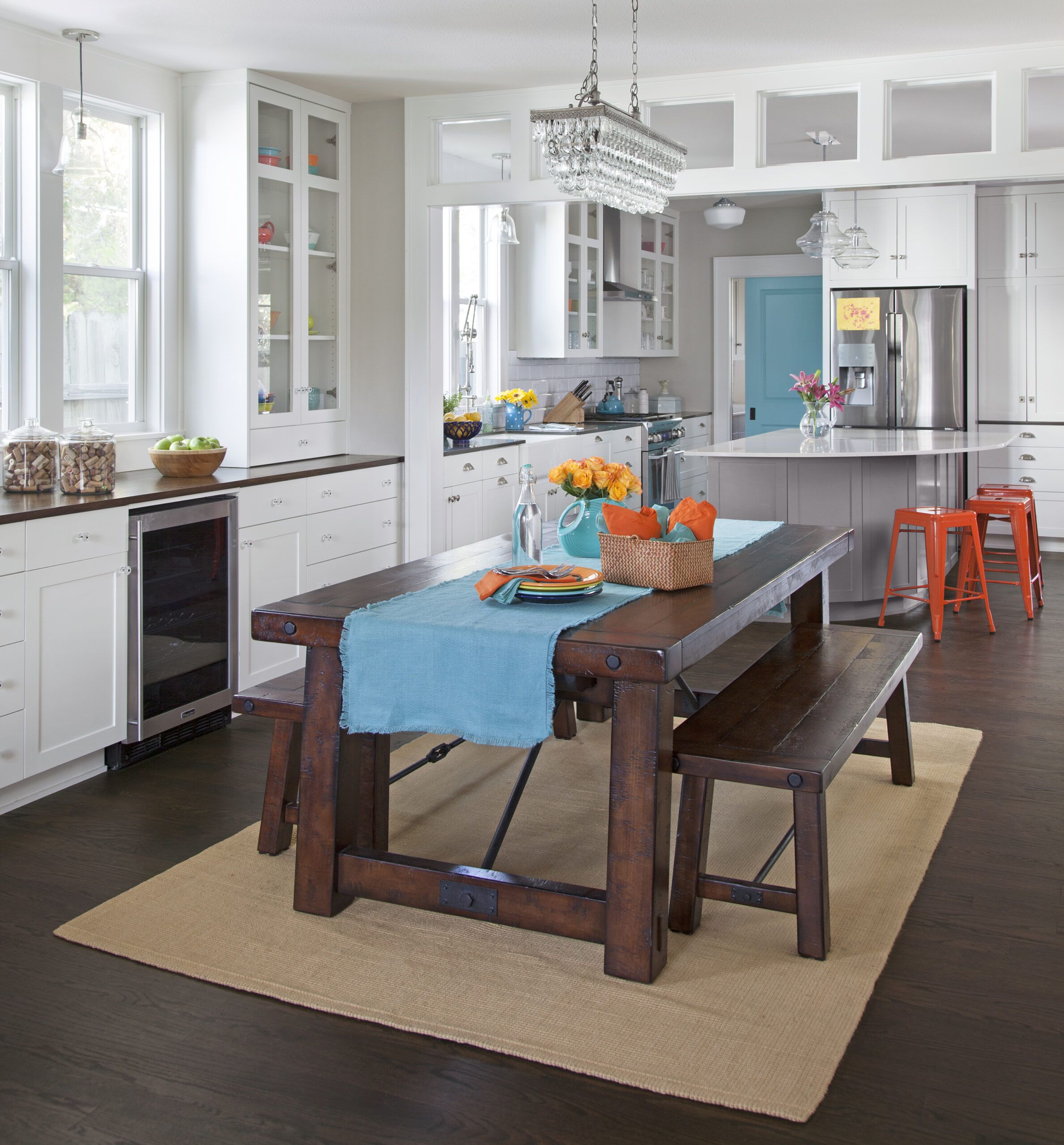
Shown: Enlarged and rebuilt, the new kitchen offers a wide-open cooking and dining space. To accommodate frequent get-togethers with friends, upgrades include a table that seats eight and an island that can double as a gathering place and a prep station.
Custom cabinets: Amazonia
Countertops: Caesarstone
Lighting: Sea Gull
Vent hood, wine fridge: KitchenAid
Kitchen That Lives Large
Davis came up with the plan. “I developed a two-story concept that had all the public spaces downstairs and all the bedrooms upstairs,” he says. It addressed the couple’s wants: two bedrooms for a growing family—baby Hayes now makes four—more space to gather in, and more places to put things. Davis’s plan bumped out the dining room by about a foot and a half and expanded it into the existing cook space to double the size of the kitchen, then merged it with a family room where the master bedroom had been. Both the family room and a new laundry room off the kitchen lead onto a screened-in porch, and voilà!—parents, kids, and dogs are outside in one slam of a screen door. “It lets the family live large in a modest-size space,” says Thomas.
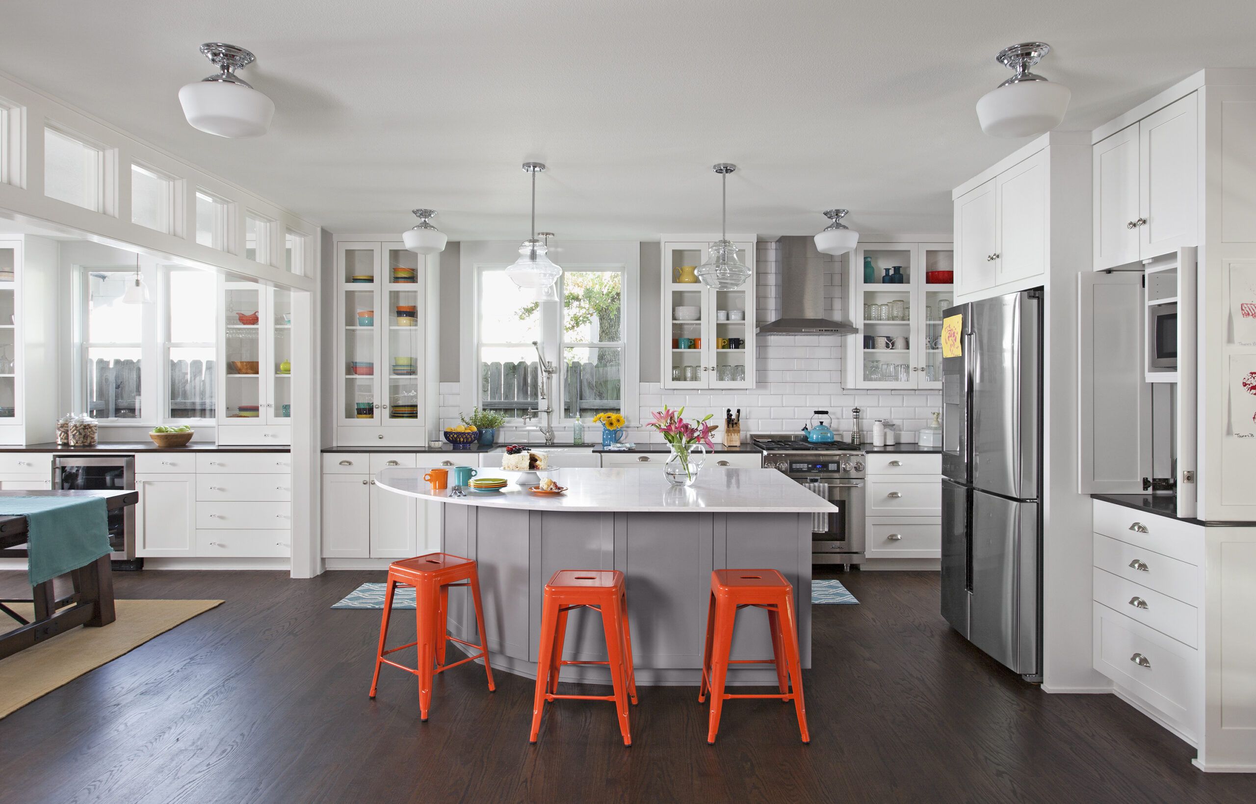
Shown: About half the kitchen is newly added space. The opening to the dining area is now defined by a row of interior windows that forms a decorative, light-funneling transom. A wall separating the kitchen from the former master bedroom also came down, opening the kitchen to a new family room and making way for the large island.
Stools: Overstock
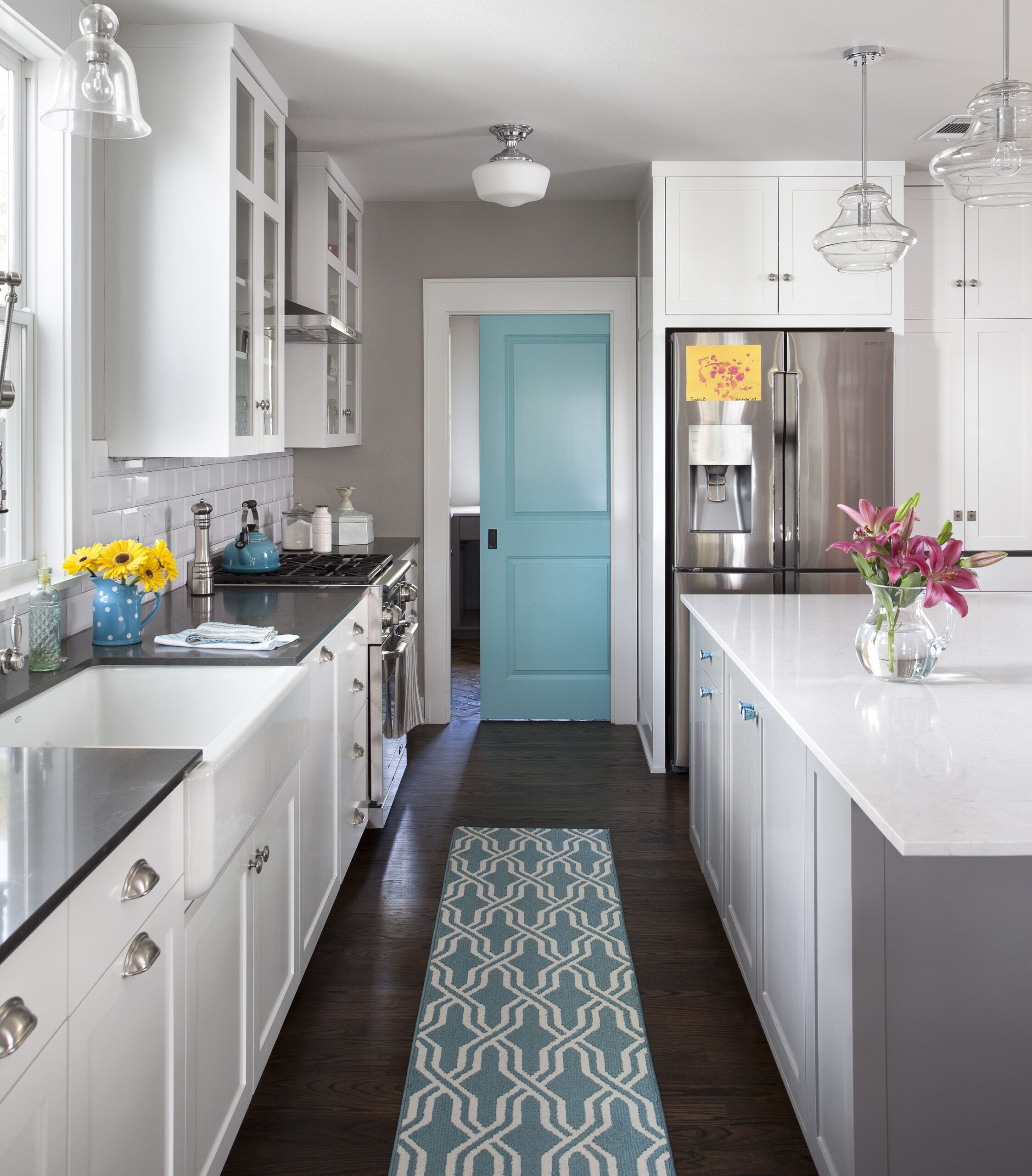
Fridge: Samsung
Range: Dacor
Multitasking Kitchen Aisle
Scrupulous preplanning circumvented the usual remodeling horror stories, but still, there were surprises. “The previous owner had redone the bathroom,” Aaron recalls. “We walked in one day, and we could see the ground.” A tiny leak—where a nail had pierced the PVC pipe three years earlier, during that bath remodel—had eaten all the way through the subfloor, a discovery made only when the contractor went to remove the tub.
Shown: The aisle behind the curved island creates a compact work zone for Aaron, with everything he needs—sink, stove, and refrigerator—within steps of one another. A pocket door, punched up with aqua paint, closes off the laundry room.
Schoolhouse pendants: Legend Lighting
Knobs on island: Anthropologie
Chandelier, table, benches: Pottery Barn
Hardwood floors: Big D’s Hardwood Floors, Wimberly, TX; (512) 848-1107
Kitchen Faucet Worthy of a Pro Chef
While the previous owner had also had the house’s original cedar post foundation replaced with steel piers, extra support had to be added for the dramatically heavier load of the now two-story structure. In the back, where the grade rises, a concrete slab foundation was poured for the kitchen bump-out as well as the porch, patio, covered storage, and carport. All the plumbing, wiring, and windows were replaced, too.
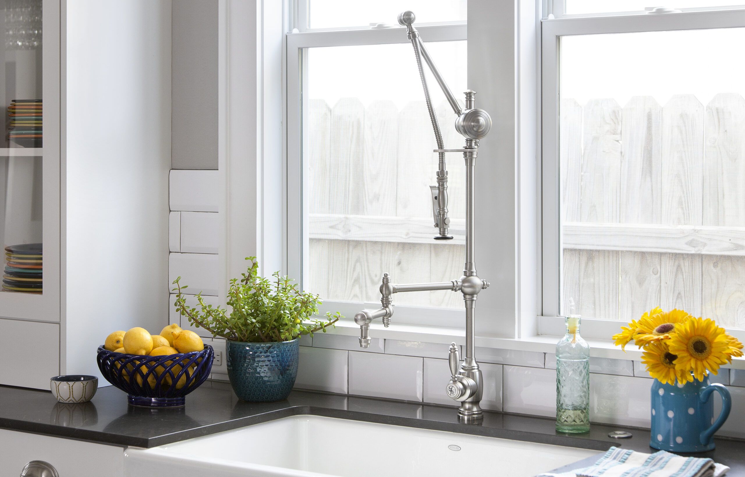
Shown: The restaurant-style jointed pot filler with spring-loaded sprayer makes chef Aaron feel right at home. The farmhouse sink holds plenty of dirty dishes.
Sink: Kohler
Faucet: Waterstone Gantry
Stacked Laundry Units for More Room
With the living space enlarged and opened up, the next challenge was to make optimal use of it. “Storage was a design project all by itself,” says Thomas. Built-ins were wedged into every nook and cranny, upstairs and downstairs. Holding court in the middle of the kitchen is the mother ship of storage islands, given a graceful curve. The linchpin of the built-ins campaign, however, is the staircase. Tucked under it on one side is Nadia’s desk. On the other, dining room side, drawers hold linens, cabinets corral china, and cubbies safeguard wine.
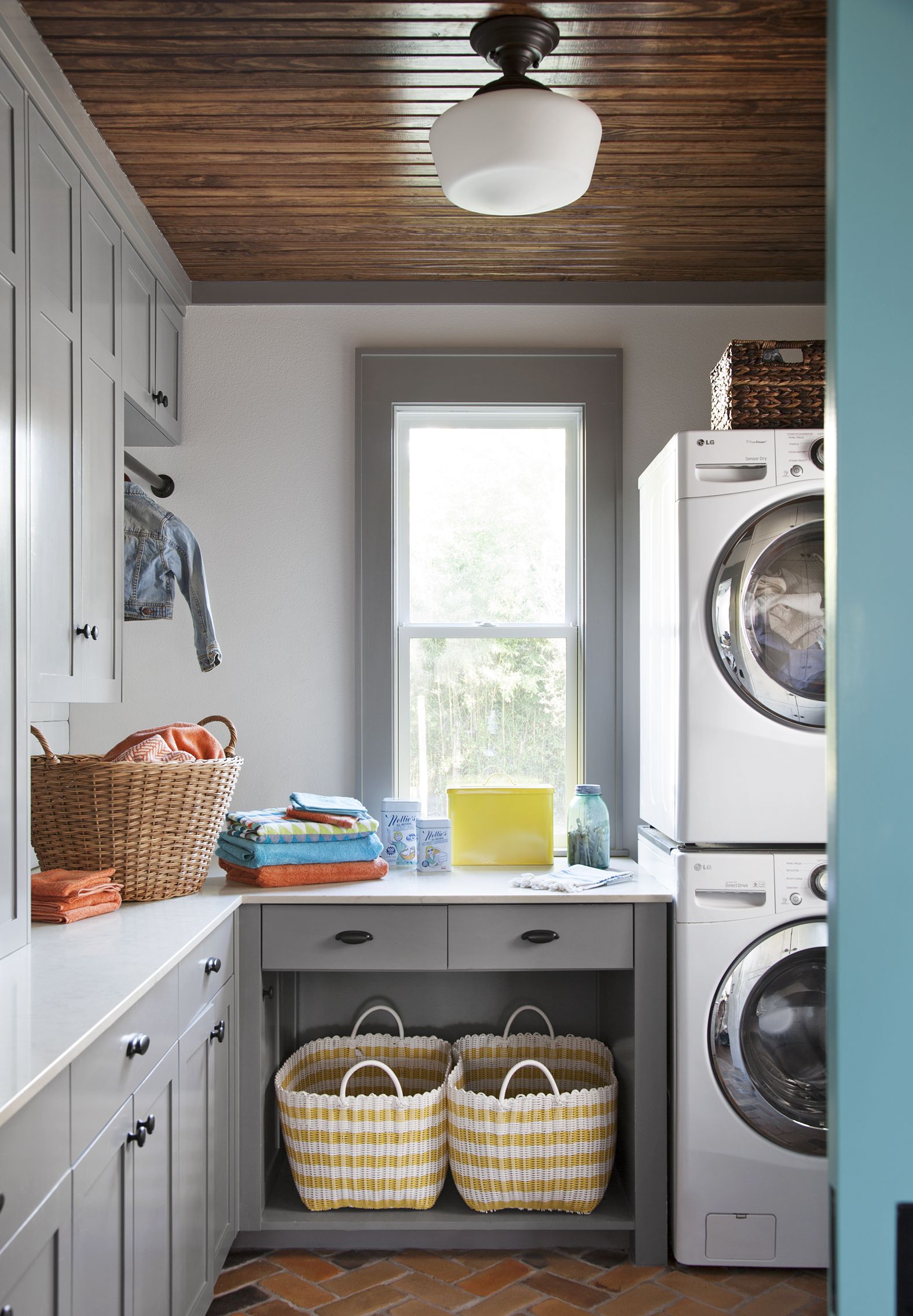
Shown: In the laundry room, a stacked washer and dryer allow counter space for folding. A corner clothing rod and an open cubby for baskets help boost the utility of the small space.
Flooring: Alpha Concrete
Countertop: Caesarstone
Cabinetry: Amazonia, Austin, TX; (512) 926-9160
Paint: Sherwin-Williams’s Mindful Gray
Hardware: Push Pull Open Close
Laundry baskets, yellow tin, hangers, wicker basket: Crate & Barrel
Room for Wine and Vinyl
Color was also key. While light-gray walls and white trim unify the public rooms, “Nadia also wanted to have fun with color because the kids are still young,” says Evans, who responded by incorporating splashes of aqua throughout the house.
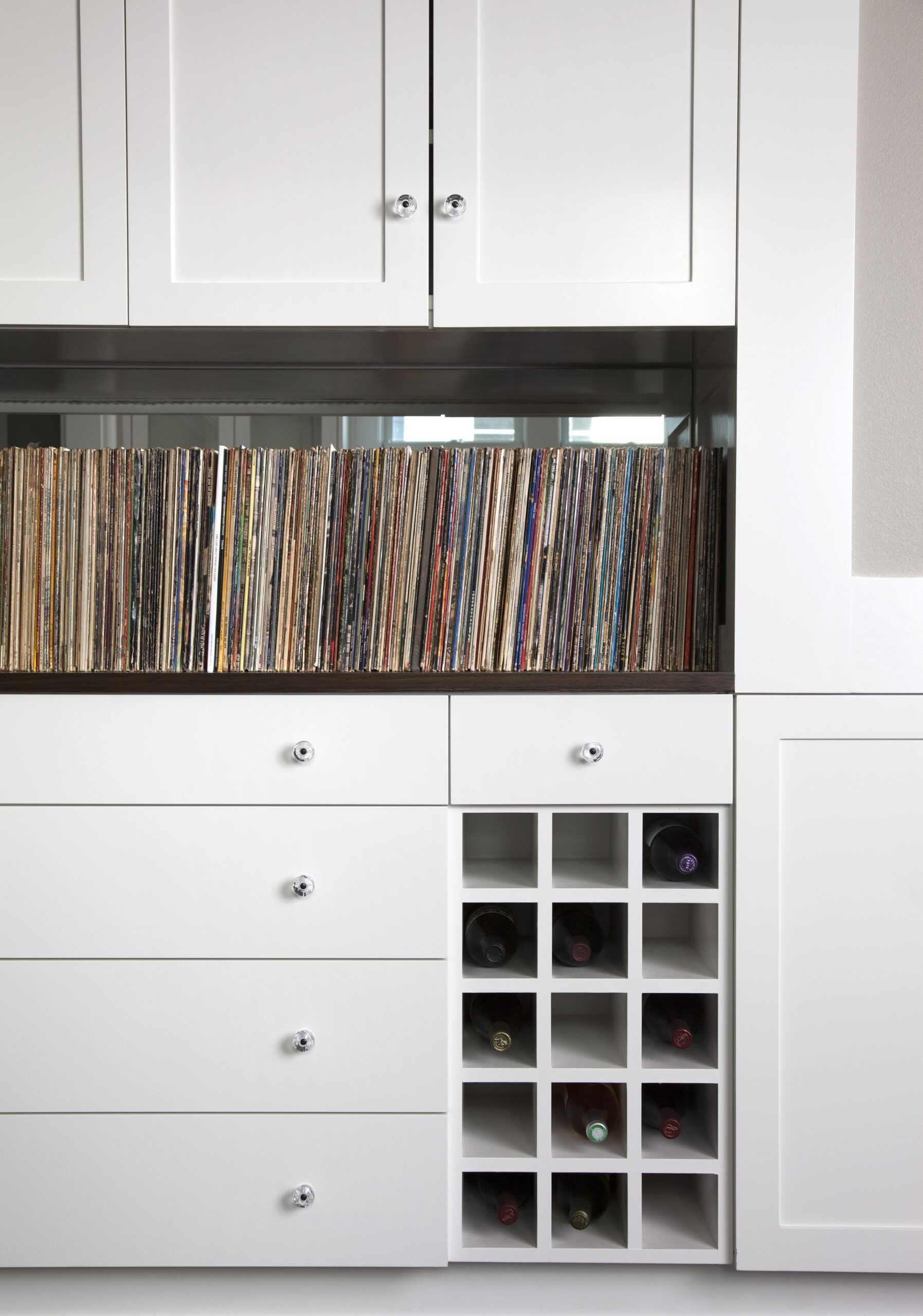
Shown: In the dining room, built-ins underneath the stairway provide storage for wine bottles and Aaron’s collection of vintage records.
Streamlined Home Office
The architects capitalized on one last thing—space underneath the new upstairs bathroom—to provide shelter for Aaron’s ’59 Chevy. A garage wasn’t an option, since any addition would butt right up to the city easement. An open-sided carport built to the precise measurements of the car—down to the tips of its fins—was the only answer. And even then, to make it work, the chef would have to resort to a skilled parking maneuver to slip his car into its made-to-fit spot. “I have to back in,” he says. “There’s not enough room to open the door and get out if the driver’s side is next to the house.”
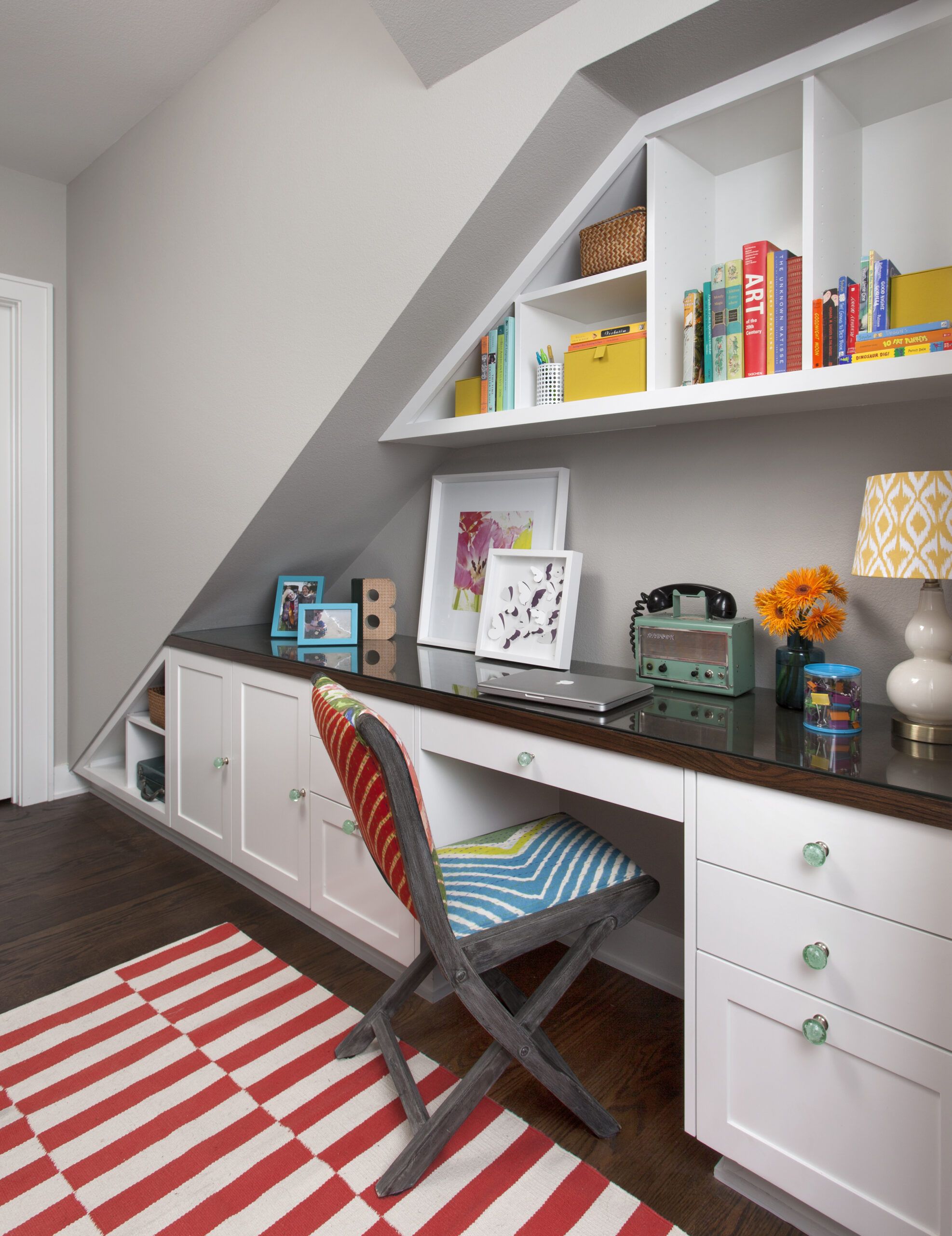
Shown: A home-office command center that doubles as a craft area fits neatly underneath the staircase. An oak desktop, protected with glass, echoes the dark-stained floors.
Chair: Pier 1
Knobs: Anthropologie
Rug: Target
A Place for Everything in the Boys’ Room
Both car and carport fit snugly into the new two-story silhouette of the reimagined house, which is still in scale with the rest of the neighborhood. “We saved the street appeal,” says Davis. “The Blairs were adamant about that.”
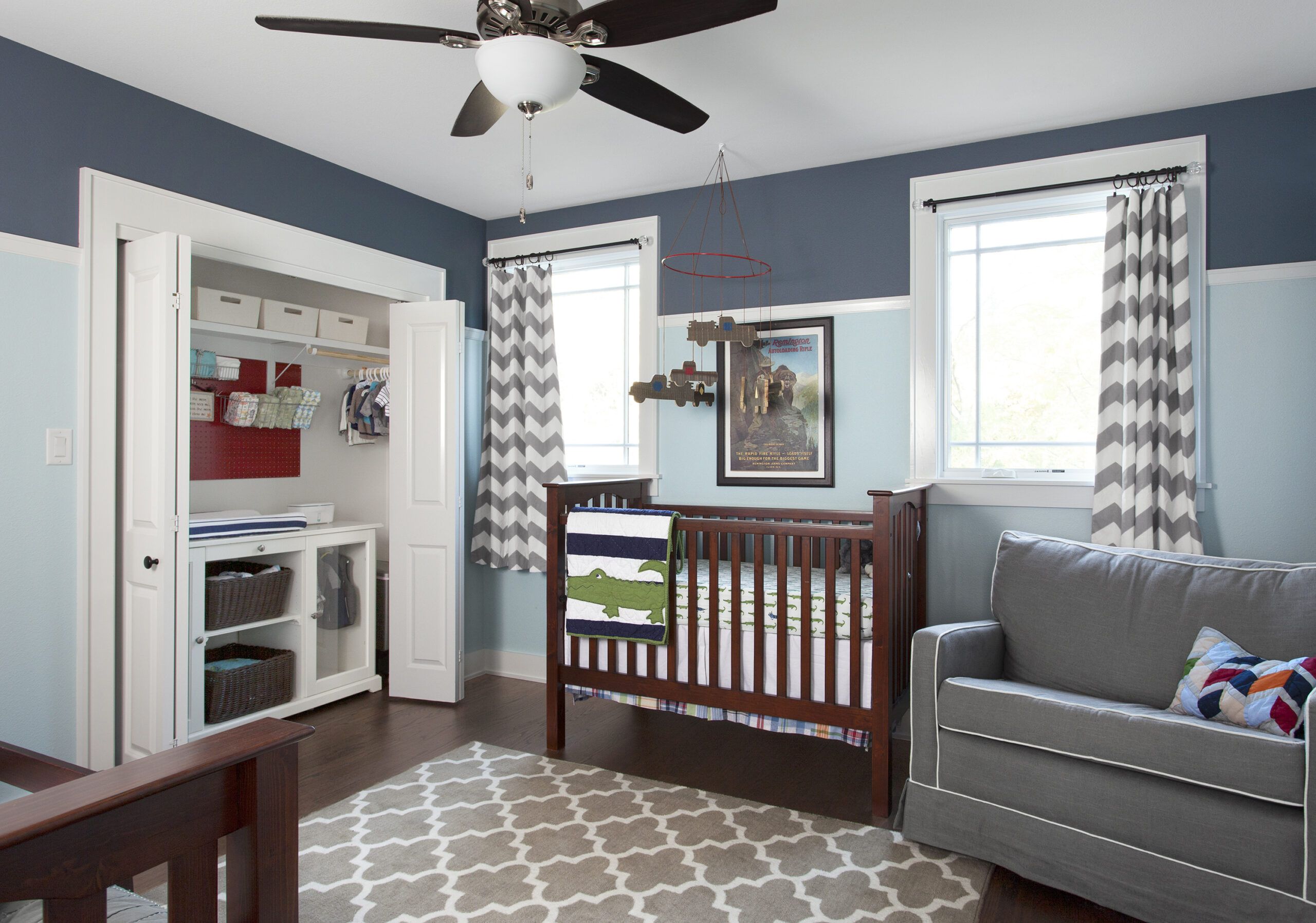
Shown: A closet built-in for the boys’ room frees up wall space. Pegboard above the dresser/changing table holds baskets for diapers and other necessities.
Bed, crib, bedding: Pottery Barn Kids
Rug: Target
Glider: Buy Buy Baby
No Storage Space Lost in the Master Bedroom
In the end, nearly everything in this vintage house has been touched in some way—except, that is, for two features. The entry porch and first-floor windows—the very details that originally captured Nadia’s heart—remain the same. “That’s why I fell in love with this house,” she says, “and that’s why I still love it now.”
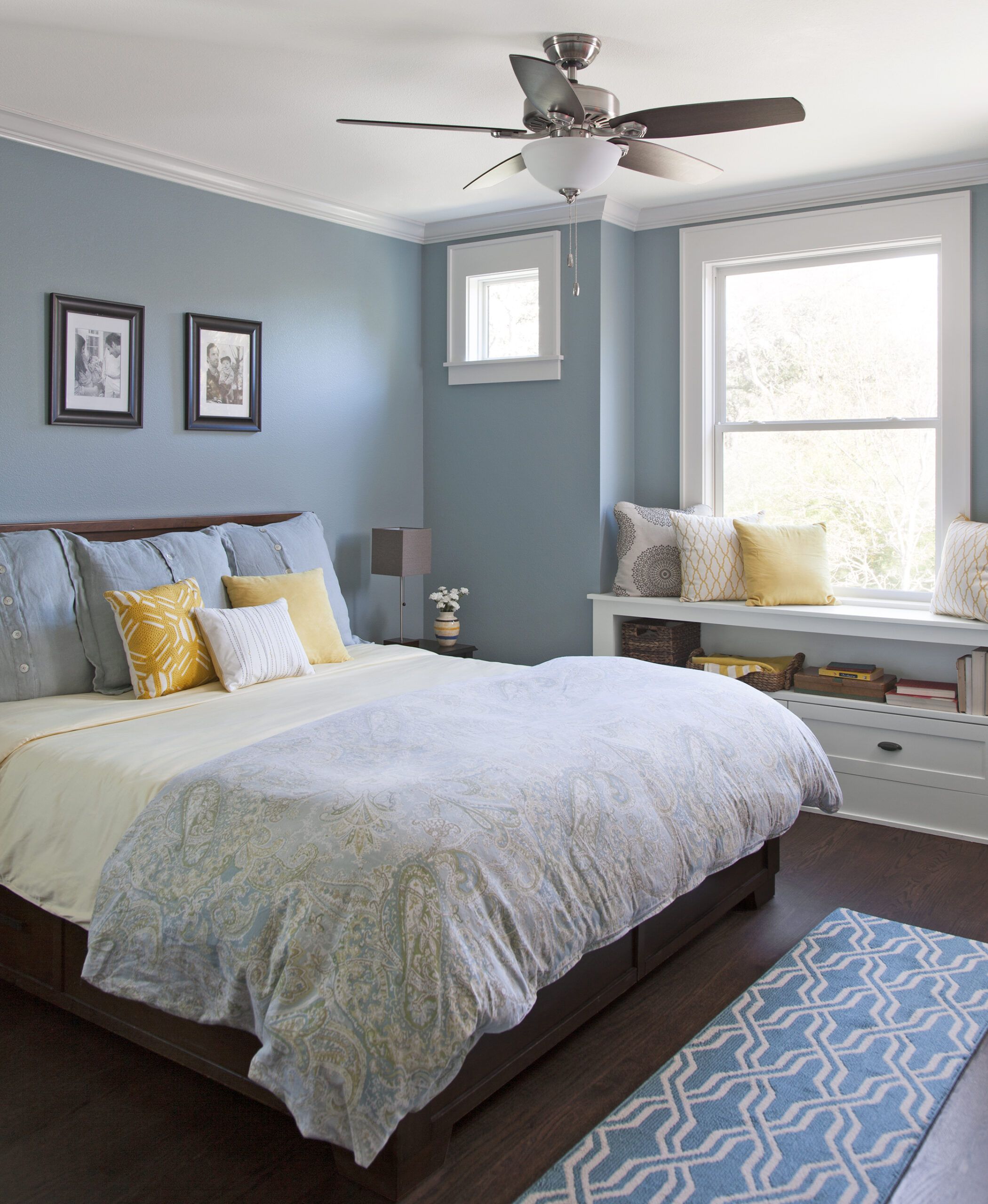
Shown: Window-seat storage maximizes every available inch in the new master bedroom and adds a touch of old-house charm.
Bed, bedding: Pottery Barn
Side tables, window seat accent pillows, throw blanket, curtains, lamps: Target
Convenient Dressing Area
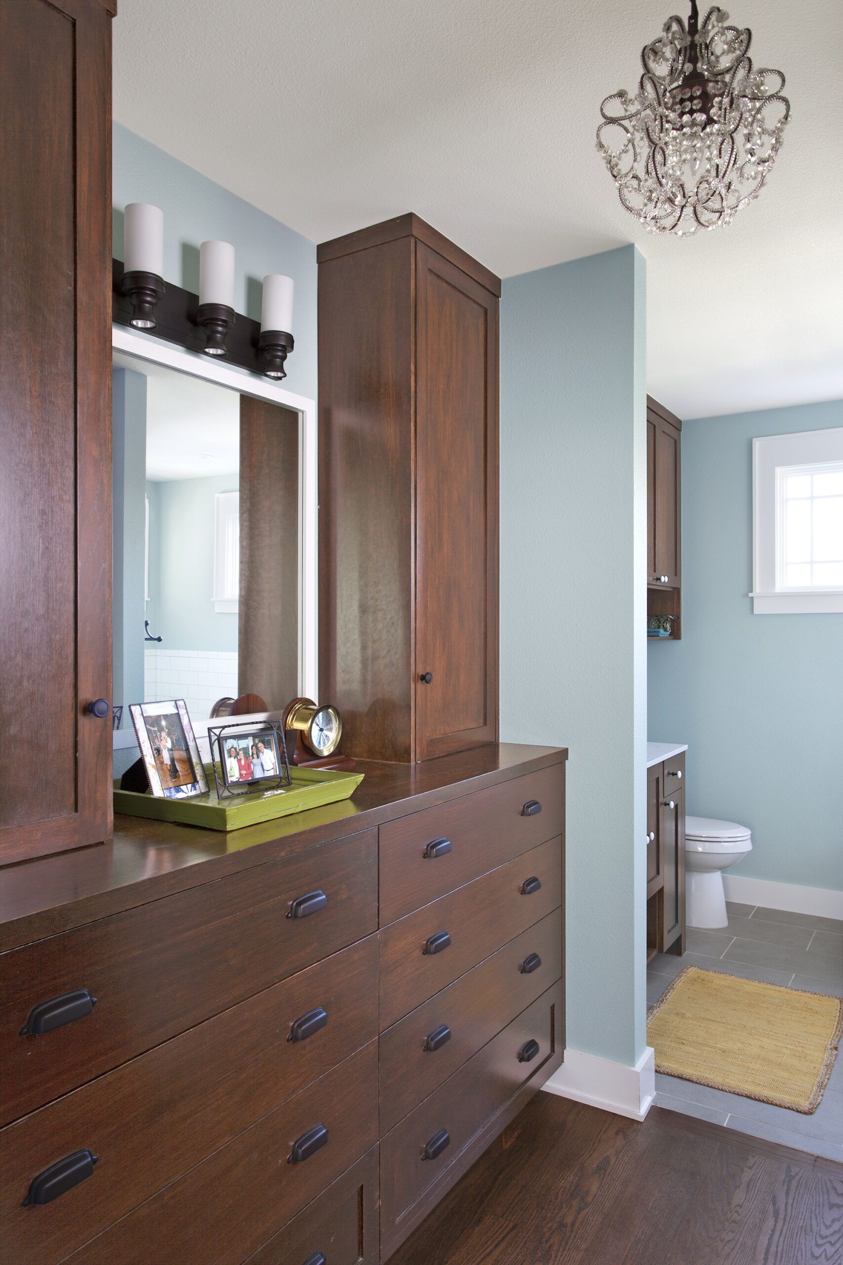
A built-in bureau opposite the master closet serves the dressing area between bedroom and bath. The chandelier was repurposed from the house’s entry.
Frameless-Glass Shower in the Master Bath
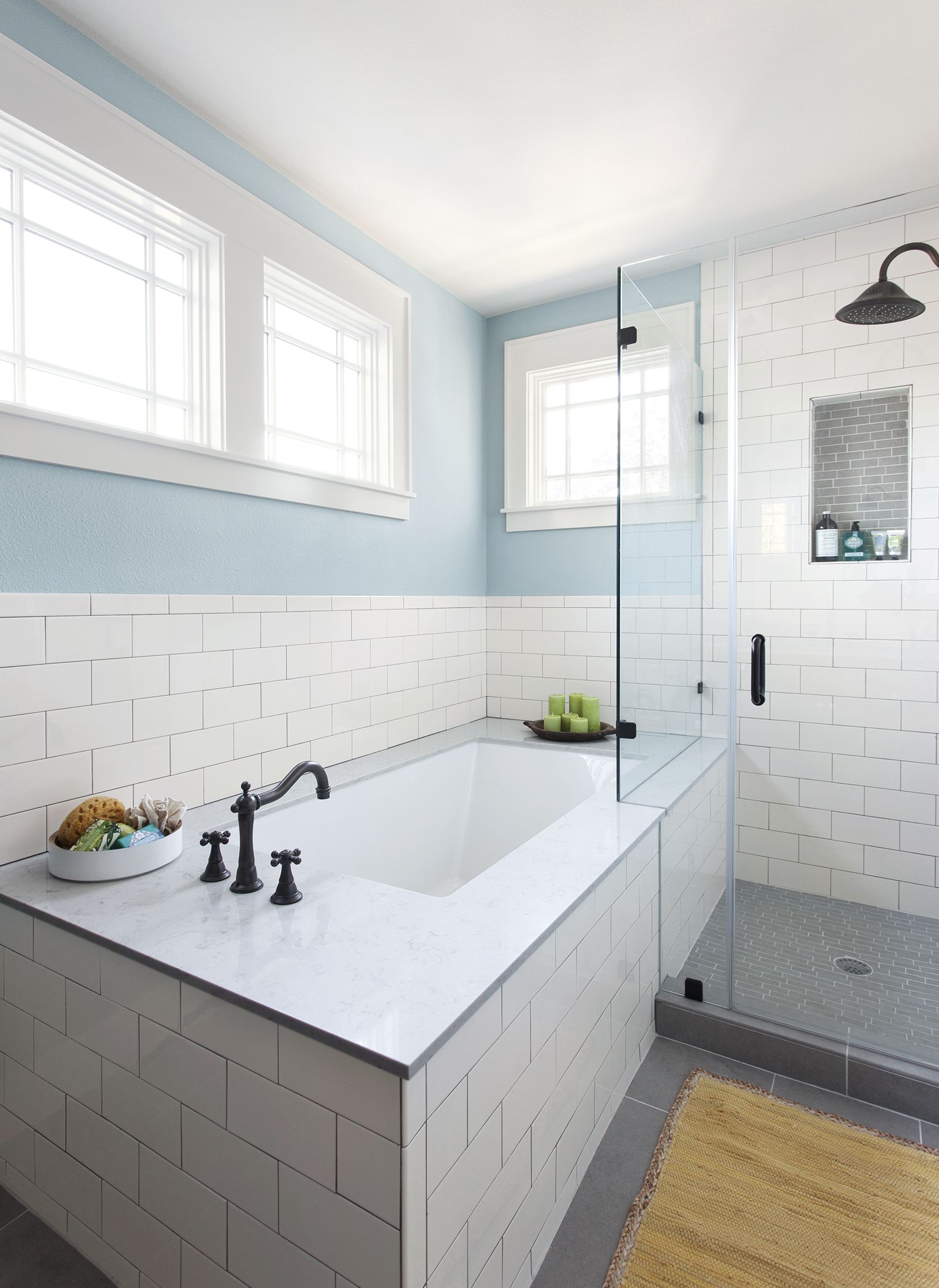
The shower’s frameless-glass enclosure sidles up to the tub in the 7½-by-13-foot master bath. The white subway tile is repeated in the kitchen and the laundry room.
Tub: Mirabelle Edenton
Showerhead, faucet: Delta
Tub deck: Silestone
Floor Plan: First Floor
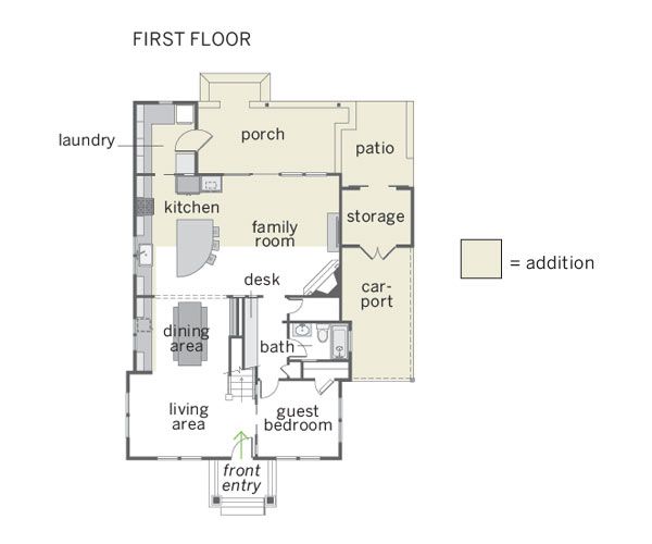
Originally, the compact 844-square-foot first floor was divided into the kitchen and living spaces on one side and two bedrooms and a bath on the other. The redo expanded the first level to 1,271 square feet, with a new laundry room, a guest bedroom, and a storage area off the family room. Outdoor improvements include a new porch, a patio, and a carport.
Floor Plan: Second Floor
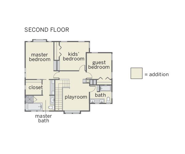
Upstairs, the new master suite, two more bedrooms, another bathroom, and a playroom complete an additional 1,165 square feet of living space.
