Privacy-Enhancing Curb Appeal for a Street-Facing House

Like many young couples, Alicia and Casey Leach, veterans of San Francisco’s tech industry, traded an apartment for a house when it came time to start a family. They fell in love with a 1903 cottage in nearby Sausalito, captivated by its small-town charm and bay views. Lucky for them, the one-story house with an unfinished attic also came with plans for expansion that had already been approved by the city. “It felt like it was supposed to be a one-bedroom house,” says Alicia, “but over its hundred years it had been remodeled into a two-bedroom.” Within three years of moving in, the couple had both a toddler and a newborn. “The house got really cramped,” she says.
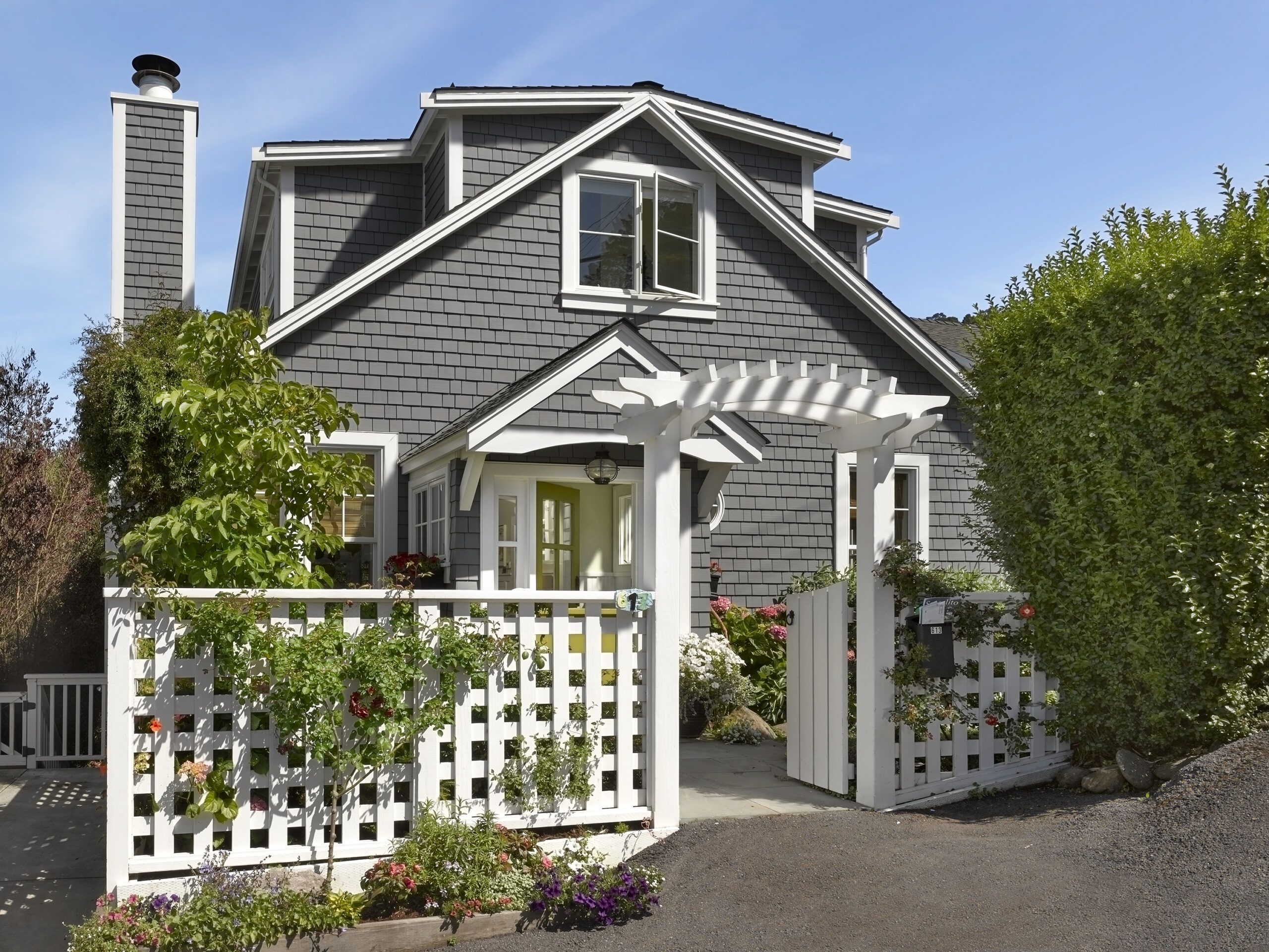
Shown: A lattice fence and an arch above the front gate boost the home’s curb appeal and create a bit of privacy for a house that sits right on the street. The gray shingles and white trim were chosen to suggest a New England sea captain’s house.
Architect: Nori Whisenand, Deer Creek Studio, Nevada City, CA;
Interior designer: Stephanie Wolter, Wolter Designs; 415-425-6335
Contractor: Paradigm Concrete & Construction, Inc., Antioch, CA;
Paint (siding): C2’s Jailhouse Rock
Windows: Andersen Windows
Much-Needed Entry Vestibule
The preapproved plans, by architect Whitney Schrauth, would allow the Leaches to convert the attic into living space, expanding the 1,092-square-foot house by 665 square feet, thanks to two shed dormers that would be added to achieve ceilings upstairs rising from 6½ feet to 9 feet. In a locale where bay views are cherished, the house’s 31-foot height would remain below the imposed 32-foot limit.
The plans also called for a massive master bedroom suite upstairs, which didn’t suit the Leaches, who wanted two bedrooms and two baths there. So Schrauth recommended architect Nori Whisenand to help the couple on an interior redesign that would address the needs of the young family.
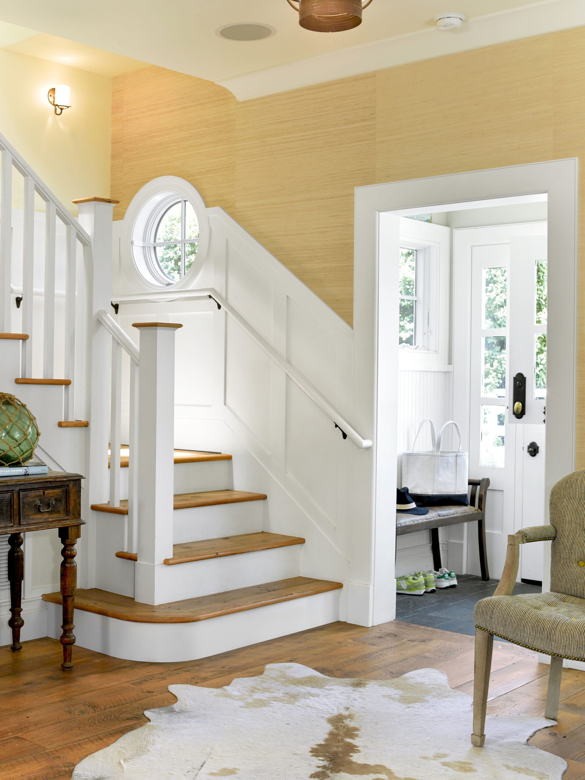
Shown: The original house had no entry vestibule—a detail the owners insisted on adding. Wainscot helps connect that space to the adjoining living room
Paint (upper walls): C2’s Gallery White
Wallpaper: Phillip Jeffries
The Leaches at Home
While the plans allowed for an exterior renovation, they didn’t include any curb-appeal enhancements. “The original structure looked like a simple storybook house that a kid would draw—a triangle on top of a square,” says Whisenand. She proposed a beachy cottage style to connect the house more directly with its location near the water.
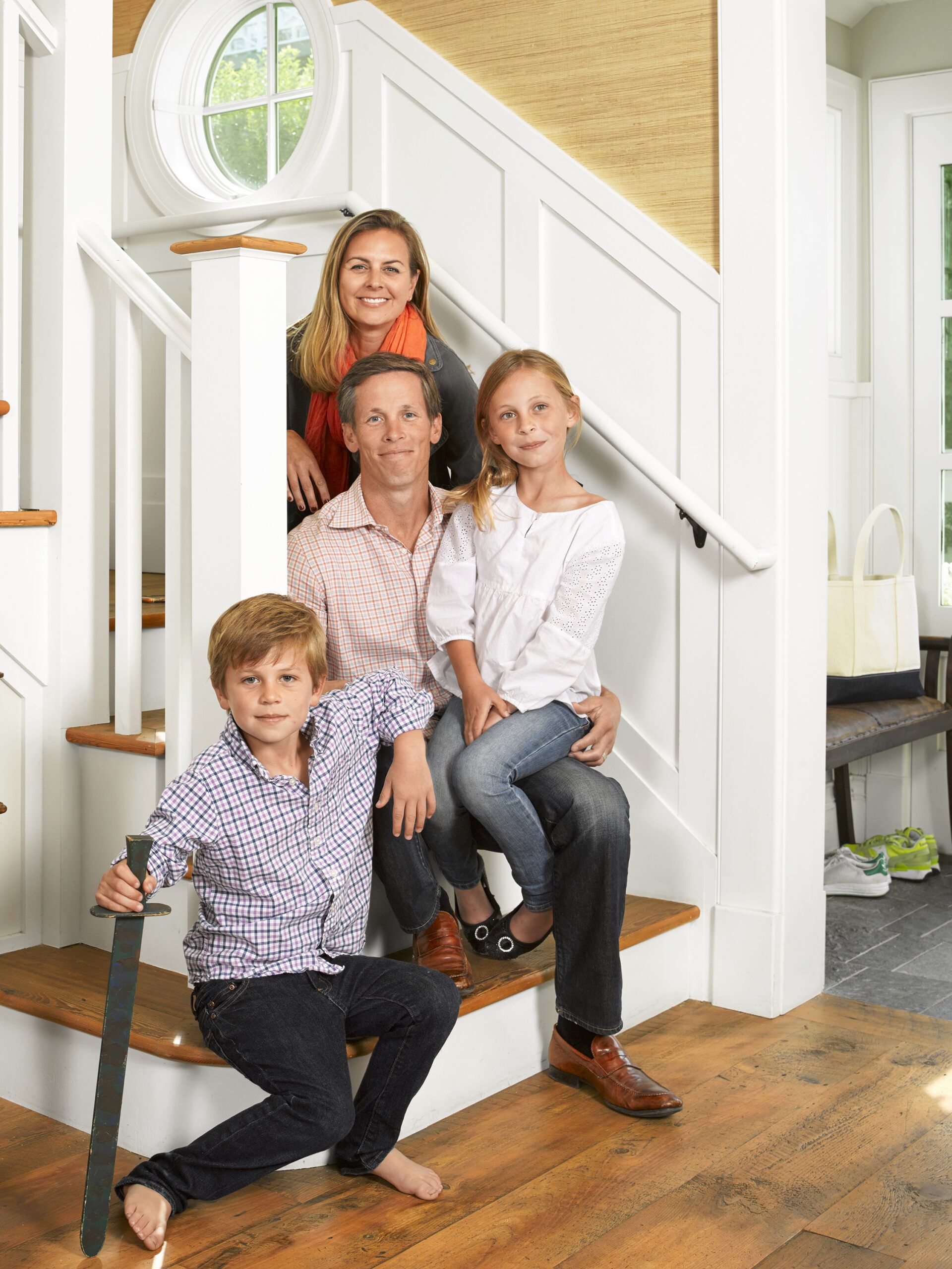
Shown: The Leach family at home—Alicia and Casey with their daughter, Hana, 9, and son, Wyatt, 8.
Reinforced Nautical Theme in the Living Room
Having lived in the home for three years before renovating, the couple knew the drawbacks of the existing configuration. Sometime during the house’s 113-year history the kitchen was moved to the front, and a long hallway divided the four rooms. “It didn’t flow at all,” says Alicia. “You had to go past the two bedrooms to get to the dining room.” Because the approved plans did not apply to the first-floor interior, Whisenand had a clean slate for rejiggering the layout.
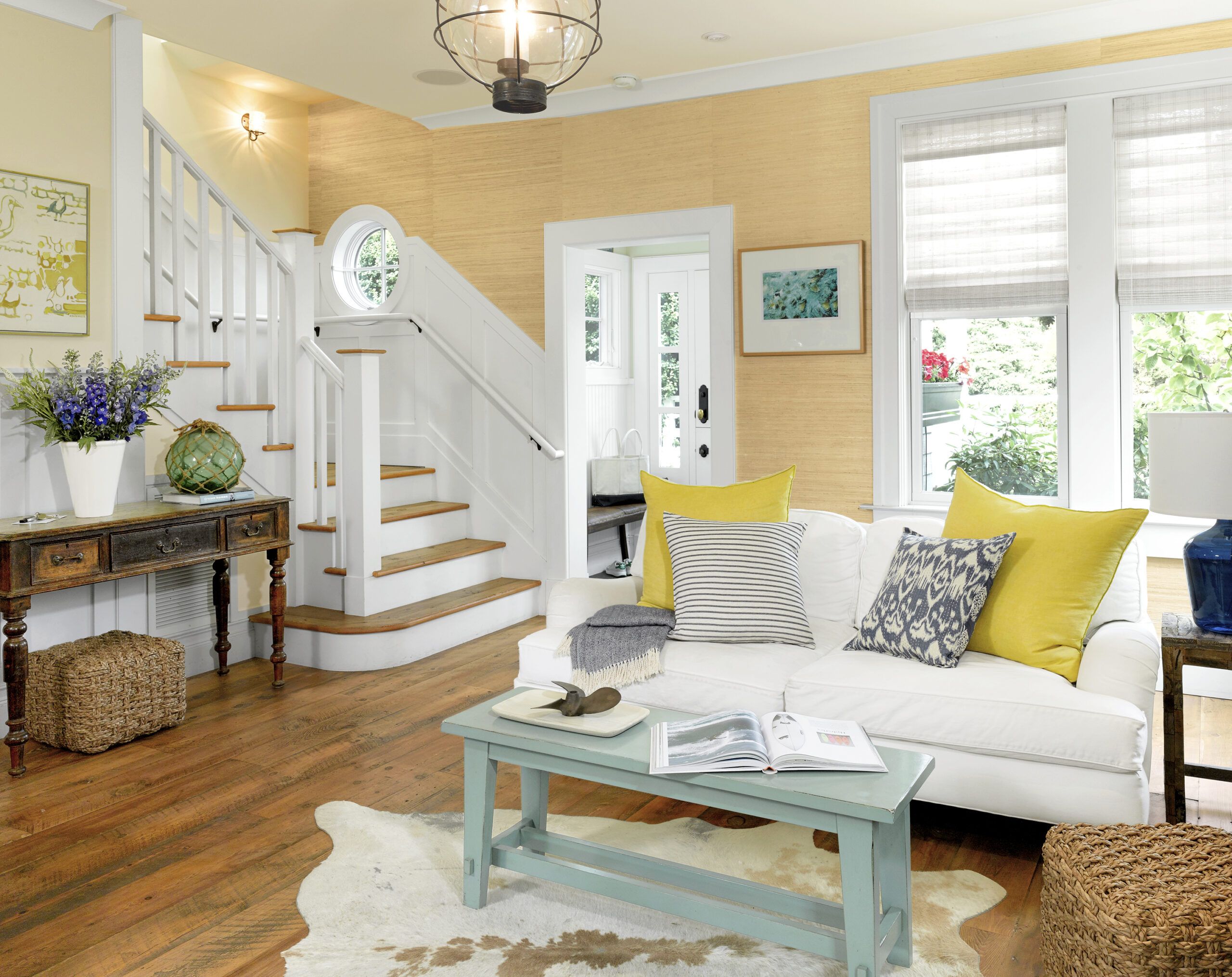
Shown: A wainscot-wrapped staircase just off the living room replaced the pull-down attic stair. It features a porthole-inspired window, where a small rectangular window had been, to capture natural light and reinforce the house’s nautical design theme.
Paint: C2’s Gallery White (walls) and Milk Moustache (trim, doors)
Wallpaper: Phillip Jeffries
Gracious Built-In Storage
Alicia also asked for a fireplace and an entry hall, requiring additional visits to municipal offices. “We ended up redesigning the entire interior of the house,” says Whisenand. To assist in the process, she brought in general contractor Russell Calhoon, and Detlev Doring, a structural engineer, a necessity in this earthquake zone. Preparing for a down-to-the-studs renovation, the Leaches moved into a rental.
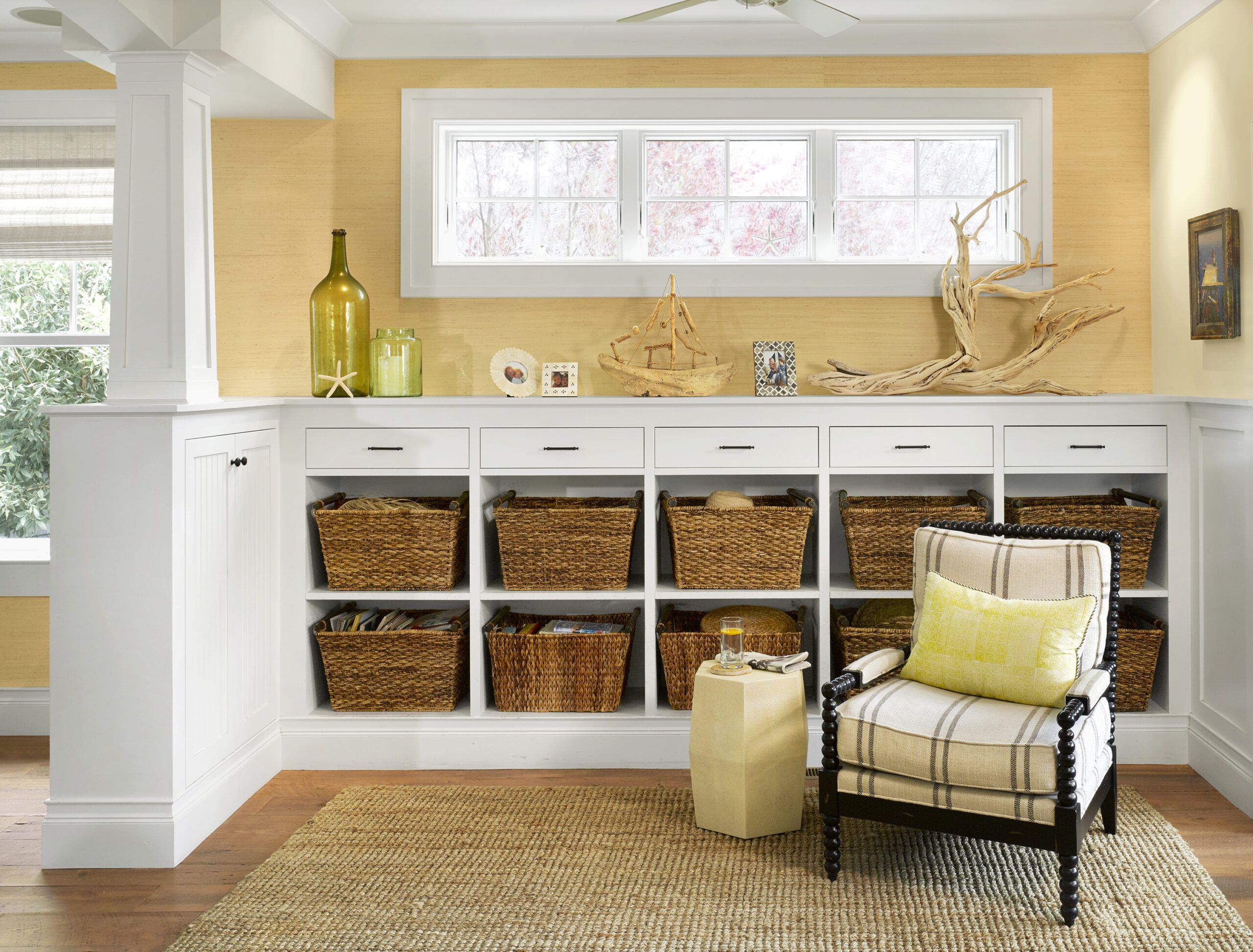
Shown: In the family room, the column above the built-in cabinet serves as both an architectural feature and a plumbing chase. Small windows placed high on the wall screen views from the street. Built-in cabinetry offers doors, drawers, and cubbies for a variety of storage options; large baskets corral toys while making them easy for kids to access.
Baskets: Crate & Barrel
Efficient Galley Kitchen
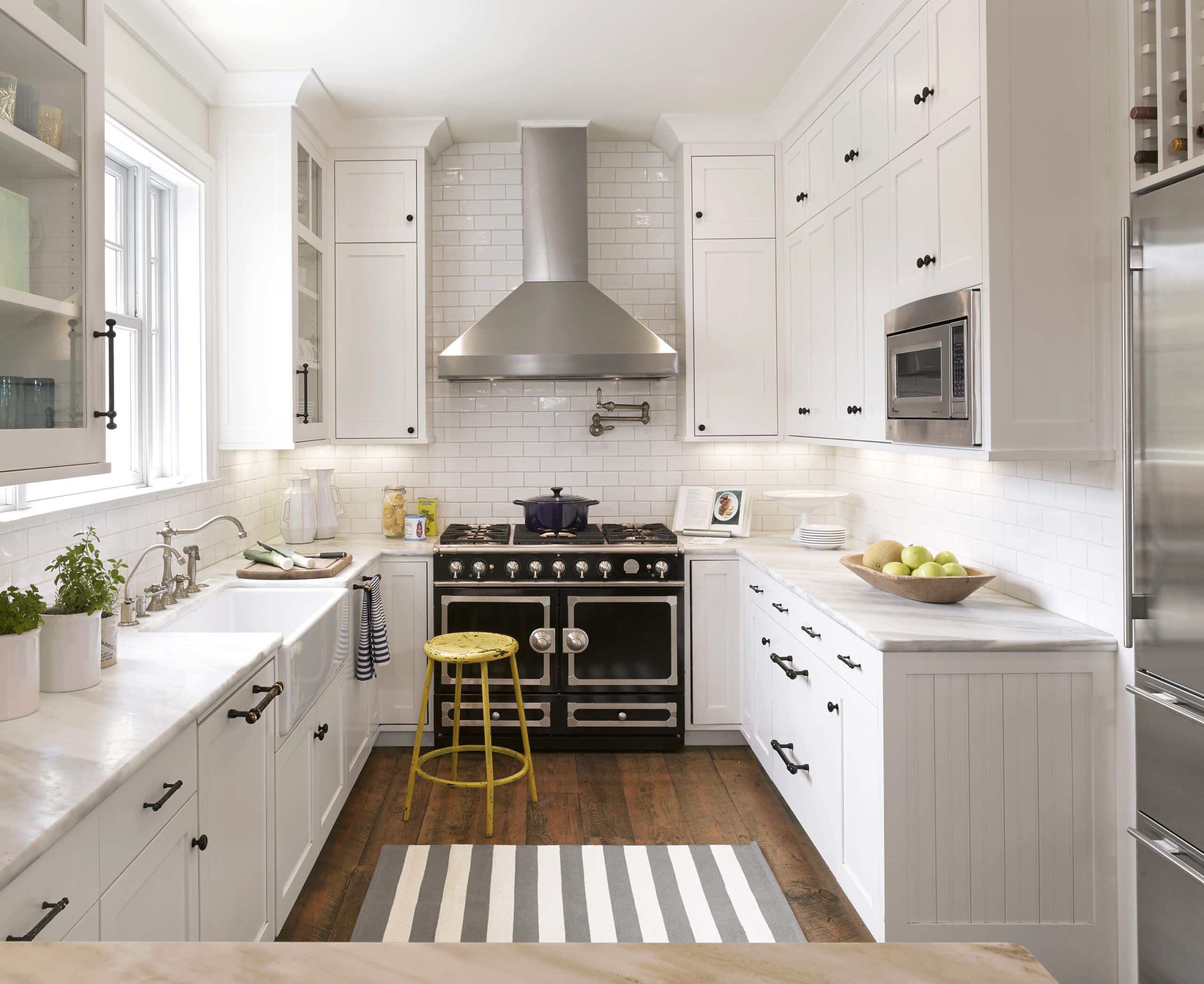
On the first floor, the reworked plans returned the kitchen to the back of the house, putting a guest bedroom in its former spot. The living room stayed put, as did the sunroom at the opposite end. Now the living room flows into the family room and the kitchen, then into the sunroom, which is now the dining room.
Shown: Although the previous cook space included an island, the new galley is configured in an efficient U shape, with a La Cornue range as the focal point.
Cabinetry: Jeff Ward; 510-610-3639
Vent hood: Vent-A-Hood
Refrigerator: Sub-Zero
Rug: Summer House
Flooring: Black’s Farmwood
Ceiling-Grazing Kitchen Cabinets for Maximum Storage
To add stylistic details that would reflect the period of the house, Whisenand pored over books, including William Radford’s Old House Measured and Scaled Detail Drawings: For Builders and Carpenters. She found inspiration in the open room dividers common to bungalows of the early 1900s, and incorporated ceiling soffits and half-columned partition walls into her design. Upstairs, carving two bedrooms and two baths out of 665 square feet would require some ingenuity. Calhoon had to figure out how to get the waste line from the second-floor baths into the basement, where it had to connect to the main line before exiting the house. As he eyed plans for the first-floor redesign, he found the perfect spot: the cabinetry in the family room. There, a half column and a soffit above conveniently conceal the line. “The column wasn’t originally designed to hide plumbing, but it worked out beautifully,” says Calhoon.
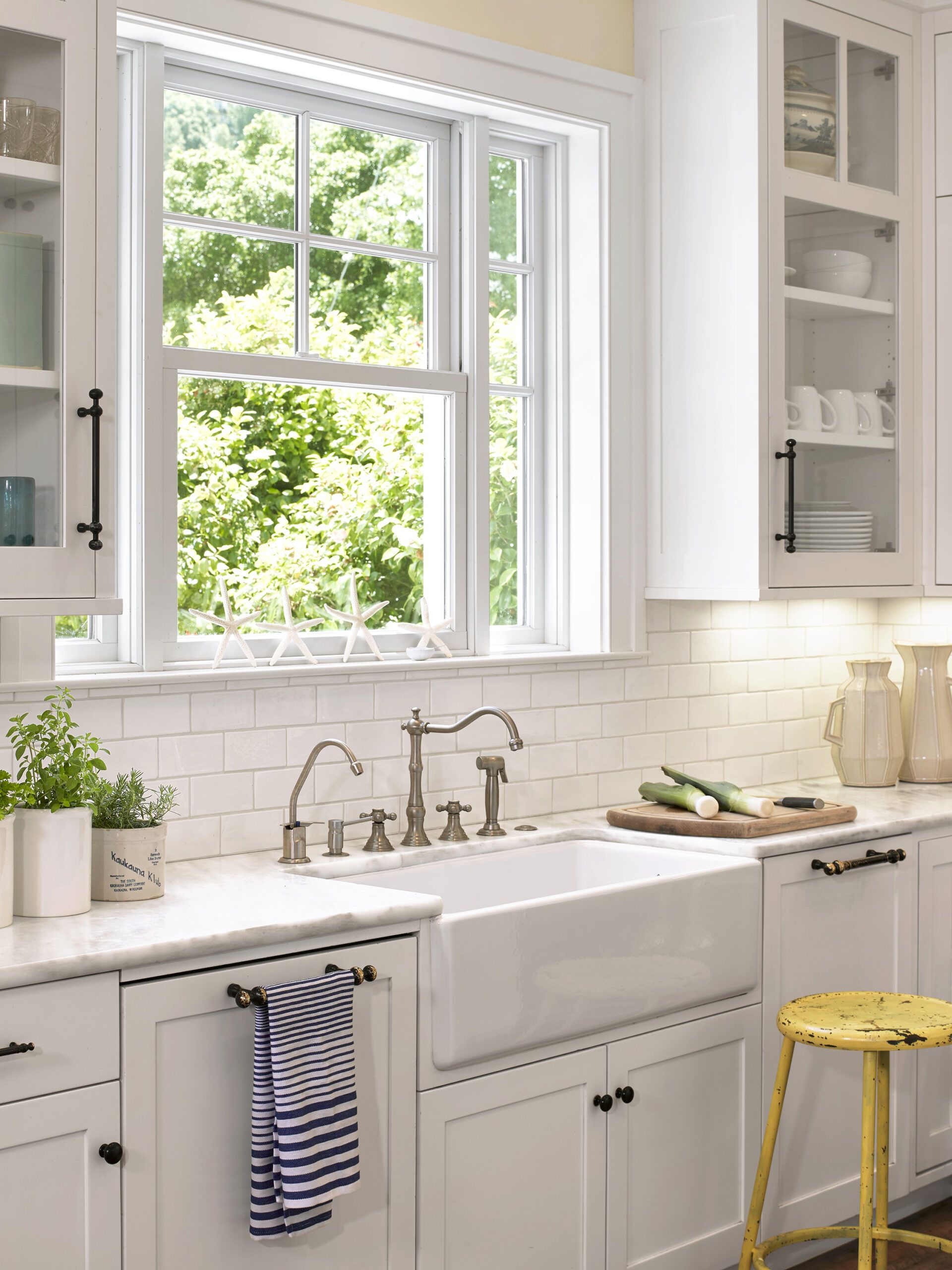
Shown: Cabinets extend to the ceiling to maximize storage. The undermount farmhouse sink allows for wiping crumbs right off the counter and into the basin.
Sink: Shaws Original
Faucet: Grohe
Sink: ROHL Home
Countertop: Marble European Style
Hardware: Top Knobs
Pendants: Schoolhouse Electric
Outdoors-Friendly Dining Room
For a major space-saving strategy, Whisenand turned to the compact design of boats. Because the master bedroom would not be large enough to include dressers, she created floor-to-ceiling built-ins along a wall in the long and narrow master bath, which doubles as a dressing area, with a closet behind a pocket door at one end. Serendipitously, the cabinetry sits right above the washer and dryer, hidden in a closet, so Whisenand added a laundry chute.
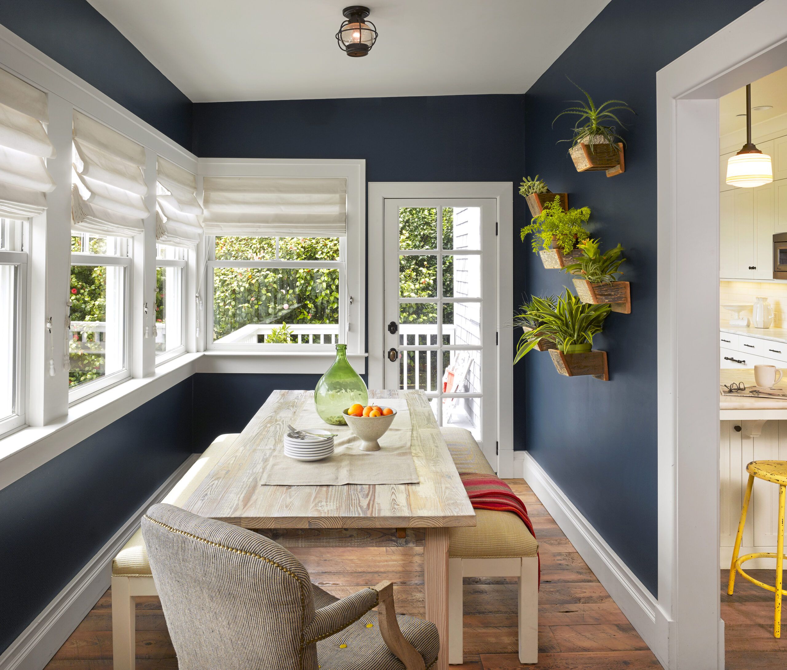
Shown: Located at the back of the house, the sunroom, which also serves as a dining space, connects the family room to a deck. The room gets a lot of sun, so the homeowners chose a saturated blue to play off the maritime location. Planter boxes mounted on the wall help bring the outdoors inside.
Paint (walls): C2’s Espionage
Table, benches: Heritage Salvage
Host chair, end chair: Anthropologie
Wall planters: Charlie Callahan
Salvaged-Flooring Surfboard as Wall Art
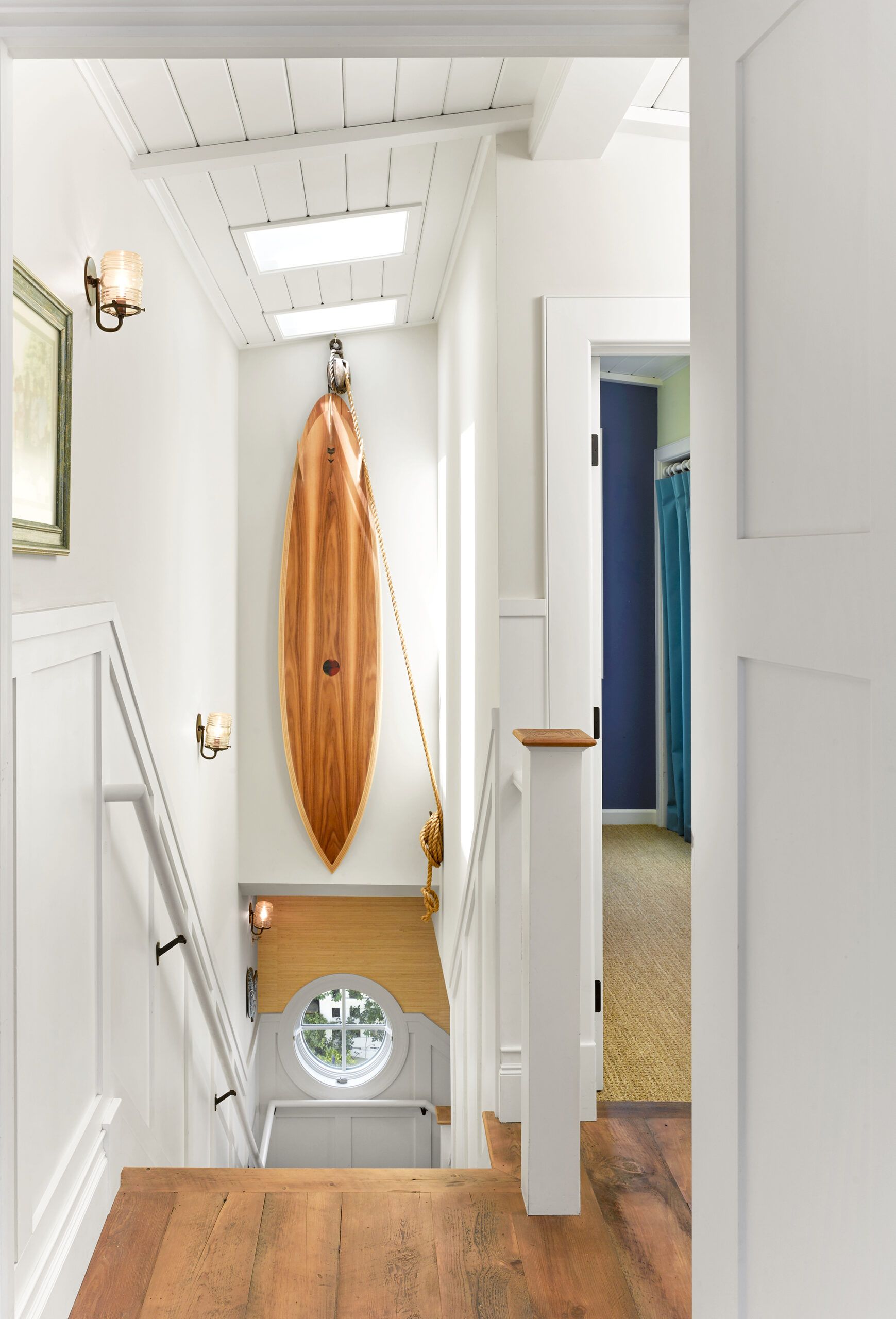
With the layout problems resolved, another, larger one was discovered behind the walls as work got under way. Open walls revealed balloon framing, rather than conventional platform framing. This 19th-century technique creates a skeletal structure that runs the height of the house with one-piece vertical studs—in this case, Douglas fir, half of it rotted, and most of it out of plumb.
Shown: In the stairwell, the homeowners had well-known surfboard-maker Danny Hess craft one out of the reclaimed hemlock left over from the floors, adding a playful, contemporary touch to the home’s classic cottage look.
Cheery Kids’ Attic Bedroom
“From the outset, the plan was to save as much of the existing exterior structure as possible,” says Calhoon—not out of budgetary concerns, but because the Leaches wanted to retain any original materials they could. But Calhoon’s discovery led him to recommend doing away with the old framing altogether. Alicia, however, was gripped by a sense of stewardship. “This is what has kept the house steady through earthquakes,” she says. “I felt very secure with this original wood holding up the house.” Calhoon and Doring were not so sure. Ultimately, they reached a compromise: Whatever timbers were not rotted would be kept and conventional frames placed inside them, even if that meant losing precious square footage. For added strength, the engineer required that the old Douglas fir frame be clipped to the new walls “so in an earthquake the old frame wouldn’t fall off the house,” Calhoon says. The foundation was altered to take the additional load and stabilized to meet seismic requirements.
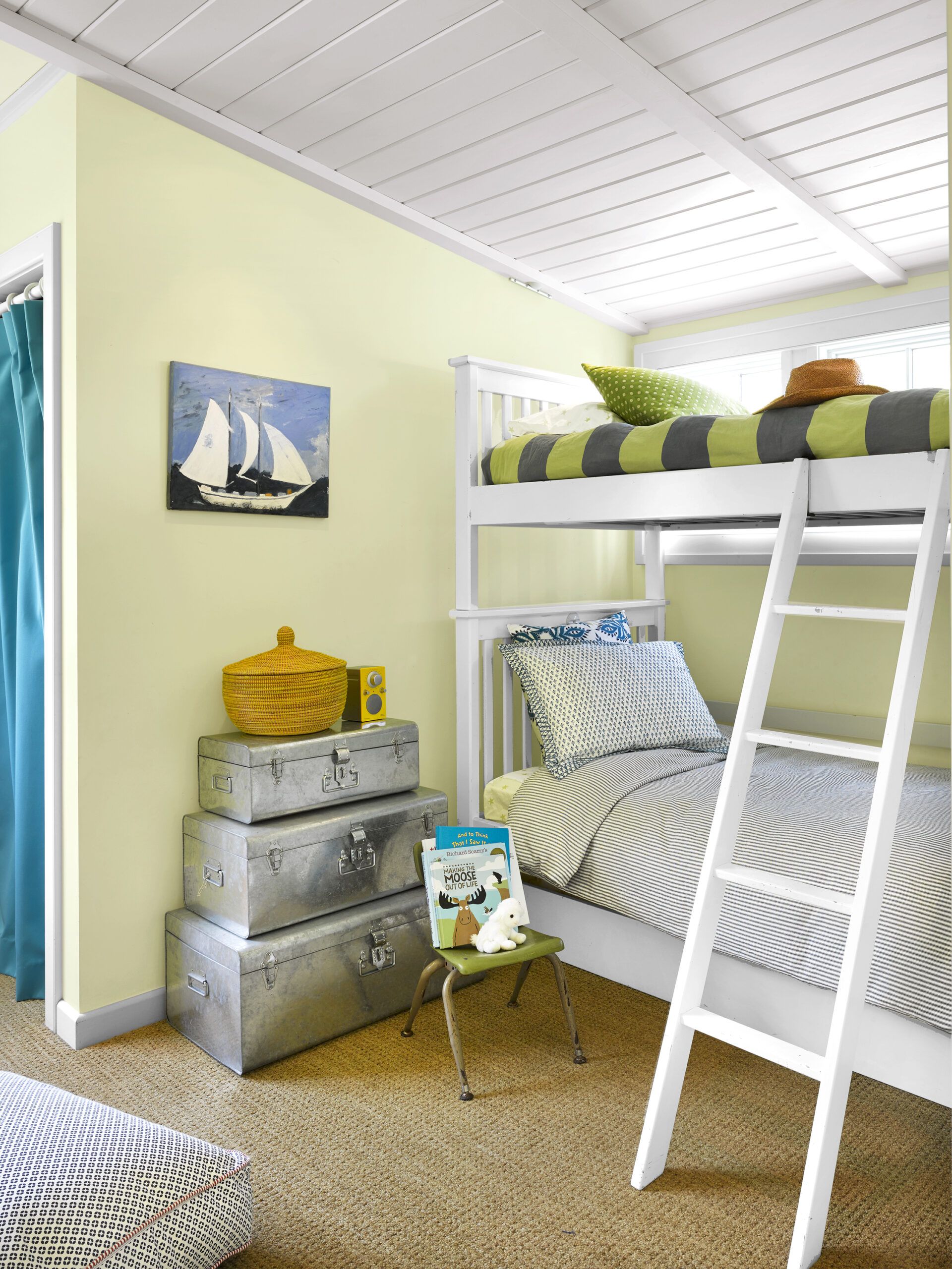
Shown: The couple’s two children, Hana and Wyatt, share a bunk room in the converted attic. The sloped ceiling is under one of the shed dormers added to the original structure to create headroom for the second floor.
Paint (walls): C2’s Green Tea
Planking Ceiling Details in the Master Bedroom
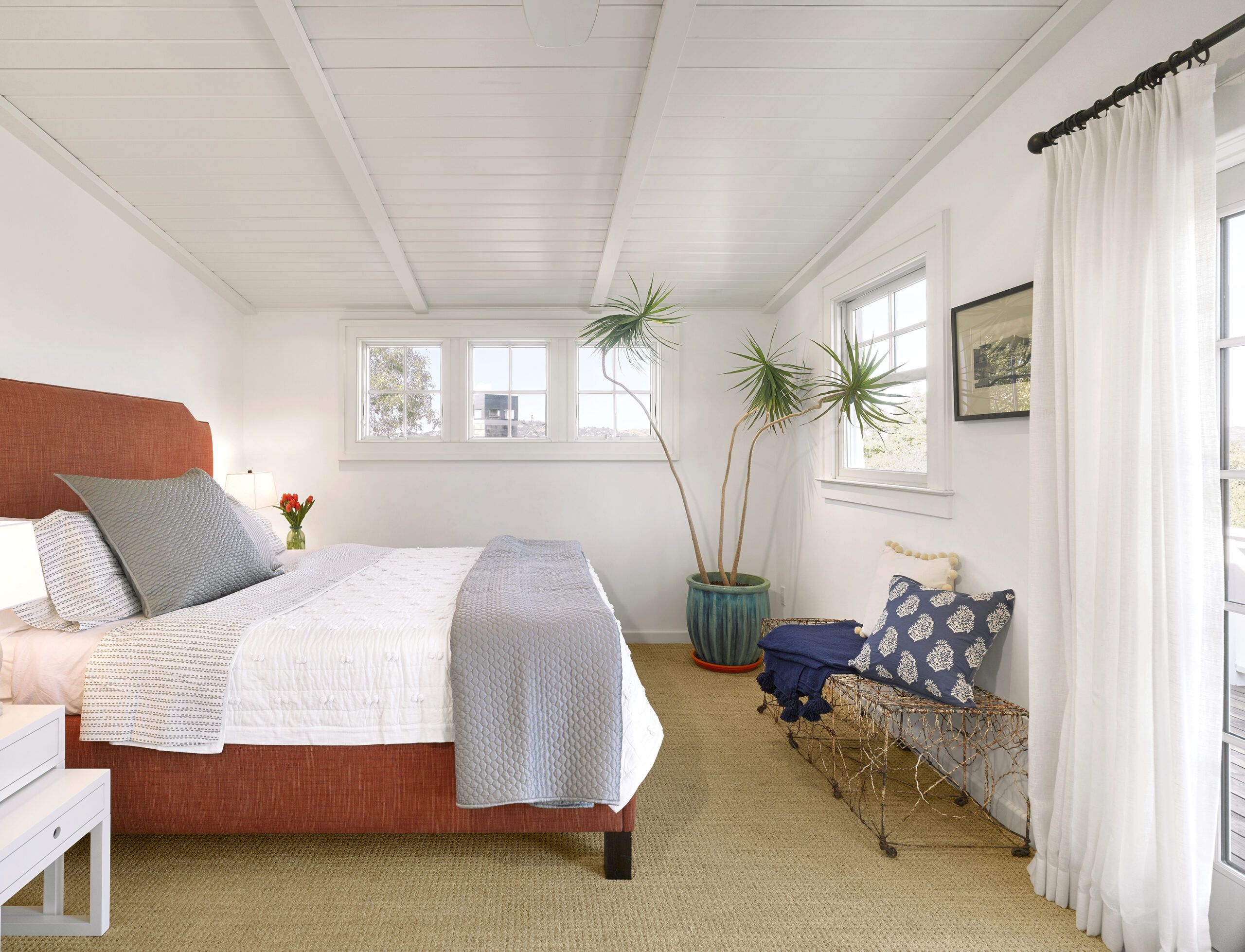
With new, sturdier structural members in place, Alicia and Calhoon worked closely on finishes and materials for period authenticity. In the new bedrooms and baths upstairs, tongue-and-groove planks cover the ceilings in lieu of plain drywall; in the living room, crown molding and Craftsman-inspired built-ins add architectural interest.
Shown: In the all-white 15-by-11-foot master bedroom, tongue-and-groove planking covers the ceiling to add dimension in the small space. White linen drapes cover French doors that lead to a new deck above the dining room, which extends the bedroom’s living space.
Stateroom-Inspired Storage in the Master Bath
When it came to the floors, Alicia wanted to retain the original Douglas fir, but there wasn’t enough of it in usable condition. She sought wood that felt good under bare feet. “I was more focused on the look,” Casey says. At a salvaged-barn-wood dealer, the couple discovered hemlock from a New York barn that satisfied them both. “It really brings a lot of character to the home,” Casey says.
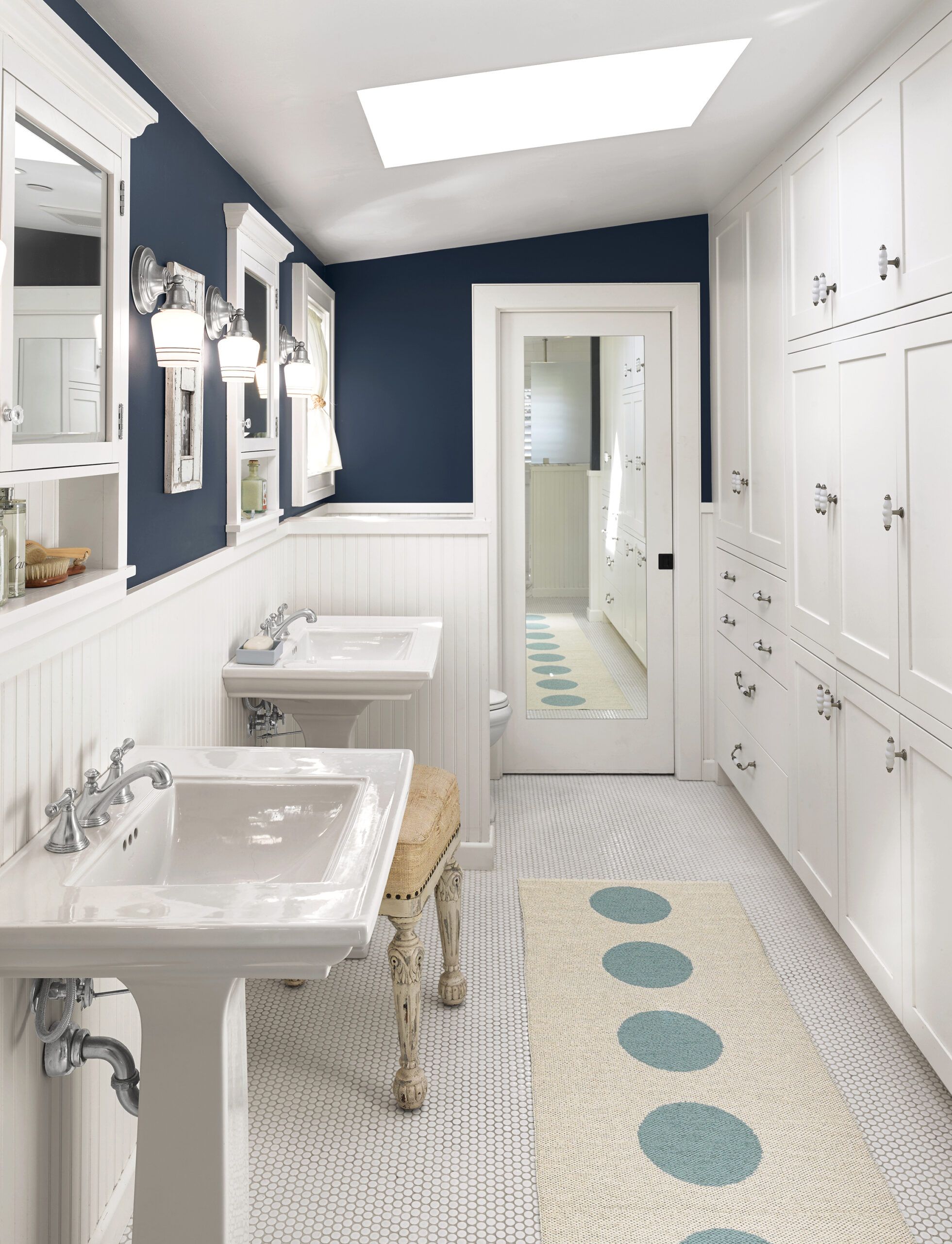
Shown: A wall of floor-to-ceiling cabinets in the master bath, inspired by a ship’s stateroom, makes up for the lack of furniture in the master bedroom. Penny-round tile was used in all the baths as a low-cost way to add vintage-inspired detail. Skylights in the upstairs bedrooms and baths usher in natural light.
Paint (upper walls): C2’s Grand Banks
Sinks: Kohler
Sconces: Schoolhouse Electric
Wainscoting as an Optical Bath Bumpout
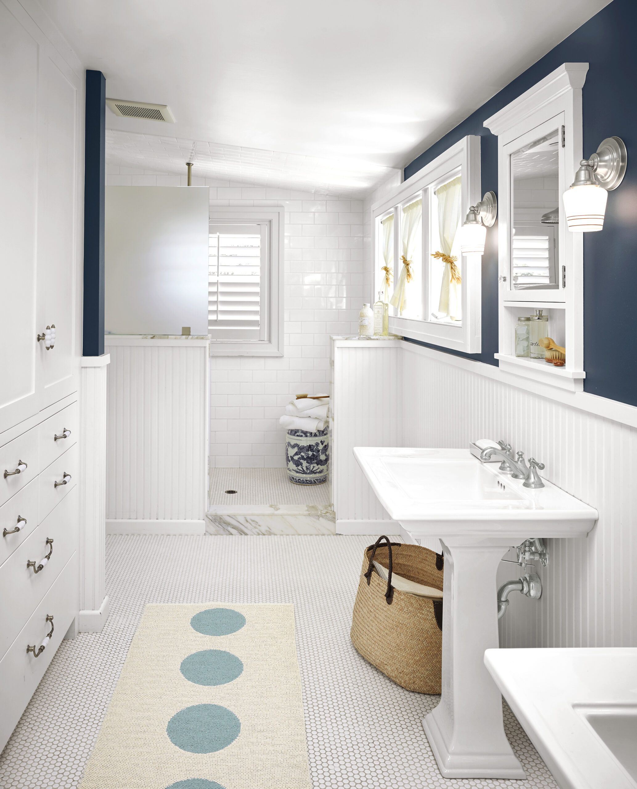
To replicate the original beadboard wainscoting and moldings, Alicia likewise took pains to make the right choices. “We might have saved some money going the MDF route,” she says. “But wood just felt right.” What also felt right was the reclaimed heart pine the couple found at another salvage company—planks that had once been a factory floor. A hunk of it now tops the Leaches’ dining room table.
Shown: Wainscoting on the sink wall continues all the way to the shower partition, helping the narrow room appear larger. Niches built into the area under the medicine cabinets stow frequently used toiletries, keeping the pedestal sinks’ deck space clear.
Medicine cabinets: Restoration Hardware
Polka-dot runner: Summer House
Cabinet pulls: Top Knobs
Light-Enhancing Shower Setup
The down-to-the-framing renovation wrapped in 10 months; the Leaches returned to their house with two months left on their rental. They discovered that the new floor plan and carefully selected materials combined to create a much more livable house. “The entry gives you a sense of transition from the outdoor space to the indoor space,” says Alicia. “It’s nice to be able to walk into a foyer, no matter how small it is.” Now, if a family member craves privacy, he or she can get away upstairs—which couldn’t be done before. “We squeezed every inch of space out of this house,” Alicia says. “It still has the cozy feel of an old house, but it now makes much more sense.”
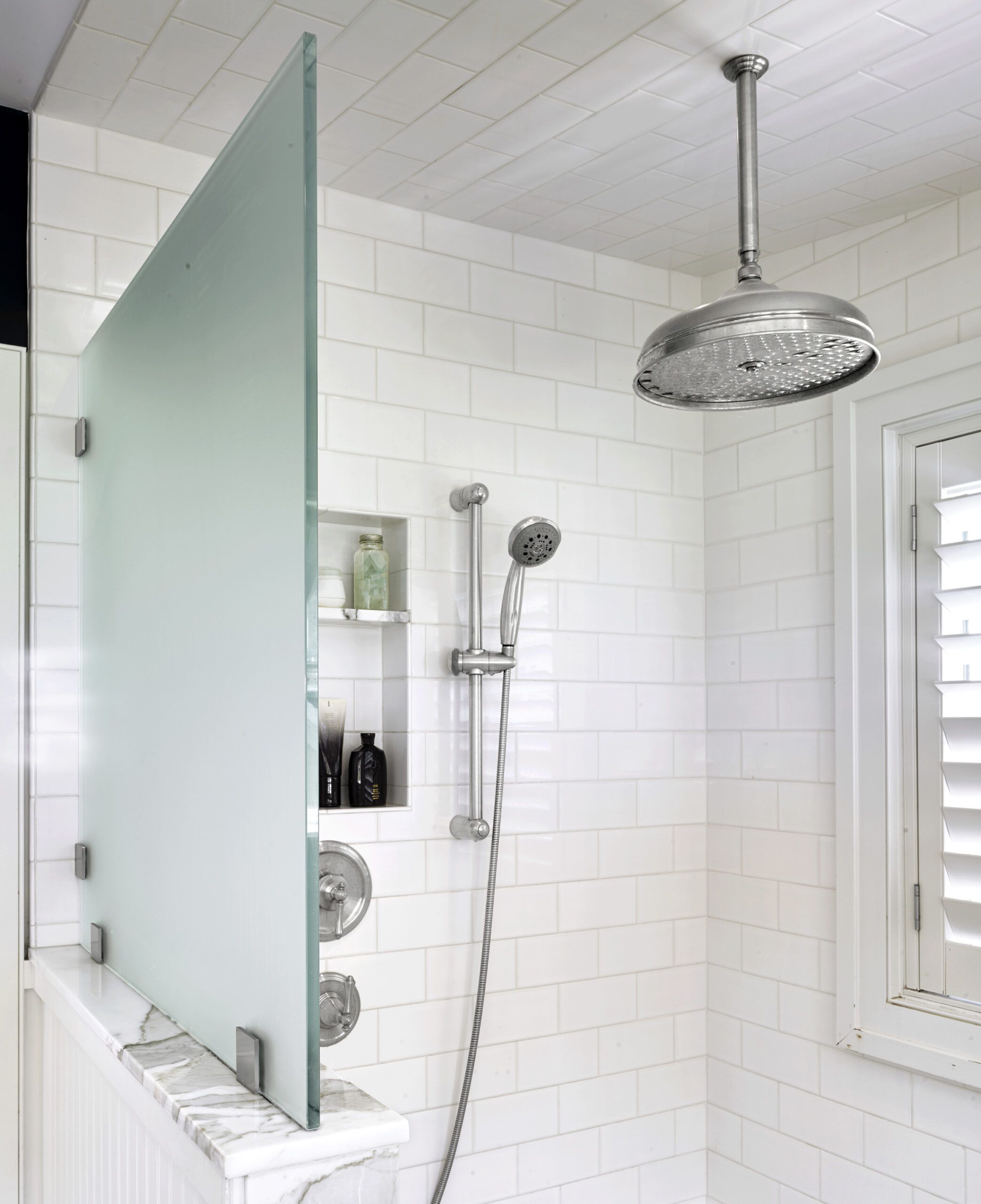
Shown: In the master bath, an opaque glass divider on the upper portion of the shower’s partition wall allows light from the nearby window to filter through to the rest of the room.
Shower fittings: Grohe
Floor Plans
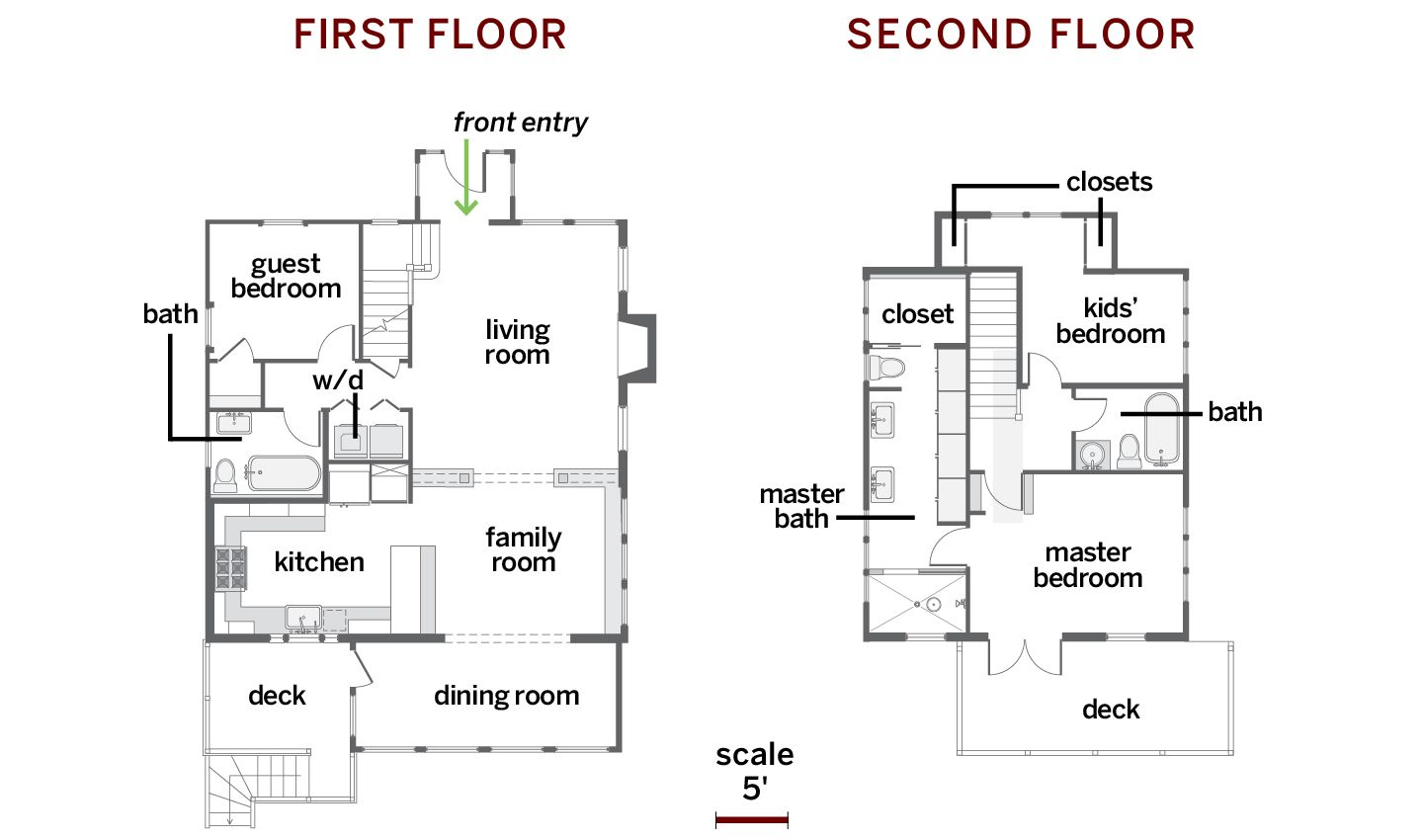
The 1,092-square-foot house gained half again as much space—665 square feet—when the attic was turned into two bedrooms and two baths.
