A Bright Color Palette for Historical Accuracy
Create your own color scheme for this home.
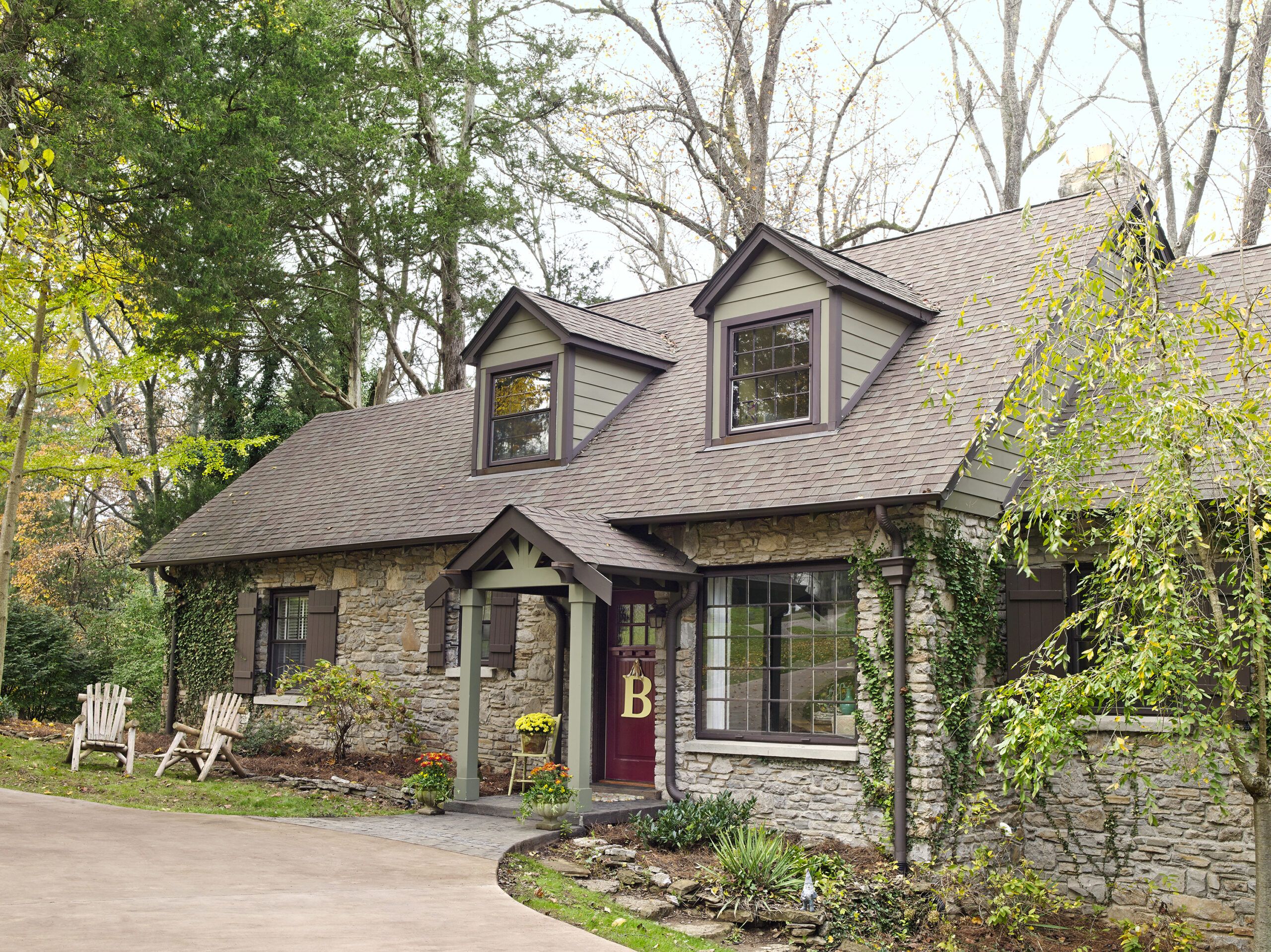
After rejecting trendy whites and grays as “just not right,” Kristie Barnett chose a more historically correct palette for her family’s 1939 house, in Nashville. “To be honest,” she says of one shade in particular, “it is a little ’30s hospital green.”
It takes courage to talk about your favorite color that way—and the kind of confidence that comes from knowing what you’re doing. Most people, after all, would rather whitewash every room than risk painting a living space anything remotely medicinal.
Shown: A palette inspired by the fieldstone facade reinforces the cottage style of the house and its new portico.
Paint: Sherwin-Williams’s Cocoon (columns and clapboards); Benjamin Moore’s Bittersweet Chocolate (trim) and Cottage Red (door)
Siding: LP Building Products
“Hospital Green” That Feels Happy
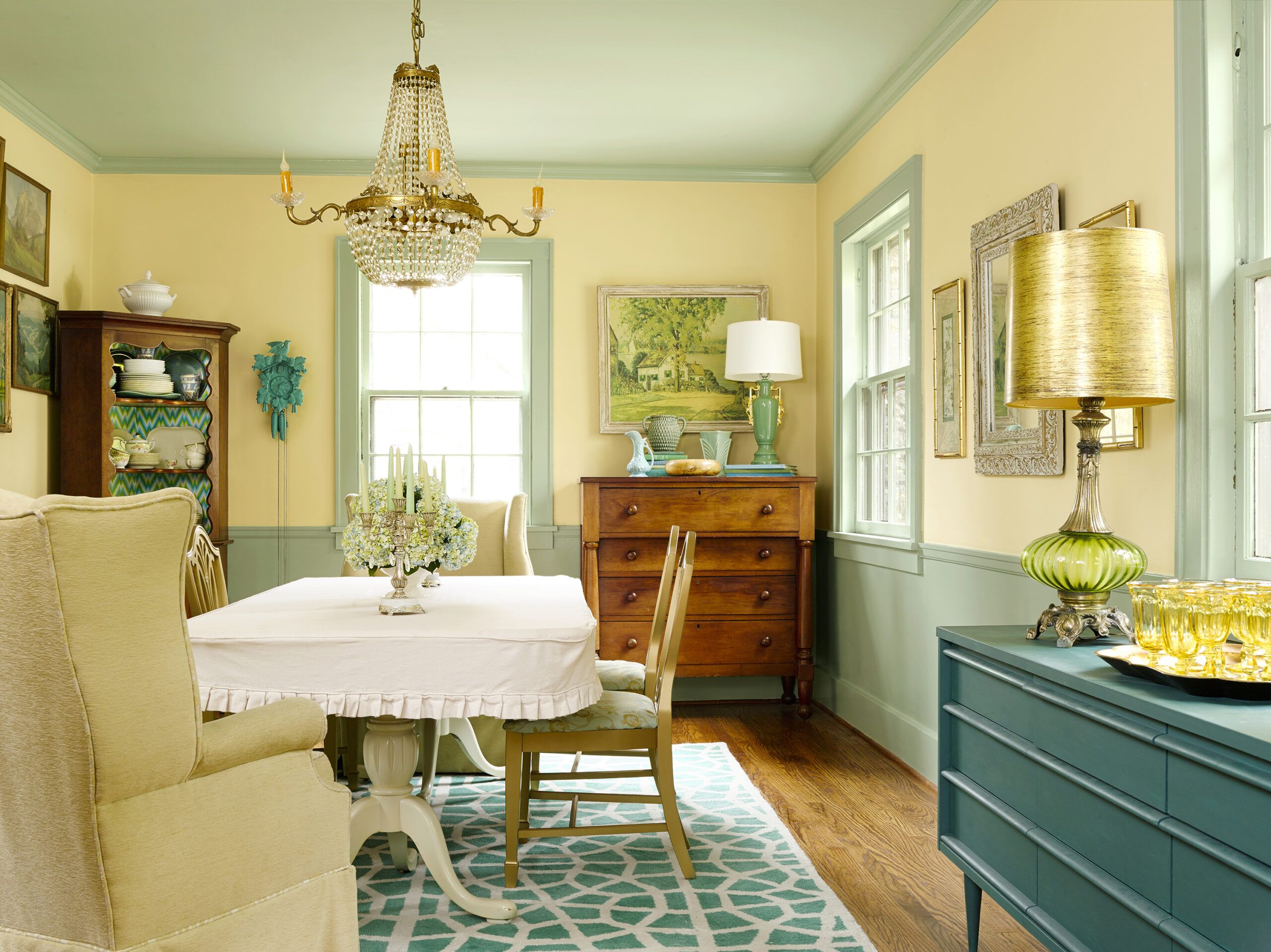
But guess what? It works. There goes Kristie’s green, drawn from the home’s original Depression-era bath tile, climbing up the dining room wainscot onto the window trim before coming to rest on the ceiling (the ceiling!). It then sallies forth into the living room and keeps going until it reaches the trim in Kristie’s home office, where it is joined by a wall color that is called, no kidding, Steamed Spinach.
Most days, you’ll find Kristie here, where she consults as a palette tamer, an interior decorator, and a “psychological stager” (more about this shortly).
Shown: A historic shade of green connects the dining room wainscot and trim to the ceiling—and adjacent rooms.
Paint: Benjamin Moore’s Prescott Green (wainscot, trim, and ceiling) and Weston Flax (upper walls); Annie Sloan Chalk Paint’s Provence (sideboard)
Rug: RugsUSA
Copper Touches in a Cozy Kitchen
While her blog, The Decorologist, provides examples of her work, few projects better distill Kristie’s approach than her own home, an ongoing experiment that involves repeated tinkering with the furniture, light fixtures, rugs, and accessories—to the surprise if not always the delight of her husband, Phil, a corporate events producer when he isn’t DIY-ing something himself. “Did you move the light switch?” he drawled once upon returning home from a business trip. “Because I can’t find it.”
The two share a love of fixing up old houses and old things. Picture an armoire that once stood in an uncle’s gift shop, spiffed up to serve as a closet for the master bedroom.
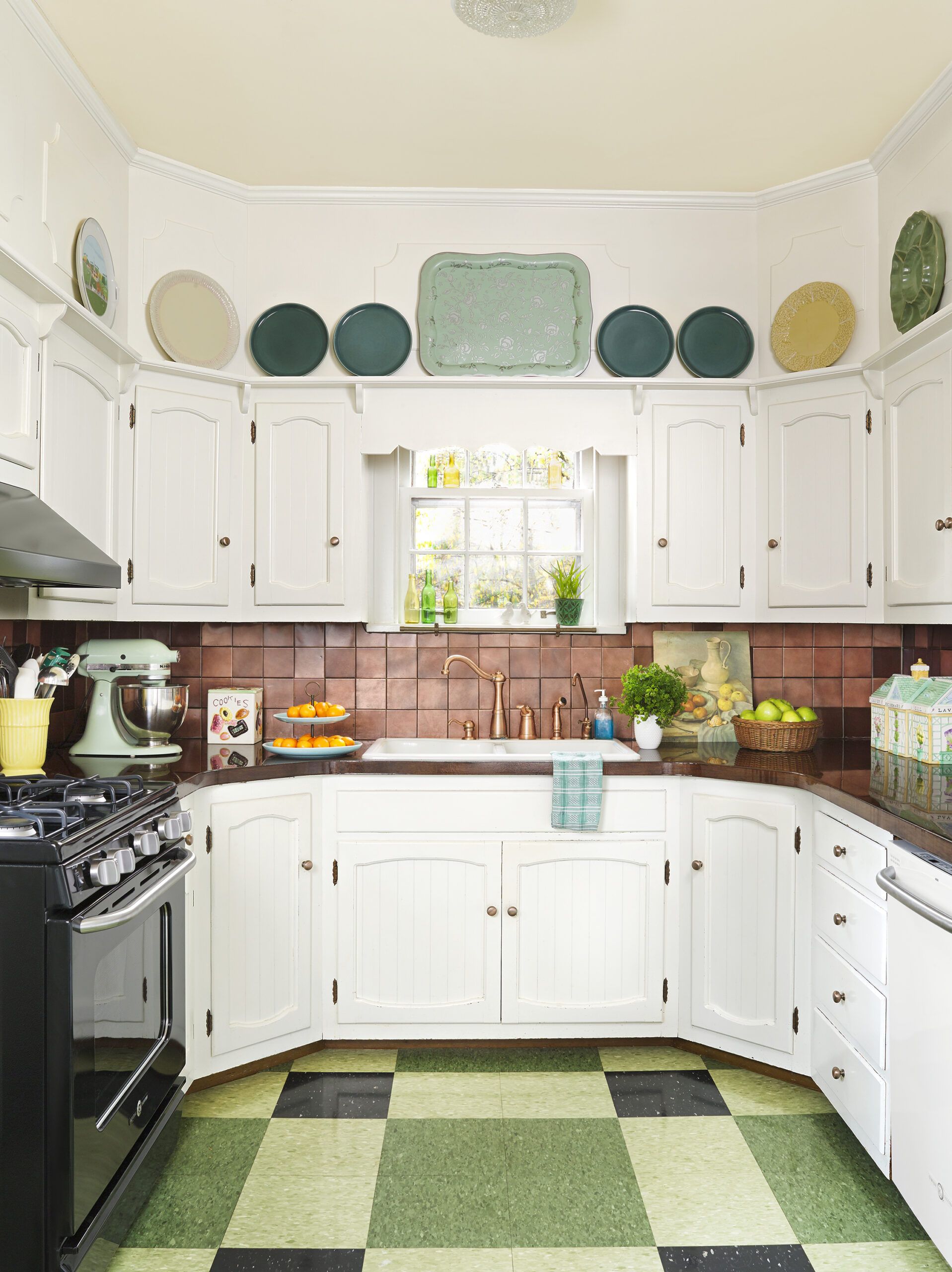
Shown: The kitchen’s worn laminate counters were updated with mahogany veneer, stained, then sealed with self- leveling epoxy. New copper-toned sink fittings and hardware nod to the existing backsplash. The range is black, allowing it to stand out in the mainly white scheme.
Range, refrigerator, and dishwasher: GE
Faucet: Pfister
Vinyl floor tile: Corlew and Perry
Range hood: Broan
Punchy Neutrals in a Living Room
When Kristie isn’t enhancing heirlooms, assisting clients, or training fellow designers, she haunts estate sales, eBay, and the mega outlet chain HomeGoods, whose unpredictable inventory plays to her strength as a professional picker.
That edge can cut both ways, as it did when the couple set eyes on their house for the first time.
“When my father-in-law said, ‘I found a house you’d love,’ I told him, ‘We’re not interested!’ We had just finished renovating a house. We had a baby. …”
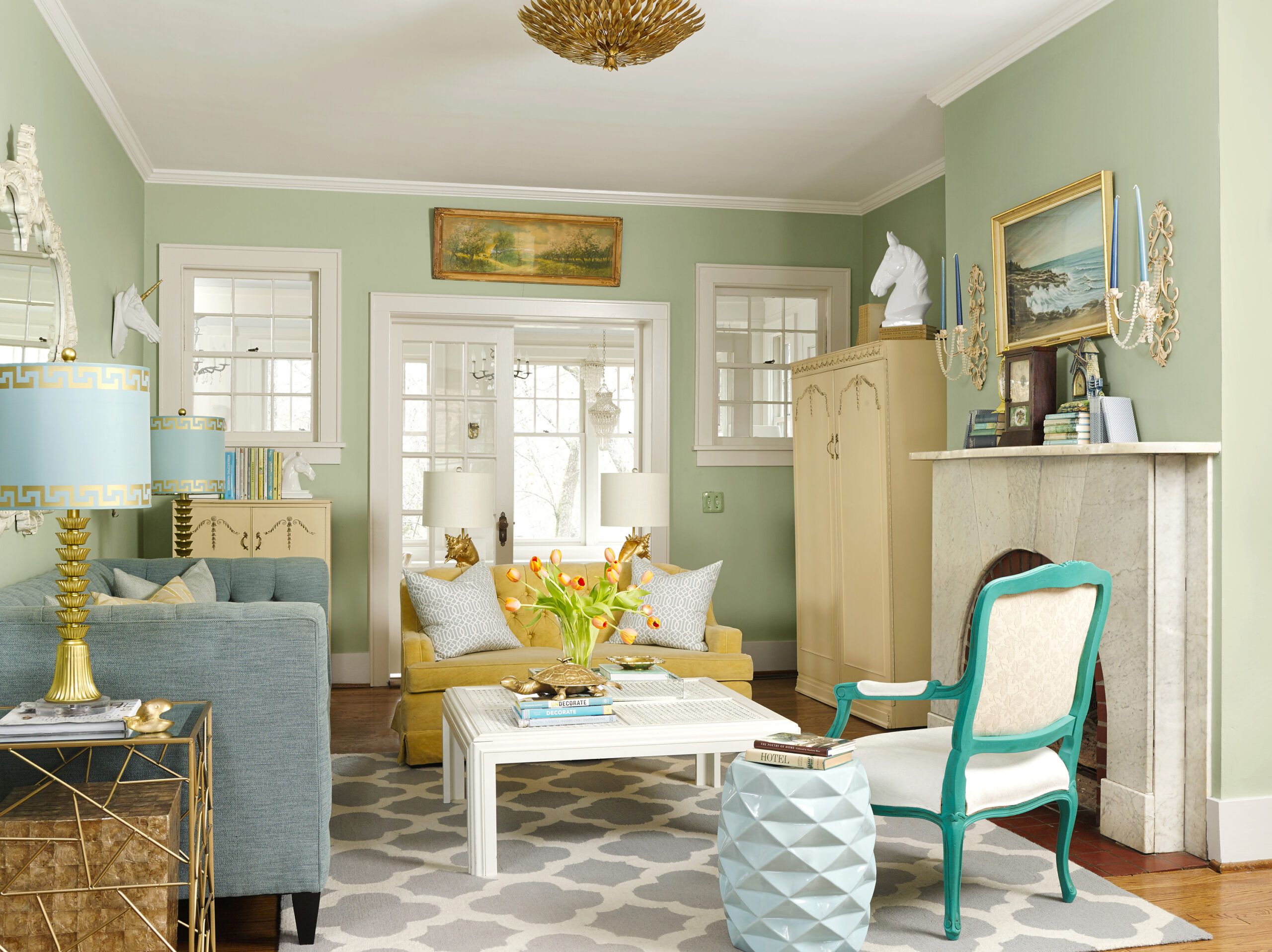
Shown: The living room opens onto a screened-porch-turned-sunroom. Teal trim on a vintage chair punches up a palette of pale neutrals.
Paint: Benjamin Moore’s Prescott Green (walls) and White Dove (trim, ceiling, and coffee table); Annie Sloan Chalk Paint’s Provence (armchair frame) and Pure (armchair fabric)
Sofa: Bernhardt
Garden stool, lamps, and end table: HomeGoods
Ceiling light fixture: Crystorama
Reaping the Rewards of Self-Taught DIY
Some reluctant home buyers cave at the sight of nodding hydrangeas and a crooked stone path, others under the heady influence of a gleaming six-burner range. For Kristie, it was more about stepping inside and back in time.
Tucked into a pleasant sprawl of 1960s ranch houses, the five-bedroom, two-bath house—about 2,700 square feet on two floors—felt like a genuine period piece. Completed in 1940, it even had a fun origin story, as the couple would later learn: The first owner was the man behind a still legendary delicacy, Vietti Chili, and is said to have cooked up his secret recipe right there in the kitchen.
Naturally, there were things that needed fixing. The couple harnessed their self-taught skills and set to work. “The day before we moved in, we stayed up all night replacing the kitchen floor,” recalls Kristie, who couldn’t wait to cover over its 1980s beige vinyl. The urgent need for fresh paint on the walls went without saying.
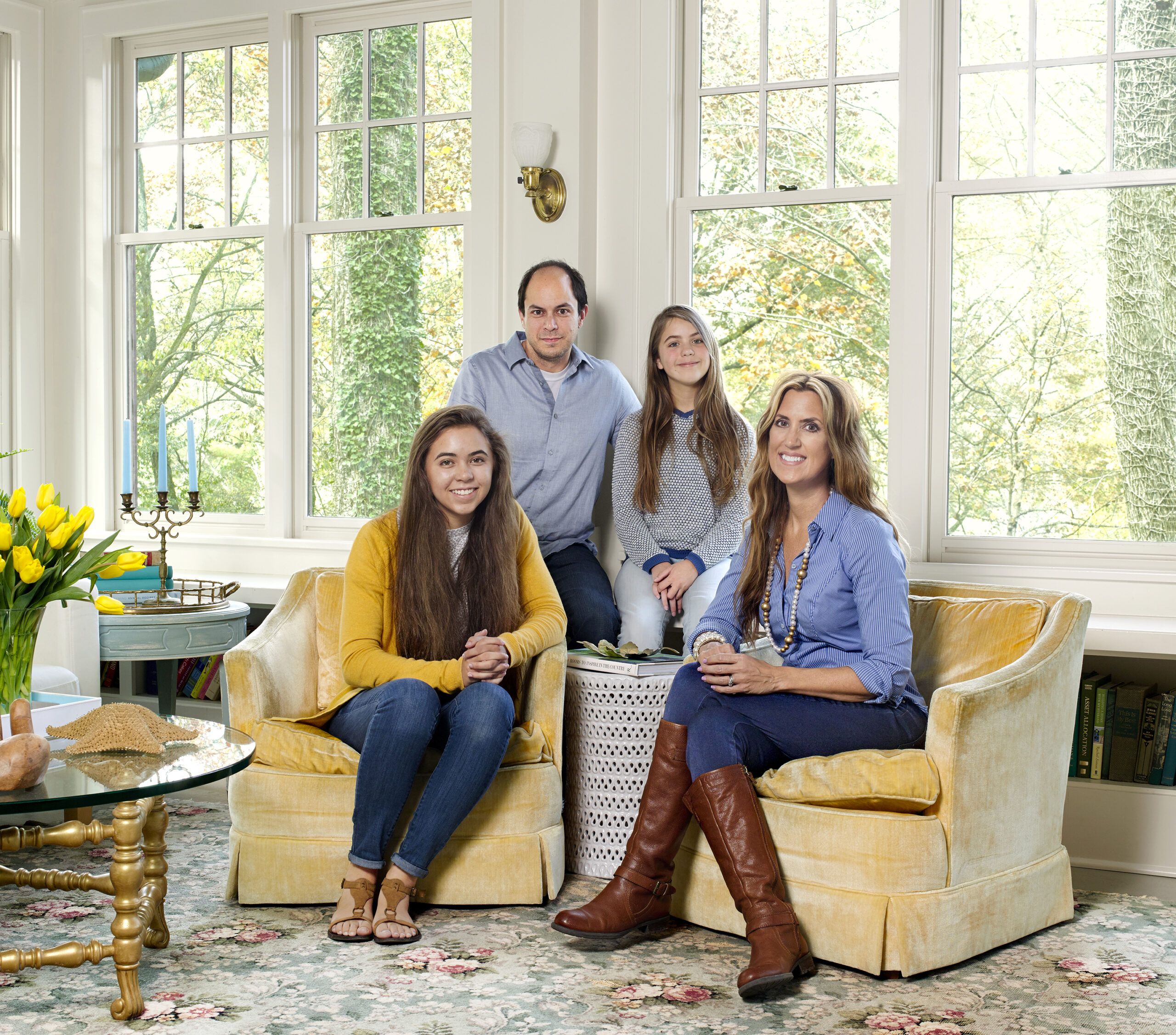
Shown: Phil and Kristie Barnett, with daughters Audrey, 16, and Kelta, 12, gather in the sunroom. The rug and armchairs were snagged at estate sales.
General contractor: Sheeler Construction, Brentwood, TN; 615-347-8063
Windows: Monarch Windows and Doors
Garden stool: HomeGoods
Lavender and Oak in the Master Bedroom
Kristie leans toward historic colors because she finds them warmer and, as she puts it, more interesting than the crisper whites and grays that are so popular now. To lend cohesiveness to the smaller rooms in older houses, she likes to start with one shade—a “main neutral”—and weave it throughout. Total monotone would be boring, while too many random colors and you risk, as she says characteristically, “getting on the crazy train.”
She applies her favored shade in different spots—on the walls in one room, on the trim in another. “It unites them but allows each to have its own personality,” she says.
Visual flow isn’t her only goal. When the back-ground stays the same, she can move furniture and accessories around, “which I do quite frequently!”
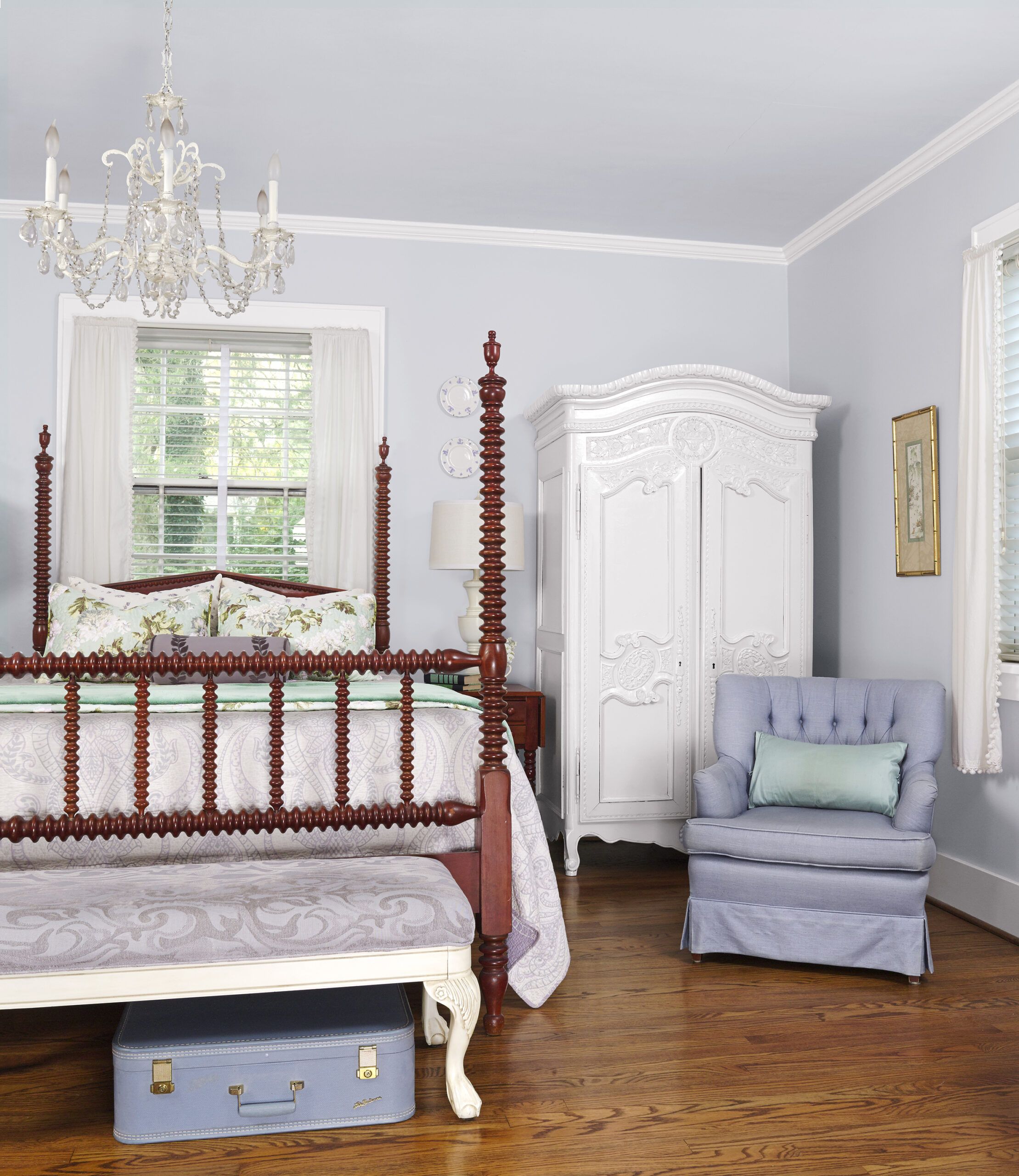
Shown: Soft lavender and crisp white bring out the warmth in the master bedroom’s oak flooring and heirloom bed.
Paint: Benjamin Moore’s Violet Mist (walls and ceiling) and White Dove (trim)
Bench: Marshalls
Master Bath Rebuilt from Scratch
That’s particularly true on the first floor, the main focus during the early stages of the renovation. The couple had no desire to alter the footprint but they did look for ways to tap more useful space, over time carving out a breakfast nook and turning a screened porch into a sunroom. They moved slowly, which is how Kristie likes it, suggesting it takes time to suss out what works not only for you but also for the house.
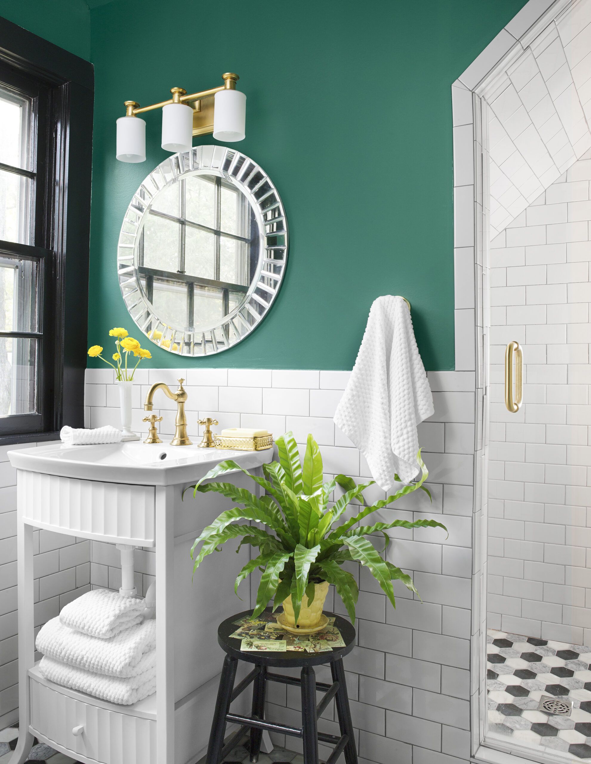
Just last year, with two growing daughters, the couple demolished two walls upstairs that didn’t appear to be original, turning a bedroom into a common area between the girls’ rooms. After years of scratching their heads over the upstairs bath—a dysfunctional space crammed under the eaves—they rebuilt it from scratch. Subway tile gives the new bath period appeal, while emerald-green walls and black trim give it a contemporary edge.
Shown: The new upstairs bath has luxury touches like marble floor tile and a gold-finished faucet.
Paint: Benjamin Moore’s Steamed Spinach (walls) and Black (window)
Mirror: HomeGoods
General contractor: Hammond & Brandt Builders, Nashville; 615-248-1818
Wall tile: Home Depot
Floor tile: The Tile Shop
Light fixture: Feiss
Faucet: Newport Brass
Vanity: Ferguson
Shower fixtures: Delta
Emerald and Jade in the Home Office
To help clients narrow their paint choices, Kristie travels with two huge bags full of oversize swatches. As part of the winnowing exercise, she holds them up against finishes that can’t be easily changed, like granite countertops or the tile around a fireplace. “It helps you see the undertones; if the granite has a little green in it,” she says, “I suggest testing a neutral with a little green in it.”
Homeowners often underestimate the impact of wood’s undertones, she notes. “When it goes up ver- tically, like a stair rail or trim, it acts like a color. For example, if it’s orangey, gray next to it would look like sludge.”
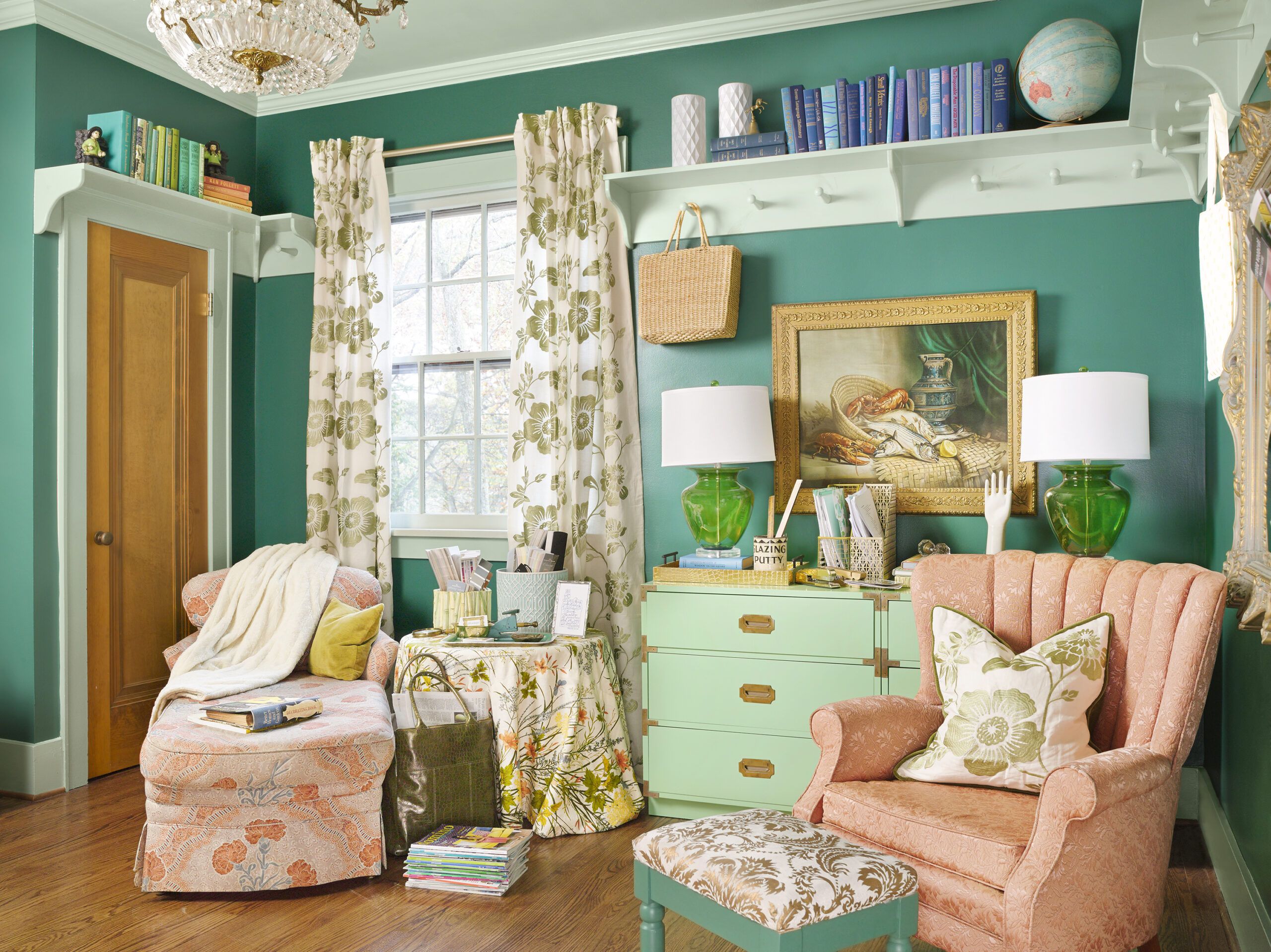
Shown: In Kristie’s home office, vivid emerald and jade complement reddish unpainted wood. Phil made the open shelves; the dresser is a reinvented vintage piece.
Paint: Benjamin Moore’s Steamed Spinach (walls) and Prescott Green (trim and ceiling)
New, Sunny Upstairs Sitting Room
Context aside, Kristie is a firm believer in following one’s gut reaction to a specific color. It goes back to her training, which includes a master’s degree in psychology. She is so tuned in to what makes people feel comfortable that she has written a book for pros called Psychological Staging, nailing what buyers really want—a home that “represents a fresh, clean start for their chaotic lives” and “hints at a lifestyle they would like to have,” as she accurately notes.
That background comes in handy when she has to help homeowners navigate in emotionally charged seas like a paint store. “Most designers start with a piece of furniture, or maybe the rug, and use that to create a palette,” she says. “But I do the opposite—because if you don’t like the wall color, you won’t like the room.”
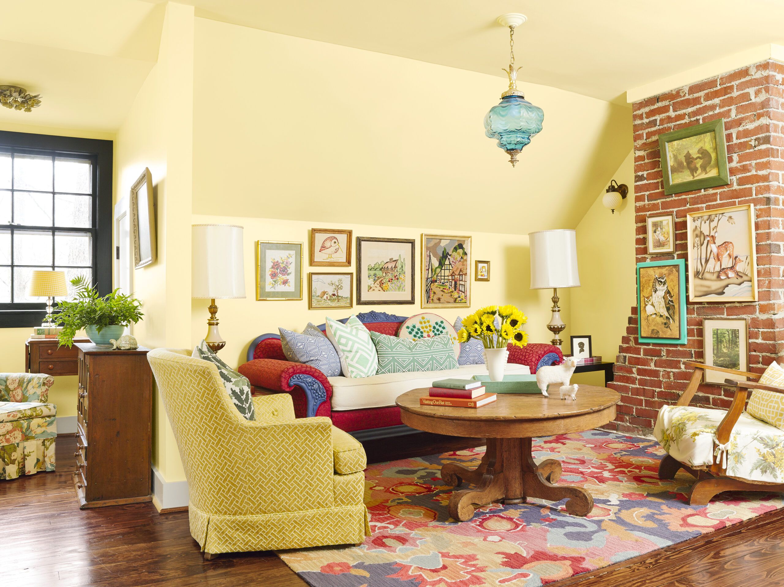
Shown: A wall came down to create this cozy second-floor space. Wrapping it in a single light-reflecting color added loft to the 8-foot ceiling.
Paint: Benjamin Moore’s Hawthorne Yellow (walls and ceiling) and Black (window); Annie Sloan Chalk Paint’s Napoleonic Blue (sofa trim)
Carefully Selected Colors for a Girl’s Room
Her one exception to the bow-to-your-real-feelings rule? Clients under the age of 18.
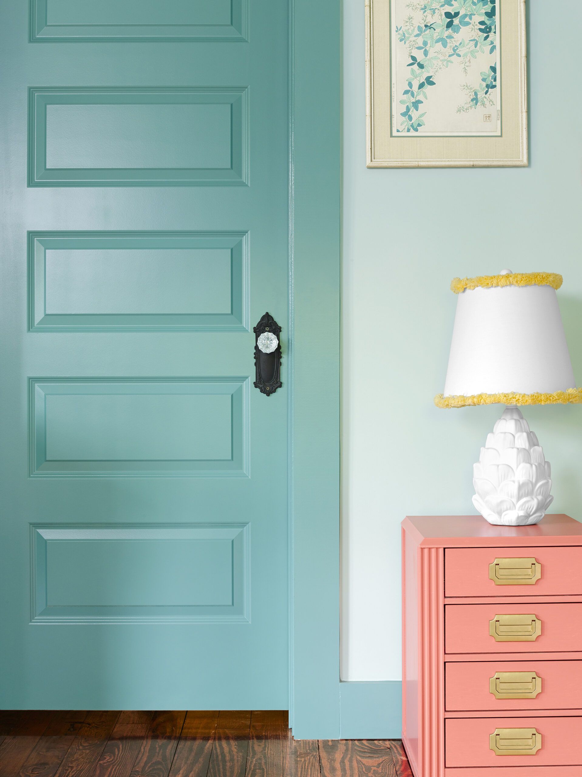
“Never let children pick out their own paint colors,” says Kristie. Instead, “show them certain palettes and ask them which they prefer.” By that she mainly means palettes drawn from the less-saturated choices at the back of her favorite fan decks. Sure, you can always repaint, but generally you want something that will work for them as they grow—and won’t set your teeth on edge in the meantime.
For one young client with a crush on the royal garb of a certain Disney princess, “I said, ‘Let’s do a European princess,’ ” Kristie recalls. So: less purple, more lavender, like the serene shade in her own bedroom.
Kristie may still enjoy moving things around, but basically her family’s forever house is done. “I like that it is very special but doesn’t intimidate people; they think it’s cool and sweet,” she says. She credits its cottage charm to rooms that aren’t big, “yet keep going.”
Shown: Two shades of blue enliven daughter Kelta’s bedroom.
Crafty Built-ins and a Standout Floor Pattern
Create your own color scheme for this room.
Speaking of that flow-enabling green, years into the renovation the couple dug into a living room wall and found traces of an almost identical green under layers of paint going back to 1940. “I was so excited, I was jumping up and down,” Kristie says.
Same thing when Phil was making kitchen improvements and unearthed the original green and black linoleum tile. “I was like, ‘Thank you, house!'” says Kristie.
“I love this house, and I feel like over the years it’s revealed different things to me—like I was on the right track all along.”
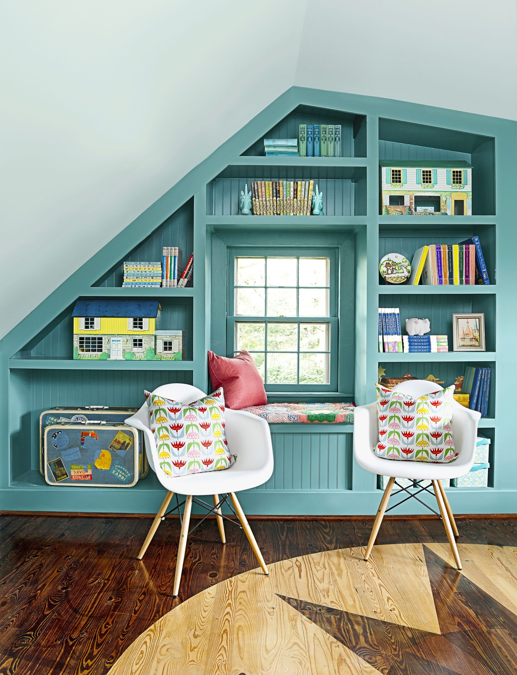
Shown: Phil made the built-ins and created the floor pattern, using a compass and string, painter’s tape, and wood stains.
Paint: Benjamin Moore’s Azure Water (door, built-ins, and trim) and Palladian Blue (walls and ceiling)
Stain: Minwax
Chairs and pillows: Overstock
