Fast Thinking for a Cheery Remodel
A gut renovation always involves making scores of decisions—and being a pro doesn’t make them any less gut-wrenching, it turns out. For Elizabeth Low Cash (Elow Landscape Design and Build), a design-build landscape contractor in Los Angeles who regularly guides clients through complex yard makeovers, the decision-making on her own remodel felt like a nonstop onslaught.
“There was never a catch-your-breath period where things moved as planned,” says Elizabeth, who bought this 1949 bungalow with her husband, David, and masterminded its makeover. “Every week, we were up against the wall: Did we have cabinet hardware picked out? How deep should the dining area’s window seat be? Did we want self-closing drawers in the vanity? I had to make decisions quickly, or risk blowing our schedule and budget.”
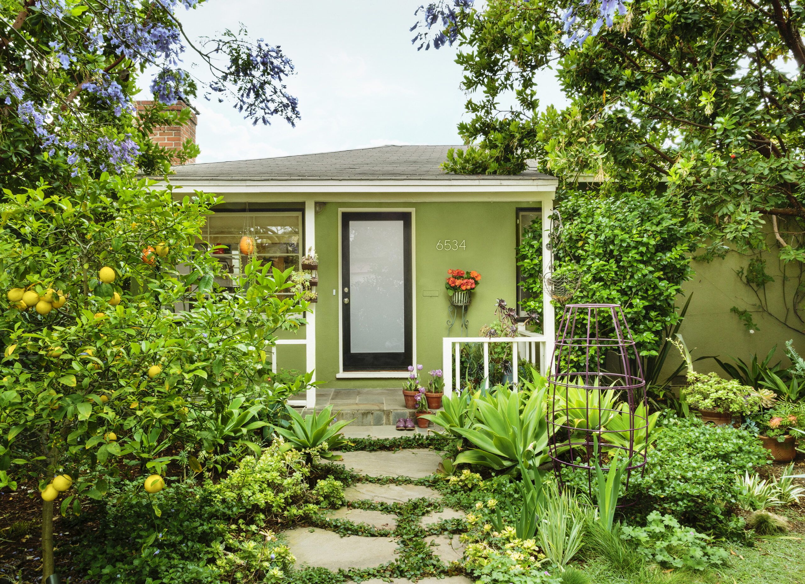
Shown: Lush plantings, including creeping strawberries and dymondia between the flagstones, large agaves, citrus trees, and a pair of purple-flowering jacarandas, lend an exuberant look to the house’s simple facade.
Small Spaces Feel Airy
And the pressure kept mounting, with good reason, as Elizabeth was pregnant with their first child at the time. Knowing that the completed house would hold just 900 square feet, she felt she had to get every detail right, including the vital indoor-outdoor connection that the couple wanted.
“Even though we fixed up the house first and the landscaping later,” says Elizabeth, “we thought constantly about how the interior and exterior spaces should work together.”
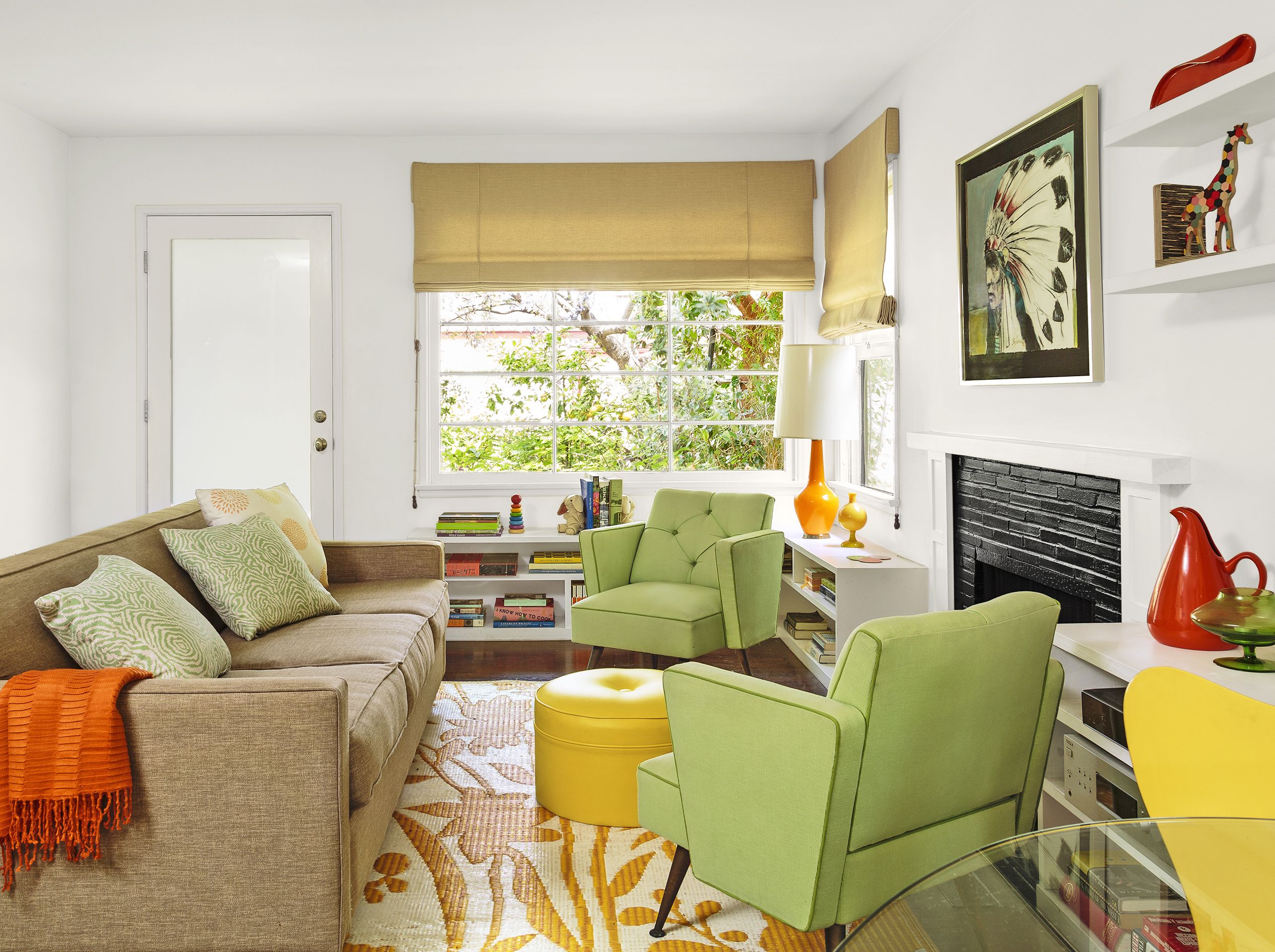
Shown: A simple fireplace surround, low bookcases, and streamlined furnishings help the small house feel larger and airier. The bookcases, crafted by homeowner David Cash’s brother, double as occasional seating in the area under the windows.
Rug: Mad Mats. Roman shades: Queen of Shades
Citrus-y Kitchen with Outdoor Views
Today, the house the couple share with their young daughter, Violet, lives much larger than its footprint. Credit a straightforward floor plan, strategic placement of doors, windows, and decks, and a nature-inspired color scheme that create a seamless flow between the house and the lush gardens on all sides.
It took a keen knowledge of the neighborhood to recognize this gem in the rough. When Elizabeth first saw the two-bedroom, one-bath, 700-square-foot house with detached garage, “it basically hadn’t been touched since it was completed,” she says. The front yard was scraggly; the backyard was choked with overgrowth. Plus it had no insulation, and the original wiring and plumbing were a mess.
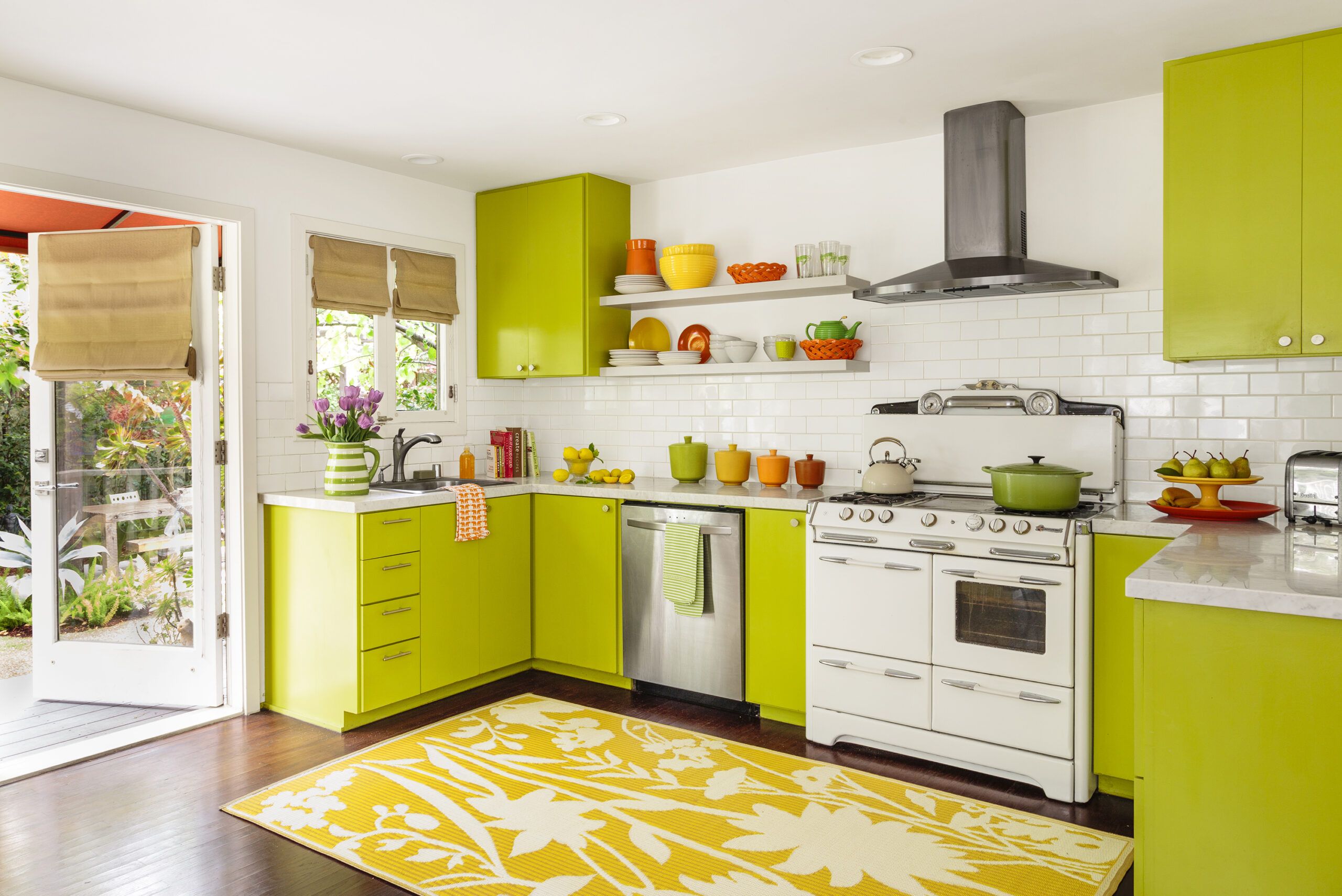
Shown: The focal point of the open kitchen is a 1940s O’Keefe & Merritt stove, a gift from the Cashs’ real estate agent, who had it left over from a renovation of his own. “It’s so heavy and hard to move that I thought my crew was going to kill me,” Elizabeth says. “When they were sliding it between the base cabinets, I was petrified that I’d gotten the measurements wrong. It fit, but just barely!”
Dishwasher, vent hood, refrigerator: Kenmore. Rug: Mad Mats
Bright Colors Bring the Garden Inside
By then, she and David had been outbid on several homes in up-and-coming Mar Vista, where modest houses from the 1940s and 1950s—built for factory workers at what is now the Santa Monica Airport—sit shoulder to shoulder on narrow streets. This one had languished on the market.
It was smaller than she would have liked, but Elizabeth was drawn to two purple-flowering jacaranda trees near the front walkway, and her real estate agent pointed out that the backyard was as large as the house, essentially doubling their living space in temperate Southern California.
Finding a metal fish sculpture entangled in the backyard’s overgrowth sealed the deal. “I grew up fly-fishing with my father, so it seemed like a good omen,” Elizabeth explains. After some haggling on price, the house was theirs.
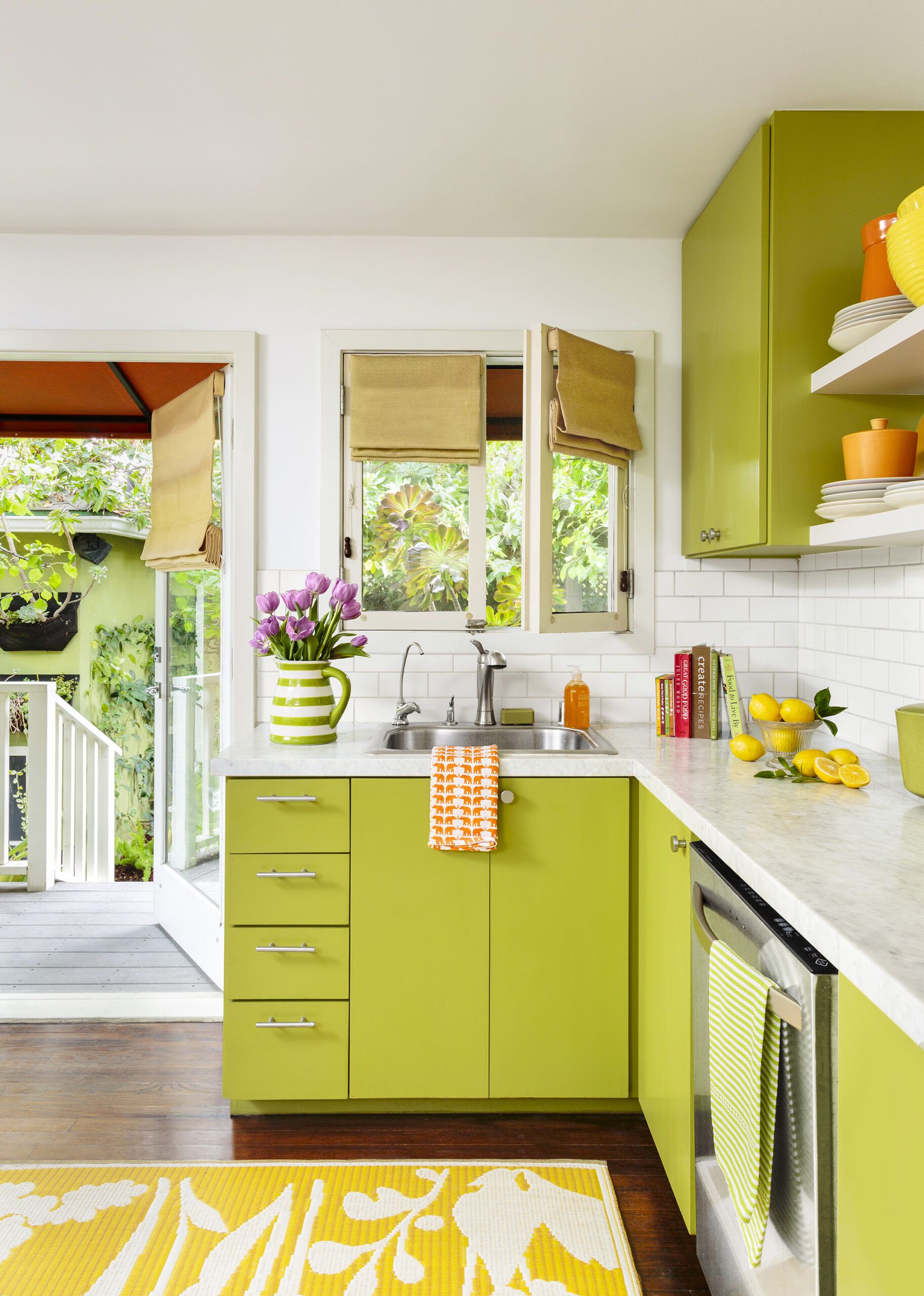
Shown: Lime-green kitchen cabinets and doors, and windows that usher in light and views, bring the backyard garden inside. The custom birch cabinets were sprayed with a lacquer that wipes clean; their color is a brilliant foil for classic Carrara-marble countertops and a white subway-tile backsplash.
Paint (cabinets): Dunn-Edwards’s Palm Frond. Countertops: Carrara marble, Bourget Bros.
Banquette for a Bay Window
The couple decided to focus on fixing up the interior first so it would be done—they hoped—by the time the baby was born. Undaunted, the mom-to-be began sketching floor plans.
With no formal training in interior design, Elixabeth attributes her knack for space planning and eye for color to her mother, who worked in the fashion business and decorated homes on the side, and to her aunt, an interior designer in New York. “They often took me to showrooms and fabric stores, and I learned so much by hearing them talk about home decor,” she says. Ultimately she handled all of the design, drawings, and permitting.
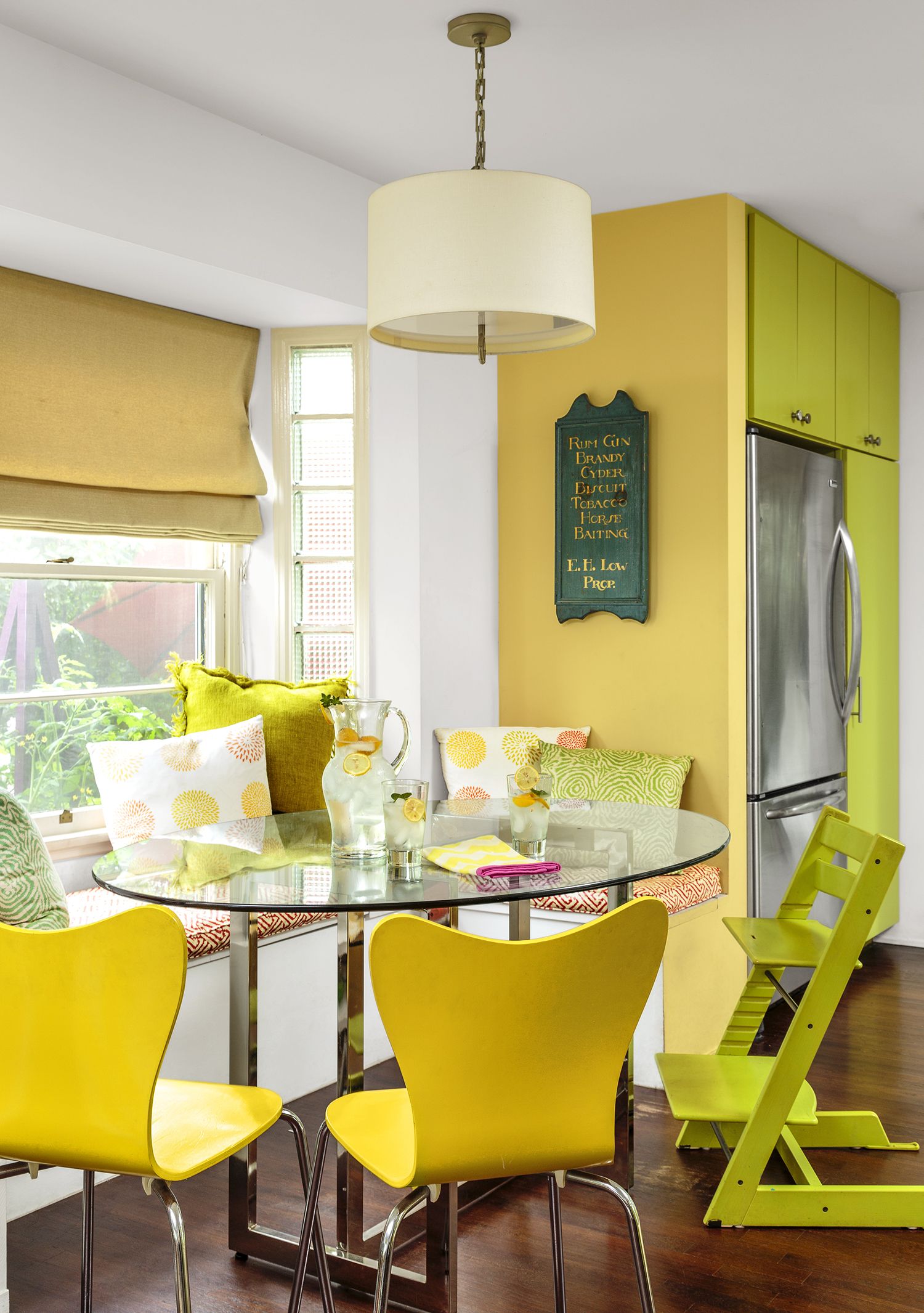
Shown: An original bay window with glass blocks along the sides offered a natural location for the space-saving banquette in the kitchen.
Pillow, seat cushion: custom; Quadrille. Dining table base, chairs: West Elm. Glass top: custom. Pendant light: Jonathan Adler
Aqua Vanity Packs a Punch
The biggest priority was creating more breathing room, and one key change accomplished that. Bumping out the back of the house by 6 feet let them enlarge the kitchen, install a double vanity in the only bath, and add a walk-in closet in the master bedroom. The plan also eliminated an interior wall and reconfigured the kitchen to open it up to the dining area and living room.
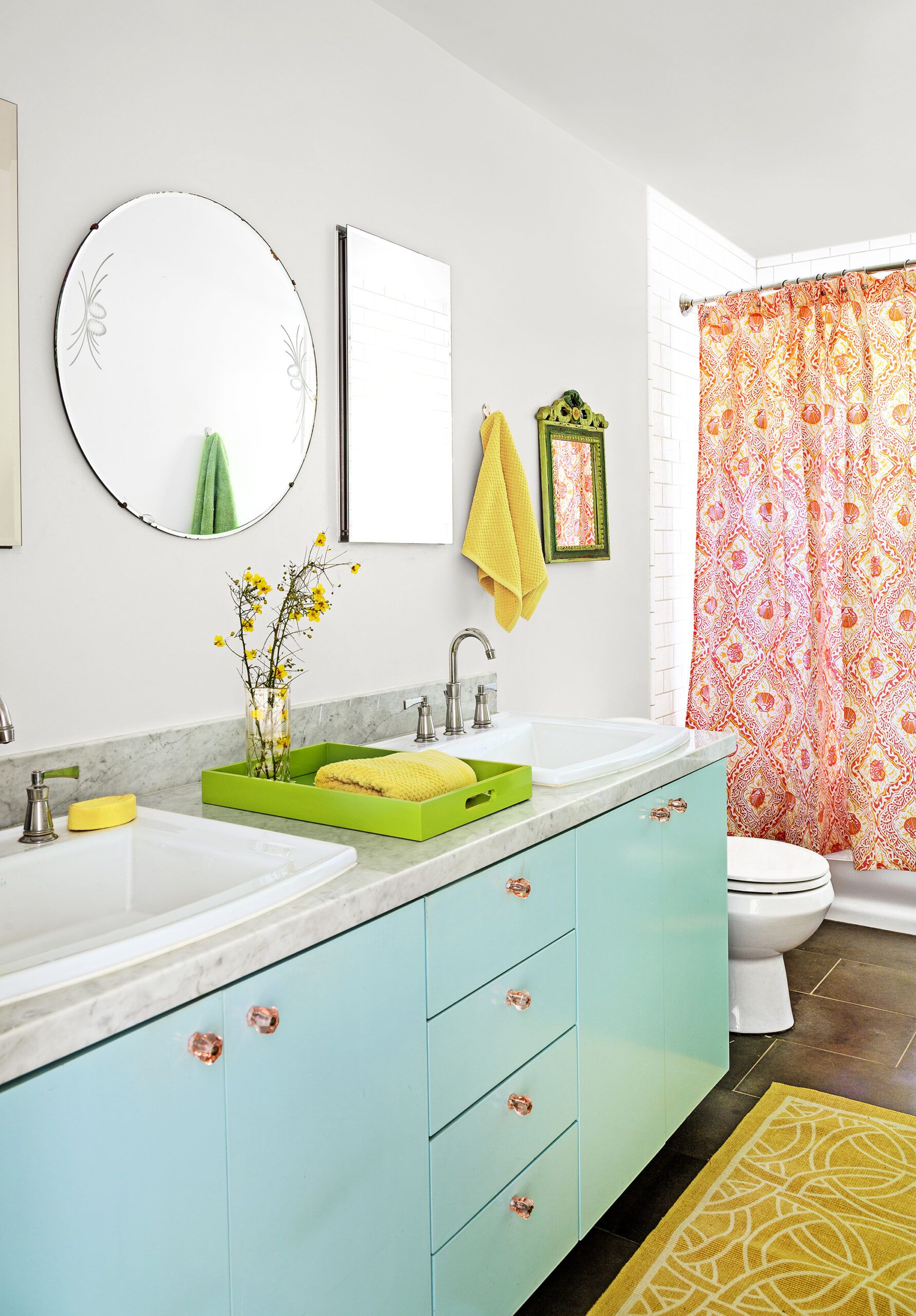
Shown: A custom double vanity maximizes function in the only bath. Its punchy aqua color enlivens the Carrara-marble countertop and soapstone tile floor.
Cabinets: custom, lacquer painted
Fixtures: Kohler
French Doors Open Onto a Deck
Throughout the house, built-ins would keep rooms orderly by giving everyday items a landing spot. The kitchen’s bay window was a natural location for a window seat with storage. In the hallway near the bathroom, Elizabeth recessed a linen closet by stealing space behind the door swing in her daughter’s bedroom. On its back side, in the bedroom, a built-in bookcase put this otherwise-dead wall space to use.
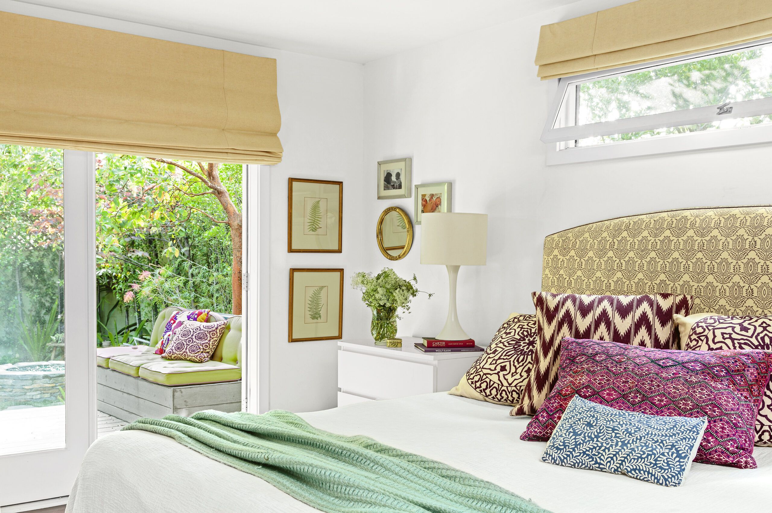
Shown: Above the bed, a large awning window with a screen outside replaced two original windows that looked onto a neighbor’s house. On the back wall, a pair of French doors now open onto a new deck, offering unobstructed views of the back garden, as well as good cross-ventilation when open at the same time as the window.
Headboard and pillows: custom; Madeline Weinrib. Throw: Jonathan Adler
A Deck that Leads to the Garden
The house’s lemon-yellow, lime-green, and orange palette was inspired by a set of vintage-look canisters. These cheery colors tie the common spaces together and help bring nature inside. “We wanted to connect the house to the outdoors as much as possible,” Elizabeth says.
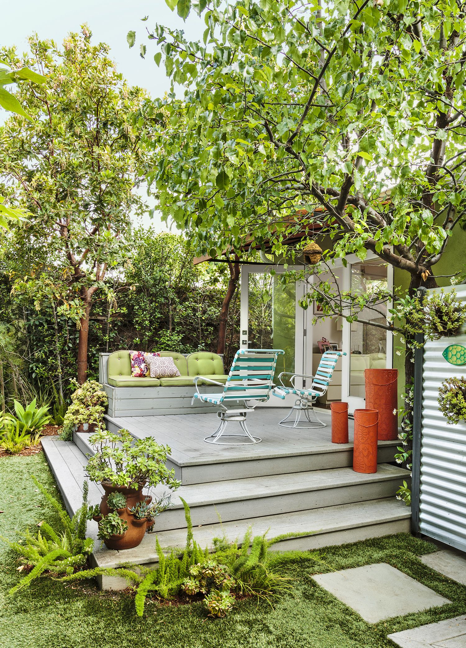
Shown: Once just a “sad little concrete pad,” this raised deck extends the master bedroom outdoors and provides a comfortable approach to the backyard two steps down. Colorful vases and potted plants anchor the corners and help create a transition to the landscaping.
Fire-pit stone (not shown) and artificial turf: Bourget Bros.
A Knack for Furniture Design
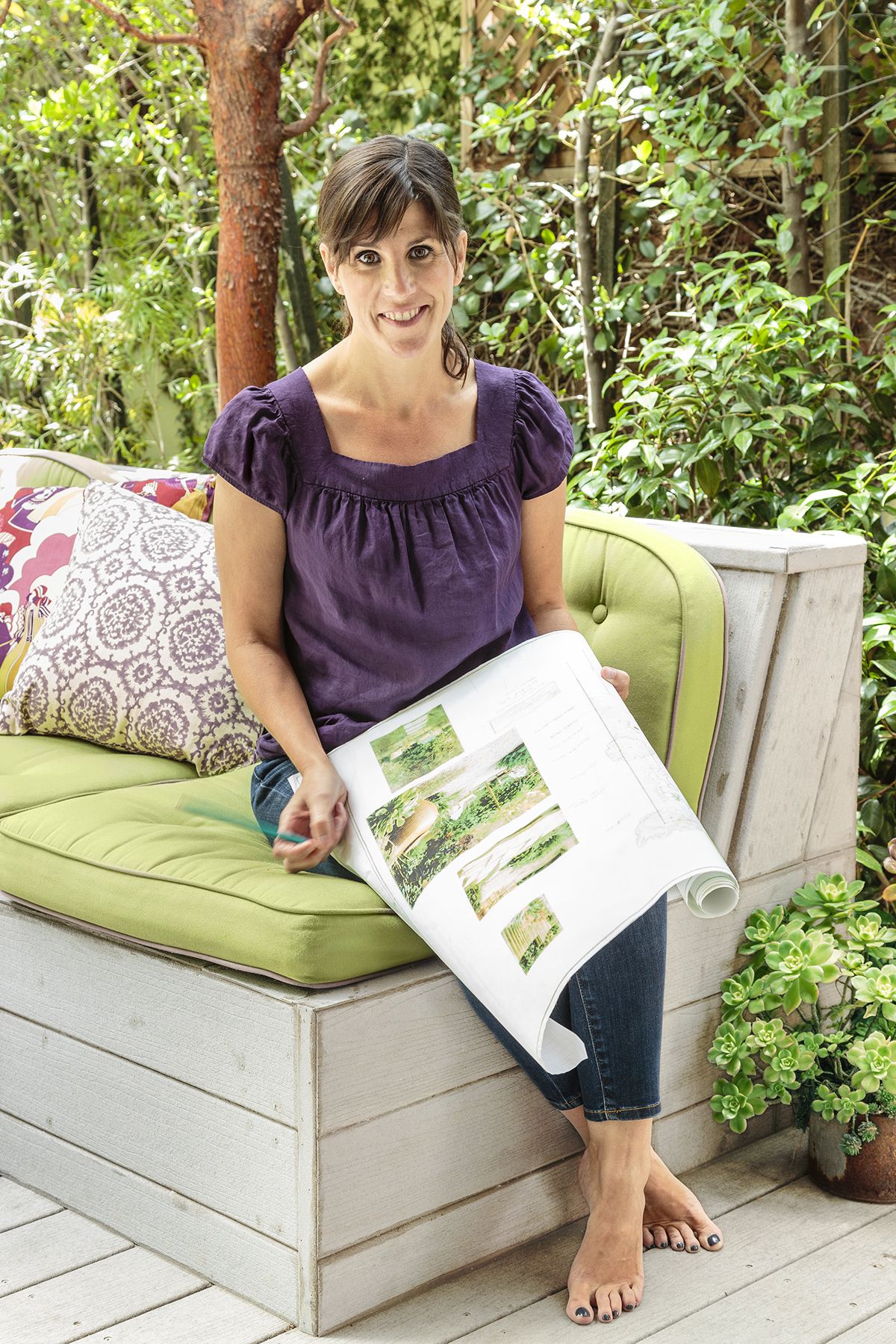
The goal of connecting the house to the outdoors led Elizabeth to decline a friend’s suggestion to put the refrigerator on the kitchen’s back wall. Instead she added French doors there, and did the same in the master bedroom. Each set opens onto a small deck that extends the room outside and serves as a landing spot before descending a couple of steps to the backyard.
“I often suggest decks like these to my clients,” says Elizabeth. “They break up a yard and make it more functional.”
Shown: Elizabeth designed this deck bench and had it built from the same composite boards used for the deck. Pillows and seat cushions blend the indoor and outdoor color palettes.
A Pergola Adds an Outdoor Room
Elizabeth’s business also gave her a leg up on sources and labor. At a stone yard that she buys from frequently, she scored Carrara-marble countertop material and soapstone floor tile at rock-bottom prices. And her usual crew refinished the oak floors, replaced aging plumbing and wiring, and built custom birch cabinets for the kitchen and bath.
The crew also restored the original windows, except for two in the master bedroom that looked onto a neighbor’s house a few yards away. Scrapping them for a single awning window high on the wall improved privacy and enabled cross breezes.
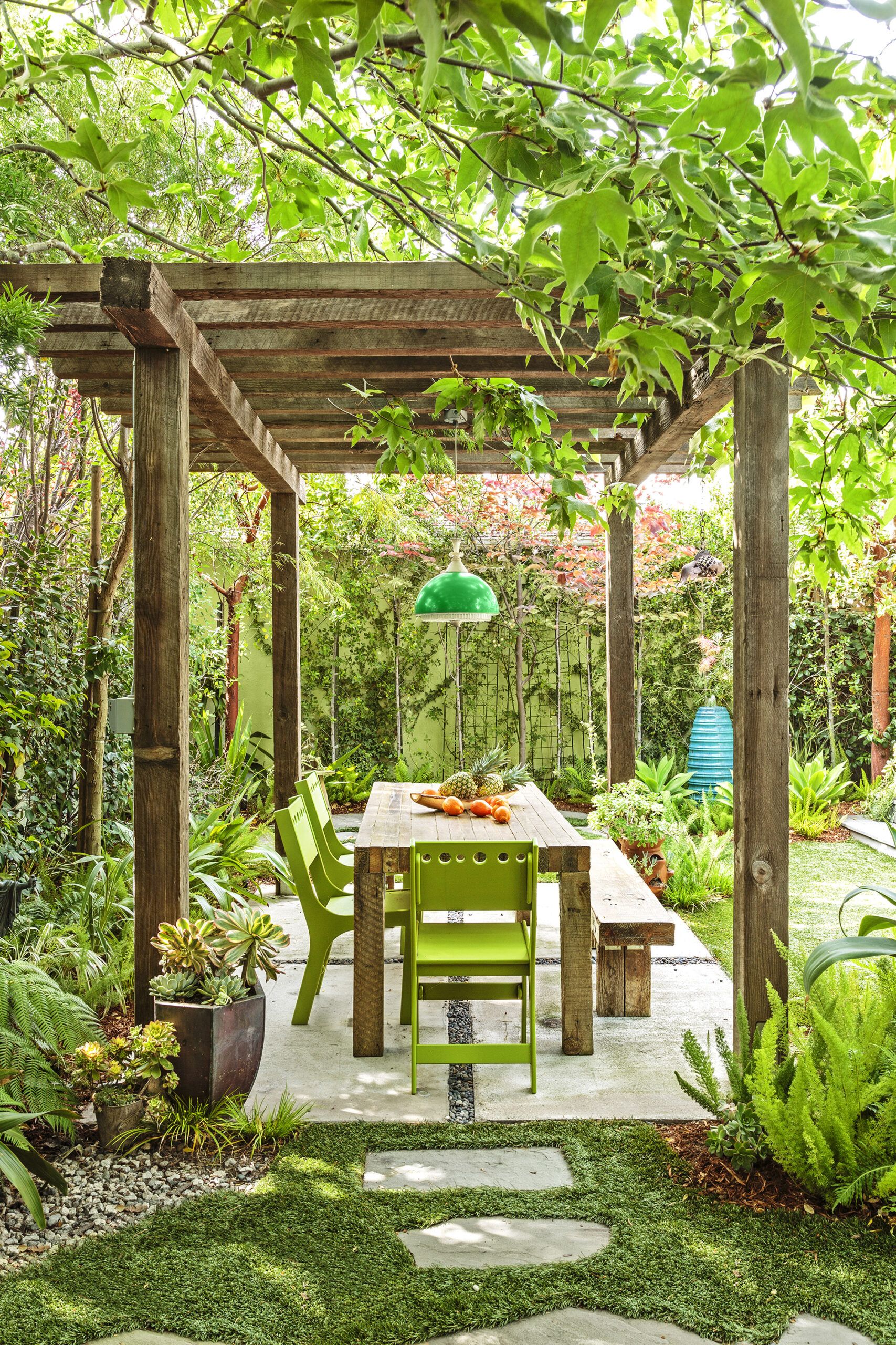
Shown: Large-scale concrete pavers with 4-inch gravel joints define the dining area under the wood pergola. The pendant light was rewired for outdoor use. Overhead, a sycamore tree provides dappled shade, while Australian tree fern and asparagus fern grow at the perimeter.
Wooden pergola: The Reclaimer. Green pendant light: Amsterdam Modern. Chairs: Loll Designs
Matching Shed
The kitchen was the hardest space to nail down. “I drew countless variations of the floor plan,” says Elizabeth. She’s happy with the result, although one small annoyance remains: the casement window over the sink. She chose an inward-swinging version with a screen on the outside so as not to interfere with a creeping fig vine growing up the exterior of the house. Then she realized that the window, when open, blocked the adjacent wall cabinet.
“As a designer, a client might have fired me for making this mistake,” she says with a laugh. But she loves the window and how it echoes the open, bright look of the single-pane French doors next to it in the kitchen, adding, “The inconvenience is minor.”
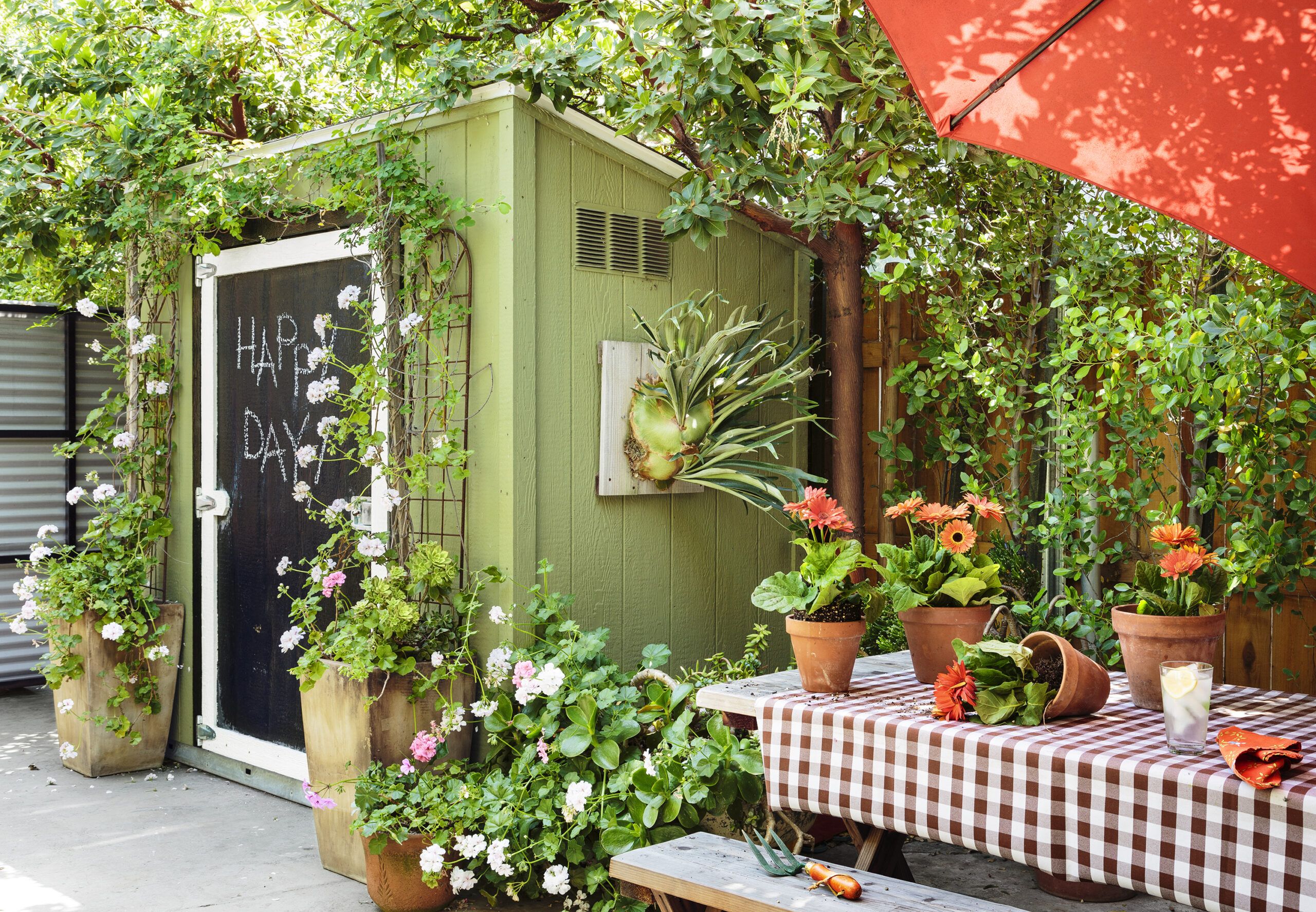
Shown: The garden shed, which stows gardening tools and supplies, was assembled from a kit. Elizabeth painted it green and white to match the house and coated the door with blackboard paint. A picnic table serves as a potting bench when it’s not providing play space for Violet.
Shed: Tuff Shed; Home Depot. Wall planter: Woolly Pocket
Elevated Kitchen Garden
Three months after Violet was born, the couple, who had relocated from a rental to a friend’s house for the last month, moved back into the bungalow. With the reno team scurrying to finish, “Our daughter’s first bedroom was the living room,” Elizabeth deadpans.
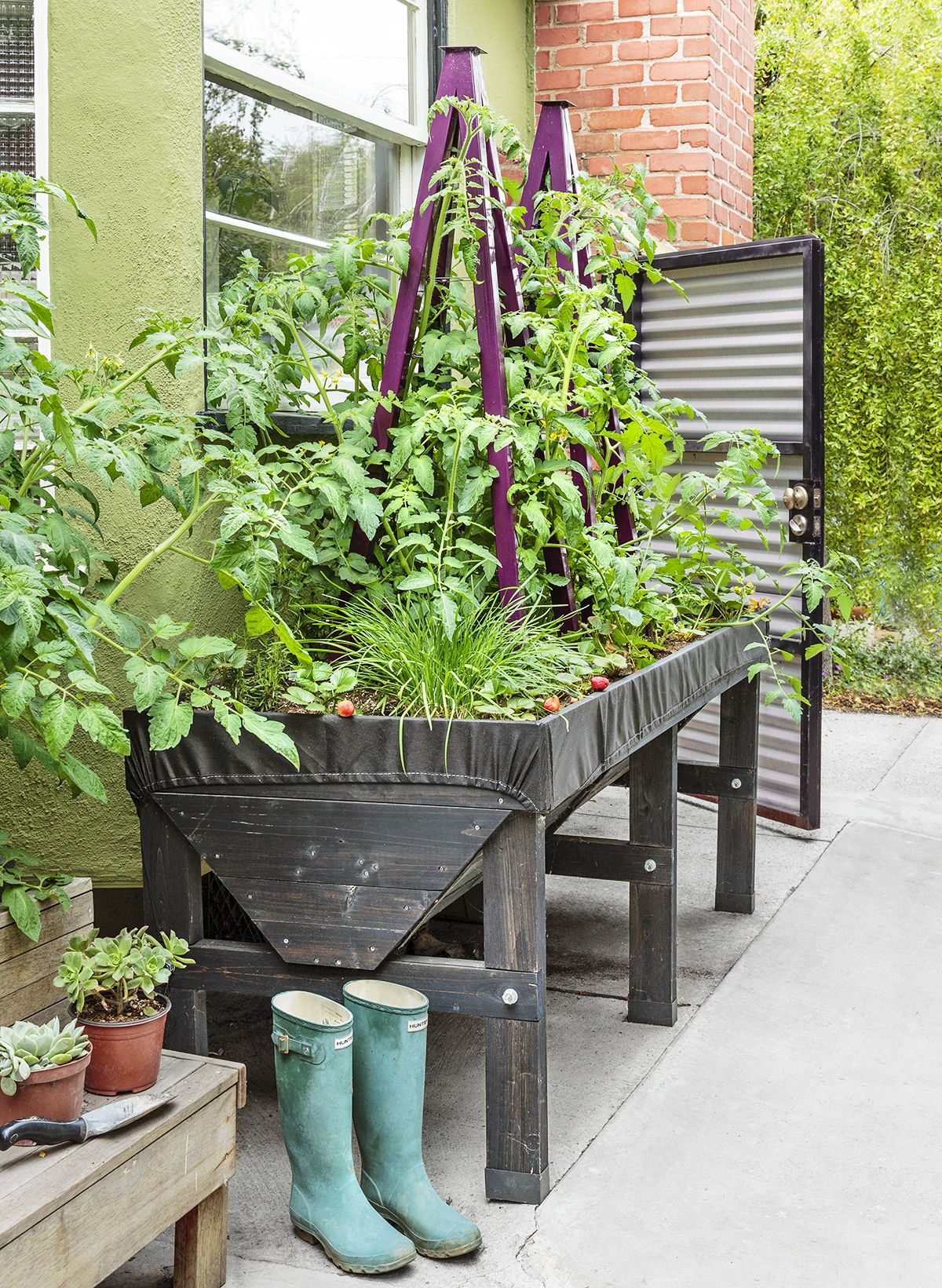
Shown: An elevated planter beneath the dining area’s bay window holds a small kitchen garden. The metal door behind it leads to the driveway.
Planter: Gardener’s Supply Company
Open-Air Shower
Once the house was complete, Elizabeth could turn her focus to the outdoors. “I wanted lots of trees to filter sunlight,” she says. In total, 39 were planted, including a fast-growing sycamore to anchor the outdoor dining area.
The rest of her initial design consisted mostly of lawn with concrete pavers and dymondia groundcover. But once Violet learned to walk—and that struggling dymondia got trampled—”I realized I needed an easy-to-maintain yard,” says Elizabeth. She also found herself drawn to a less hard-edged look.
So grass was replaced with easy-care artificial turf, and the rest of the yard morphed into a series of modest-sized spaces for dining, socializing, and relaxing, with a pineapple guava hedge on the perimeter, and ferns, agave, and succulents like ‘Sunburst’ aeonium further softening the landscape.
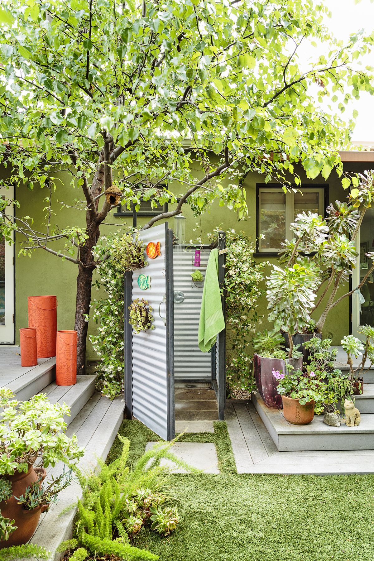
Shown: Building code allowed only a half bath for the office/guest room in the former garage, so Elizabeth added an outdoor shower to the wall shared by the house’s bathroom, enclosing it with corrugated metal and reclaimed wood.
An Urn Becomes a Garden Fountain

David flexed his DIY muscle for several outdoor projects with help from his brother, John. They painted the house’s exterior, built the reclaimed-wood pergola and dining table, and constructed a fire pit from stacked stone. A gas line from the house feeds the flames so they ignite with the flick of a switch.
Shown: A large ceramic garden urn with a drainage hole was turned upside down and fitted with a pump and irrigation piping to transform it into a burbling fountain.
More Creative Repurposing
It was also David who found the recycled-denim insulation they used in the house and the detached garage, which they converted to a home office that functions as guest quarters thanks to a fold-out sofa. David, a writer, works out of the office, while Elizabeth makes calls and does paperwork from an armchair in the living room.
“Here, I’m surrounded by things I love—bright colors, filtered sunlight, trees visible through the windows,” she says. All those shade trees, combined with coastal breezes, make air-conditioning unnecessary.
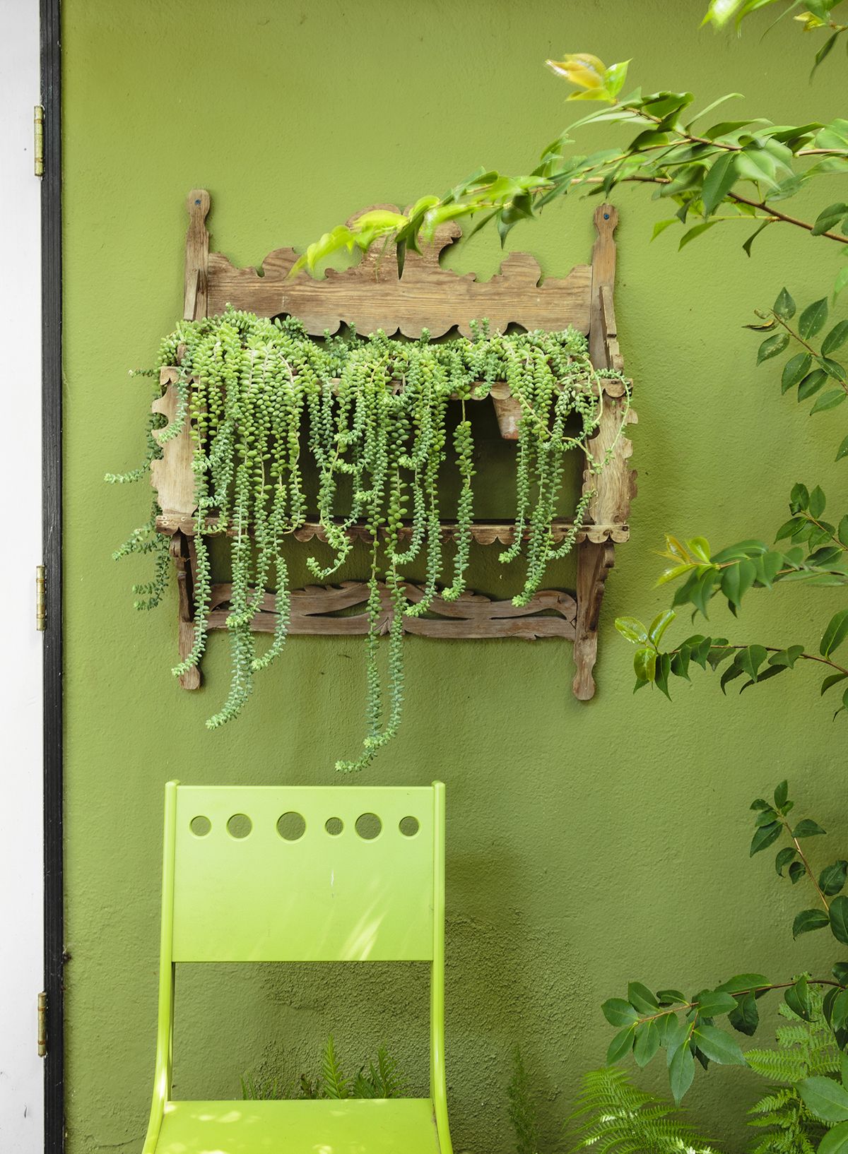
Shown: A whimsical antique shelf, handmade by Elizabeth’s great-uncle, spills over with donkey tail succulents, encapsulating the loose, wild mood in the revamped outdoor space.
Bubble Trellis
Elizabeth also uses her yard as a laboratory of sorts for her business. “I’m constantly moving the container plants around, to see which species tolerate low water or full shade,” she says.
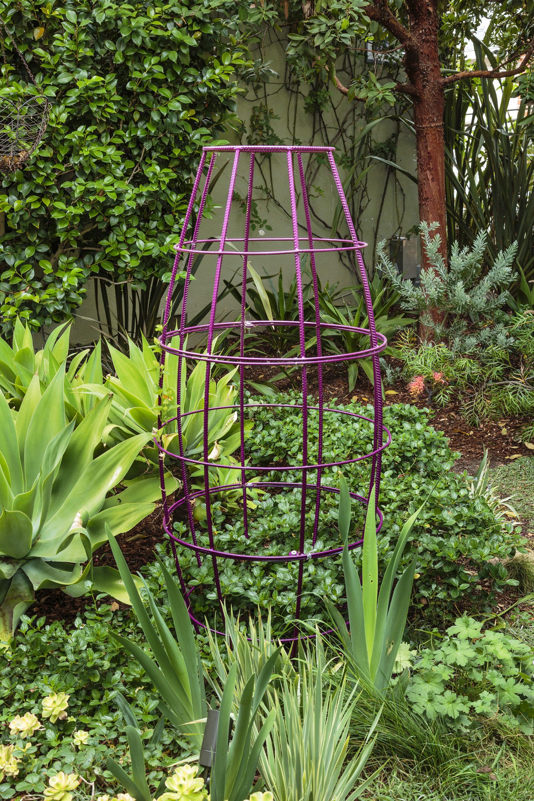
Shown: In the front yard, an eggplant-colored bubble trellis sits as a sculptural element in a bed of agave and ‘Kiwi’ aeonium.
Trellis: Terra Trellis
Color-Coordinated Gate
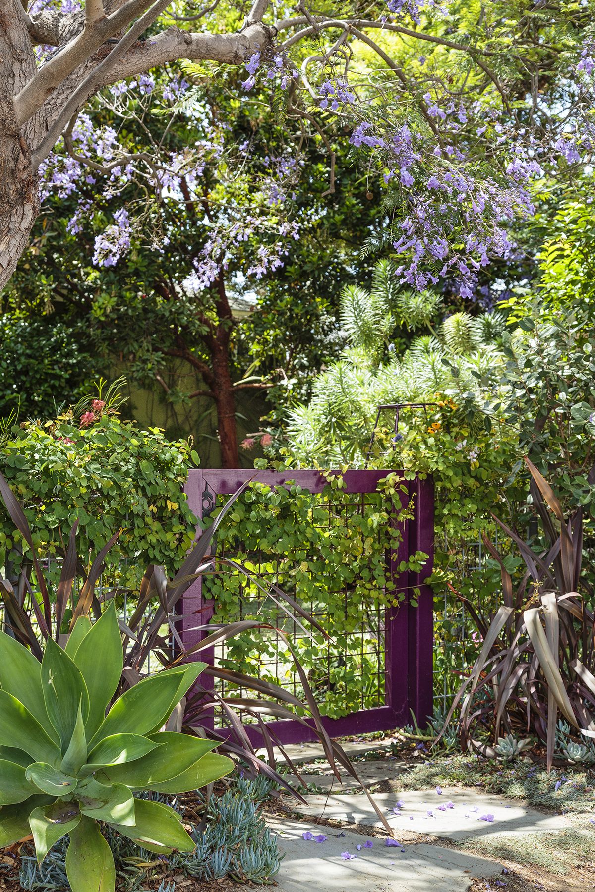
Shrouded in abelia vine and ‘Pride of Madeira’ echium, the metal fence and gate that mark the front walkway were purchased from an estate sale. Painted deep purple, they match the bubble trellis, both of which complement the blooming jacaranda trees overhead.
Succulents for a Green Welcome
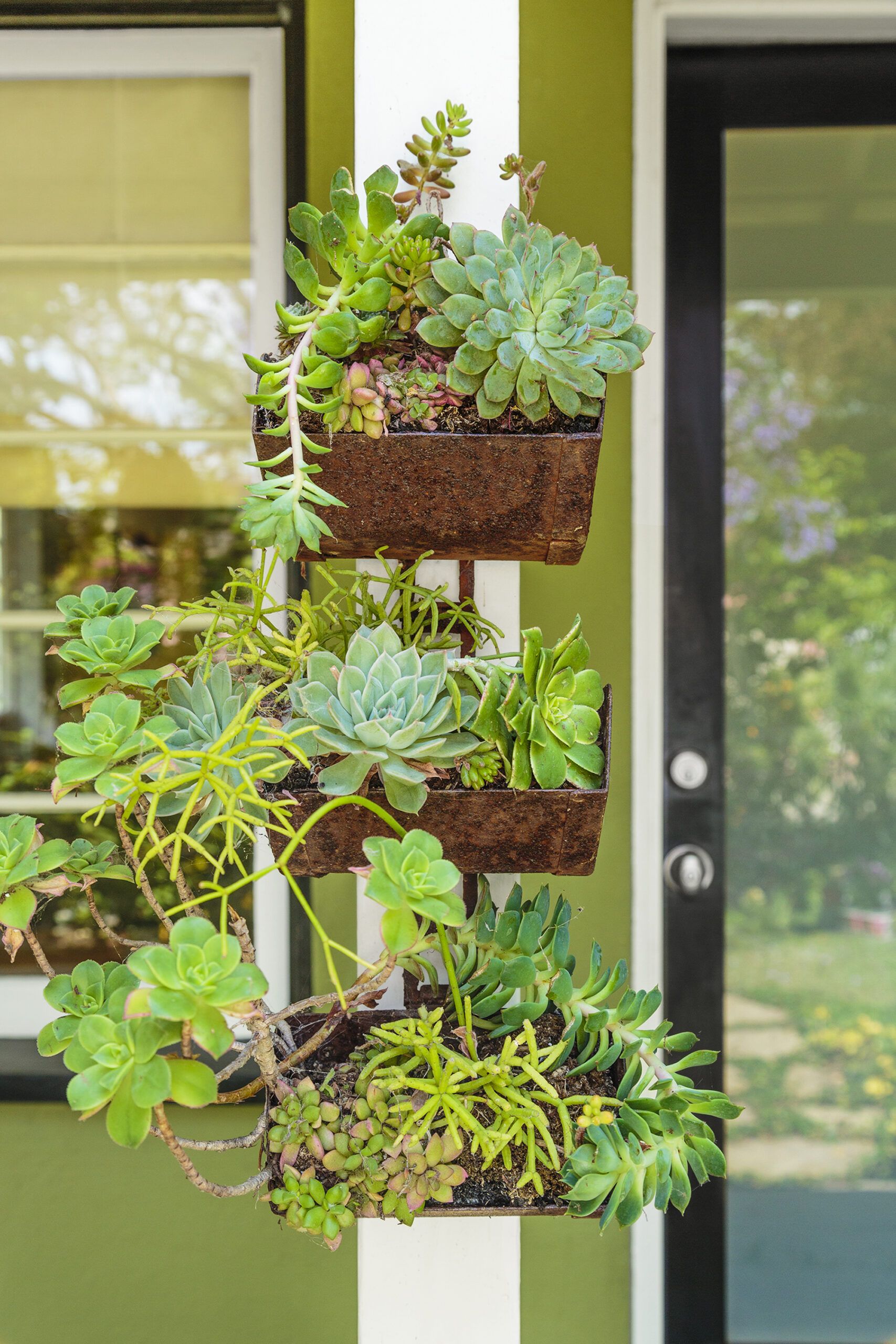
Elizabeth and David are toying with future projects, like reconfiguring the kitchen to put in a breakfast bar, or adding a small second story for extra bedrooms. But nothing’s in the works yet. As she says, “This house has proven to be all the space we really need.”
Shown: Easy-care succulents, including echeveria and ‘Kiwi’ aeonium, fill pocket planters attached to a porch post.
Garden and Floor Plan
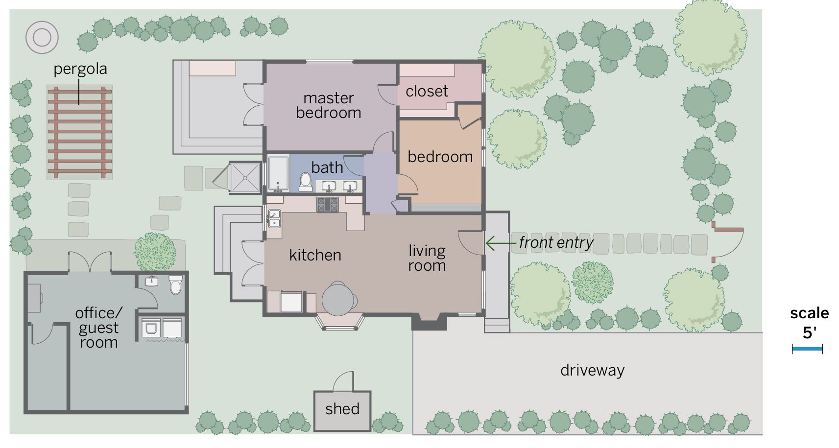
The owners added 6 feet to the back of the house to enlarge the kitchen and the only bath. Decks outside the kitchen and the master bedroom link indoor and outdoor living spaces to make the 900-square-foot cottage feel larger. The garage is now an office/guest room.
