January/February: A Grand Master Suite to Relax In
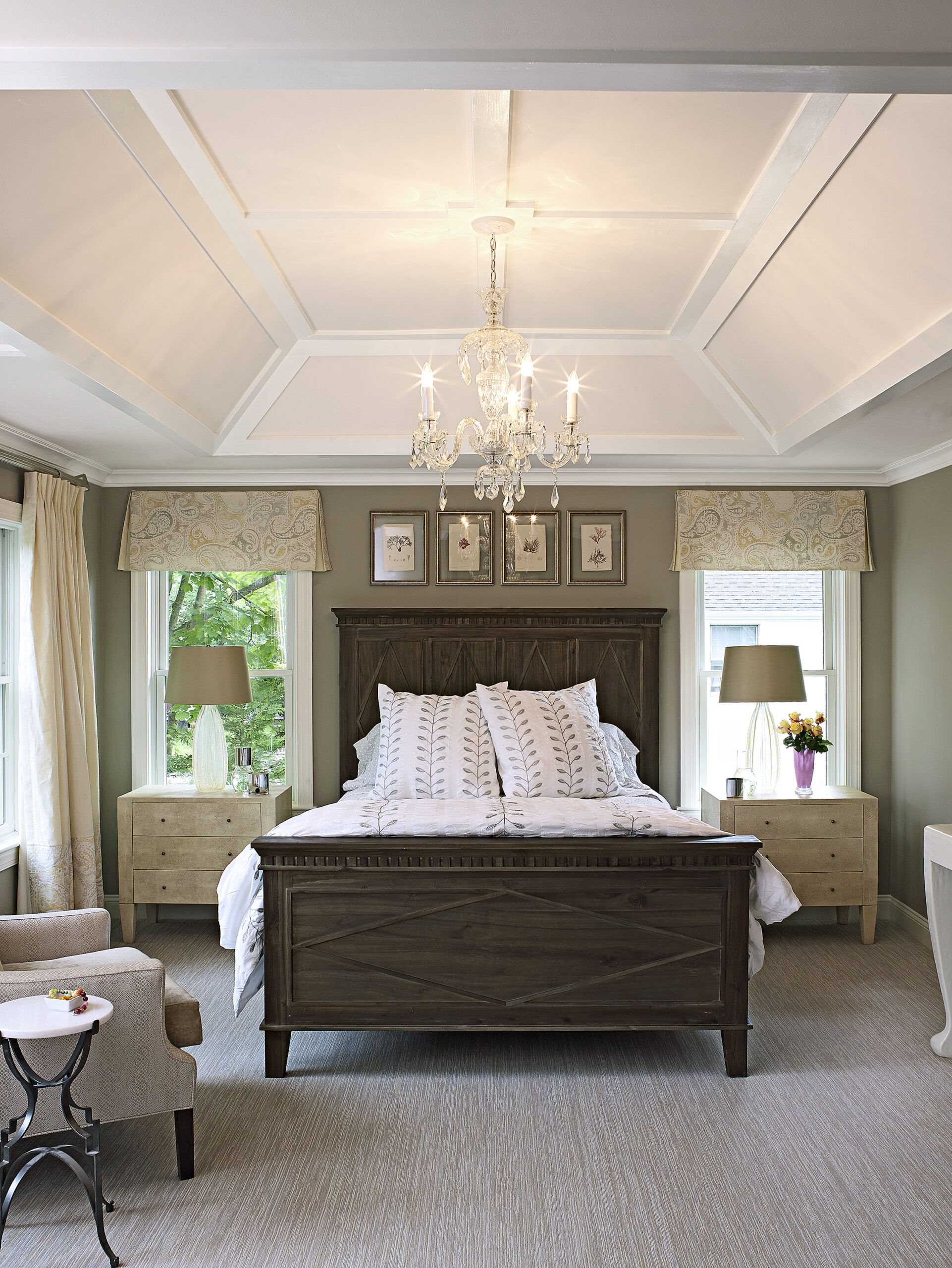
A little more room, a little more color, and a lot more personal style turn a once-bland house into a distinctive home.
Shown: The happily copacetic team hammered out a plan to capture space above the existing one-story addition while also gutting the old master suite, yielding 100 square feet to rebuild and furnish from scratch. They laid out a swank suite, its bedroom topped by a lofty tray ceiling finished with trim in keeping with the rest of the house. “With a master suite you want to get a little luxury out of it,” says architect Maxine Giordano. “When there’s an attic above it, it’s an opportunity to get extra space, so it’s not just a larger children’s bedroom.”
The bed, moved away from the door for a more private feel, now stretches out between two windows, and the bath is down a “hall” of facing walk-in closets. “Everything feels just a little bit bigger,” Giordano says. Lots of white trim “keeps it traditional, while the couple extra feet of height makes it grander.” Soft neutrals, wall-to-wall carpeting, and symmetry add to the serene feel.
“It’s clean and fresh and there’s plenty of room,” says homeowner Suzanne Butler. “I can really relax in here—it’s where I want to hang out after the kids are in bed.”
Bed: Four Hands. Bedside tables: Made Goods. Carpet: Bloomsburg Carpet/Silver Creek
ORIGINALLY FEATURED IN: Bold Colors and Design Choices Transform a 1950s Colonial Revival
March/April: Afternoon Nap Room
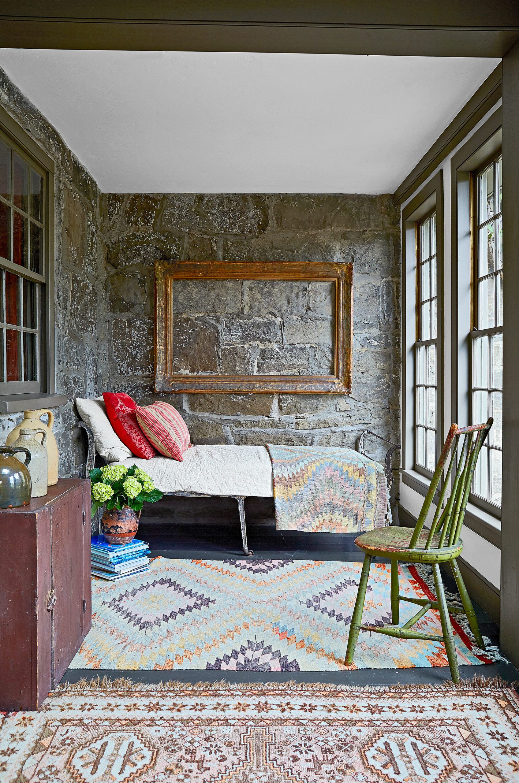
In 1850, it was a busy tavern. Today, it’s a cozy stone house with a separate studio for a couple of design-minded owners.
Shown: The sunroom, enclosed by former owners, is now a designated napping space.
ORIGINALLY FEATURED IN: Roadside Attraction
May: Spacious Master Bath
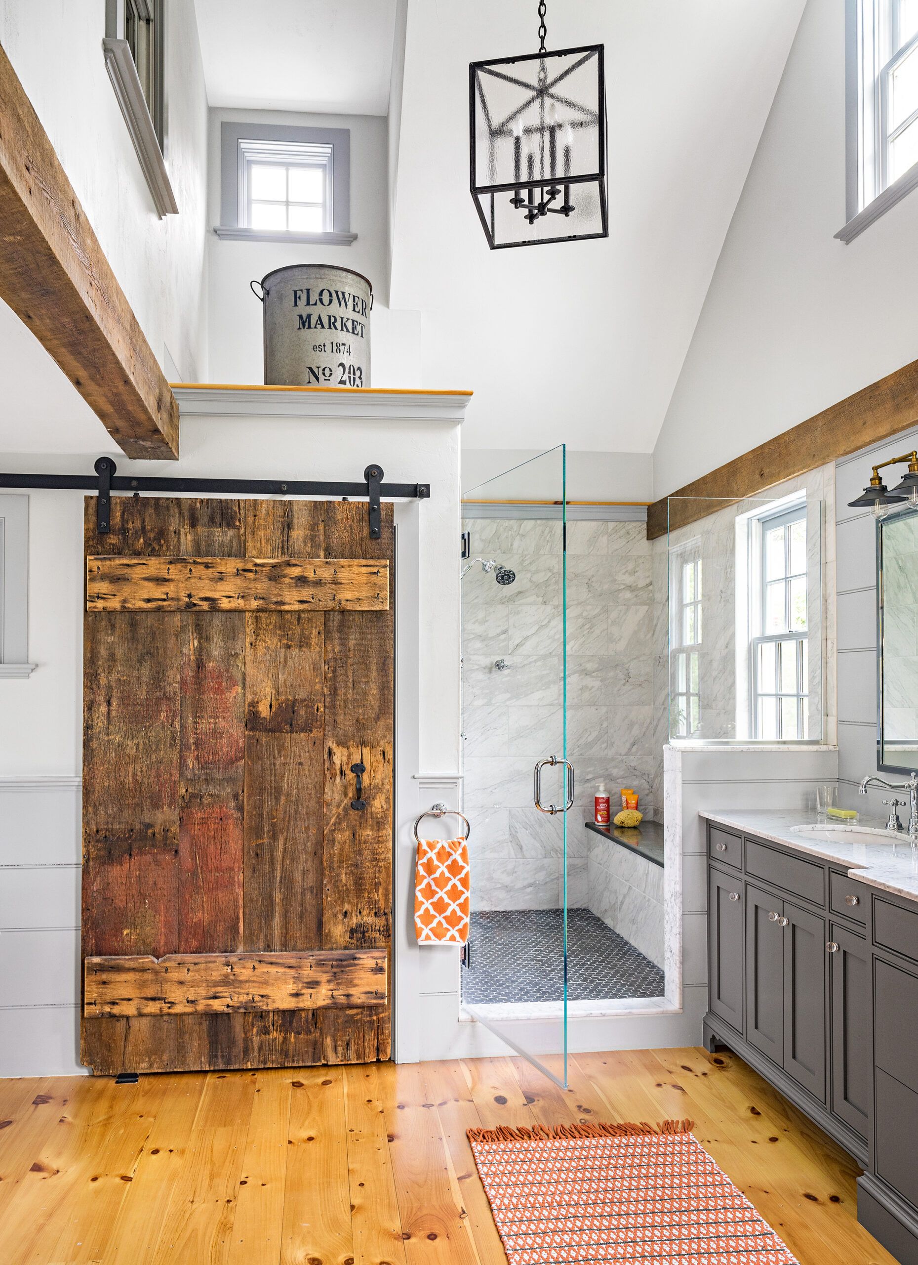
A 1750 Georgian gets a preservation-minded redo with smart expansion to serve a family of seven.
Shown: Lofty ceilings are a welcome change in the double-height master bath. The closet’s rustic barn door offers a striking contrast to the sleek glass-and-marble shower.
Sconces and mirrors: Restoration Hardware
Paint: Benjamin Moore’s Wickham Gray (walls), Coventry Gray (woodwork), and Chelsea Gray (vanity)
ORIGINALLY FEATURED IN: An Artful Restoration for a 300-Year-Old Landmark
June: Citrus Kitchen
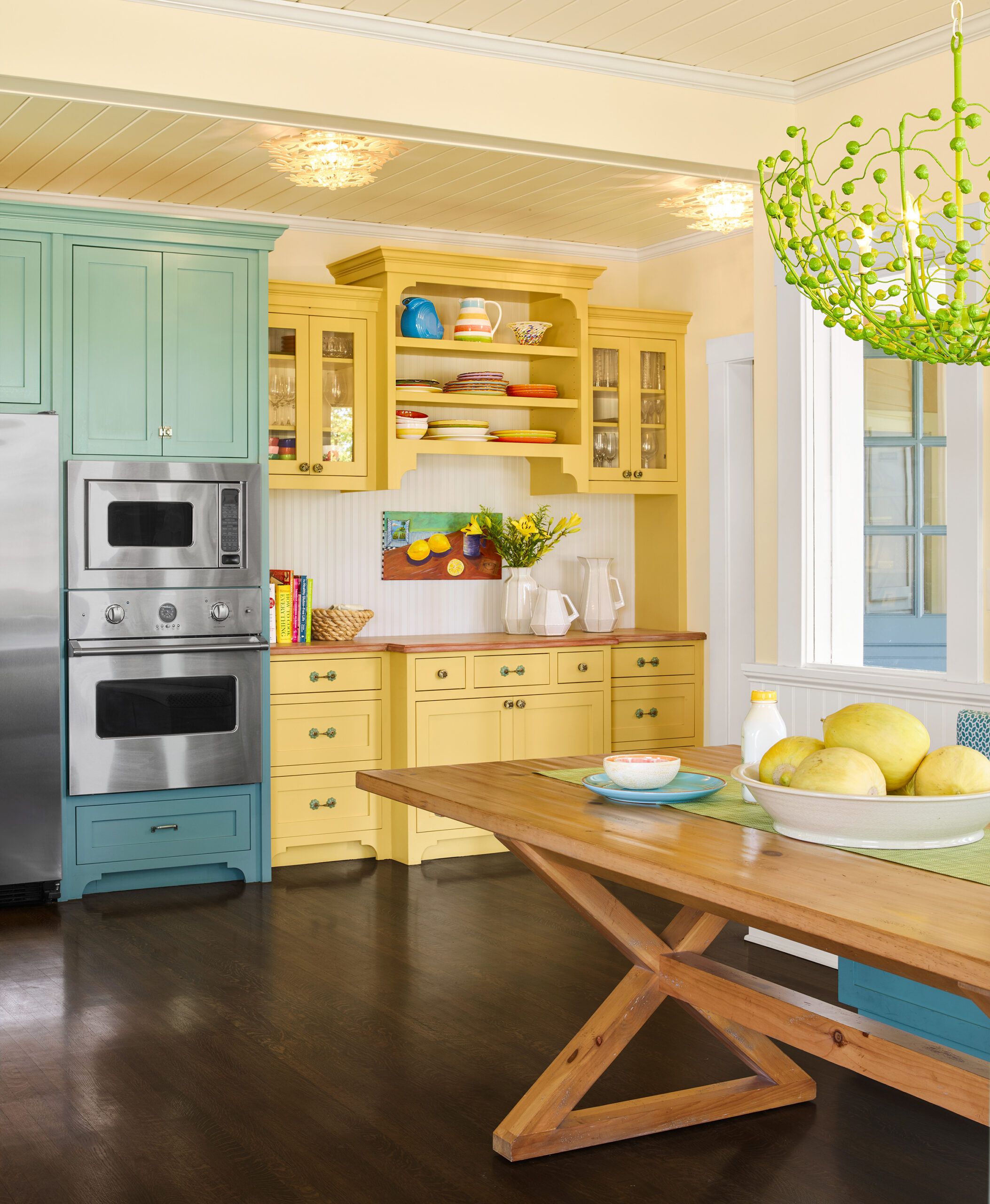
A lively yet restrained paint palette turns a century-old white box into a cheerful family home.
Shown: a tongue-and-groove ceiling pays homage to the porch that long ago stood in the kitchen’s spot. The ceiling and the period-style built-in are balanced by a fanciful lime-green chandelier.
Chandelier: Stray Dog Designs
Table: Ethan Allen
Hutch: Wood Touch
Hutch knobs and pulls: Anthropologie
Paint: Benjamin Moore’s Freedom Trail (hutch)
Refrigerator, range, oven, and microwave: Viking
ORIGINALLY FEATURED IN: Bright Ideas for a Colorful Whole House Remodel
July/August: Island Atmosphere
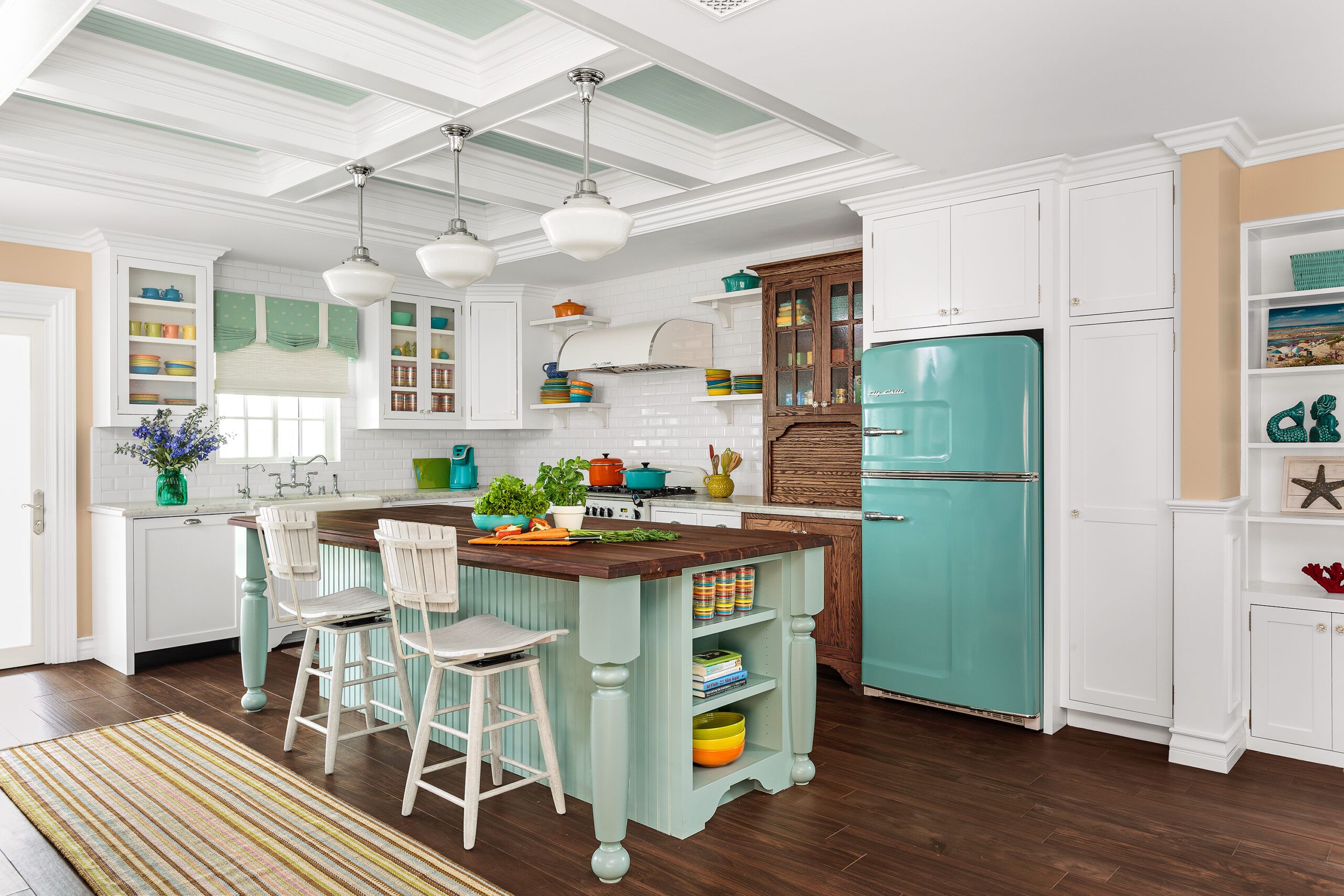
Two empty nesters turn their vacation retreat into a year-round magnet for friends and family.
Shown: In the kitchen, the island’s walnut butcher-block top echoes the porcelain flooring. Finished with beadboard and chunky table-style legs, it adds period flavor, reinforced by an unpainted Hoosier-inspired built-in and a fridge right out of the ’50s.
Paint (island): Dunn-Edwards’s Rolling Waves
Cabinets and island: Holland’s Custom Cabinets
Refrigerator: Big Chill
Stools: Hooker Furniture
Floor and wall tile: Daltile
Windows and door: Sierra Pacific
Pendant fixtures: Rejuvenation
Sink and faucet: Rohl
Runner: Dash & Albert
ORIGINALLY FEATURED IN: Remodeling a Vacation Home into a Grown-Up Getaway
September: Smile, It’s a Fireplace!
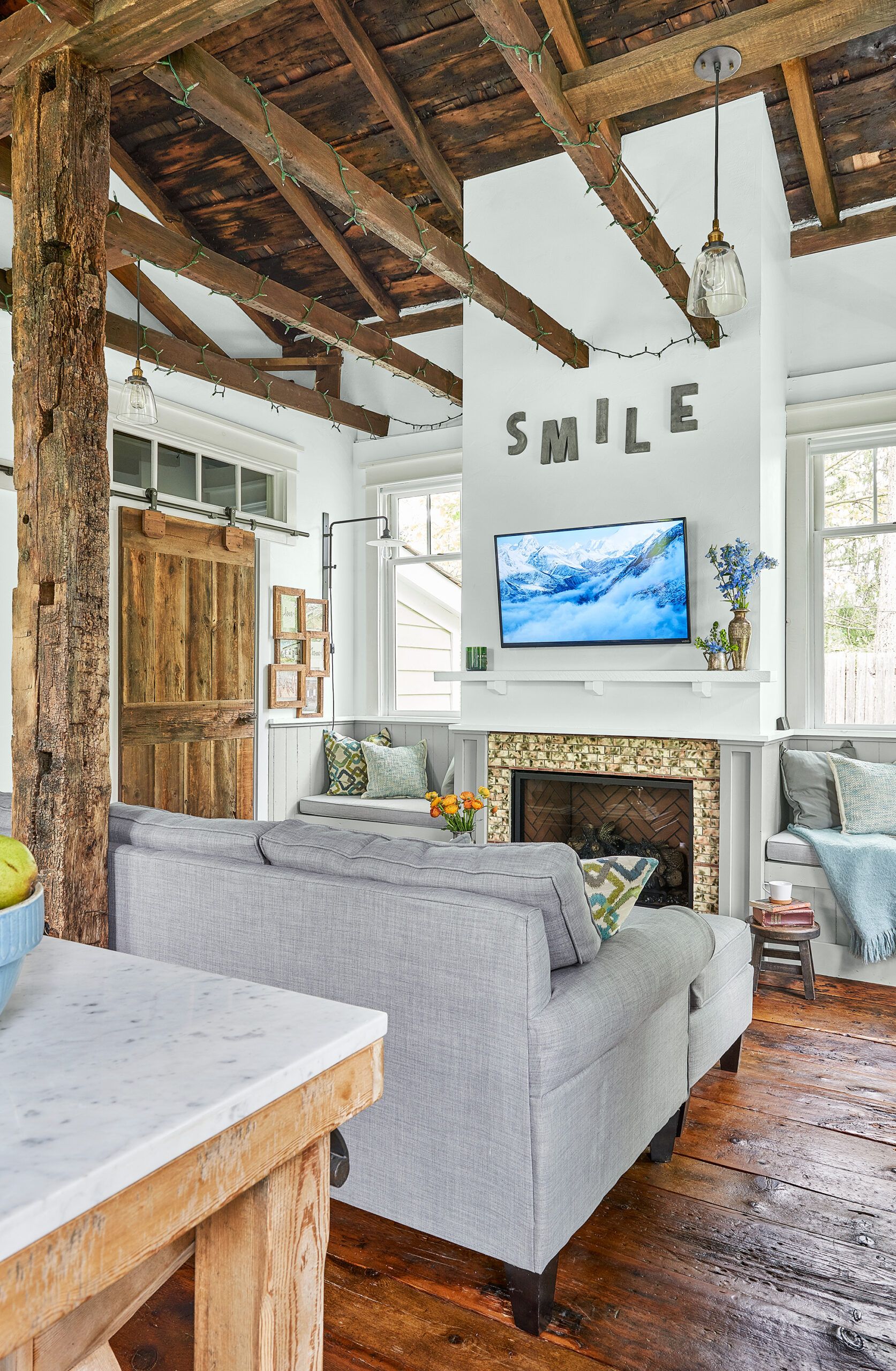
Hands-on couple Annette and Richard Andradez totally transformed a 179-year-old former schoolhouse, creating a cozy cottage home for their daughter, Jessica.
Shown: Richard built the gas-insert fireplace, as well as the storage benches that flank it.
Paint: Benjamin Moore’s Coventry Gray (built-ins)
Fireplace insert: Northstar Energy Systems
Wall sconces: Restoration Hardware
ORIGINALLY FEATURED IN: Schoolhouse Renovation: Heirloom in the Making
September: Outdoor Room Additions
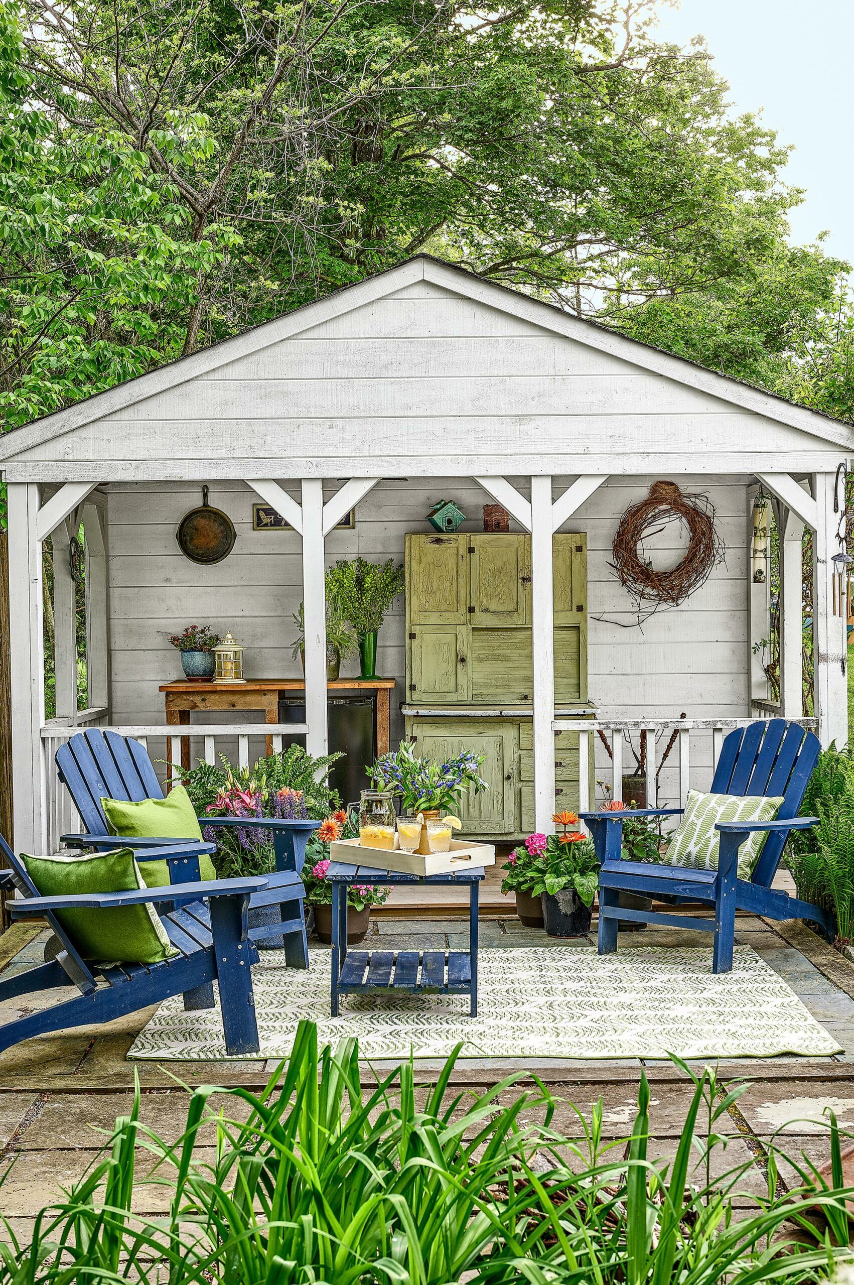
Bonus! This outdoor room is another favorite from the September issue home features.
Shown: Richard also added a porch to one garden shed, connecting it to an existing patio. He also found and refurbished the vintage Hoosier cabinet.
ORIGINALLY FEATURED IN: Schoolhouse Renovation: Heirloom in the Making
October: A Casual Front Entry
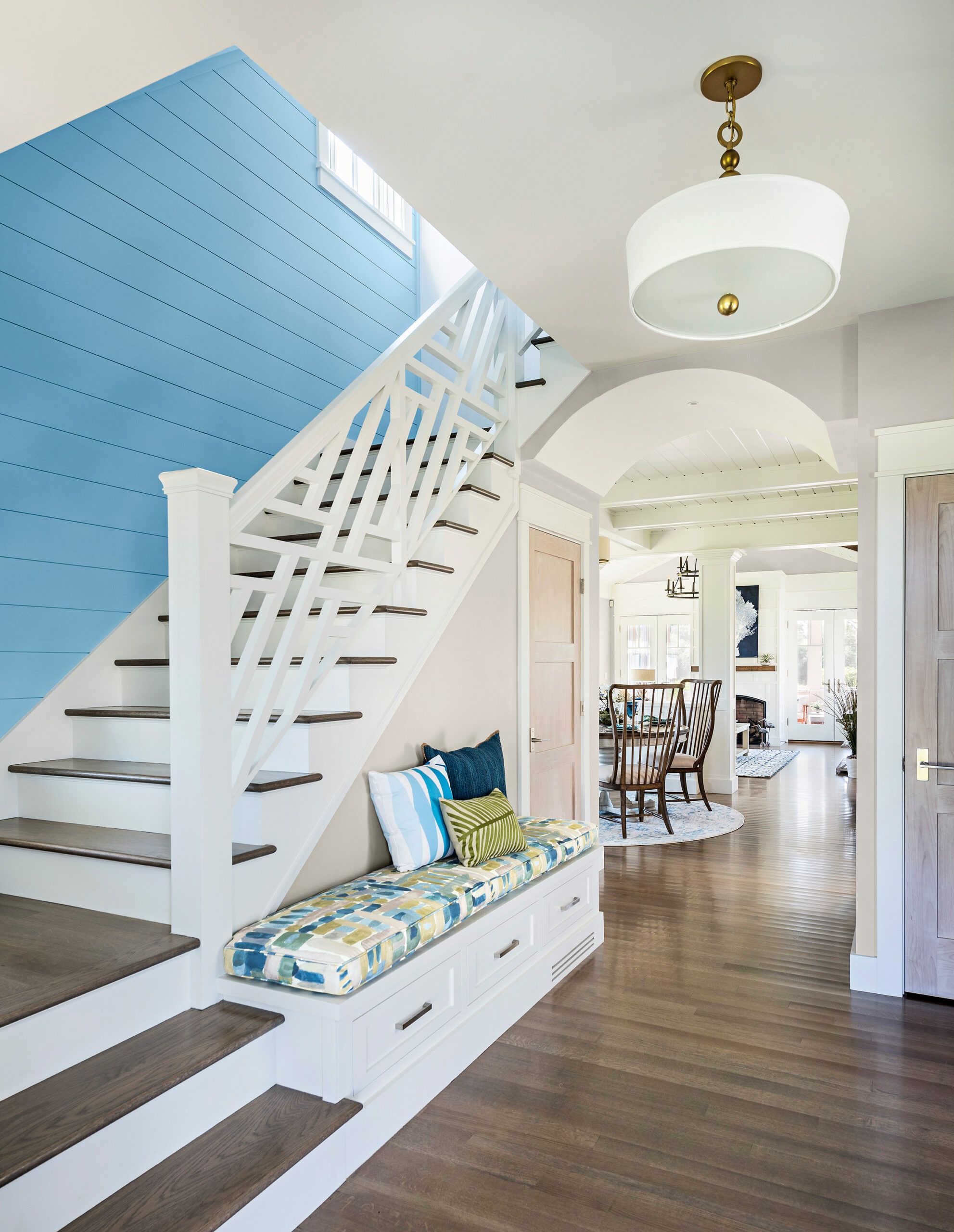
An update of a classic seaside architectural style, our 2017 Idea House is built for easy living, with a flexible layout than can welcome multiple generations.
Shown: The front entry sets a casual beach-house tone with a cushioned built-in bench, a crisp-white Chippendale-style stair railing, and a shiplap accent wall painted bright blue. The rift-sawn and quartersawn white oak floors are stained to suggested driftwood.
ORIGINALLY FEATURED IN: Rhode Island Beach House
November/December 2017: Spacious Kitchen
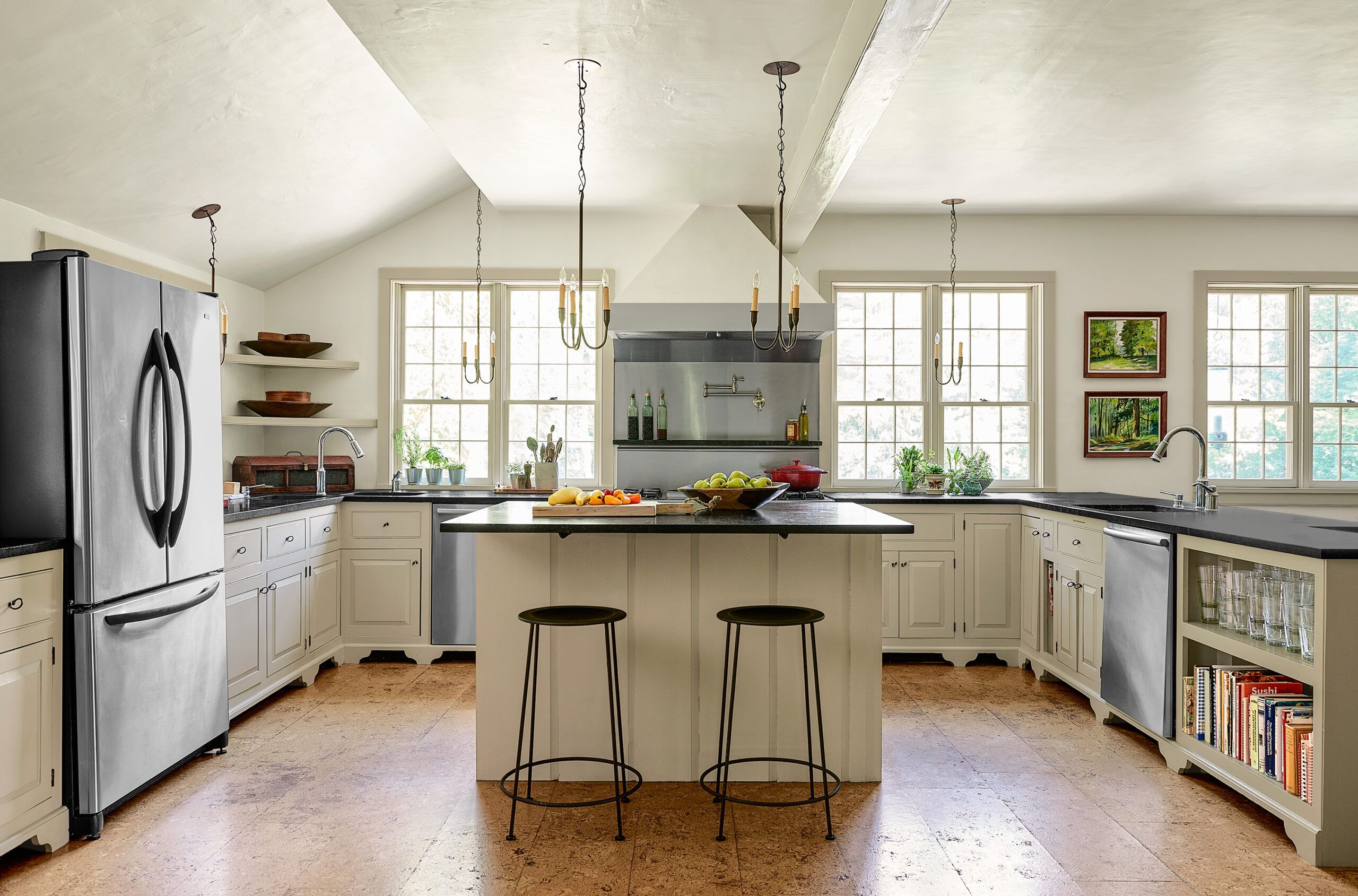
When Kim Kimble and Tom McEntee looked up one day during the endless renovation of their family’s 18th-century relic, they were pleased to see their two grown sons getting ready to shingle the roof. It had been years since the whole-house reno had gotten under way, they were all tired of living in chaos, and word had gone out: Everyone, please help!
Shown: The addition holds a family-size kitchen with cork flooring, soapstone countertops, and two dishwashers. Nine-over-six windows match the originals; a layer of joint compound on the drywall gives the look of plaster.
