Soothing Neutrals

For Susan and Bob Fisher, who had been living in a sprawling 1995 five-bedroom house on the outskirts of town while raising their two children, the two-story shingled house on a quiet street of Sag Harbor, New York, was just what they were looking for. “We wanted to be in the village, to be able to walk to restaurants, shops, and our store, to live in a different way than we had outside of town,” says Susan. The couple’s business, Fishers Home Furnishings, has been a fixture on Main Street for more than 30 years.
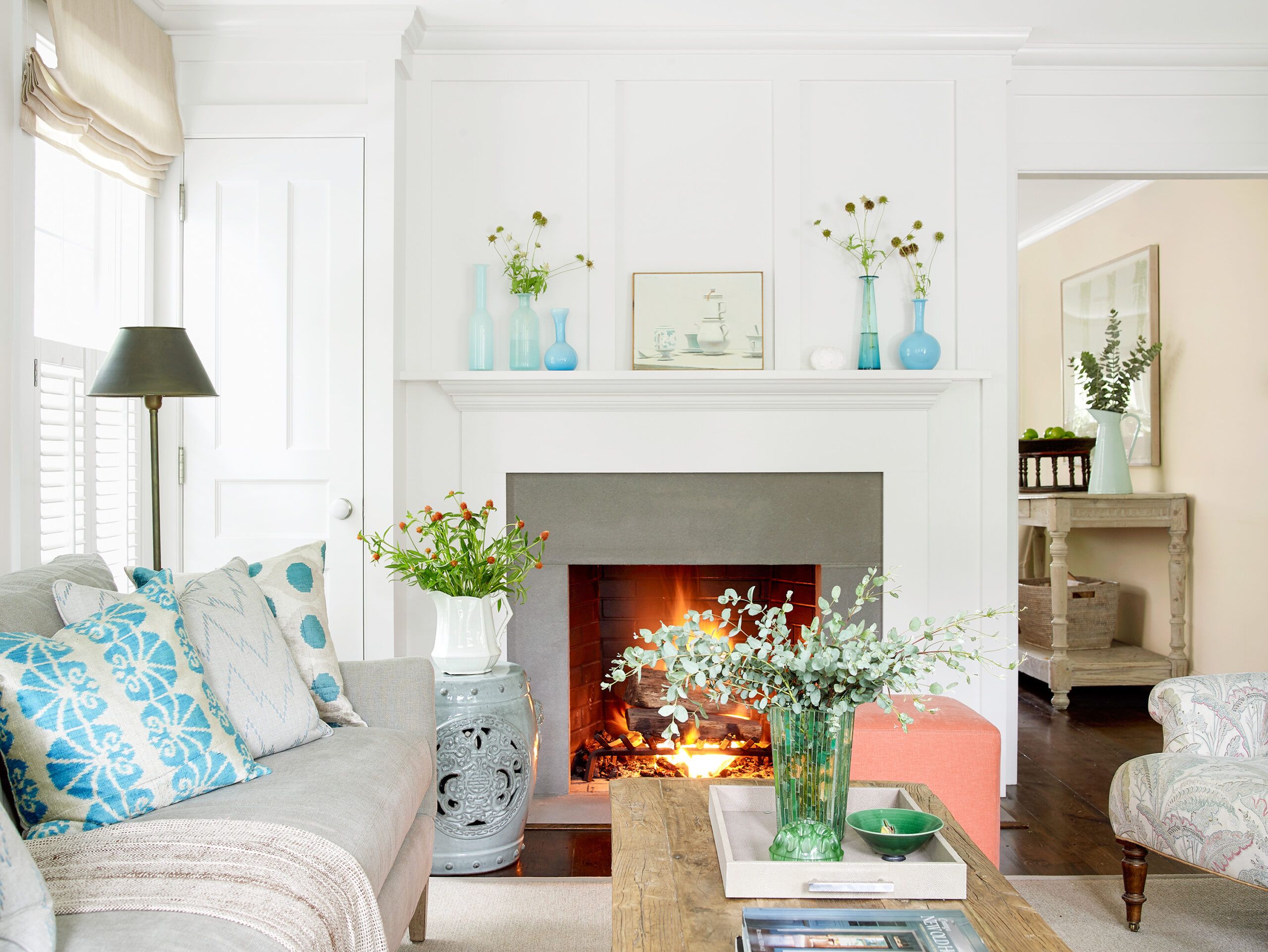
Shown: Two-piece crown molding, a refined fireplace mantel with flat-panel detailing above it, and soothing neutral finishes with luminous blue and coral accents give the living room layers of interest. Slabs of bluestone face the fireplace surround.
Paint: (woodwork): Benjamin Moore’s White Dove and Patriotic White (walls)
Pillows, lamps, tray: Fishers Home Furnishings
Decked Out

Architecturally and in terms of scale, with a modest street-facing facade, the house blends seamlessly into the fabric of the former 18th-century whaling village, dense with simple period houses on small lots. The surprise is that this house is only about a quarter-century old. The circa-1873 home that had stood in its spot for more than 100 years became so water damaged that it was deemed unsafe when previous owners looked into remodeling it in the 1990s. Despite a strict historic-preservation ethos, the town allowed them to rebuild, as long as they saved what they could and preserved the spirit of the original house. The painstaking rebuild included vintage pine floors, original fireplaces and a claw-foot tub, old brick walls, salvaged doors, and other recycled elements that give the interior a patina of age.
Shown: The new-old house, rebuilt in 1870s style, as it looks decked out for the holiday season.
Paint: (front door) Benjamin Moore’s Mountain Laurel
Windows: Marvin Windows
White Marble Counters
“The location of this house, its charm, and the fact that it was a newer house that incorporated many old elements appealed to us,” Susan says.
But even though the new-old house had been well designed and well built, the couple saw room for improvements that would truly make it their own. The kitchen was hemmed in by a clumsy peninsula that cut it off from the adjacent dining room. The Fishers envisioned opening up the first floor to allow for easier entertaining. Upstairs, they wanted a more spacious master bath, which would mean appropriating an adjacent bath and linen closet, then finding space for a bath for the other bedrooms. The simple interior also lacked some of the refined period details they saw in several of the houses nearby, including crown molding, an elegant fireplace mantel, and paneled woodwork. The unfinished basement was dark and dank. The office, located in what had been the detached garage, was too separate from the house and lacked both amenities and personality; the couple saw it morphing into a full-fledged pool house, which also meant installing its namesake feature.
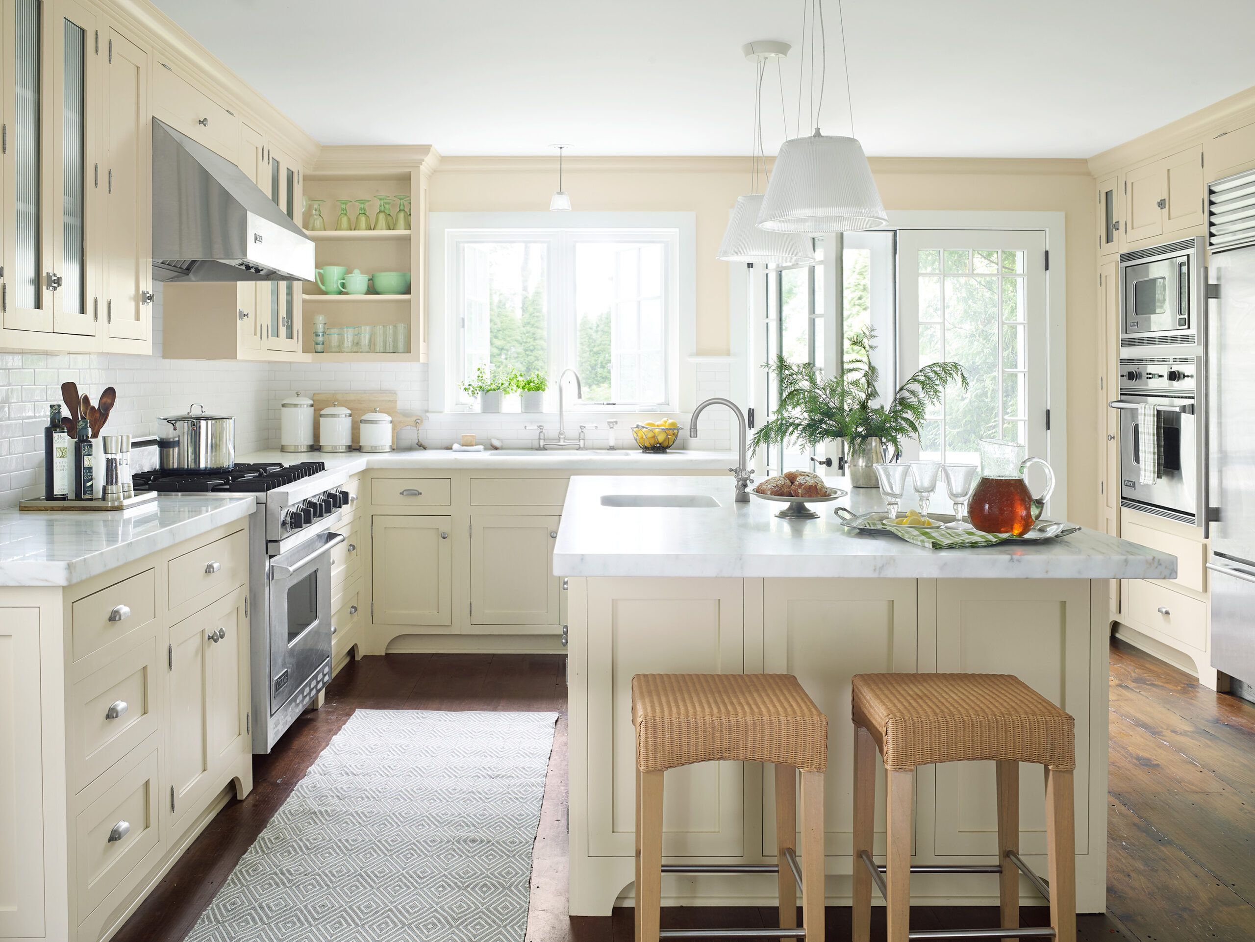
Shown: Because she cooks often for friends and family, especially her visiting grandchildren, homeowner Susan Fisher and her husband, Bob Fisher, wanted a sunlit, modern kitchen. Countertops are clad with 2-inch-thick Vermont Danby marble. The flooring throughout is vintage pine.
Paint: (walls) Benjamin Moore’s Linen White
Sinks: Kohler
Faucets: Barber Wilsons & Co. Ltd.
Runner, stools: Fishers Home Furnishings
Tile: Gramercy Park in Heirloom White; Walker Zanger
Range, range hood, refrigerator, wall ovens: Viking Range
Canisters: Williams Sonoma
Cake stand and tray: Match
The Homeowners
“The former owner was a builder-architect who’d done a good job,” says Mike Kelley, the general contractor who made the design vision of the Fishers’ architect, the now-late Peter Price, a reality. “Susan and Bob’s architect was so thorough in laying out the plans that he made my life a lot easier. He’d crawled deep into spaces to make accurate measurements, custom-designed the crown molding and the fireplace mantel for the downstairs, and created a floor plan that worked out really well.”
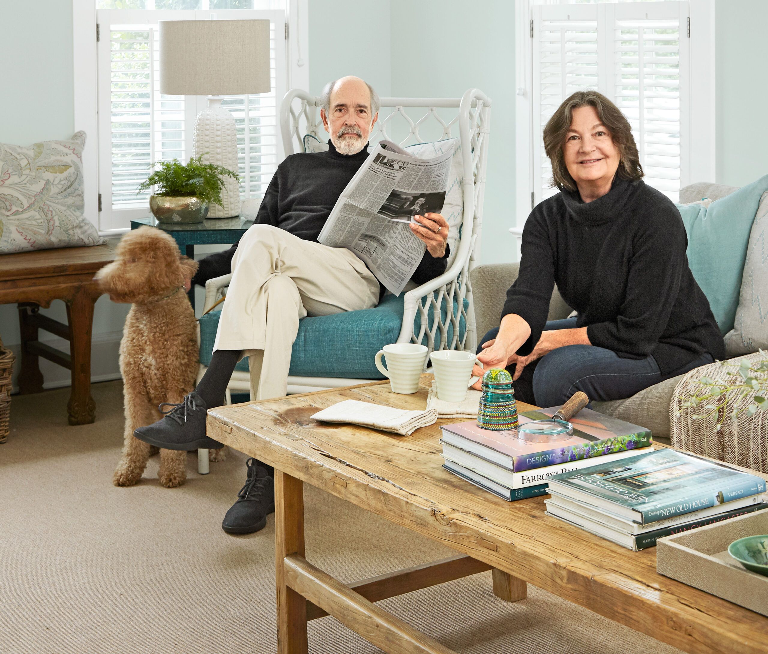
Shown: homeowner Susan Fisher and her husband, Bob Fisher
Dining in the Round
Among the first tasks to which Kelley attended was the removal of that peninsula as part of a gut remodel of the kitchen. “I wanted one big open space, separated only partially by a new kitchen island,” Susan says. “At this point in our lives, it’s more logical to live and to entertain our grandchildren this way. And because, frankly, we’re getting older, we wanted the first floor to be as open as possible. In the event that one of us needs to live downstairs, the space should be flexible enough and spacious enough to function as both a bedroom and living area.”
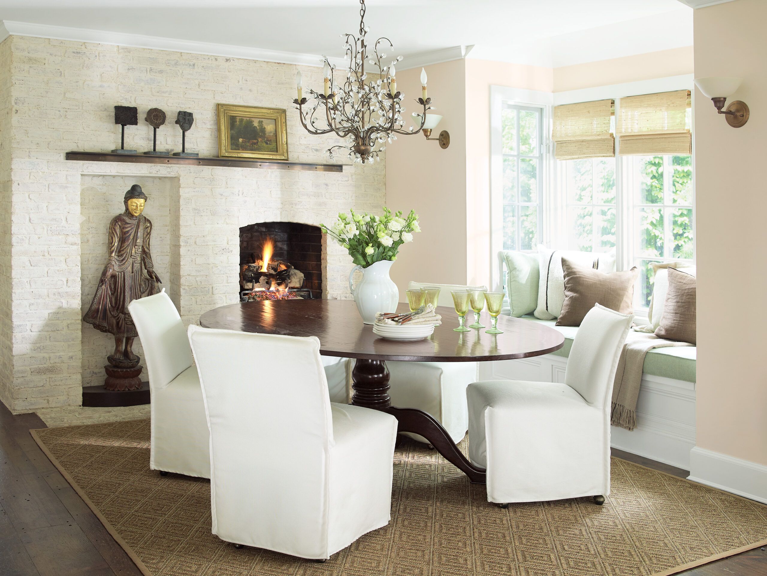
Shown: With the kitchen peninsula gone, the dining area easily fits a round table.
Paint (walls): Benjamin Moore’s Linen White and White Dove (trim)
Lighting: Currey & Company
Art, History, Furniture
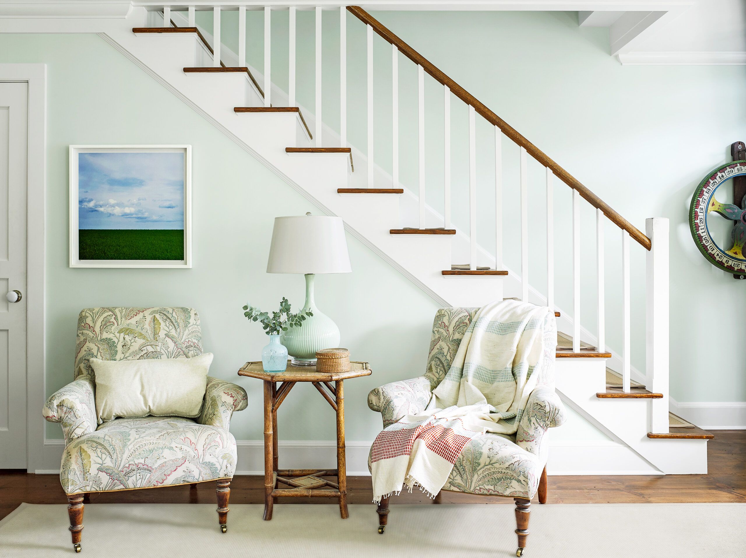
The previous owners had used salvaged white-pine flooring throughout, and when Kelley and his team removed the cabinets and established the footprint for the new island, the flooring contractor had to feather in more salvaged pine boards, and color match them with stain. He also had to replicate the random widths of the existing boards, which measure between 6 and 20 inches wide.
Shown: The Fishers love art and history and furniture—all three come together in this intimate seating area at one end of the living room.
Paint: Benjamin Moore’s Patriotic White (walls) and White Dove (trim)
Chairs: Lee Industries
Guest Bedroom
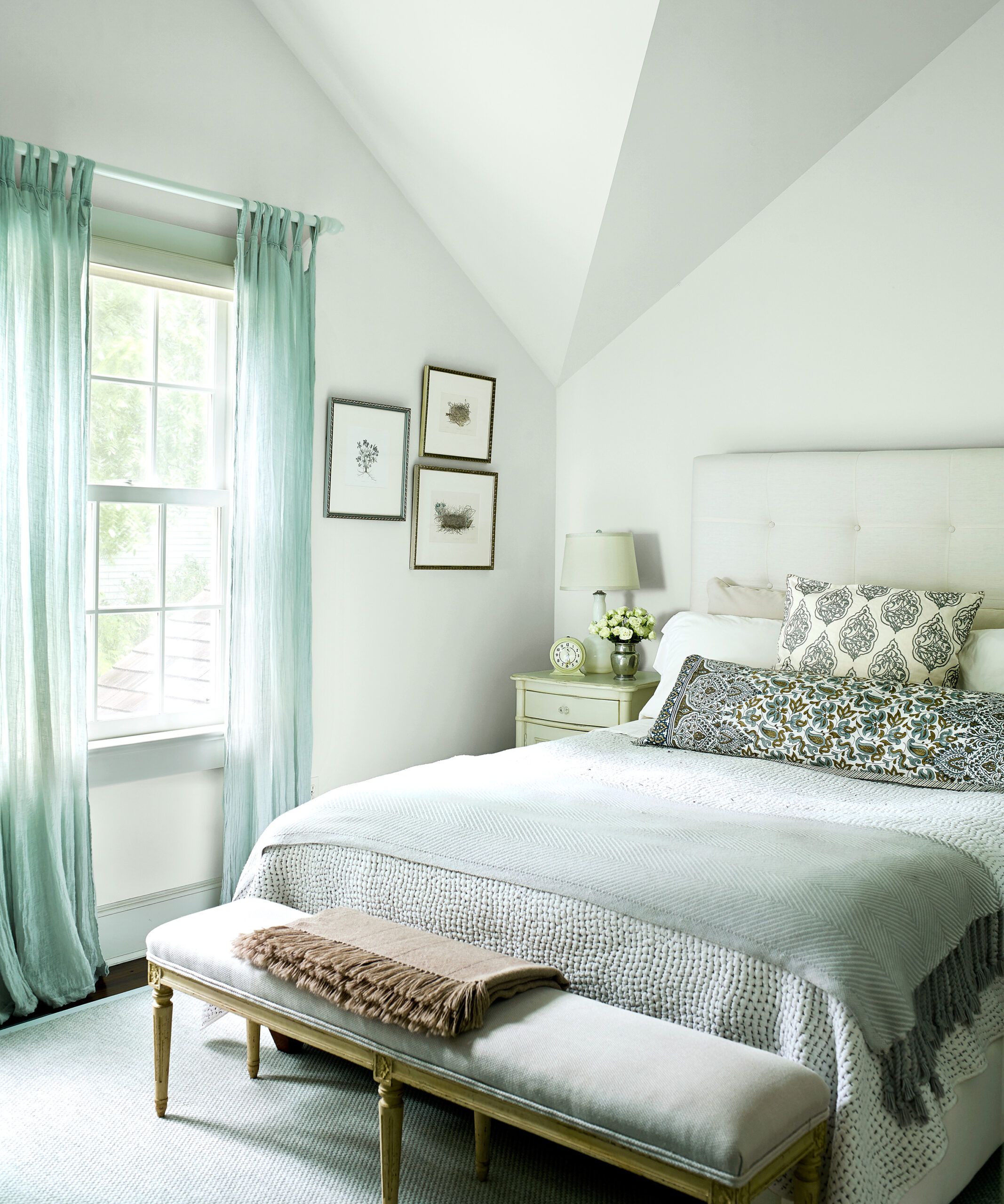
The Fishers knew from the start what they wanted for the kitchen—a bright, up-to-date space with modern appliances, but one that remained true to the historical feel of the house. Susan sourced a 2-inch-thick slab of Vermont Danby marble, large enough to cap both the perimeter cabinets and the island. That material, combined with painted maple cabinetry and stainless-steel appliances, helps the highly functional space blend with the house’s period style. Key to the room’s finely finished look is the crown molding added along the ceiling—a touch the architect felt strongly that it needed.
Shown: Soft-blue fabrics and paint give a lift to neutral furnishings in one of the guest bedrooms.
Paint (walls, ceiling): Benjamin Moore’s White Ice
Bedding, bench: Fishers Home Furnishings
Guest Bathroom
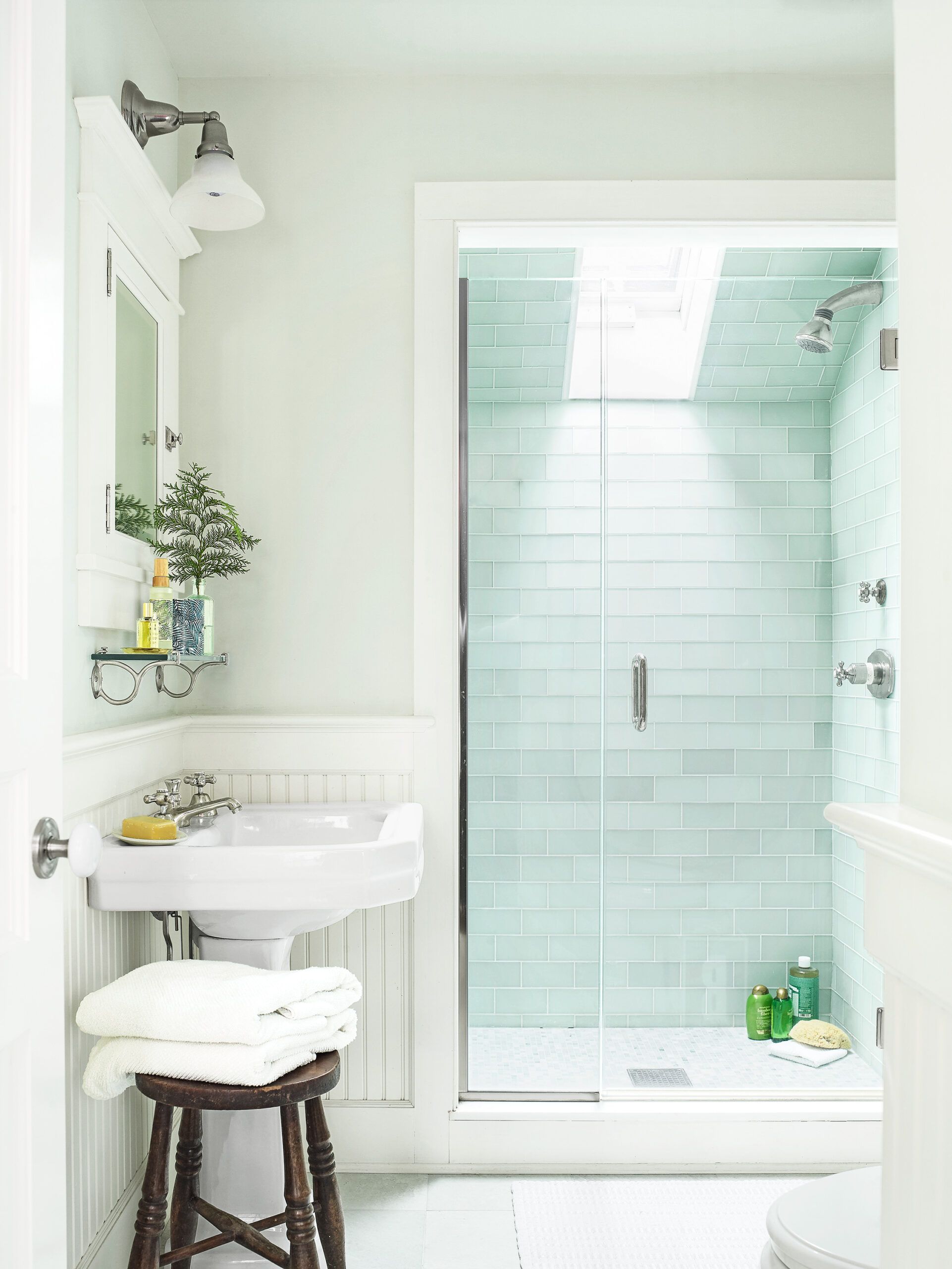
“Peter, the architect, was really good at creating things,” says Susan. “We’d thought about building an addition to accommodate a bigger master bath, but he came up with a plan to combine two existing bathrooms upstairs and eliminate a closet to make a larger space.” As a result, the couple were able to get everything they wanted within the existing footprint.
To expand the master bath, Kelley had to do some reframing, then carve out a smaller bath between the remaining two bedrooms, which is accessible from the hallway. To bring in more light, especially important in the windowless shared bath, he cut operable skylights into both shower ceilings, which required some roof reframing and reshingling.
Shown: The new guest bath upstairs has a skylight in the shower. Its interior is lined with green glass tile.
Sink: Kohler
Faucet, shower fittings: Grohe
Tile: Southampton Masonry
Medicine cabinet and wall sconce: Rejuvenation
Ceiling Slopes
To finish the raw basement and make it functional, Kelley framed in the ceiling HVAC ductwork and built walls to partition off an office/den, a laundry room, a media room, and a play area for the Fishers’ grandchildren. The three-level house now holds a generous 3,500 square feet of comfortable living space.
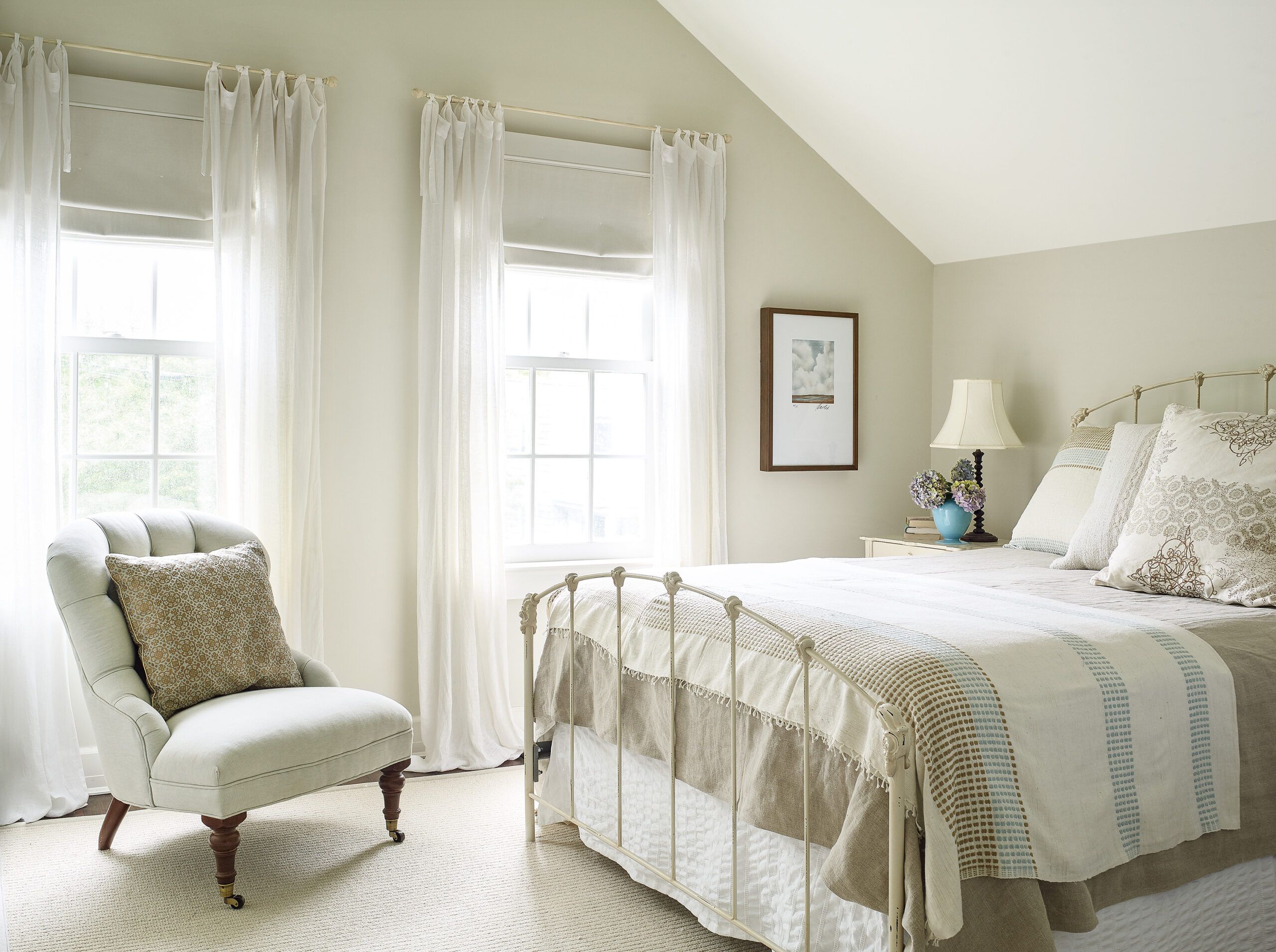
Shown: The sloped ceiling in one of the two upstairs guest bedrooms is painted white as a way to further reflect natural light drawn into the room by large double-hung windows.
Paint (walls): Benjamin Moore’s Morning Dew
Pool House
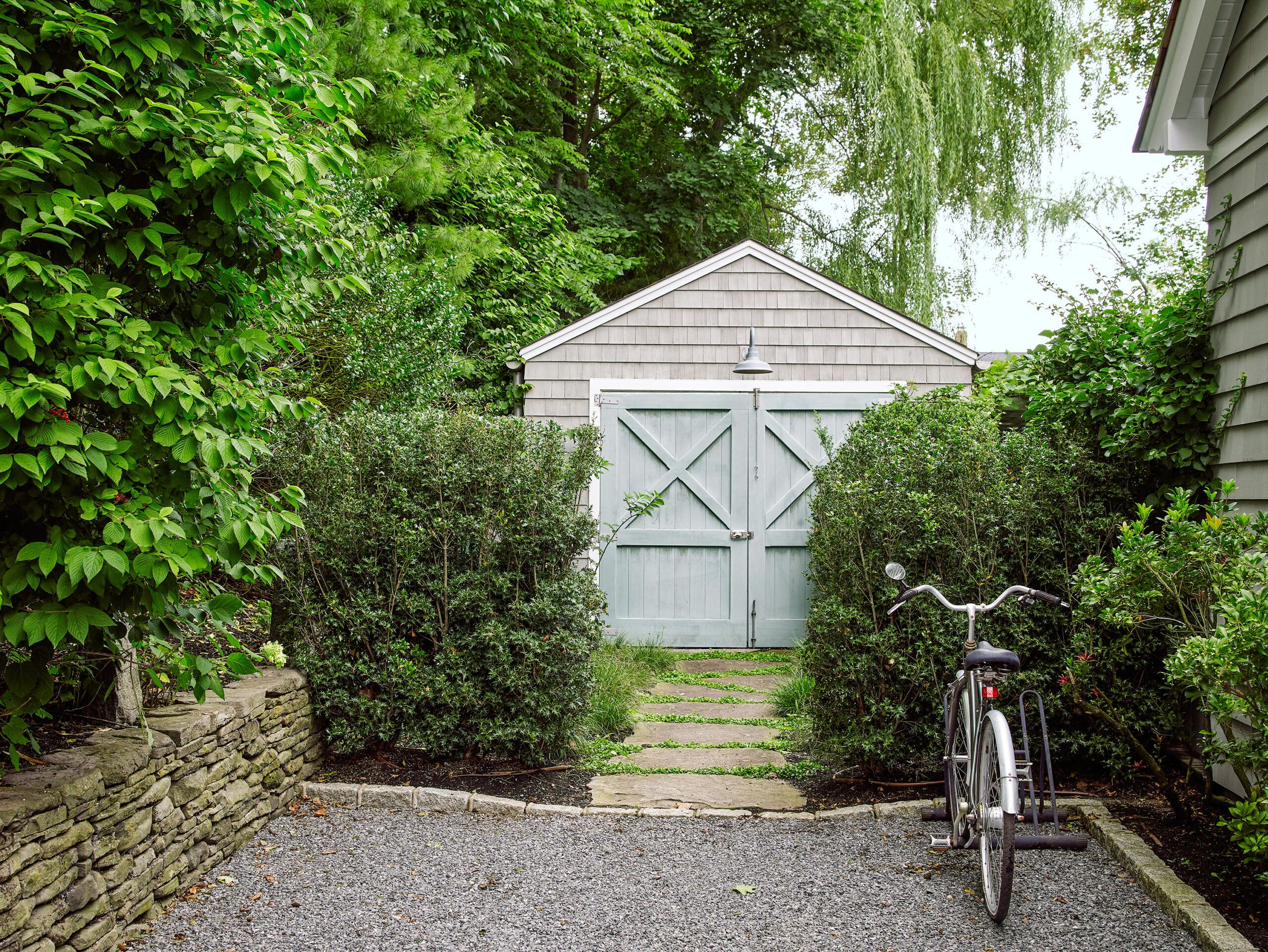
One of the property’s more whimsical features is the old freestanding single-car garage, visible from the street. Fronted with barn-like, cross-braced wood doors, it is now a renovated pool house. Behind those doors is a 2-foot-deep storage area for trash, with the pool house entrance now on the side. Kelley connected the pool house with the main water line to add a full bathroom. He added heating and air-conditioning, including floors with radiant heat, an appealing feature to the Fishers’ grandchildren, who use the pool well into autumn.
Shown: From the street, the pool house appears as a freestanding garage, accessed by two doors. In fact, the pool house is reached via a side door. The two faux garage doors, when opened, reveal storage spaces for trash bins and recycling.
Paint (walls): Benjamin Moore’s Healing Aloe and White Dove (trim)
Lighting: Suffolk Designer Lighting
Arbor Alfresco
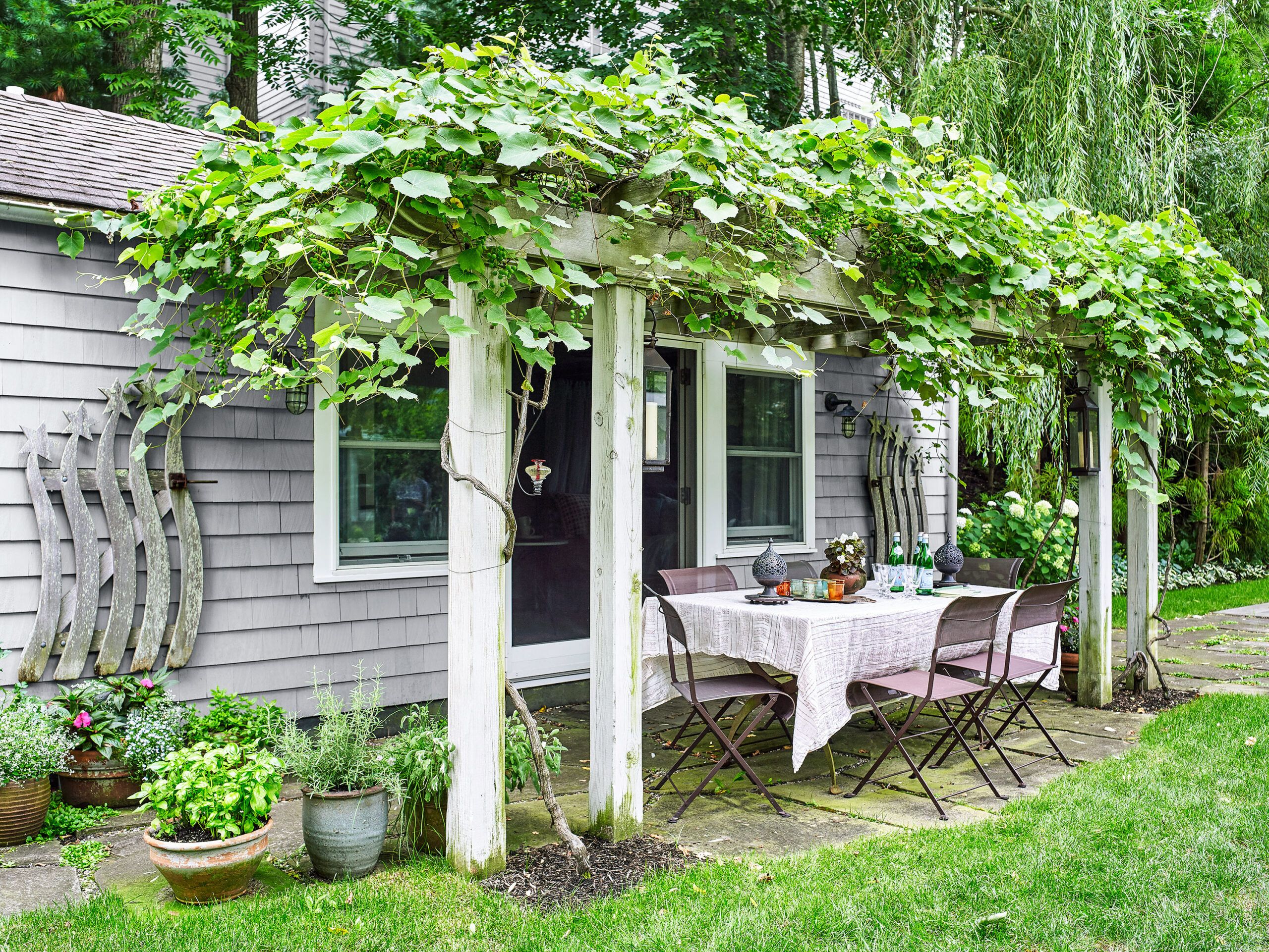
Now that the house is customized to meet their needs, downsizing has resulted in an upsizing of daily life for the Fishers. Says Susan, “With everything now done, we can really enjoy the house and enjoy being an even bigger part of this town we love.”
As their interior designer and friend John Bjørnen says, “When they moved back to the village, they renovated not only the house, but also their lives.”
Shown: In summer, a table just outside the pool house, sheltered under an arbor draped with flourishing vines, is the site of many alfresco meals. Beneath it are bluestone pavers that echo the front walkway.
Miles of Throw Pillows
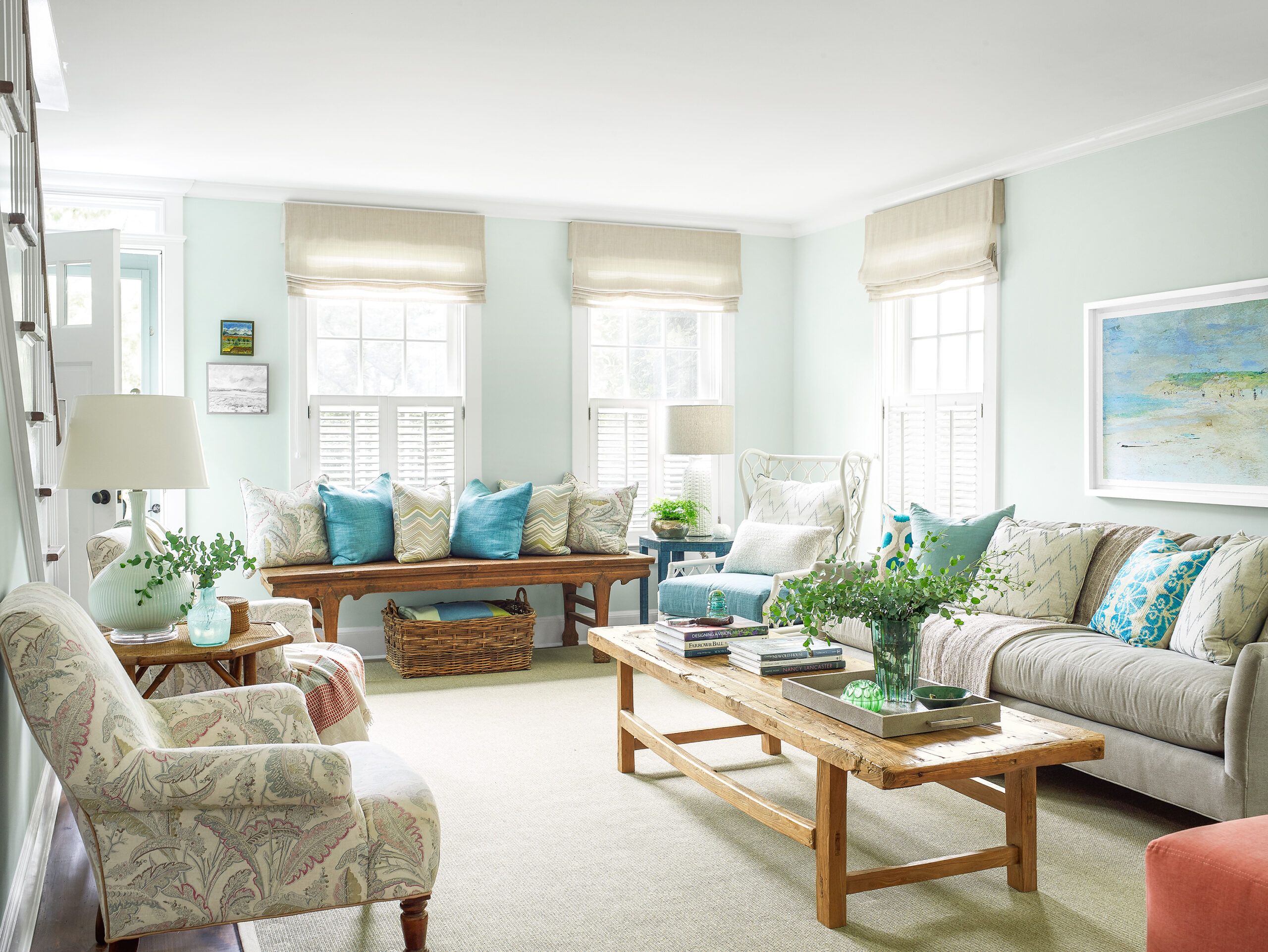
Greens and blues that evoke beach glass and bay waters—seen here in the living room throw pillows—infuse the largely neutral palette with color. Pale Roman shades keep the room bright, while shutters on the lower sash foster privacy from the street.
Pillows, lamps, tray: Fishers Home Furnishings
Niches
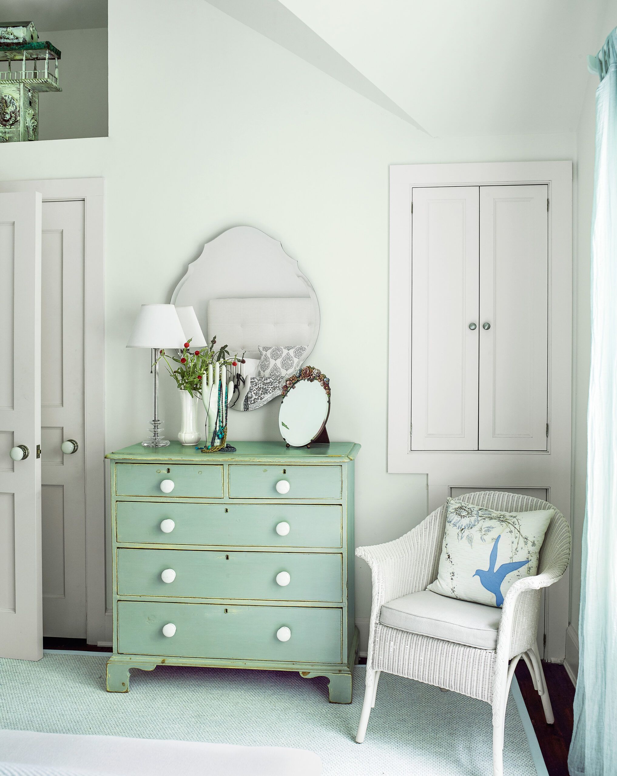
The architect and contractor deliberately sought to enliven the interiors with small and architecturally interesting touches, including a display niche up high in this guest bedroom. The double-door cabinet in the far right corner is large enough to hold clothes, while the cabinet below it stores small items.
Mudroom of Light
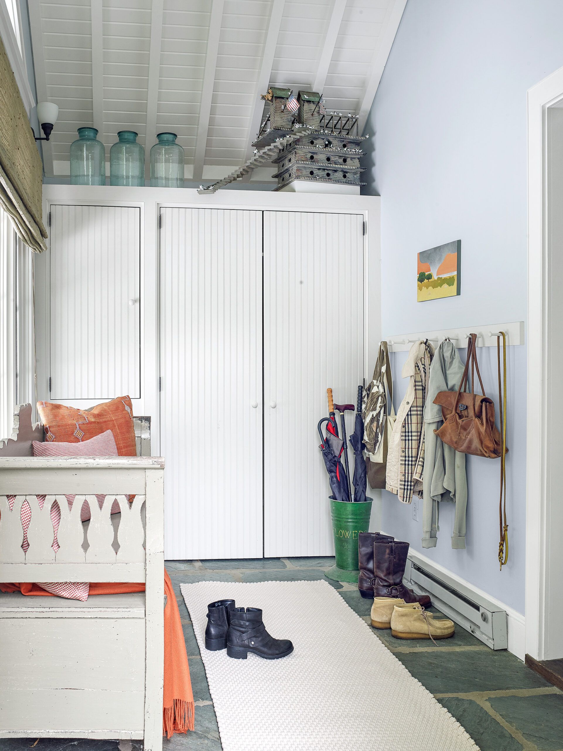
The mudroom is both practical and inviting, with a natural stone floor, tall cabinets topped with a deep shelf, and a wall of coat hooks. A clerestory window helps usher in light.
Paint (walls): Benjamin Moore’s Healing Aloe and White Dove (cabinetry and trim)
Open Console
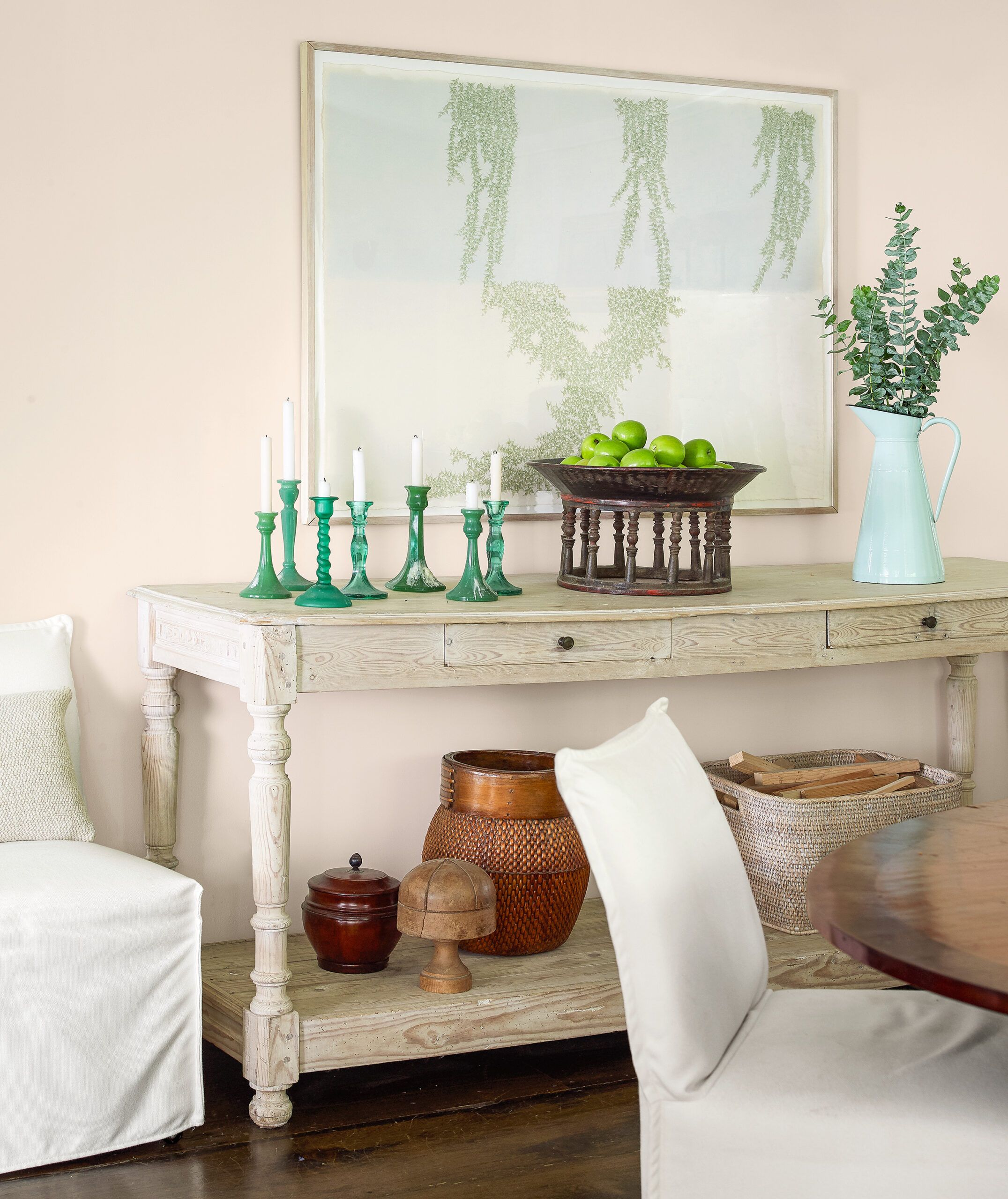
As a way to keep the first-floor living-dining area as open as possible, much of the storage and seating is set against the walls. In the dining area, a narrow console table with a bottom shelf is used for storage and display. Extra dining chairs are placed alongside it.
Pool House Lounging
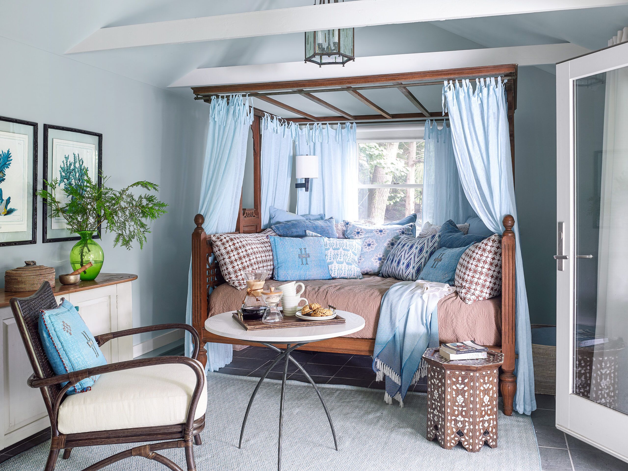
A canopy bed in the pool house is an inviting spot for lounging. The ceiling beams are both structural and decorative. French doors (at right) lead to the pool.
Paint (walls, ceiling): Benjamin Moore’s Healing Aloe
Pillows, bedding: Fishers Home Furnishings
Hutch-Like
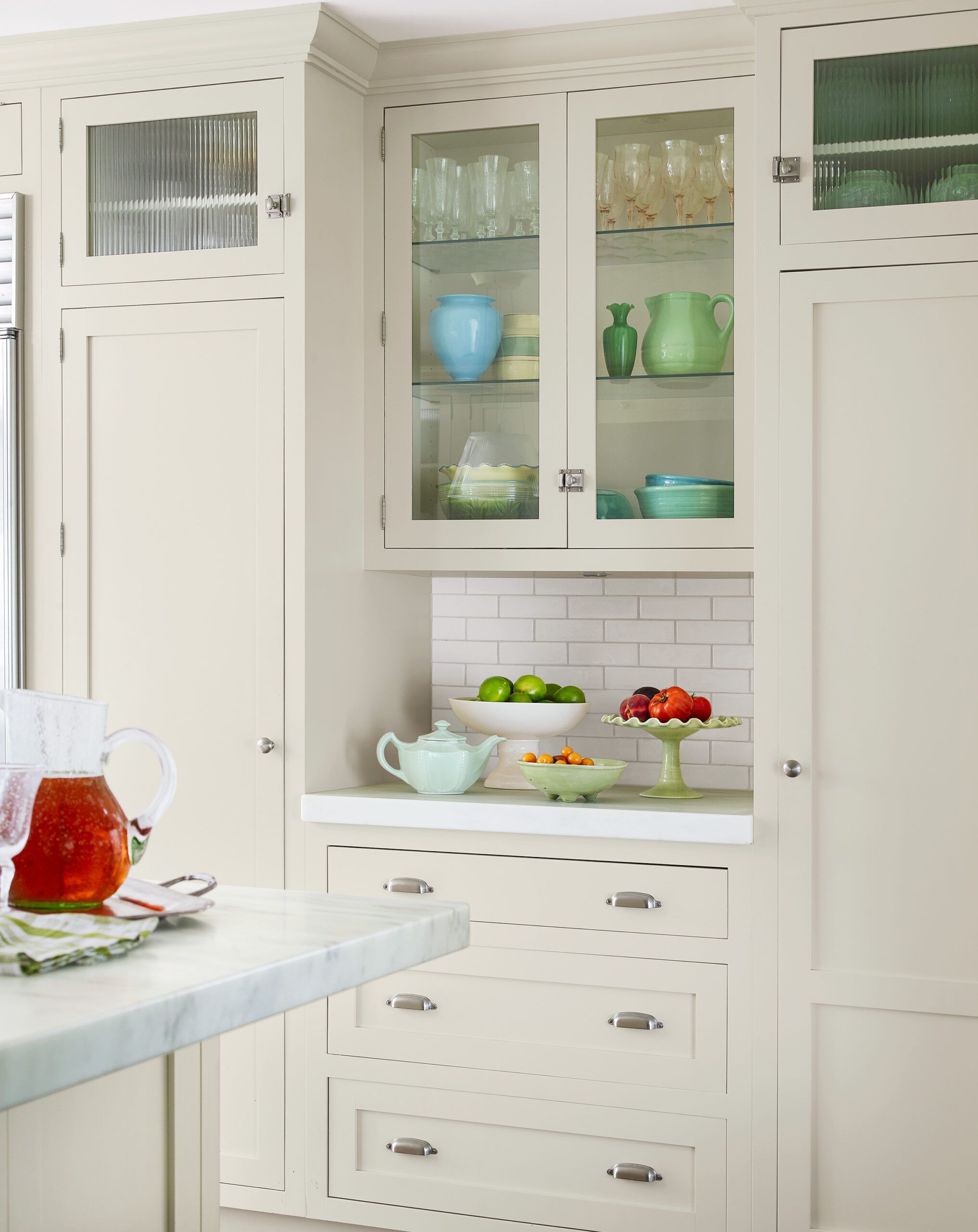
Some of the new glass-front kitchen cabinets are shallow to create a hutch-like effect, with a work surface and drawer storage below.
First Floor Plans
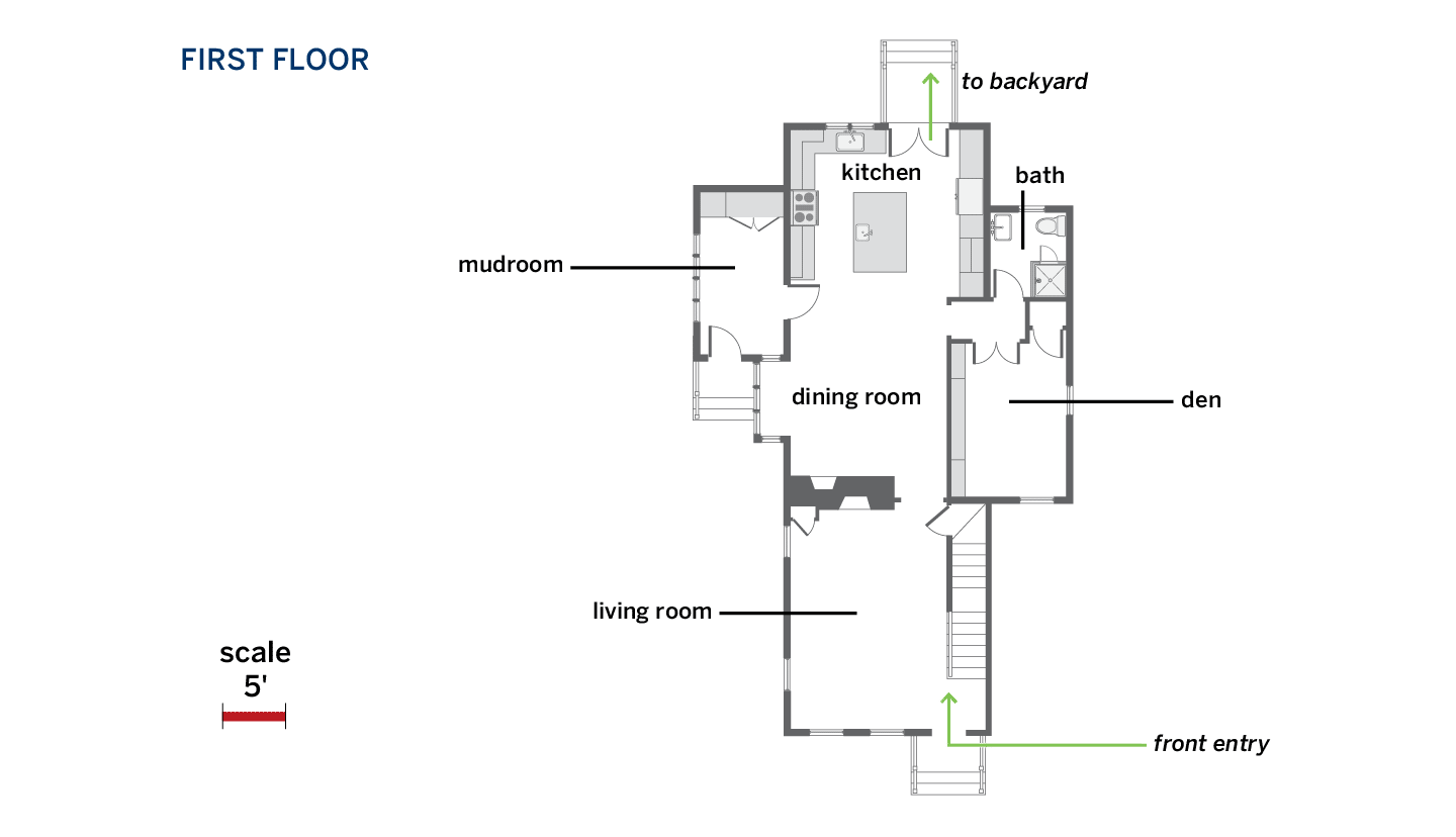
On the first floor, an island replaced a peninsula to open the kitchen up to the dining room.
Second Floor Plans
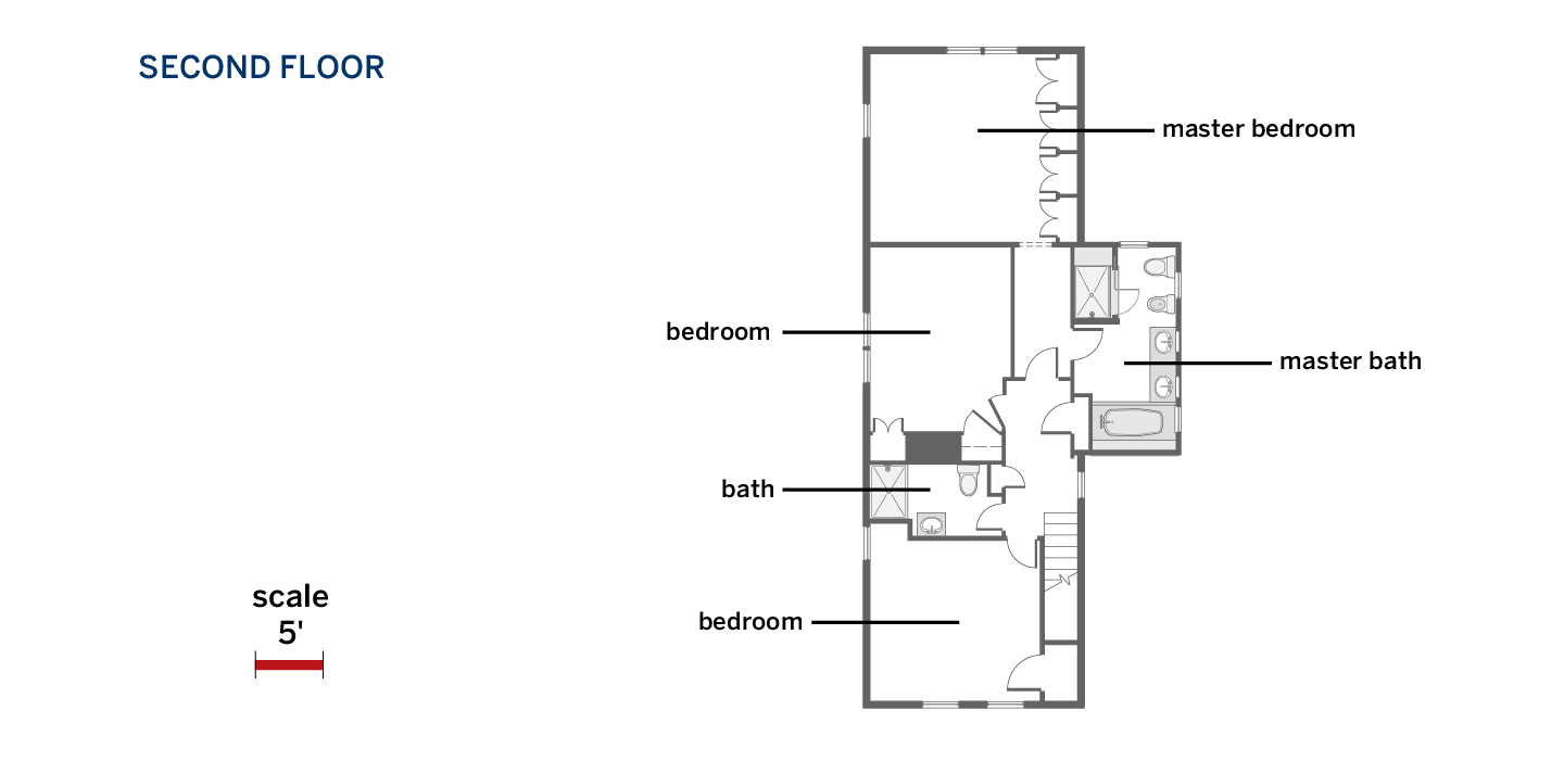
Upstairs, a small bath and linen closet were annexed to enlarge the master bath; another bath was carved out between the remaining bedrooms. Finishing the basement (not shown) yielded an office, laundry, TV room, and play area for 3,500 square feet of living space.
