Modern Entry
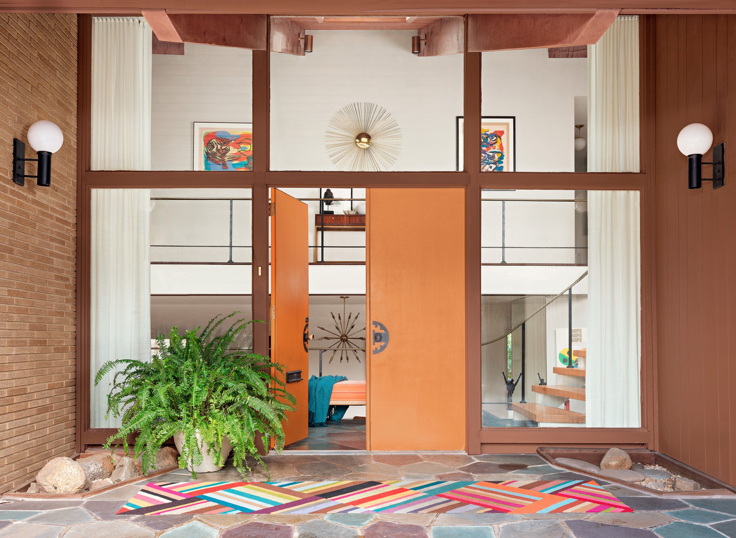
For many period-house lovers, the term “mid-century modern” evokes sharp angles, bare windows, and no place to sit except a stiff chrome chair. But you won’t have trouble finding privacy or comfy seating in the spacious 1959 home of George Marrone and Michael Nocera, dedicated restorers with a distinct preference for the floor plans and furnishings of the Mad Men era.
Shown: Zingy orange-painted doors greet visitors as they enter the brick-and-wood-clad house, built in 1959. The doors, hardware, and sconces are original.
Paint: Behr’s Clove Brown (siding) and Flaming Torch (door)
Rug: Flor
Curtains: The Shade Store
Sunburst mirror: Jonathan Adler
Spacious Entertaining
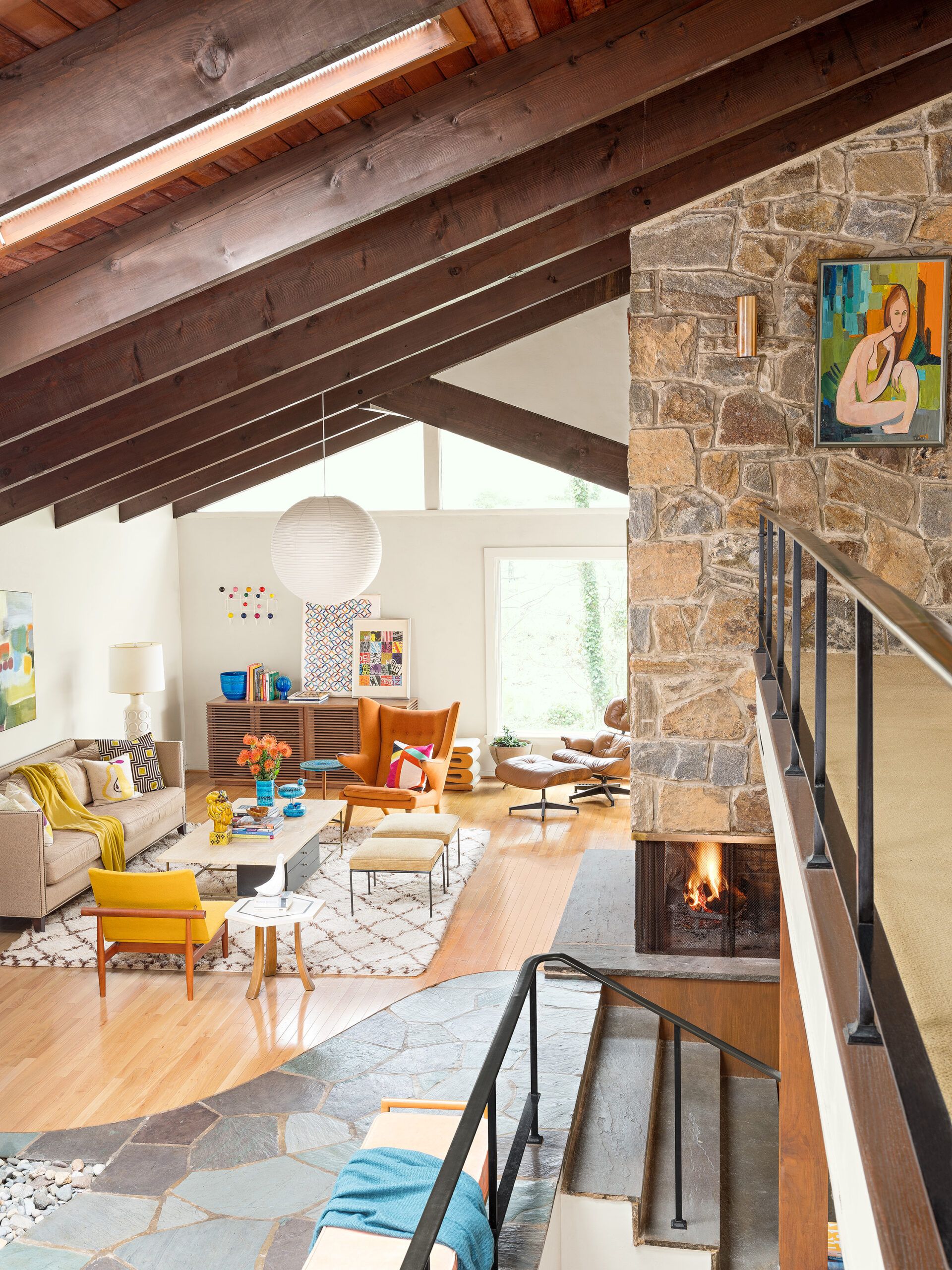
Instead, their postwar gem, in a leafy neck of Wilmington, Delaware, is more slinky than severe, with warming trends at every turn, from luminous wood accents to a fireplace open to pooled living space ideal for both cocooning and entertaining.
Shown: The living room’s old and new mid-century-style furnishings, many in citrus shades, reinforce the warmth of the oak floors, dark-stained rafters, and flagstone fireplace.
Paint: White Dove (walls) ; Benjamin Moore
Noguchi pendant light and Paul McCobb coffee table and stools: vintage
Credenza: Design Within Reach
Sofa: Mitchell Gold + Bob Williams
Living room new flooring: Avalon Flooring
Accent pillows: Jonathan Adler and Crate & Barrel (sofa) and Target (armchair)
Bright Kitchen
Appraising the house from the outside, near a sinuous creek and a wandering walkway, George tips his hat to the couple who commissioned it, Carolyn and Stanley Blish, and who “emphasized curves,” as he puts it, right down to a low-slung stone wall that wraps the back as if giving it a hug. The property’s well-rounded approach extends inside, to a curvaceous swath of flagstone flooring and a floating staircase in the shape of an inverted capital C.
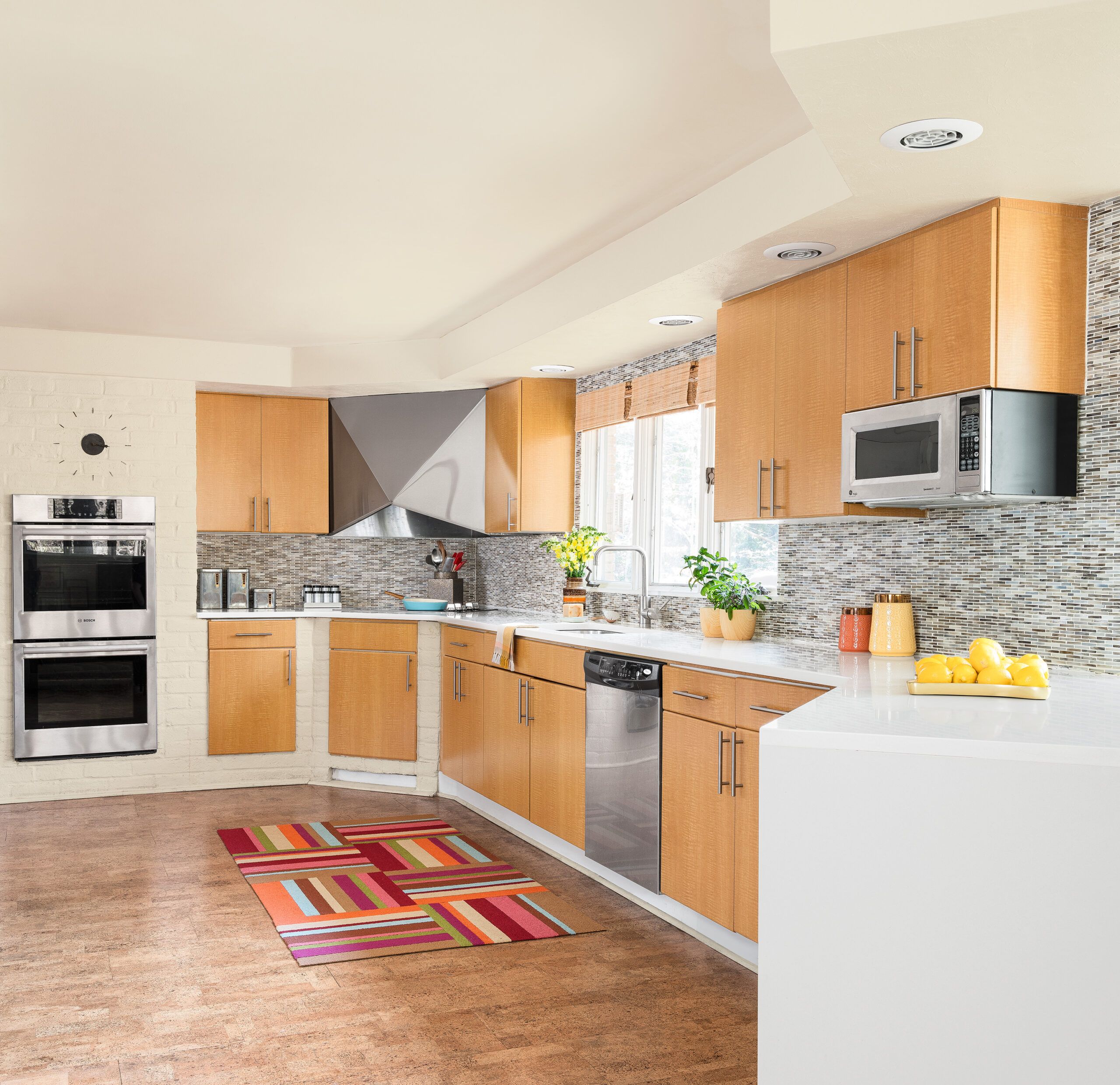
Shown: White paint, quartz countertops, sparkling mosaic tile, and new cabinet hardware and stainless-steel wall ovens brighten the kitchen. Cork flooring was chosen to blend with the adjacent oak. The sculptural vent hood is original.
Wall ovens: Bosch
Microwave: GE Appliances
Faucet: Grohe
Countertops: Cambria; Stone Masters
Tile: Ann Sacks
Cork flooring: Wicanders
Vintage Den
Carolyn Blish, an artist, now 90 and living in rural Pennsylvania, seems surprised to get a call about the house, as if it’s newsworthy. It sits, after all, in the shadow of a Frank Lloyd Wright built around the same time on the very same creek, she says, by her late husband’s then boss.
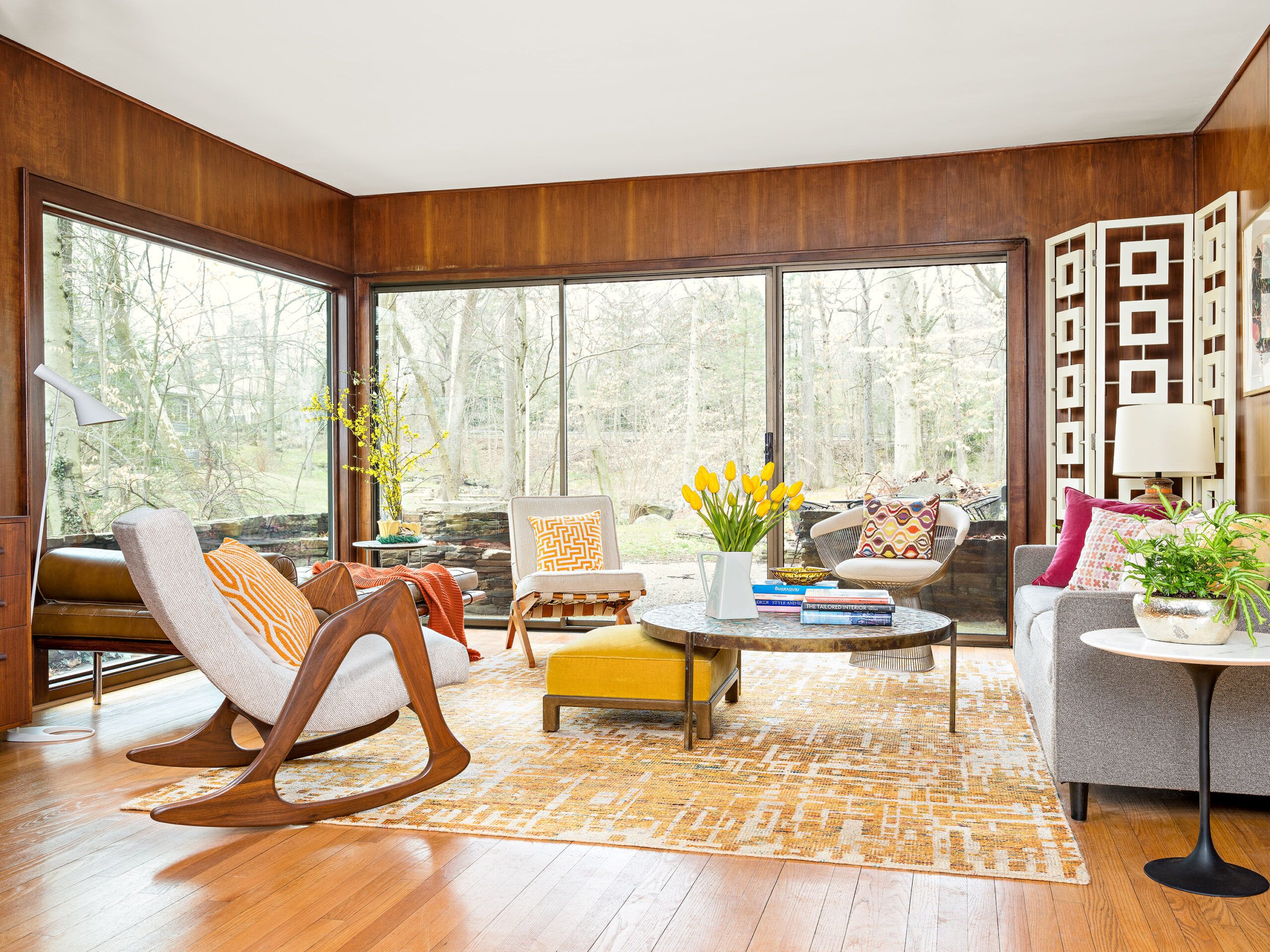
Shown: The downstairs den retains its sliding door and stained-walnut wall covering, complemented by vintage furnishings like an Adrian Pearsall rocker. The oversize picture window replaced one that was drafty and threatening to pop out.
Window: Pella
Window installation: Quality First Contractors
Sofa: Mitchell Gold + Bob Williams
Homeowner and His Dog
The Blish house lacks a big-name provenance. “No architect,” says Carolyn, offering credit only to a savvy hairdresser. She and Stanley, an executive at DuPont, had been given an acre-and-a-half plot by her parents, who lived next door. “I saw a picture in a magazine, which I found through the guy who cut my hair,” she says. The house had a self-effacing brick facade and wild amounts of glass in back. “We said, ‘That’s it’ and gave it to our builder.”
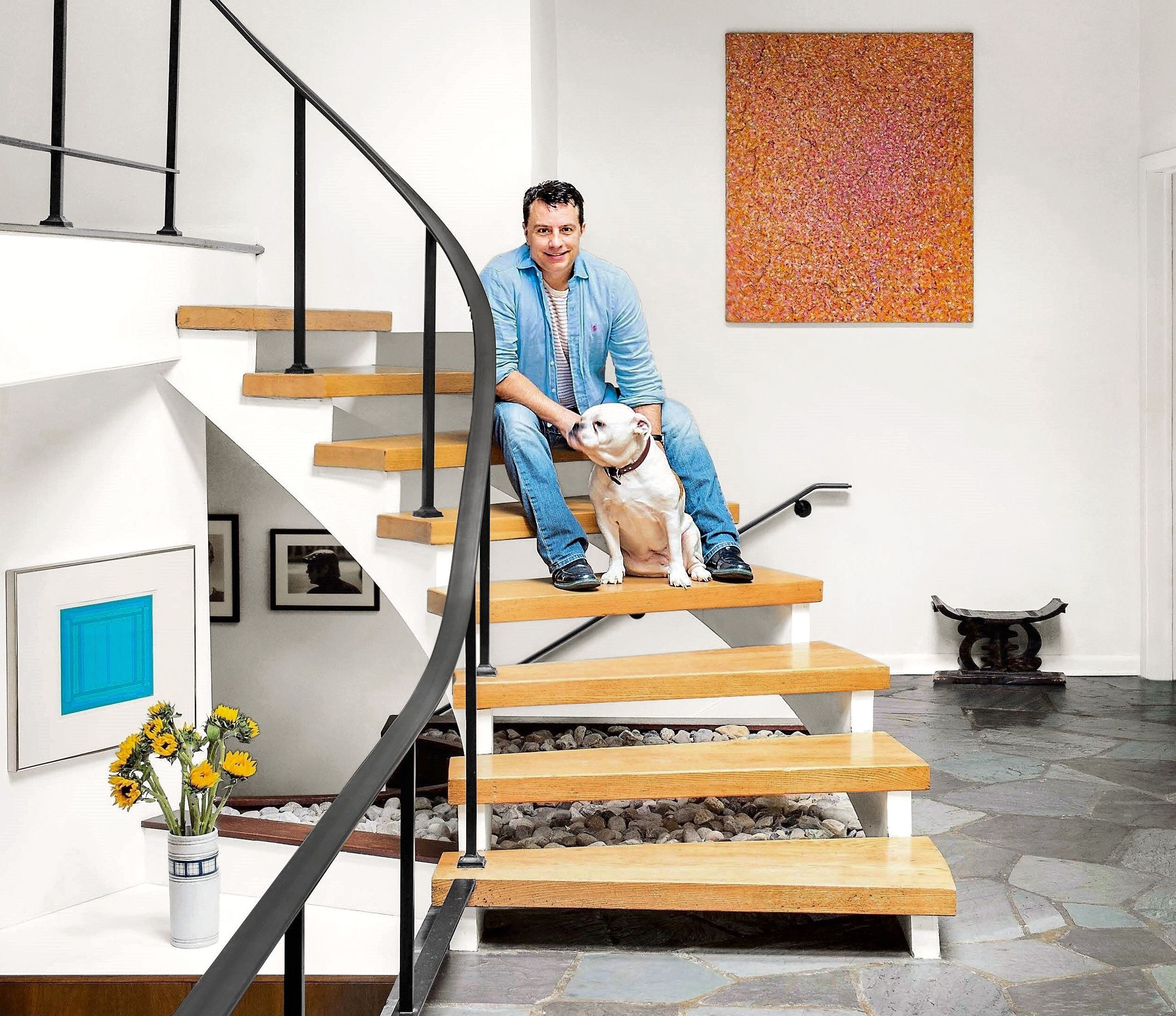
Shown: Homeowner George Marrone, with Sasha, an Olde English Bulldogge, on the restored oak treads of the floating stairs. Previous owners had stained them ebony and wrapped them individually in thick-piled carpet.
Lively Guest Room
The moniker “mid-century modern,” which you’ll now find everywhere, wasn’t popularized until the 1980s, when interest in the period, roughly 1935 to 1965, took off, perhaps in reaction to bland McMansions. Stripped of ornamentation and trained on Mother Nature, the houses are characterized by opaque walls in front and large, open, shared spaces with expanses of glass in back. Natural materials like rugged stone and unpainted wood mingled with more contemporary plywood and plastic, giving rise to equally innovative furnishings—fiberglass chairs, paper pendants, sputnik chandeliers, anything Eames.
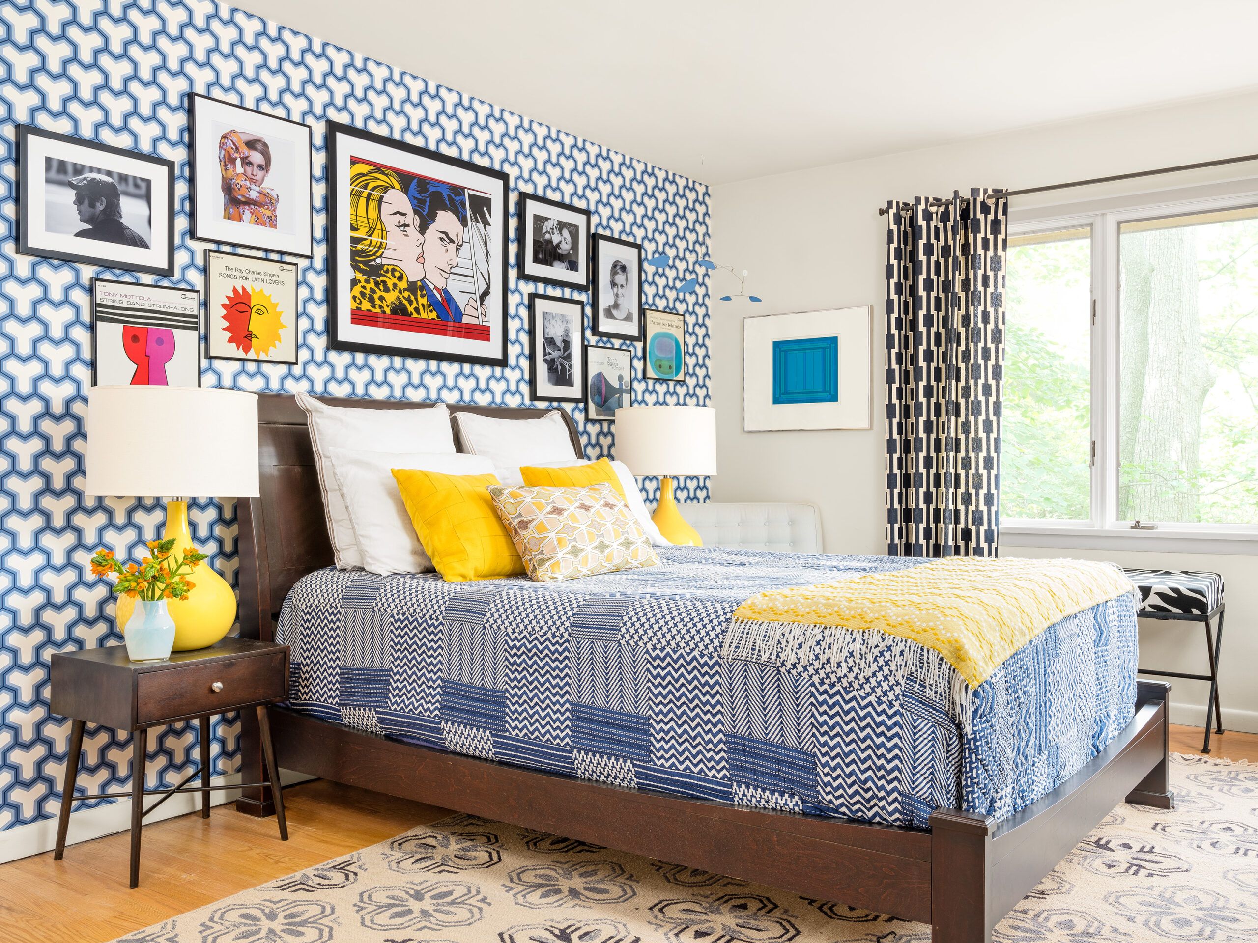
Shown: A guest bedroom looks lively thanks to vintage lamps and mod-patterned wallpaper and curtains. A large print by Roy Lichtenstein is surrounded by pieces from the 1960s.
Wallpaper: Antonina Vella; Wallpapers & Fabric to Go
Quilt: Crate & Barrel
Curtains: West Elm
Rug: Pottery Barn
Bedside table: Target
Master Bedroom
George believes his post-and-beam find may have been a magazine’s “idea house” and would love to run across the period periodical that would help him trace its DNA. A health care administrator by day, he is a sleuth by nature. Few things delight him like unearthing a planter at a garage sale that has a racy mid-century provenance and a value far exceeding the $5 asking price. “I enjoy the thrill of the hunt,” he says, surrounded by mid-century furnishings painstakingly acquired online and on foot.
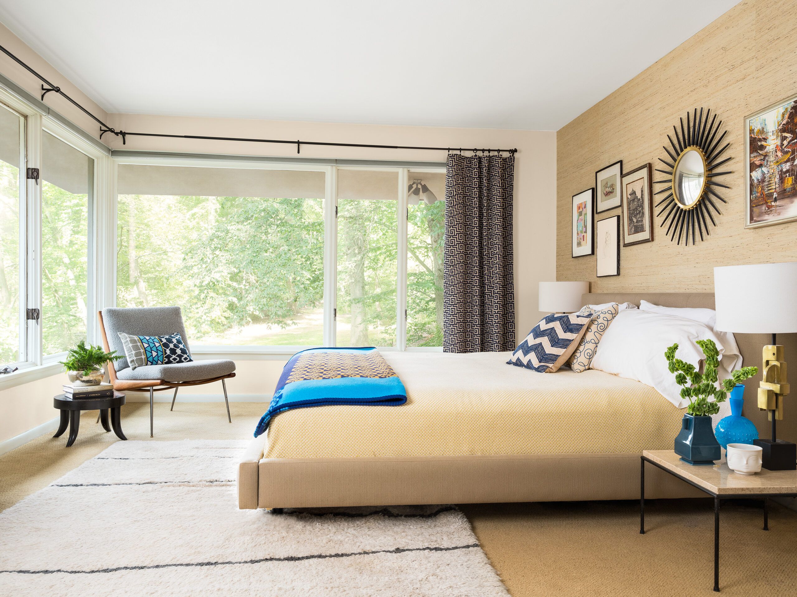
Shown: A muted palette and textured grasscloth wallpaper add to the serenity of the master bedroom. New curtains cozy up the original windows.
Paint: Navajo White (walls); Benjamin Moore
Curtains: Pottery Barn
Wallpaper: Phillip Jeffries
Bed: Crate & Barrel
Paul McCobb side table and Peter Hvidt chair: vintage
Citrus-Hued Powder Room
For a house with no architect, this one has swagger to spare. A stately front entrance, set back and framed by glass panels, hints at the dramatic space just inside. Skylights brighten dark-stained rafters angled over an entry anchored by Pennsylvania flagstone, handpicked by Carolyn Blish in shades of teal and eggplant. The entry faces a wide mezzanine fronting three bedrooms, an upstairs den, and two baths. Windows clustered at the back overlook a circular patio cracked by age and fond use like a worn leather sofa.
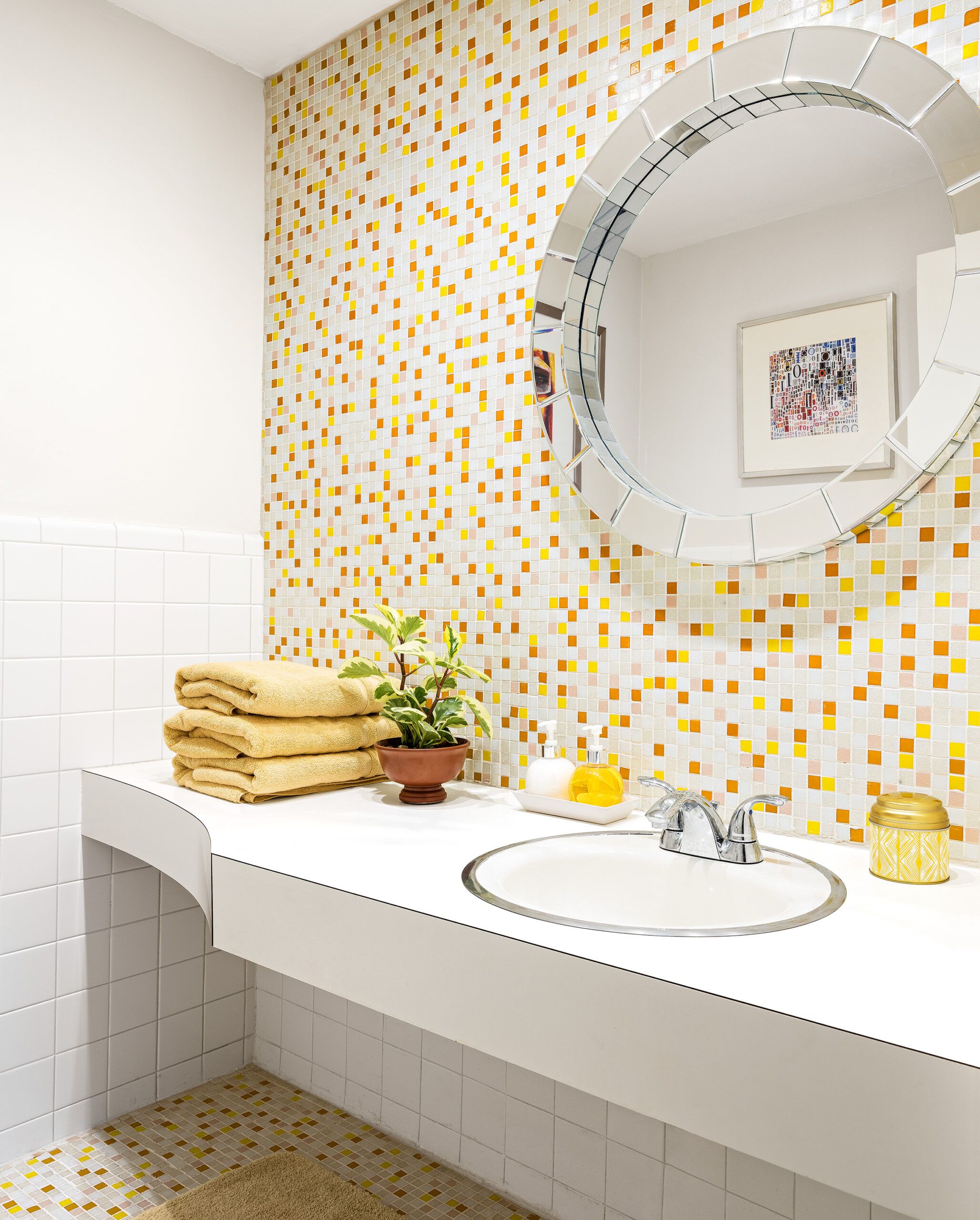
Shown: The powder room held on to its original floating vanity and white side walls while gaining cheery mosaic tile in citrus hues, set in a custom pattern by homeowner George. Michael raised the ceiling and replaced the light fixtures.
Paint: China White (walls); Benjamin Moore
Mosaic tile: Modwalls
Mirror: West Elm
Softened Dining
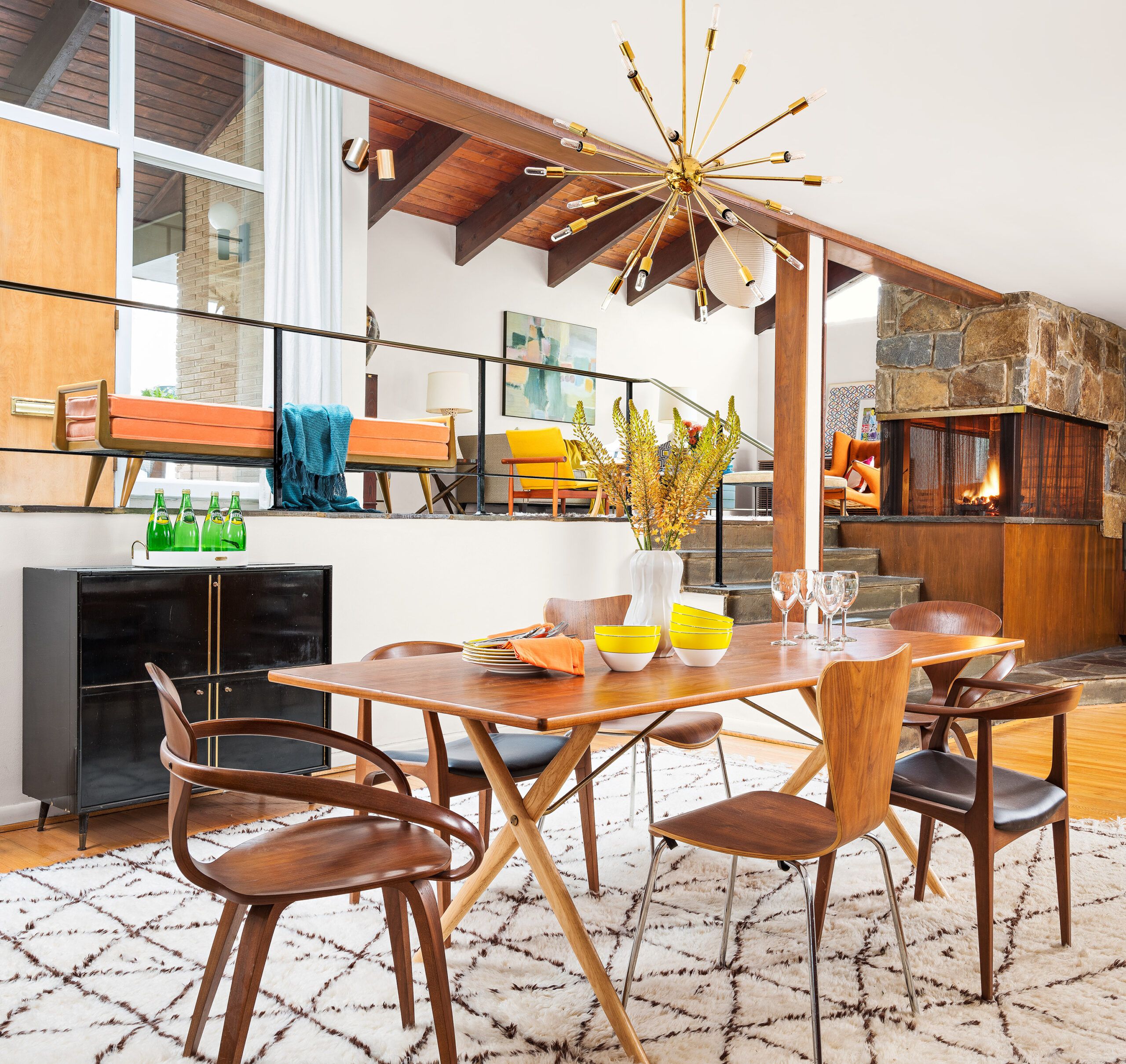
Floating stairs and warm wood built-ins add a sense of spaciousness to an already roomy 4,300 square feet. “The first time I saw it empty, I asked myself, ‘What did we do?’ ” says George.
He grew up nearby, and had roamed around house-hunting for years without noticing all that excitement hidden in plain sight. Through some trick of reverse-snob curb appeal, the house, he notes, “looks like a small ranch from the front.” He had always wondered what it would be like to lay claim to a house similar to the one in The Brady Bunch, as he likes to say, with “its casualness, its full rock wall.”
Shown: A Moroccan rug and sputnik chandelier soften the formal dining area.
Rug: Persian Rug Imports
Table and upholstered armchairs: Design Within Reach
Upholstery: Art Craft Upholstery
Gathering Spot
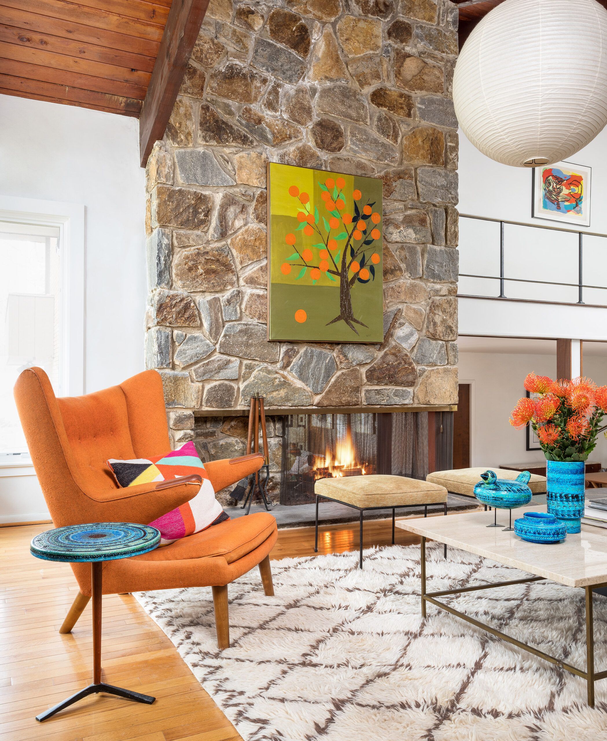
He found what he was looking for through “kismet,” he says, after he and Michael, who works in finance, had renovated a townhouse in Wilmington. They were settled into vertical living and continuing to grow their collection of mid-century finds, when one day George was Web-surfing on behalf of a friend and saw a listing that featured the Bradys’ airy staircase and stonework.
Shown: The living room fireplace shares its glow with a gathering spot on the other side.
Hans Wegner armchair and Bitossi ceramics, including side table: vintage
Family Display
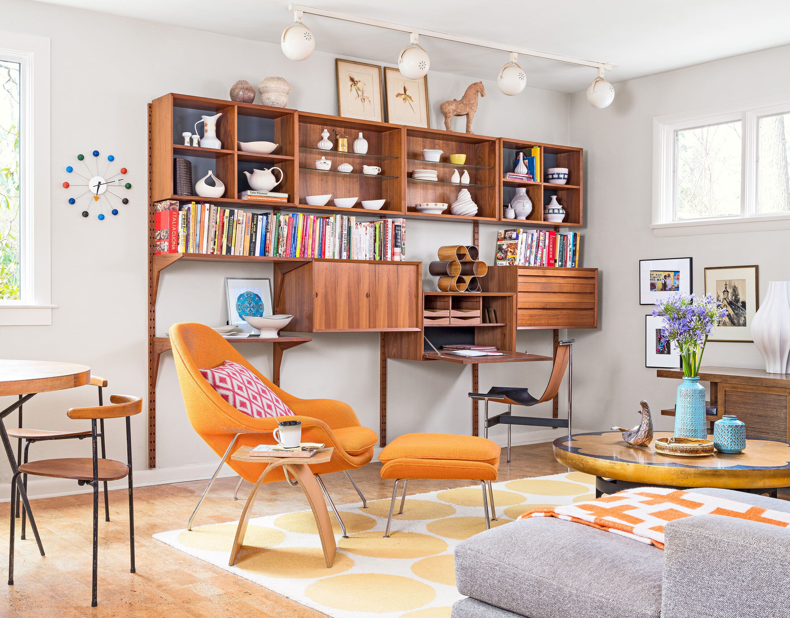
A year later, his friend was still looking, and George and Michael were once again renovating.
While the place was sound, with a new roof and stepped-up wiring, some of the double-paned windows were foggy or slipping in their openings, and the HVAC system required reinforcement. The unloved living room carpeting sat on bare subflooring, and the repeatedly worked-upon kitchen had dark solid-surface counters and so many layers of lavender linoleum flooring that “you had to step up to go in,” George recalls. The master bath also needed updating. Overall, the place felt dark, as if it needed to be dusted off and reminded of its clean, airy origins.
Shown: Cork flooring flows from the kitchen into the adjacent family room, where more mid-century classics reign.
Poul Cadovius teak wall unit, Eero Saarinen for Knoll Womb chair, and Kittinger Lotus coffee table: vintage
HVAC contractor: Joseph Frederick & Sons
Cork and oak floor refinishing: Henning’s Hardwood Floors
Upstairs Den
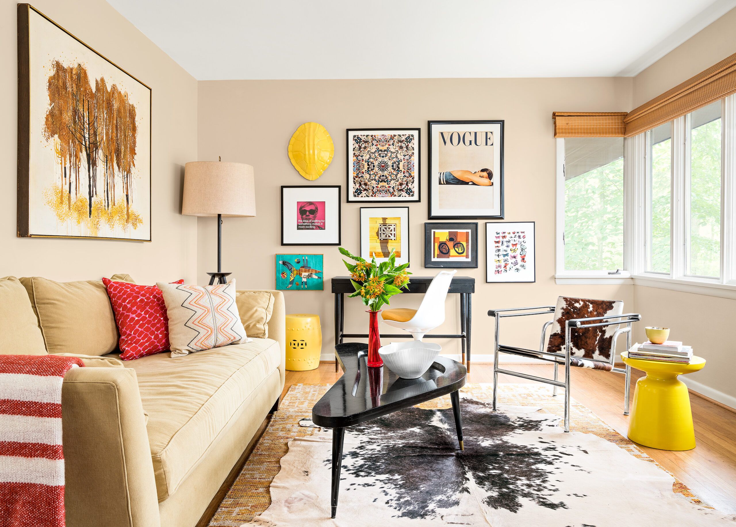
The new owners found themselves moving from one unfinished space to the next, shoving aside unpacked boxes and bags while pulling down heavy curtains, pulling up shaggy carpet, and struggling to lighten things up with lots of white paint. They found a company to tackle the heating and cooling, and tracked down a contractor who could swap in energy- efficient windows in the living spaces, replacing a view-impairing trio in the living room with a single unit. Later, after an earthquake, heavy rains ushered water into the basement, so more pros were called in to install two French drains and a second sump pump.
Shown: The upstairs den, originally a bedroom, holds a sofa that turns into a single bed for guests. The room has its original windows.
Sofa: Crate & Barrel
Window blinds: The Home Depot
Cowhide rug: eBay
Floor lamp: Jonathan Adler
Paint: Navajo White (walls); Benjamin Moore
Downstairs Den
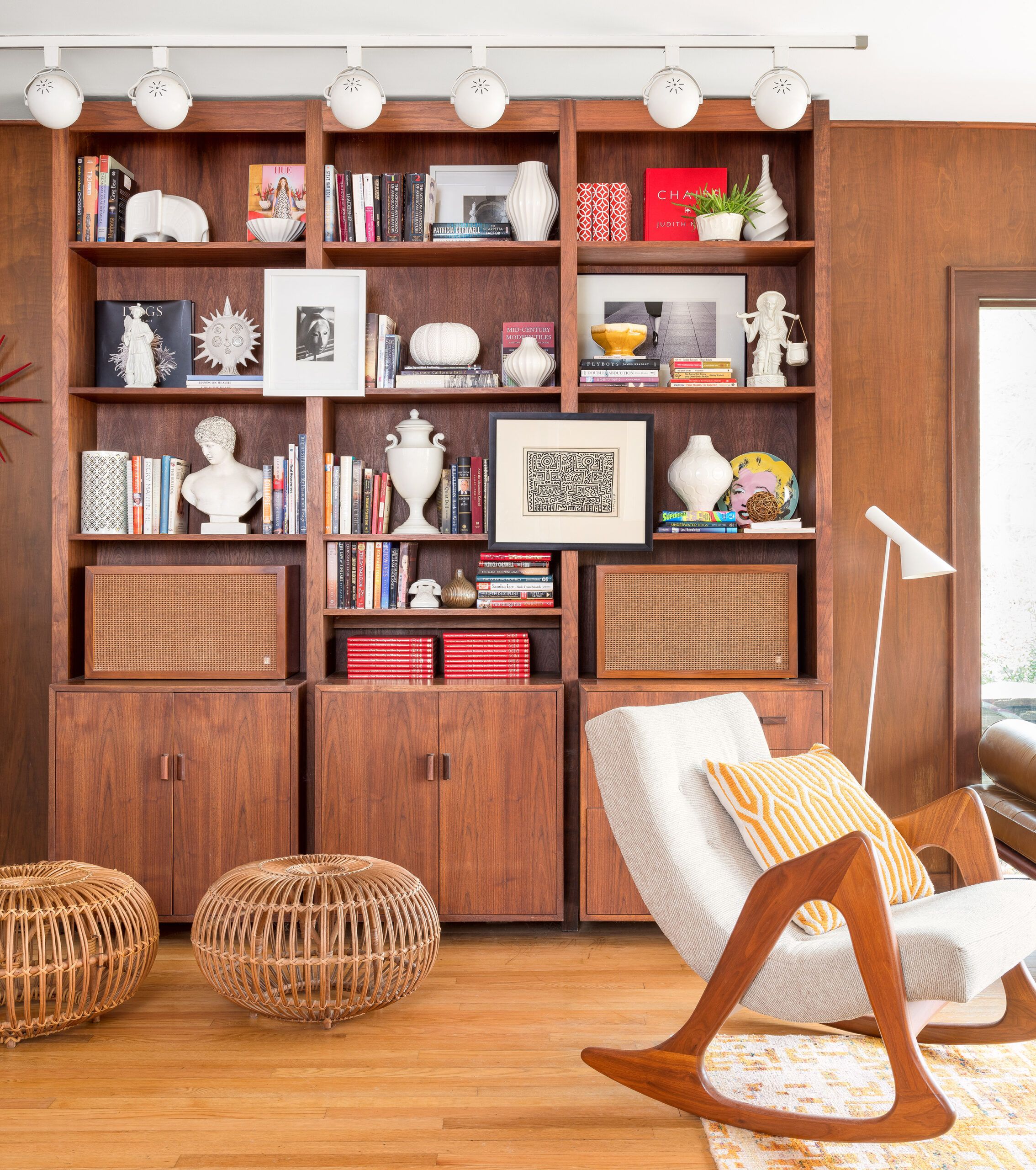
The couple managed all this while attempting to contain two bulldog puppies, who set about turning a minimalist raked sand bed under the stairs into a jumping-pad shortcut to the sunken dining area. Today Sasha and Sophie play no small part in fostering interest in the house on Instagram, where “@modernpup” has 19,200 followers.
Shown: The downstairs den has held on to its original built-ins and track lighting.
Albini rattan ottomans: vintage
Paperless Bath
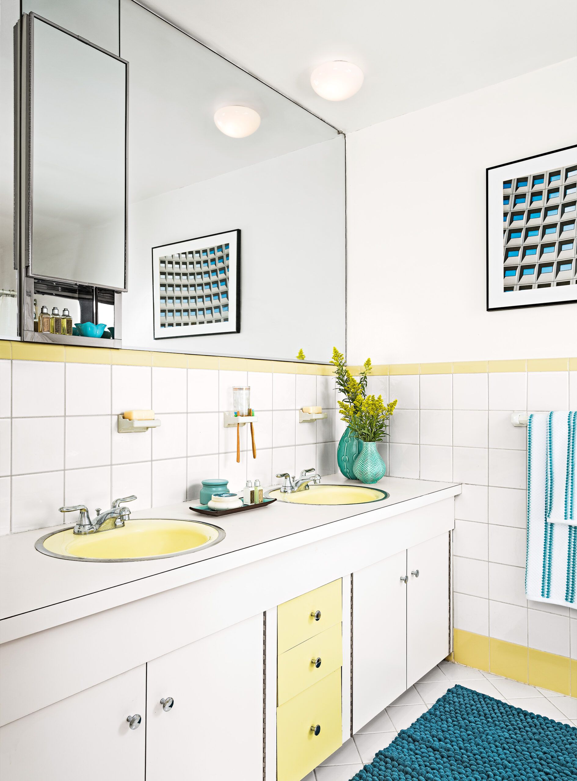
Less high-profile is the role played by Michael, who credits his handiness to a DIY dad, stints watching This Old House on TV, and plenty of book research. At estate sales, while George hunts up the odd Paul McCobb, Michael is drawn to the old tools.
Together they painted the exterior and interior, redid the master bath and powder room, and hung wallpaper—upside down, in one case. “We almost killed each other,” George says dryly, “but we did it.”
Shown: The original guest bath was too cool to touch, once its 1970s foil wallpaper came down.
Sputnik Lighting
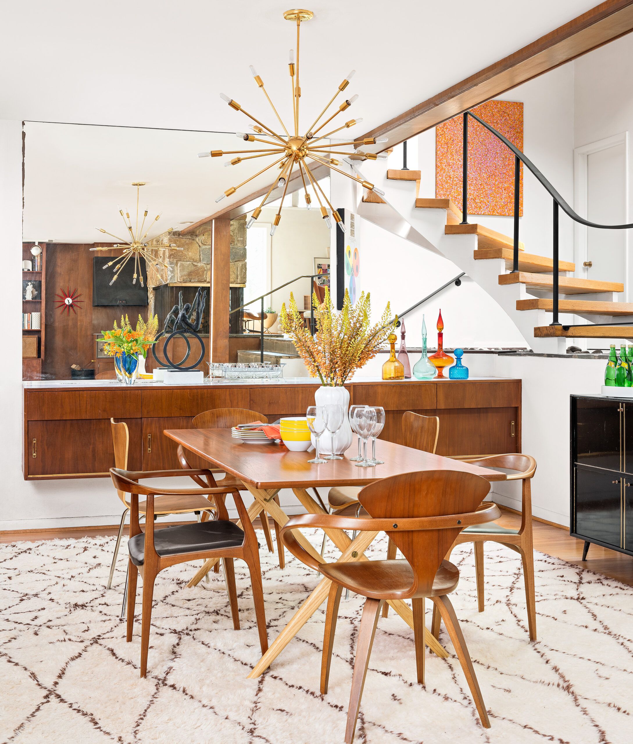
Their biggest project was the kitchen, large for its era and walled off from the formal dining area. They wisely left the wall, while opening things up by removing cabinets over the peninsula facing the breakfast table and family room. They put in a glistening tile backsplash, white counters, stainless-steel wall ovens, plus a new sink, faucet, and cabinet hardware.
Shown: The owners found the vintage sputnik chandelier at auction. Mid-century dining chairs (without upholstery) include designs by Norman Cherner and Arne Jacobsen.
Vintage Bench
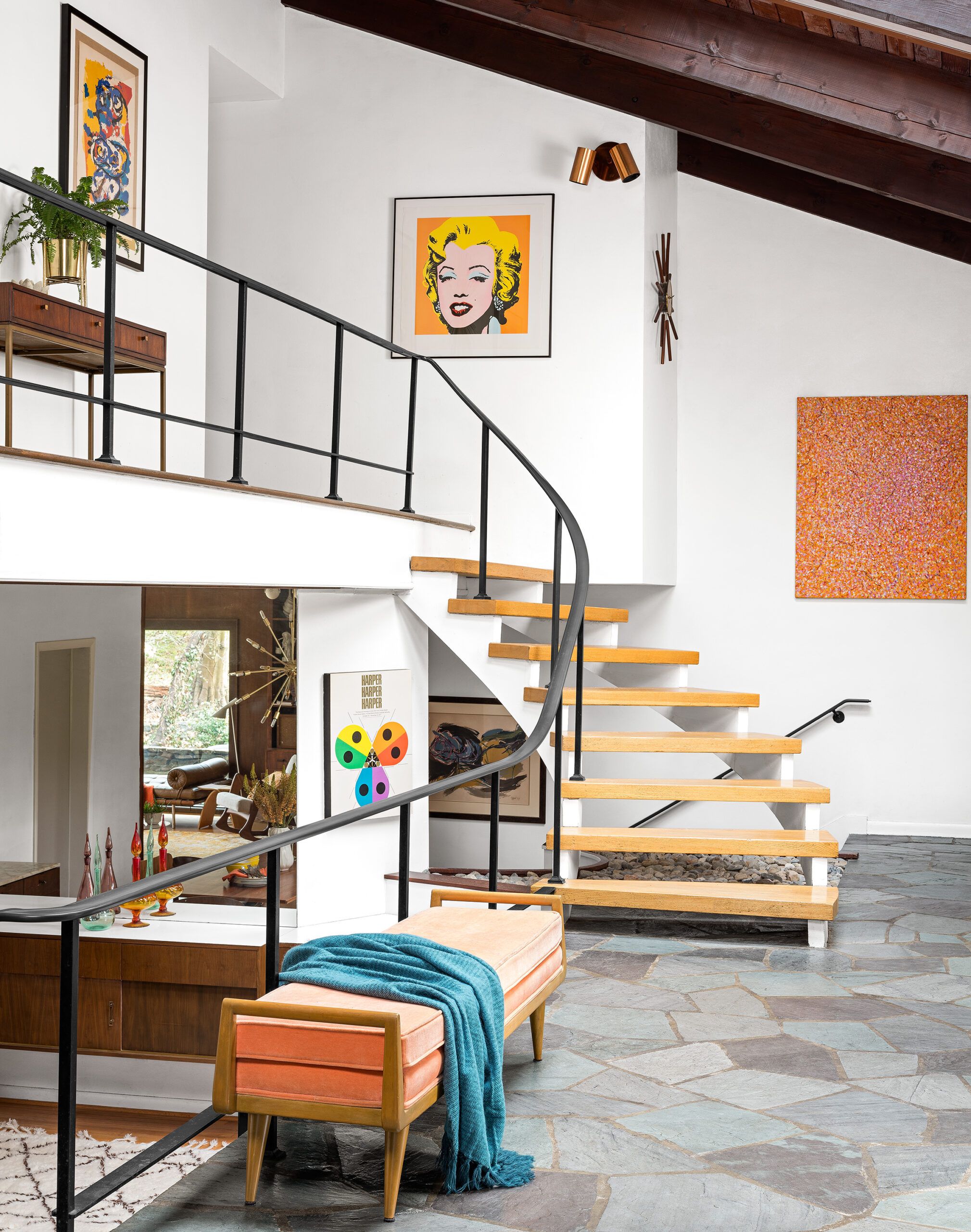
The house looks like its old self. All that’s left is for Michael to finish a small home-gym area near the original cedar-lined sauna—which still works.
Hot rocks, open fires, stairs everywhere: One thing that never changed is the reckless air so characteristic of the postwar, pre-seatbelt era. Never mind a fireplace open on three sides—the den still has a built-in charcoal grill with a flue. (“We grill outside,” George hastens to add.) Railings 32 inches high with balusters 42 inches apart could be seen as an invitation to swing—or jump. “When kids are here, I get a little nervous,” George only half-jokes, one eye on collectibles daringly arrayed on low vintage tables.
Shown: On the teal and eggplant flagstone in the entry sits one of the owners’ favorite pieces, a vintage bleached-mahogany bench, author unknown, with orange velvet upholstery.
Unassuming Exterior
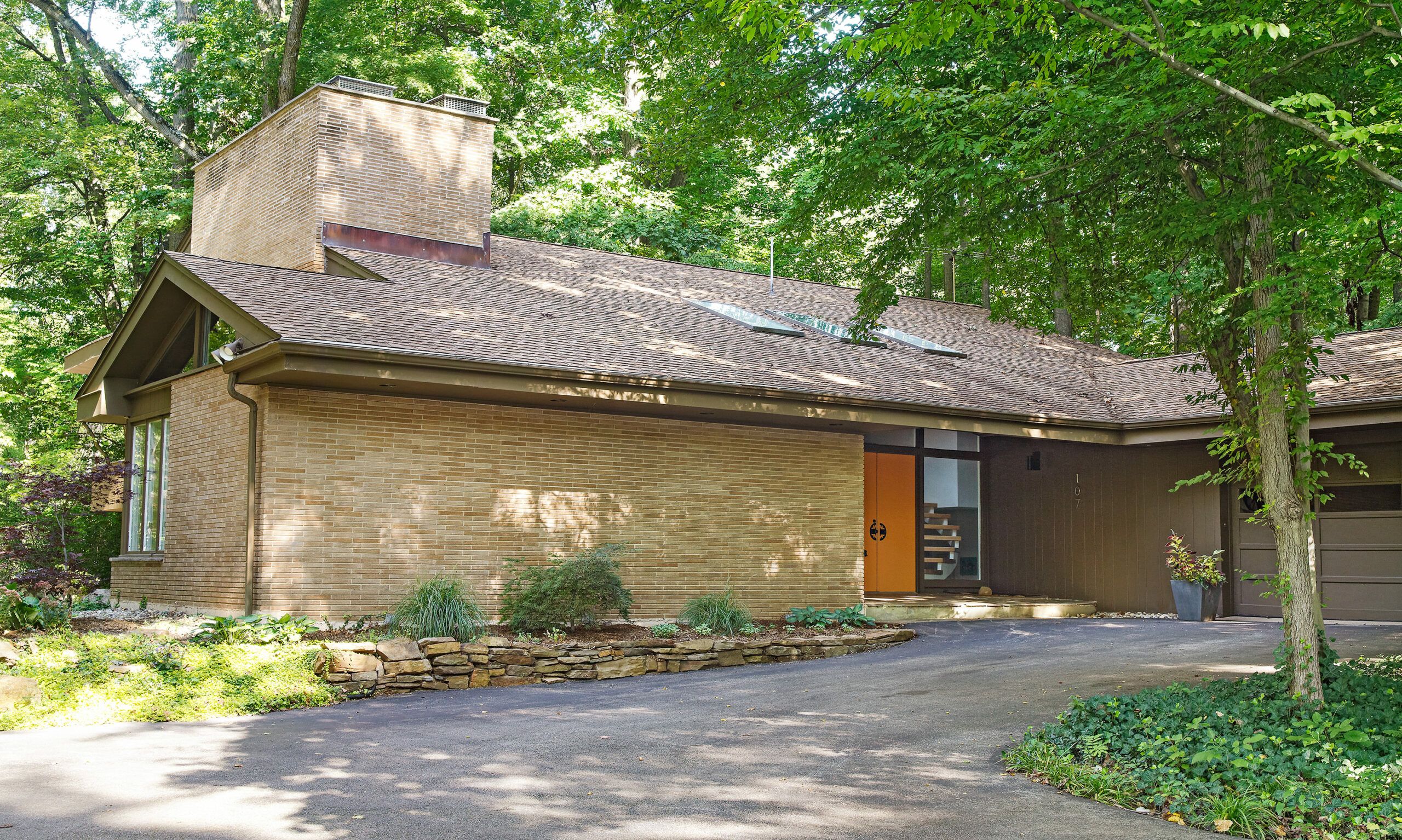
Despite the carefully curated interior, the house still pulls the eye to its bones and to the views outside. It was built, after all, into a slope, as if bowing to nature. “No matter what room I’m in, I can connect with the outdoors,” George says happily.
Shown: From the street, the house looks like a standard ranch with an attached garage. It expands as it moves down the slope, offering broad views in back of winding Shellpot Creek.
French drain and sump pump: ValueDry
Lively Wallpaper
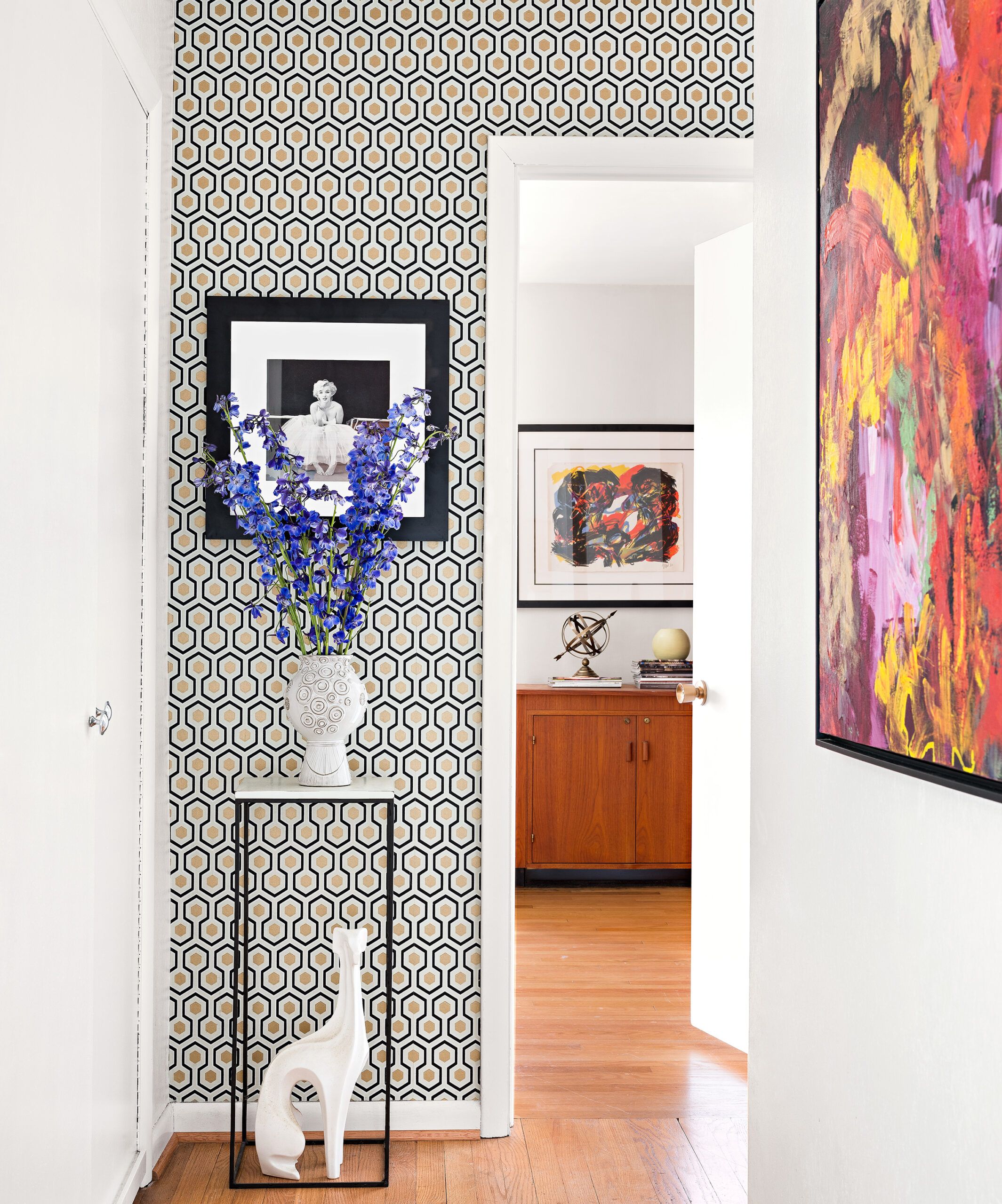
Michael agrees. “I have a few favorite things,” he says. “In winter it’s definitely the fireplace, but in mild weather it’s the indoor-outdoor vibe, and enjoying the creek and gardens from inside or out on the patio.”
Shown: Artwork and wallpaper enliven the upstairs hall.
Wallpaper: Cole and Son
Ceramic vase and whippet: Jonathan Adler
Oil painting (at right): C. Jones
Casual Eating Area
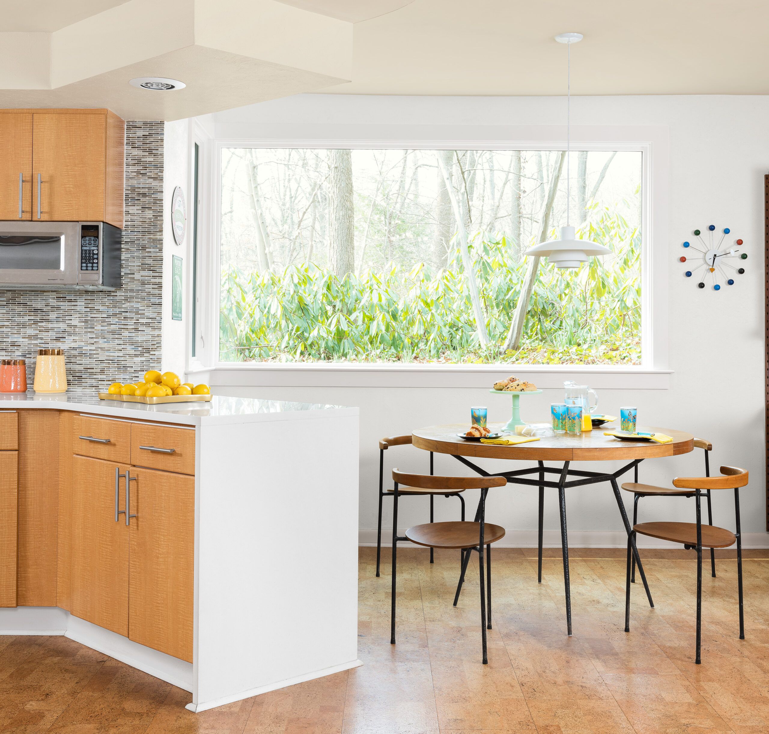
Both men talk about how magical it is to move around the multilevel open space, and how it lends itself to entertaining. “Everything flows so well,” George says, “yet if there’s only a few people it still feels intimate.”
“We do Mother’s Day, Thanksgiving, and a family reunion on Memorial Day,” he adds. “Everyone stays here.” Between extra bedrooms, sofas, and a Barcelona daybed, “we always have room for guests.”
Shown: With ceiling-hung cabinets over the small peninsula gone, the kitchen is even more open to the family room, which hosts a casual eating area.
Chairs: vintage
Table: Oly Studio
George Nelson wall clock: Vitra
Floor Plans
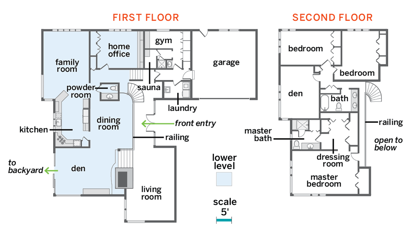
The 4,300-square-foot house still has its four bedrooms, two and a half baths, and working sauna (with shower). The homeowners furnished one bedroom as an upstairs den, renovated the master bath and powder room, and removed cabinets over a kitchen peninsula. They shied away from changing the layout, which is centered around a dramatic open, multilevel living space.
