Expansive Kitchen
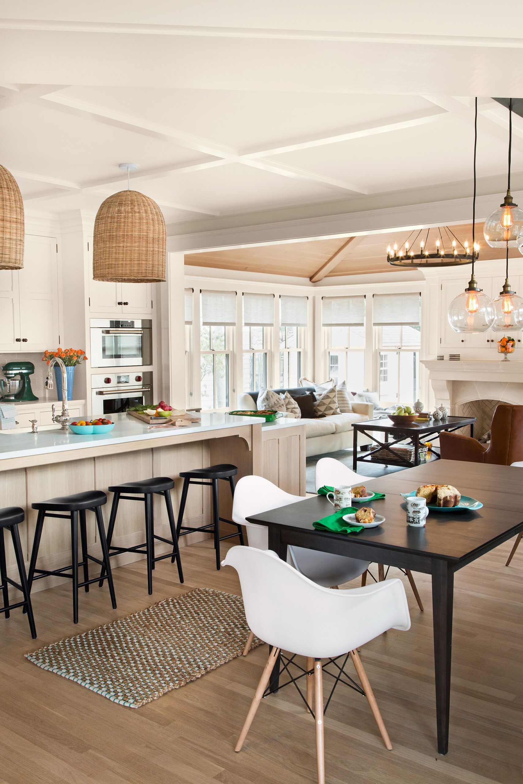
On a recent afternoon, as Nick and Emily Deldon’s extended family gathered at their home, the younger set could be found running laps around the first floor—making a loop from kitchen to dining room to front foyer to living room, and back through the kitchen. Soleil, the family Newfoundland, slept undisturbed on the family-room hearth, and the adults chatted around the kitchen island, where they could easily keep an eye on the action. “This would never have been possible before,” says Emily, recalling their daughter Serafina’s last at-home birthday party, when guests had to line up single file to be served in the tiny kitchen then make their way into the dining room. “Now the spaces make sense,” she says. “There’s room for everyone.”
The kitchen layout is designed to support a family who enjoys cooking as entertainment: A marble-topped center island with plenty of prep space runs parallel to a working wall of cabinets, with double ovens and a gas cooktop, the latter crowned with a showpiece brass-accented vent hood. There’s even a lower section of the island that functions as a baking center for Serafina. “All these details really make the house work for this family, while also keeping it true to the traditional craftsmanship of the era,” Norm says.
Shown: A steel I-beam allowed for wide-open spaces in the rear addition. Ceiling coffers and natural wood finishes reinforce the house’s Arts and Crafts style. The new kitchen’s expansive oak island has a gently whitewashed hand finish. The family room got a vaulted ceiling, walls of windows, and a fireplace.
ARCHITECTURAL DESIGN: Sharratt Design & Co.
INTERIOR DESIGN: Hudson Interior Designs
WINDOWS: Marvin
KITCHEN CABINETS: Kennebec Company
WALL OVENS: Wolf
ISLAND FAUCET: Kohler
RATTAN PENDANTS: Serena & Lily
BAR STOOLS: Room & Board
KITCHEN CHAIRS: Hudson
GLOBE PENDANT: Restoration Hardware
LED BULBS: Sylvania
Meet the Deldons
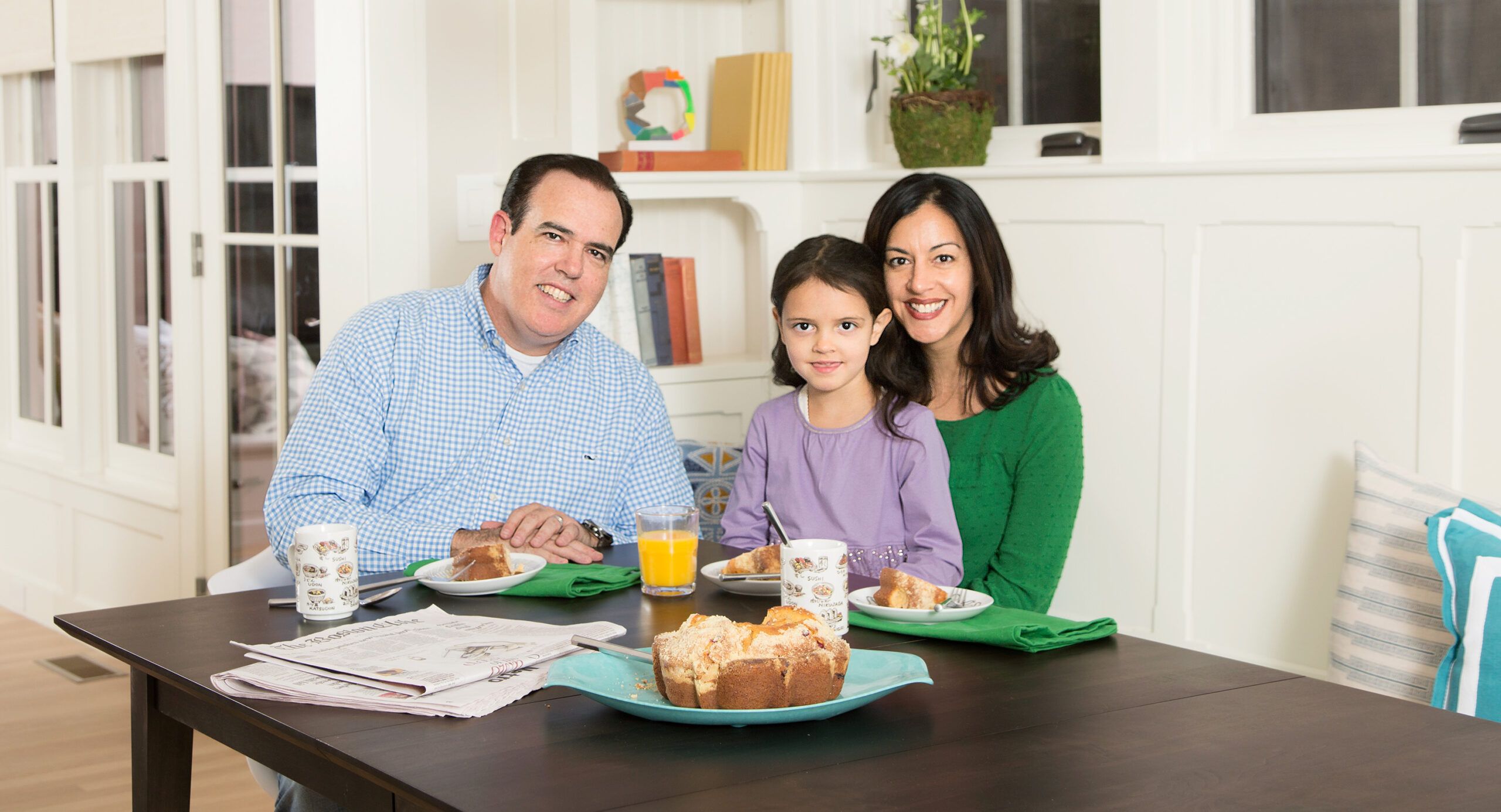
This was no case of instant gratification. After a decade of house hunting, the Deldons bought and lived in this Arlington, Massachusetts, home for three more years before moving out last April so that This Old House general contractor Tom Silva and his crew could begin renovating the 1909 house. Particularly important for the Deldons was ensuring that the end result would blend seamlessly—from gabled roofline to interior spaces to exterior architectural detail—with the house’s original Arts and Crafts style. “The idea was to honor the traditional craftsmanship of their house, but give the Deldons the spaces they needed,” says This Old House master carpenter Norm Abram.
Shown: Nick and Emily Deldon seated at the new kitchen table with their now 5-year-old daughter, Serafina.
KITCHEN TABLE: Room & Board
Family Room
The eight-month renovation addressed a multitude of flaws: a cramped 1960s galley kitchen, nonexistent gathering spaces, a decrepit side deck, an awkward mudroom entry, a walled-off living room that impeded circulation, the lack of a master bath, a deteriorating roof, dried-out-beyond-repair shingle siding, a misfit front-entry porch, and an old heating system that cost a fortune to run.
Building an 890-square-foot, three-story addition in the rear was key to the just-completed transformation, making way for a large open-plan kitchen leading to a window-lined family room on the first floor, a master bath on the second floor, and a light-filled crafts and play space on the third floor.
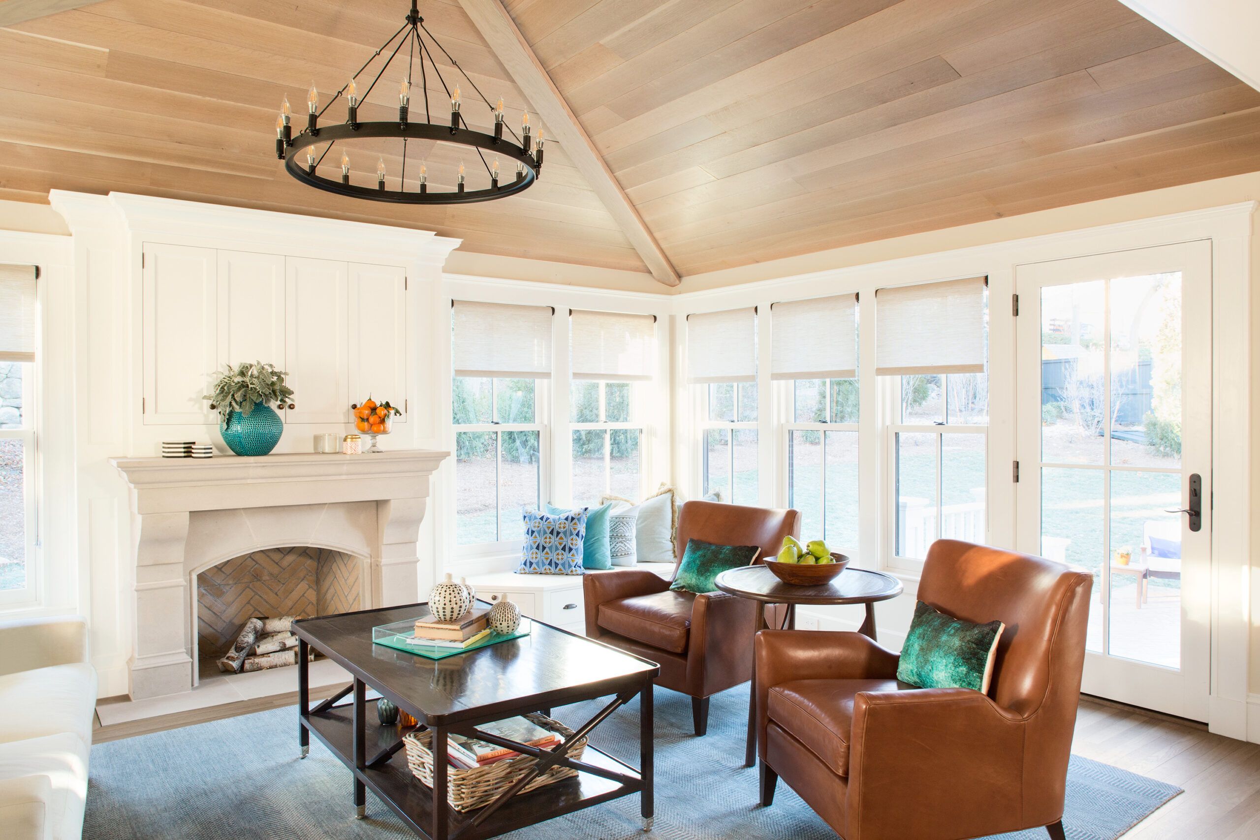
Shown: The 14-by-20-foot family room features a vaulted ceiling covered in whitewashed oak that matches the kitchen island. The fireplace’s precast stone mantel is topped with a TV cabinet.
WOOD CEILING: Kennebec Company
FIREPLACE SURROUND: Old World Stoneworks
RUG: Landry & Arcari
LEATHER CHAIRS: Mitchell Gold + Bob Williams
WINDOWS: Marvin
Exterior Details

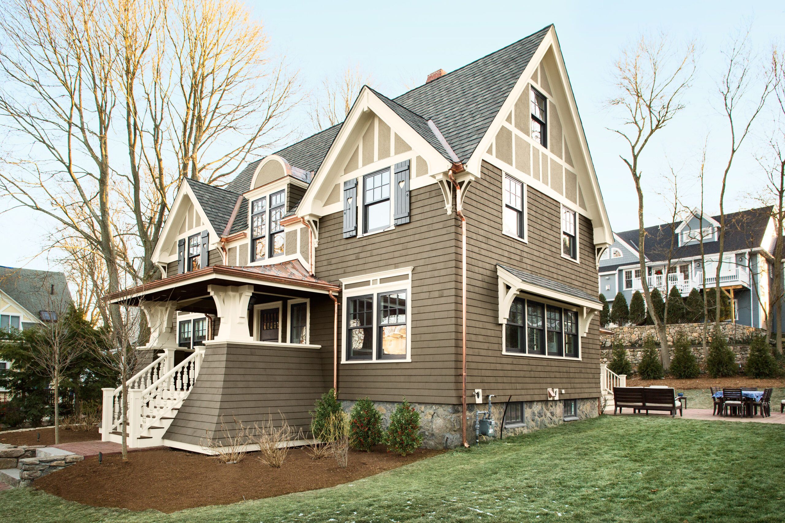
From Tom’s point of view, the success of the addition rested on one thing: support. A 28-foot-long, 10-inch-high, 1,000-pound steel I-beam replaced the original rear wall. “Steel gave us the option of having a family room that’s all windows with a floor plan open to the kitchen,” Tom says. The addition’s footprint is largest on the first floor—designed with a single-story family room that extends 14 feet into the backyard to accommodate the vaulted-ceiling focal point the Deldons wanted for the main gathering area, as well as a new fireplace and chimney.
Throughout the finished house, the interior design emphasizes traditional craftsmanship by incorporating natural materials and period details. “We wanted the architecture to be the standout focus, and let the interiors provide a subtle complement with neutral earth tones,” says interior designer Jill Goldberg.
Shown: The 1909 house is ready for another 100 years with new red cedar shingle siding, PVC trim, “splash stucco” in the gable ends, and a dramatic new entry porch.
EXTERIOR TRIM: Azek
PAINT: Benjamin Moore
SHUTTERS: Timberlane
Dining Room
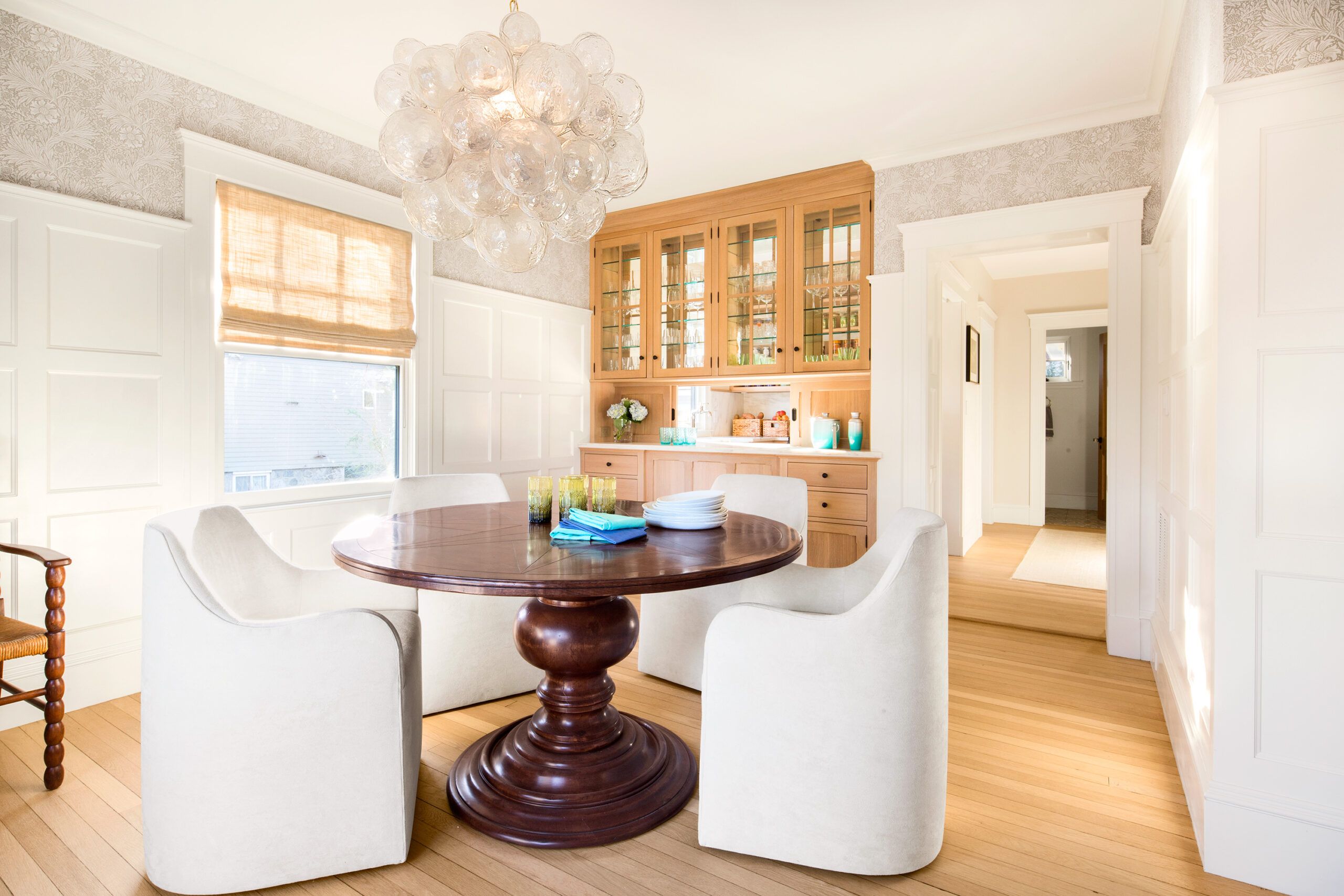
As in any renovation, not everything went as originally planned. Though the Deldons had envisioned lightening up the dark living room by painting the period woodwork white, they changed their minds midproject after painting contractor Mauro Henrique did some experimenting. After stripping one section of the living room’s original white oak wainscoting—which had grown quite dark over the years—he asked Emily and Goldberg to take a look. It was an aha moment, confirmation that the woodwork was too beautiful to cover up. “Our concern from day one, when we stepped in the house, was that the front rooms felt dark,” Emily says. “Even though white paint would have been effective in lightening them up, painting over the oak never felt quite right.”
Shown: New MDF wainscot in a grid pattern and a classic Arts and Crafts wallpaper dress up the dining room. Original white oak floors were sanded and finished with a matte clear coat for a lighter look. The built-in has a pass-through to the butler’s pantry.
DINING ROOM BUILT-IN CABINETS: Kennebec Company
SHADE: The Shade Store
WALL COVERING: William Morris
CHANDELIER: Oly
FLOOR FINISH: Lobadur
Butler’s Pantry
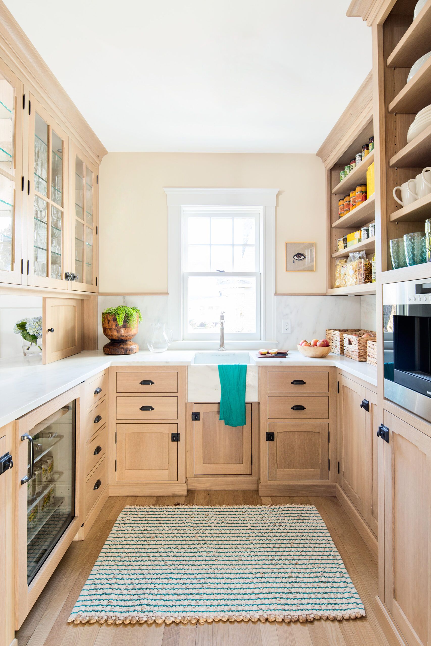
The biggest transformation, however, is unquestionably the addition of the kitchen and family room—the heart of the house for the Deldons today and the area that best shows how the renovation honors the house’s Arts and Crafts style while incorporating more-functional new spaces.
For the kitchen, designer Heather Kraussé combined brush-painted white perimeter cabinets with a whitewashed oak island. She chose white oak for the island and for a built-in in the adjoining family room as a nod to the house’s original woodwork, but with a twist. The cut of the oak is rift-sawn (rather than quarter-sawn) for a clean-lined straight grain, and the custom finish—a water-based dye sealed with a flat-sheen urethane—gives it a delicately bleached look in keeping with the lighter, more contemporary palette.
Shown: New floor-to-ceiling cabinets in the butler’s pantry help minimize kitchen clutter.
PANTRY CABINETS: Kennebec Company
PANTRY COFFEE SYSTEM: Wolf
BEVERAGE FRIDGE: Sub-Zero
COUNTERTOP, SINK: Vermont Quarries Corp.
PAINT: Benjamin Moore
Wainscot and Other Details
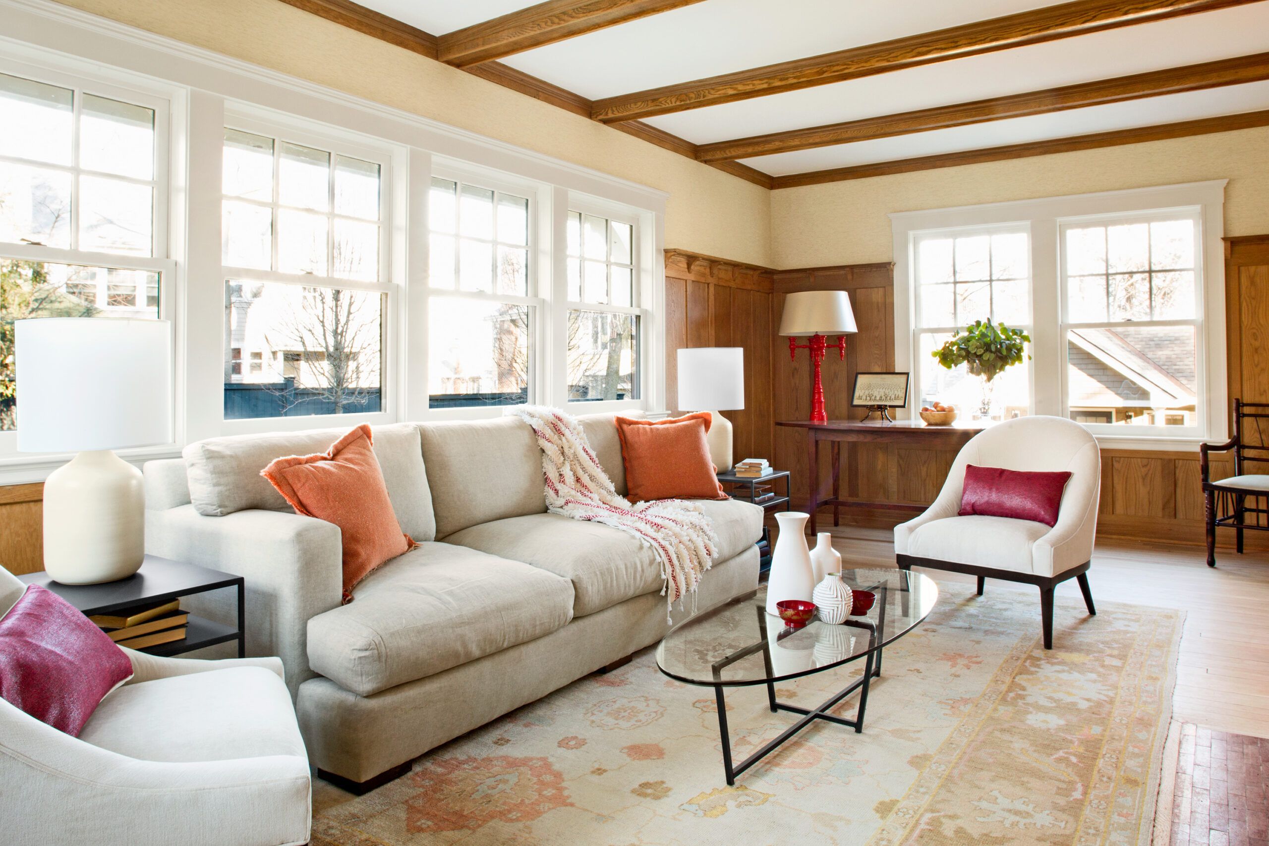
Henrique stripped not only the living room wainscot but the ceiling coffers and crown molding, too, clear-coating them with a matte-finish water-based polyurethane to preserve their lighter look. He worked similar magic with the original flooring—white oak on the first floor and birch on the second—sanding the boards and sealing them with two coats of a self-sealing water-based clear finish that gives the look of bare wood. “Having these wood surfaces restored instead of covered up is a great solution,” Tom says. “It’s worth the extra effort in a house from this era.”
Shown: The living room’s original white oak wainscot, ceiling coffers, and crown molding—which had darkened over time—were stripped and given a matte clear coat for a lighter look. Double-pane, aluminum-clad wood windows boost energy efficiency.
SPRAY-FOAM INSULATION: Icynene
WINDOWS: Marvinhttp://www.marvin.com/
WOOD FINISHES: Lenmar
LIVING ROOM RUG: Landry & Arcari
SOFA: Studio 534
UPHOLSTERED CHAIRS: Mitchell Gold + Bob Williams
WALL COVERING: Phillip Jeffries
SHADES: Smith & Noble
Serafina’s Bedroom
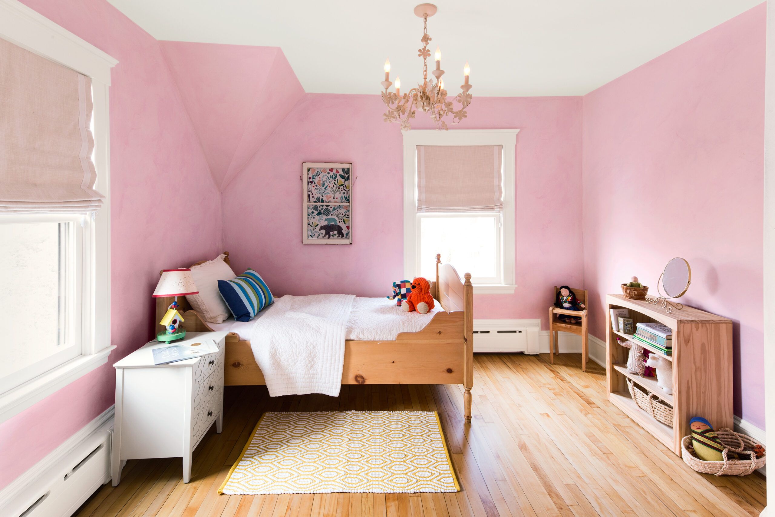
Shown: Serafina’s bedroom walls are lazure painted with a base coat of clay paint, followed by multiple layers of thinned acrylic paint for a watercolor effect.
PAINT: Benjamin Moore
Master Bedroom
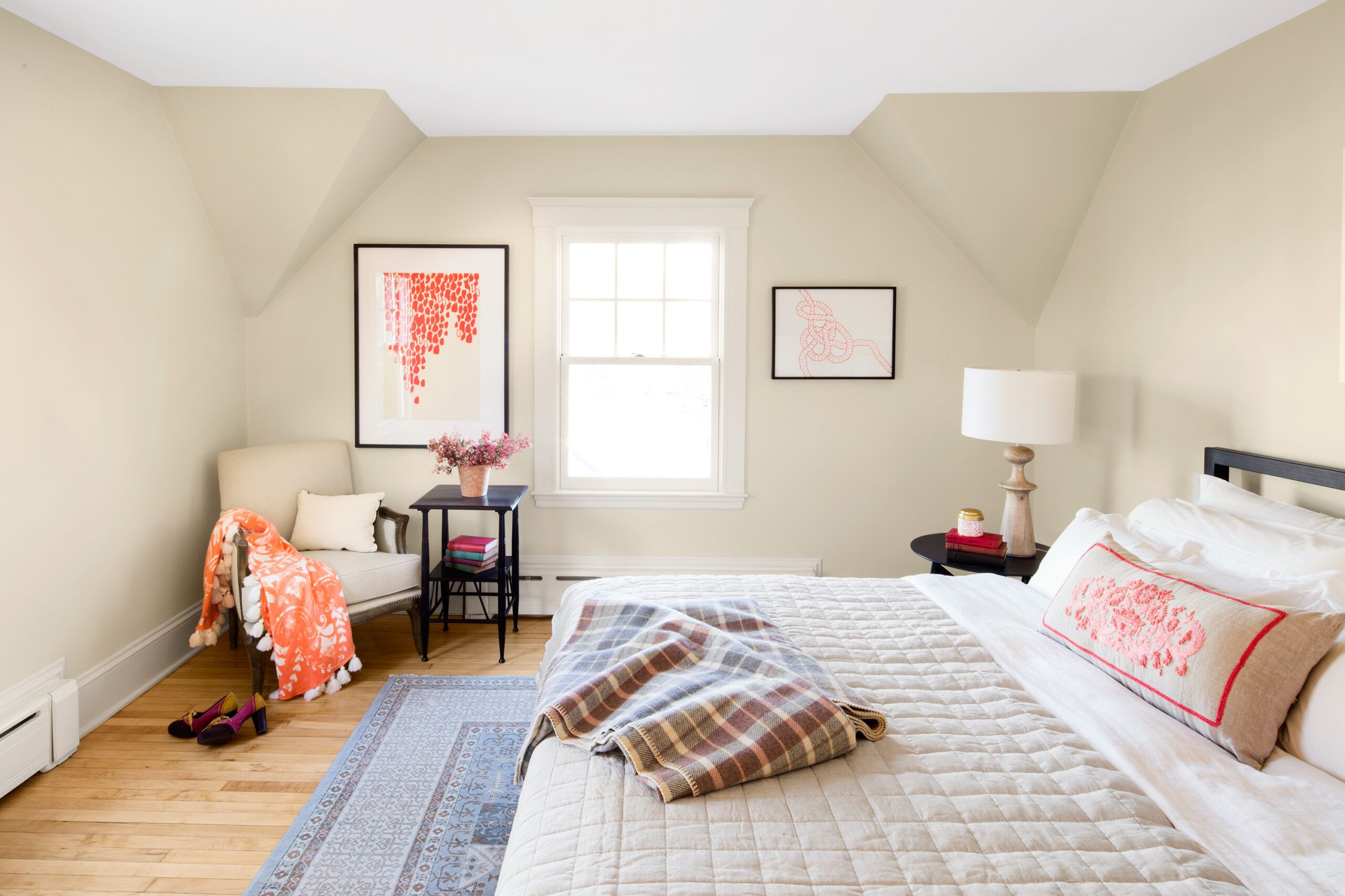
Shown: Soft neutrals give the existing master bedroom an airy feel.
PAINT: Benjamin Moore
TABLES: Room & Board
ARTWORK (BY CHAIRS): Minted
PLAID BLANKET: Pine Cone Hill
SHEETS, ORANGE THROW: Garnet Hill
QUILT PILLOW: West Elm
Master Bath
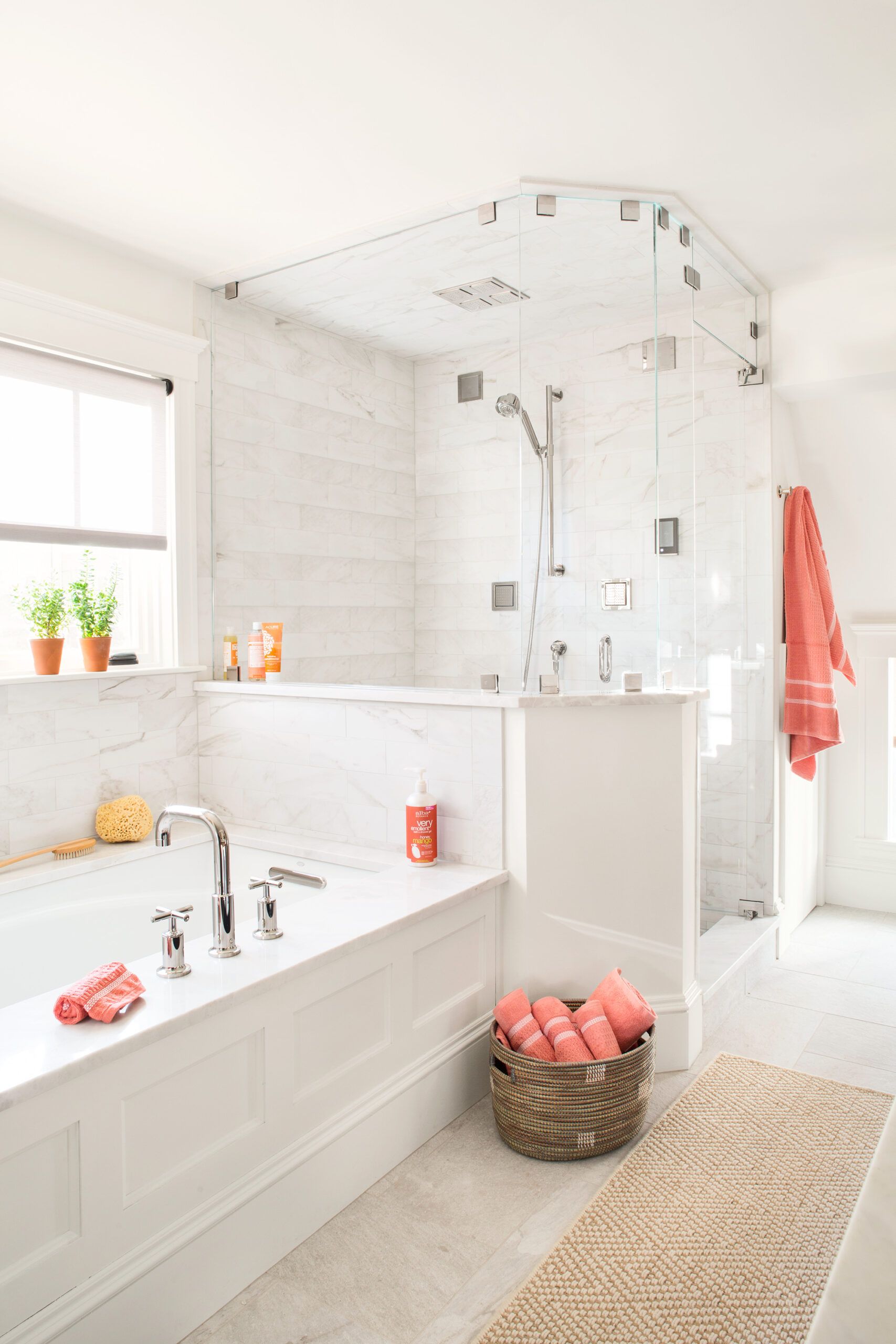
Certain elements of the renovation embrace the modern era thoroughly, such as the second-floor master bath, with its spa-like sensibility, a shower with touch-screen controls for integrated sound, water, steam, and light features, plus a hydrotherapy tub that offers sound vibrations and massaging bubbles. In addition to supporting such luxuries, the whole-house plan to increase energy efficiency also adds comfort and provides welcome cost savings. “Installing a super-efficient gas-fired condensing boiler is just one part of it,” says This Old House heating and plumbing expert Richard Trethewey. “Better insulation, new windows, and right-sizing the heating system all contribute.”
Shown: The new master bath has a shower system with touch-screen settings for music, steam, body sprays, and lighting. For convenience, the shade above the hydrotherapy tub is remote controlled.
BATH FIXTURES AND FITTINGS: Kohler
ACOUSTIC INSULATION: Roxul
VENT FAN: Panasonic
SHOWER DOOR: Banner Glass
WALL TILE: Emil America
MOTORIZED SHADE: The Shade Store
Front Entry
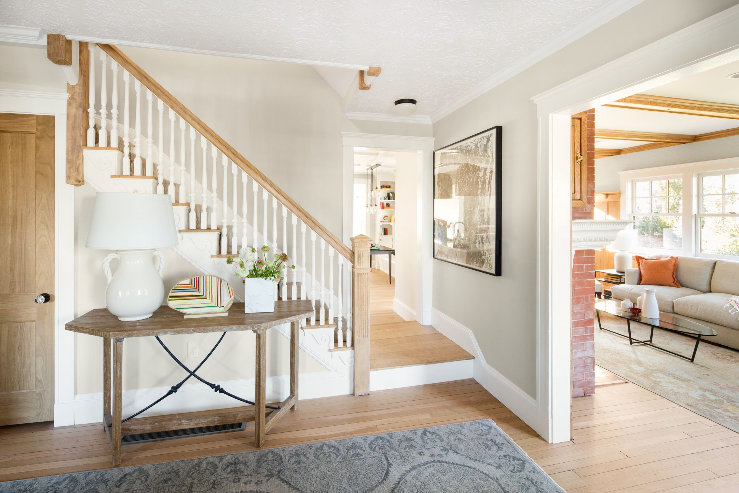
For Emily, it’s also the everyday things that make living in the house a delight. “We now enter the house through a new back door and a tiled mudroom, which makes so much more sense,” she says. “The old mudroom was dark and cramped and led into a carpeted playroom that we could never keep clean, especially with the dog’s muddy paws.”
The front entry has an open-plan feeling with views into the living room at right and the kitchen straight ahead. Original white oak floors were sanded and given a clear coat for a lighter look.
CLEOPATRA WALL COVERING (CEILING): Lincrusta
PAINT: Benjamin Moore’s Maritime White
CONSOLE TABLE: Studio 534
TABLE LAMP: Hudson Valley
Open Plan
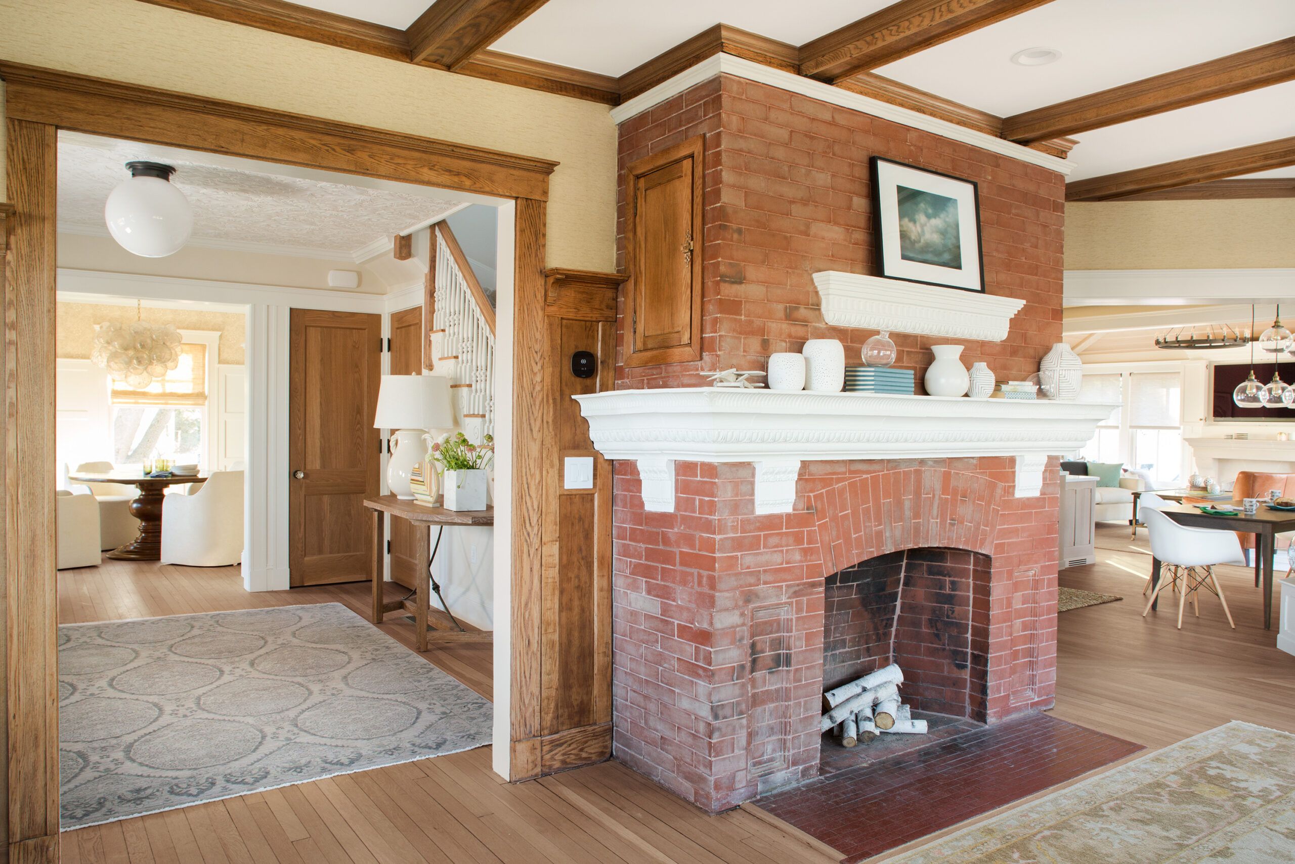
Views from the living room to the front entry and dining room on one side, and to the kitchen on the other, convey a sense of openness. The living room’s brick fireplace was repointed and the painted clay mantel was repaired using new cast-cement pieces, to preserve the original look.
WALL COVERING: Phillip Jeffries Intertwined 6230 in Cozy Cream
PAINT: Benjamin Moore’s White Dove (trim)
RUGS: Landry & Arcari
Cooking Wall
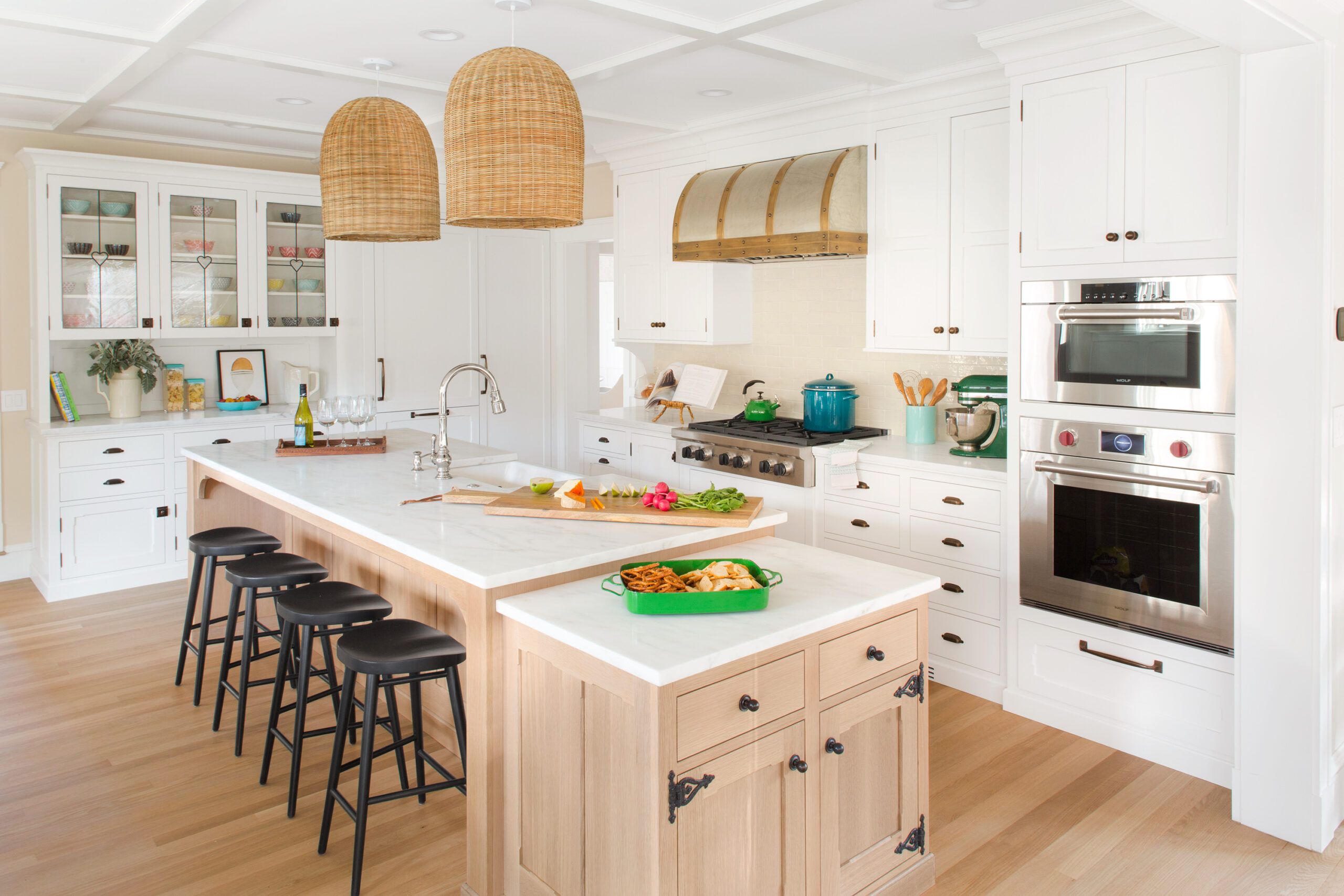
The kitchen’s cooking wall includes a wall oven with a convection steam oven stacked above it, a gas cooktop, a glazed-tile backsplash, and a custom hood made of nickel silver and brass over a stainless steel liner. The refrigerator and freezer, located next to the glass-door cabinets, are finished with painted wood panels.
RANGE, WALL OVENS: Wolf
CUSTOM VENT HOOD: The Tin Shop
REFRIGERATOR: Sub-Zero
BAR STOOLS: Room & Board
CABINETS: Kennebec Company
IMPERIAL DANBY MARBLE COUNTERTOPS: Vermont Quarries Corp.
Eating Area
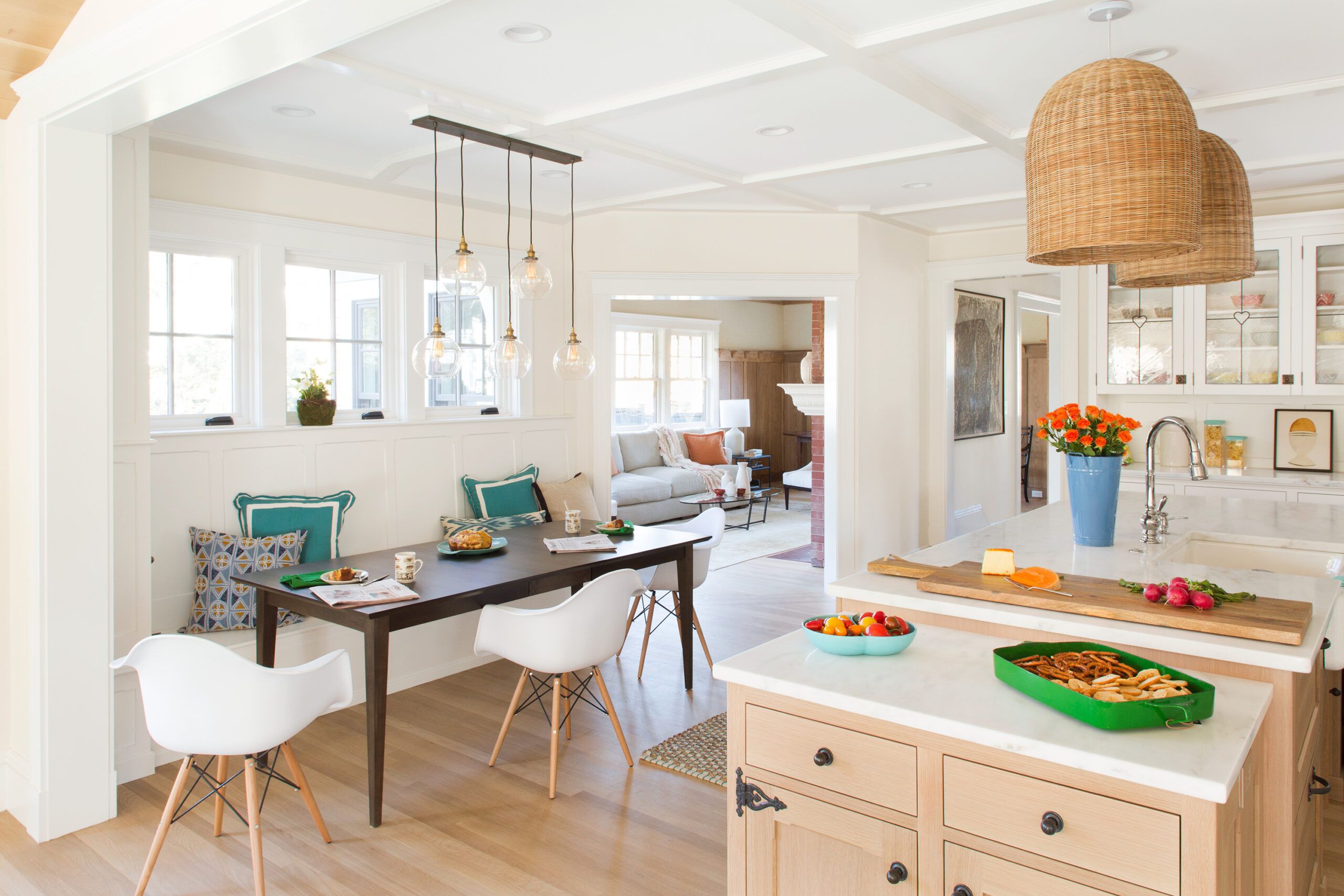
The kitchen eating area includes a built-in banquette under a bank of windows; clear glass pendants above the kitchen table have an airy see-through effect. The opening to the living room was created during the renovation.
KITCHEN TABLE: Room & Board
CHAIRS: Hudson
GLOBE LIGHT FIXTURE: Restoration Hardware
RATTAN PENDANTS: Serena & Lily
WINDOWS: Marvin
Built-Ins
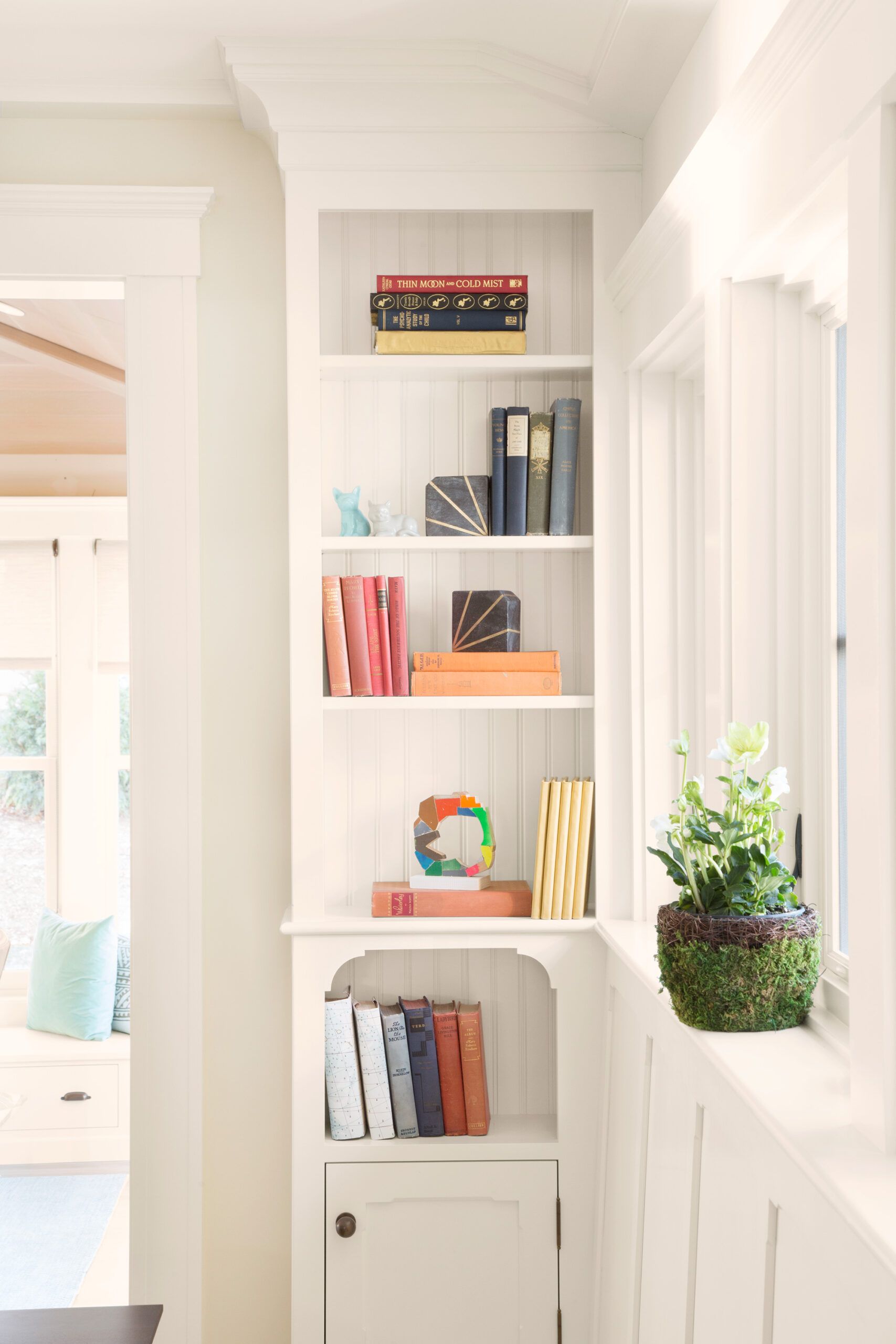
The built-in bookcase near the kitchen eating area showcases the fine craftsmanship of the new cabinetry.
BUILT-IN: Kennebec Company
Half Bath
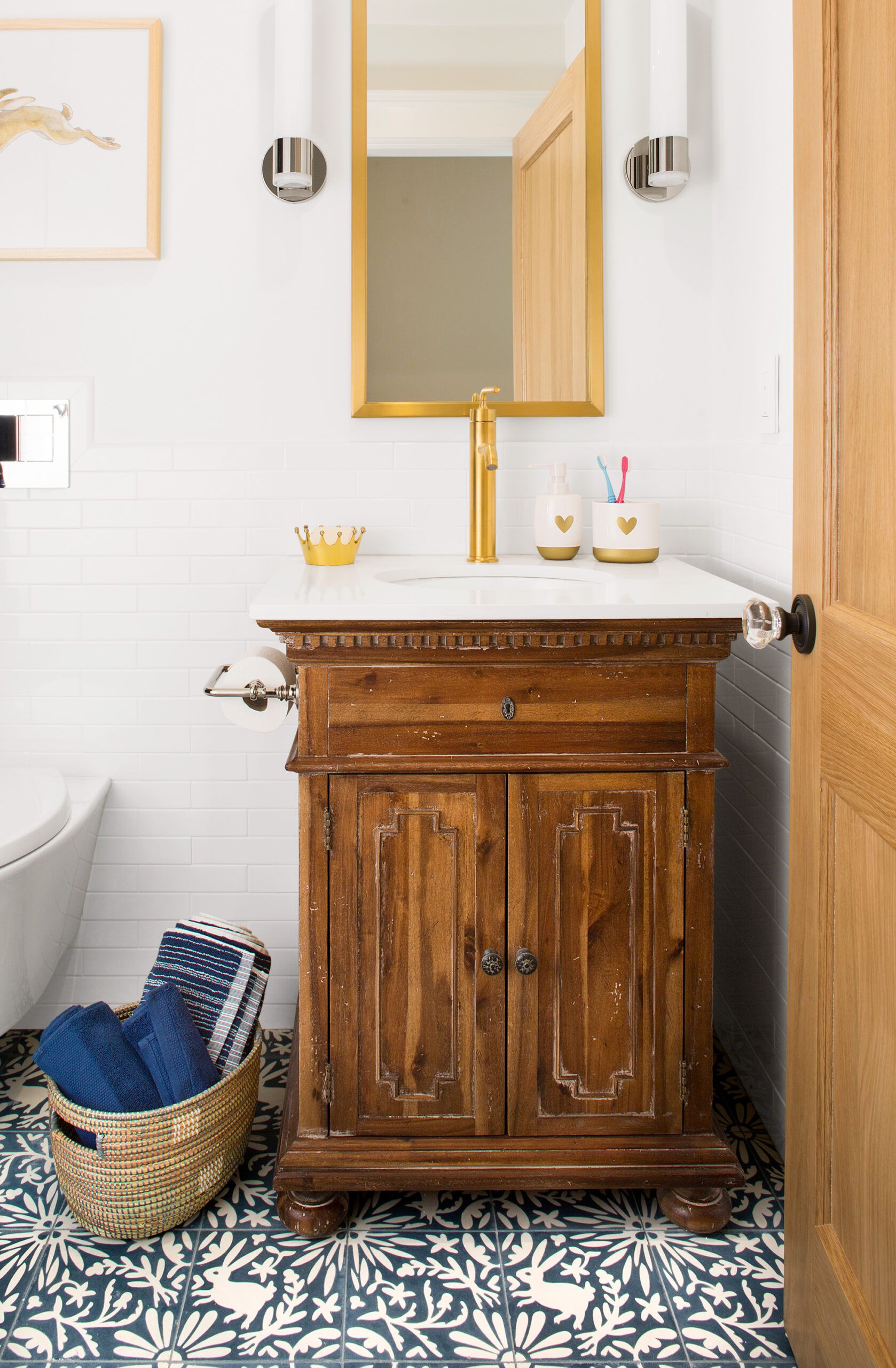
The cement tile floor in the second-floor hall bath has a pattern reminiscent of English Arts and Crafts style; a reproduction vanity adds to the room’s period look.
VANITY: Restoration Hardware
FIXTURES, FITTINGS, AND SCONCES: Kohler
CEMENT FLOOR TILE: Grow House Grow
INTERIOR DOOR: Homestead Interior Doors
Hidden Alcove
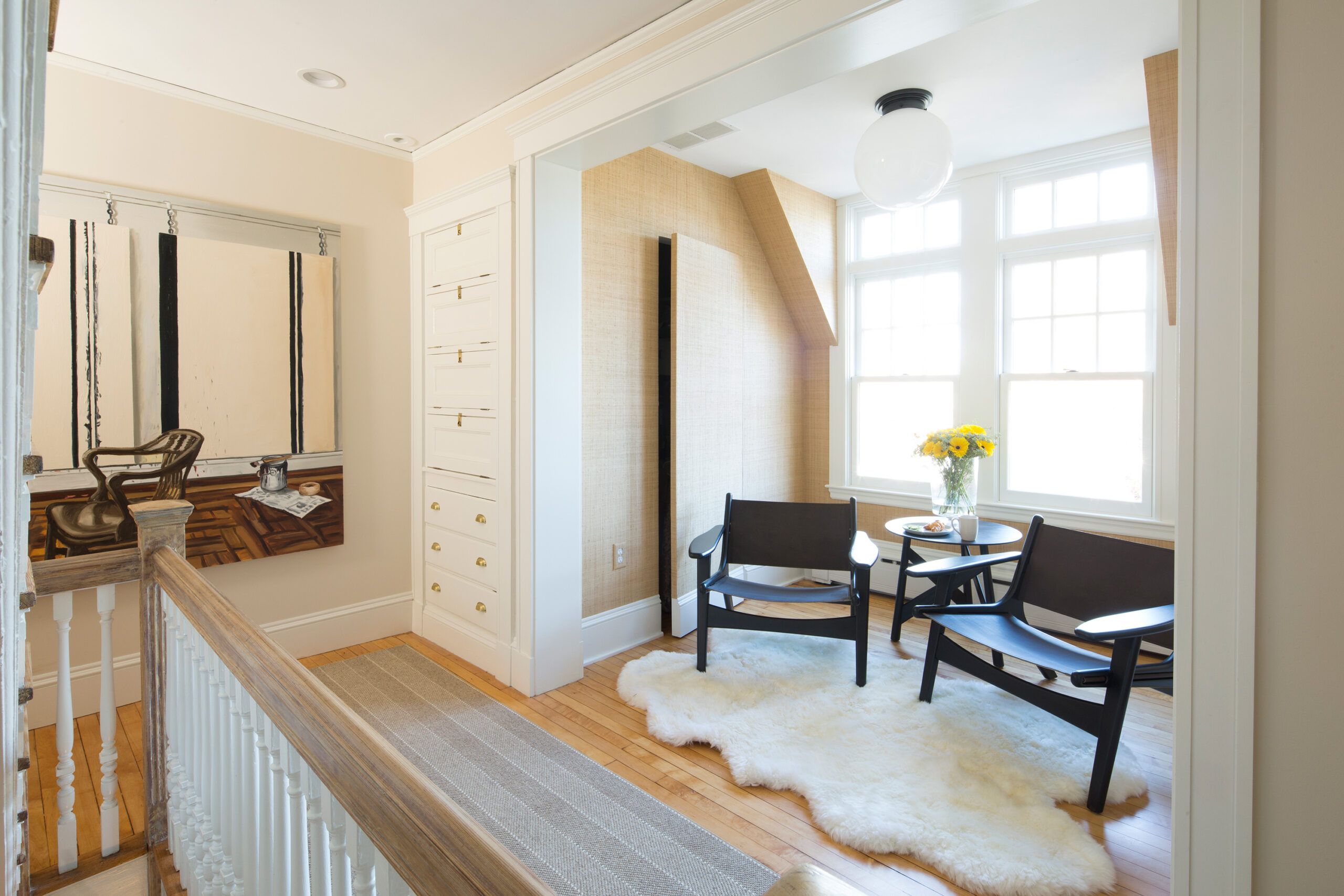
A windowed alcove along the second-floor hallway is spacious enough for a pair of reading chairs. The “hidden” door, accessed via push latch, leads to a closet.
AFRICAN RAFFIA WALL COVERING: Phillip Jeffries
PAINT: Benjamin Moore’s Maritime White (walls) and White Dove (trim)
CHAIRS: Room & Board
RUNNER: Landry & Arcari
SHEEPSKIN RUG: Overstock
LARGE PAINTING: Carroll and Sons
Craft Room
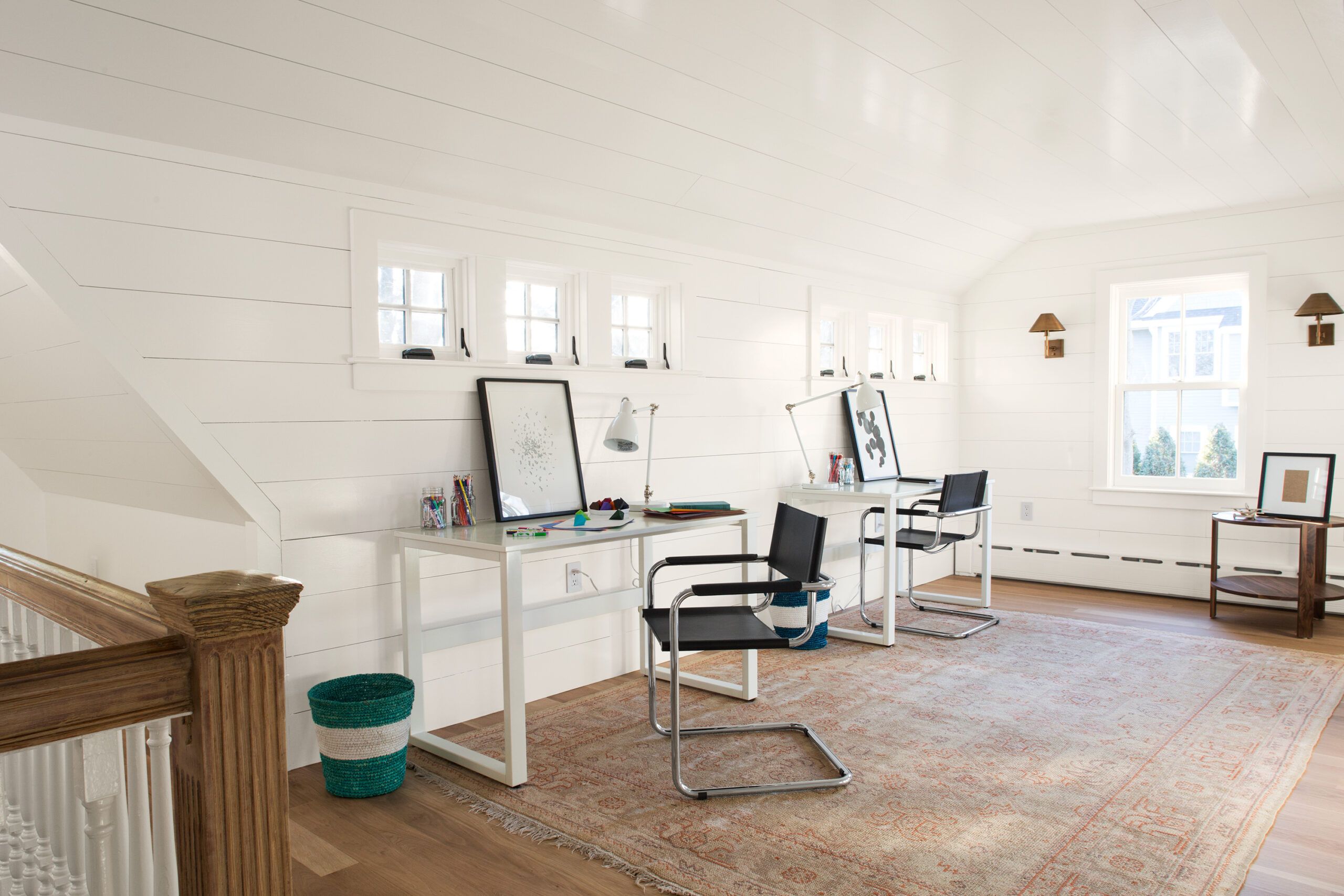
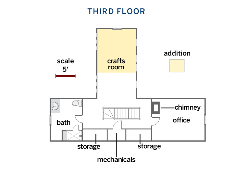
The third floor of the addition created room for a craft space, which was given a bright and casual look with shiplap-style pine walls and ceiling.
WHITE OAK FLOORING: Lumber Liquidators
FURNITURE: Room & Board
SCONCES: Restoration Hardware
PAINT: Benjamin Moore’s White Dove
Office at the Top
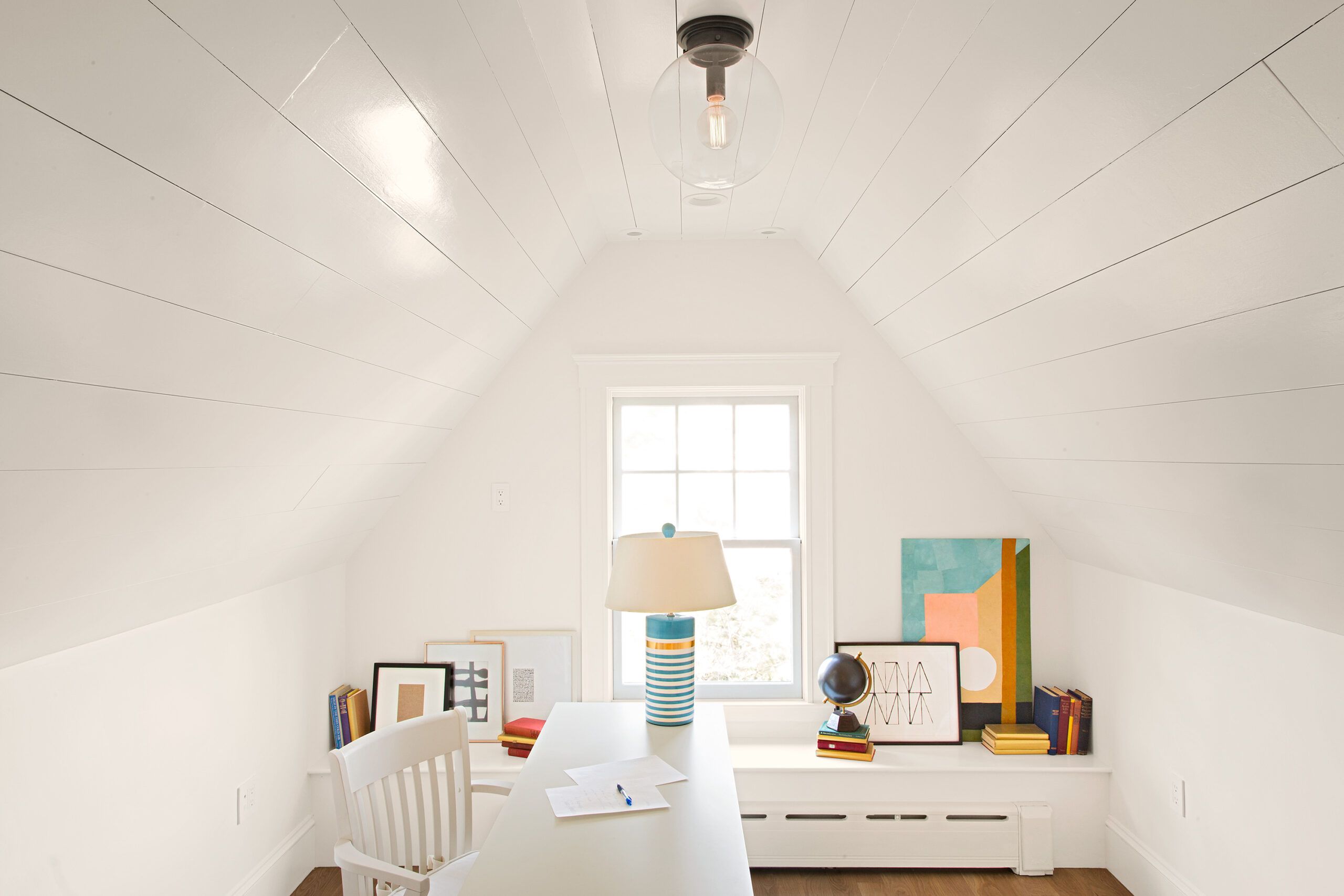
The existing third-floor office received shiplap-style painted pine on the walls and ceiling as well as a new window.
CEILING LIGHT: Restoration Hardware
LAMP: Hudson Valley
DESK AND CHAIR: Pottery Barn
PAINT: Benjamin Moore’s White Dove
WINDOWS: Marvin
Guest Bath
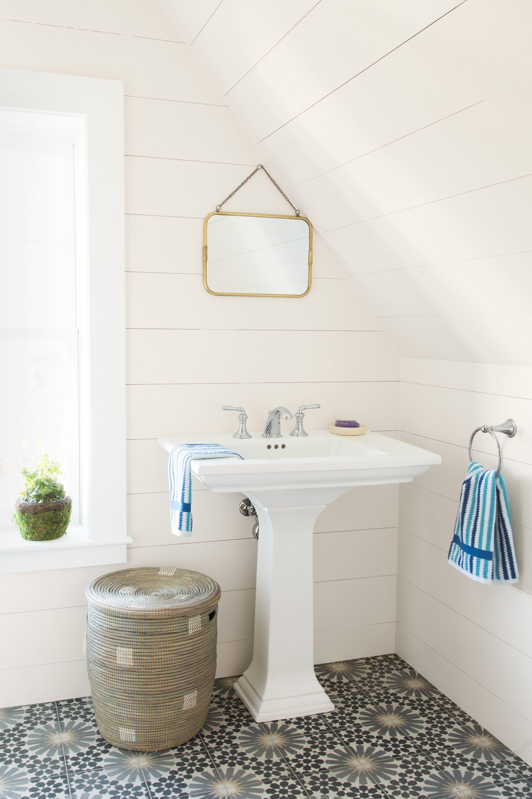
An existing bath on the third floor was transformed with shiplap-style painted pine walls and ceiling, a cement tile floor, a pedestal sink, and a new window.
SINK, FAUCET: Kohler
STRADA 9 CEMENT FLOOR TILE: Tabarka Studio
WINDOWS: Marvin
BASKET: Garnet Hill
PAINT: Benjamin Moore’s White Dove
Third Floor Plans
Now that the construction dust has settled, Nick says, “We finally feel that we have the setup to have great times with friends and family at home.”
Outdoor Living Space
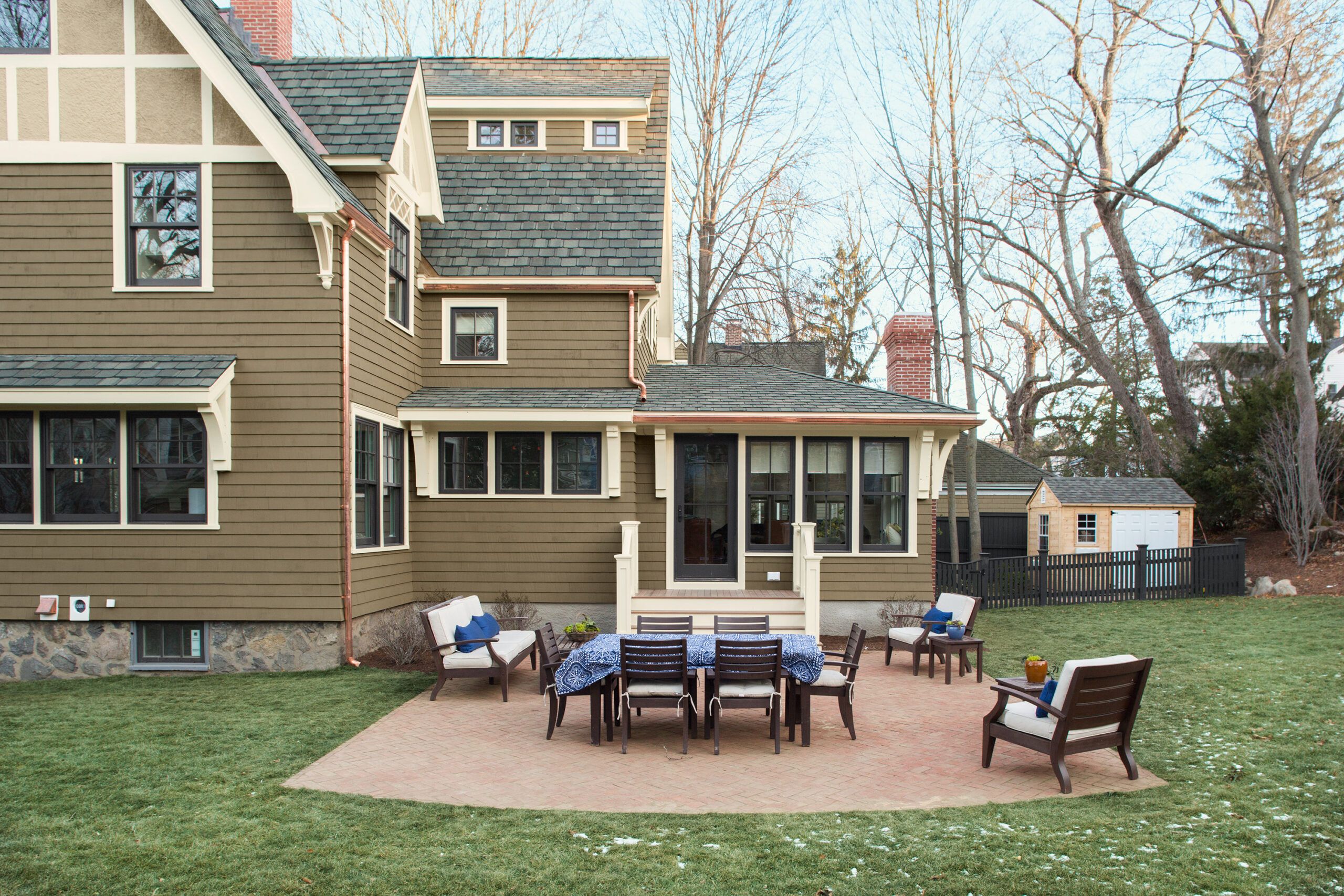
The exterior plan by landscape architect Kim Turner adds the crowning touch—living and entertaining space outdoors, too. A brick patio, laid in a herringbone pattern by This Old House landscape contractor Roger Cook’s crew, is easily accessed from the family room; plantings around the perimeter of the yard add privacy. Both of these additions are key to the family’s enjoyment of the house going forward. “It’s inspiring to have natural light pour into the family room and to be able to get to our backyard so easily,” says Emily, who has been busy planning a picnic get-together on the patio—with no real limit to the number of guests she could invite.
The rear addition rises three stories, with a single-story extension for the family room and a French door providing easy access to the new brick patio.
BRICK PAVERS: The Stiles and Hart Brick Company
WINDOWS AND DOOR: Marvin
EXTERIOR TRIM: Azek
FENCE: Walpole Outdoors
LANDSCAPE LIGHTING: Commonwealth Landscape Lighting
MORE:
