Aurburndale Goes for the Bold
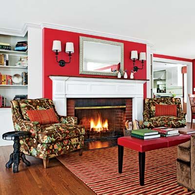
Remodeling is no task for the timid—especially if you’ve barely lived in your house before taking the plunge. But a fast-track timetable suited Allison and Raveen Sharma, owners of the latest This Old House TV project, just fine. Before buying their 1940 Colonial Revival in Auburndale, Massachusetts, the couple asked their architect for ideas on updating it. Scarcely more than a year later, they’re living in the sunny, colorful home of their dreams, courtesy of the TOH TV crew and a design team that understood and improved upon the couple’s vision.
Shown: Red walls set off by white trim offer a dynamic backdrop for the revamped living room.
Paint: C2 Paint
Wall sconces: Hudson Valley
Upholstered furniture: Pearson Furniture
Rug: Merida Custom Rugs
Before: Living Room
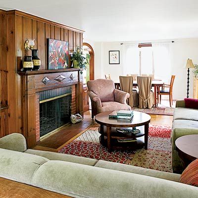
To get there, they took down walls, added windows, and were even willing to ditch some original details. “Many folks shy away from doing this, but it’s better to replace or rebuild when old materials aren’t of high quality or if the original design interferes with a sensible floor plan,” says TOH general contractor Tom Silva. Read on to see how daring decisions paid off.
Shown: Stained knotty pine around the fireplace looked heavy and dark.
After: Playing with Color
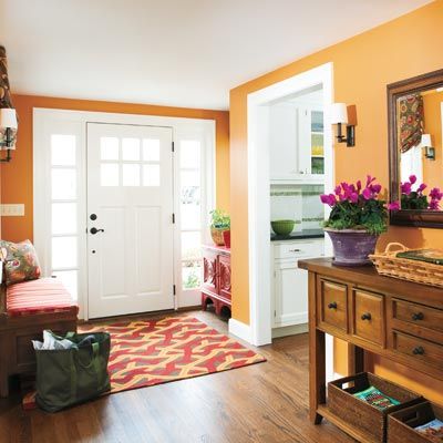
Pumpkin walls and a vivid rug add personality to the bumped-out entryway, but they’re not overwhelming. “It can be a challenge to use different colors in an open floor plan without making the house look cartoonish,” says Melissa Gulley, the project’s interior designer.
Front door: TruStile Doors
Door hardware: Kwikset
Security system: Stanley
After: Downstairs Powder Room
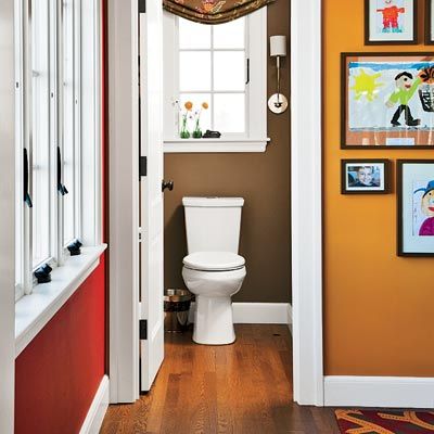
Sticking with warm, deep tones did the trick, where a red living room wall meets the powder room and foyer. “These shades complement each other yet make the spaces feel distinct,” says Melissa Gulley
Powder room ventilation fan: Broan-NuTone
Window treatment fabric: Duralee
Window treatment construction: Marylou Fraser
Before: Kitchen
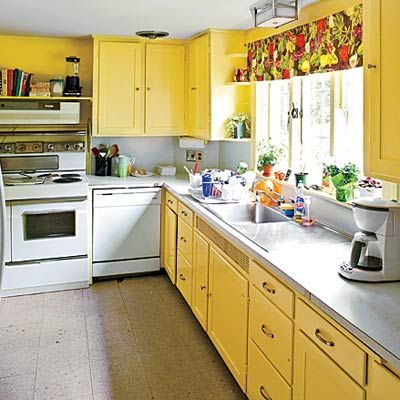
The old kitchen was narrow and isolated from the rest of the house.
Kitchen After: For Cooks and Eaters, Too
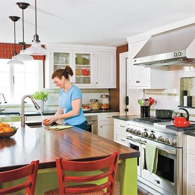
The airy new kitchen is much better integrated. A wood-topped island seats the family of four and creates two distinct zones, one for food prep and cooking on the range side, and a second for grabbing snacks on the fridge side.
Appliances: GE
Cabinets: Premier Custom Built
Wood countertop: The Grothouse Lumber Company
Backsplash: Tile Showcase
Kitchen After: Designed for Two
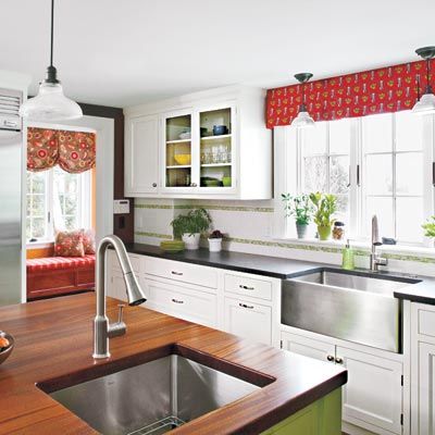
“Allison and Raveen cook together, so having an extra prep sink really helps them work efficiently,” says Donna Venegas, the project’s kitchen designer. A microwave tucked under the countertop lets the kids heat up leftovers without assistance. The white color scheme is warmed up by tropical-green accent tile and island cabinets, walls in chocolate brown, red bar stools, and a coordinating window treatment.
Granite countertop: Stone Technologies
Plumbing fixtures: American Standard
Smoke alarms: Kidde
Dining Room After: Tidy Space
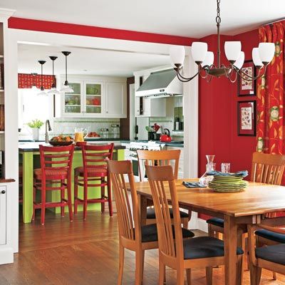
The table stayed in the same place, but the arched opening to the kitchen was widened and made square to improve traffic flow between these two areas. “The dining room table is now centered in the opening, which makes for a much better layout,” says TOH general contractor Tom Silva.
Before: Sunporch
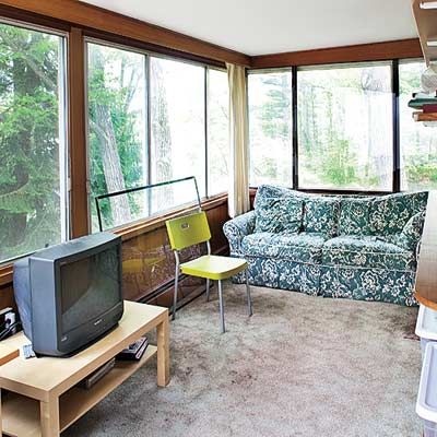
The old sunporch boasted terrific views of the Charles River. But at a mere 7 feet
deep and lacking insulation, it wasn’t the most comfortable place to hang out.
Sunporch After: A Bright Spot
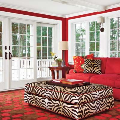
In its place rose a larger sunroom that opens onto a deck. Walls of windows and stairs that descend from
the deck to the backyard add a welcome connection between inside and out.
Windows: Andersen
Decking: Trex
Radiant heat: Uponor
High-velocity HVAC: The Unico System
Sunporch After: Places to Gather
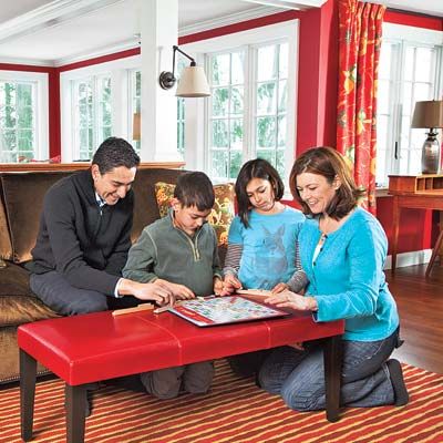
With the living room and sunroom acting as a continuous space, the Sharmas have lots of options for socializing with their kids and guests. “We’re casual people. The open floor plan really suits us, and we love how the sunlight pours in here,” says Raveen.
Wood flooring: Lumber Liquidators
Before: Basement
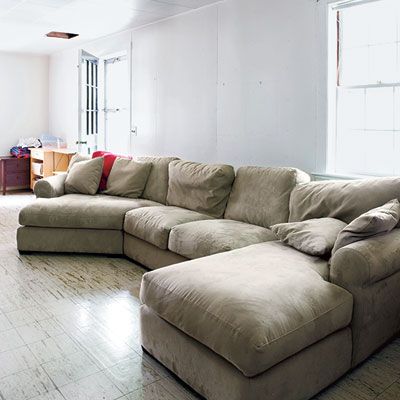
The basement was once dominated by an oversize sectional.
Basement After: Comfy and Cozy
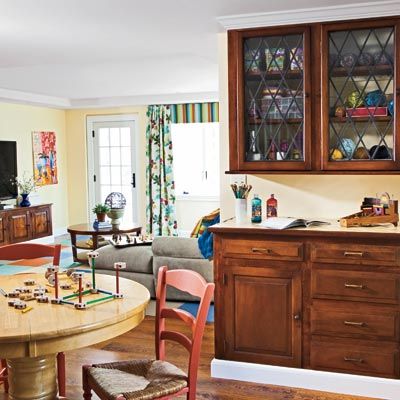
Yes, this is a basement. The walk-out, enlarged below the sunroom, now features a TV room and an area for playing games and making crafts. The cabinets were relocated from the dining room and foyer.
Closet systems: The Home Depot
Before: Exterior
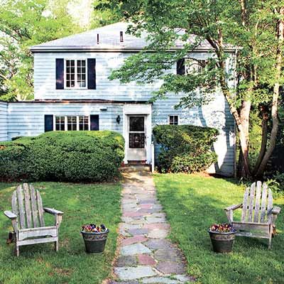
The existing house’s ho-hum facade needed work.
Exterior After: Big Curb Appeal Boost
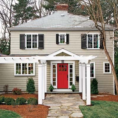
Architect Harriet Christina Chu suggested a pergola to add visual appeal and draw attention to the new gabled entry. A small window above it also highlights this focal point. The final touch: a classic neutral color scheme, with a red door that hints at all the lively spaces beyond it.
Pergola: Walpole Woodworkers
Shutters: Atlantic Premium Shutters
Exterior lighting: Hinkley Lighting
Floorplan: More Windows Than Walls
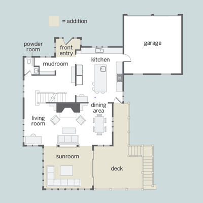
The sunroom flows seamlessly into the living room and dining area, and a new deck provides extra living space in warm weather.
