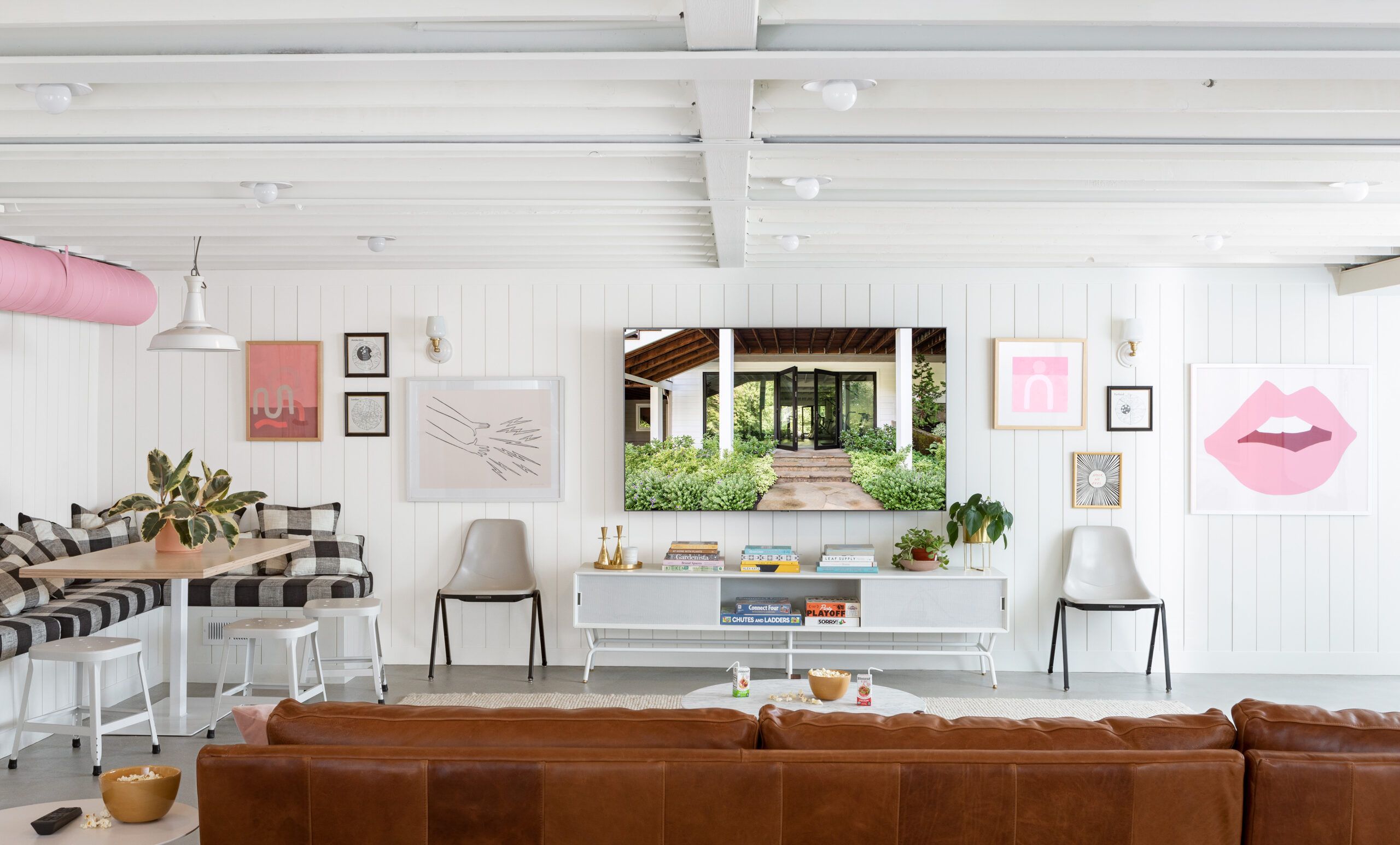
Can’t remember being impressed by a basement? Then this transformation might be a first. The windowless central gathering space downstairs in this 1950s house in Portland, OR, started out dimly lit and all chopped up. “Structural columns and walls divided the space—it was very dark and just grody,” says designer Max Humphrey, who tackled the redesign after renovating the upstairs. Simply put, he adds, “You didn’t want to hang out down there.” With two girls under 10, the family longed for a bright, open “great room” for playing games and enjoying movie nights—as well as upgrades to the adjacent laundry and bath.
AFTER: Adding steel beams allowed for an expansive open space; exposed ceiling joists and shiplap walls, all coated bright white, plus a dozen ceiling lights create a fresh, airy feeling. The polished concrete floor reflects light—and saved money. Painting an exposed duct pink and echoing the color in whimsical wall art amped up the fun factor.
TV media cabinet: Blu Dot
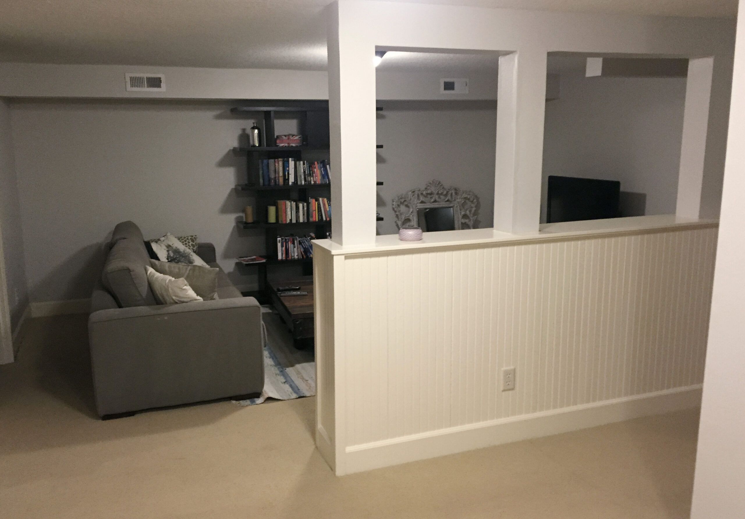
But turning the 591-square-foot living space into an airy, free-flowing hangout meant significant structural work. Contractor Patrick Richardson had to install three steel beams supported by new posts along one wall to span what’s now a fully open family room. To funnel daylight from adjacent spaces with windows, Humphrey removed a door and added glass where he could. But the giant HVAC duct couldn’t budge. His solution? Paint it a fun color. Or as he puts it, “If you’re going to have this industrial exposed duct, it might as well be pink, right?” It proved just the kind of unique design element that this young family craved.
BEFORE: The basement was a dimly lit maze of finished and unfinished spaces.
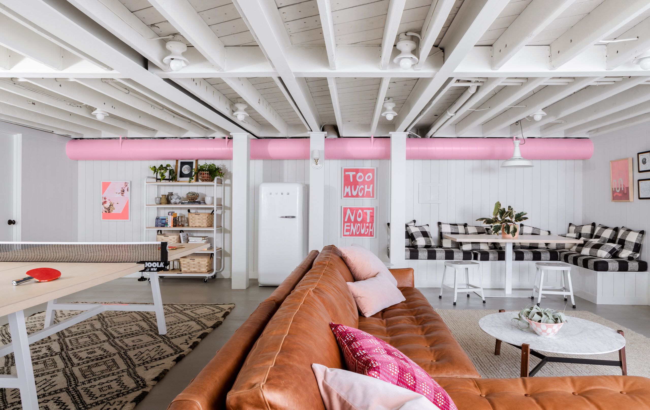
Exposed joists visually raise the ceiling without having to dig out the floor. A trio of steel beams supported by posts along the back wall allow for one large open space. Three furnished zones cater to various activities. A dining nook and a vintage-style fridge nearby host snack time—and some work-at-home sessions. A custom metal-and-plywood Ping-Pong table and a large leather sectional facing the TV offer different kinds of fun for all ages.
Paint: Simply White (walls, ceiling) and Sweet Taffy (duct), Benjamin Moore; Custom dining table and Ping-Pong table: Nathan Dinihanian, Dinihanian Design Build; Sectional sofa: Rejuvenation; Coffee table: Blu Dot; Refrigerator: SMEG; Rolling bookcase: Schoolhouse; Too Much and Not Enough artwork: Chairish; Vintage rugs: Kat and Maouche

Pro advice: “This midtone pink accent color was a fun choice for a family with two girls, but you could use any color you like. Lime green or yellow would have been great, too.” —designer Max Humphrey, Portland, OR
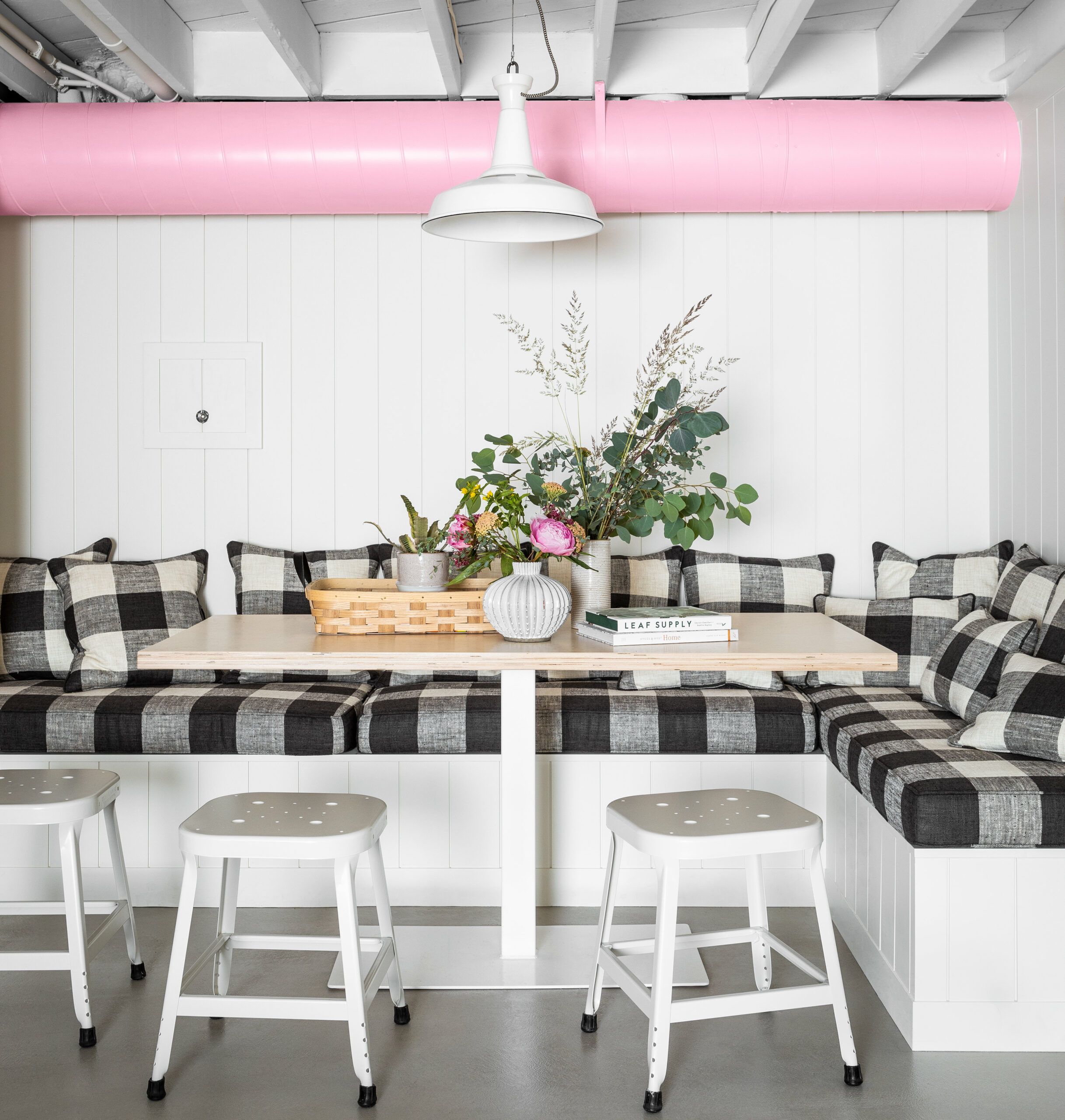
Shown: Exposed wiring snakes through the ceiling. “There are holes in the joists and chippy stuff, but I like how beat-up the ceiling looks,” says Humphrey. “It offsets the newness of everything else.”
Lighting, stools: Schoolhouse; Banquette gingham fabric: Pindler
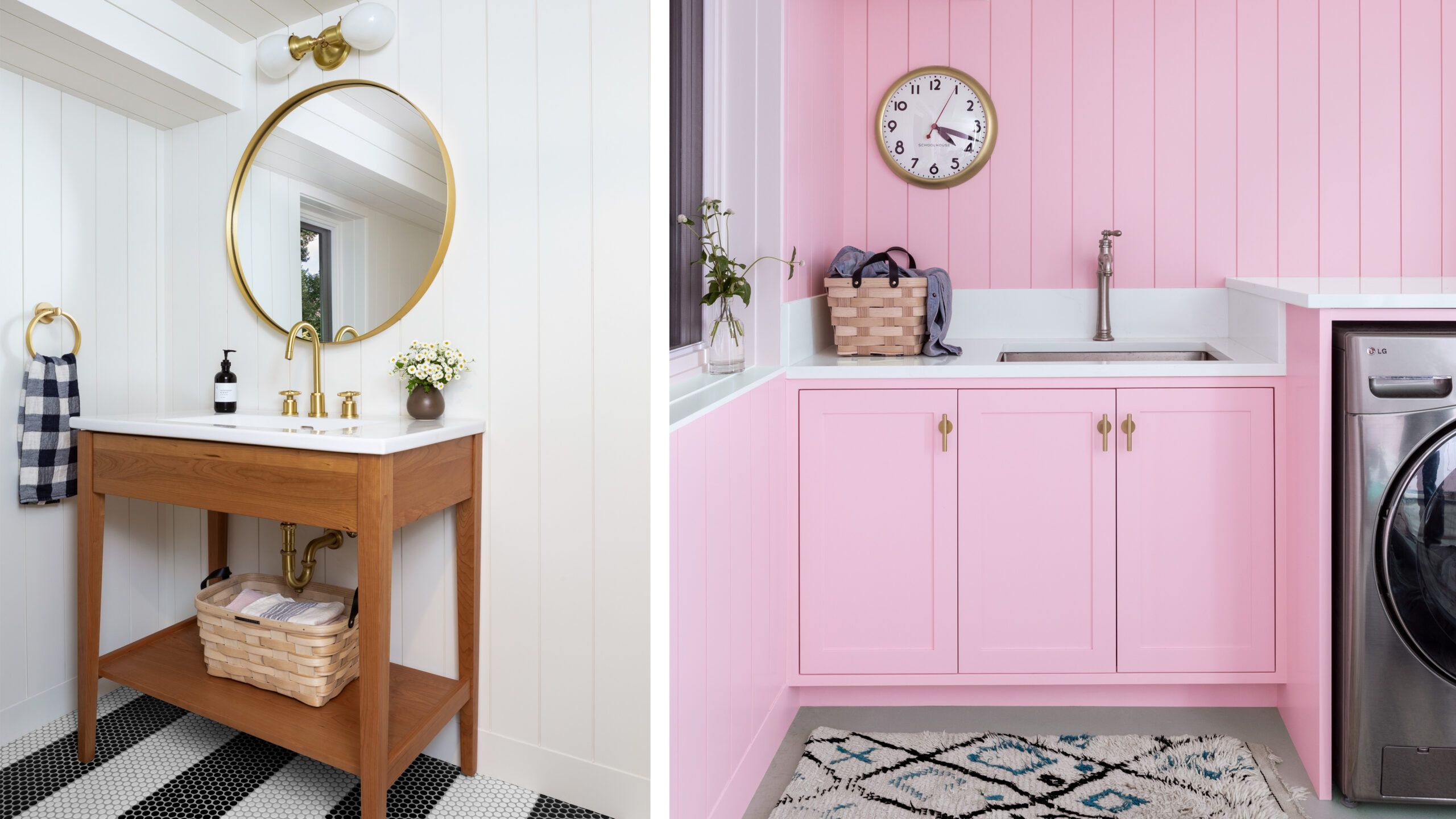
Shown left: Vertical shiplap on all the walls helps make the ceilings seem higher. Bands of black and white penny tile on the bathroom floor are another visual trick, making the small space seem larger.
Vanity, sink, faucet: Rejuvenation; Tile: Ann Sacks
Shown right: The laundry room kept its existing washer and dryer, but got new shiplap paneling, cabinets, countertops, a sink, a vintage rug—and a heady dose of that pink paint.
Clock, and laundry cabinet hardware: Schoolhouse; Faucet: Kohler; Quartz countertops: Caesarstone
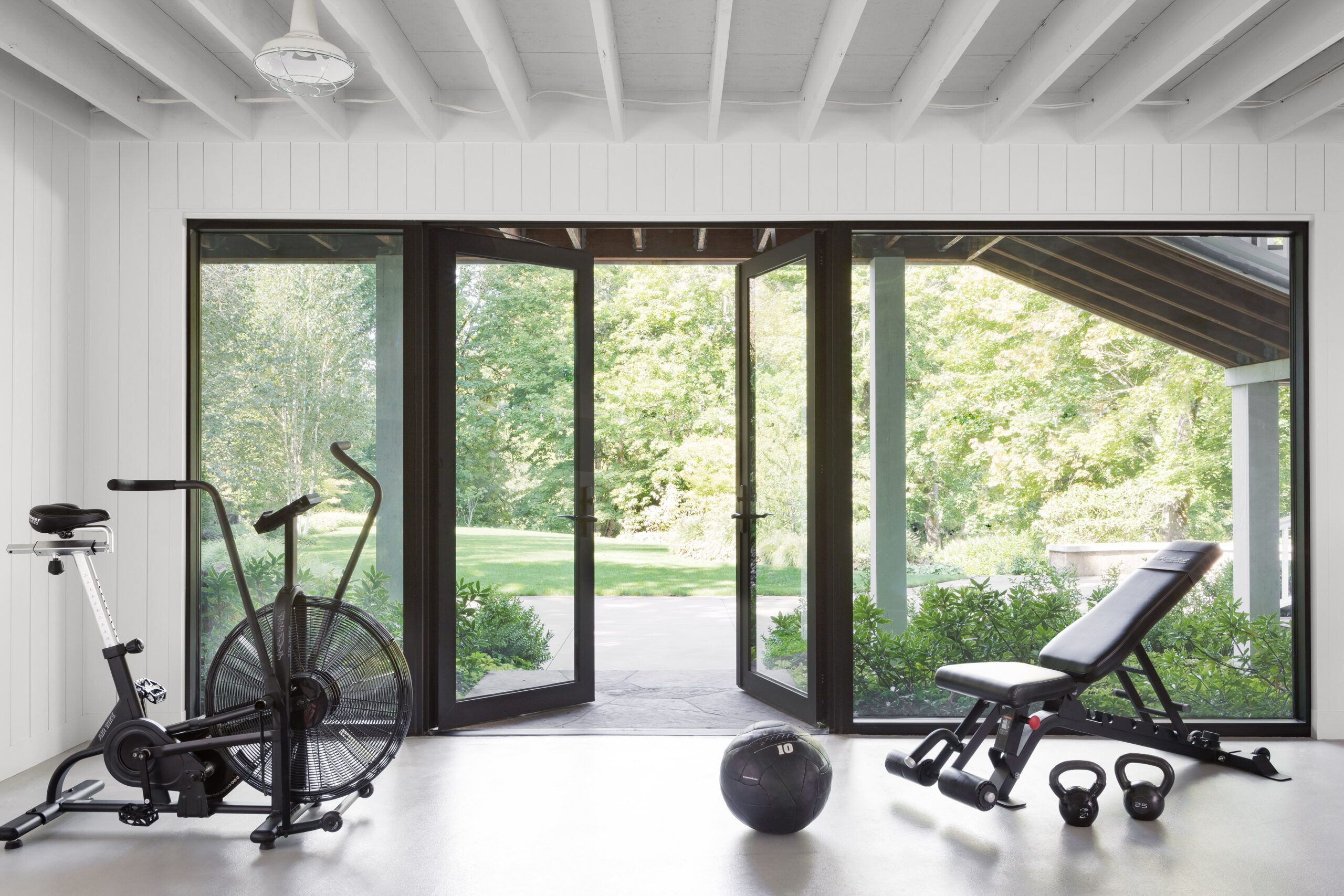
The home gym adjacent to the basement gathering space is one of two walk-out areas on the lower level; the other is the laundry. To maximize the natural light in the gym, Humphrey inserted large storefront windows and doors. (The flat-screen in the family room shows what they look like from outside the house.)
Glass and aluminum storefront door system: Kawneer
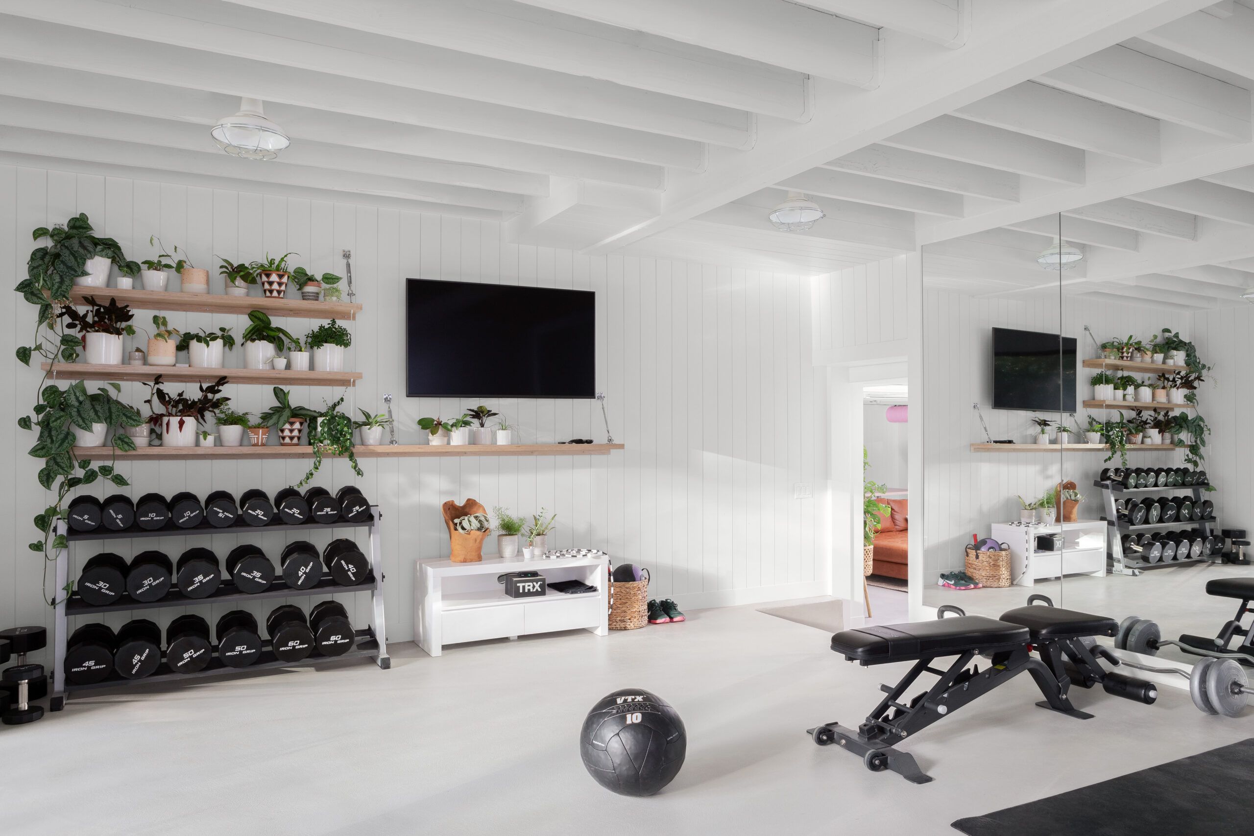
The adjacent home gym got an overhaul, too, with white shiplap walls and a white ceiling with exposed joists. Humphrey skipped the pink accents here, and instead brought the outside in by designing plant shelves that have exposed plywood edges and turnbuckle hanging hardware.
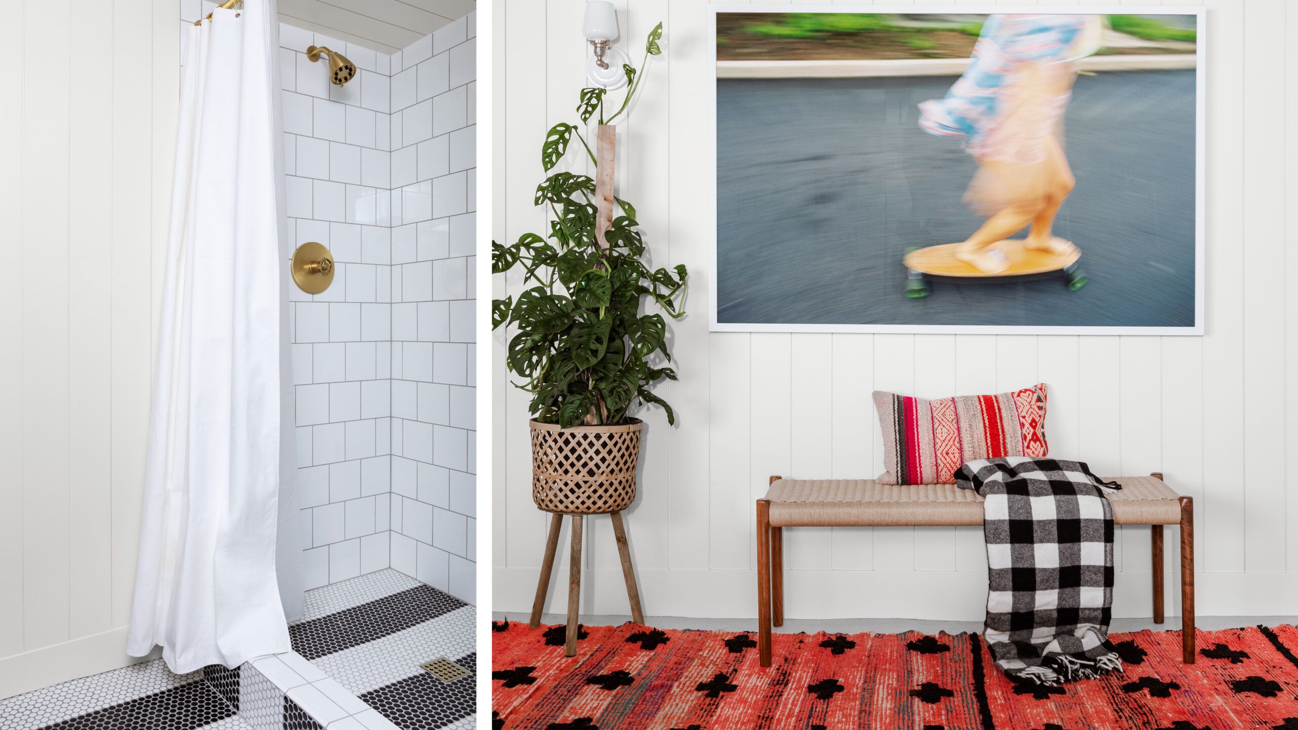
Shown left: “We didn’t want to spend a ton of money on materials—it’s a basement bathroom!” Humphrey says. Stripes of penny-round tiles on the floor—and up the shower curb and onto the shower floor—and simple white squares on the shower walls lend a lot of style for not a lot of cash.
Shower fittings: Rejuvenation
Shown right: A high-energy photo and colorful textiles enliven what might otherwise be a lackluster pass-by space between the laundry and bathroom.
Wendy Laurel photograph: Eventide Collective; Bench: Design Within Reach; Vintage rug: Kat and Maouche
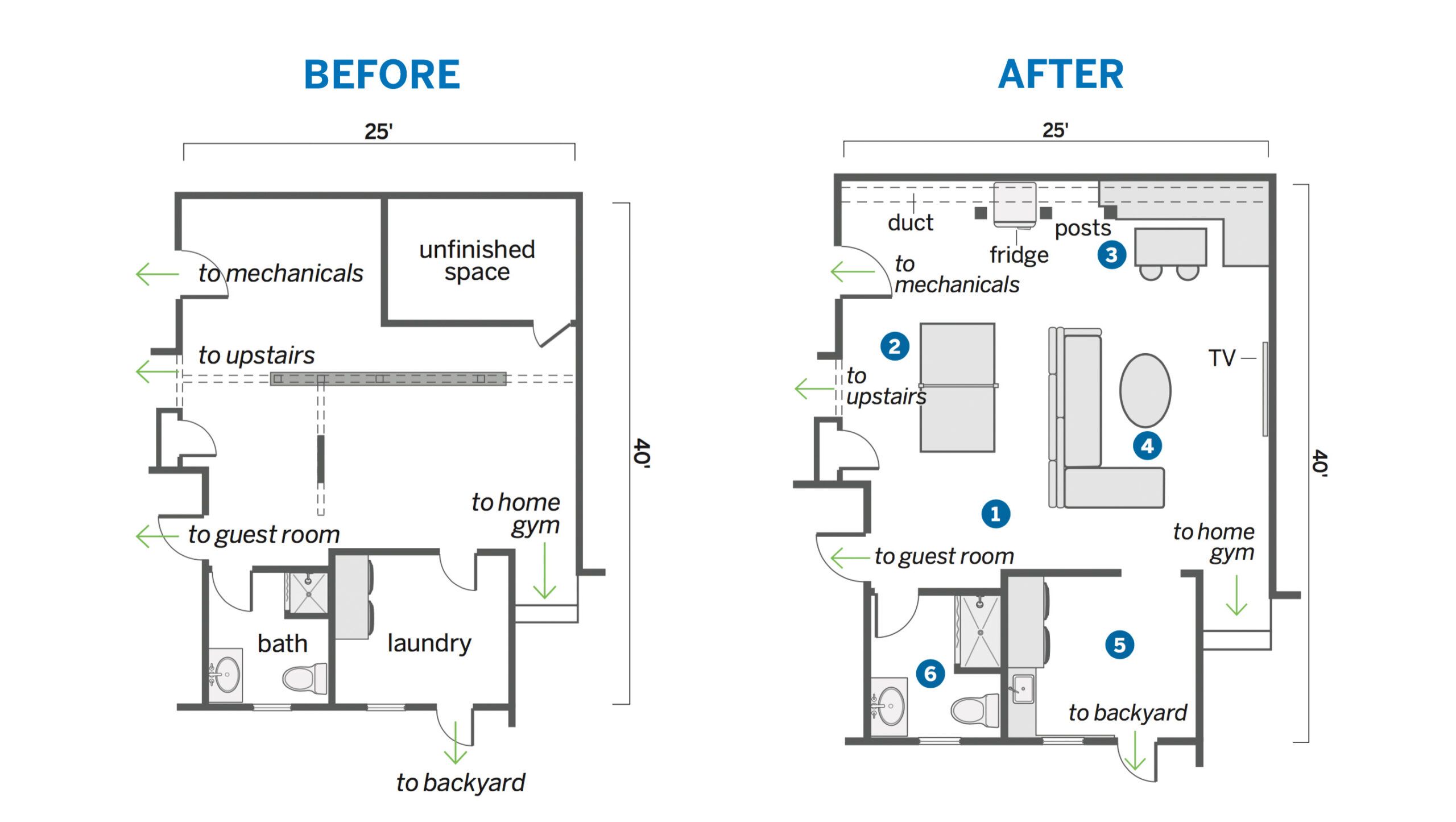
Floor Plans
BEFORE
Partition walls left the windowless area in the center of the basement feeling dark and cramped.
AFTER
Adding three steel beams with support posts along a wall enabled a 591-square-foot open family space. Removing a door channels light from the adjacent laundry.
- Removed partition walls and added three steel beams tied to three posts along one wall (and in front of an existing duct); exposed ceiling joists to add about 6 inches of height overhead.
- Positioned a Ping-Pong table just off the stairs, reserving plenty of open circulation space around it.
- Built in an L-shaped bench for a table steps from a fridge to allow for snacking (and laptop time).
- Zoned a TV space with a large L-shaped sectional sofa in the center of the room.
- Upgraded the laundry with new cabinets, paneling, and a sink; took off the door to share natural light with the family room.6. Gave the bath an overhaul with new fixtures and fittings, plus a larger custom shower stall.
