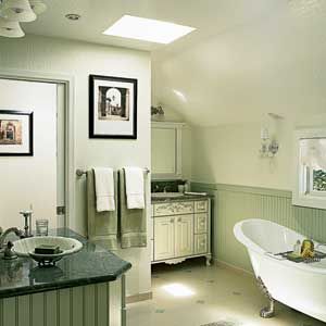
When it comes to designing a master bath, designating one side for him and one for her can be a no-brainer if you’re working with a generously sized rectangular plan. But Linda and Gene Frederick wanted their Alamo, California, bath to have personal cleanup zones and a cozy old–house scale, with odd angles and small niches you’d find in a vintage cottage.
So the couple turned to designer Randy Cohn to reinvent their existing shoebox of a room—which had them elbow to elbow at the double vanity—as part of a master suite renovation. Cohn was able to reconfigure the room into a more visually interesting L–shape by bumping out an exterior wall, which enlarged the bath from 257 to 344 square feet and added space for a sitting area in the bedroom. The new bath footprint allowed him to create subtly distinct husband and wife zones, with her vanity and the tub along one wall, and his vanity around the corner from the shower. He carved out separate closets for each half of the couple as well.
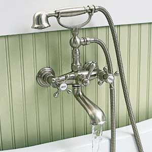
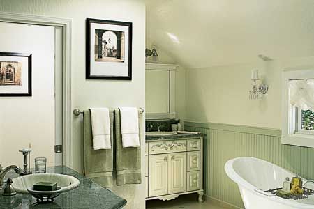
Then Cohn gave the bath the desired century–old look. He ringed the walls with beadboard wainscoting, replaced a modern drop–in tub with a Victorian–style claw–foot model, and added brushed–nickel fixtures. But unlike typical 19th–century baths, this one is filled with light, thanks to two skylights and a window over the tub.
The plan put an end to the couple’s jockeying for elbow room—and the overall discomfort the old layout created. “I get a good feeling now when I’m in the room,” says Linda. “I don’t feel like I’m stuck in a box.”
The Plan
Reconfigure the layout with some old-house quirks—yet make it functional and efficient for a busy couple.
What They Did
1. Redistributed and enlarged the space, creating an L-shape. The old toilet/shower room was walled off to become part of a separate kids’ bath, and the rest of the room gutted. Then the exterior wall where the old bath alcove had stood was bumped out by 15 feet, and the resulting space was configured into a slightly larger,
L–shaped bath with a roomier master bedroom next door.
2. Designated separate his-and- hers zones. Her vanity was set into a corner nook next to the new toilet room, and the tub placed along the adjoining wall, with her now generous closet just beyond. His vanity was installed on the wall opposite the tub, with his closet on one side and the shower on the other.
3. Kept sightlines open. The two new closets were left doorless; the bedroom and the toilet room have low–profile pocket doors. Two skylights, plus a sliding window tucked under the low roofline, maximize natural light.

Where to find it:
Design and construction:
Gayler Construction Co., Inc.,
Danville, CA
925–820–0185
Door hardware:
Emtek
City of Industry, CA
800–356–2741
Tub:
Sunrise Specialty
Oakland, CA
510–729–7277
TILE:
Santangelo Tile, Stone & Hardwood
Concord, CA
925–692–0060
Electric:
Degryse Electric
Livermore, CA
925–243–9473
Shower Door:
WGM Shower Door and Mirror Company
San Leandro, CA
510–667–0781
Shower head and valve:
Hansgrohe Inc.
Alpharetta, GA
800–488–8819
Sink:
Bates and Bates
Paramount, CA
800–726–7680
Valves:
Newport Brass, a div. of Brasstech Inc.
Santa Ana, CA
866–417–5207
Radiant floor heat:
NuHeat
British Columbia, Canada
604–529–4400
Skylight:
Velux America Inc.
Greenwood, SC
800–888–3589
Windows
Andersen Corporation
Bayport, MN
800–426–4261

