Gorgeous & Green Master Bathroom
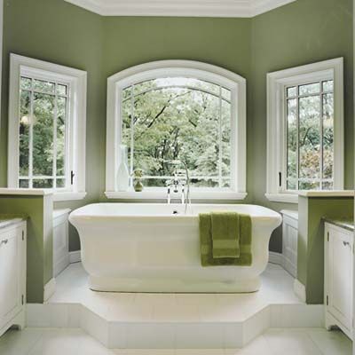
One thing can lead to another when a remodel is under way. The owners of this sunlit master bath in Westchester County, New York, were embarking on some changes to their Shingle-style home when architect Carol Kurth came up with a suggestion: Instead of the simple cosmetic update they’d planned for their leaky, 1980s-style bath, why not go a bit further?
“When we showed them the opportunities for storage and views that a small addition would open up, they decided to go for it,” says Kurth. Her plan hinged on a modest bumpout—about 8 feet deep and 10½ feet wide—to allow for twin vanities and a vaulted, windowed bay for a freestanding tub, positioned to maximize Hudson River views. The original section now holds a shower, a dressing area with custom cabinets, and a private toilet room. On a platform in the new windowed bay, a Waterworks tub soaks up natural light and scenic vistas.
See more from this remodel in Bath Bumpout Adds Space With a Vintage Look.
Light and Airy Bath Retreat
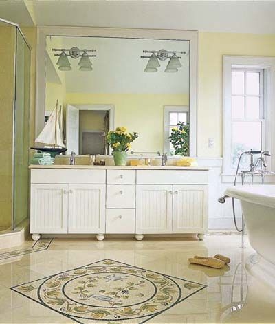
When their summer home in Montauk, New York, became more hectic than relaxing, this couple decided to create a real getaway. With three active children and a long list of regular guests, they wanted a space that they could call their own. So they hired an architect to build a second story on their low-slung ranch, equipped with an office (for his work), a sewing room (for her hobby), and a large bath with a view for the ultimate in relaxation.
The generously sized bathroom features 14-foot ceilings, a pedestal tub overlooking Lake Montauk, a double vanity, and a glass-walled shower. Focal points anchor the open space. These include a 30-inch mosaic in the marble floor and the furniture-style vanity topped with a ceiling-height mirror that makes the room feel even bigger.
See more of this gorgeous room in An Airy Bath Provides the Ultimate Escape.
Color-Blast in a Shoe-Box Bath
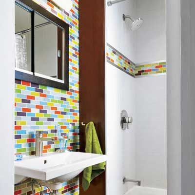
The smaller the space, the more critical the details—at least that’s the approach these New Jersey homeowners took in tackling the bath they shared with their two young daughters. Their rowhouse dates to the 1890s, but in 1966 a previous owner turned the bath into a study in dark maroon. After living with the gloomy, cramped space for six years, they decided to remodel it themselves, with help from a plumber and electrician.
Scouring plumbing-supply shops, they found a smaller toilet, a narrow-rimmed tub, and a sink just wide enough for two kids armed with toothbrushes. They did almost everything and experimented endlessly to create a colorful pattern of 1-by-3-inch clear, frosted, and silvery glass tiles, pre-mounted on mesh sections for easy installation. A recessed cabinet with sliding doors holds essentials—spillover goes to the linen closet—and radiant heat saves space too. It still gets crowded at bath time, but having every detail right makes being there a pleasure. A new pocket door saves space and has a tidy, tailored look while light-reflecting glass tile and downsized fixtures help create a cheery, open feel.
See the rest of this transformation in Creating Major Impact in a Small Bath.
From Unused Room to Brand-New Bath
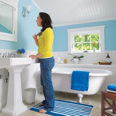
Sometimes starting from scratch is the only way to go. When Brennan and Stephanie White first saw their 1820 Cape Cod cottage, they were taken aback by its only bath, a very narrow former pantry on the first floor. An avid DIYer with plans to reorganize the layout of the whole house for better flow, Brennan decided to turn the bath into a hallway and carve a master bath out of a spare bedroom in the home’s slanted-roof addition, which dates to the 1940s.
Cool-blue walls, sand-colored marble floor tile, and white beadboard wainscoting give the new room a relaxing feel. “The bath is our safe place from all the dust,” Stephanie says of ongoing work at the house. That payoff clearly inspired them—they’ve already added a half bath upstairs for guests.
For more on this remodel, see Spare Bedroom Becomes Spacious Bath.
A Blah Bath Gets a Dose of Deco-Inspired Style
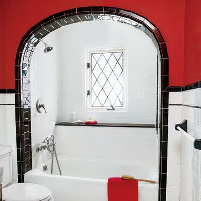
Staying true to a home’s character doesn’t mean you have to keep banging your knees against the bathtub. Annmarie McCarthy and Mark LePage, both architects, were drawn to their 1934 Tudor Revival in Chappaqua, New York, for its vintage look.
But after a few years of living with its original black-and-white L-shaped bath (the lone full bath upstairs—and one they share with their three children), the couple craved a little leg room. Now wider and brighter, the room has vintage-style tile, chrome fittings, and a windowed alcove. The marble ledge offers a handy spot for bath supplies while reinforcing the horizontal lines of the tilework.
See the rest of this room in A 1930s Shared Bath Gets a Revamp.
Low-Cost Luxury Bathroom Makeover
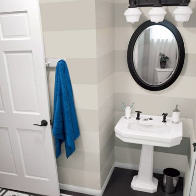
Even in long-haul remodels, some spaces cry out for prompt design attention. For Roeshel Summerville of Butler, Pennsylvania, that space was the first-floor bath. Located between a home office and the family room, it’s the most trafficked of the 1927 farmhouse’s three baths and two powder rooms. But when Roeshel, her husband, and their two daughters moved in, it sported bare drywall and grungy carpeting.
Two years in, with a full redo out of the question, Roeshel decided to make the space “less embarrassing.” Refinishing everything from the plywood subfloor to the original sink fixtures with paint, she updated the bath over four weekends with a gray-and-brown palette and low-cost touches, such as a three-light vanity fixture. “It was supposed to be a temporary fix, but I love it. And now we can focus our money on bigger projects,” says Roeshel. The rug motif and wide wall stripes add classic charm to this now-inviting space.
See more details from this space in A Bath Remodel for Only $439.
Beautiful Attic Bath Addition
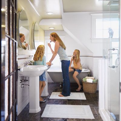
Choose a focal point, some designers say, and the rest will fall into place. Tom and Arleen Mulligan of Rumson, New Jersey, selected a claw-foot tub that they found not in a salvage yard but in a storage room on the third floor of their 1895 Queen Anne. Though the 87-square-foot space tucked under the roof “was a crooked mess,” Tom says, the couple realized they could turn it into a master bath, with the tub as its centerpiece.
Tom, a seasoned renovator, fixed the slanted floor, reframed the crooked doorway, created drop ceilings to accommodate can lights, skim-coated the old plaster, and made crown to match the house’s original. The couple found period-style pedestal sinks to complement the tub, and an irresistible deal on marble floor tile. A plumber helped install the sinks, a glassed-in shower, and that tub. Freshly painted and with chrome-plated feet, it grabs the spotlight. “After four months of lugging stuff up and down stairs,” says Tom, “we finally have a master bath that fits perfectly with the rest of the house.”
See more from this remodel in Fitting a Period Bath Under the Attic Rafters.
A Gentleman’s Bath
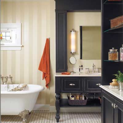
Nothing speeds up the timeline for a bath redo like a shower leaking into the room below it. At least, that was the impetus for Martin Stock to finally tackle the master bath in his 1910 home in Wilmette, Illinois. Remodeled in the 1980s, the charmless space was lined with bulky beige built-ins. “I just wanted to throw three grenades in there and blow it up,” he says.
In its place he wanted a masculine bath that was more traditional gentlemen’s club than locker room. Turning to designer Karen Walker to come up with a plan, Stock presented her with magazine pages and offered up a piece of antique stained glass he bought in London. That window found a home above a new Victoria & Albert claw-foot tub that sits alongside a ceiling-height built-in vanity and across from a now larger shower. Walker fit the new amenities within the original footprint, using the existing plumbing lines—smart moves that allowed for high-end luxuries, such as custom cabinetry, an alabaster pendant by Urban Archaeology, and marble floor tile. The result is a vintage-style space that’s stately but simple—and, of course, watertight.
You can see more photos from this remodel in A Ho-Hum Bath Becomes a Handsome Retreat.
A Sea-Blue Bath Fit for a Bungalow
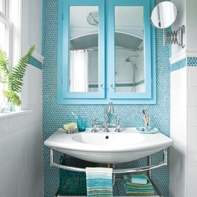
When a house has only one bath, remodeling can wreak havoc with daily routines. Steve and Laura McElhaney, owners of a 1941 bungalow in Jacksonville, Florida, lived with their single bath’s cracked pink tile for five years before calling in general contractor Dean Celano—then asking neighbors for temporary bath privileges. Celano gutted the space, annexed parts of a closet and hall, including space that held a nonworking chimney and hall-facing open shelves, and moved the doorway. Replumbing allowed the toilet to move to a better spot, while the sink gained its own alcove, and a smaller tub opened up floor space. To give the bath a timeless, eclectic style, Laura chose a contemporary light fixture and sink, oversize subway tile, and traditional penny-rounds in white and blue, using it to cover the sink wall from floor to ceiling. Three weeks sans tub and toilet paid off. “It’s exactly as I pictured it,” says Laura, “the perfect combination of cheery and restful.”
See more of this before and after in A Dated Bath Gets a Timeless Update.
Old-Time Accents in a Beautiful Bath
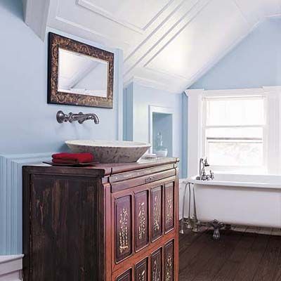
Many an old house comes with evidence of a not-quite-as-old renovation. When the owners of this Westchester County, New York, home moved in, they took one look at the attic bath’s circa-1960 “update” and closed the door—for five years. The family focused their attention on other areas of the Queen Anne home until, finally, the lack of a bath near the attic playroom—the family has four children—became too inconvenient to bear. They had already gutted the space when designers Rick and Liz O’Leary, who were working downstairs on the kitchen renovation, came up for a look.
Rick helped the family determine the new layout and sketched the panel-molding ceiling treatment. The molding adds old-house detail to the new bathroom’s vaulted ceiling. A mix of vintage finds, including the claw-foot tub and antique Chinese chest, and modern elements, such as the vessel sink and wall-mounted faucet, gives it an updated traditional look. Glacier Lake wall color and White Dove trim, both from Benjamin Moore,
make the space fresh and inviting.
See the rest of this inspirational space in Vintage Details Make An Old Bath New Again.
Making a White Bath Work
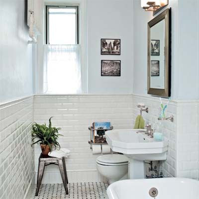
Old doesn’t always mean quaint. That was the lesson Filip and Ruxandra Balasov learned after moving into their 1920s co-op apartment in Queens, New York. Previous tenants hadn’t been kind to the master bath: Chipped subway tiles lined the walls, rust spots marred the cast-iron sink, and concrete peeked out beneath the broken ceramic floor squares.
Restoration wasn’t an option, and the 5-by-11-foot space didn’t allow for changing the fixture placement. So the couple enlisted contractor Patrick McCormack to update every element—but with a vintage look. A new claw-foot tub and pedestal sink and a black-and-white tile scheme added plenty of period charm.
Today the cast-iron soaker’s definitely the star of the remodel, having turned the master bath into a favorite relaxation zone for son Sebastian, 13, and daughter Catinca, 2. Says Filip, “For us, it’s a 10-minute shower, but the kids spend hours in there!”
See more from this transformation in Bath Gets a Classic Redo, 1920s-Style.
Making a Bath Fit
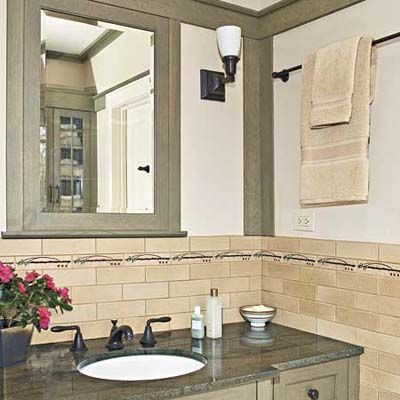
The personality of a home’s former occupants often lingers most in the master bath. A floral-Colonial specter haunted the one in Phil and Peggy Reitz’s 1920s house in Wilmette, Illinois. Avid collectors of Arts and Crafts furniture, the couple saw the frilly bath as “a total mismatch” with their home, Peggy says. Just as bad, the heat was inadequate, and the standard-height vanities were unsuitable: He’s six two; she’s five eight. Now earthy green granite, wood cabinets, bronze fittings, and tiles with a handcrafted look give a bath Craftsman style.
See more details from this redo in Handsome Face-Lift for a Dated Bath.
A Dated Bath Gets Sophisticated
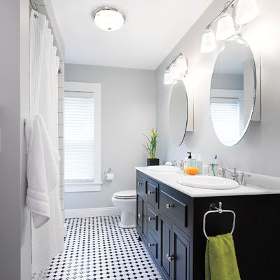
Living next door to the in-laws has its rewards. When Kevin and Jennifer Johnson, owners of a 1917 foursquare in tight-knit, family-centric Lowellville, Ohio, redid their only bath, Kevin looked for help from neighbor Bob Coppola—aka Jennifer’s dad—and a network of local suppliers and advisers.
From an aunt, who, coincidentally, lived in the house 60 years ago, they learned that the space once held a kitchenette. That explained its generous footprint, but not, as six-foot-one Kevin puts it, having to “scrape my knuckles on a lowered ceiling while showering in what felt like a cave.” He and Bob took the room down to its studs; replaced pipes and wiring; popped in a new vanity, tub, toilet, and sconces; and crafted new casings. They finished with paint custom-tinted by Bob, a retired painting contractor.
A plumber friend provided know-how, and the only paid help was the tile installer. Says Kevin, “I like that we did it ourselves—and everything works.” See more in DIY Bath Renovation: From Dated to Sophisticated.
Updated Vintage Bath Before and After
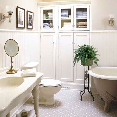
With the help of Chicago designer Christine Julian, the new bathroom not only fits right in with the rest of the house, it has a clean, inviting look.
A new storage cupboard was patterned after an old-fashioned built-in. The white-painted maple unit features glass-front doors above and solid doors below; the latter conceal two pull-out shelves for organizing toiletries. Glass knobs keep the vintage look consistent.
See more in Updated Vintage Bath Before and After.
Going Green the Second Time Around
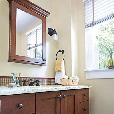
Do what you can where you can. It’s a sound strategy when it comes to living—and renovating—green. Mark and Linda Beckelman had already redone the only full bath in their Springfield, New Jersey, home soon after they moved in, more than 20 years ago.
At that time, their bank account only allowed for off-the-shelf home-center fixtures and finishes. So this time they wanted a vintage-style redo that would reflect their 1929 house. They also wanted to make environmentally friendly choices—and stick to a bottom line of $10,000 for the gut renovation. See how they did it in Bathroom Beauty on a Budget.
Tranquil Spa-Bathroom Retreat
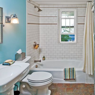
An addition to the family can often kick a remodel into high gear. Such was the case for Lisa and Jim Steele of Syracuse, New York. The couple was “skeeved out” by the grim lone full bath left behind by previous owners, and they dealt with the eyesore by taking quick showers—never baths. But with son Coby, now 3, on the way, they envisioned tub times full of toys for their little one. So, shopping sales and eBay for discounted fixtures, they began to create an inviting bath in their 1925 cottage, piece by piece.
Explore this budget before and after in A Total Bath Redo for $2,238.
A Better Master Bathroom
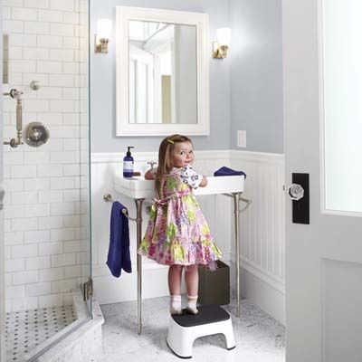
Generally, it’s good to avoid stairs in the black of night. But for Jill Becker and Drew Phelps, descending the steps in darkness was tough to avoid. The master bedroom in their 1853 rowhouse was the only room on the three-story home’s second floor, thanks to a rental apartment that had been carved out in the 1950s. That two-bedroom unit made reaching their only bath, on the first floor, a literal nightmare. “To get to it,” says Drew, “we had to navigate 13 steps, walk through the dining room, the kitchen, and a downstairs hallway.”
The couple, who had bought the Cambridge, Massachusetts, house with the intention of restoring its single-family configuration, longed for a master bath within shuffling distance of their bedroom. And while they wanted it to feel right for their 19th-century home, they also wanted 21st-century amenities like a steam shower and radiant heat. Local designer Charlie Allen reintegrated the rental unit to add a vintage-look master bath and dressing area. As a bonus, the couple’s daughter got spacious digs as well. The redesign entailed a few compromises—having to cross the hall to get from bedroom to bath, for one—but the couple has no complaints. Says Allen, “Now they can roll out of bed and step right into the shower.”
See the rest of this remodel in An Unused Bedroom Becomes a Functional Bath.
Go Big (in a Bath Remodel) Or Go Home
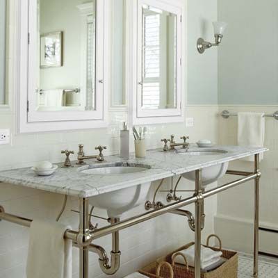
When it comes to owning a home, necessity is often the mother of reinvention. For Tim and Elizabeth Dugan of Kenilworth, Illinois, the need to reimagine their space grew out of the realization that their three boys (an 11-year-old and 8-year-old twins) had been bumping elbows in the hall bathroom they shared. The misguided bath remodel shouted 1980s. It lacked both practicality and privacy, with the toilet on display between the shower and the partially enclosed tub.
Just when the couple were drawing up plans to update their Prairie-style home’s master bath—the victim of a botched 1980s-style redo—the project looked as if it would be trumped by the boys’ needs. Then their architect, Chip Hackley, had a lightbulb moment and found a solution to make daily life a bit easier for the whole family. The windowed space that was formerly the master bedroom makes a spacious location for the new vintage-look console double sink and wood-framed, recessed medicine cabinets from Waterworks, a towel bar from Chicago Brass, and a sconce from Rejuvenation.
See the rest of this remodel in A Sitting Room Sacrificed for a Bigger Bath.
A Smarter Bath Layout
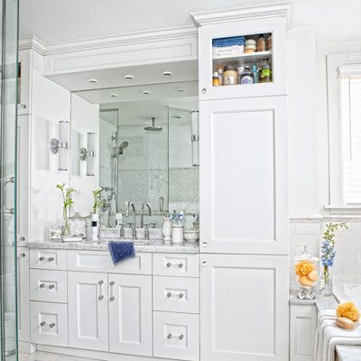
In the eternal quest for an additional bath, owners of older homes have been known to do strange things. Consider the arrangement that greeted Canadians Anamaria and Stephen Manna when they bought their 1914 house, in Toronto, Ontario. Previous owners had crafted an odd, 350-square-foot L-shaped bath with a carpeted sitting area on the second floor. With an interior window onto the hall and a French door, “privacy was what the bath lacked most,” says the couple’s designer, Jane Lockhart. To-the-ceiling cabinets on each side help keep the shared vanity clutter-free.
See more photos from this before and after in A Squared-Off Bath for a Smarter Layout.
Not-So-Empty Nest Bathroom
When empty-nest syndrome kicks in, most couples think about downsizing. But when the owners of this Chappaqua, New York, house found that their grown kids were frequently bringing friends home to an increasingly cramped dinner table, they realized they’d need more room than ever. “We were seating 20-something adults at their own ‘kids’ table,” says the husband.
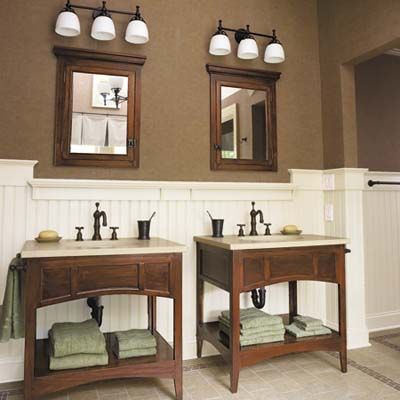
So the couple enlisted the help of architect Carol Kurth in rethinking their home. The result was a whole-house renovation that included converting the old, attached garage into living space. Kurth also suggested raising the garage’s roof and using some of the unfinished attic for a separate guest suite. While the bedroom boasts a walk-in closet and lots of natural light, it’s the bathroom—with its luxurious two-person soaking tub and serene views of treetops—that’s the real star of the space. With the roof bumped up, the new bath boasts an airy vaulted ceiling. Custom mahogany-stained open-shelf vanity bases preserve the spacious feeling. Stained medicine cabinets add more warm wood tones.
See more in Bath as the Star of a Guest Quarter Addition.
Creating a Kid-Friendly Bath
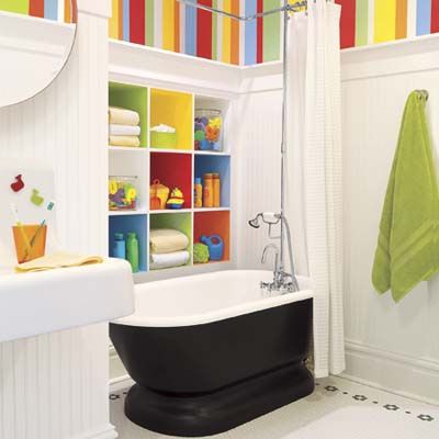
Old houses often have just a single washroom upstairs for the whole family, and it’s seldom kid-friendly: The tub’s too deep, the sink’s too high, and there’s never enough bath toy storage. That was the situation at Marcus and Kristin Moomey’s 1885 home in St. Louis, Missouri, and why they decided to build a pint-sized bath for their daughter, Ella, now 6.
Problem was, they’d have to carve it out of the middle of the unfinished attic, reserving windows at either end of the top floor for bedrooms they’d planned. Plus, they wanted the space to have plenty of vintage charm. All on a budget. See how they did it in Light and Bright Kids’ Bath.
