We may be compensated if you purchase through links on our website. Our team is committed to delivering honest, objective, and independent reviews on home products and services.
A bathroom renovation can often lead to unexpected opportunities for improvement. When the owners of a Shingle-style home in Westchester County, New York, planned a simple update for their outdated master bath, architect Carol Kurth saw the potential for something more. “When we showed them the opportunities for storage and views that a small addition would open up, they decided to go for it,” she says. This bath bumpout project showcases how a modest addition can make a big difference in creating a luxurious, functional, and vintage-inspired bathroom retreat.
After Bumpout: New Scenic Bath
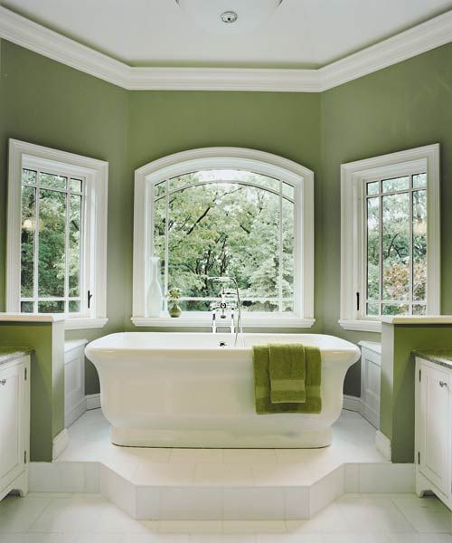
The main focus of this remodel is a bumpout measuring approximately eight feet deep and 10.5 feet wide. Contractors installed twin vanities and Kolbe bay windows to make room for a freestanding, elevated Waterworks bathtub with a beautiful view of the Hudson River. In the original bathroom section, Kurth redesigned the space to include a walk-in shower, a dressing area with cabinets, and a private toilet room.
Before Bumpout: Narrow ’80s Bath
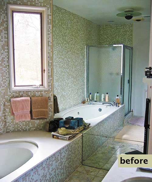
The original bathroom, a relic of 1980s design, had a number of issues that made it feel outdated and uninviting:
- Dingy tiles created a dull, dated atmosphere.
- Leaky pipes posed water damage risks and added to the need for an urgent renovation.
- Mirrored walls made it look older.
- Narrow windows limited natural light and views.
Extra Storage for the Master Suite
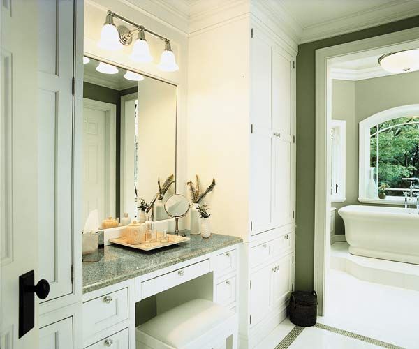
The homeowners wanted to address the lack of storage space in the master suite. The architect’s solution included integrating wardrobe cabinets on either side of a built-in vanity table, creating a dedicated dressing area. The custom cabinetry fit the bathroom’s vintage decor while providing more space for clothing, linens, and personal items. The built-in vanity table offers a convenient grooming spot and adds some elegance to the space.
Serene Green Paint
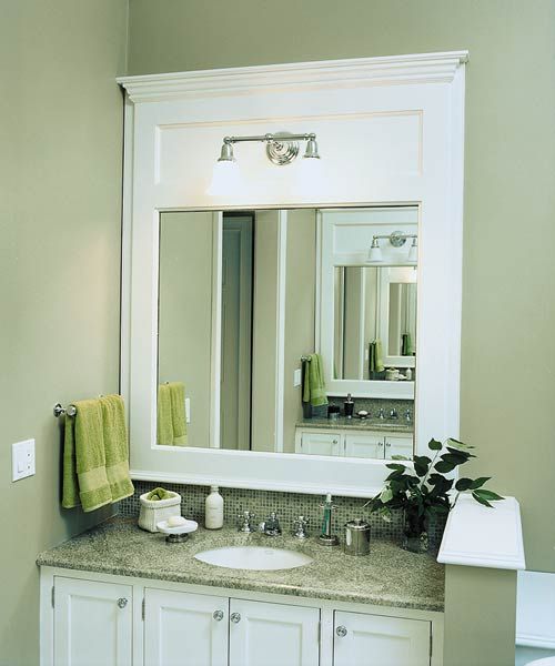
The vanity and hanging fixture, both from Nulco, are complemented by a serene green paint called Grassland SW 6163 by Sherwin-Williams. This soft, nature-inspired hue creates a calming atmosphere that enhances the bathroom’s connection to the outdoor views. The green tone is similar to popular colors in early 20th-century bathrooms and harmonizes beautifully with the polished chrome fixtures.
Custom Shower
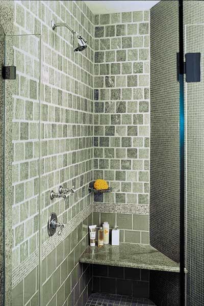
They remade the shower area into a spa-like space with the following features:
- Built-in seating for comfort and convenience
- Curved wall that gives a sense of spaciousness
- Glass door
- High-end fixtures from Waterworks, including the shower, fittings, head, and valve trim
- Twin stone-topped vanities for counter and storage space
Mix of Tile Materials
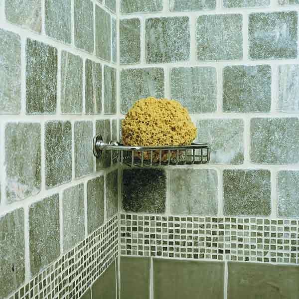
The shower’s tiling showcases a thoughtful mix of materials that add depth and texture to the space. The combination includes ceramic tiles, glass mosaics, and Verde Laguna marble tiles. The marble and ceramic tiles come from Terra Tile, while the glass mosaics come from Waterworks.
Chrome Fittings
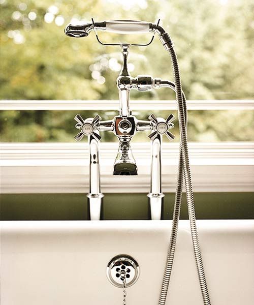
To honor the home’s turn-of-the-century vintage style, they selected chrome tub and shower fittings from Waterworks. Chrome fixtures offer the following benefits:
- Durability and resistance to tarnishing
- Easy maintenance and cleaning
- Reflective quality that brings in more light
- Timelessness that complements both traditional and modern designs
Floor Plan After: New Space
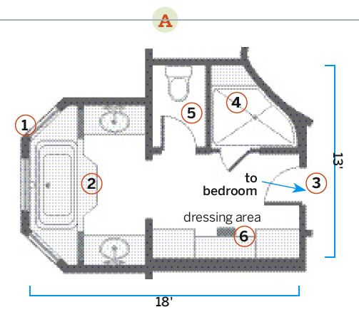
The 78-square-foot bumpout turned the bathroom into a spacious retreat for two. The new floor plan includes the following features:
- Built-in storage to keep the space organized and clutter-free
- Dual vanities for convenience
- Three large windows that flood the space with natural light
- Toilet room for added privacy
- Walk-in shower with custom features
What They Did
From moving the doorway to relocating the shower, here are the updates in the space:
- Built a platform to elevate the 6-foot tub for an uninterrupted sight line to the river
- Bumped out the far end of the bath, creating a larger windowed bay to accommodate the freestanding 6-foot tub and built-in vanities on either side
- Created a dressing area, featuring a vanity table with floor-to-ceiling wardrobe cabinets along the wall where the tub and shower previously stood
- Increased privacy by creating a separate toilet room with its own door
- Moved the doorway from its original position in a clipped corner to a more central location on an adjacent wall for accessibility
- Relocated the shower to the former linen closet area for more space
Floor Plan Before: Squeezed Amenities
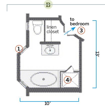
The original 10-by-13-foot bath had several design problems that made it feel cramped and uncomfortable:
- Inefficient use of space made the room feel cramped.
- Other fixtures were squeezed into tight areas and weren’t used.
- Small windows restricted natural light and views.
- The large built-in tub dominated the space.
