After: Updated Classic Look
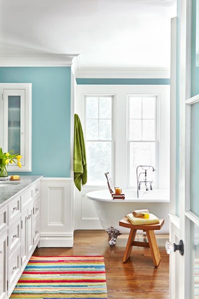
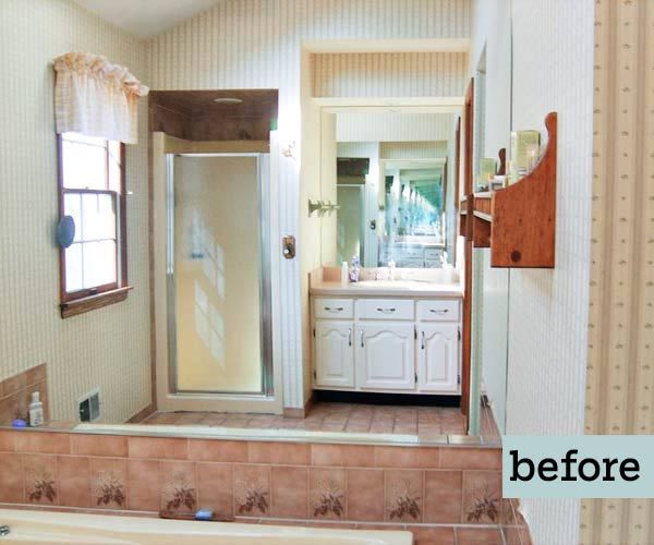
The Eighties look hasn’t exactly stood the test of time. And yet, until recently, the master bath in Patty Monteleone’s 1986 Neocolonial, in Warwick, New York, was still sporting all the old fads. With its mottled brown tiles, mirrored walls, sloped ceiling, and patterned wallpaper, “the place was like the set of a bad sitcom,” recalls Jeff DeGraw, her architect and longtime friend. Not that the rest of the house was any better. “It was all so ugly,” says Patty, who was quick to agree to a whole-house renovation when she and her husband, Joe, got engaged.
Shown: Crisp white trim and serene blue walls further brighten the spacious new layout.
Architect: Jeff DeGraw, DeGraw & DeHaan Architects, Middletown, NY; 845-343-8510
Paint (walls): Farrow & Ball‘s Oval Room Blue
Rug and manzanita branch: Pier 1 Imports
Before: Outdated Eighties Style
Topping the couple’s wish list was a more functional master suite. While they pored over lighting catalogs and paint swatches, DeGraw devised a layout with better flow, expanding the bathroom and making room for spacious his-and-hers closets just outside it. Then he added timeless details, including wainscoted walls, a uniform 8-foot ceiling trimmed with crown molding, oak flooring, and Patty’s favorite feature, a claw-foot soaking tub. The couple couldn’t be happier. Says Patty, “It feels like a luxurious hotel suite, a little escape inside our house.”
Shown: The mirror over the old drop-in tub reflects a clear view of the bath’s dingy wallpaper, outdated fixtures, and overall tight quarters.
Ample Vanity Space
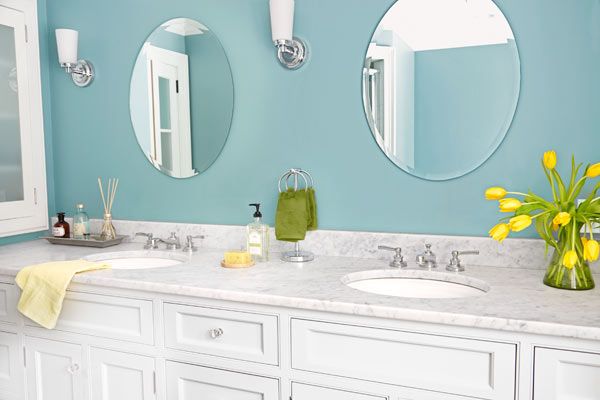
The double vanity, topped with Carrara marble, offers 9 feet of deck space and cabinet storage.
Cabinetry: Wells Woodworking, Bloomingburg, NY; 845-733-8029
Faucets: Restoration Hardware
Cast Iron Alternative
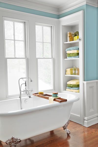
The double-ended claw-foot tub is cast from a durable blend of resins and volcanic limestone, a lightweight alternative to traditional cast iron.
Tub: Victoria + Albert, vandabaths.com
Tub filler: California Faucet
Towels, stool, and tub caddy: Bed Bath & Beyond
Convenient Wall Storage
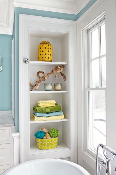
Built-in open shelves at either end of the tub make use of dead space behind the wall and offer a convenient spot for stashing towels and bath accessories.
Less Grout to Scrub
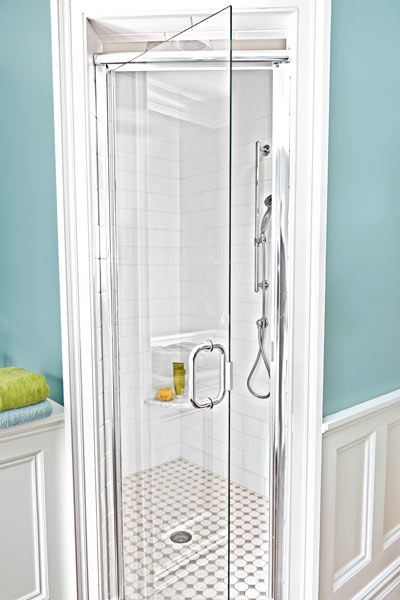
Covering the shower walls with oversize 4-by-12-inch subway tiles creates a clean look and reduces the amount of grout to scrub.
Tile: Daltile
Showerhead: ROHL Home
Handshower: Kohler
Light-Look Frosted Glass
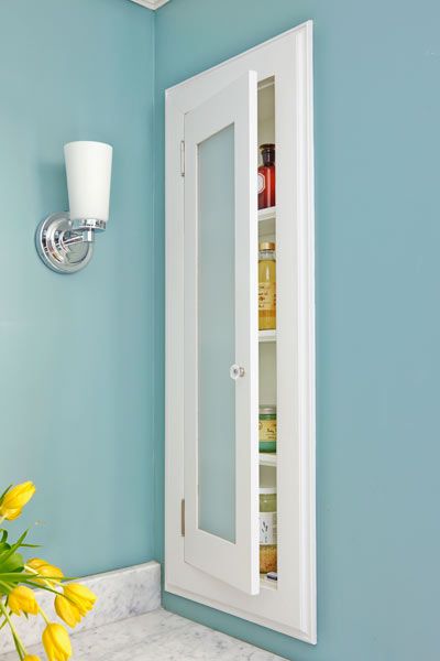
The couple had solid-wood doors made for the medicine cabinets, then decided they looked too heavy. Installing frosted glass panels was the perfect fix.
Knobs and sconces: Restoration Hardware
Before Floor Plan: Scattered Space
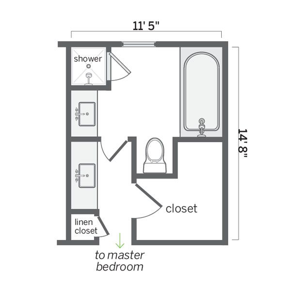
A second vanity outside the main bath and a big L-shaped closet chopped up the space.
Homeowner tip: “Since the bath remodel made the master bedroom smaller, we were careful to enlarge the closets, so the room doesn’t need as much furniture.” —Patty Monteleone, Warwick, N.Y.
After Floor Plan: Comfortable Layout
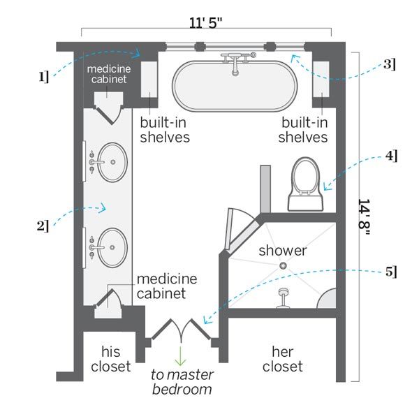
Reconfiguring the closets and moving the doorway cleared floor space for a more comfortable layout. New windows flood the room with natural light.
1. Removed a cramped shower stall and framed out a cozy tub alcove with built-in shelves at either end.
2. Relocated the doorway and traded two vanities for one with ample storage.
3. Tripled the number of windows over the tub.
4. Took space from a closet to shift the toilet and make way for a 4-by-5-foot shower stall.
5. Installed double doors at the entrance, and stole bedroom space for facing his-and-hers walk-in closets.
