Better Lit and Opened Up: After
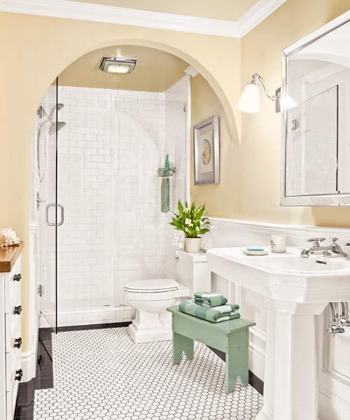
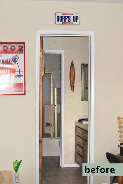
The guest bath is often at the bottom of the homeowner’s redo list. But not for Oceanside, California, residents Larry and Dona Burns, whose windowless guest washroom was weighed down by dark fixtures and a doorway segregating the shower and toilet from the vanity and linen closet.
Shown: A wide archway that terminates into a sidewall opens up the space. A large mirrored medicine cabinet and white fixtures add to the bright, clean look.
Paint (walls): Ralph Lauren’s Nigerian Peony
Dark and Weighed Down: Before
To keep their company more comfortable, the couple enlisted designer Beth Bynon, who carved the dividing-wall doorway into a dramatic arch framing a glass shower enclosure for an uninterrupted front-to-back sight line. She swapped the bulky vanity for a 1920s-style pedestal sink, and the dark floor tile for white hexes. She also eliminated the linen closet just inside the main doorway, allowing direct access to the guest-bedroom closet. A bathroom hutch houses towels and toiletries; wainscoting and crown molding complete the classic look.
“It used to be like a tomb in there,” Larry says. “But now it’s nice and open. It’s the difference between night and day.”
Shown: With no windows, the broken-up bath lacked light and air.
Airy and Functional
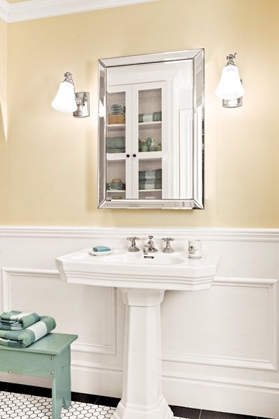
A wide pedestal sink keeps the bath feeling airy while providing deck space for toiletries. The mirrored medicine cabinet reflects light from a pair of vintage-look sconces.
Sink, faucet, and medicine cabinet: For Town by Michael S. Smith
Sconces: Restoration Hardware
Light-Looking Storage
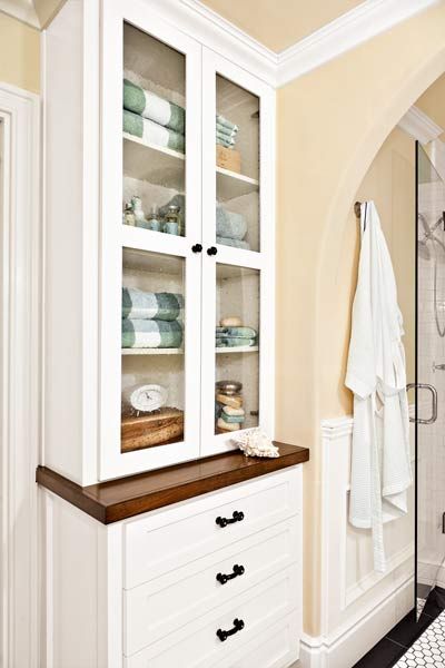
The built-in hutch features shelves for bathing essentials and four drawers for guests’ belongings. Seeded-glass doors lighten the look of the ceiling-high cabinet.
Graphic Tile
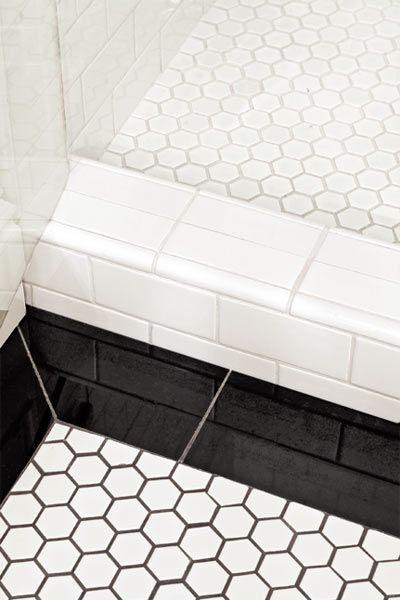
Onyx tile creates a graphic, clean-lined border along the floor. It gains definition from gray grout, which highlights its classic shape.
Floor tile: EMS
Carrying a Theme
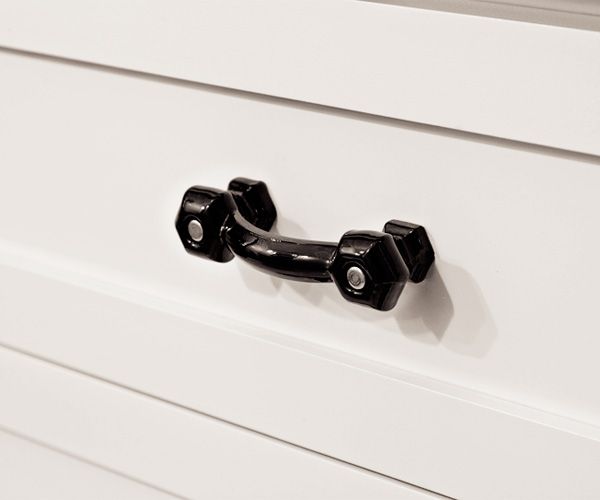
Vintage glass pulls echo the black tile border on the floor.
Floor Plan After: Spacious Feeling
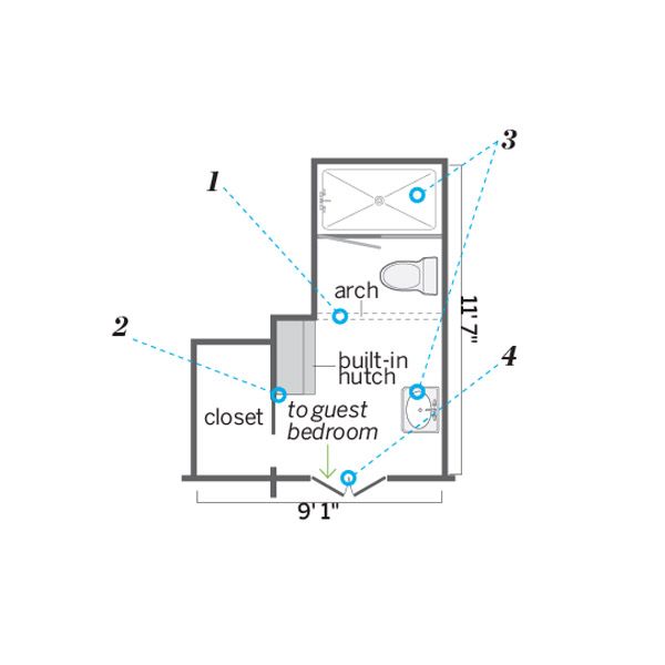
While the footprint stayed the same, a more open layout, built-in storage, an airy pedestal sink, and a frameless-glass shower wall create a feeling of spaciousness.
1. Carved out an arch to open up an existing dividing wall and doorway that cut the bath in two.
2. Removed a linen closet to allow access to the guest bedroom closet via a pocket door, and added a built-in hutch for storage.
3. Replaced the tub/shower with a glass-enclosed tiled shower stall, and swapped a bulky vanity for a sleek pedestal sink.
4. Widened the narrow doorway by 10 inches to accommodate double doors for a more gracious entry.
Pro advice: “A curved arch helps draw the eye up, visually lifting the ceiling and making a small space feel bigger.” —Beth Bynon, interior designer, Oceanside, California
