Pre-War Details
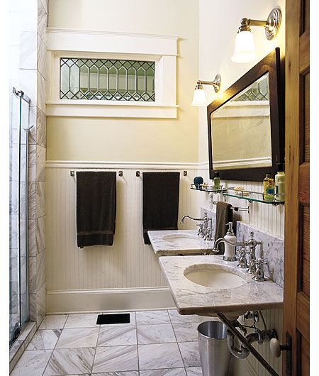
From Return of a Southern Beauty, This Old House magazine, December 2003
This bathroom isn’t large, but it has all the elegant essentials of a grand pre-war (that is, pre WWI) lavatory: Carrara marble countertops and floors, nickel-plated fixtures, glass shelving and stained oak woodwork for the mirror and door. To me, this combination of traditional materials and styling has the comfortable, historic feel of a club that Teddy Roosevelt and his Ivy-League Rough Riders might have belonged to. Only the shower stall gives away its true age.
—Tom Baker, Building Technology Editor
Antique Charm
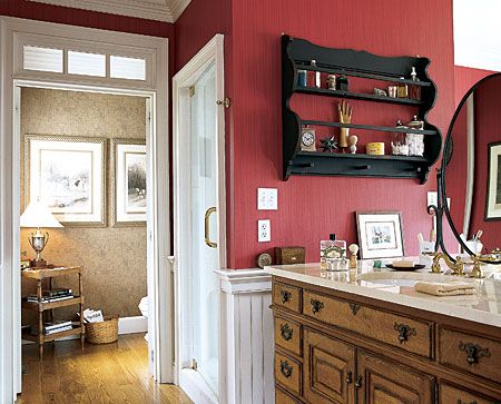
From Side by Side, This Old House magazine, Winter 2004 Kitchen and Bath Guide
The two-sided vanity in this master bath in Port Chester, PA, is amazing. Made of matching antique bureaus placed back-to-back and then linked together with a single slab of marble countertop, it’s got way more character than any of the new stuff you’d find at the local kitchen and bath store. The tarnished drawer pulls and well-worn wood add a romantic, old-world look to this his and hers space. I also like the idea of the lovey-dovey homeowners peeking around the two-sided mirror while they brush their teeth.
—Amy R. Hughes, Senior Editor
Country Rock
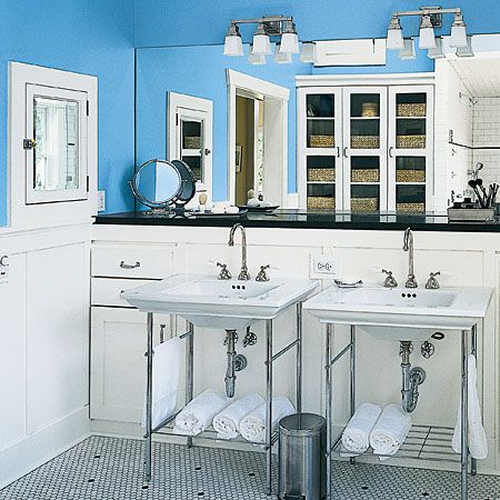
From Adding a Bath Without Adding On, This Old House magazine, June 2006
Though this bath is built for a family, it’s sexy. It’s a little bit country, with blue walls—the color of hope, wainscoting and details like woven baskets seen through glass-fronted built-ins. And, with its exposed chrome plumbing, gooseneck faucets and black granite countertop, it’s a little bit rock ‘n’ roll—or Weimar cabaret in its sharp vintage appeal. I imagine someone fastening her stockings to her garters and adjusting their seams by the light of the Deco overhead fixtures, her heels clicking across the hexagonal tile floor. And, beyond style, the built-in drawers and cabinets framing the dual sinks provide ingeniously unobtrusive storage space.
—Betsy Andrews, Online Editor
Raise the Roof
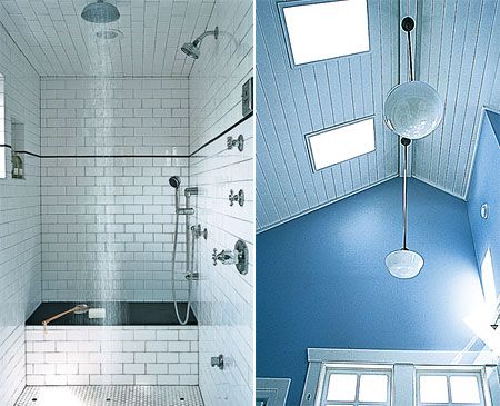
From Adding a Bath Without Adding On, This Old House magazine, June 2006
The architect raised the roof 7 feet to open up a tiny upstairs space in a 1916 Craftsman, and it’s as if he let the sky in—with skylights and a window in the shower that streams light through the central showerhead’s cascading waters. The pendant lights are almost reform-schoolish. Along with the steam shower’s heavy-metal appearance (all those chrome fixtures, all that water shooting out from multiple sources, the black of the granite seat), there’s a real edge to this room that belies the high blue ceiling’s easy optimism. This bathroom serves both a slap and a tickle, and that’s what makes it so hot.
—Betsy Andrews, Online Editor
Salvaged Beauty
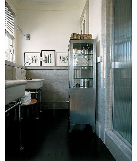
From Amazing Grace, This Old House magazine, July/August 1998
It’s so rare in residential bathrooms to see magnificent slabs like these, salvaged from an old office building, mounted on the walls like wainscoting from a 1920’s bank. A salvaged pair of porcelain bathtub sinks perched on shiny chrome legs brighten the gray stone and dark wood floors. Both sinks have no-handled, foot-operated faucets, a brilliant idea that minimizes cleaning. I’d lose the stainless dental supply cabinet, however; it hides too much of the marble.
—Tom Baker, Building Technology Editor
Classic Fixtures
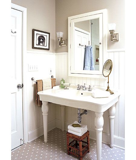
From A Vintage Look for a New Bathroom, This Old House magazine, October 2003
This bath balances form with function using classic fixtures. The leggy claw-foot tub, console sink, planters and stools are all raised off the ground, emphasizing the subway tile shining up from the floor. Also, the detail on the tub’s feet resembles the swooping profile of cast plaster. The bright white built-ins and wainscoting shine beneath a skylight, showing the room’s lightness and simplicity.
—Harry Sawyers, Editorial Assistant
Modern Masterpiece
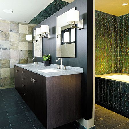
From TOH TV Takes the Chill off Modern, This Old House magazine, April 2006
I’m not even sure a photograph can do justice to the beauty of the iridescent tiles around the tub in this bathroom (or in the shower in the back right corner, which isn’t visible here). And the Jura green limestone counter is so lovely over the floating vanity, with its serene dark wood and hefty square pulls. The lighting is perfect, the wall that doesn’t quite reach the ceiling is ingenious, the feeling of the space is transcendent. I’m a recent convert to Modern architecture and design, and the features in this bathroom (and the whole house—last year’s TV show project in Cambridge) are largely responsible.
—Alexandra Bandon, Senior EditorI love the clean, modern fixtures and layout of this bathroom, combined with the warmth of the natural limestone and wood. I would love to be in that big soaking tub surrounded by those beautiful handmade tiles that look so great together, and also have such interesting variation of color within each individual piece. Real artists, not machines, made those tiles and it shows.
—Amy Rosenfeld, Design Director
Pretty in White
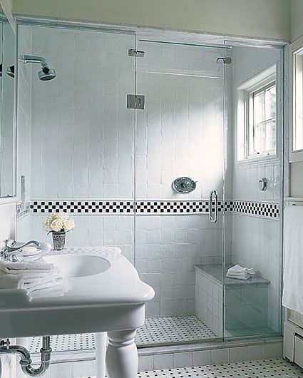
From The Sum of Its Parts, This Old House magazine, January/February 2005
A lot of white tile can sometimes create a very cold, hospital-like environment, but this master bath escapes that tragedy. I love the subtle imperfections of the hand-made tiles, which give a clean look without being sterile. I’m also pretty fond of the curvy console against all the boxiness of the tiles, shower bench and windows.
—Natalie Rodriguez, Editorial Assistant
Personal Space
From , This Old House magazine, Winter 2004 Kitchen Bath Guide
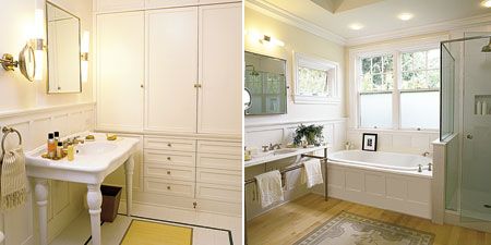
The idea of having separate bathrooms is every wife’s and mother’s dream—finally a place to call her own, a sanctuary to wash away the worries of the day. Her bathroom is simple in design and traditional in style. The console sink adds a touch of simplicity and elegance. His bathroom is simpler still, featuring a steam shower, lot of storage and a masculine looking console sink. Although separate, these two baths compliment each other, and above all create an individual and private domain.
—Colette Ortiz, Design Editor
Clean and Simple
From Making the Pieces Fit, This Old House magazine, July/August 2003
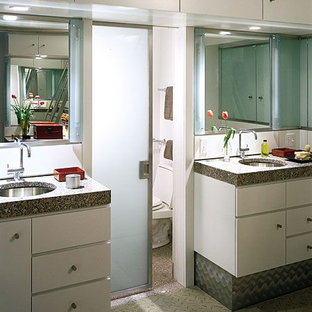
One of today’s hottest bath-design trends is the furniture look, with vessel sinks set into antique vanities, ornate wood details, even upholstered pieces. But to tell you the truth, I’ve never much gone for it. I prefer a bath to look like what it is: a fuss-free, functional space for the business of daily ablutions. But that doesn’t mean it can’t be beautiful, even a source of uplift as you get ready to face the day. Like this master bath. With its clean lines, high ceilings, and white cabinetry, it has an open, airy feeling that belies its compact size. The chunky stone countertops warm up the otherwise clinical surfaces of glass, mirror, and stainless steel. I like the way the vanity cabinets (two of them, a true luxury!) float above the floor. And the separate WC adds functionality without compromising privacy—or dignity.
—Laura Goldstein, Executive Editor
San Francisco Treat
From High Drama, This Old House magazine, Sept. 2003
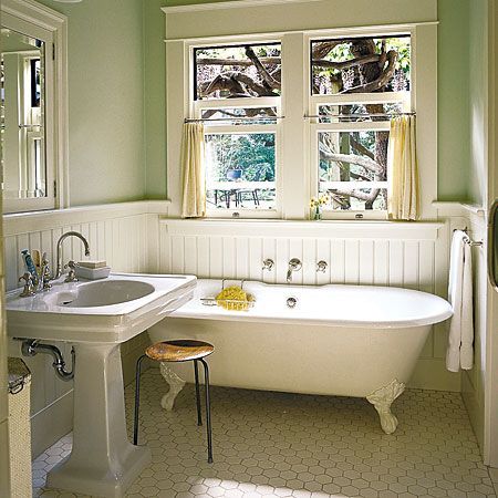
I like the li’l’ lav featured in our September 2003 issue. Located inside a circa-1920 San Francisco cottage, it’s small, bright, clean, and simple as can be with its traditional claw-foot tub and pedestal sink. I also dig the big, fat bead-boards and the garden view.
—Keith Pandolfi, Associate Editor
Spa-Like Retreat
From Split Personality, This Old House magazine, December 2004
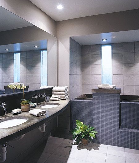
I like this bathroom because it looks solid. It mimics the look and feel of a day spa, with soothing, muted colors of grey and slate blue. All this, minus the visible PVC beneath the counter.
—Michael Stolper, Assistant to Editor
Island Beauty
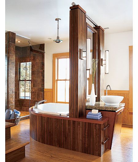
From Island Beauty, This Old House magazine, April 2005
What I find particularly appealing about this bathroom is the fact that the tub, vanity and mirrors are in the middle of the room. While different, it is very functional, makes good use of space, and creates a very cool focal point. The combined use of warm woods with modern fixtures and fittings gives this master bath a timeless look.
—Colette Ortiz, Design EditorI like this bath because the island in the center of the room is functional, yet feels more like a piece of art than a vanity. I also love the elegant woodwork and built-ins galore on the opposite wall.
—Michael Stolper, Assistant to Editor
A Room With A View
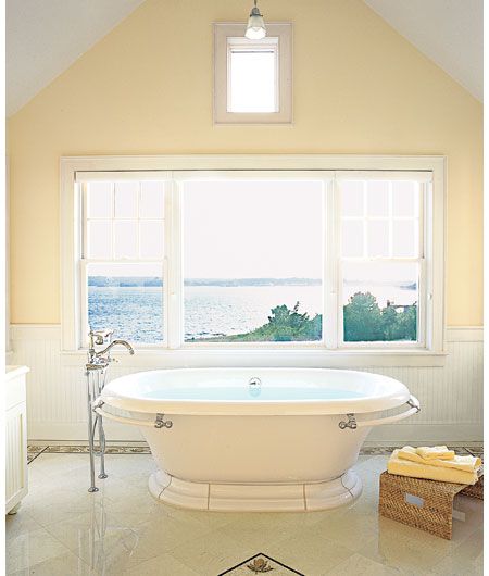
From Second-Story Job, This Old House magazine, July/August 2006
My fantasy bathroom would have a good old-fashioned tub like this, with a view through a picture window onto a large body of water. (Can you tell I’m a Pisces?) This room is actually quite simple, with just enough rich detail, like the mosaic and the stone tile, to feel luxurious.
—Leslie Monthan, Copy ChiefA tub in a mosaic-tiled bathroom beside a large window overlooking a body of water? A Pisces dream. The windows give it a light, airy feel and its size makes you want to live there.
—Susan Ryan, Copy EditorI wanted to jump in that bathtub. And the room is just flooded with light that bounces off the polished floor, pale yellow walls and eggshell colored wainscoting. The view of the water reminded me of home, growing up near the beach. I just felt like the only thing that was missing from that picture was me sitting in the tub, staring at the water and deciding what kind of bait I was going to use on my next fishing trip.
—Jason Carpenter, Projects Editor
Soothing Shade
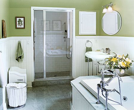
From Split Decision, This Old House magazine, March 2006
The best thing about this bathroom is the color. A soothing green accenting tidy, white wainscoting. The pedestal sink and chrome plumbing fixtures give it a clean finish. I could live in this room.
—Michael Stolper, Assistant to Editor
Wake-Up Call
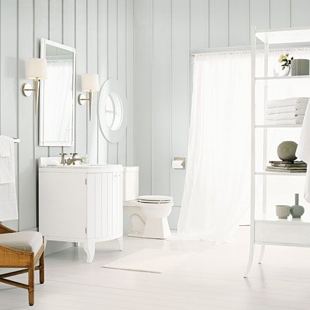
From , This Old House magazine, Winter 2004 Kitchen & Bath Guide
I am not a morning person, so a little sunshine streaming in can be a real pick-me-up in the a.m. I love the light and airy feeling of this space. The soft colors are easy on the eyes, while straight lines and simple amenities offer a really clean look.
—Kristen Mucci, Associate Online Editor
Stylish Storage
From A Bath From Scratch, This Old House magazine, November 2005
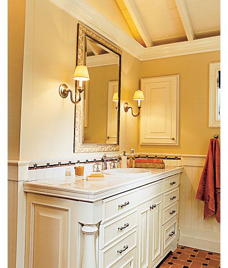
You can never have too much storage space, but it’s sometimes hard to fit it stylishly into a bathroom. That’s why I love the custom-built, antique-looking vanities in this Cape Cod bathroom. They have enough drawers to keep extra towels, and stash away any accessories that would otherwise clutter the counter.
—Natalie Rodriguez, Editorial Assistant
All Natural
From It’s a Natural, This Old House magazine, December 2005
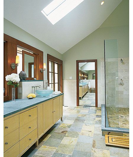
Soothing colors, natural materials, abundant light, and thoughtful details—what more could you want in a bath? If you ask me, not much. The owners of this space (carved from a roof deck over the garage) made the most of the long, narrow room, with double sinks in a 10-foot maple vanity along one wall and a glass-enclosed limestone shower stall on the other. The multicolored slate floor ties together the light and dark wood tones, gray countertop, and pale green walls. But it’s the little details you can’t help admiring—like the mirror suspended in the window well over the sink, teasing with a sliver of view, and the mirrored pocket door that extends the space forever. No fuzzy bath mats here: Even the wood step-out stays true to the room’s richly austere spirit.
—Laura Goldstein, Executive EditorI really like this bath for its handsome mix of natural materials—multicolored slate tile on the floor, limestone wainscoting on the walls, mahogany trim and maple cabinets—but also for the fact it has some memorable design features. A full height mirror slides open to reveal a dressing closet. Framed mirrors hung in front of windows over each of the sinks allow a peek at the outdoors, as do sliding French doors to a deck outside, and twin skylights. You can watch the sun set from the all-glass shower enclosure. How cool is that?
—Kathryn Keller, Executive Editor
