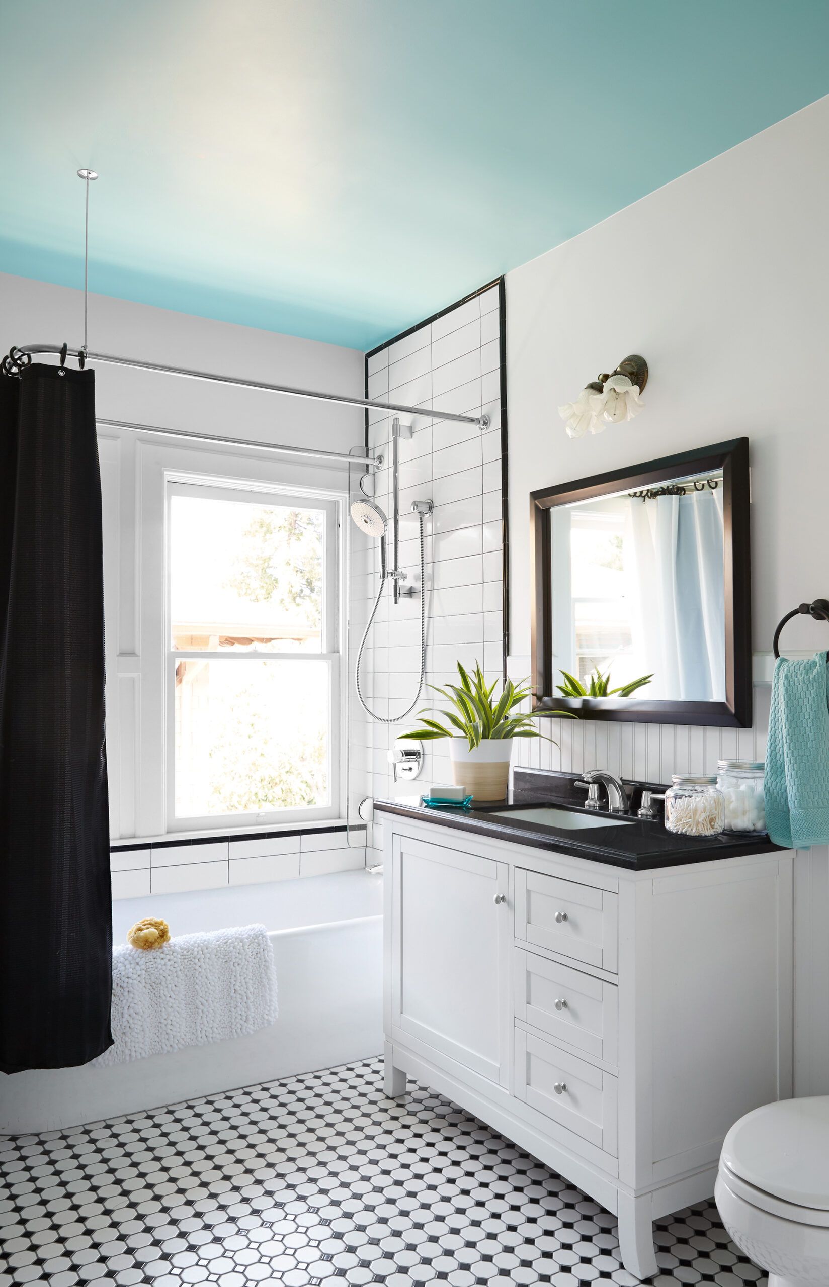
Before: Bland, White
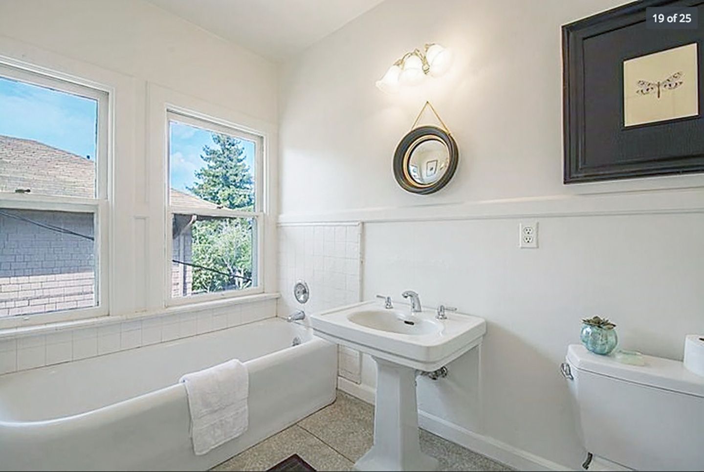
A kids’ bath should feel fun, but youthful design choices should be undoable on a dime. Before Adam and Jill Sharkey purchased their 1905 Craftsman home in Santa Barbara, CA, the family of four had been sharing a single bathroom. “I foresaw some serious tension if we didn’t give the kids their own space,” says Adam, an architect. He wanted the new house’s second bath to be one the kids could grow into without it looking too childish later on. He also needed to add a shower to the tub, without risking water damage to the windows alongside it.
Shown: The bland white bath lacked a shower and storage.
After: Room to Grow

The custom double shower-rod system Adam designed lets the curtain and liners pull around three sides of the tub when the shower is in use; they pull to the side of the windows at the end of the tub when it’s not. A vanity adds storage and fits into the overall palette of classic black and white—except for the ceiling, which received a pop of bright turquoise. Now, Adam says, mornings are easier on everyone, and the kids love how the space is tailored for them. “It looks traditional until you walk in and look up,” he says. “It’s got hidden pizzazz.”
Shown: Now it has a new shower over the tub, a vanity in place of a pedestal sink, smart black-and-white finishes, and a fun hit of color on the ceiling.
Paint: Aqueduct (ceiling) Sherwin-Williams
Vanity: Ove Decors at Home Depot
Custom shower glass fin: JNL Glass, Inc.
Shower glass fin hardware: Hafele America Co.
Toilet: American Standard
Faucet: Grohe
Two Height Towels
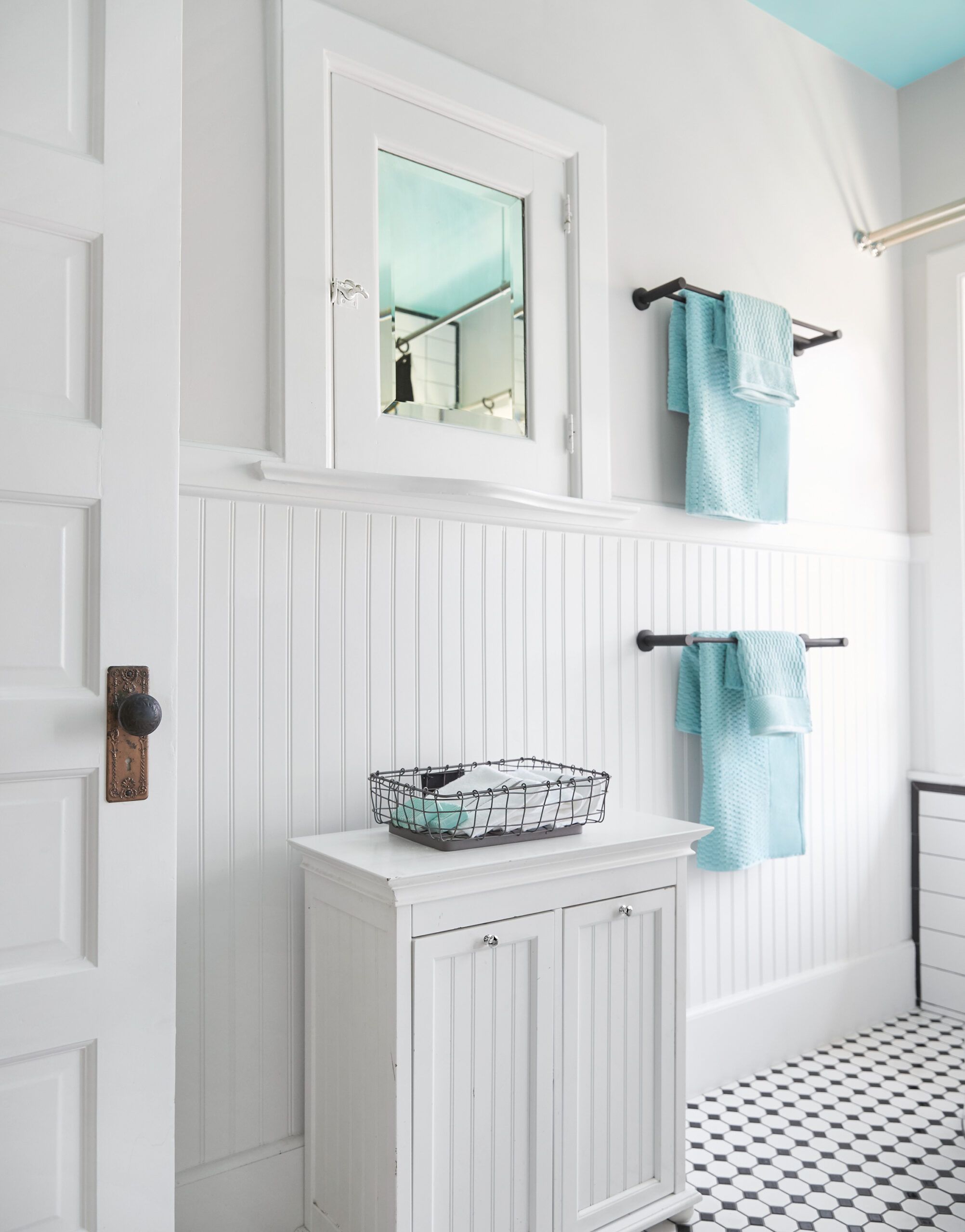
The homeowners installed double towel bars at two heights, so the children can reach the lower set now and grow into the higher set. A hamper that plays off the beadboard walls helps the kids keep things tidy on their own. The wood medicine cabinet above it was already in place.
Towel bars: Marmolux
Custom Rod System
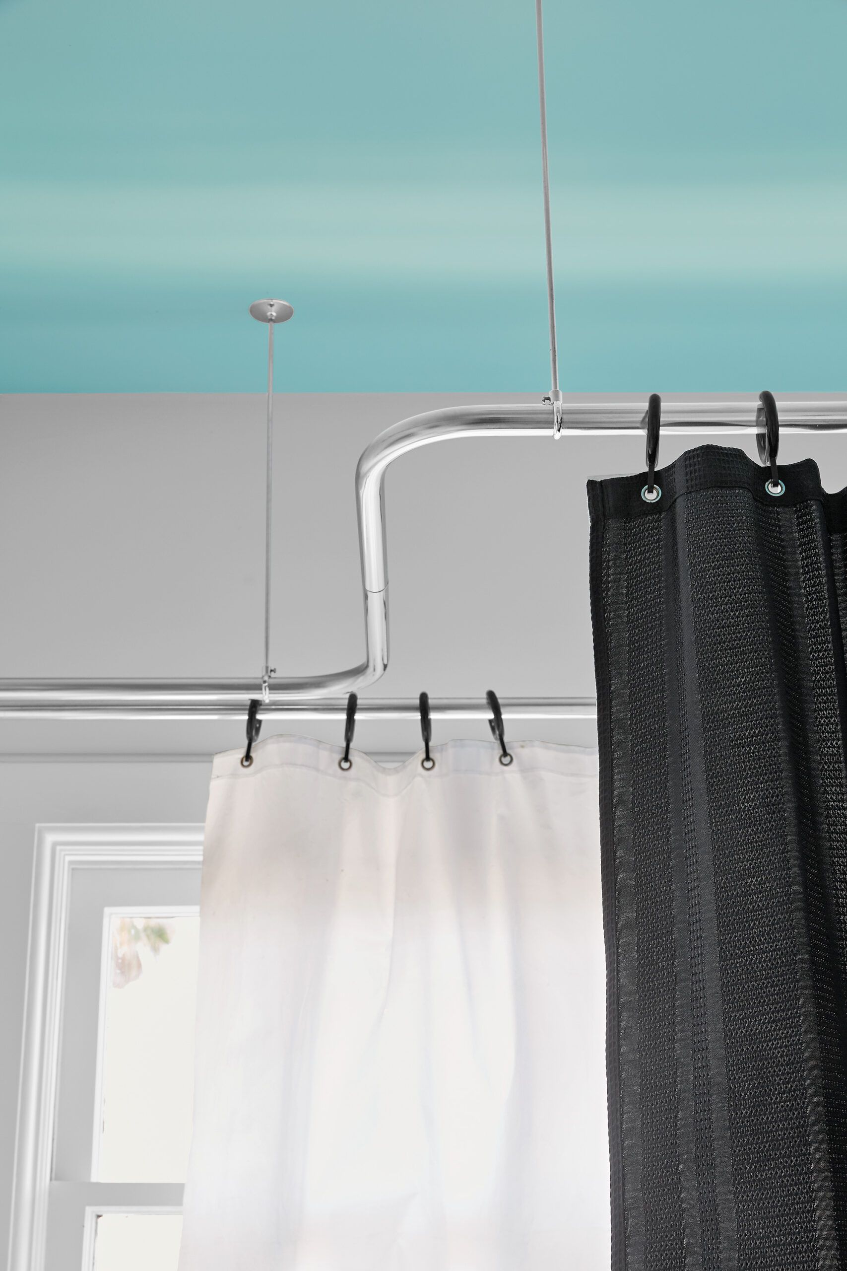
A custom rod system allows the shower curtain and liners to be pulled to one side of the windows to avoid obstructing natural light. When the shower is in use, a liner protects windows from moisture. The ceiling paint was color-matched to towels the homeowners had on hand.
Homeowner tip: “Rather than risk a woefully outdated space later on, use temporary tricks like paint colors or your kids’ artwork to make a space youthful yet easy to change as they get older.” —Adam Sharkey, Santa Barbara, CA
Custom rod system: J. Sharone’s
Window Protection
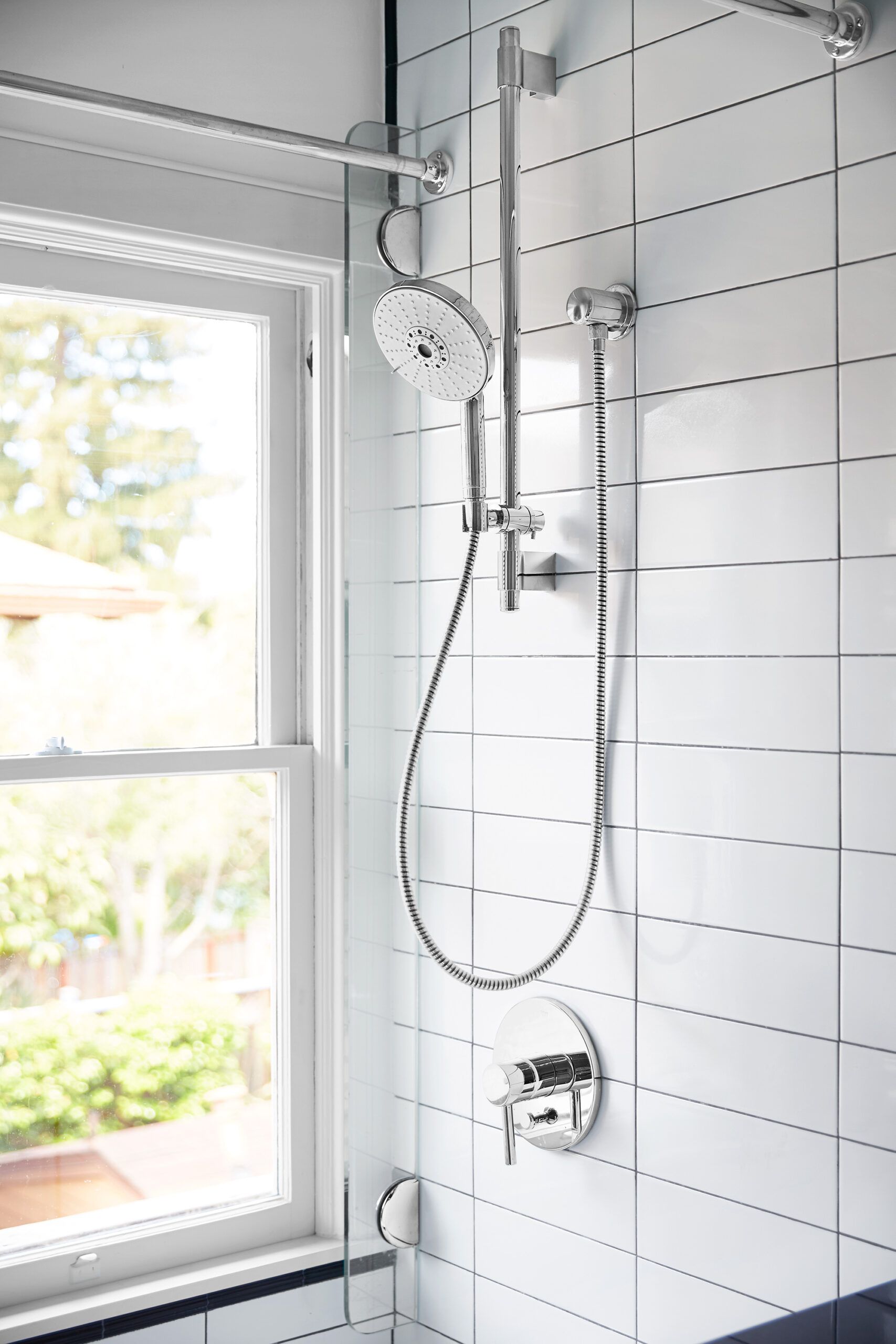
Tucking a curtain liner behind a custom glass fin protects the wood windows from water damage. Narrow 4-by-12-inch tiles look even more modern installed in a stacked bond pattern.
Shower fittings: Grohe
Tile: Tileco
Towel Bar
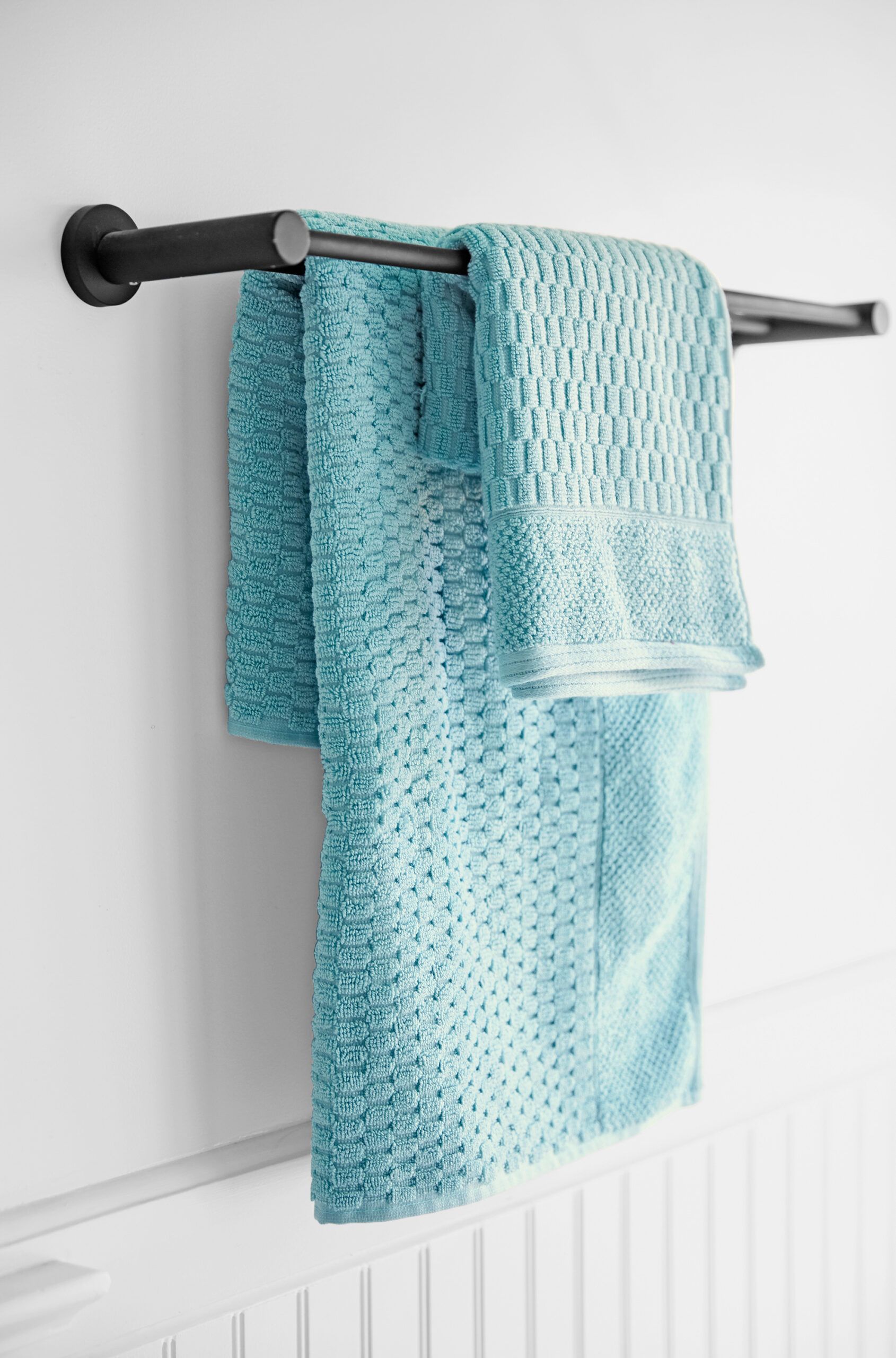
Matte-black towel bars fit in with the classic black-and-white theme, but their sleek lines make them feel modern, too.
Towel bar: Marmolux
Tile Highlights
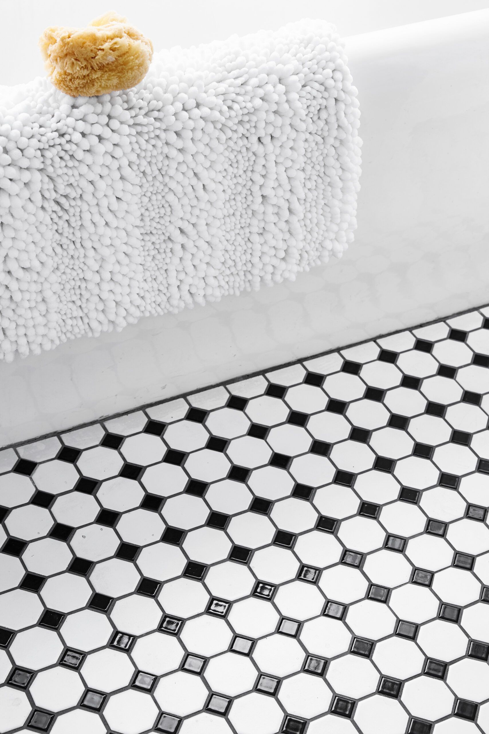
Gray grout highlights the shape of the black and white ceramic tile, which replaced dated laminate flooring.
Tile: Tileco
Fresh Beadboard
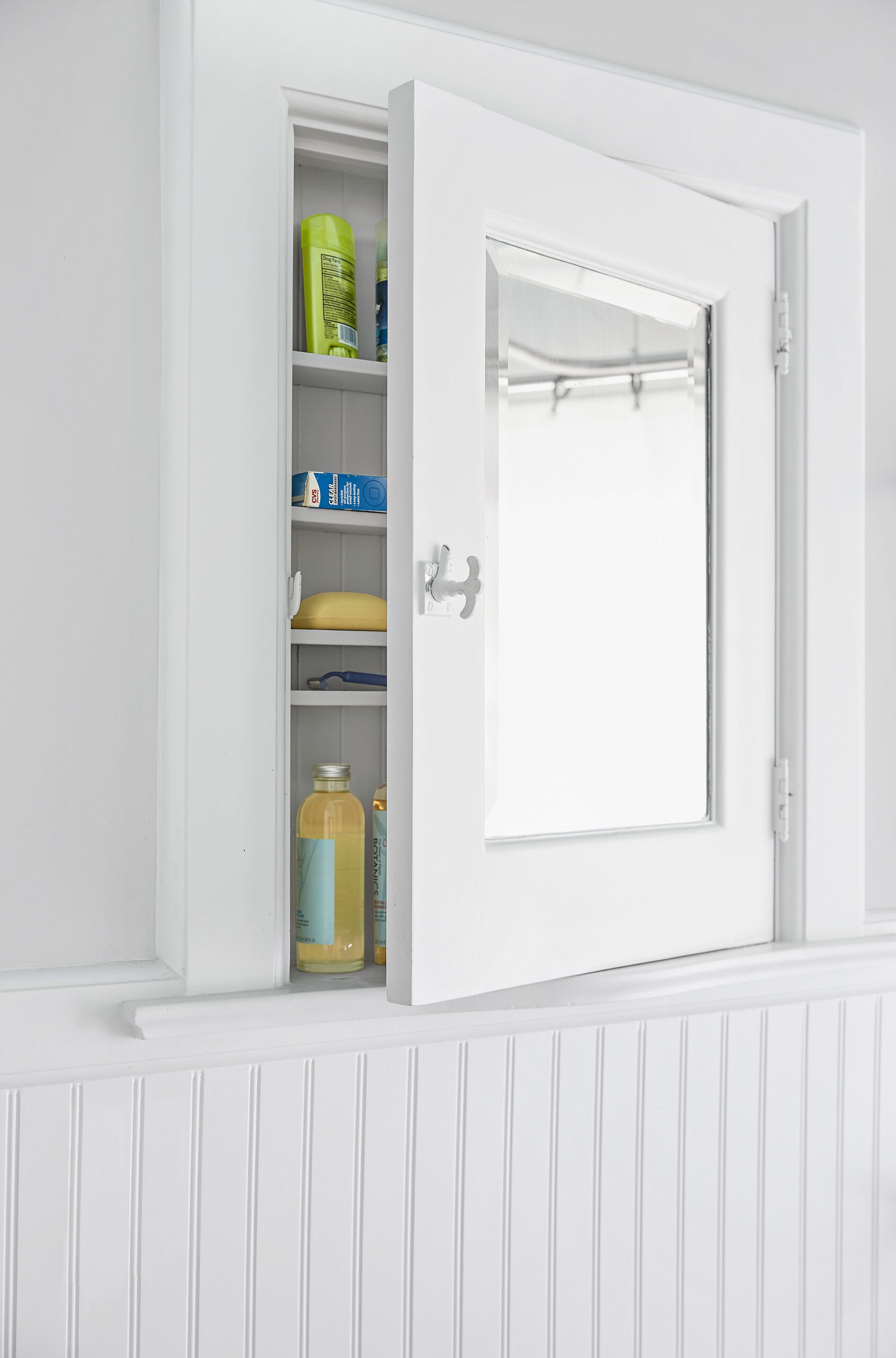
The homeowners added beadboard beneath the existing chair rail for a more finished look. The recessed medicine cabinet, another original feature, just needed a fresh coat of paint.
After Plans

The bath gained vanity storage and a shower, thanks to a window-saving curtain-rod system, without changing the room’s footprint or layout.
1. Installed custom rods so the shower curtain and liners could be pulled out of the way of the windows.
2. Hung double towel bars to one side of an existing medicine cabinet, and added a hamper below it.
3. Opened up the wall to plumb a shower over the existing tub.
4. Replaced the pedestal sink with a 42-inch-wide vanity for added storage.
5. Upgraded the bath with a water-saving dual-flush toilet.
