Functional but Drab
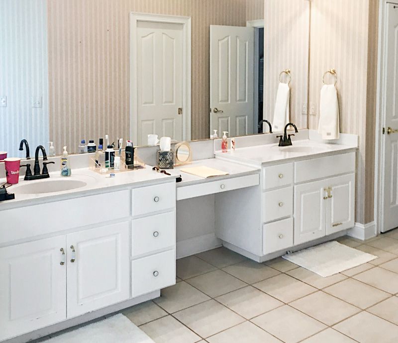
It’s every homeowner’s dream to spend less and get more when remodeling, but it takes an experienced eye to deliver that kind of design magic. John Shumaker liked that the master bath that came with his 1990s home in Brunswick, GA, had a good size and good bones. Two linen closets, a big double vanity, and a separate shower and tub helped the room function to the max. But the particleboard cabinets, laminate countertops, and dated wallpaper made the space feel dull and dingy.
Shown: The existing master bath functioned fine but had drab builder-grade fixtures and fittings.
Character Boost
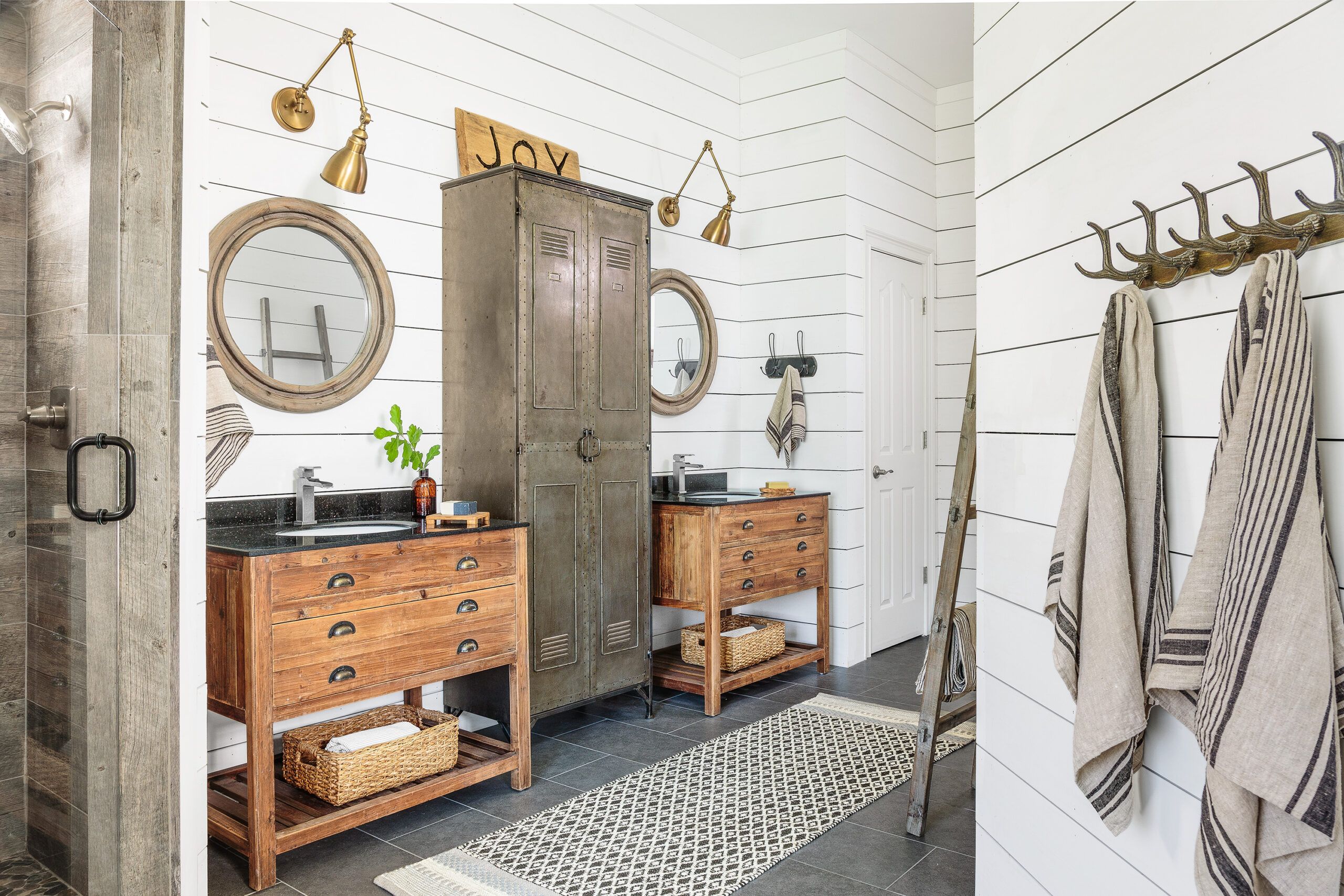
So interior designer Kim Kelly, of Bella Rustica Design, came up with a plan to give John the most bang for his buck. Saving on demolition costs, Kelly covered the wallpaper with shiplap-style pine planks, then laid new tile over old around the tub and inside the shower. Preserving an extra $2,000 in the budget allowed for a pair of distressed-pine vanities, brass sconces, a slate floor, and other rustic-meets-refined accents to overhaul every last square inch of the space. “It feels updated and new,” John says of the result. “And it’s not a style you see in every other house around here.”
Shown: Pine vanities, horizontal wall cladding, and aged brass, silver, and black metal finishes warm up the space and better reflect the homeowner’s taste.
Vanities: GJ Styles
Paint: Pure white (walls); Benjamin Moore
Looks Like Shiplap
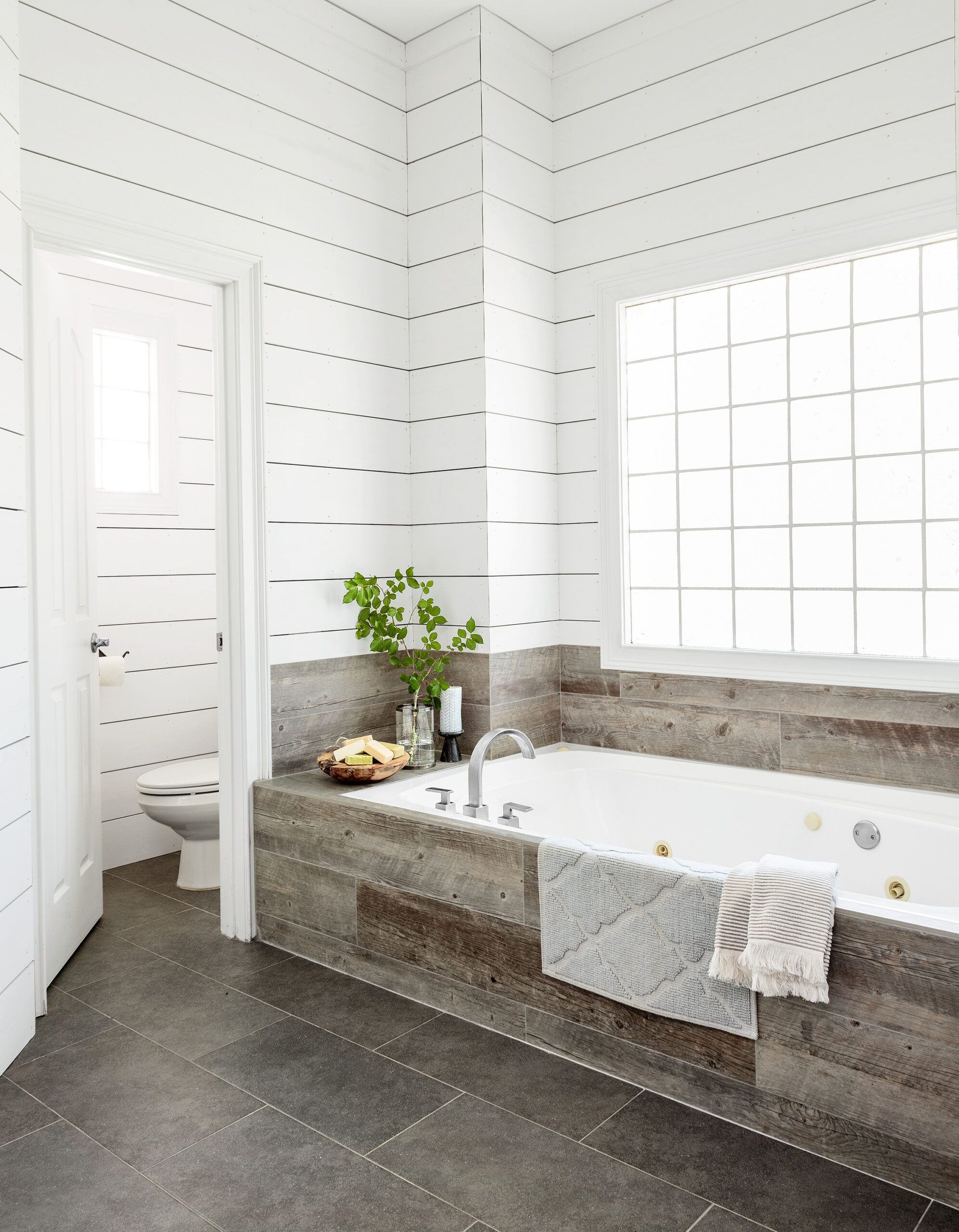
Preprimed 1×8 pine boards spaced 1⁄8 inch apart create the look of shiplap. Painting the existing walls black underneath mimics the shadow line made by traditional shiplap’s overlapping joints—and in this case saved the cost of stripping off the old wallpaper.
Shower Upgrade
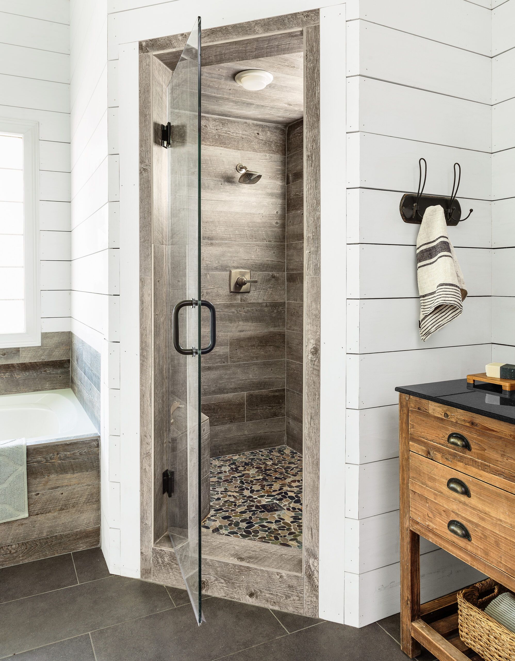
Since the shiplap built out the walls by about three quarters of an inch, porcelain planks could be laid directly over the old tub-surround tile for a flush look. The same tile lines the shower and frames its sleek new glass door.
Floor, shower walls, and tub tile: Style Selections
Homeowner Tip: “If you have the money, upgrade everything at the same time rather than making small, incremental changes. You’ll save more in the long run.” —John Shumaker, Brunswick, GA
Earthy Elements
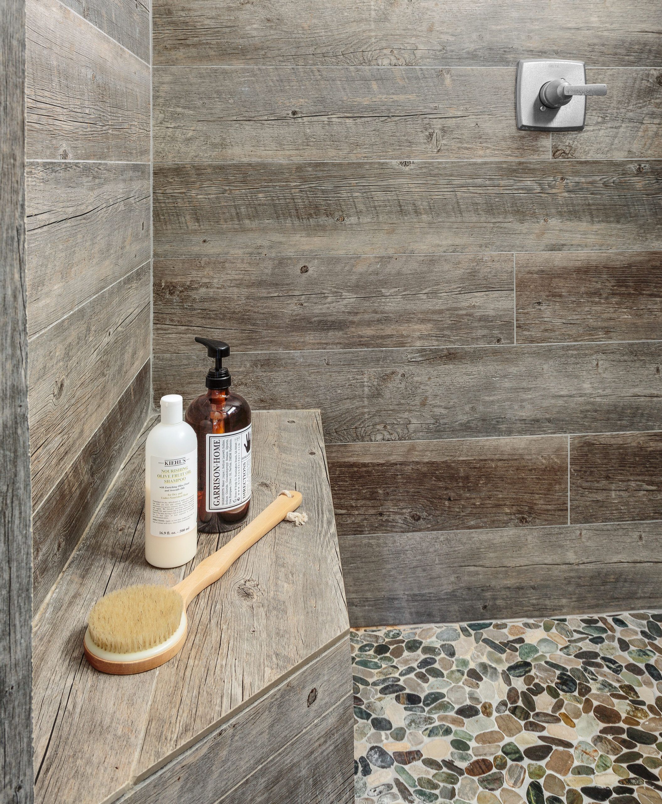
Porcelain planks offer the look of reclaimed wood while standing up to moisture; pebble mosaic tile underfoot adds another earthy element.
Shower floor tile: American Olean
Antler Racks
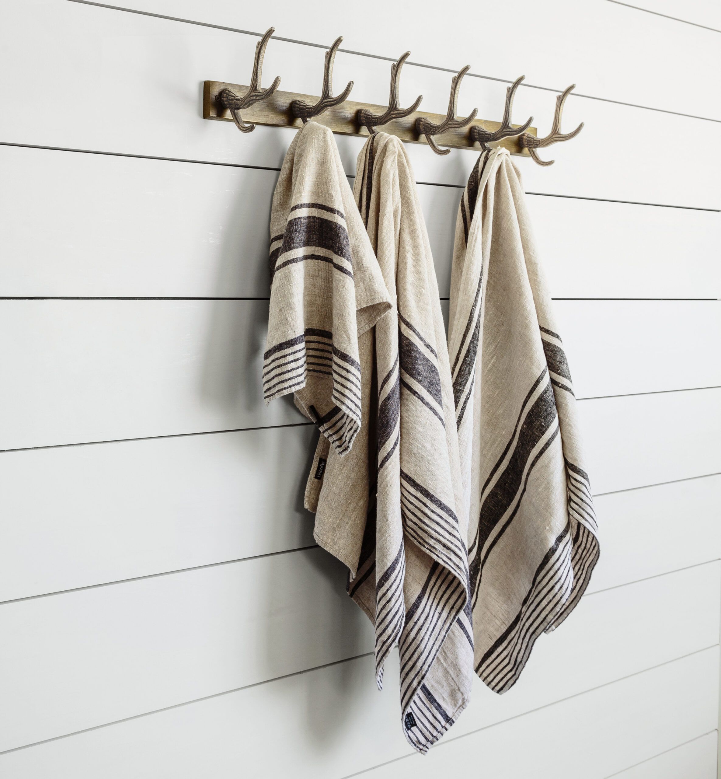
Since coatracks tend to have more character than standard towel bars, designer Kim Kelly prefers to incorporate them in her bath designs. This whimsical antler-inspired version has the practical plus of lots of hooks.
Coatrack: Houzz.com
Mirror and Sconce
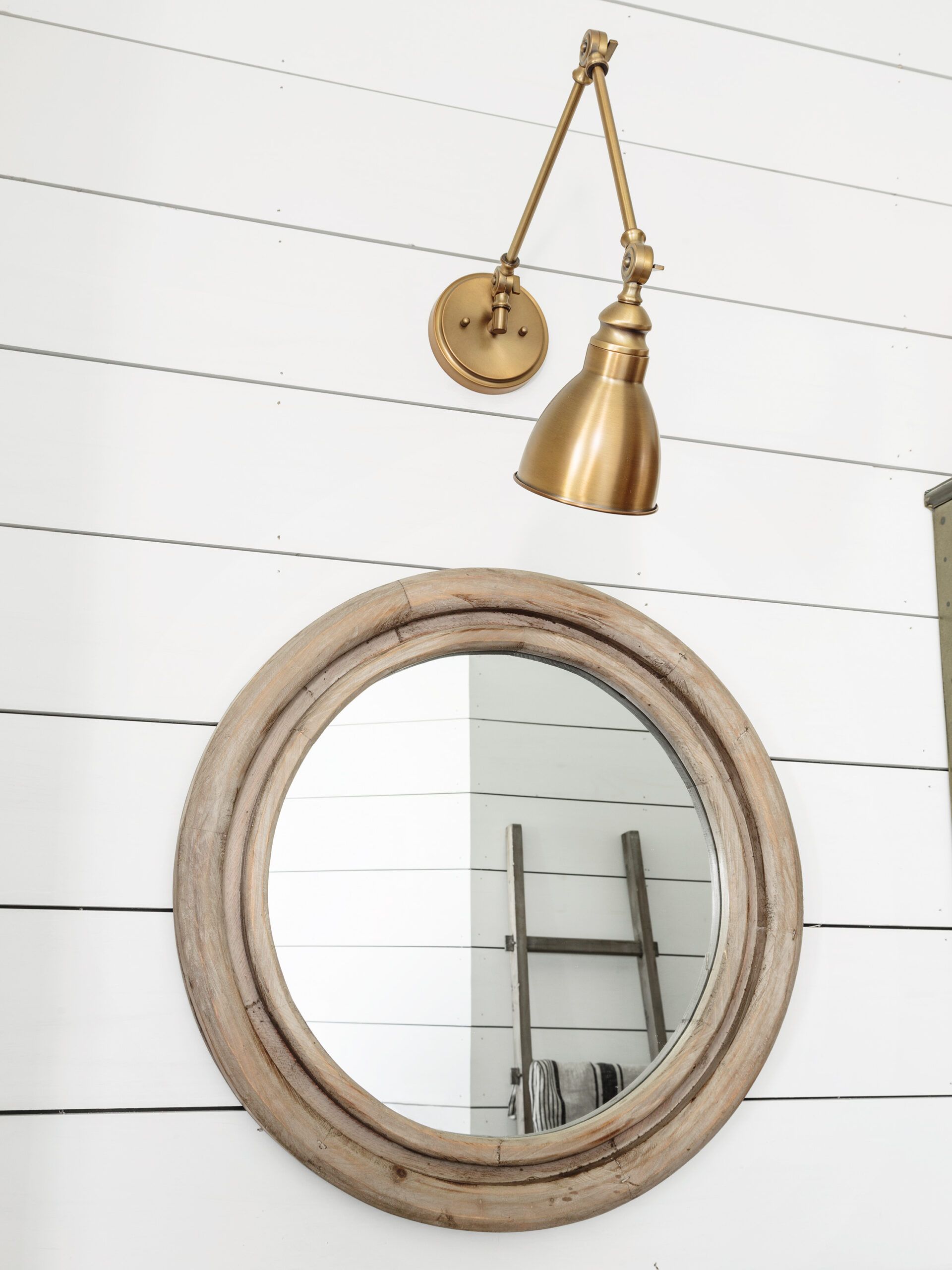
Brass articulating sconces above the sink mirrors mix with satin nickel faucets, a galvanized metal storage locker, and a black iron towel rack.
Mirror: Vagabond Vintage
Lighting: Coley Electric & Plumbing Supply
Linen Cabinet
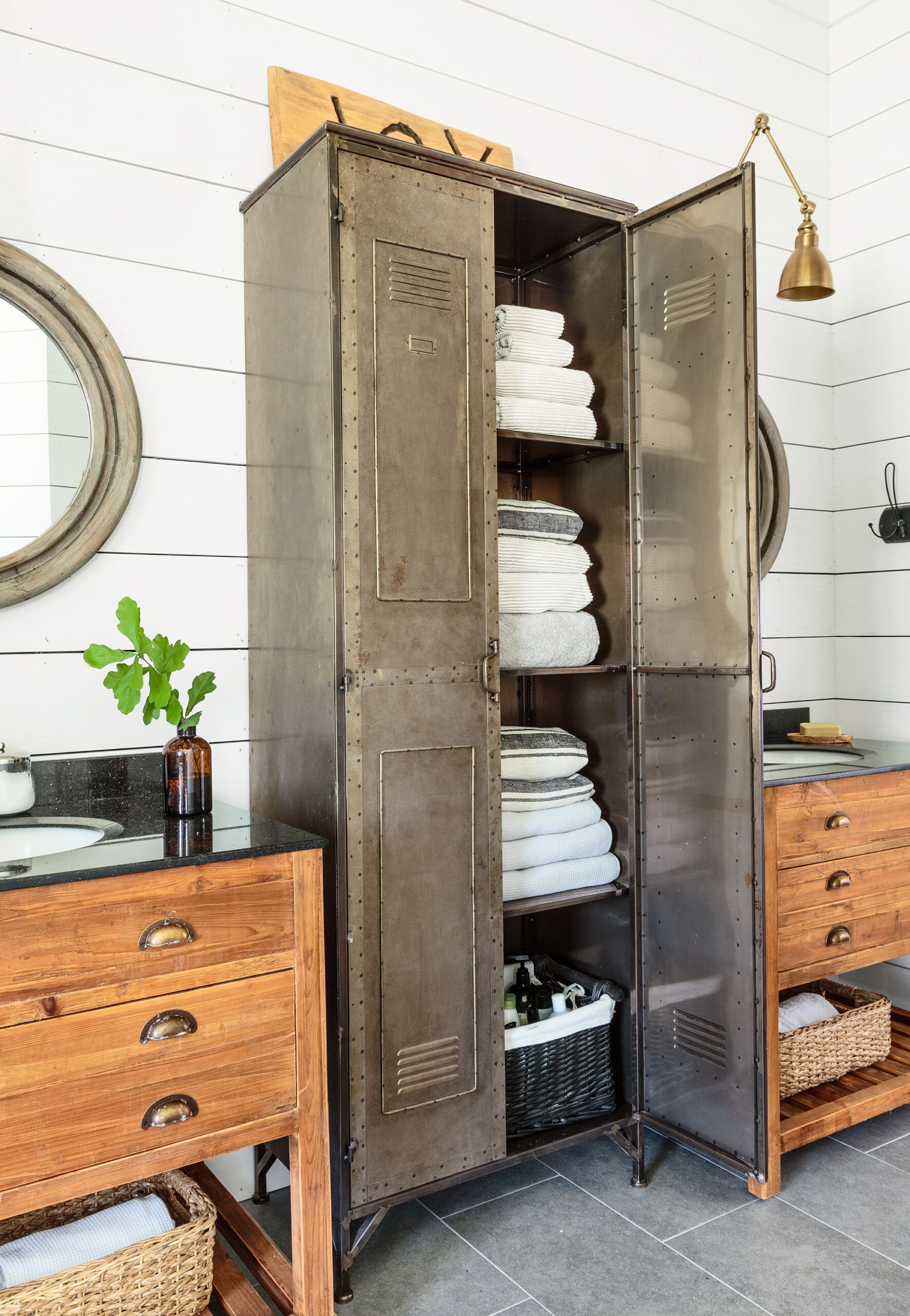
The old vanity was a nonstandard size, so to avoid blowing the budget on a custom unit, the designer opted for two smaller, separate stock sink cabinets with a tall metal storage locker between them.
Towels on Rungs
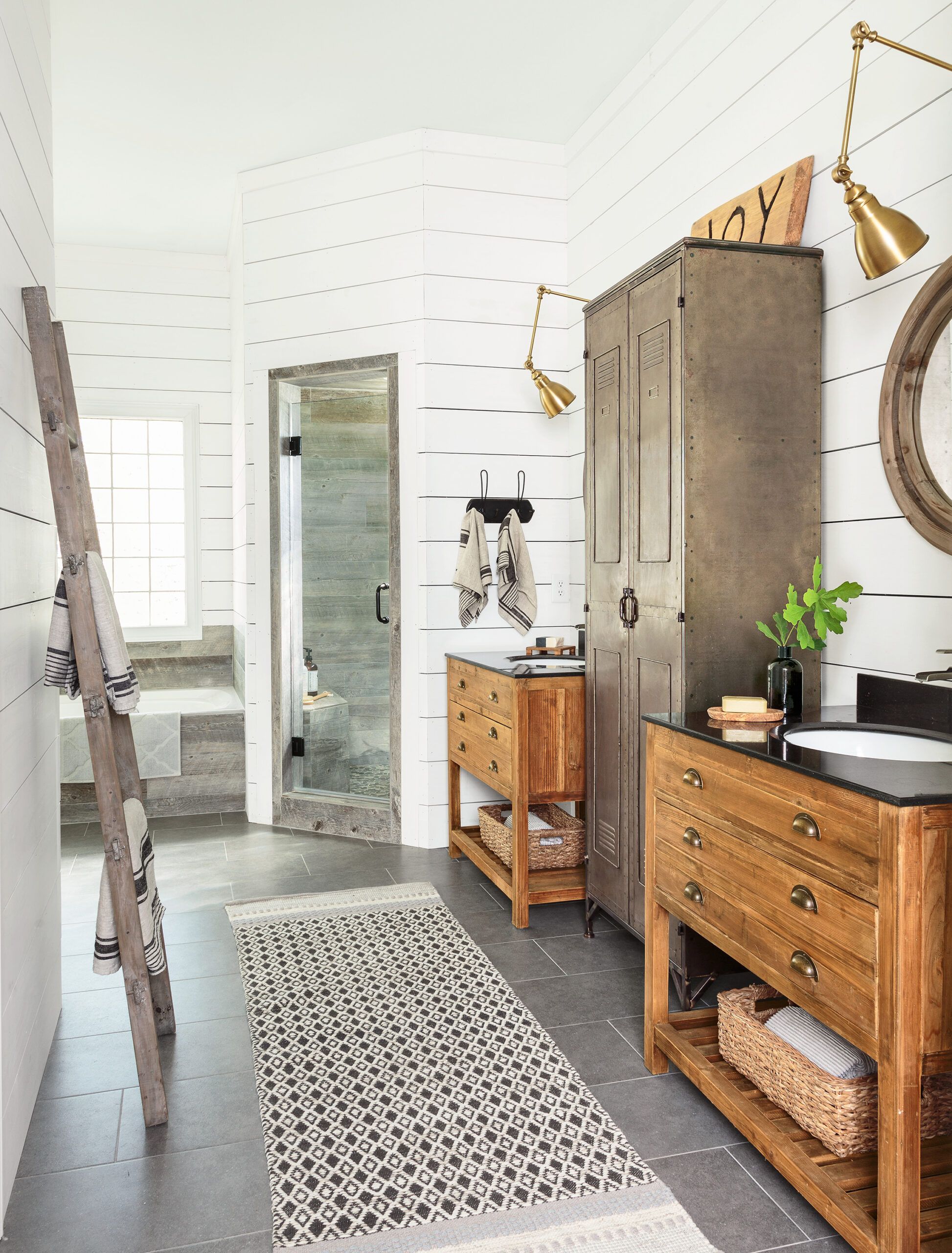
Furniture-like vanities and a freestanding storage cabinet help distract from the room’s odd angles. A wood ladder holds towels and breaks up a long expanse of closet wall.
Metal locker and ladder: Park Hill Collection
Floor Plan
Preserving the fixture layout in the 266-square-foot space meant more of the renovation budget could go toward finishes.
1. Tiled over the existing tub surround and shower walls with porcelain planks.
2. Painted over the existing wallpaper and installed 1×8 pine planks to create the look of shiplap.
3. Upgraded the shower door to a more modern, frameless glass model.
4. Added a freestanding metal locker for extra storage where an integrated makeup vanity had been.
5. Replaced the old 104-inch-wide double vanity with two separate sink cabinets.

