BEFORE | Space Challenge
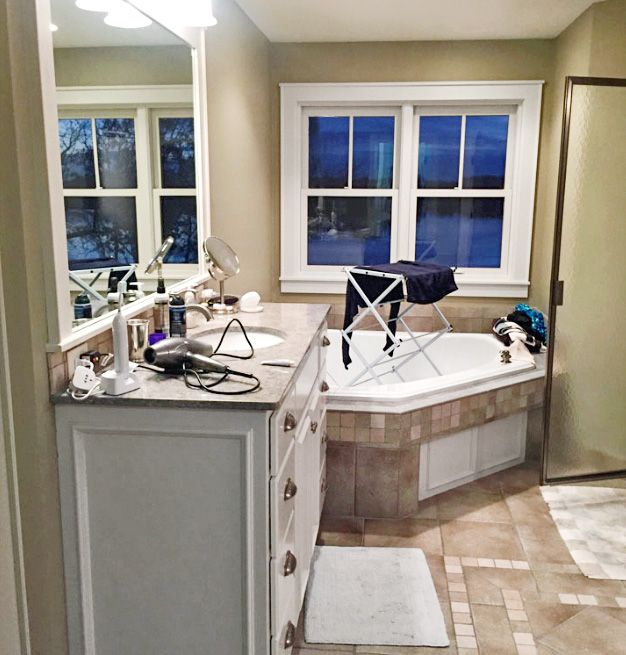
A foolish consistency is, well, let’s just say unnecessary when it comes to the look and feel of your home. Just ask Rick and Amy Steinhauser, who appreciate how their lodge-style home suits its lakeside setting in Plymouth, MN, but, as frequent travelers, also longed for a master bath with the fine finishes and luxury amenities they have enjoyed during hotel stays. Original to the 2003 house, the existing bath “was brown, woodsy, and dark,” says Rick of the 184-square-foot space. “We wanted a complete departure, something truly spa-like.”
Shown: Dated finishes included a corner tub that ate up space, and textured floor tile with hard-to-clean pits and divots.
Spacious Sanctuary

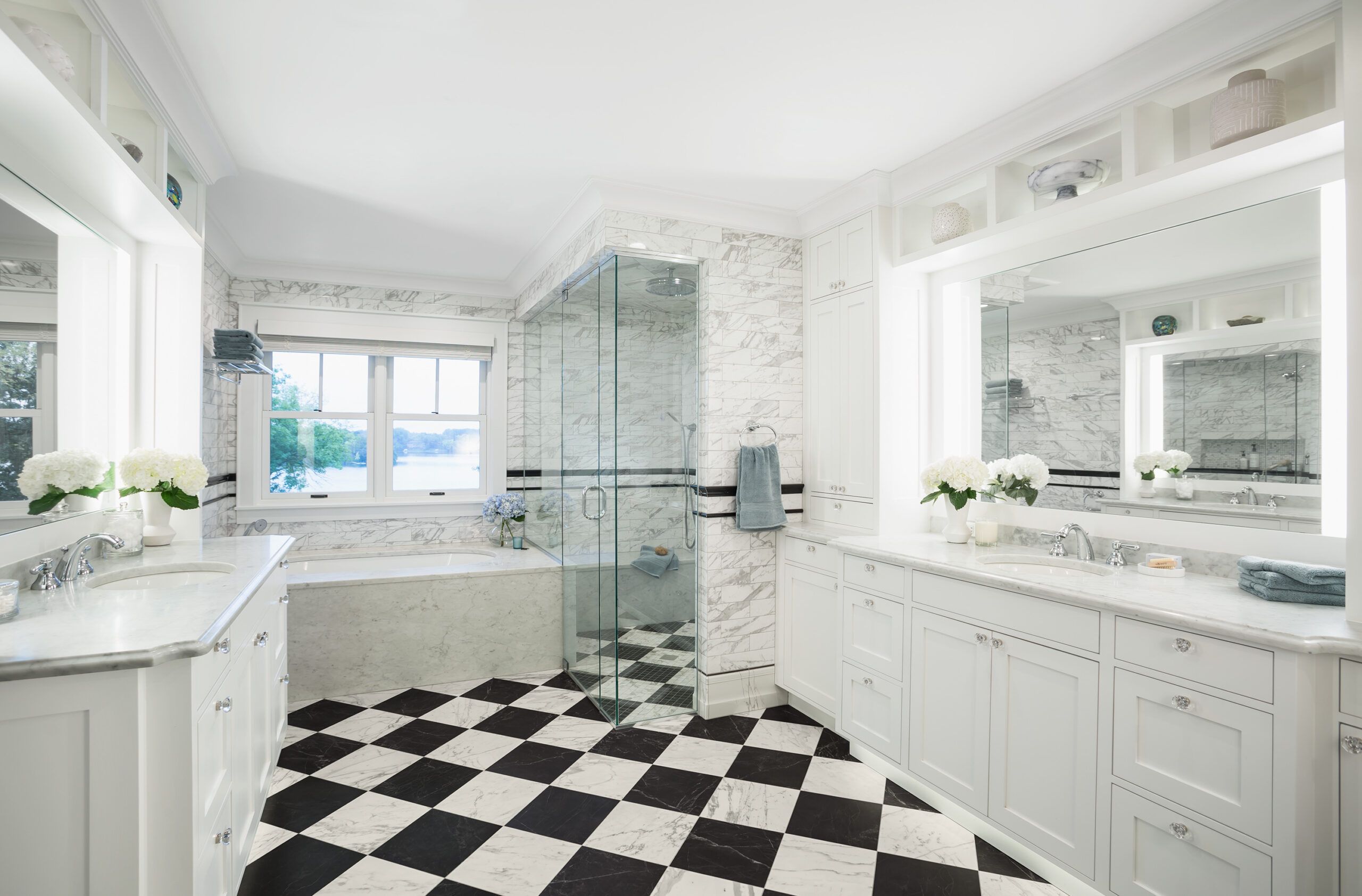
So it was out with the rustic earth tones and in with a traditional black-and-white scheme by Minneapolis-based Edit Design Build Studio. The firm swapped a clunky corner tub for an undermount soaker finished with Carrara marble, and continued marble-look tile up the walls with contrasting black chair-rail and pencil-trim accents. The dim cave of a shower gave way to a frameless-glass-enclosed, no-threshold steam model. “We plan to live in the house until we’re carried out, so the walk-in will be more accommodating as we age,” says Amy. Ceiling-high custom cabinetry, generous mirrored vanities with built-in lighting, and the marble-look checkerboard floor are as practical as they are polished. But the Steinhausers didn’t stop there. “We refreshed our bedroom with paint and carpet to reflect the new bath,” says Rick. “Now we have the dramatic, elegant space we always wanted, and it all works together.”
Shown: Custom cabinetry with built-in mirrors and lighting, Carrara countertops, and marble-look wall and floor tile give the space a luxe feel. “We think it has the old-world glamour of a European hotel,” says Rick Steinhauser.
Tile installer: Tile Fusion, Shakopee, MN
Tile: Atlas Concorde
Sinks, showerhead and mirror: Kohler
Faucets: Rohl
Tub: Hydro Systems
Countertops: Paramount Granite Co.
Shower Enclosure
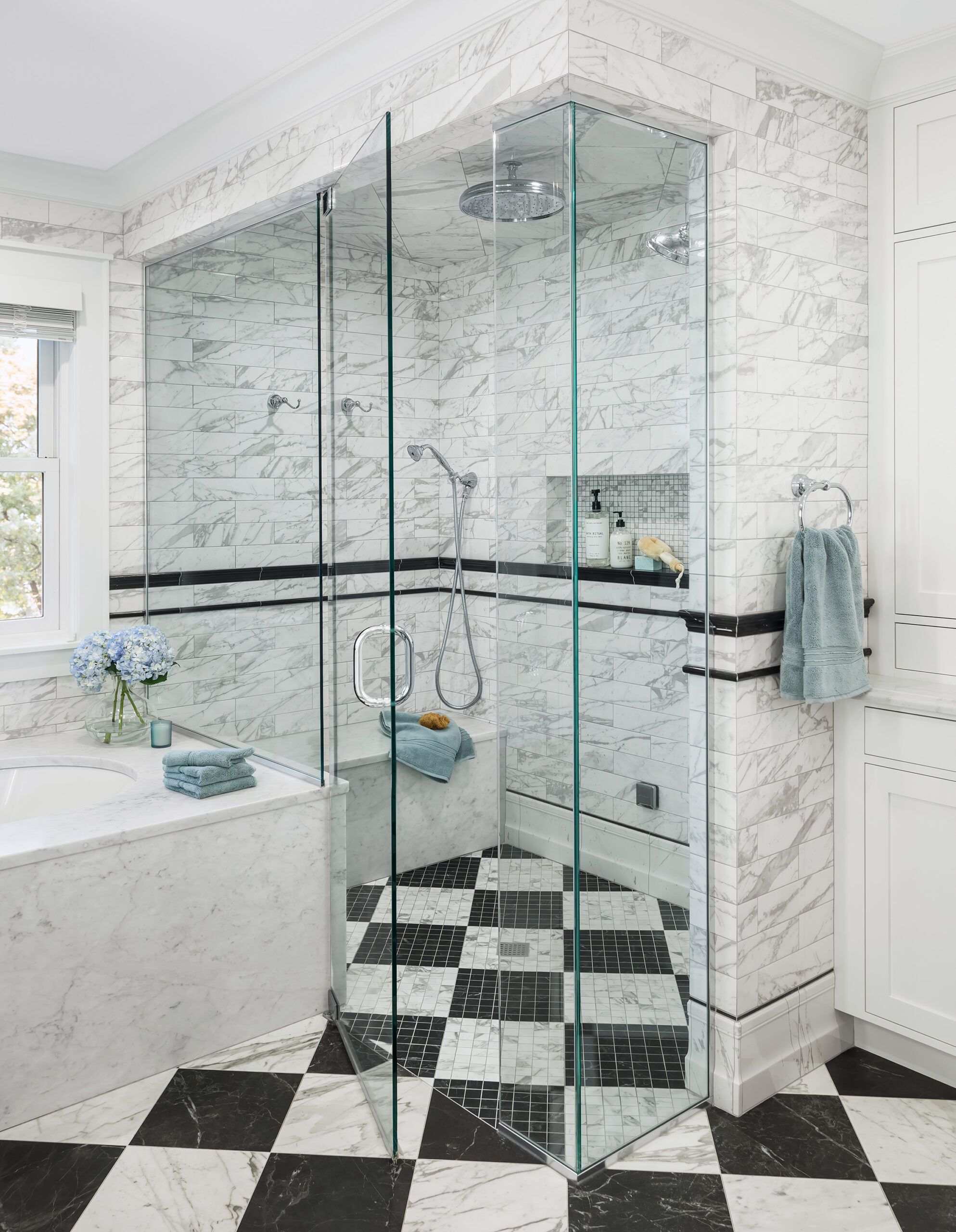
The frameless glass shower enclosure visually disappears, making the bath seem even larger. The built-in bench and handshower add convenience now, and will make aging in place easier down the road.
Shower enclosure: Kohler
The Homeowners
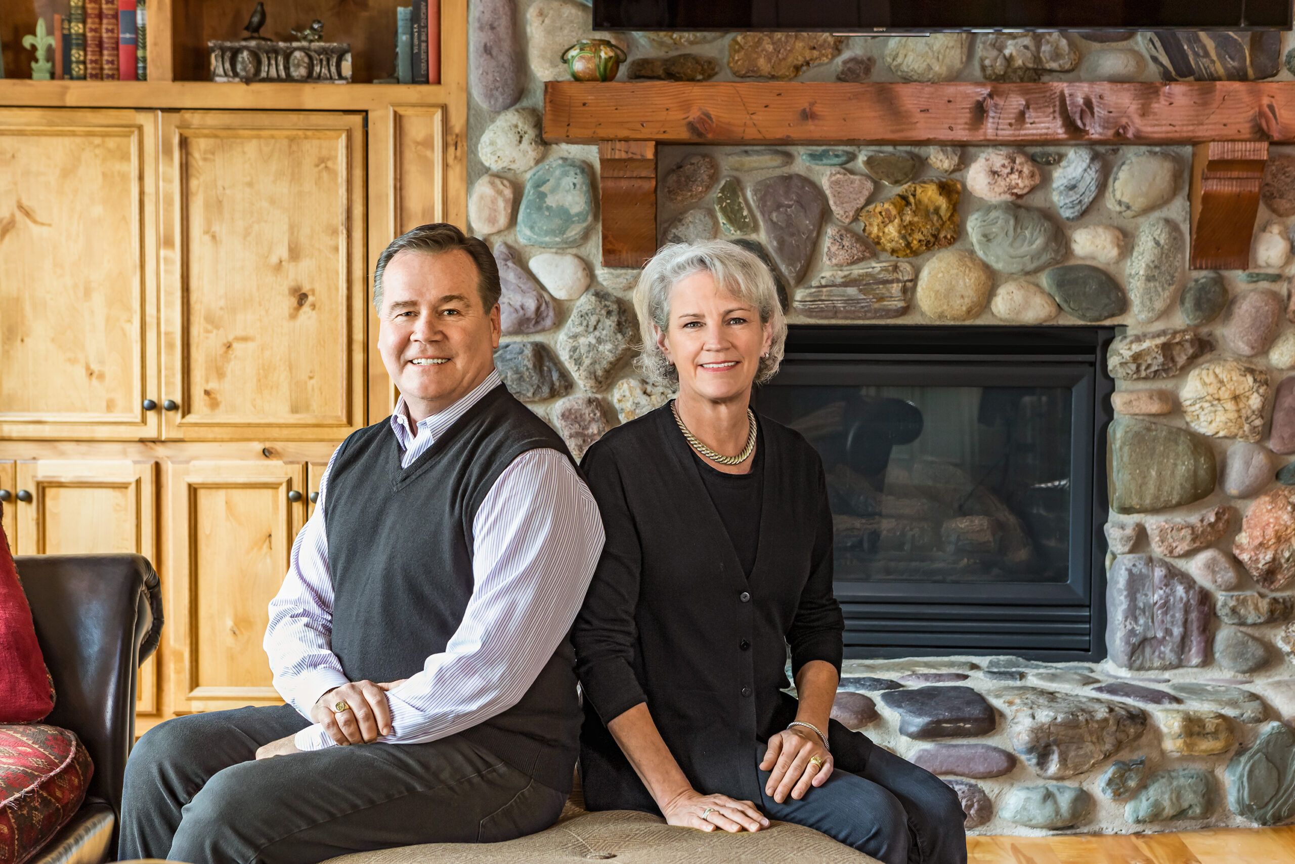
Homeowners Rick and Amy Steinhauser in the living room of their lodge-style house.
In the Niche
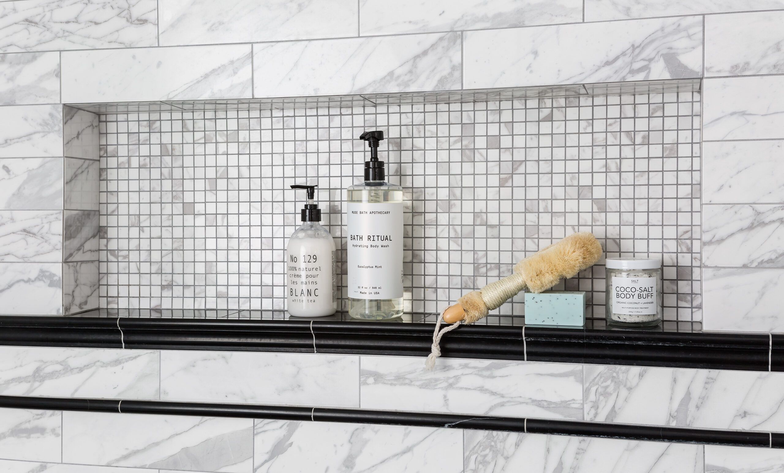
The oversize niche—37 inches wide, 12 inches high, and 4 inches deep—keeps toiletries handy. Backing it in mosaic tile adds an extra design detail that ties in with the shower floor.
Threshold Free
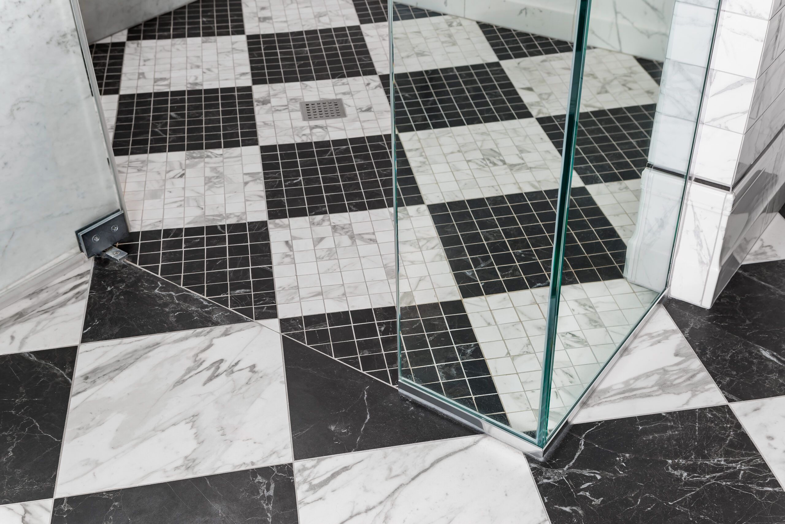
A no-threshold shower stall equals “No tripping hazard!” as Rick says. The transition to smaller floor tiles means more grout, improving drainage—and traction underfoot.
Custom Storage
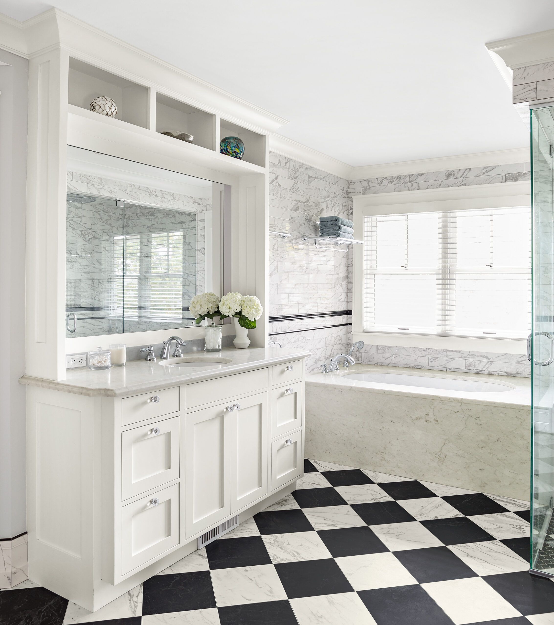
Custom cabinetry in the bath allowed the homeowners to get all the details right—from inset lighting to the best place for a hair-dryer outlet. Open shelves along the top are perfect for displaying unique pieces that personalize the space.
Vanity cabinets: Minnesota Valley Cabinets
Hardware: Restoration Hardware
After Floor Plan
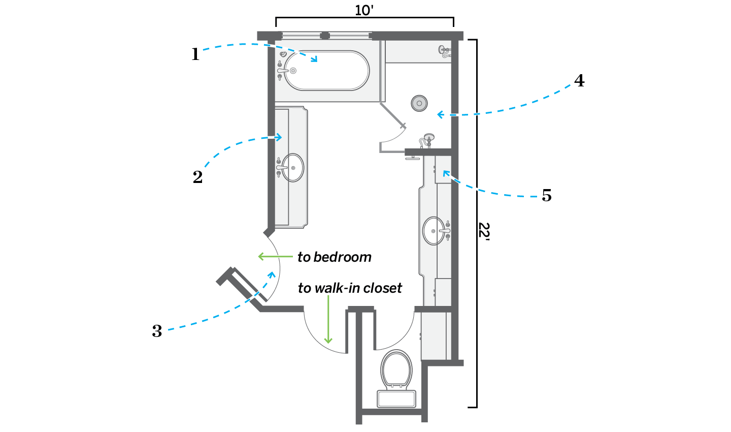
The layout stayed the same in the 184-square-foot space, with a slimmer tub and a larger shower.
- Removed a bulky corner tub and swapped in an oval one with generous deck space.
- Replaced both vanities with built-in units that have ceiling-high shelves and large mirrors with linear lighting along both sides.
- Reversed a door swing to save space in the adjacent bedroom.
- Reconfigured the shower to be approximately 4 by 6 feet, with a built-in bench and without a threshold, to reduce the risk of falling.
- Redesigned the larger of the two vanities with less-obtrusive stepped-back upper storage cabinets along both sides. The toilet enclosure remained in place.
