This article appeared in the Summer 2022 issue of This Old House Magazine.
When choosing a designer for a remodel, it’s a good idea to hire someone who will consider your future needs as well as your present wants. Even better when that person is your daughter and knows your taste to a tee.
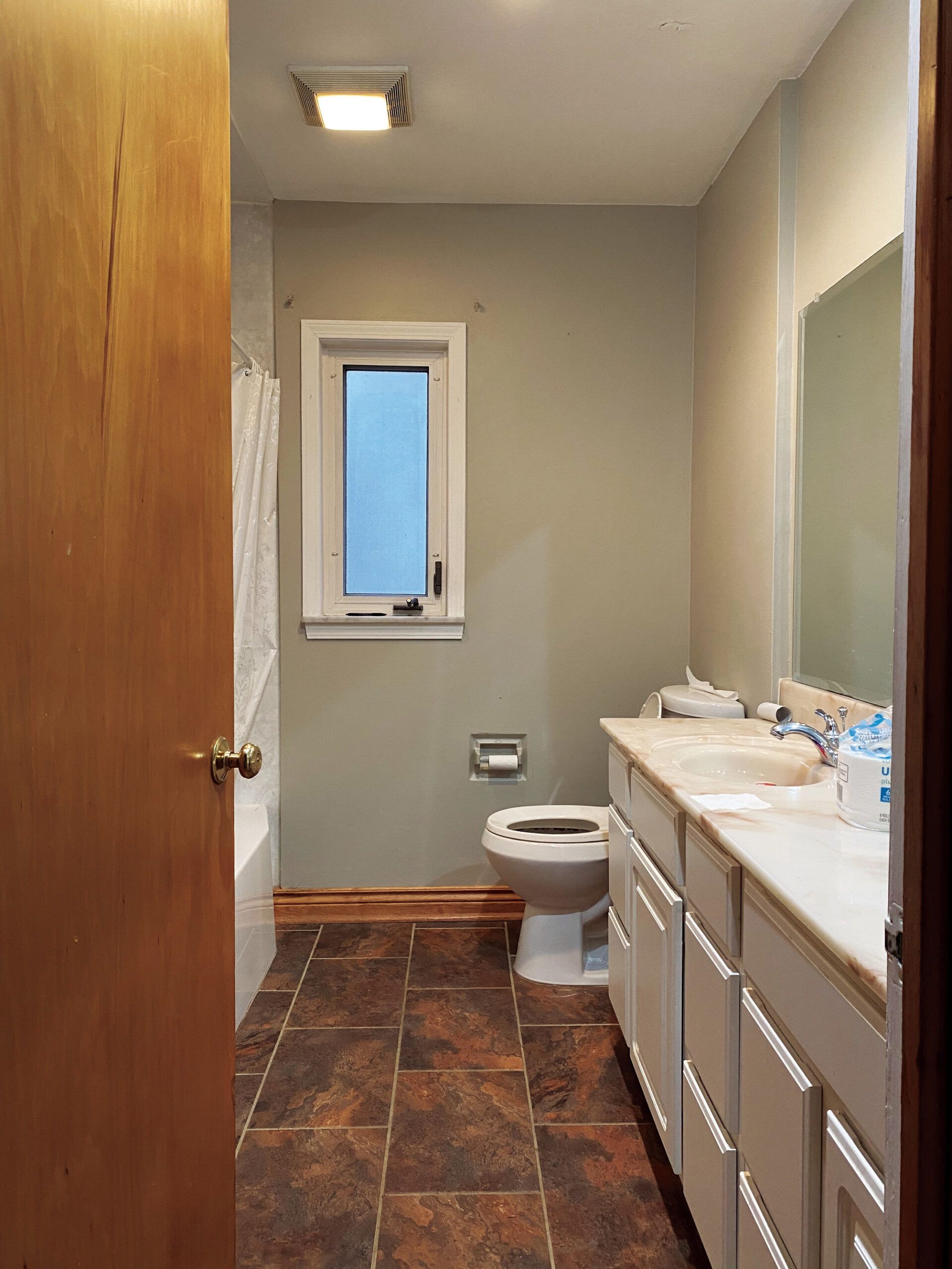
While Catherine Williamson’s parents wanted the 1950s Cape they bought near her family in Columbus, OH, to be their forever home, they could see that the second-floor primary bath (and the basement laundry) might not be doable for them down the road.
So they turned to Catherine and her designer-husband, Bryan, to improve the existing first-floor guest bath and find space for laundry nearby.
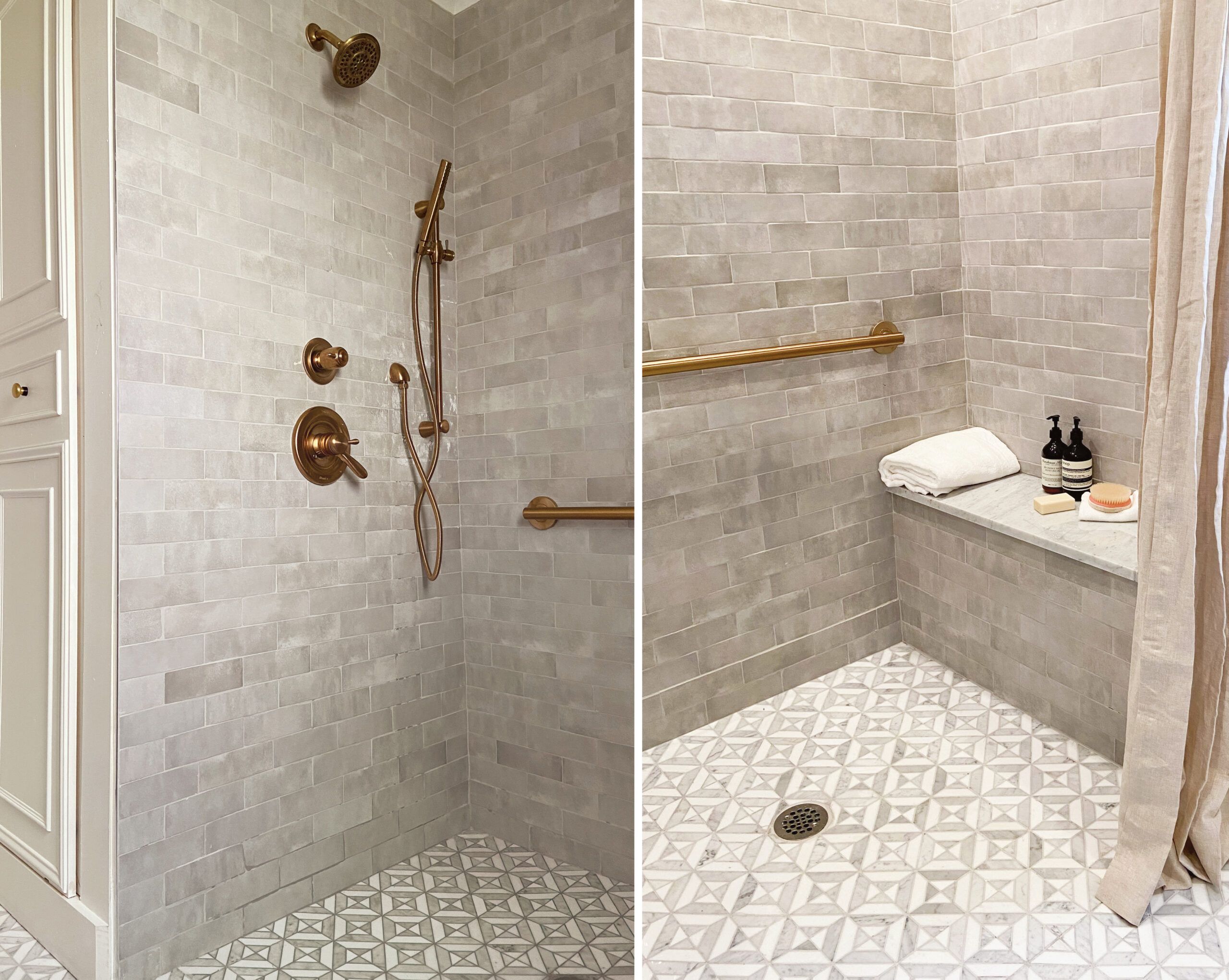
Key to making the bath more accessible: ditching the tub for a curbless walk-in shower. Stealing a foot of space from the guest bedroom and sacrificing some of the bath’s linen cupboard allowed the designers to achieve two goals: a larger, 4-by-5-foot shower with a bench seat in the bath, and a laundry closet that opens onto the hall.
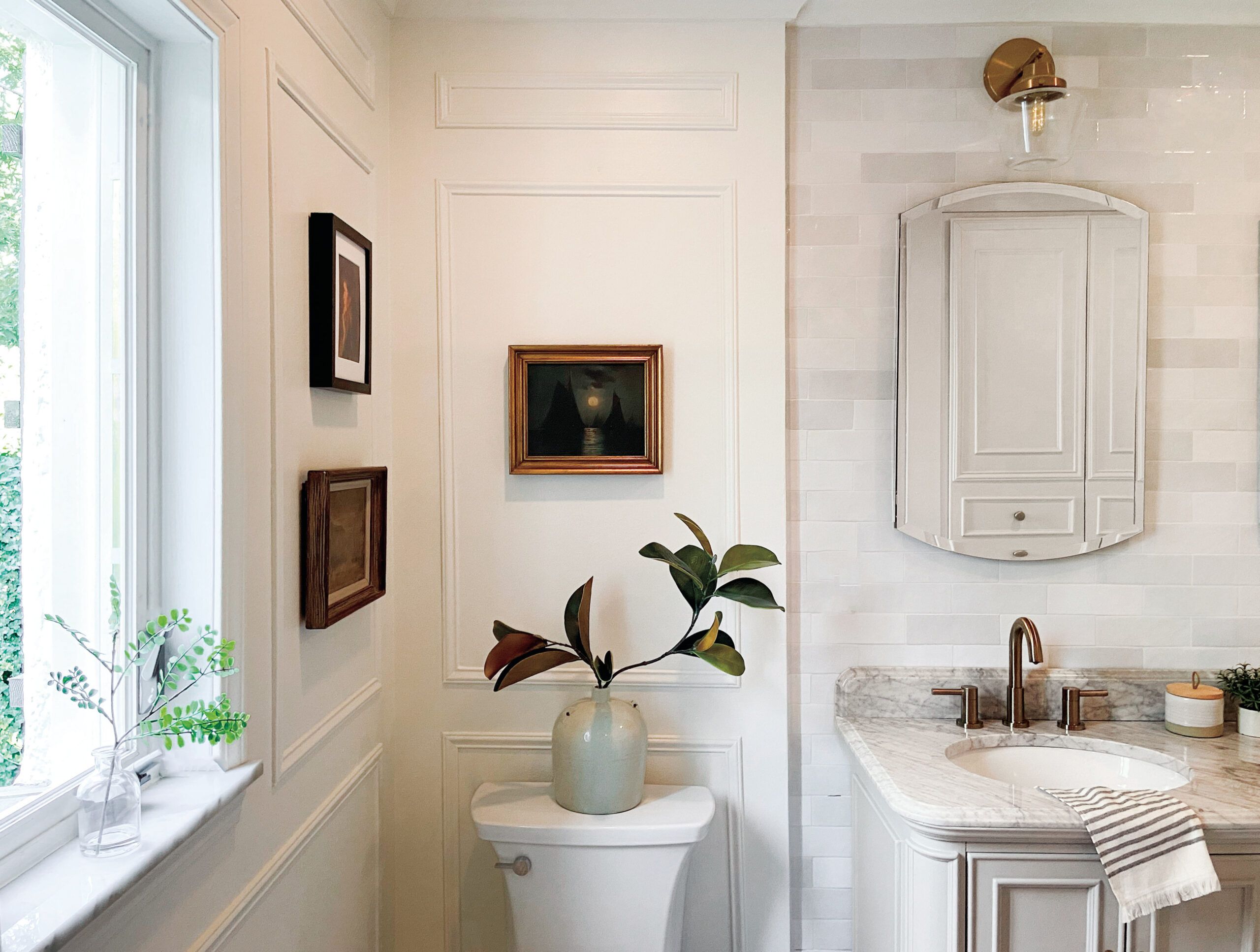
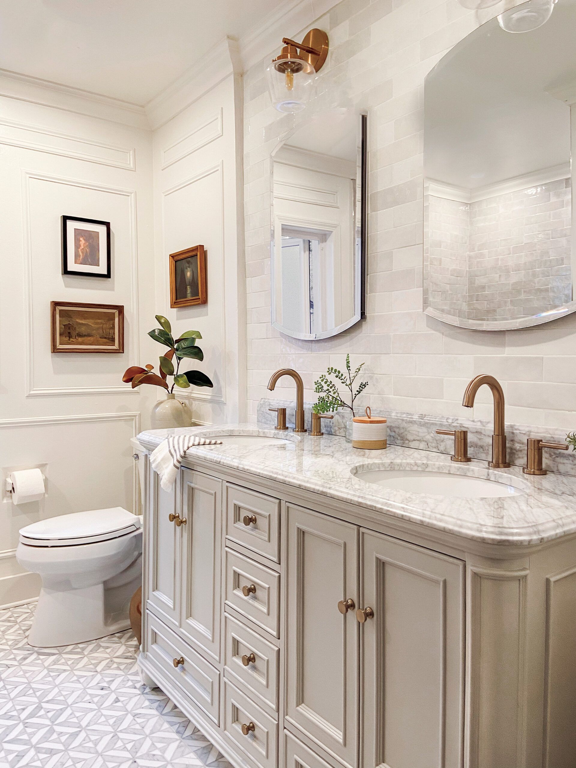
A second sink and a pair of medicine cabinets boost the bath’s storage, while brushed-bronze faucets and brass hardware add a warm counterpoint to the new marble vanity top and floor tile. Now the space feels sophisticated, fresh, and—most importantly—much safer for Catherine’s parents when they need it.
Floor Plans
Planning ahead to enable first-floor living, the designers annexed space from an adjacent bedroom for a large walk-in shower in the bath and a hallway laundry closet.
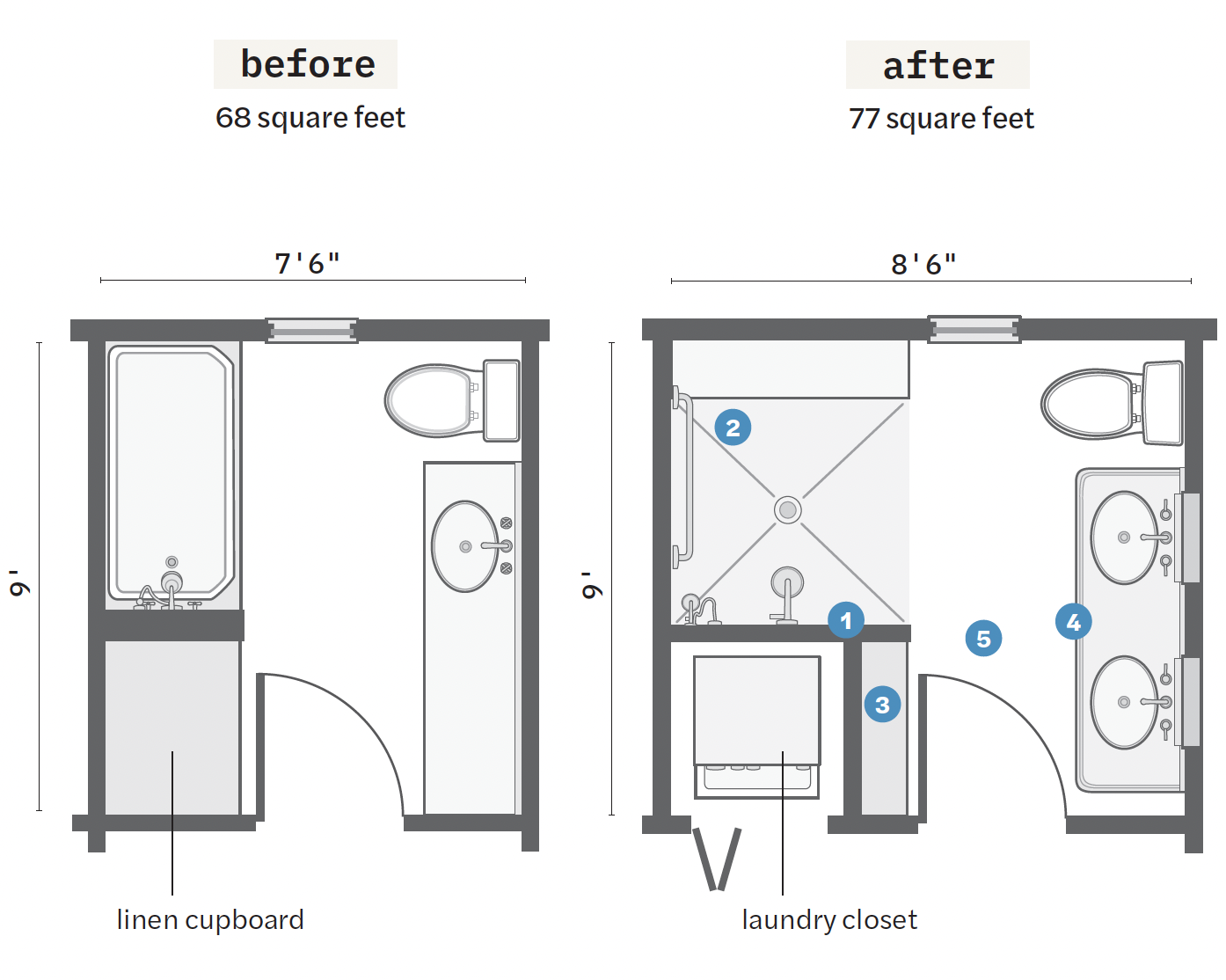
- Bumped the tub/linen-cupboard wall out about 12 inches, stealing square footage from a guest room.
- With the old tub/ shower gone, built a curbless walk-in shower with a built-in bench and a grab bar in the expanded footprint. A shower curtain contains errant splashes.
- Rebuilt the linen cupboard, which ceded space to the laundry; it is now 8 feet tall, 40 inches wide, and a shallow 10 inches deep.
- Swapped the 72-inch vanity for a 60-inch model with a second sink, and installed medicine cabinets with sconces above to compensate for some of the lost storage.
- Widened the entry by a couple of inches and upgraded the door; installed a new vent fan and recessed lights in the ceiling to ensure a clean, bright space.
Designing a Bath to Suit All Ages
Thoughtful design choices are what make a forever home, as designers Catherine and Bryan Williamson demonstrate in this bath renovation. Here, they share some of their aging-in-place strategies.
1. Factor in seating arrangements
A sturdy bench is a key feature for anyone who may become unsteady. Not only is the shower wand’s height adjustable, but the Williamsons also made sure the hose could reach the bench when someone is seated. “It’s one of those things that you may not realize until you actually try to use it,” says Catherine.
2. Raise the bar, design-wise
When it comes to style, grab bars have come a long way. The Williamsons chose a sleek, brushed-brass model that coordinates with the rest of the finishes, installing extra blocking when the walls were open in order to mount it safely. Since it also doubles as a towel bar for washcloths, guests are none the wiser.
3. Consider traction underfoot
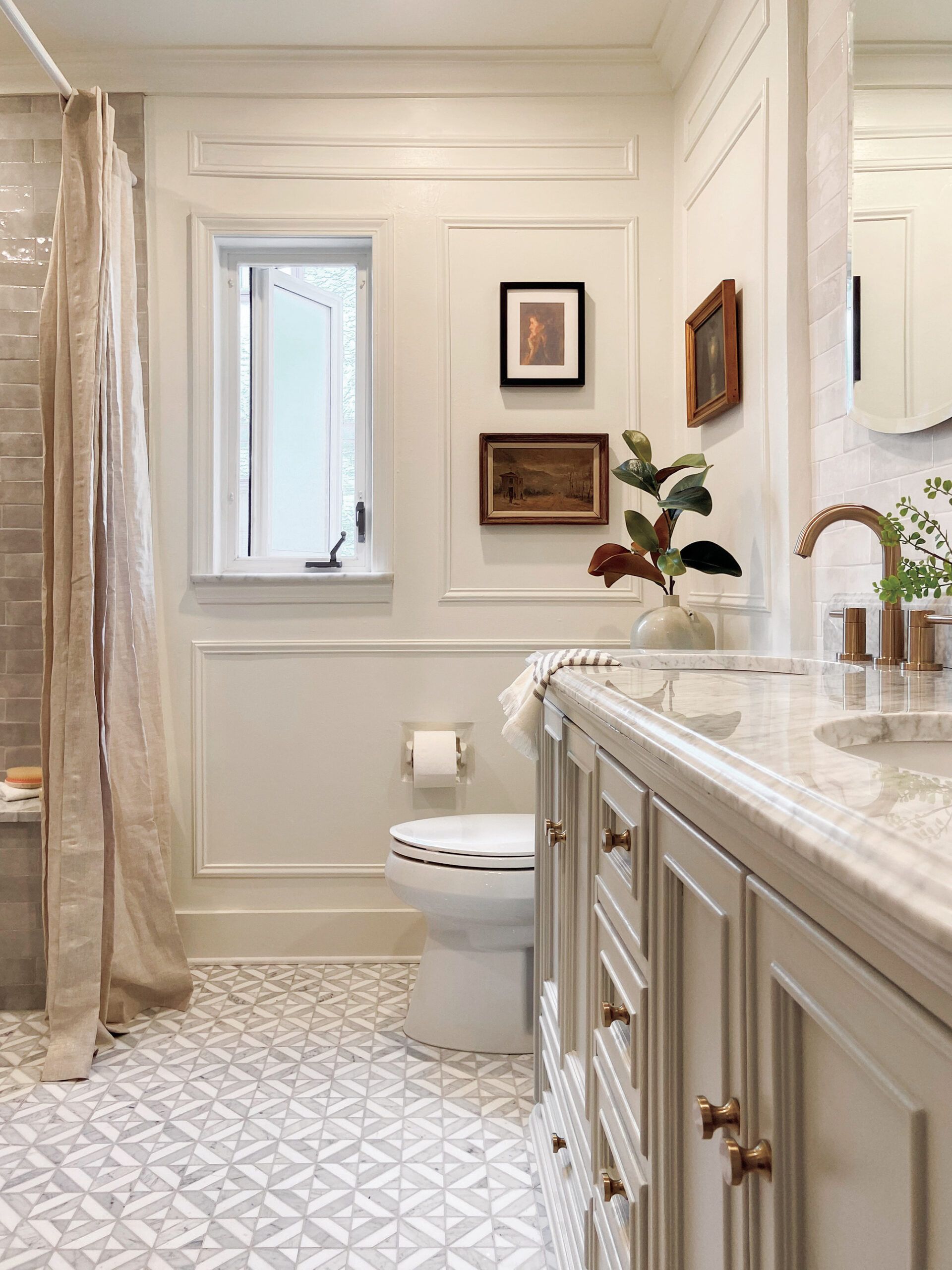
The Williamsons strategically selected a parquet tile pattern that offers plenty of grout lines. Mesh-backed mosaics and small hexagons or penny rounds are other options. For a look with fewer grout lines, opt for textured or matte tile with a DCOF rating of at least 0.42 for good slip resistance.
4. Choose the grout color with care
More grout lines mean more to keep clean—a challenge for homeowners at any age. The designers knew white grout was out of the question for this high-traffic first-floor space (it currently serves as the powder room), so they finished the gray-and-white tile with a light gray grout that is less likely to look dingy
