The 1990s building boom left a legacy of sprawling bathrooms with oversize tubs and lackluster finishes. Ahead: three remodels that maximize the footprint, while transforming the space’s look, feel, and function.
The Fix: No Tub, More Storage
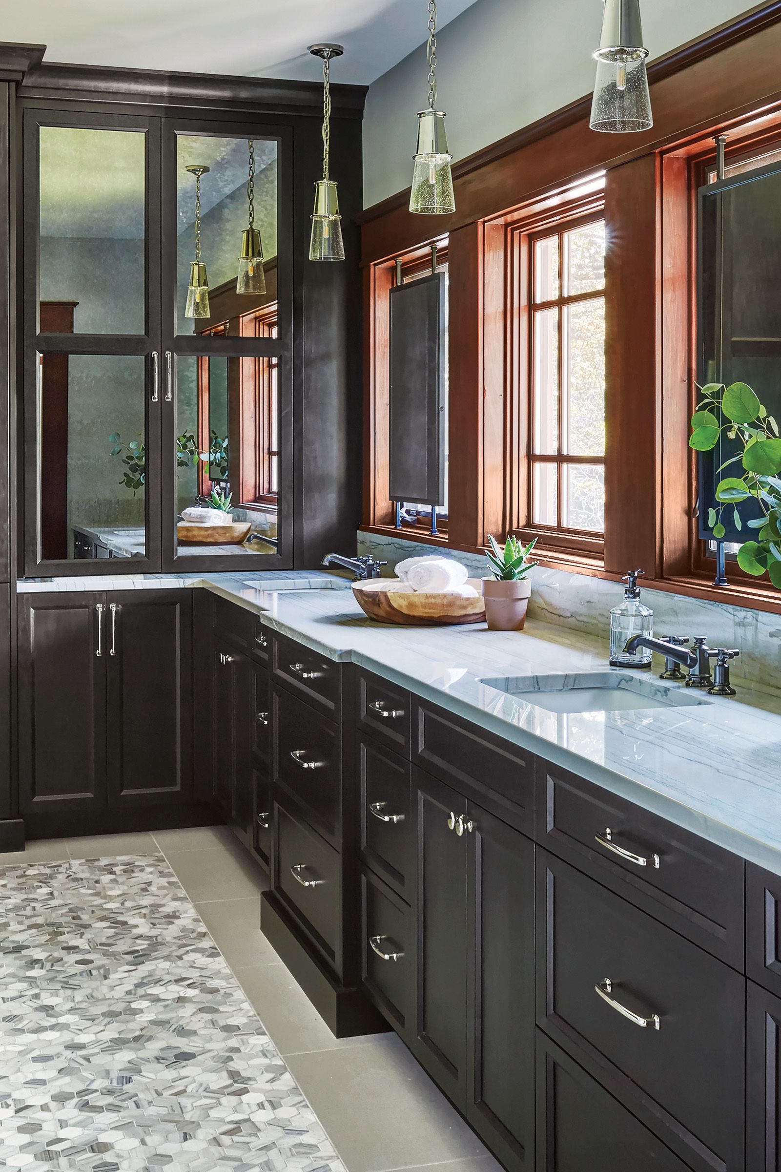
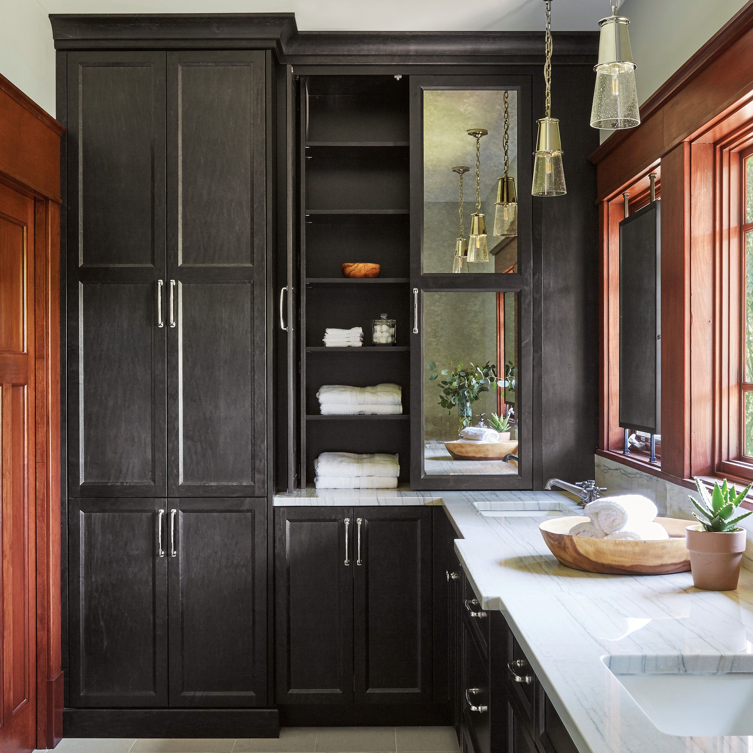

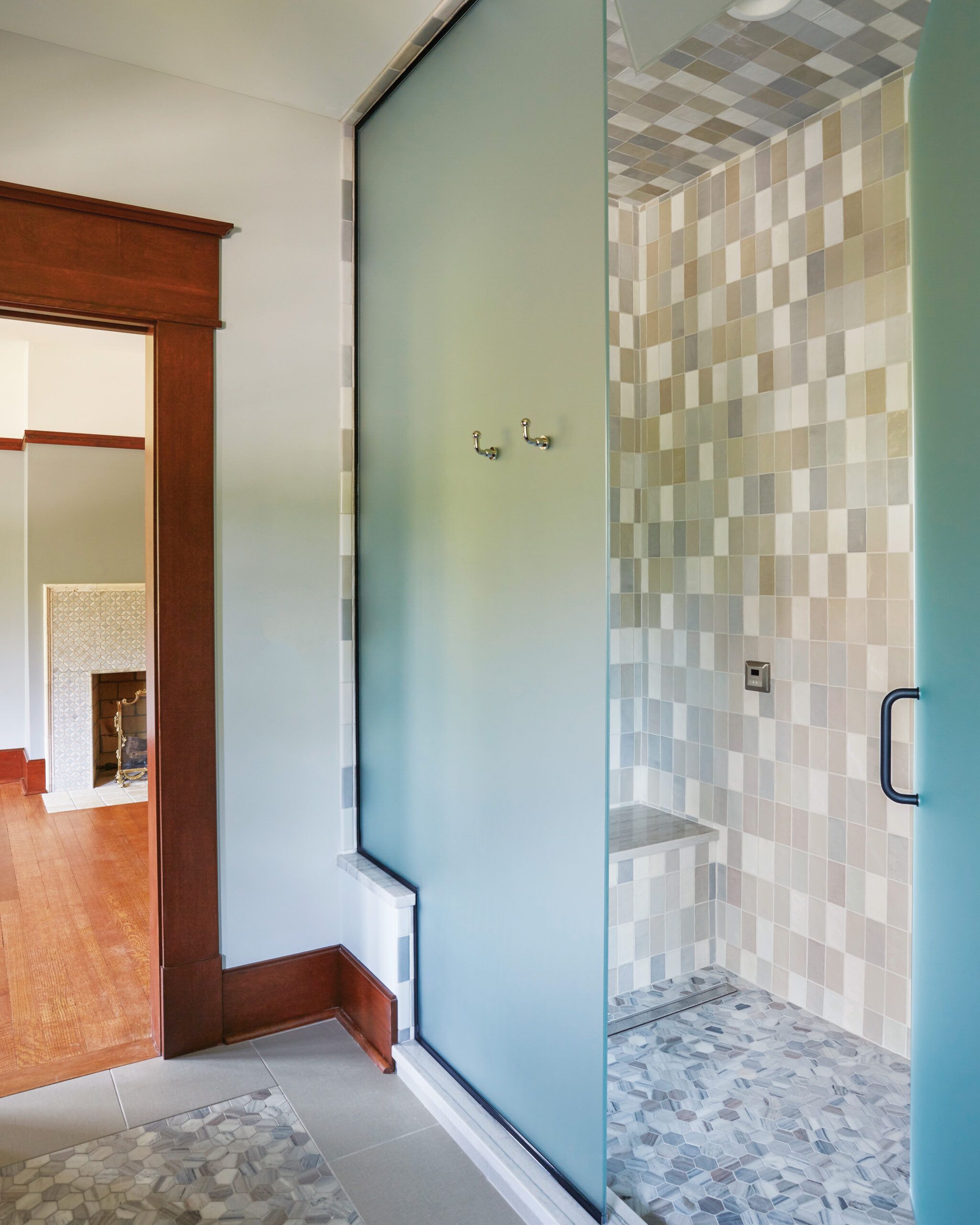


“The size of homes increased during the ’90s, with overly large baths that builders filled by dropping in giant decked tubs,” says designer Rachel Alcorn. Often the only storage was a clunky low vanity.
Parents with a blended family that includes six kids—aged 11 to 19 at the time of the reno—Laura Scariano and Frank Bednarz wanted their primary bath to offer adult-worthy amenities, greater privacy, and enough room for the linens and supplies big households need to stockpile. “There was shockingly little storage in the bath,” Laura says of the single-sink vanity.
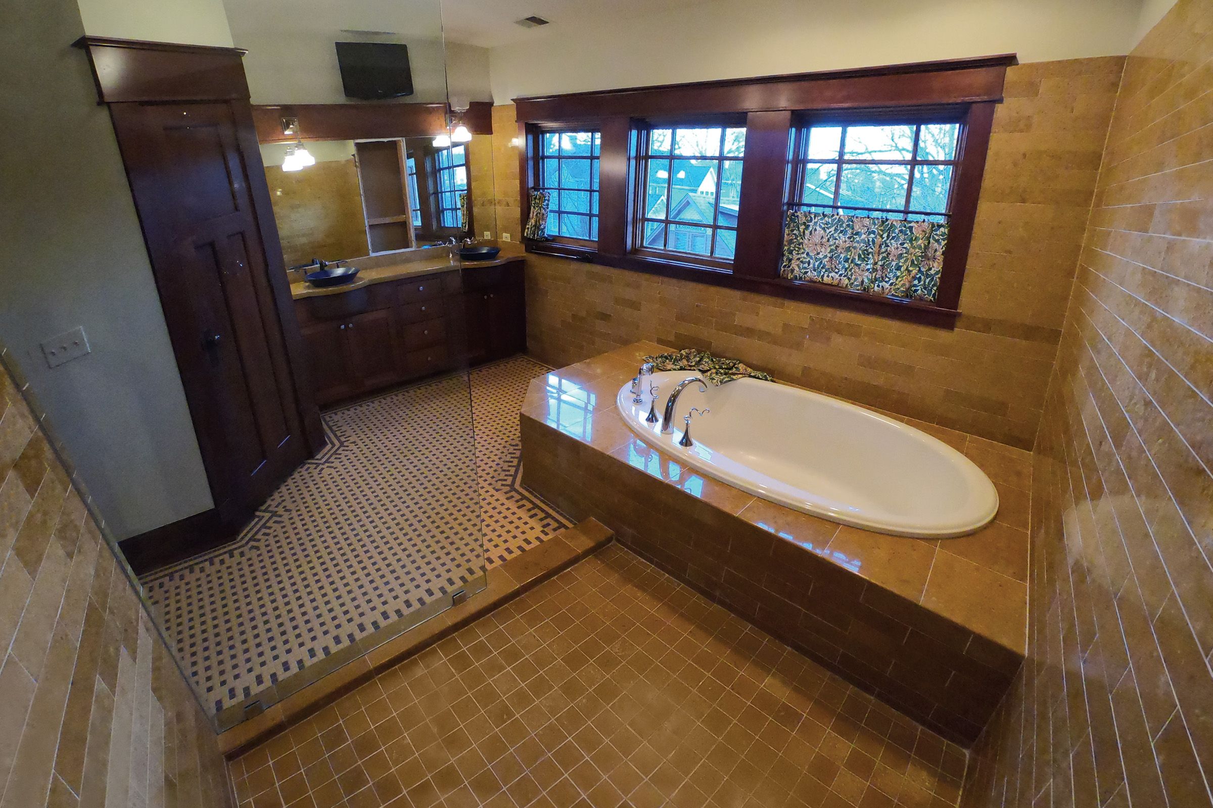
“Plus, an open shower with only a clear-glass partition wasn’t working with kids running in and out.” They also wanted the bath to better suit their home, a 1997 Craftsman in Glen Ellyn, IL. To reimagine the space, Alcorn ditched the built-in tub and its large deck altogether, installing a long double vanity in its place, under the bank of windows. Floor-to-ceiling custom cabinetry took over the wall where the vanity had been.
There was even room to slightly expand the shower—the homeowners splurged on a steam system—which got a much-needed opaque- glass enclosure with a transom at the top for venting. While new flat-panel door and drawer fronts jibe with Craftsman style, the couple wanted some European flair, too—achieved via mosaic tile accents, glossy silver hardware, and cabinetry with a rich charcoal stain.
“Having enough space for bulk buys of toilet paper and toothpaste is great,” Laura says of the smart, sophisticated redesign. “But the renovated bath is more than functional—it’s a serene getaway, a genuine retreat.”
What They Did
Storage in the 176-square-foot bath was limited to a one-sink vanity—not nearly enough to serve the needs of a large family.
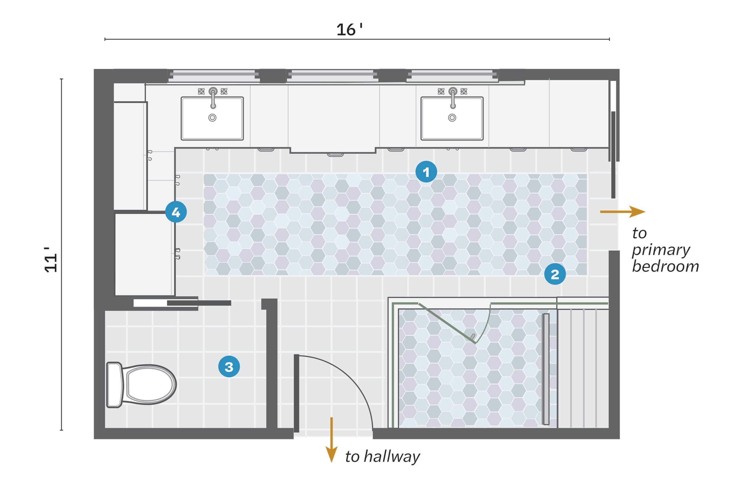
- Demoed the 4-by-8-foot tub deck beneath the bank of windows and installed a long double vanity.
- Added a direct entry to the bedroom between the sinks and the shower, which was enlarged by 4 square feet and given a bench.
- Kept the WC in its place, swapping in a pocket door to save space. 4. Built ceiling-high cabinets where the vanity and a closet had been.
- Built ceiling-high cabinets where the vanity and a closet had been.
The Fix: Luxe Soaker, Upgraded Vanity
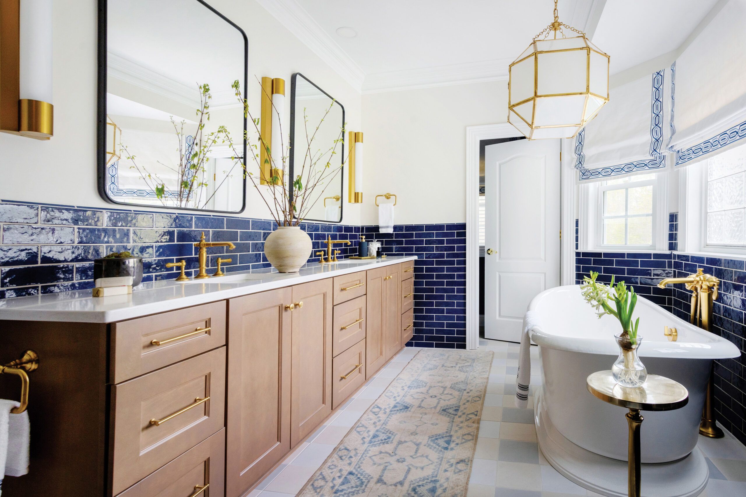

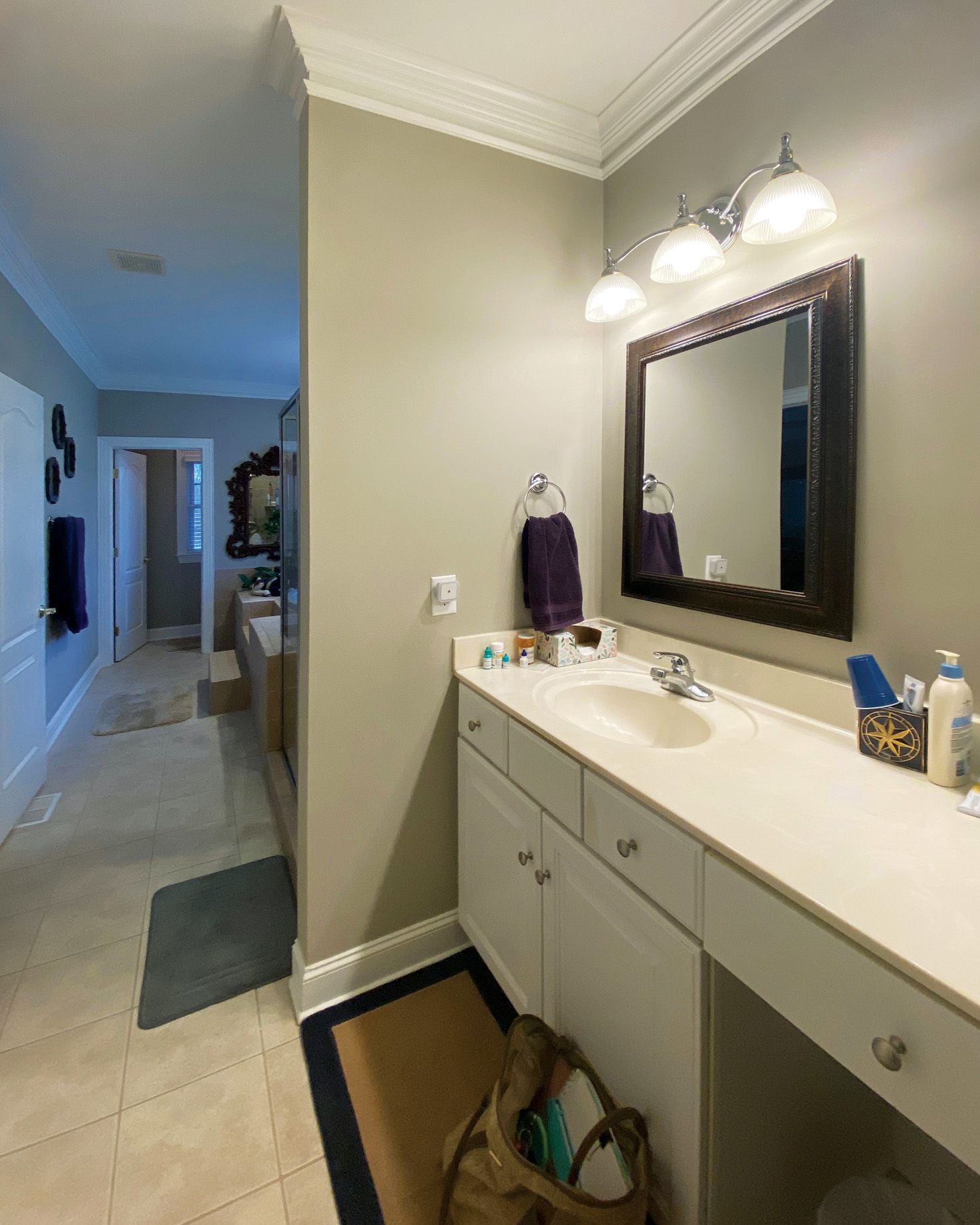


“So much valuable real estate wasted!” bemoans designer Emma Legg of the jetted tub and surround that jutted out into the middle of this 190-square-foot bath, with the shower positioned at its foot and the vanity on the same wall at the end of the long, narrow room. “The awkward layout created a bowling alley effect.”
Though built in 2003, the primary bath in Bill Hurt and Marshall Morrow’s farmhouse in Browns Summit, NC, was “a victim of leftover ’90s design,” says Sydney Foley, Legg’s design partner. “The overscaled tub deck and modest shower were dead giveaways.” Not only did the surround hog precious space, but its steep steps were also downright dangerous.
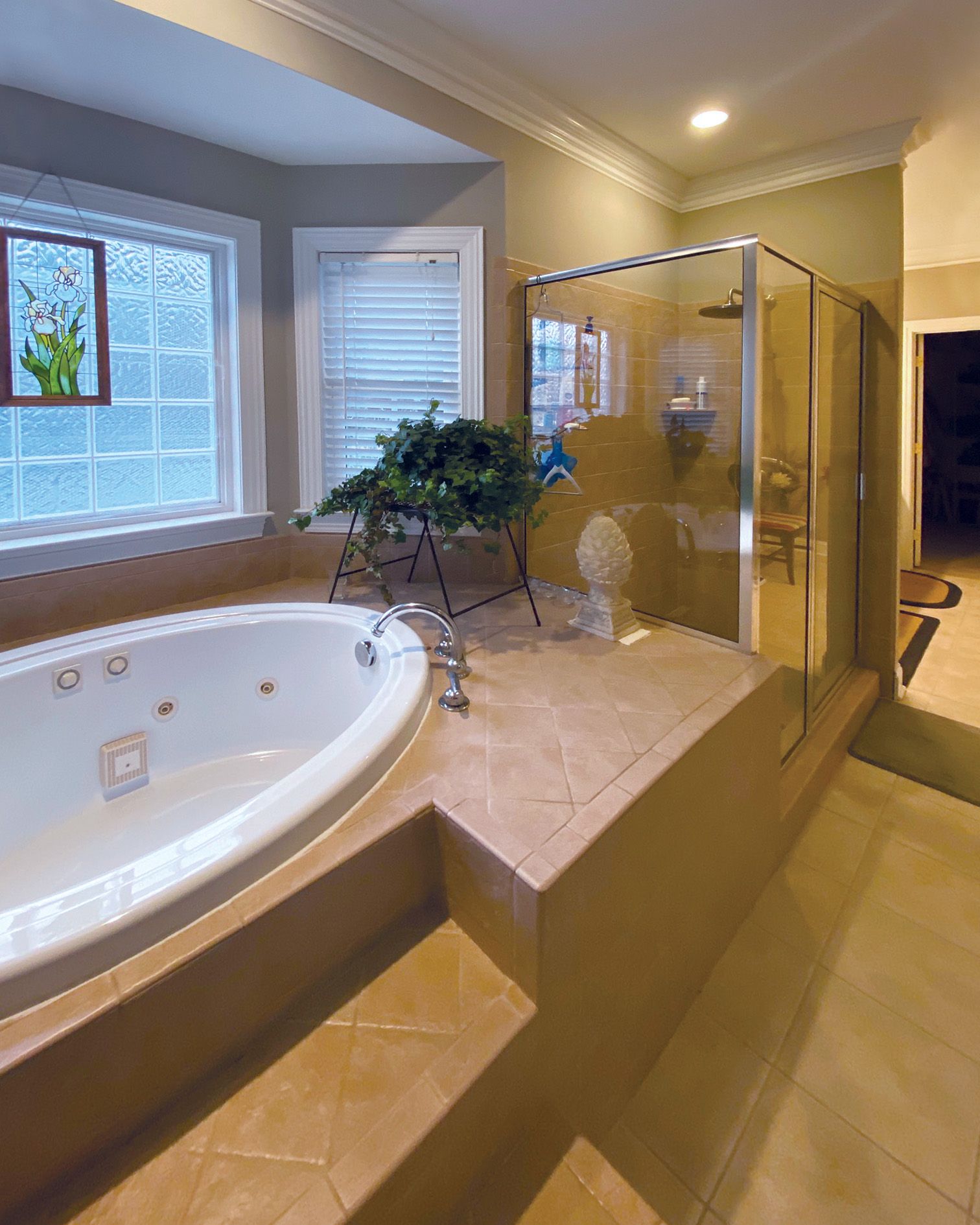
“They were a slipping hazard,” recalls Bill. “We feared for our safety getting in and out,” adds Marshall, and the bland, builder-grade finishes offered no incentive to take the risk. What’s more, he says, “the position of the shower was incompatible with privacy. If the bathroom door was open, you could see it all the way from the den.”
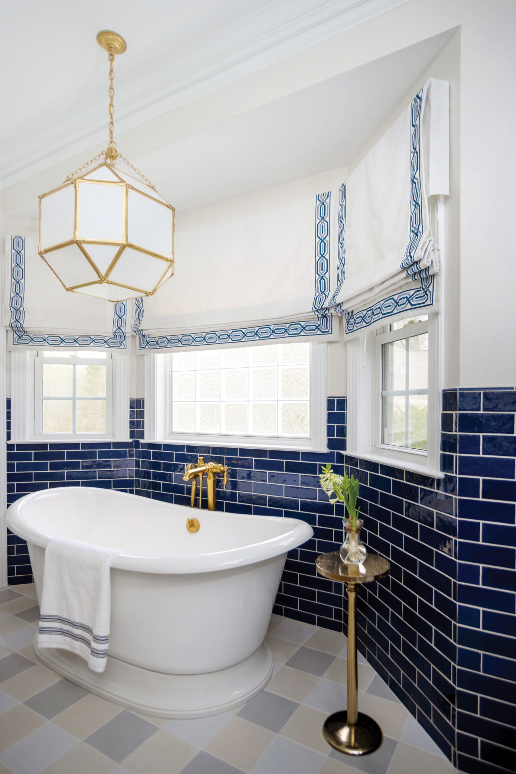
So Legg and Foley reimagined the room by first eliminating the imposing platform, which freed up 20 square feet of circulation space. This allowed them to put in a freestanding soaking tub and, opposite it, a long double vanity. They relocated the shower to where a shallow linen closet had been, enlarging it considerably, while managing to add two linen closets to replace the lost storage and then some.
High-gloss, cobalt-blue subway tile plus bright brass hardware and faucets are focal points in the space, balanced by light-colored floor tile and soft roman shades. “The bath is elegant and inviting, with timeless design and color combinations,” says Bill. “We love the beauty, functionality, and amenities, which suit the eclectic style of our home.”
What They Did
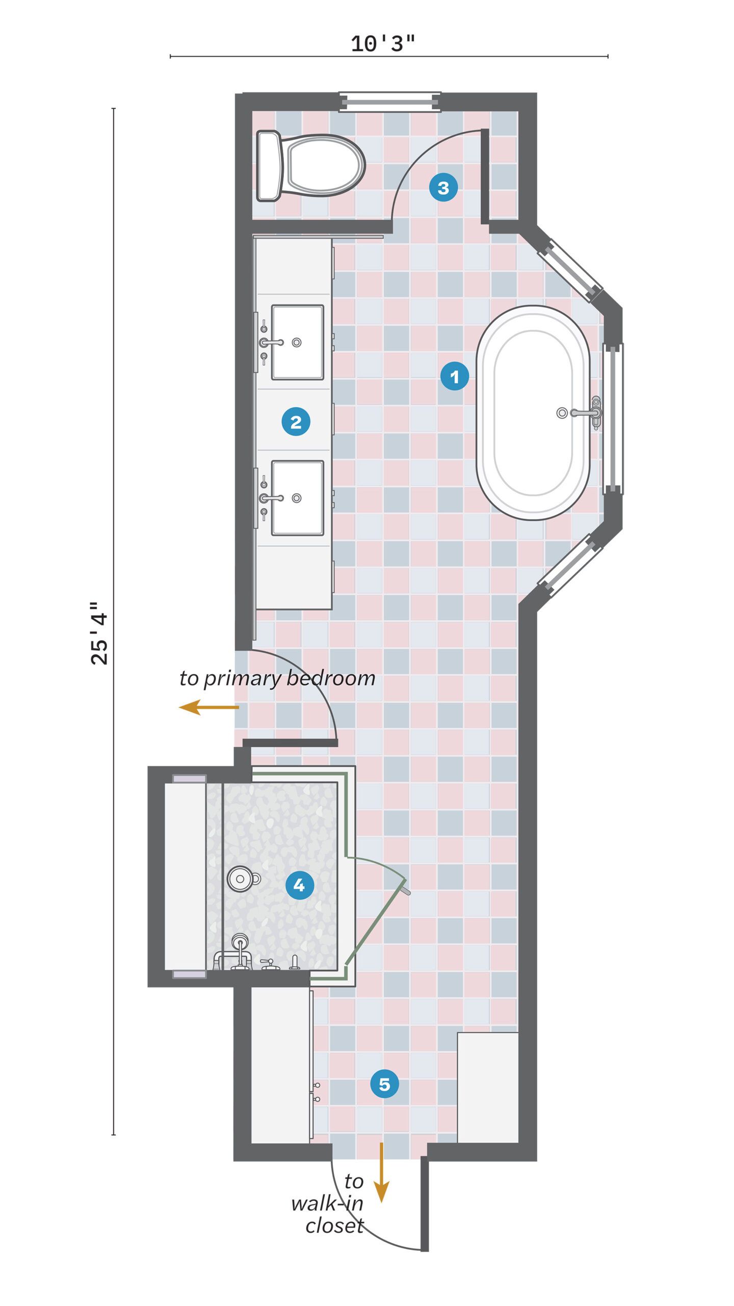
Located at opposite ends of the room, the water closet was a hike from the vanity, and a titanic tub surround cut into the aisle between them.
- Demolished the clunky tub deck and replaced it with a graceful pedestal soaker.
- Capitalized on the opened-up floor space by locating a double vanity across from the tub.
- Kept the WC location, moving the toilet to the opposite wall and the door to clear it.
- Relocated and enlarged the shower, which had abutted the tub, moving it to where a shallow linen closet had been.
- Built two facing storage closets outside the shower, the smaller one in space previously occupied by the vanity.
The Fix: Same Spots, All New Finishes
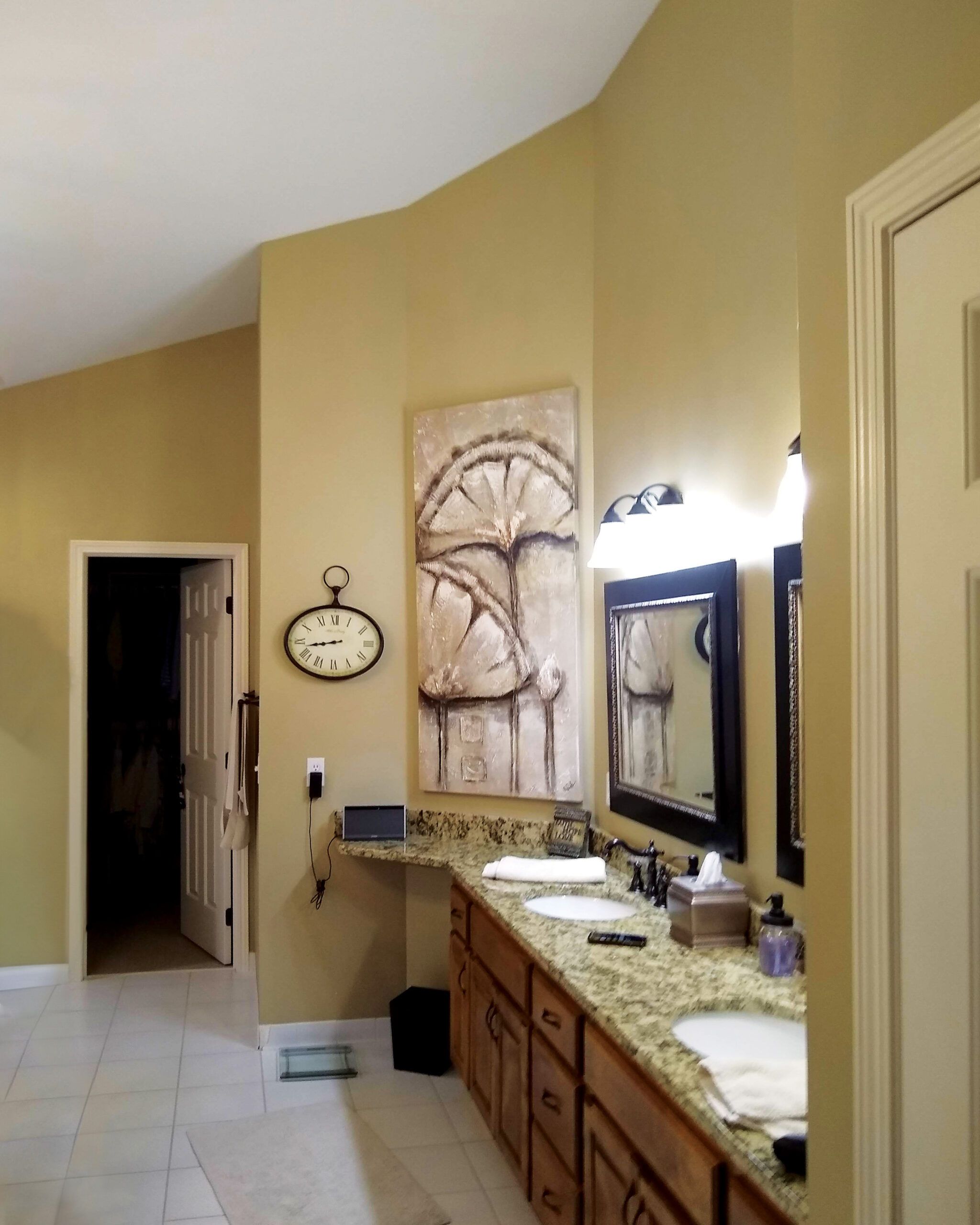
Bling wasn’t just for jewelry in the ’90s. “Dark granite, heavy wood, chunky mirror trim, and ornate crystal chandeliers all had their moment—and all look dated now,” says designer Jennifer Davis. The ubiquitous McMansions of the era saw lots of walls swathed in beige and gold paint, too.
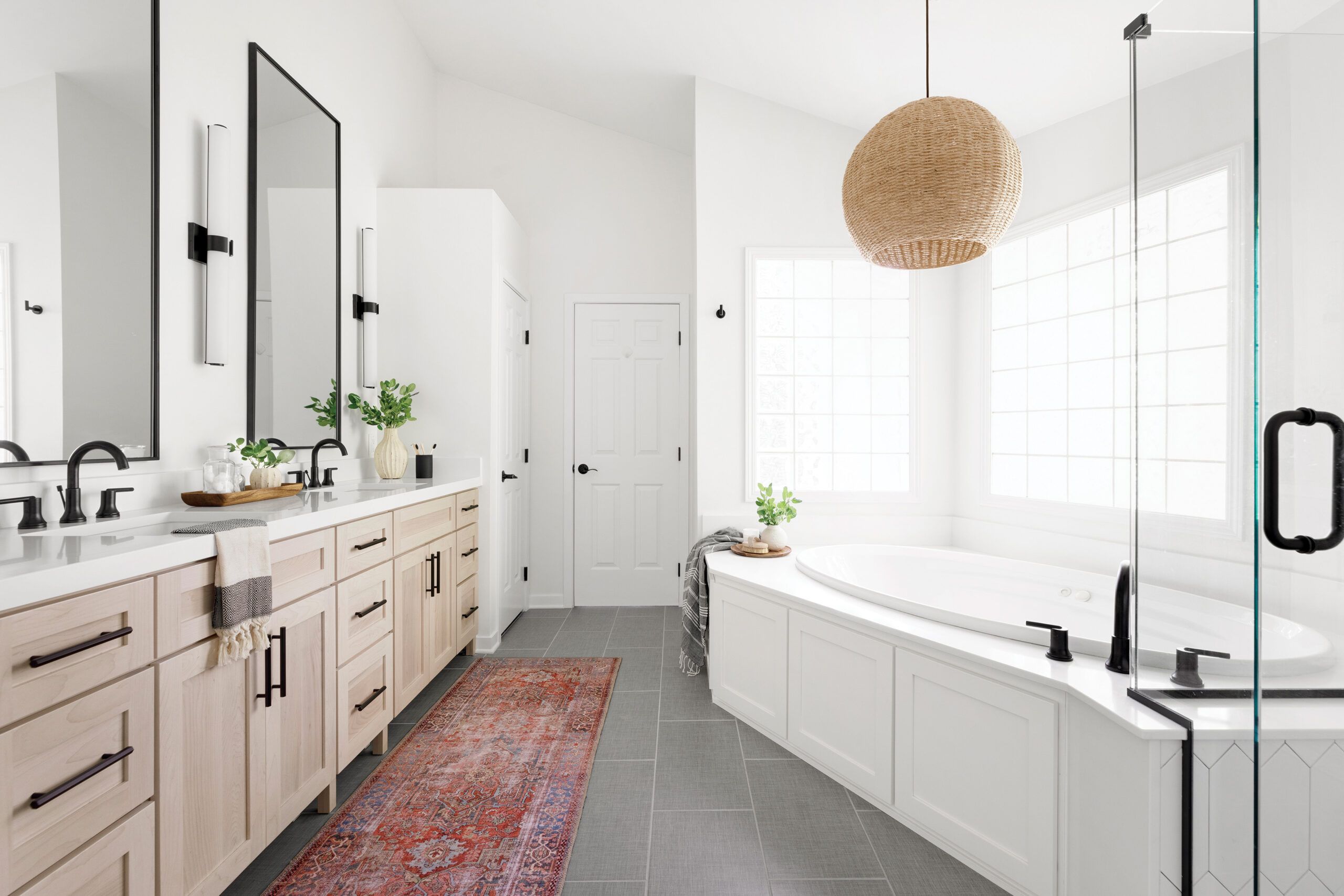

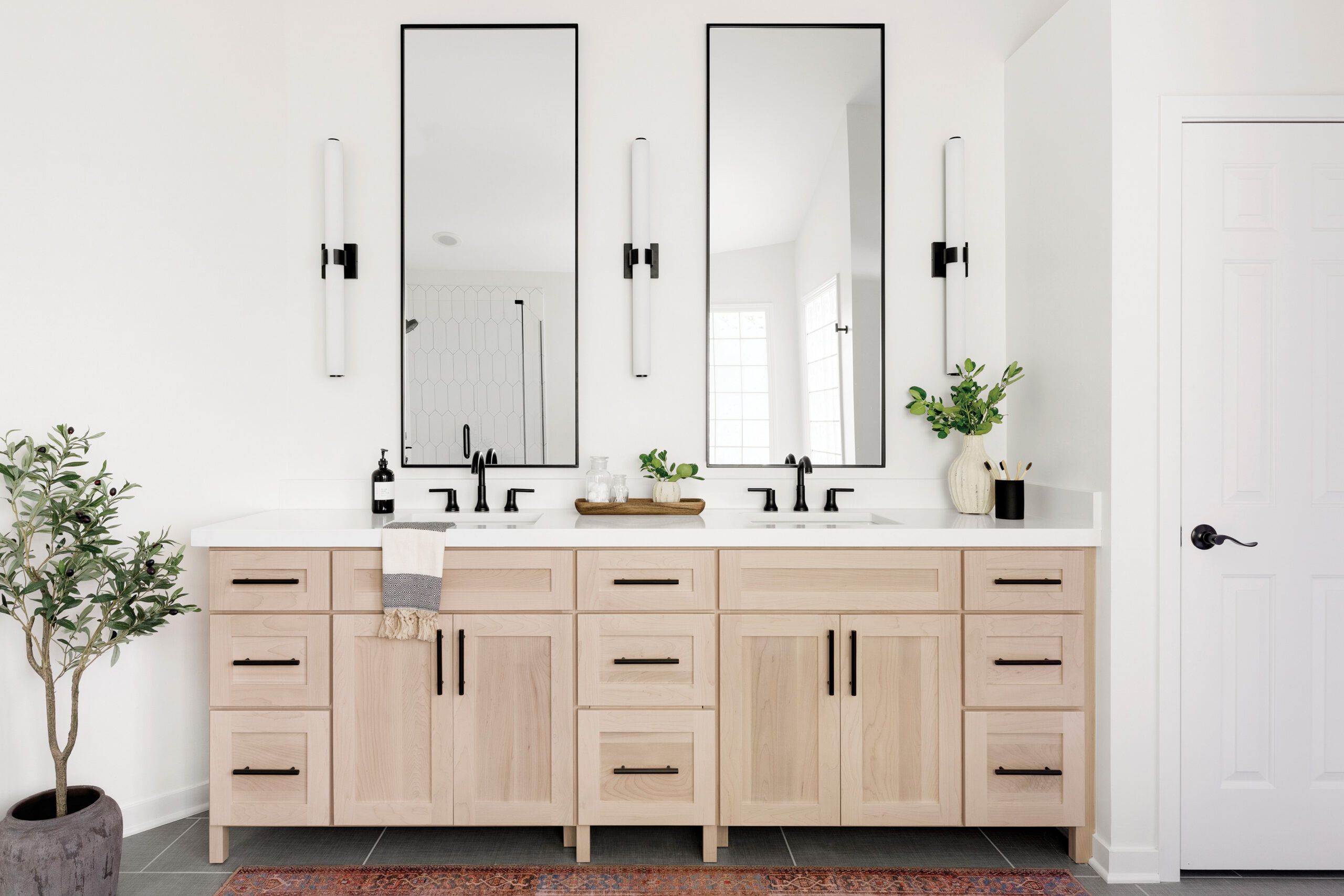
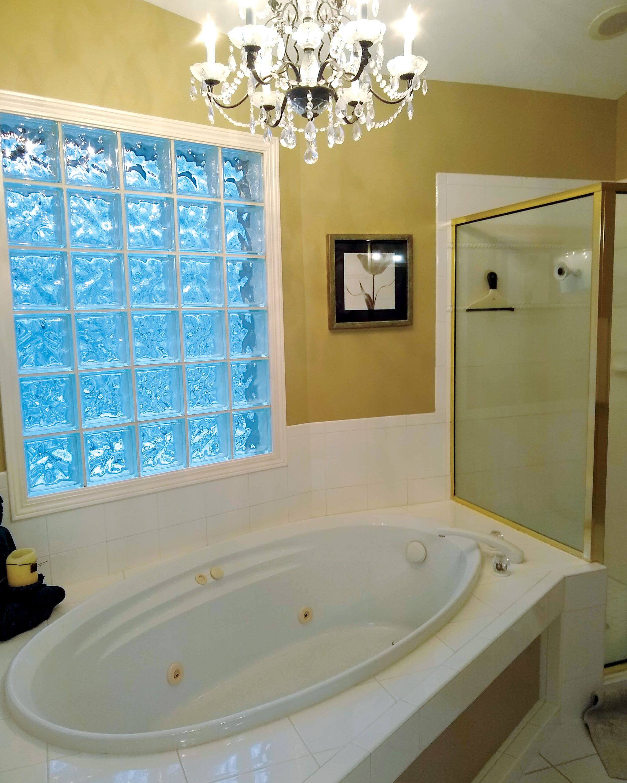


While the supersized homes of the 1990s often had big, bad bathrooms, the primary in this 1994 house in Minnetonka, MN, actually made sense in terms of its layout—and the tub deck wasn’t even substantially out of scale. The room’s real problem was its chaotic grab bag of ornate finishes and flourishes.
“A bath should be a sanctuary for relaxation and rejuvenation,” Davis says. “It ought to feel soothing and be easy on the eyes. These homeowners wanted a clean, fresh look, so the renovation was all about simplicity, replacing busy patterns and dark colors with neutral tones and natural materials.”
And nothing says timeless quite like a scheme of basic black and white. “The contrast between these two colors creates a visually striking, elegant space that has lasting appeal,” Davis adds. “The combination never seems to go out of style.”
In this bath Davis introduced distinctive modern touches, too, such as picket-style tile in the shower, porcelain floor tile with a linen-like finish, and a natural-fiber pendant. “These subtle elements add character and texture without being in your face,” she says.
A solid-surface top on the tub surround eliminated visible grout lines for a sleek effect. More small tweaks, including a furniture-style vanity that stops short of wrapping an angled side wall and a seamless tub-deck extension that creates a shelf inside the shower, add up to a luxe look that’s sure to stand the test of time.
What They Did
In this 175-square-foot bath, the tub, vanity, shower, and toilet were in the right places, but new fixtures and finishes were needed to turn the atmosphere from chaotic to calming.
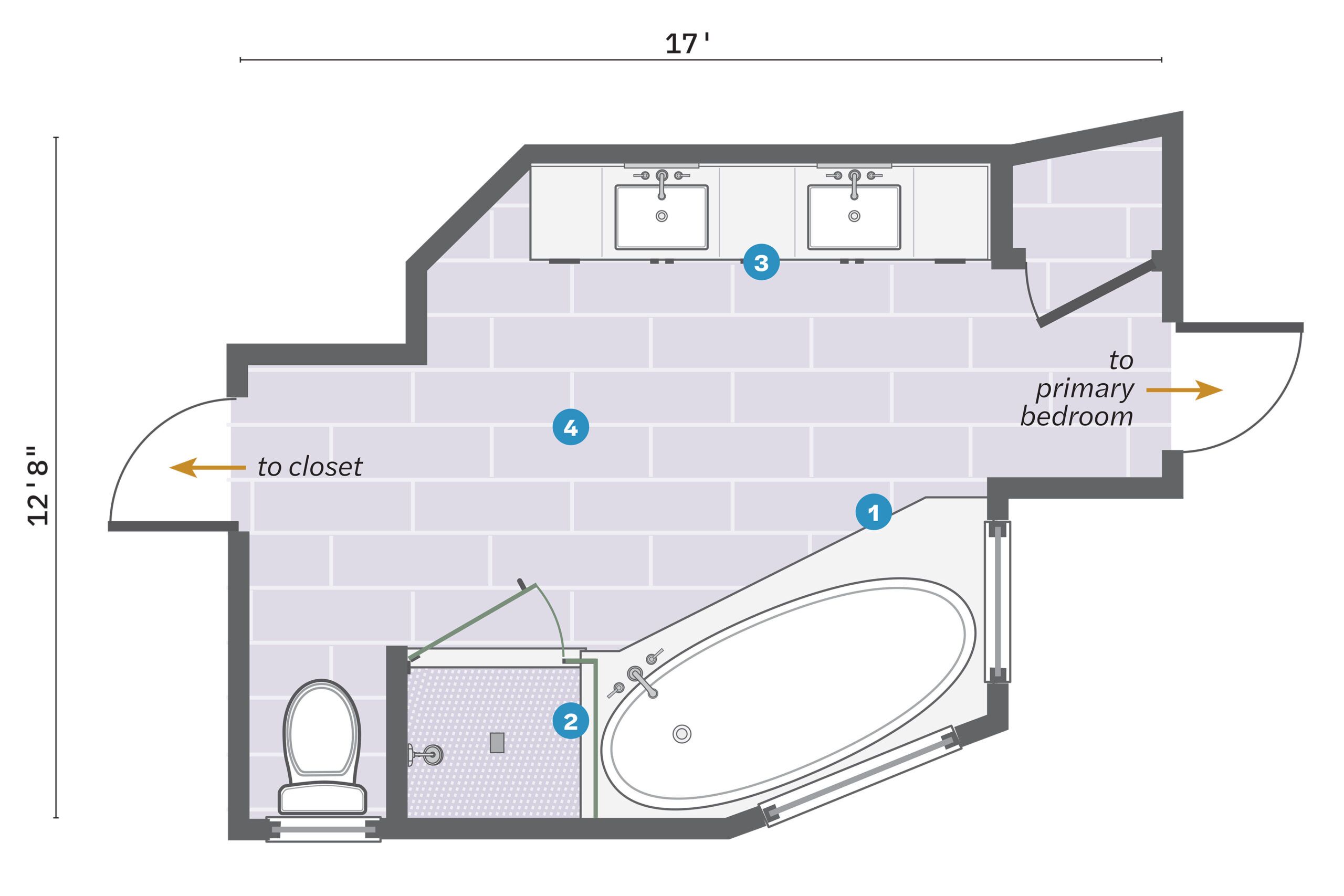
- Rebuilt the tub deck with a painted-wood paneled surround and a seamless top, which extends into the shower to serve as a shelf.
- Added picket tile to the 4-by-4-foot shower walls, one of which partitions off the toilet; a frameless-glass enclosure preserves the room’s light, airy look.
- Put in a furniture-style double vanity that stops short of an angled side wall; the closet stayed alongside.
- Added subtle textural touches with a woven shade and linen-finish floor tile.
