Bedford, After: More than Just a Paint Job
Low ceilings, cramped rooms, crumbling chimneys—it’s not often that a nearly 300-year-old home would still be livable today. But when Joe and Becky Titlow first toured their circa 1720 Georgian in Bedford, Massachusetts, the latest This Old House TV project, they jumped at the opportunity to buy it. “We knew it needed an overhaul, but we loved all the period details,” says Becky.
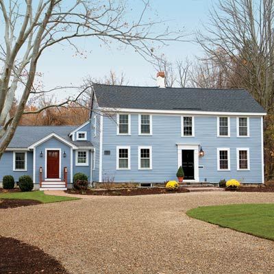
Shown: Cedar clapboards painted gray-blue, a revamped formal entry, and a gable-topped mudroom entry freshen up the facade.
Window restoration: Window Woman of New England
Interior design: Terrat Elms
Before: Red Menace
The structure, which is listed on the National Register of Historic Places, was once home to a flag bearer during the Revolutionary War and has had a couple of additions and renovations over the centuries.
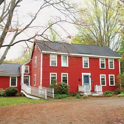
Shown: The circa 1720 Georgian needed new siding, and the entries lacked appeal.
Kitchen, Before: Rustic Framework
As it happened, they found a sympathetic ear in TOH general contractor Tom Silva, who cut his teeth working alongside his father on his family’s house, which was built in the same era. Tom recognized and appreciated features like hand-hewn wood ceiling beams and longleaf pine millwork.
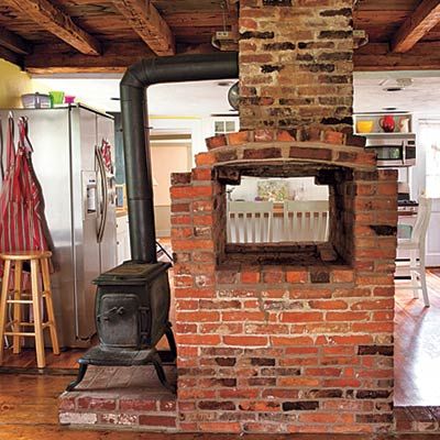
Shown: This Old House general contractor Tom Silva and his crew dismantled a brick chimney and oven that once sat smack in the middle of the room.
After: Refined Kitchen
At the same time, he also understood the family’s need for more space and their desire to work around quirks that others might have done away with, like those under-7-foot wood ceilings. “We never dreamed of gutting this place,” says Joe, a home-improvement buff who took on a few projects with Becky.
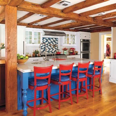
Shown: The combination of crisp white cabinets, traditional marble and granite counters, exposed posts and beams, and the red, white, and blue island area lend the remodeled space a polished yet informal vibe. Tom made the appliance wall longer by closing up a doorway and moving an exterior entry to the mudroom. To hide pipes that run alongside a ceiling beam and to make the beams appear more uniform, he built faux box beams from lumber salvaged during demolition and added drywall between them to make the low ceiling feel less weighty.
Kitchen design: K. Marshall Design
Lighting design: Wolfers Lighting
AC condenser: Trane
Vent hood: Broan-NuTone
Backsplash: Discover Tile
Countertops: Gerrity Stone
Plumbing fixtures: Jado
Kitchen cabinets: Levant Kitchen Furniture
Appliances: Yale Appliance + Lighting
Ceiling fixtures: Philips Color Kinetics
American Accents
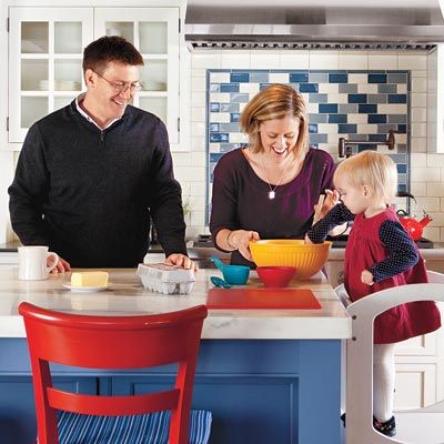
In the kitchen, interior designers Dee Elms and Andrew Terrat created a backsplash tile pattern behind the cooktop to suggest the field of stars in the American flag. “We love how this room embodies our house’s roots,” say owners Joe and Becky Titlow, shown here with their daughter.
An Airy Yet Cozy Gathering Spot
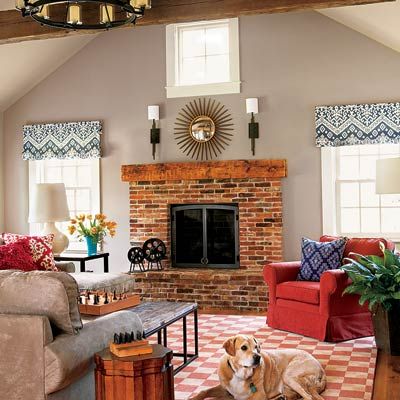
So from the get-go it was a like-minded match of client and contractor. As the renovation progressed, Tom repurposed salvaged materials in new spaces and found other ways to make the additions seem appropriately aged. “We all agreed that the changes should appear seamless,” he says.
Shown: Becky and Joe wanted a double-height family room right off the kitchen, so Tom decked it out, as he did elsewhere, with rustic and salvaged materials to make the spaces feel continuous. The fireplace surround is made of brick from the demolished kitchen chimney, and nonstructural ceiling timbers came from an old train-whistle factory. Iron tables and fixtures suit the aesthetic and help give it a relaxed, homey feel.
Sofa and chair: Mitchell Gold + Bob Williams
Family room rug: Faber Rug
Window fabric: Kravet
Salvaged Materials

Tom saved an old support post from a demolished wall and made it into the fireplace mantel in the family room (previous photo).
An Open Layout
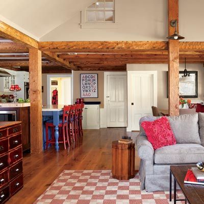
In the end, the Titlows got exactly what they had asked for: a remodel that pays homage to the charming original spaces they were so fond of, while offering more breathing room and plenty of modern comforts and conveniences for a young, growing family.
Shown: New solid-fir support posts between the family room and kitchen, given a simple clear coat, look fully integrated with the kitchen’s post-and-beam construction—as if they’d been there all along.
Hardwood floors: Lumber Liquidators
Places for Food and Family
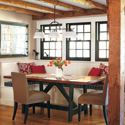
An oak trestle table with a salvaged longleaf pine top was built to fit a nook along a bank of windows. Tom made sure the banquette’s seat extended past the base so that people can tuck their legs beneath it. “Otherwise, you’d step on each others’ feet under the table,” he says. Another clever trick: adding forced-air supply vents in the toekick and along the cap molding to keep diners toasty.
Trestle table: Staples Creative Art Furniture
New windows: Norwood Windows
Light fixtures: Troy Lighting
A Period Pantry
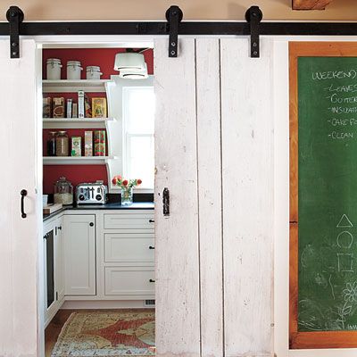
Period touches in the new pantry include open shelves supported by brackets that Tom crafted and old wood doors hung as barn-style sliders.
Dining Room Before
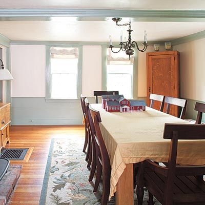
Joe and Becky liked the dining room’s period details, but its color scheme and furnishings were dated.
Small Changes, Big Impact
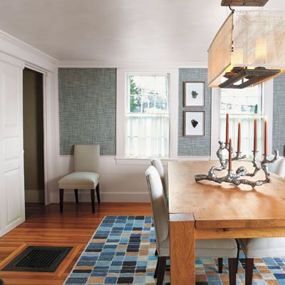
Interior designers Elms and Terrat freshened the trim, paneling, and Greek Revival-era wainscot with ivory paint and added a denim-blue grasscloth wall covering for color and texture. Fabric-covered chairs and an iron-and-canvas light fixture feel contemporary while complementing the room’s revamped traditional style.
Dining room wall covering: Phillip Jeffries
Chairs: Mitchell Gold + Bob Williams
Rug: Steven King
A Powder Room with Personality
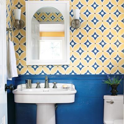
Tom and the TOH team squeezed in this diminutive lav just off the mudroom. To give the walls distinction, Tom duplicated the horizontal design of the dining-room wainscot using lumber from the kitchen’s old subfloor and sheathing that came down during demolition. The wall covering is made of canvas that’s hand-painted with a pattern and color scheme inspired by colonial-era stencils. “This room is a conversation piece already—people love the bold walls,” says Becky.
Sink and toilet: Porcher
Bathroom wall covering: Chroma Lab
Bath fan: Vent hood: Broan-NuTone
Entryway Before
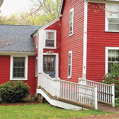
The access ramp added by previous owners was no longer needed, and the door it led to opened right into the kitchen.
A Better Way to Enter
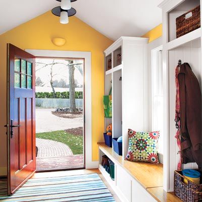
The old entry was closed off to make way for a storage-packed mudroom bumpout that provides a much-needed transition from outdoors to inside. “Our two dogs can wipe their paws here,” jokes Joe. Tom built the trimmed medium-density-fiberboard storage cubbies and oak bench seat. A generous window and divided-light door keep the area bright and cheery.
Mudroom door: New England Fenestration
Light fixtures: Troy Lighting
Insulation: Icynene
Room to Grow
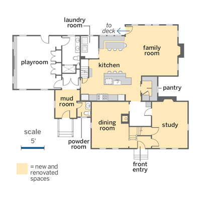
The project was confined to the first floor, where a new mudroom, powder room, and family room added nearly 700 square feet of space.
What These Avid DIYers Learned: Backyard Deck
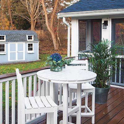
The Titlows took on a few projects themselves, while the TOH crew did the rest, and reaped some valuable lessons.
1. Don’t be afraid to ask questions. Joe sought Tom’s input before building the backyard deck. “He convinced me that using composite boards was the way to go,” says Joe.
Decking and deck furniture: Trex
Shed: The Home Depot
What These Avid DIYers Learned: Garage
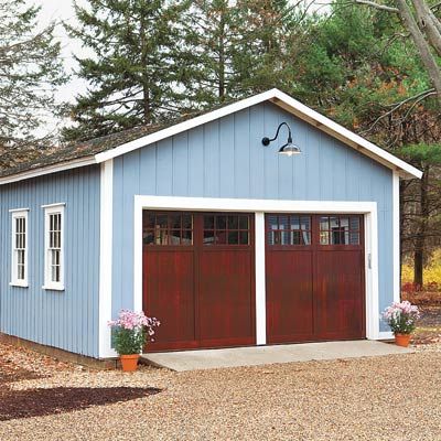
2. Expect the unexpected. Becky had thought repainting the garage would be a cinch. But as soon as she started scraping, she found rotted wood underneath. Joe had to re-side the front of the garage and patch other areas before Becky, aided by her father, could get back to work.
Garage doors: Designer Doors
What These Avid DIYers Learned: Workshop
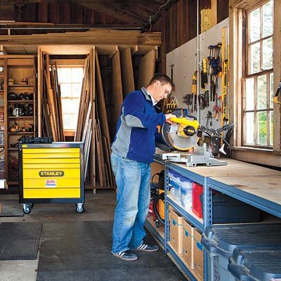
3. Let your plans evolve. Though Joe had hoped to build a Norm Abram-level garage workshop, some key repairs took precedence. For now, he’s got a spot for his workbench and tools while he and Becky save for the next upgrade.
Workshop tools: Stanley
