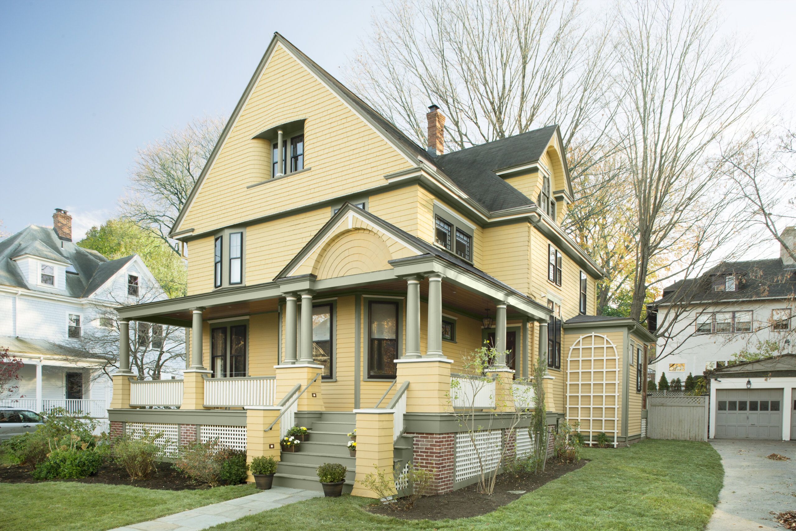
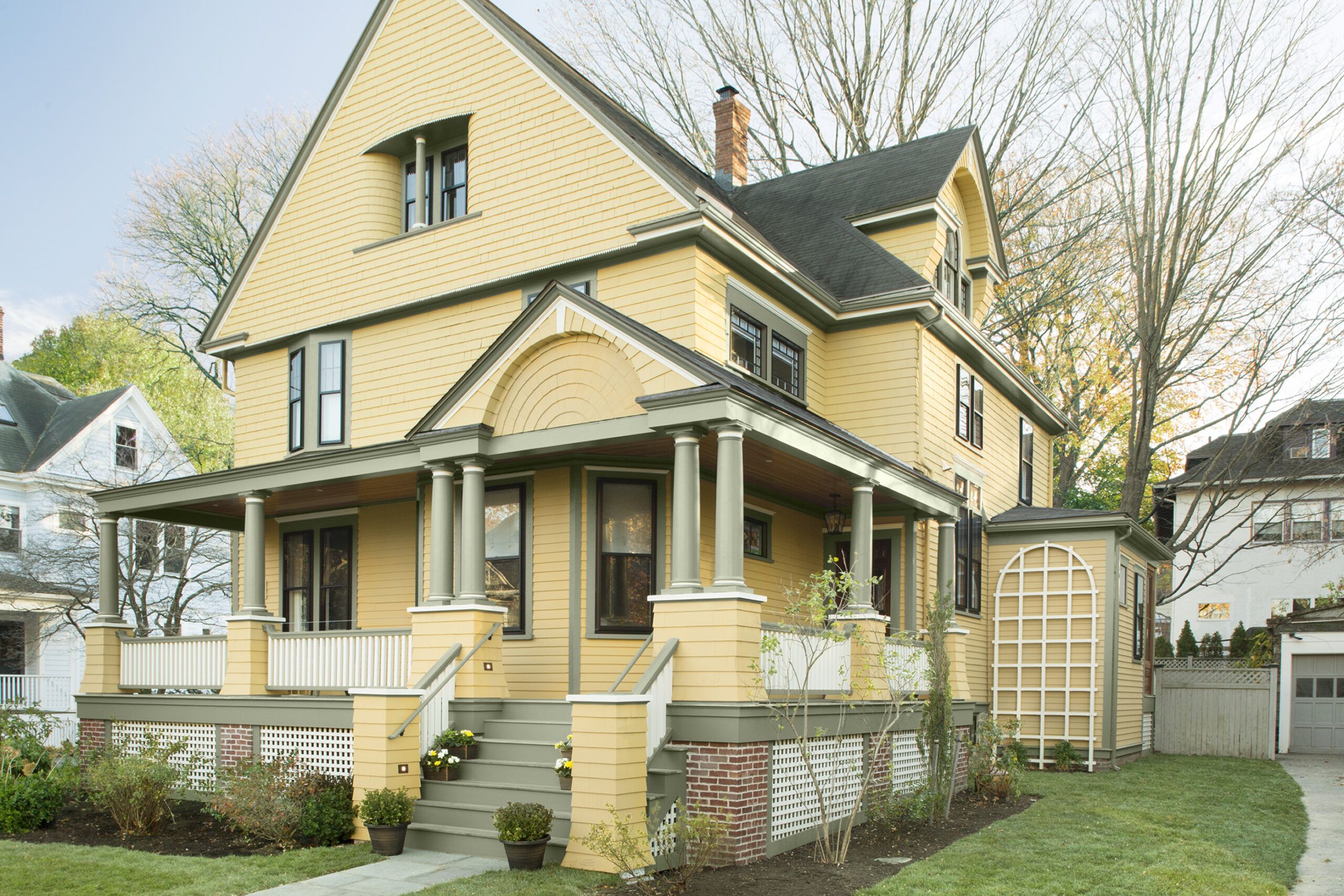
The Porch, Remastered: After
Excited about their first working session with the architect, homeowners Katherine and Murat Bicer led Mat Cummings to the dining room of their 1895 Queen Anne. Cummings unrolled a set of existing-house drawings across the table, spread them flat, and asked what the Bicers wanted for their house, the subject of the current season of This Old House TV. Some of the improvements they discussed would include a new kitchen, a revamped foyer, a mudroom bumpout, a generous master suite, and a new heating and cooling system.
Shown: This season, TOH general contractor Tom Silva and the crew are renovating an 1895 Queen Anne in Belmont, Massachusetts. Rebuilding the wraparound front porch of became a major part of the project.
Blank Facade: Before
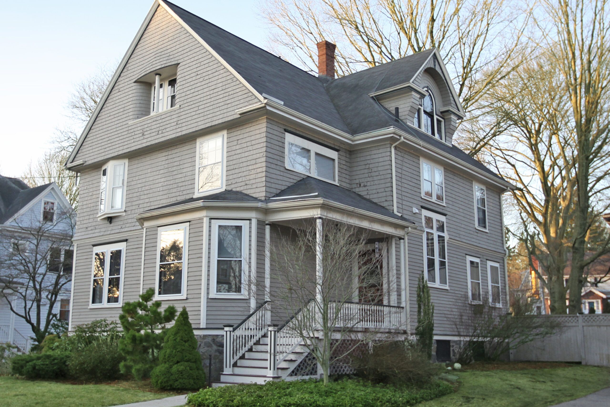
Homing in on a front elevation, Murat spoke up: “It looks naked, like something’s missing.” At that, the architect produced a piece of tracing paper and a black Sharpie and started sketching over the blank facade—columns, a swooping railing, wide steps. Right before their eyes, the picture the couple had envisioned since buying the house a month earlier began to take shape. “He drew a porch for the house in about 30 seconds,” says Katherine. “And he really nailed it. We could see immediately that a porch was exactly what the house needed.”
And so begins the story of a renovation in which adding a porch where one had long ago been removed took on major significance, in effort, expense, and impact. It completely transformed the facade. The interior changes addressed function and lifestyle.
But the porch was all about architectural detail and the overall feel of the place.
Shown: The Queen Anne had lost some of its charm.
A Porch Look at Home in the Neighborhood

An old town map shows the footprint of a porch running along the main facade and wrapping around the right side of the house, but by the time Murat and Katherine came along, only a stubby set of steps remained. “A front porch would have been really important to this house during the Victorian era because at that time, people sat out there and greeted their neighbors as they strolled by,” says Cummings. “It created the streetscape. It’s not just a porch, really—it is the character of the house itself.”
Shown: Murat and Katherine Bicer, here with their daughter and son, feel that their historical-looking new porch makes the house more a part of the neighborhood.
Architect: Matthew Cummings, Cummings Architects, 87 Central Street, Ipswich, MA 01938; 978-356-5026
Paint: Benjamin Moore’s Bryant Gold HC-7 (clapboards on first floor and porch, piers and also the inset shingled archway over the front stairs), Stuart Gold HC-10 (shingles on second and third floor), Crownsville Gray HC-106 (trim), and White Sand 964 (lattice/accent).
Early Sketch for a Happy Finish
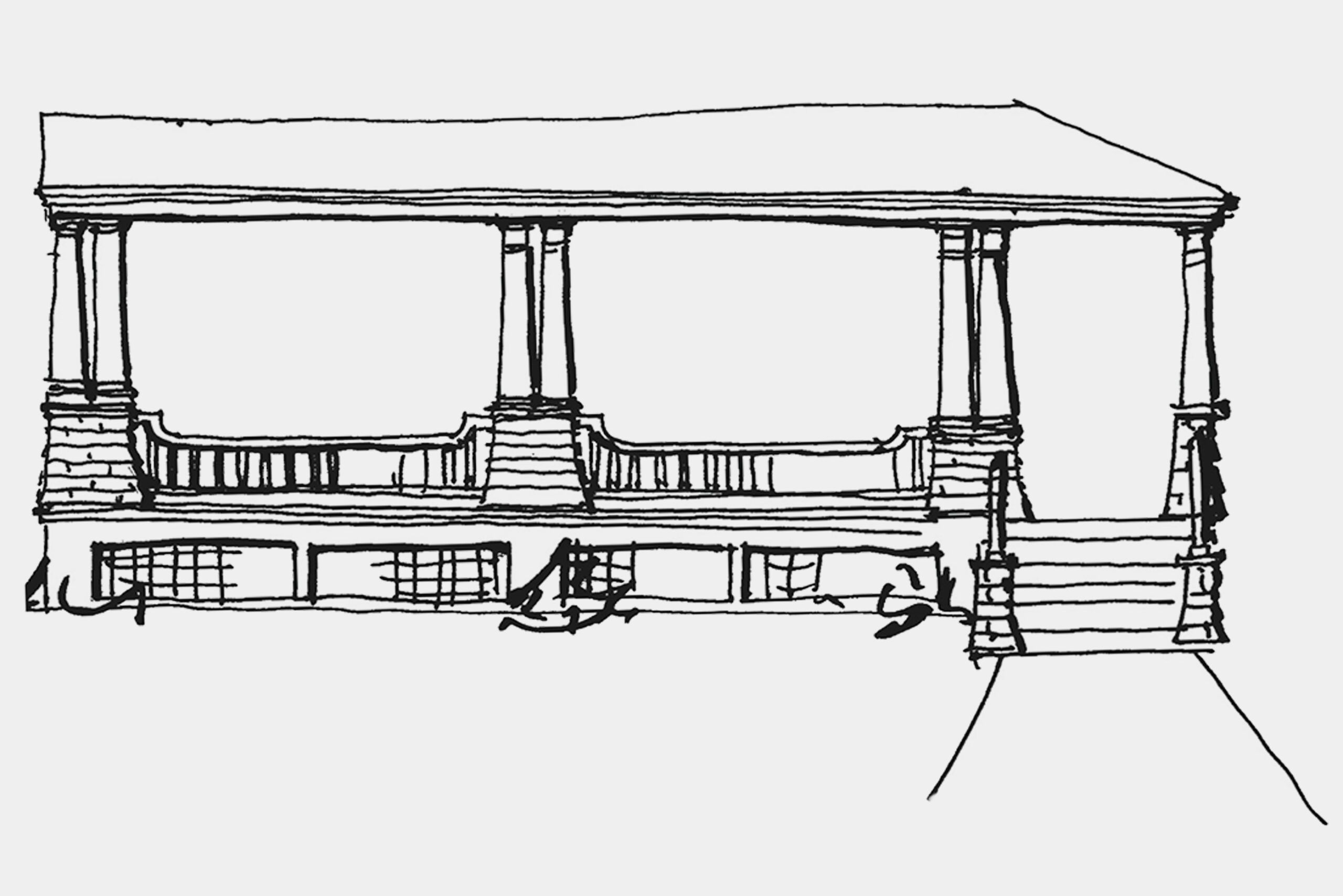
To design the porch, he drew on his experience with other projects from the period, as well as his observations of the defining elements on the houses in the Bicers’ neighborhood. “It was kind of like putting together an entire dinosaur skeleton from a toe bone,” says Cummings. The result is in keeping with the Queen Anne vernacular, which is known for plenty of detail, asymmetry, and a bit of whimsy. For example, he included columns resting on shingled piers that flare out at the bottom and a decorative gable signaling the front door—both elements characteristic of the style. Taken together, they display a level of detail that a custom home built in 1895 would likely have had.
Creating a Victorian-era porch today, however, requires devotion to the notion of doing things right. “It all comes down to whether you pay enough attention to detail,” says Cummings. One test of this philosophy arose during the design of the porch foundation. As Katherine recalls: “Murat and I worried about the cost of brick and thought we should go with a less expensive material and hide the entire porch foundation behind lattice. Mat pushed back and said it would really make a difference. He was so right.”
Shown: The sketch that architect Mat Cummings drew early on established an overall look for the porch that delighted homeowners Murat and Katherine Bicer.
Installing the Mahogany Decking

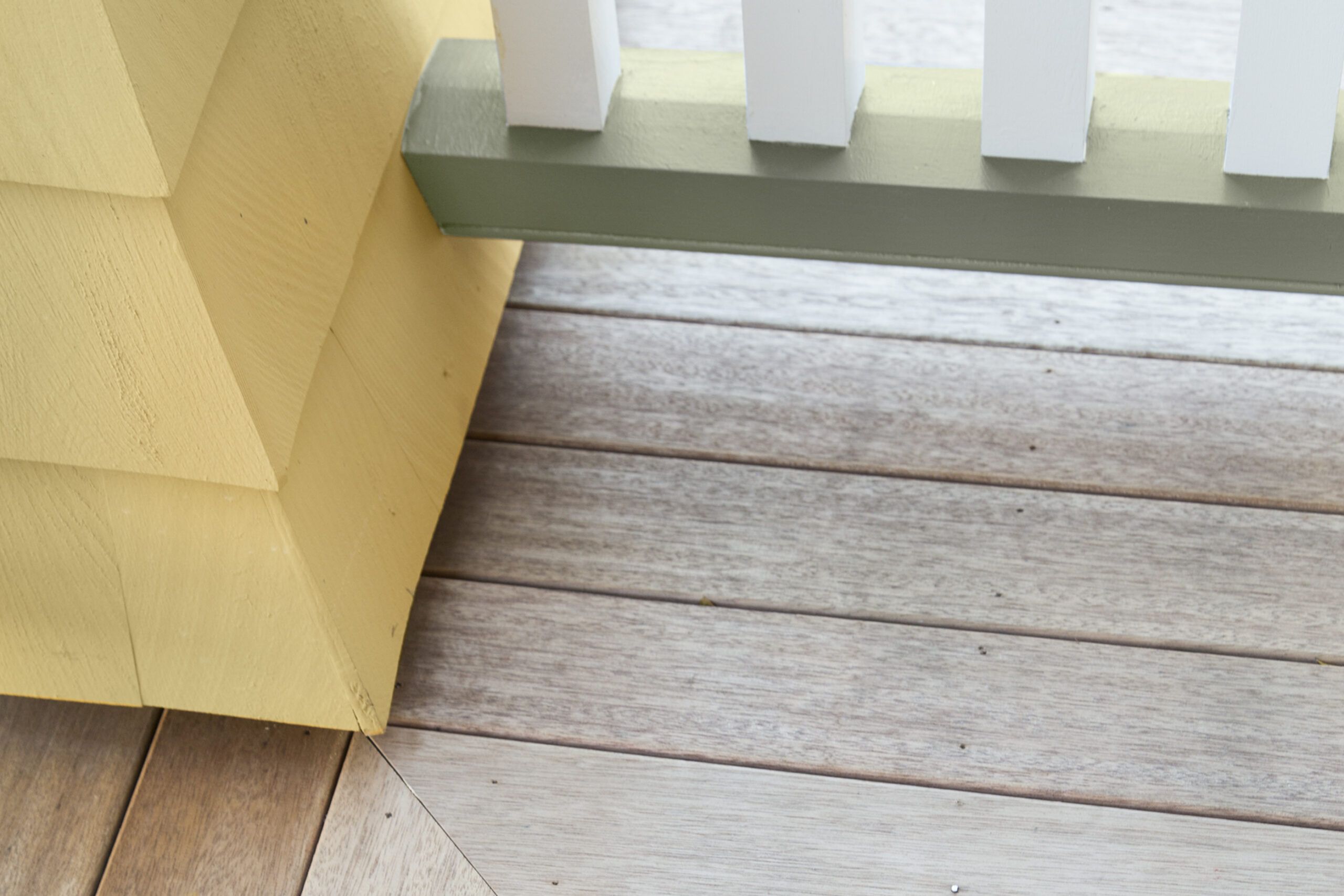
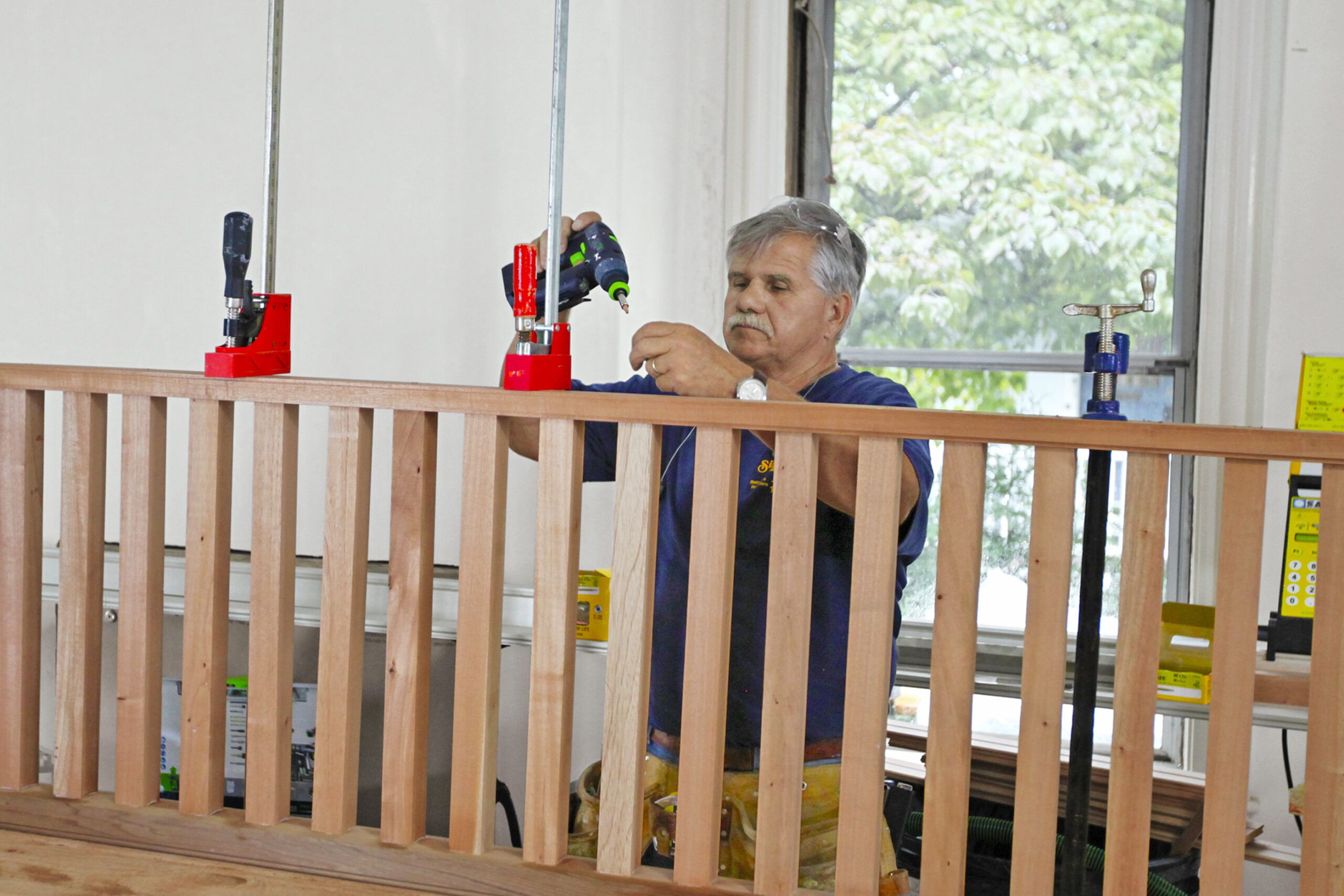
Despite the painstaking work required, TOH general contractor Tom Silva needed no convincing. “There’s a lot of detail and a lot of different materials in this porch, but it’s worth it because it’s such a key element of the house,” says Tom. He poured effort into every aspect, from installing the fir beadboard ceiling and mahogany decking with mitered corners where the porch wraps around to shingling the piers with butt-edges and handcrafting the swooping handrail and balusters.
While it’s unusual for decking to turn the corner with the porch, Cummings feels that when all the decking is oriented in one direction, it doesn’t lead anywhere. Tom face-nailed the decking in place, a technique typical of the era and one he uses for most of his projects. He also used a strong adhesive, “because that’s the way I like to do it today.”
Shown: Using a belt-and-suspenders approach, Silva Brothers foreman Dan Buckley installs the mahogany decking, running adhesive on the joists first, then face-nailing the boards in place.
Spanish Cedar Railing
The signature detail of the porch, however, is the gable, and it is a feature to which the entire team brought heart and soul. Early on, Murat and Katherine embarked on a family outing to get ideas for the look of the gable, piling both kids into the SUV one Sunday afternoon and driving around neighborhoods with Victorian-era houses for inspiration—soldiering on through the kids’ protestations. “If we saw a porch gable we liked, we’d pull over, take a photo, and keep going,” says Katherine. “Then we chose our favorites and shared them with Mat.” The common denominator of the gables they liked was that they were all shingled and they all had decorative elements that made them feel like they belonged on their respective houses.
Shown: Tom builds sections of the Spanish cedar railing, to be installed between the piers.
Shingled Sunburst Inset for a Welcoming Porch
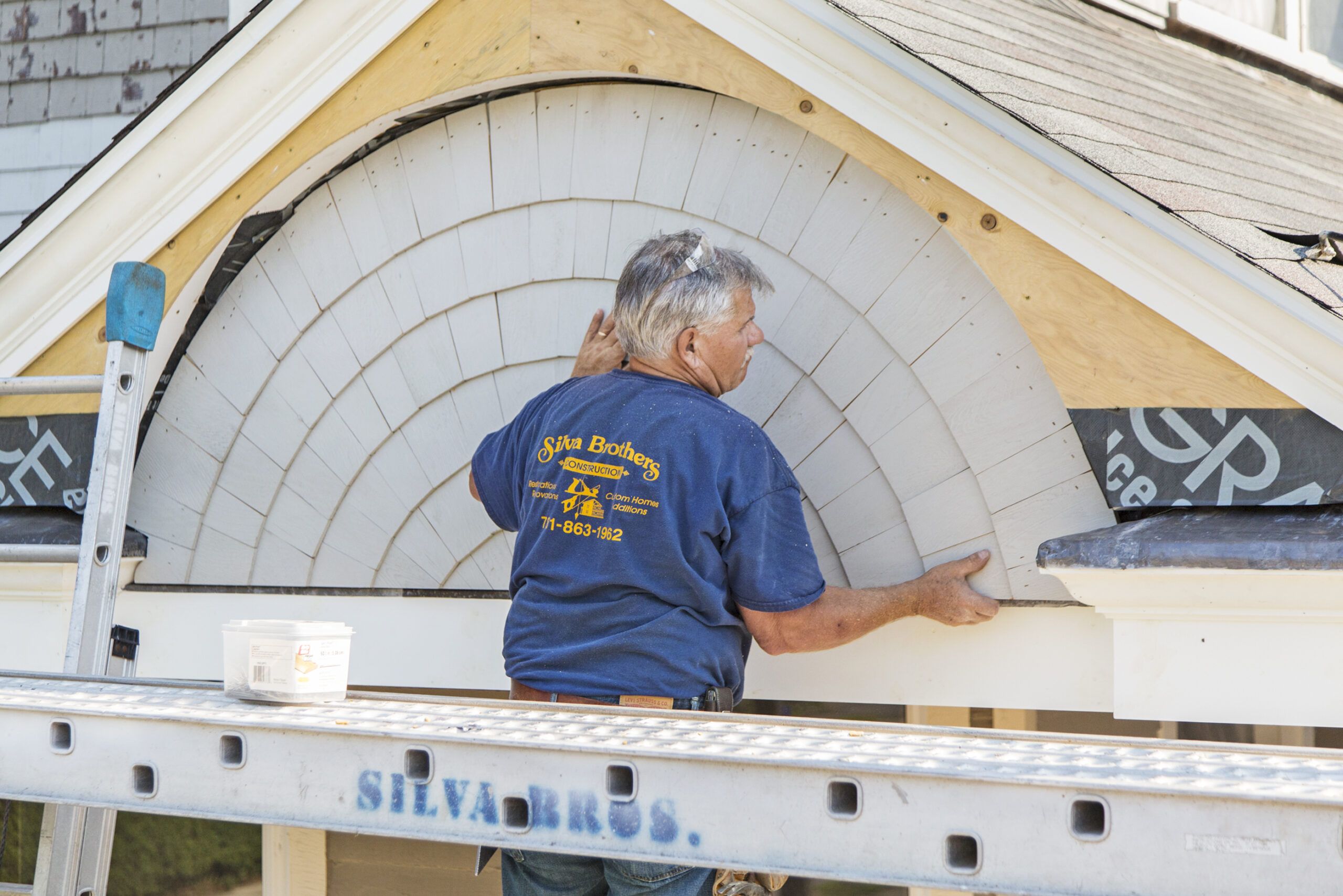
Cummings drew a gable that celebrated the wide and welcoming entry steps, with a pair of columns on either side, and with a shingled sunburst that echoes the one found on the house’s existing third-story gable, facing the side yard. Tom built the shingled inset on a table—tapering every cedar shingle by hand with a knife, nailing each one to a plywood back, then trimming out the shape—and installed the finished piece on the house. “It’s a lot of work for a small area, but in the end, it’s one more thing that makes this porch look like it’s always been there,” says Tom.
Shown: Tom built the shingled sunburst inset for the porch gable on a workbench, then installed the finished piece on the house.
Boston City Hall Pavers for the Porch

For the family, the porch sums up their dreams for the house. “In terms of our daily lives, it probably has the least impact—versus the kitchen and the mudroom and the air-conditioning, for example,” says Katherine. “But in terms of the joy we get, it is immeasurable. Every time we walk up those steps, we will be glad we did it. We have given our house its proper respect.”
Shown: The porch piers were made with new Boston City Hall pavers, a kind of molded brick that has been continuously produced for more than a century.
Anatomy of a Perfect Porch, Detail by Detail
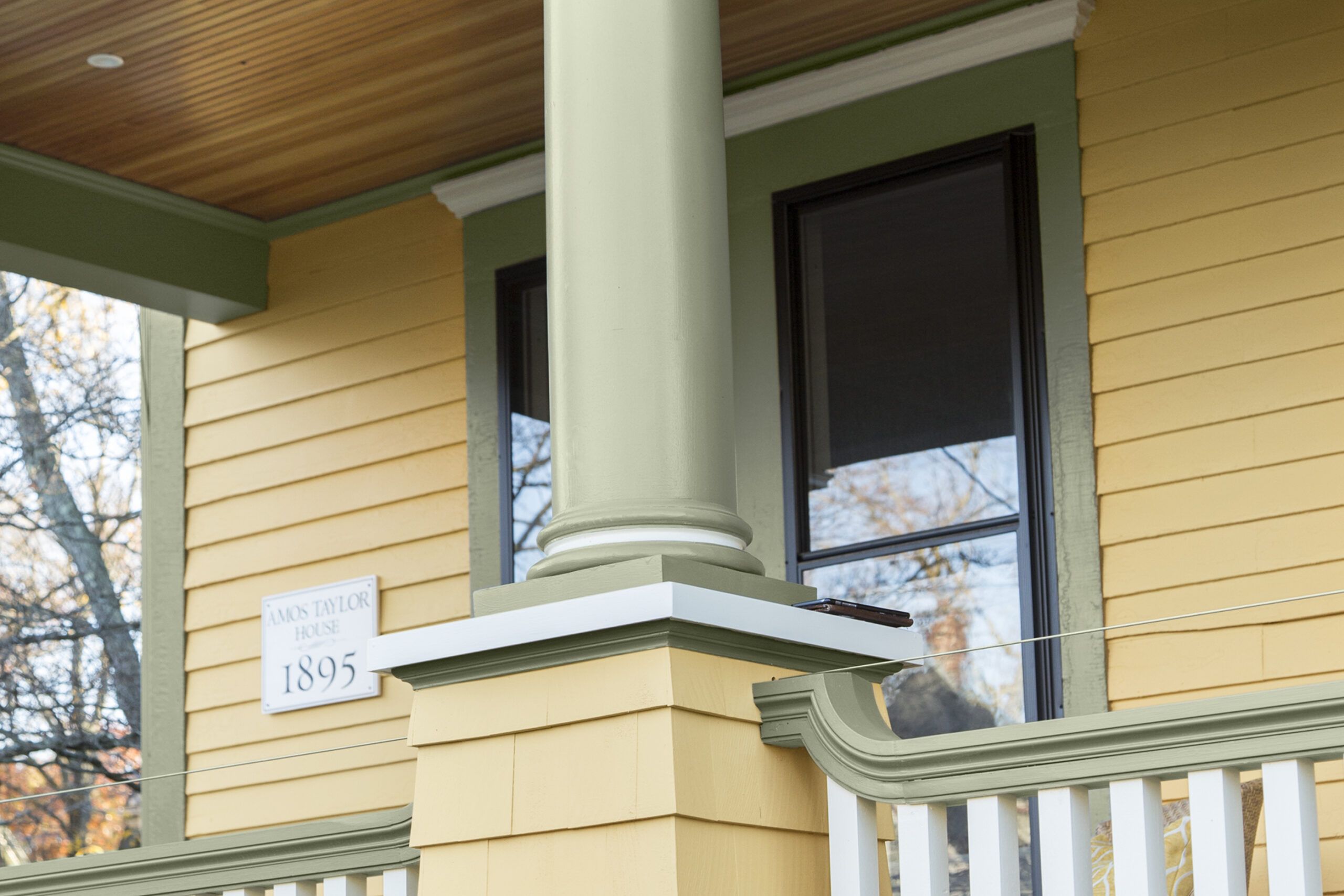
A single column on a top-story window inspired the silhouette of the porch columns.
Columns: Chadsworth Incorporated
Victorian-Perfect Handrail
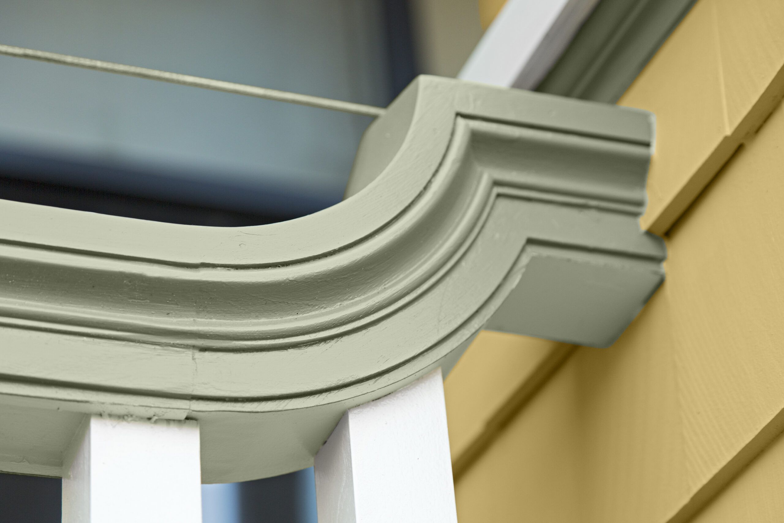
The swooping handrail is the sort of detail found on Victorian-era houses, which included a diversity of architectural shapes. A nearly invisible steel cable attached just above the rail’s anchor point was Tom’s subtle solution to meeting the building-code height of 36 inches.
Flared, Shingled Porch Piers
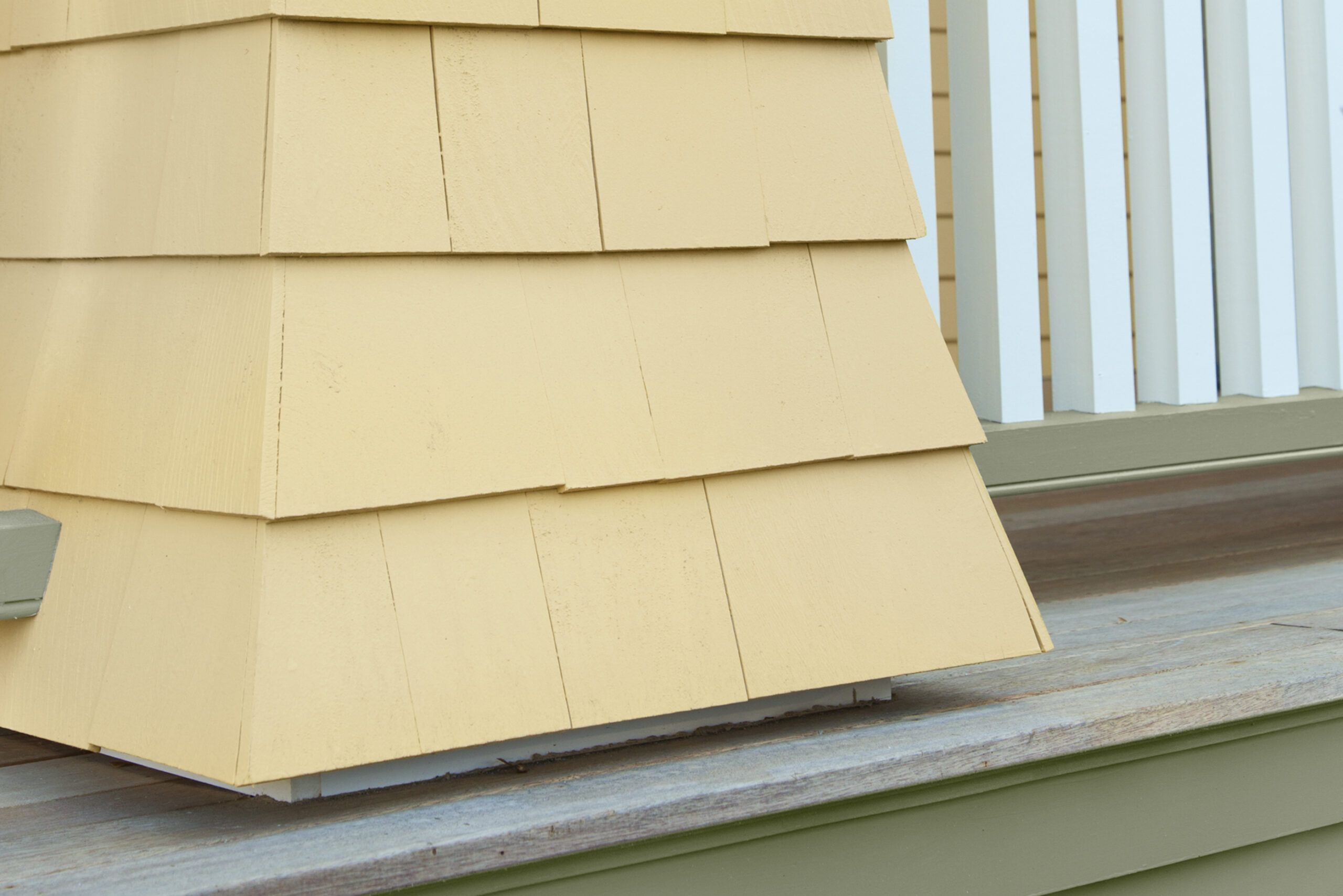
Taking cues from neighboring Queen Annes, Cummings included porch piers shingled in white cedar and flared at the bottom—more Victorian whimsy.
Visual Cues for a Recessed Door
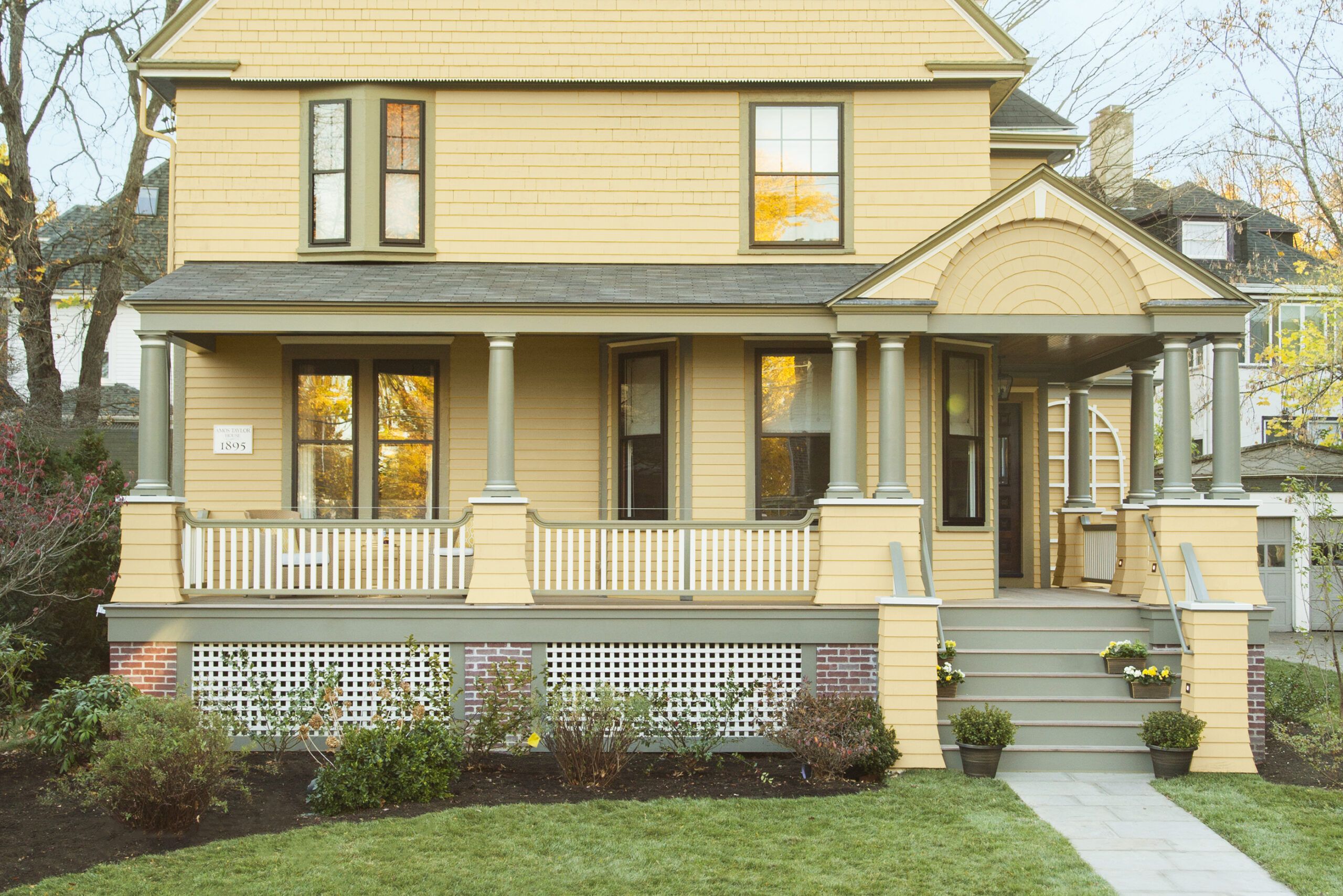
As the plan developed from the sketch, the need for a gable to announce the recessed front door became clear. Beneath it, wide steps signal an openness and speak to the ideal of porch as gathering spot. “The double columns are needed to look proportional,” explains Cummings.
Stairway marker light: Juno LMSW Series LED Outdoor Step Light
Bright Beginnings
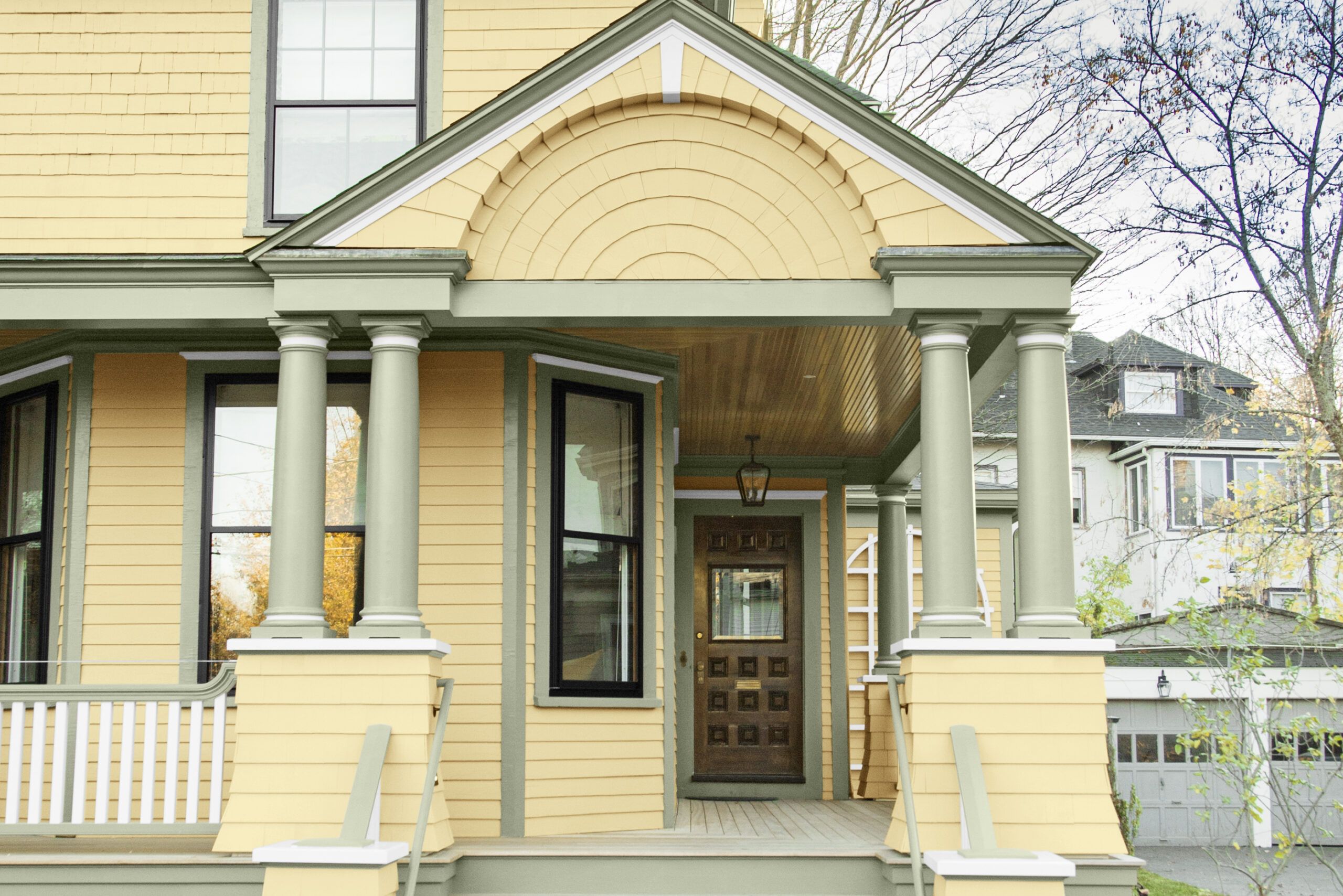
The intricately detailed gable over wide steps presents an unmistakable welcome to visitors.
Storm Windows: Harvey Building Products
Brick Piers for an Authentic Look
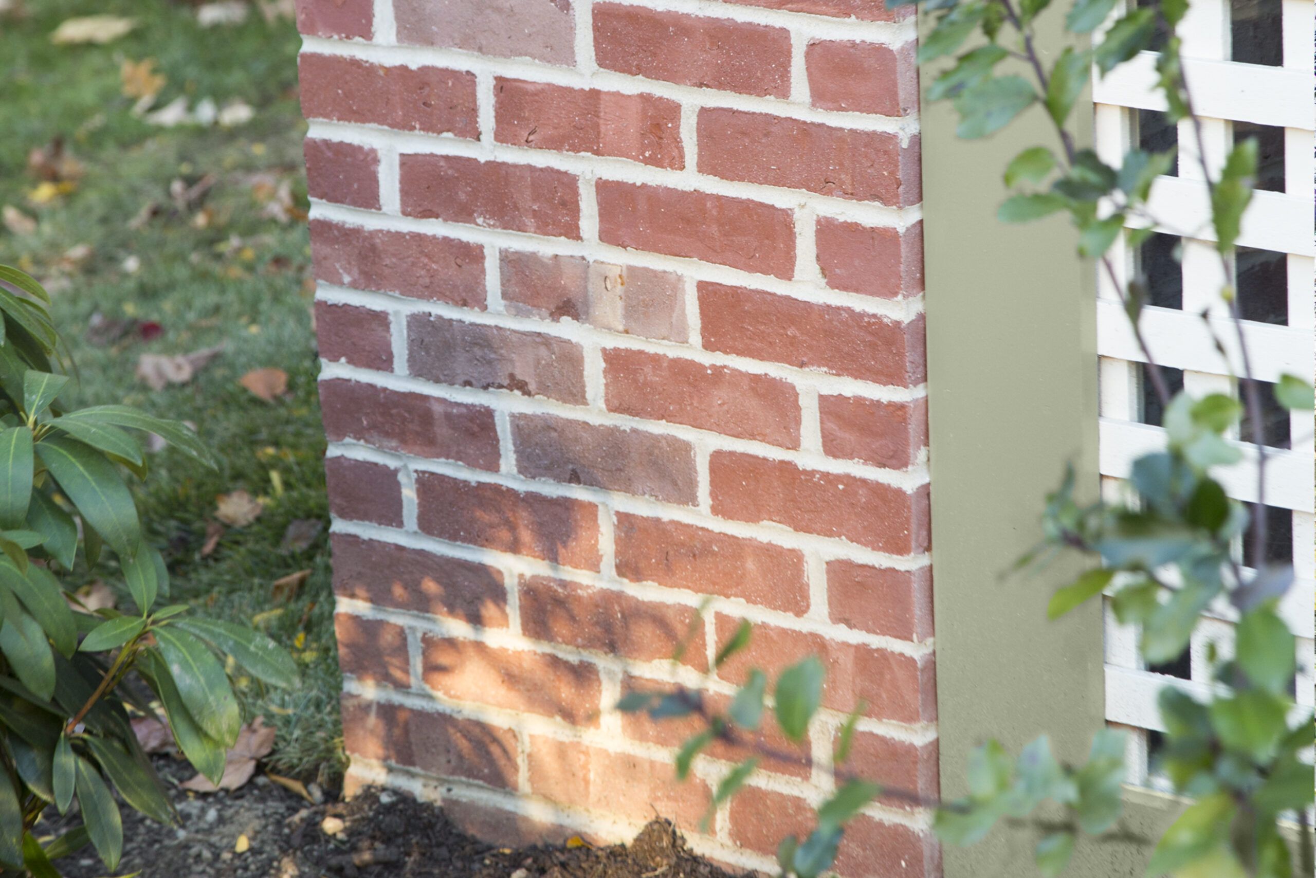
Setting the porch on a foundation of brick piers rather than hiding concrete ones behind the lattice reinforces the feeling that the porch has always been there. The brick matches the house’s chimney.
Bricks for Piers: The Stiles and Hart Brick Company “Boston City Hall Paving Brick”
Natural Wood Porch Ceiling
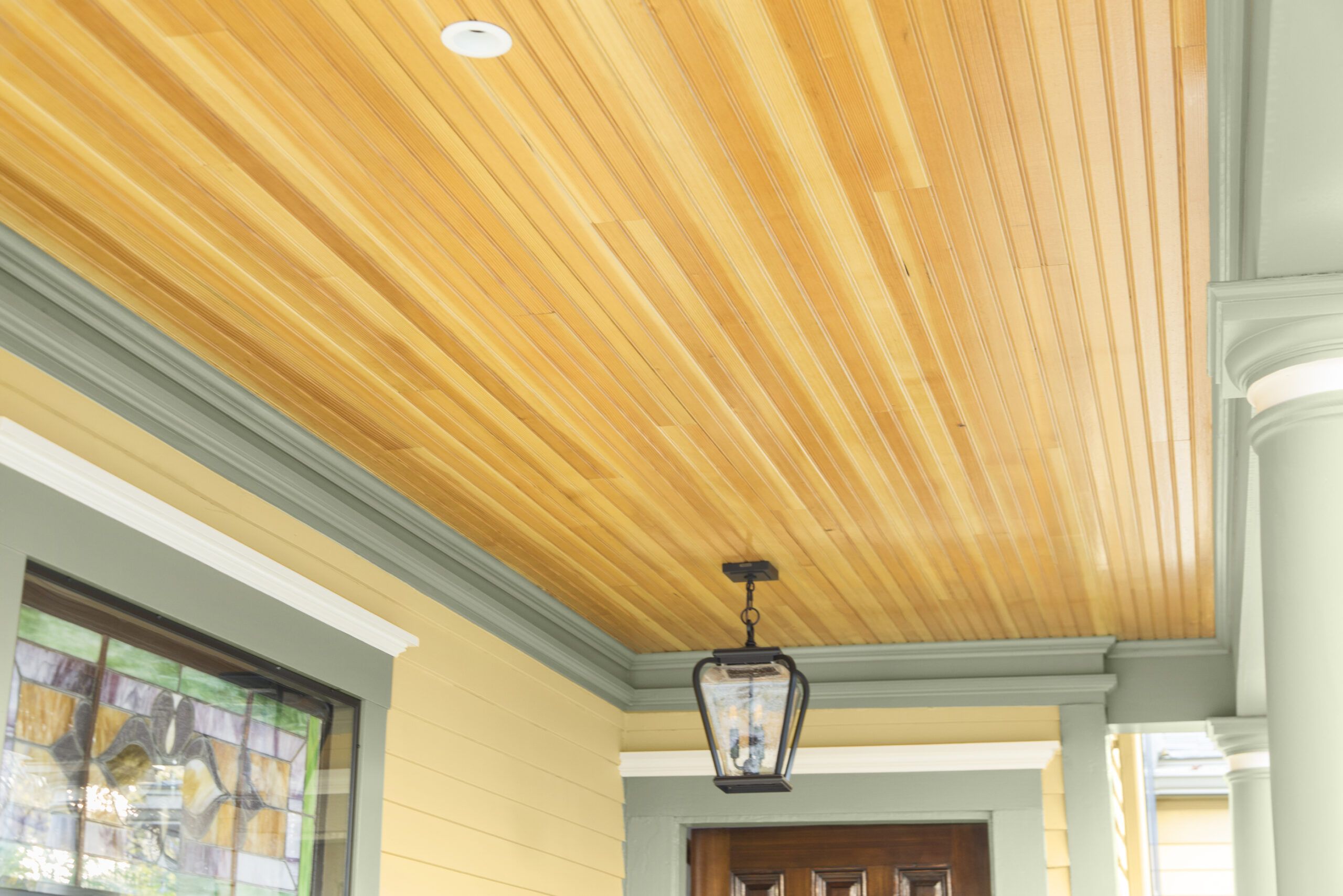
Wood porch ceilings were characteristic of the era. While often painted, the ceilings were sometimes left natural, like these tongue-and-groove fir beadboards.
Three Light Outdoor Hanging Lantern: Quoizel Province PRV1909K
