19th-Century Character Restored
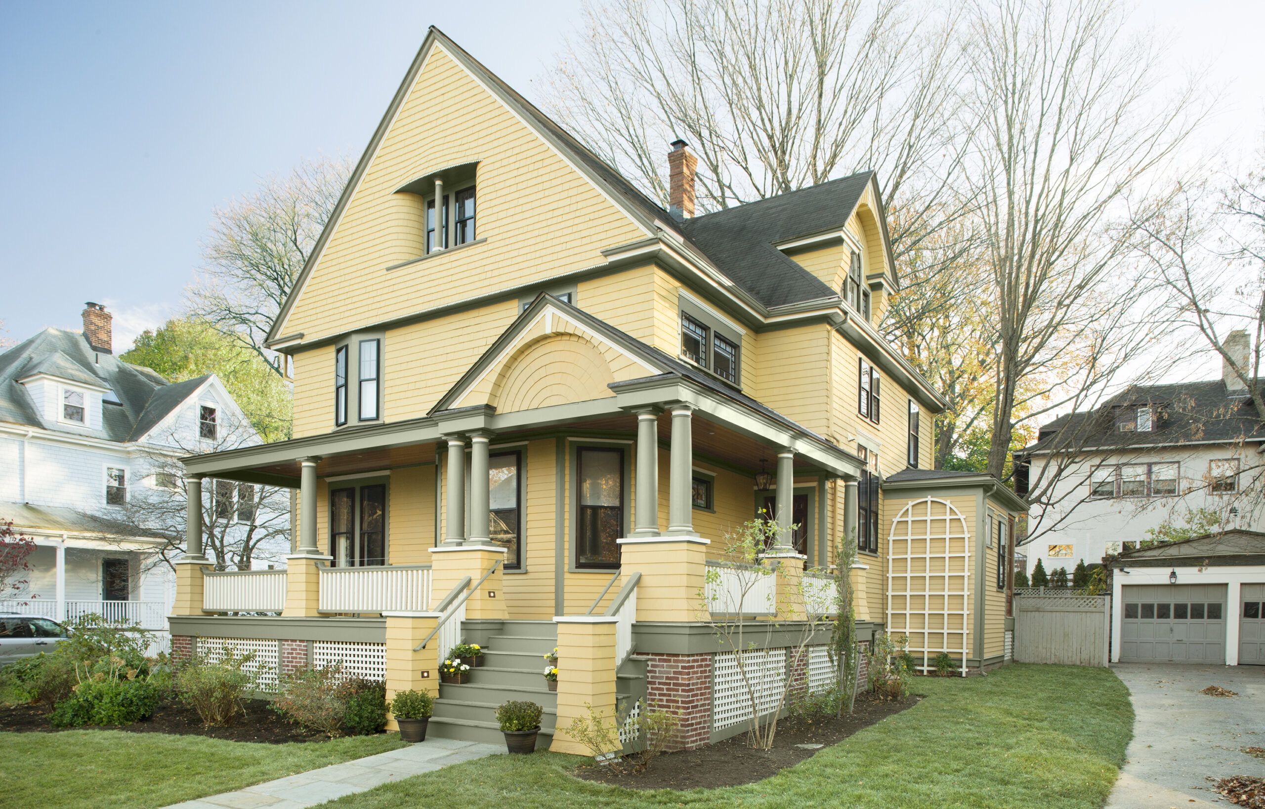
When Katherine and Murat Bicer fell for their old house, they envisioned a cheerful space for their family, but they knew it needed upgrades—so much so that they never really unpacked after buying the place in August 2014. They moved out again eight months later so that TOH TV general contractor Tom Silva and the crew could renovate the three-story, 3,200-square-foot Queen Anne. Architect Mat Cummings created the master plan, and the Bicers also tapped the expertise of kitchen designer Linda Cloutier and interior designer Amanda Reid. The renovation mantra: Keep it Victorian-era in feeling but here-and-now in functionality. Watch full episodes of the project
Shown: A new, historically inspired wraparound porch restored the house’s 19th-century character. Read more about the porch overhaul
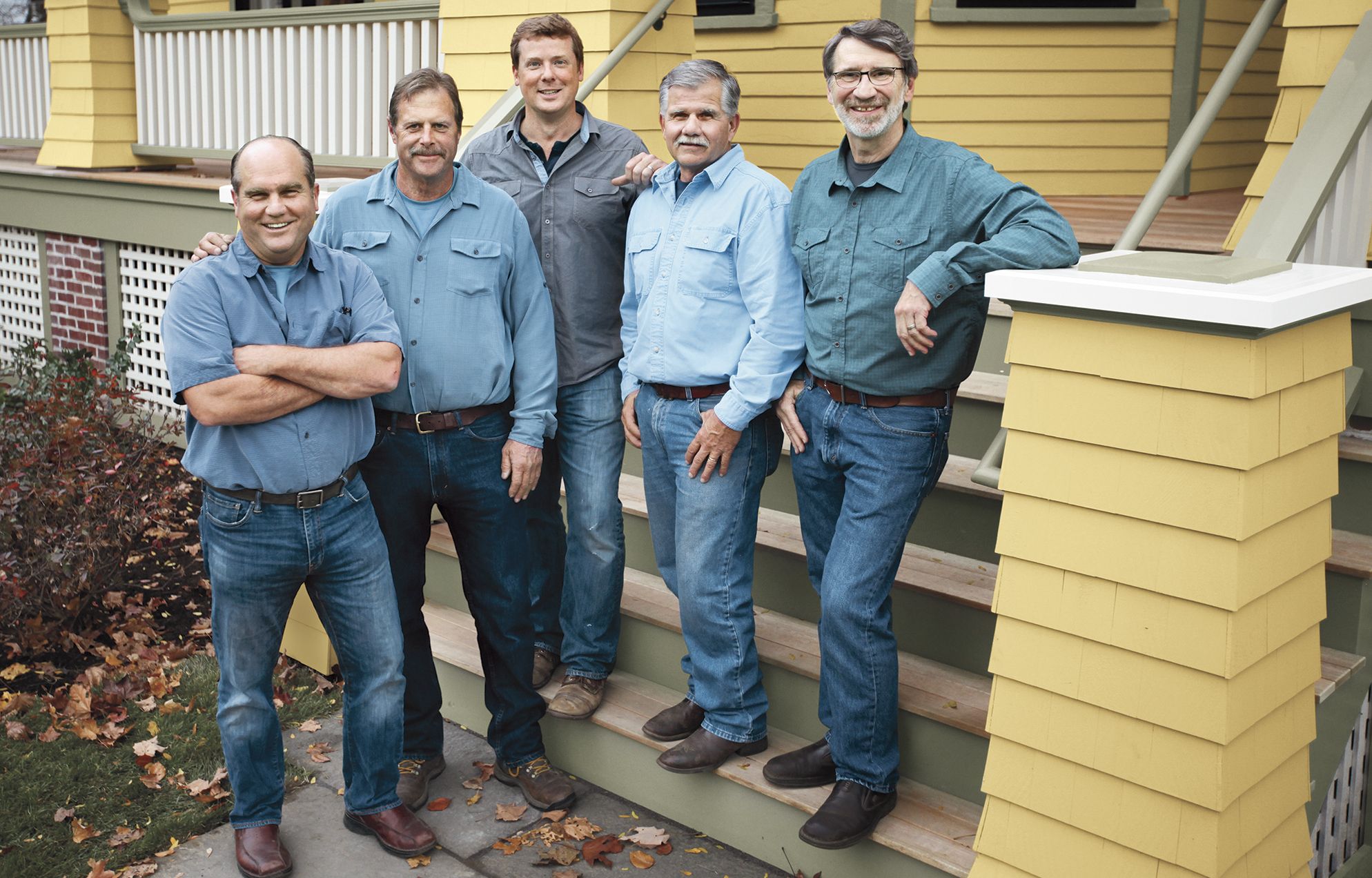
The TOH TV Crew with the Charming Redo
Once the dust settled, the Bicer home emerged as a deft blend of old and new, seen and unseen. Largely hidden are such essentials as beams supporting a reconfigured kitchen-eating-mudroom area that spans the entire back of the house, new ductwork for heating and cooling, and a new copper water line from curb to house. In full, glorious view are a cheery kitchen with a new bay window looking out onto the backyard; a back-entry and mudroom bumpout; a luxurious master suite; fresh color palettes inside and out; and salvaged items incorporated throughout the house, which Katherine and Murat find “good for the soul.” With the renovation complete, the Bicers have moved back in—and this time, Katherine reports, they unpacked everything. “We are here to stay,” she says. “The house perfectly suits the way we live and play as a family.”
Shown: The TOH TV crew worked with the architect’s plans to blend the best of old and new.
Paint: Benjamin Moore’s Stuart Gold (exterior)
Exterior trim: AZEK
Storm windows: Harvey Building Products
Insulation: Icynene
Bright and Hardworking Family Kitchen

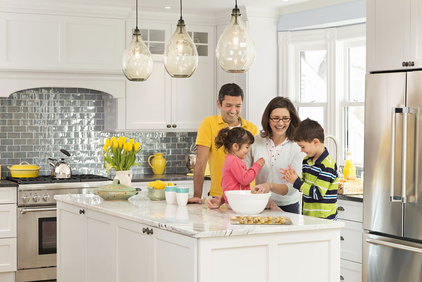
The homeowners and their children gather at the marble-topped island in their kitchen, a new space that owes its luminosity to classic white cabinets, a large bay window, and layered lighting. The island itself is a storage stalwart: 8 feet long, with a wide drawer for dish storage on the side that faces the sink and shallow shelves behind cabinet doors for dry goods on the other side. Vintage bin pulls Katherine found at a salvage shop were just right for the cabinet drawers.
Paint: Benjamin Moore’s Beacon Gray
Kitchen cabinets: Wood-Mode
Fridge and stove: Thermador
Backsplash tile: The Winchester Tile Company
Pendant lights: Cisco Brothers
Under-cabinet lighting: AFX
Recessed lighting: Juno Lighting Group
Elegant Foyer with Custom Details
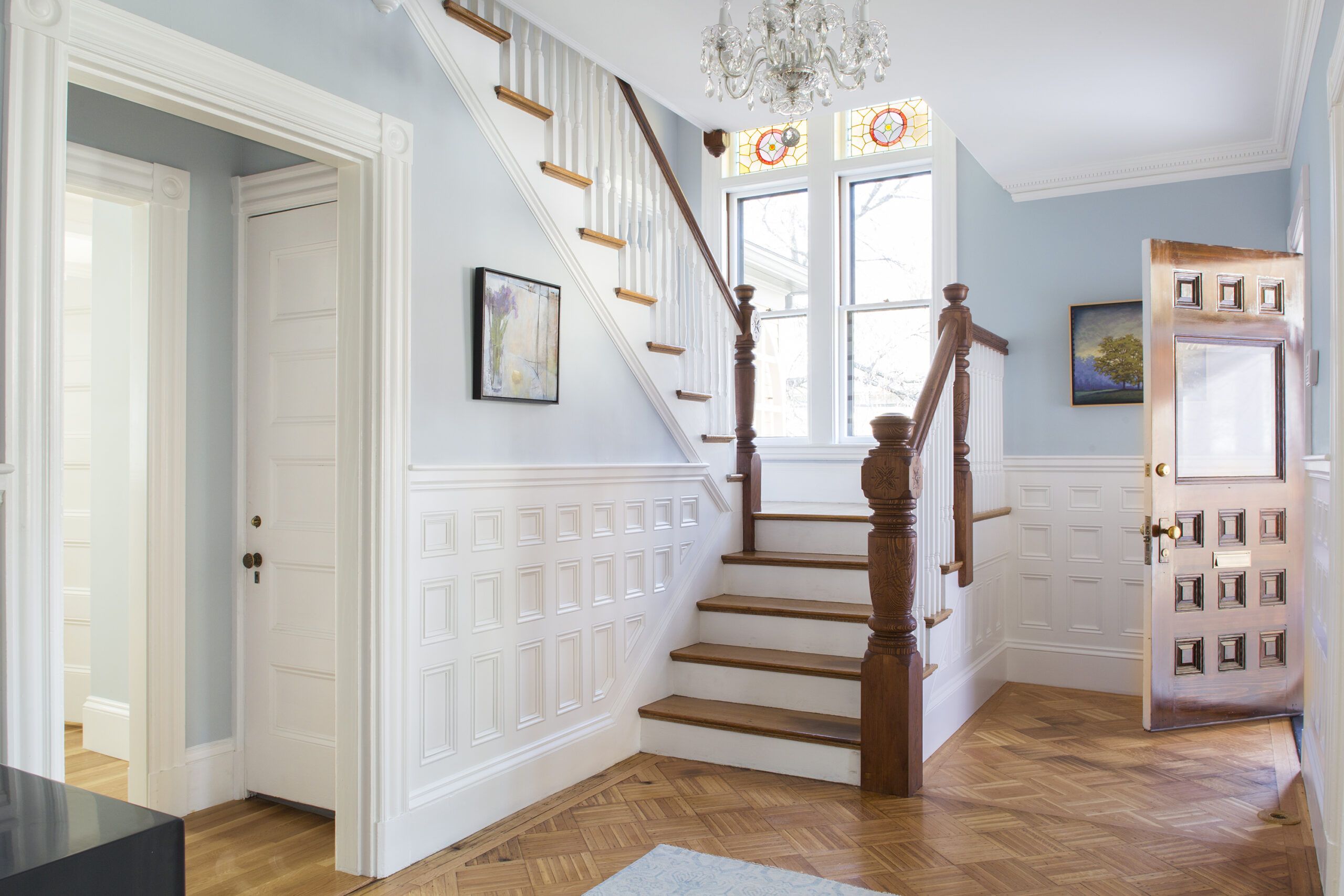
Previously blocked off by a full wall, the once coffin-like foyer is now welcoming and elegant, thanks to lower stairs upgraded with handcrafted newel posts and custom wall paneling installed by the TOH TV crew.
Paint: Benjamin Moore’s Misty Memories
Foyer chandelier: Historic Houseparts
Hardware: House of Antique Hardware
Disguised Storage in the Dining Area
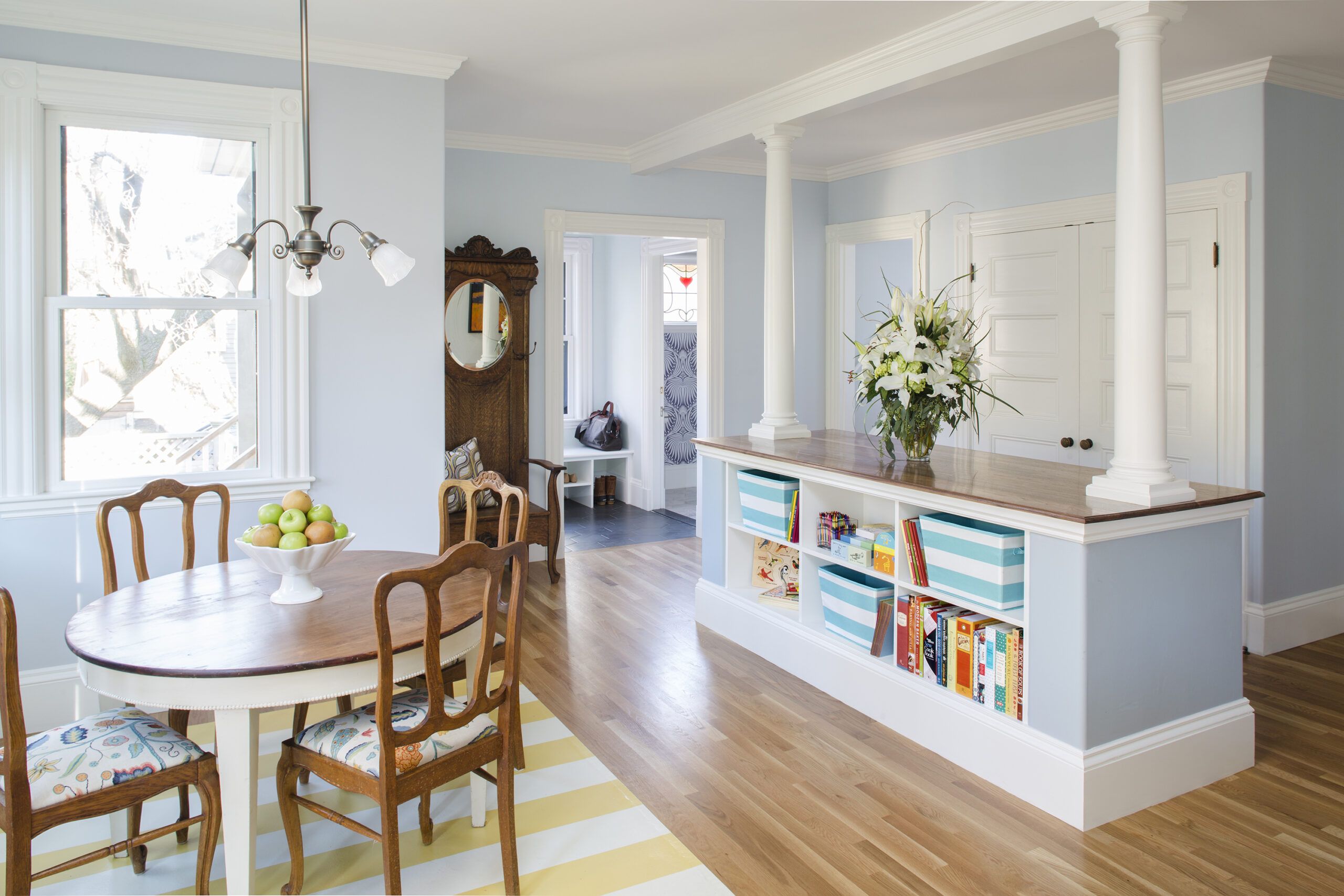
The eating area, just off the kitchen, features a vintage round table that Katherine found at an antiques market and a custom floorcloth that hews to family tradition: She has always had yellow kitchens. The column-topped partition and large closet provide charging stations and prime storage near the tiled mudroom, just a few steps from a newly added rear entry.
Columns: Chadsworth Incorporated
Kitchen chair upholstery: Kampler and Prospect Upholstery
Formal Yet Fresh Living Room
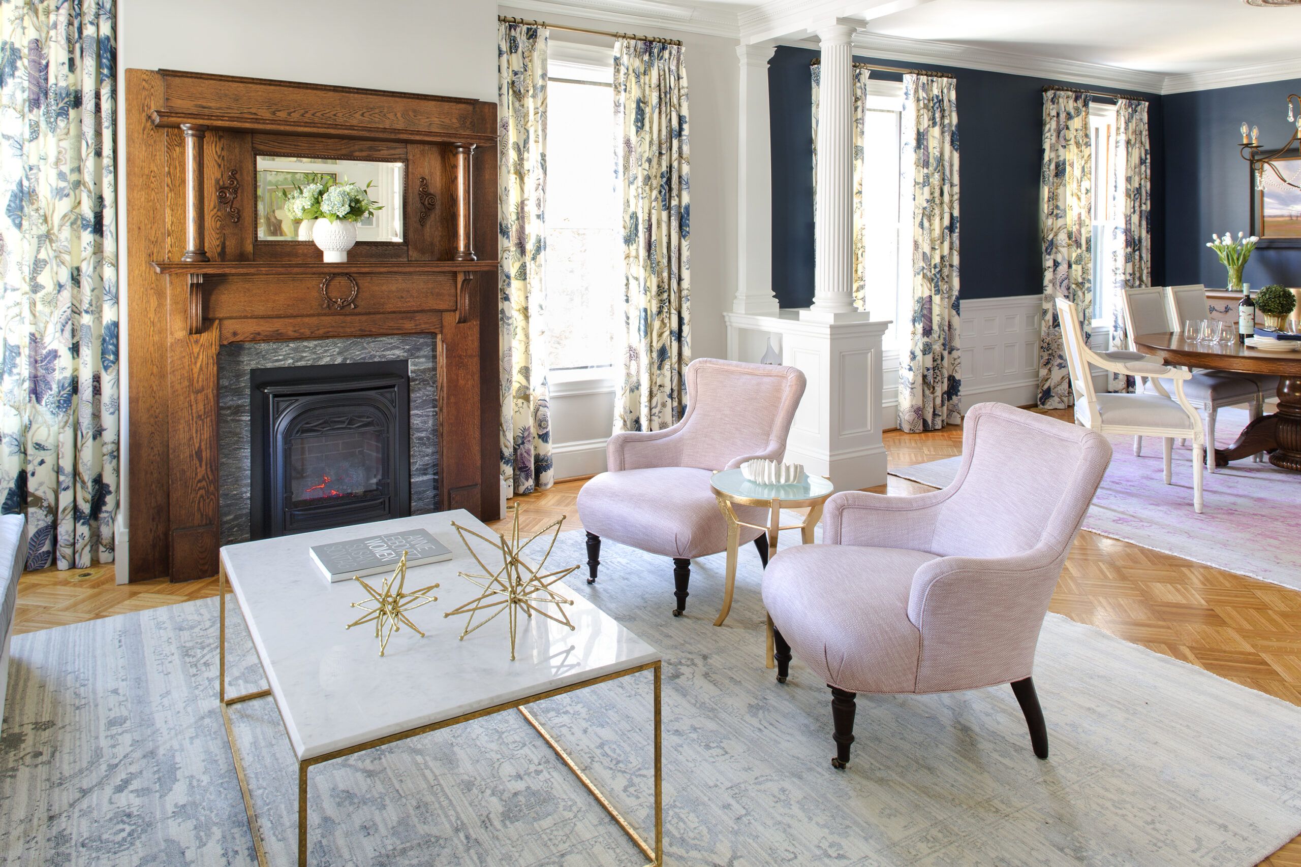
Columned half walls now delineate the entertaining spaces—living room and dining room—without closing them off, while an antique oak fireplace mantel supplies character.
Paint: Benjamin Moore’s Alaskan Husky (living room walls)
Custom drapery: Fabrika
Drapery fabric: Indian Arbre in Hyacinth; Schumacher
Handsome Hearth
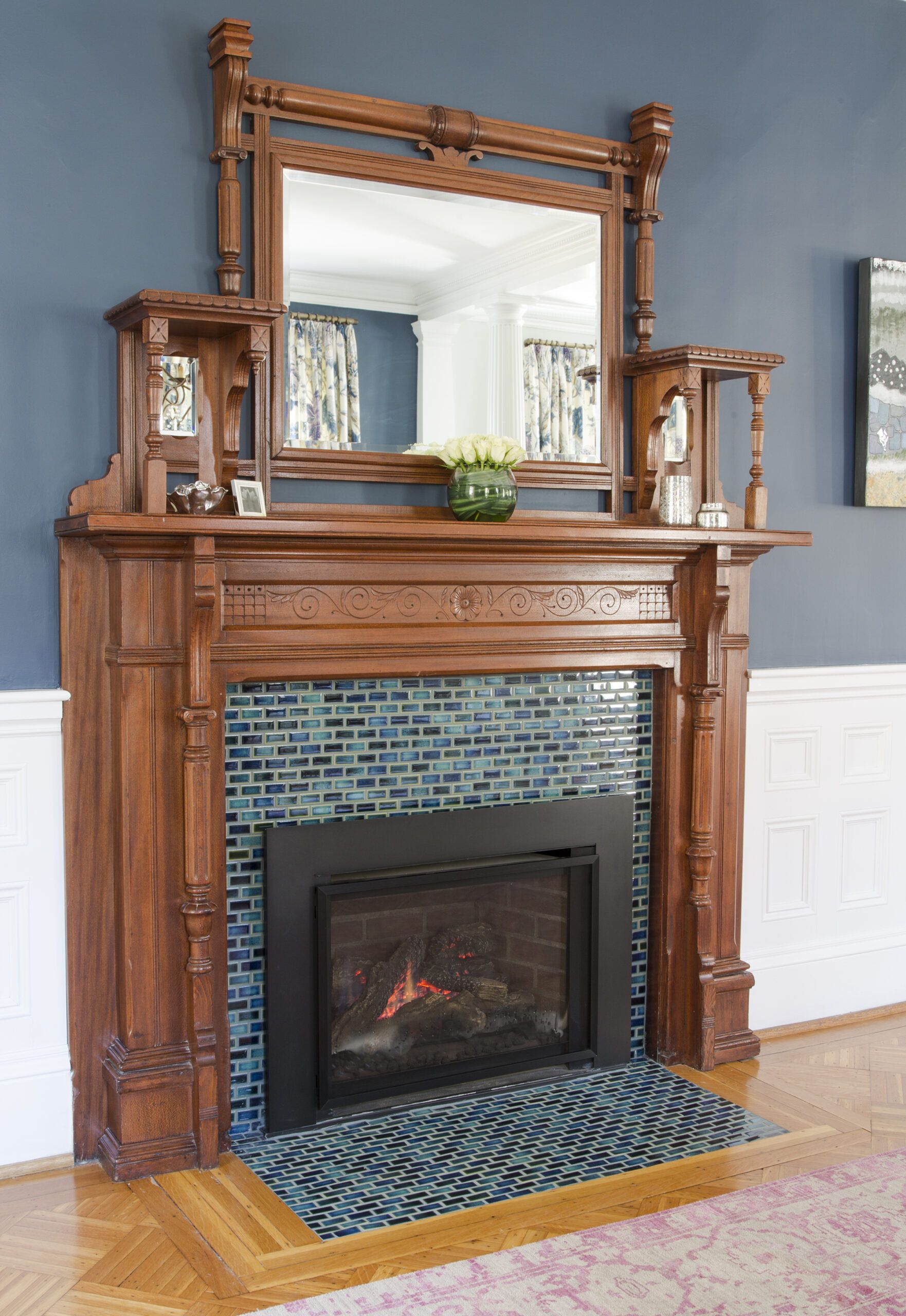
An antique mantel and a newly installed colorful tile surround give the existing dining room fireplace—outfitted with a gas insert—an entirely fresh look.
Small and Dramatic Powder Room
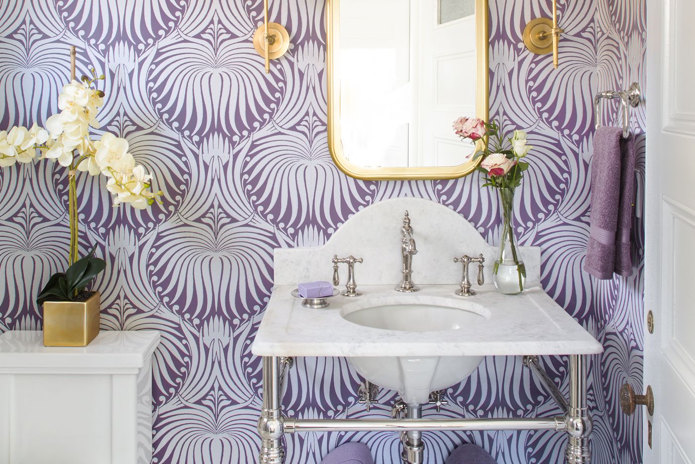
The living room drapery fabric’s whites, grays, blues, and lavenders established the color palette for the entire house, including the new powder room.
Bath fan: Panasonic
Insulation: Roxul
Console: Palmer Industries
Designed Around a Special Stained-Glass Window
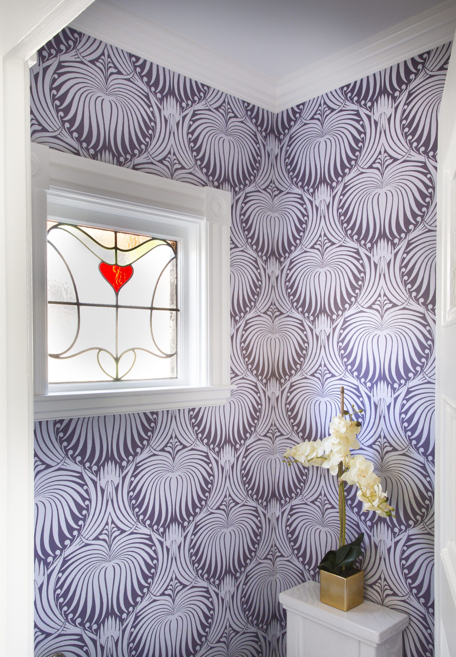
“We wanted drama,” notes interior designer Amanda Reid, who came through with strong visual elements for the first-floor powder room, including Farrow & Ball wallpaper, 8-inch hexagonal marble floor tiles, and a marble vanity original to the house. The stained-glass window has sentimental meaning—Murat and Katherine purchased the pane as newlyweds and asked architect Mat Cummings to build the powder room around it.
Wallpaper: Lotus pattern 2062; Farrow & Ball
Paint: Benjamin Moore’s Chantilly Lace (trim)
Mayhem Tamed in a Handsome Mudroom
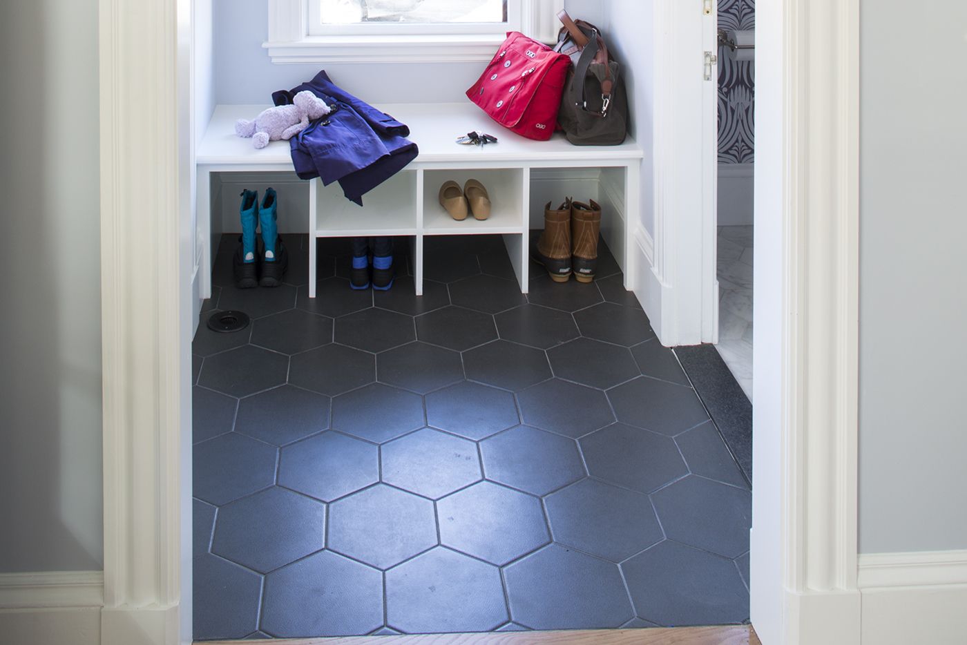
The area immediately inside the new back door includes a built-in bench for removing shoes and boots in this socks-only household. The 10-inch hexagonal porcelain tile is rugged enough for mudroom duty and reminiscent of the Victorian era, when hexagons, typically much smaller, were a popular tile motif.
Exposed Shingles for Extra Character
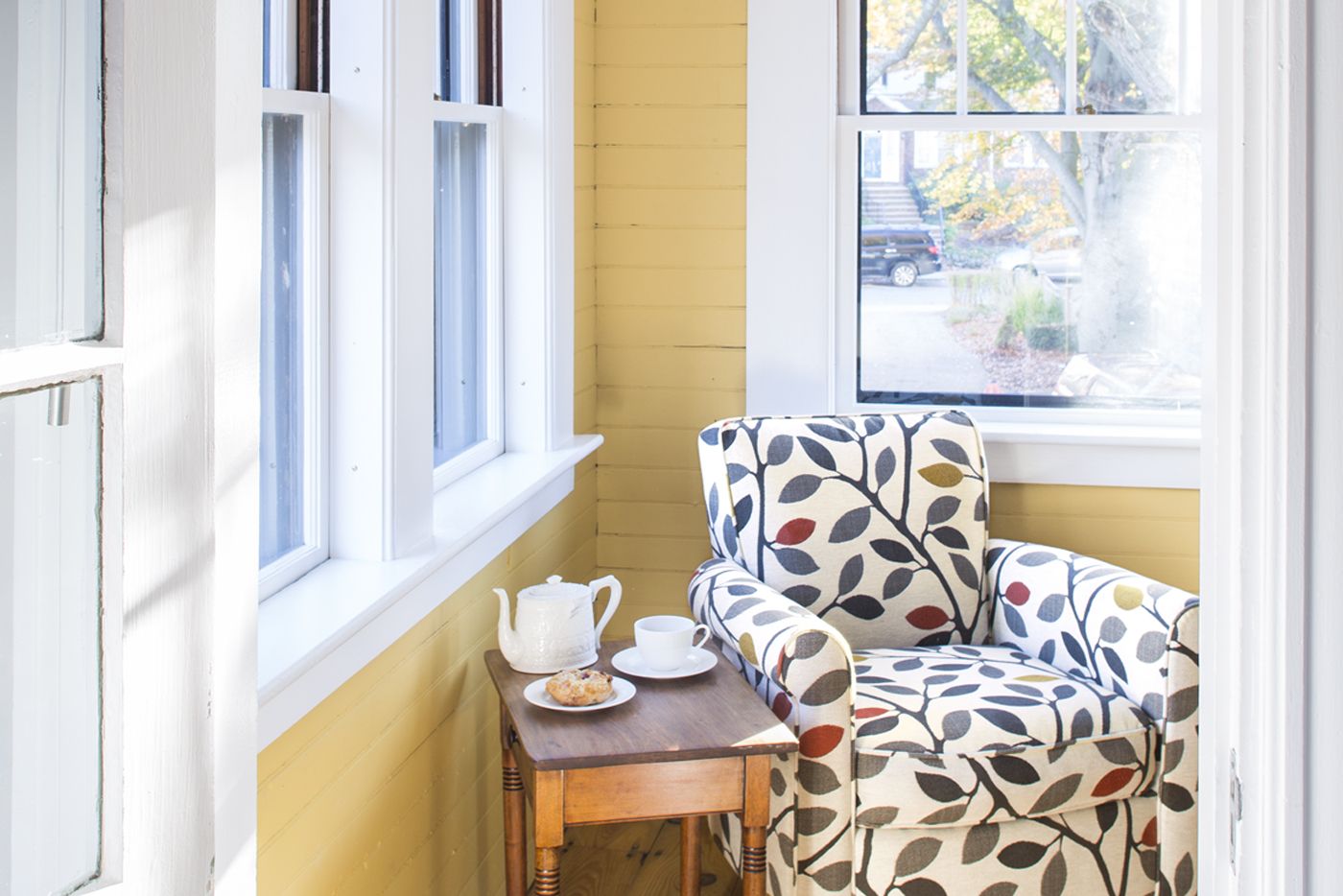
The former sleeping porch kept its shingled walls, painted to match the new exterior paint scheme.
Inviting Master Suite
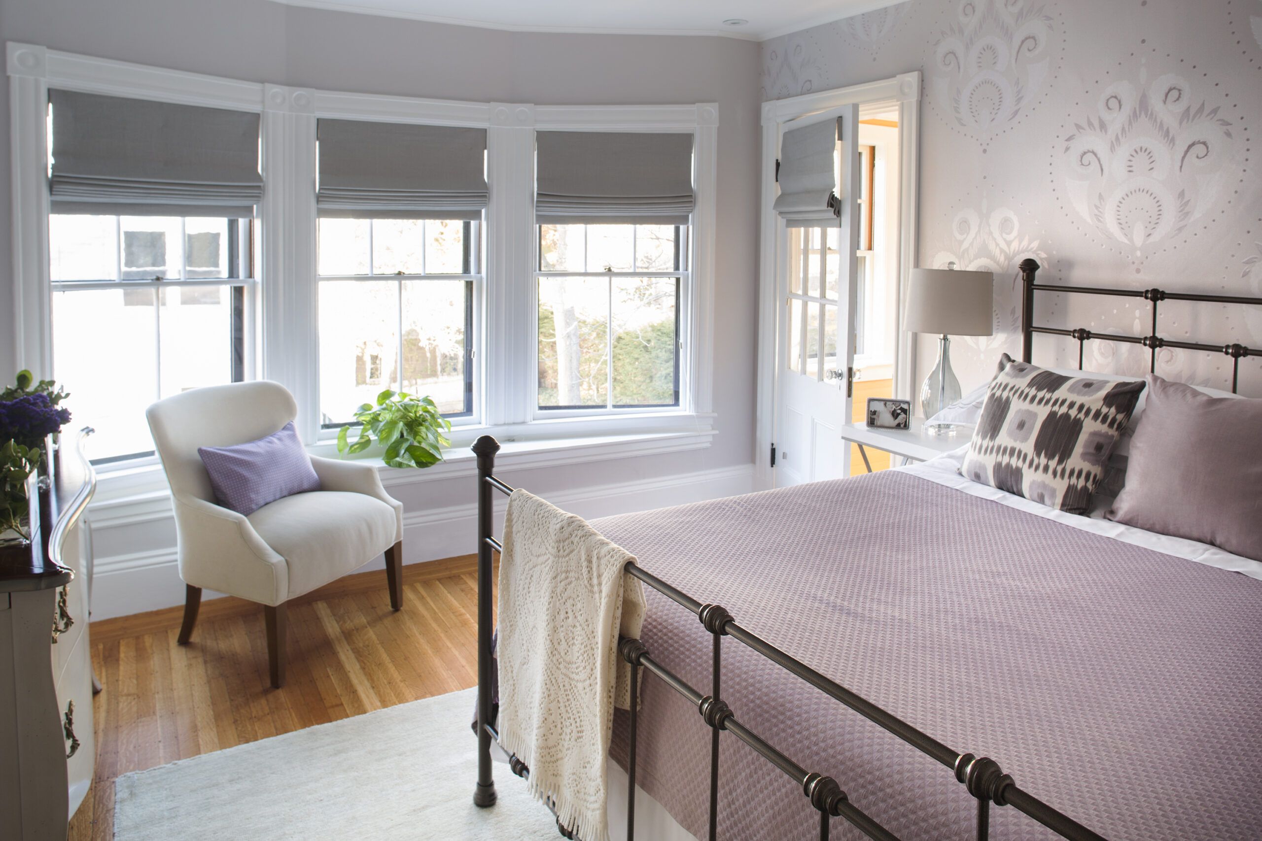
In the master bedroom, an existing bay window invites in natural light, and walls with a stenciled floral pattern in soothing tones of pale lavender and gray continue the color palette.
Custom wall finish: Patina Designs
Custom roman shades: The Shade Store
Original Claw-Foot Tub Revamped
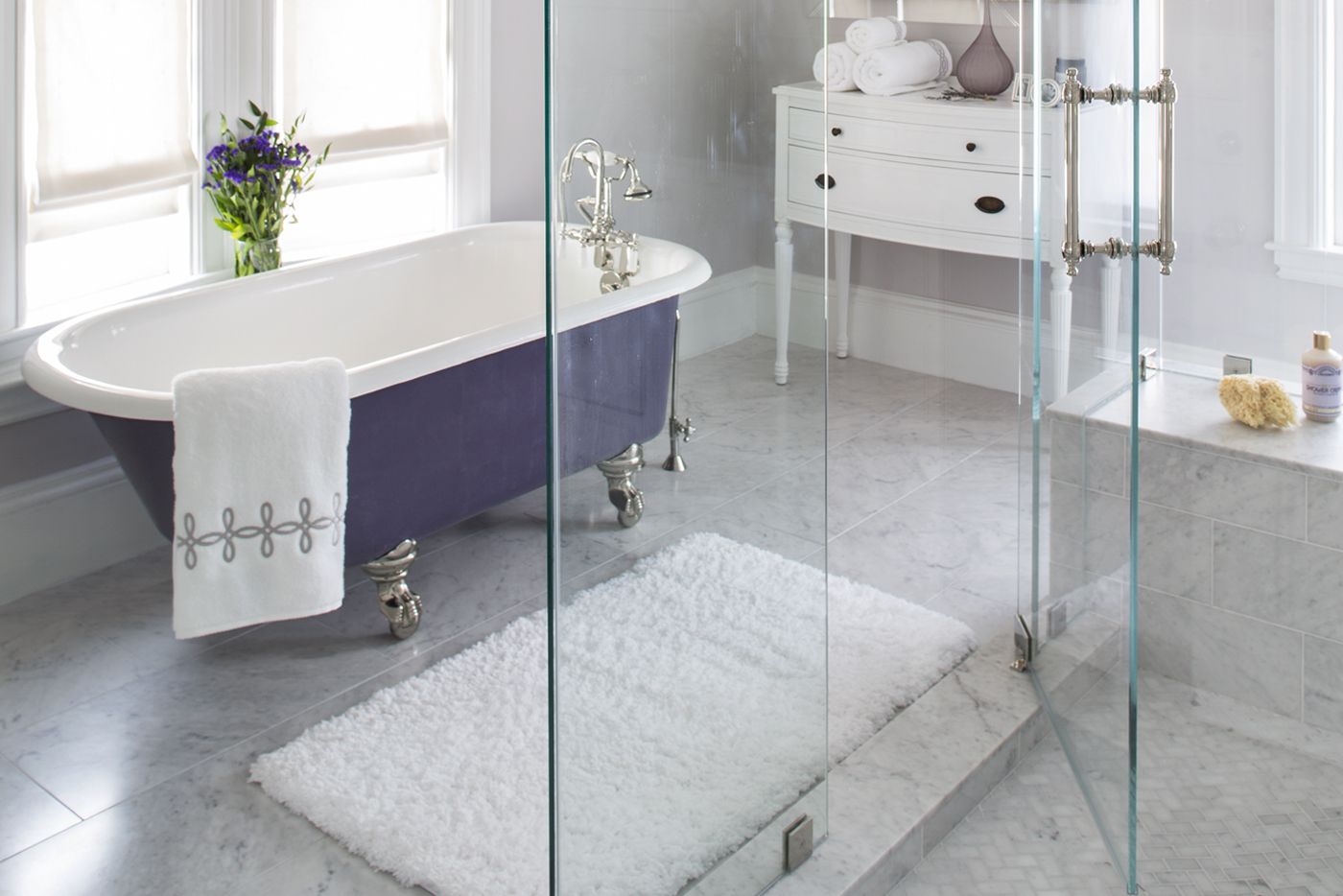
The master bath exudes a spa-like serenity with a glass-walled shower, a marble floor, and the original claw-foot tub reconditioned with nickel-plated feet and a new accent color of eggplant.
Tub refinishing: The Tub Doctors
Shower fixtures and fittings: Kohler
Salvaged Flooring Put to Use Elsewhere
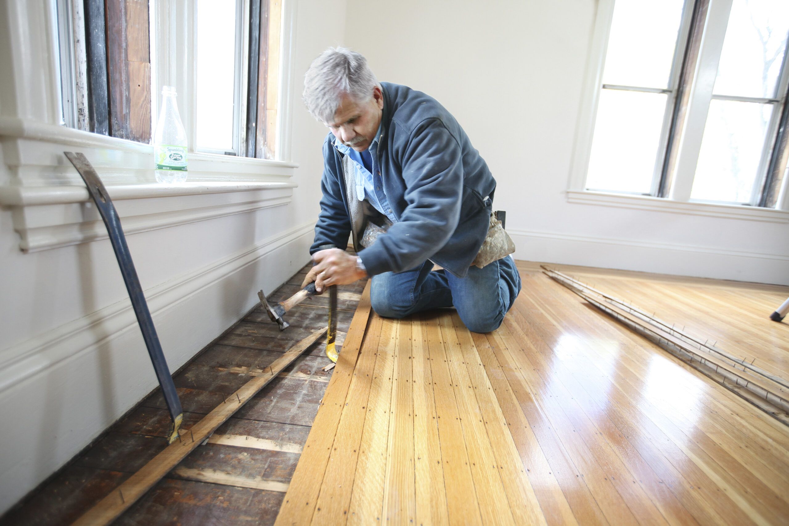
Tom Silva and crew salvaged the strip flooring from the old bedroom-turned-master-bath and used it to patch flooring elsewhere in the house.
Colorful Touches in the Children’s Bath
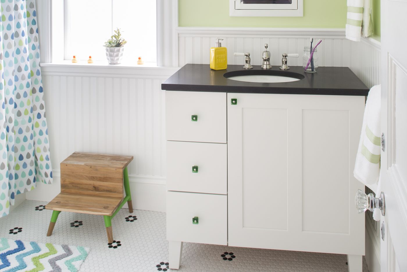
The vanity and tile floor of the children’s bath feature a classic black-and-white theme, allowing the room’s style to evolve as the kids grow. For now, the cheery room includes vivid accents of green, blue, and violet.
Office Space at the Top
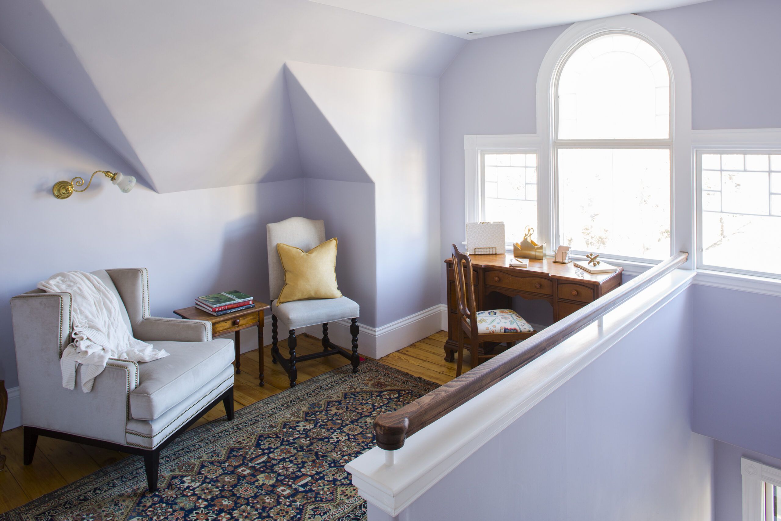
A third-floor space at the top of the stairs serves as a home office. The original Palladian-style window used to be divided by a full wall that cut off the right-hand third of the opening.
Bumpouts for Easy Access: First Floor
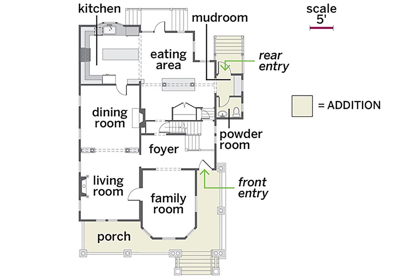
On the first floor, removing a stairway wall that faced the front door ushered in a new sense of the home’s Victorian-era grace. A bumpout for a new mudroom and powder room allows easy entry from the driveway to the opened-up kitchen and eating area.
Bedroom for a Bigger Master Bath: Second Floor
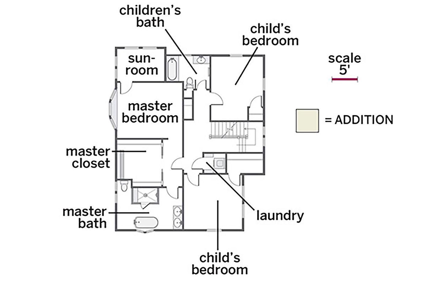
Upstairs, the master bath took over a front bedroom, forming a suite that leaves the structural center wall undisturbed.
Added Wall for Flexible Space: Third Floor
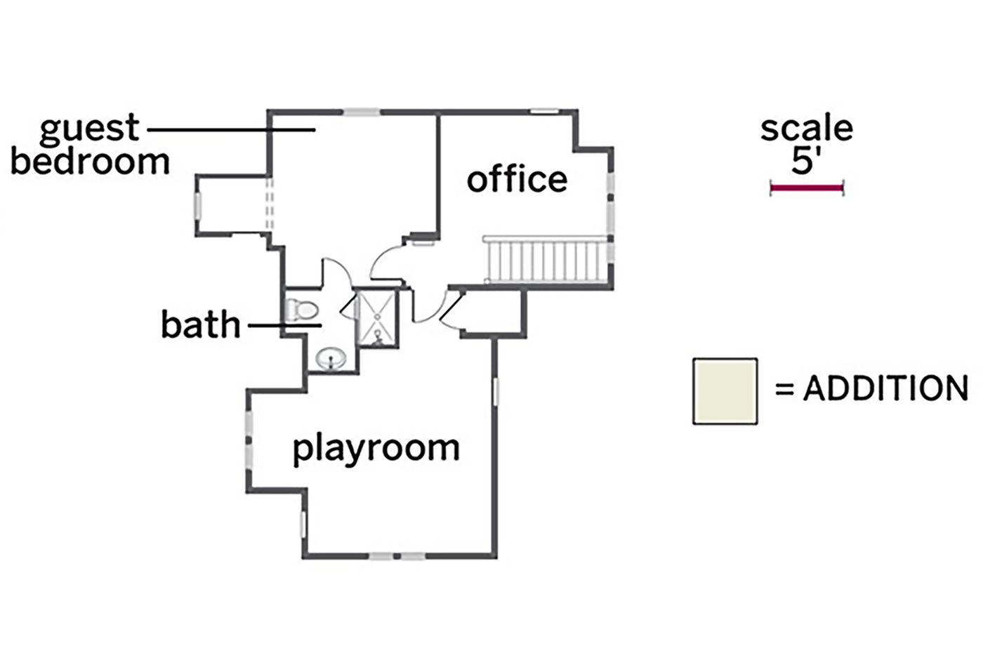
On the top floor, adding a wall created a guest suite, an office, and a dedicated playroom.
