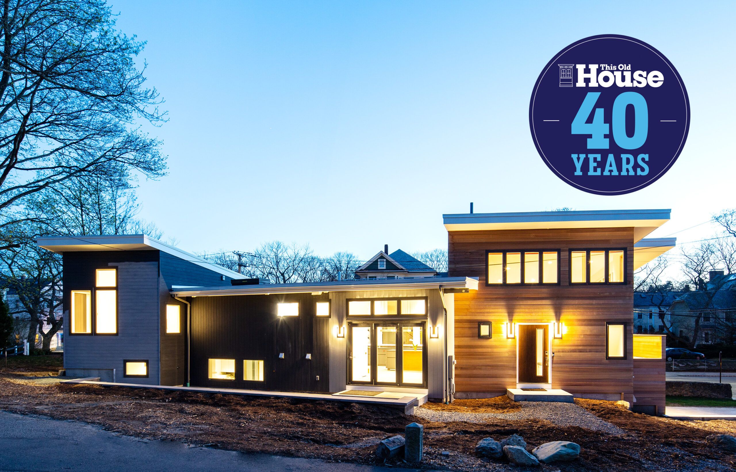
Family in Light

From their first walk-through of the small, boxy 1950s house in Brookline, Massachusetts, Dr. Sunil Ghelani and Dr. Neha Kwatra envisioned it transformed. Once filming wrapped on the renovated mid-century modern house—a subject of This Old House’s 40th-anniversary television season—and party guests filled the warmly lit and comfortably furnished rooms, the split-level, open interior, with its soaring ceilings, cool-gray floors, and expansive windows, didn’t disappoint. “It’s what we had imagined our dream house would be,” says Neha.
Shown: Dr. Neha Kwatra (left), Dr. Sunil Ghelani, and their 3-year-old daughter, Nisa, enjoy the light-filled living area in the renovated house.
Windows: Marvin
Geometry Lessons
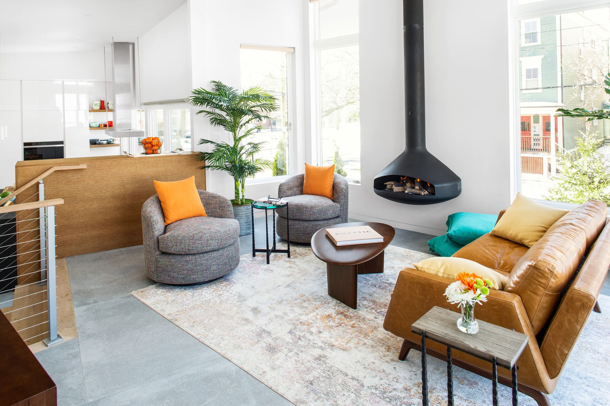
Achieving each of those signature design elements presented special challenges, however. The open floor plan meant nowhere to run ductwork; the porcelain-tile floors were a compromise, as the concrete the homeowners wanted would have meant additional work to beef up the floor structure; the 14-foot ceilings required maneuvering 25-foot-long steel I-beams and engineered lumber beams into place; and the large windows and folding glass doors entailed their own complex installation.
Shown: Located in the north addition, the living area has many hallmarks of the modern aesthetic the homeowners love: high ceilings, concrete-look tile floors, a wall-mounted floating metal fireplace, and expansive windows with no casings. The open layout is defined by split levels; here, three oak steps—with simple steel-cable-and-oak railings—lead down to the kitchen-dining area.
Furniture and rug: Circle Furniture
Gas fireplace: Focus, from European Home
Motorized window shades: J Geiger
Floor tIle: Porcelanosa
Paint: Benjamin Moore’s Baby’s Breath (walls), Chantilly Lace (trim and doors), and White (ceilings)
Sleek Kitchen
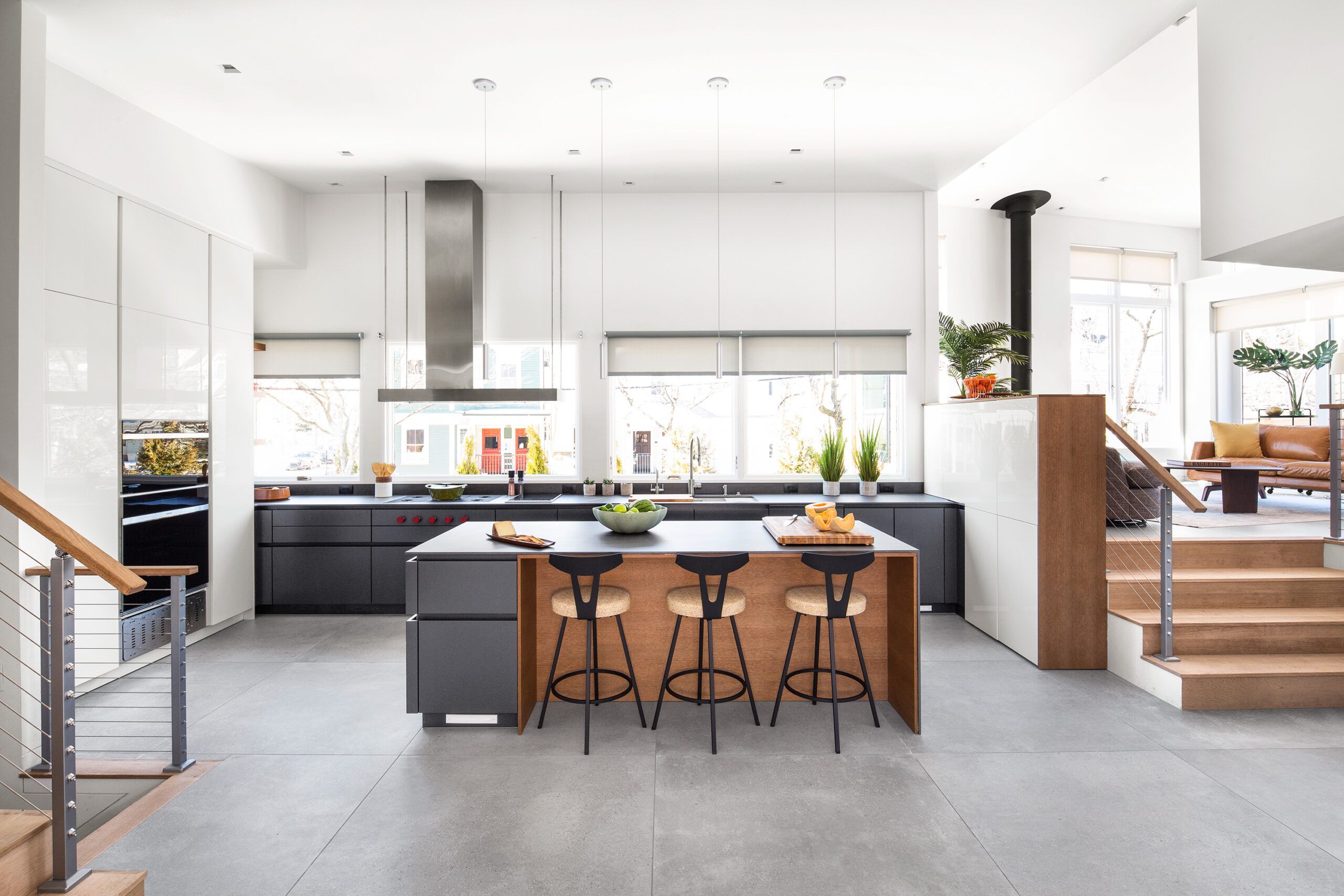
“It was all about location for us,” says Sunil, recalling why they took the plunge and bought the 1,400-square-foot house in a historic district, knowing an extensive renovation lay ahead of them. The house is within walking distance of their jobs at Boston Children’s Hospital, and a top-rated Brookline public school for their daughter, 3-year-old Nisa, is just a few blocks away.
Shown: The kitchen’s sleek look is defined by walls of glossy white panels—including pantry storage in the partition between kitchen and living area—and matte dark-gray countertops and base cabinets for contrast. Locating the cooktop, vent hood, and sink along the wall of windows was an aesthetic choice requiring the complex installation of ductwork and drains.
Kitchen cabinets: LEICHT
Countertops: Neolith
Sink and faucet: Kohler
Cooktop and vent hood: Wolf
Refrigerator and freezer: Sub-Zero
Barstools: Circle Furniture
Motorized window shades: J Geiger
Lofty View
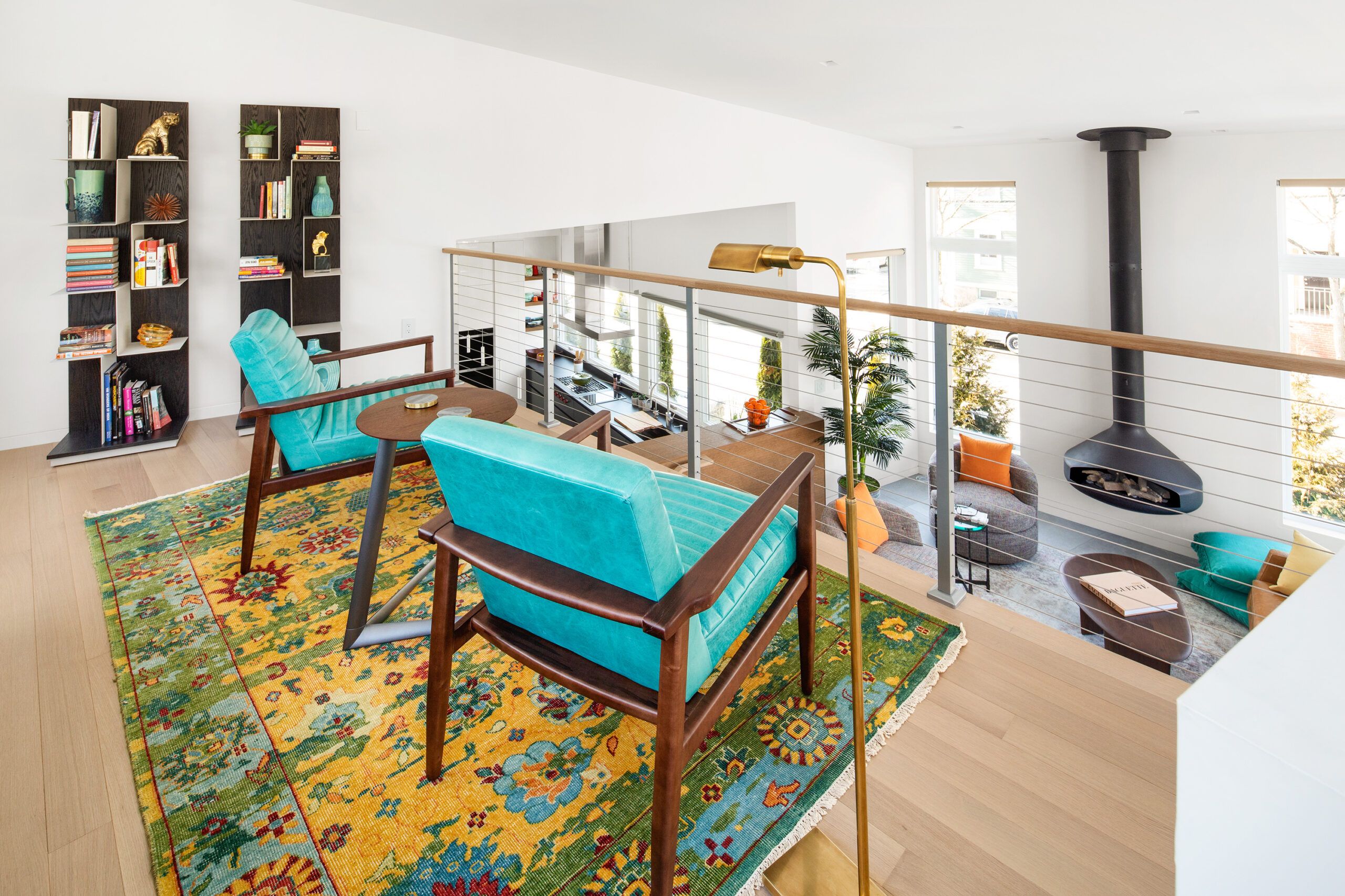
From This Old House master carpenter Norm Abram’s perspective, the project was a chance to work on a style of house the show has tackled only once before. “It’s been more than ten years since we did a modern house, and the style is getting more popular with homeowners everywhere,” says Norm. “There were additional challenges here, though, because the original house wasn’t built to today’s standards.”
Shown: Tucked up high in the north addition, a loft offers intriguing views of the living area and kitchen. The modern steel-cable railing allows unimpeded sight lines; the oak handrail echoes the pale wood floors, which are warmed by radiant heat.
Loft furniture, rug, and lamp: Circle Furniture
Clean-Lined Dining
The key to turning the small gray box into the more functional, 3,200-square-foot house that Sunil and Neha wanted was two additions designed by architect Linda Hamlin—a two-story north addition with a garage on the lower level, topped by a living area and loft, and a two-story south addition with a master suite and an expanded bedroom for their daughter on the upper floor and a guest suite underneath. Both additions are six-sided, intentionally designed to enhance the house’s geometry. “The original house was a square box on four levels,” says Hamlin. “The angles of the additions make the house more sculptural than a conventional house.” Inside, the new floor plan is defined by eight split levels, and to maximize the space, the plan called for finishing the basement.
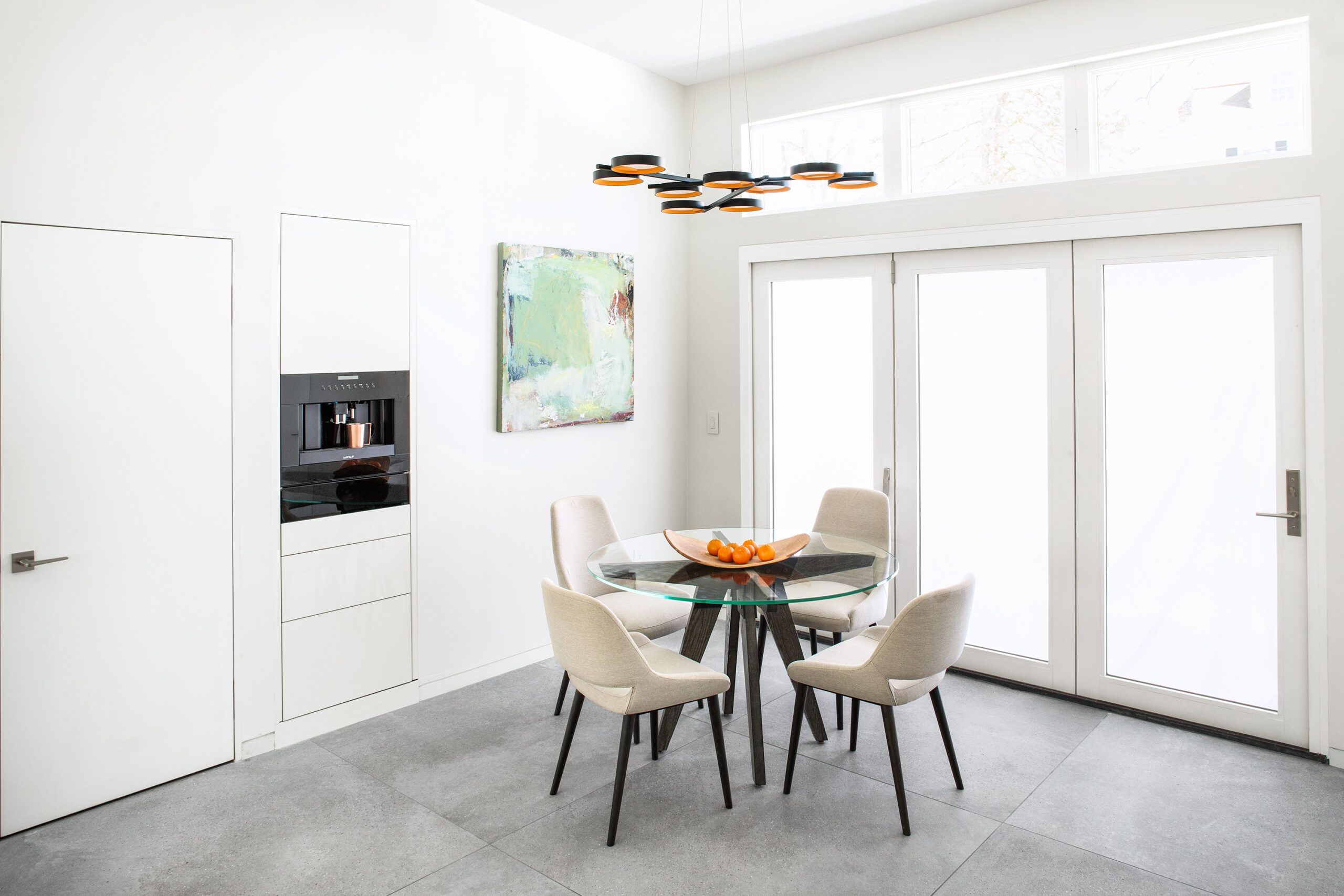
Shown: The dining area, adjacent to the kitchen, continues the clean-lined look, with large-format porcelain tile floors and unembellished doors and windows. The hinged system of French doors stacks at the left when open, creating a wide indoor-outdoor connection in warm weather.
Dining table and chairs: Circle Furniture
Chandelier: Sonneman
Windows and French doors: Marvin
Thermostat: Ecobee
Air handler: The Unico System
Security system: SimpliSafe
Floor tile: Porcelanosa
Coffee Center
One of the most distinctive aspects of the design is the open layout of the kitchen-dining area, living room, and loft. To join the kitchen to the newly built living area, an exterior wall had to come down, and two laminated-veneer-lumber beams were sistered to the existing beam to carry the load of the widened expanse. Up three steps in the north addition, the living room ceiling was framed 2 feet taller, rising to a lofty 14 feet. “We took an already open layout and made it even more open, with plenty of space for the family,” says TOH host Kevin O’Connor.
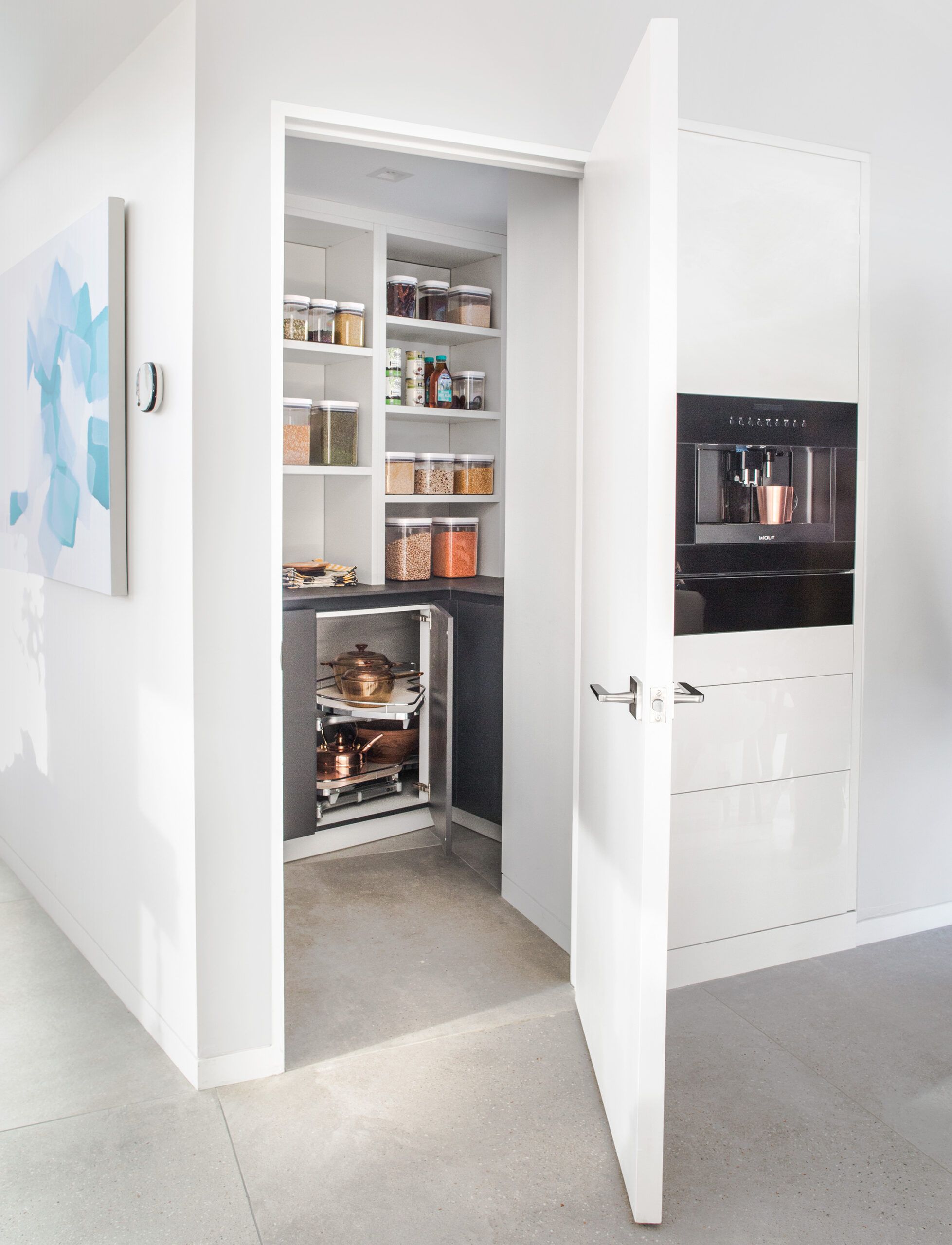
Shown: A built-in coffee center and a large pantry closet add convenience and boost storage in the dining area.
Coffee station: Wolf
Cabinetry: LEICHT
Interior door: TruStile
Master Bedroom
Although the plan delivered the design and function Sunil and Neha wanted, it also created one of the biggest obstacles: With an open layout (having fewer interior walls), high ceilings (no attic), and a livable basement (finished ceilings), there was nowhere to run the ductwork. “This was the most challenging project we’ve done in forty years,” says TOH plumbing and heating expert Richard Trethewey, who chose a mini-duct AC system so ductwork could be fished through the floors in corners, and radiant floor heat with an aluminum track and tubing that could fit between the subfloors and finished floors.
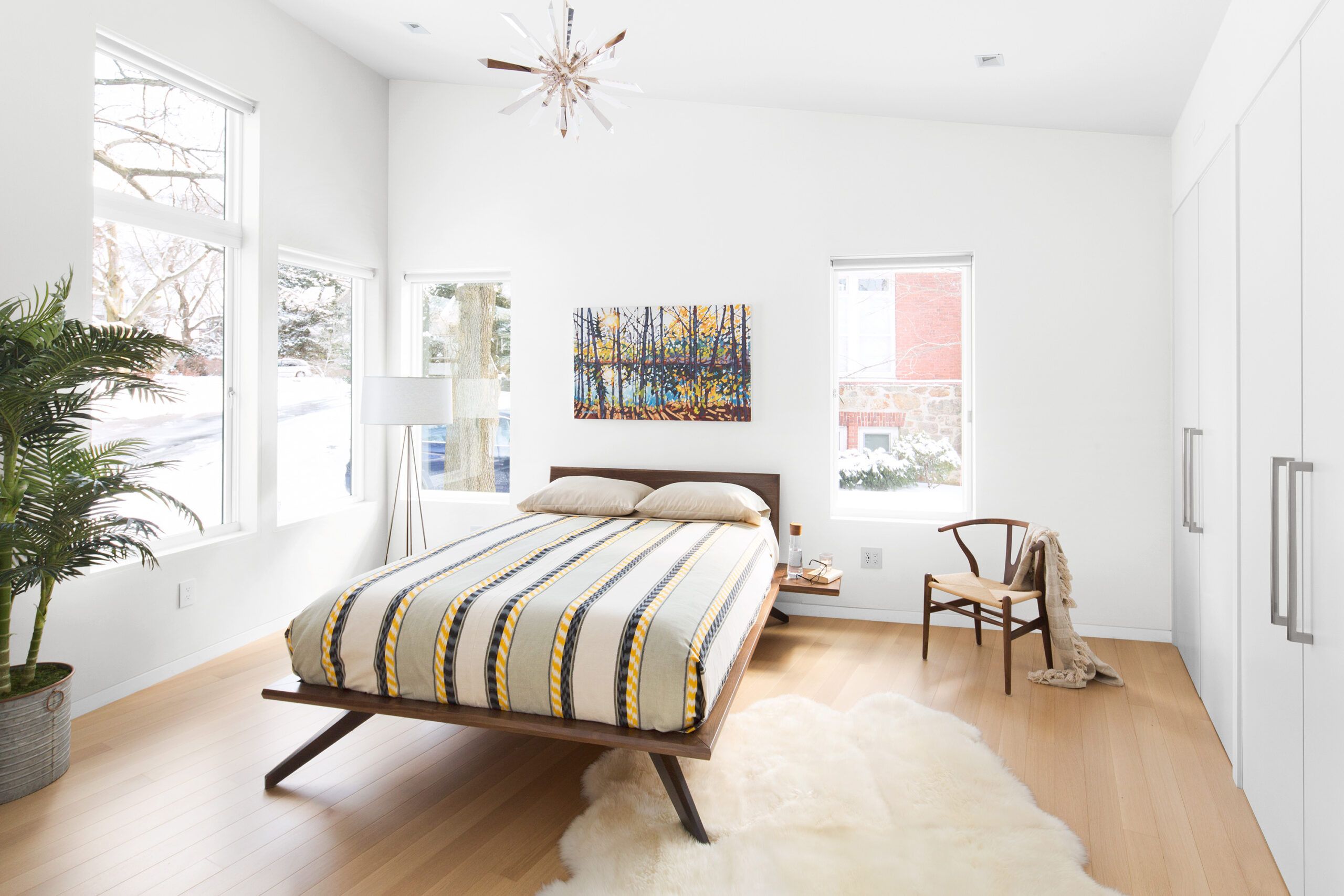
Shown: The master bedroom ceiling follows the slope of the shed roof, creating a dynamic sense of spaciousness. Closets along the interior wall allow for tall windows on the exterior walls and offer sleek clothing storage. Pale oak floors add to the airy effect.
Bed, rug, chair, and lamp: Circle Furniture
Bed linens: Malabar
Master Bathroom
To address the no-foundation-footings surprise, discovered when the crew was digging out the basement to gain ceiling height, This Old House mason Mark McCullough installed a concrete buttress in the basement. Early on, when the house was gutted and at its lightest—without plaster walls, roofing, or flooring—he dug a channel along and under the existing foundation, laid down a grid of rebar, and backfilled it with concrete.
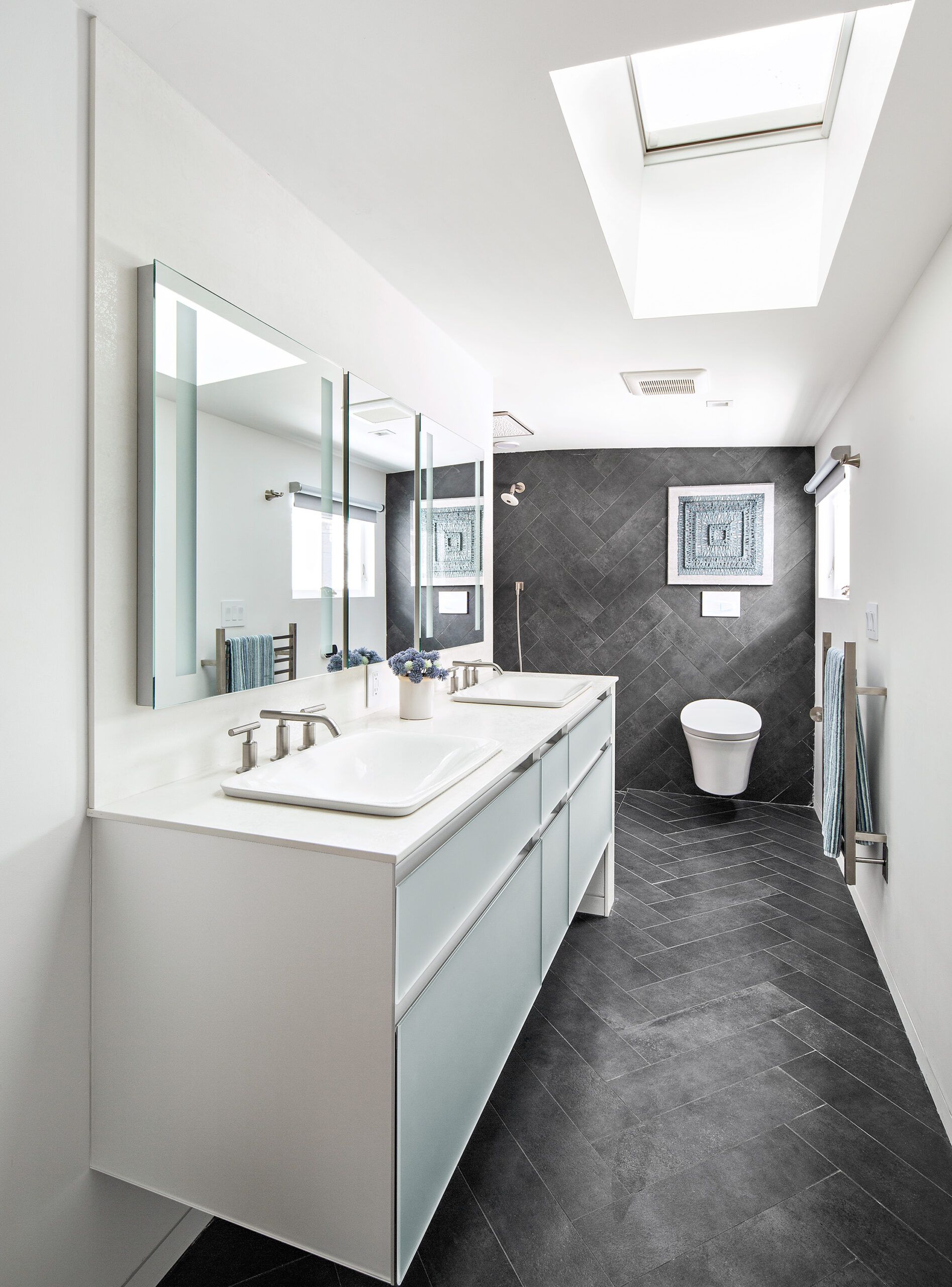
Shown: The master bath is a study in contrast, with dark-gray tile planks lining the floor and continuing up the far wall, set against bright white walls and a white double vanity. A large skylight floods the space with natural light.
Plumbing and heating contractor: Bilo Plumbing and Heating, Ipswich, MA
Tile installer: Mark Ferrante, Ferrante Tile, Stoneham, MA
Bathroom skylight: VELUX
Master shower drain: QuickDrain
Bath fan: Panasonic
Sinks, faucets, and toilet: Kohler
Vanity and medicine cabinets: Robern
Vanity top: Neolith
Floor tile: Daltile
Nisa’s Room
Another unanticipated challenge was the sewer line, which was found—by a camera scope—to be cracked and blocked by tree roots. In the process of making that repair, however, more problems emerged due to a combination of the house’s compromised plumbing and the city’s antiquated pipes. “We ended up having to dig across the street to replace storm, sewer, and water lines,” says Richard.
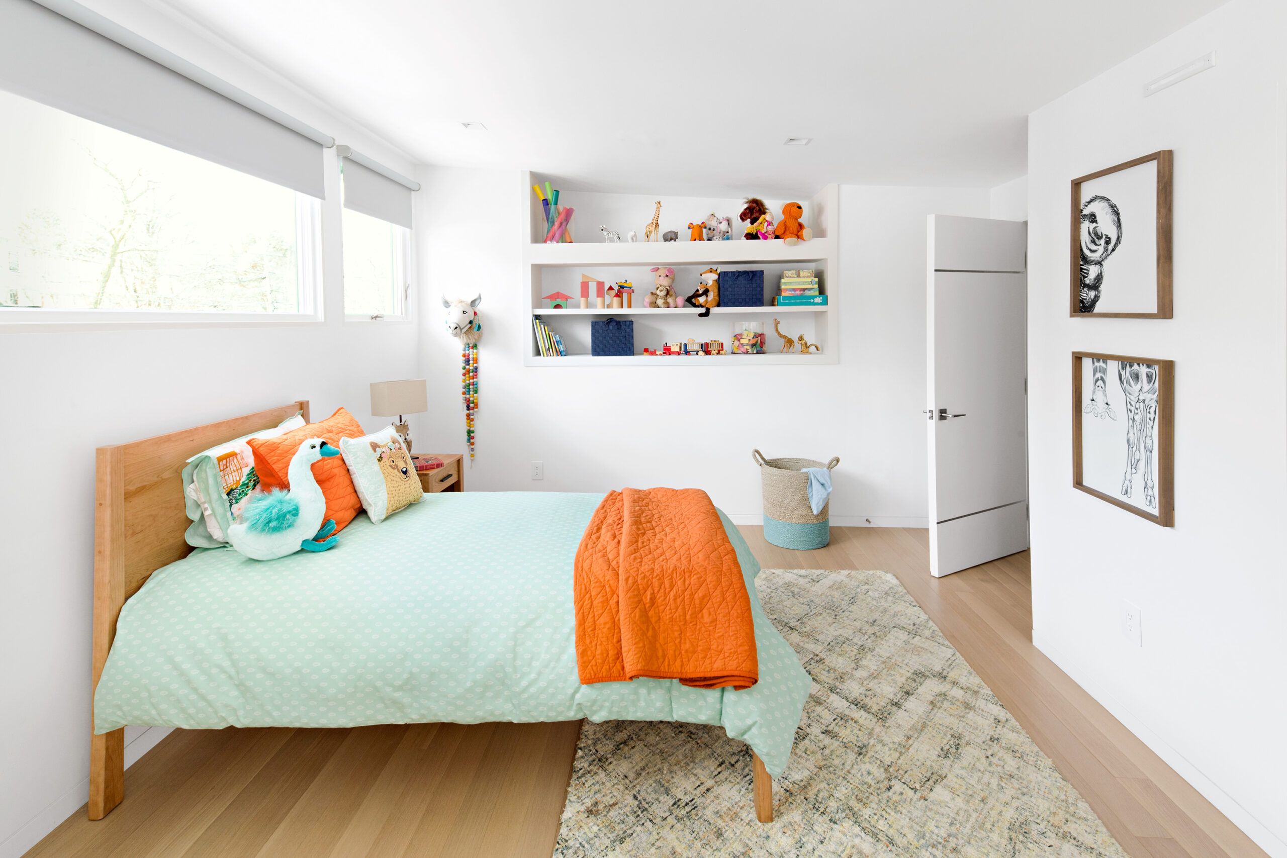
Shown: Daughter Nisa’s bedroom is finished with wood floors, built-in display shelves, and large windows so that the room will be appropriate for years to come. The room’s entry door has a subtle metal band detail that is repeated on the other main interior doors in the house.
Windows: Marvin
Bed, rug, and side table: Circle Furniture
Interior door: TruStile
Motorized window shades: J Geiger
Hexagonal Bath Tiles
As infrastructure issues were resolved, the couple turned to selecting finishes. Though neither has formal training, both have an eye for design and naturally gravitate to the kind of clean, modern architecture they grew up surrounded by in their native Mumbai. Both also have the ability to envision flat renderings in three dimensions, says Sunil, in part because of their work in medical imaging (he’s a pediatric cardiac imagist, she’s a pediatric radiologist).
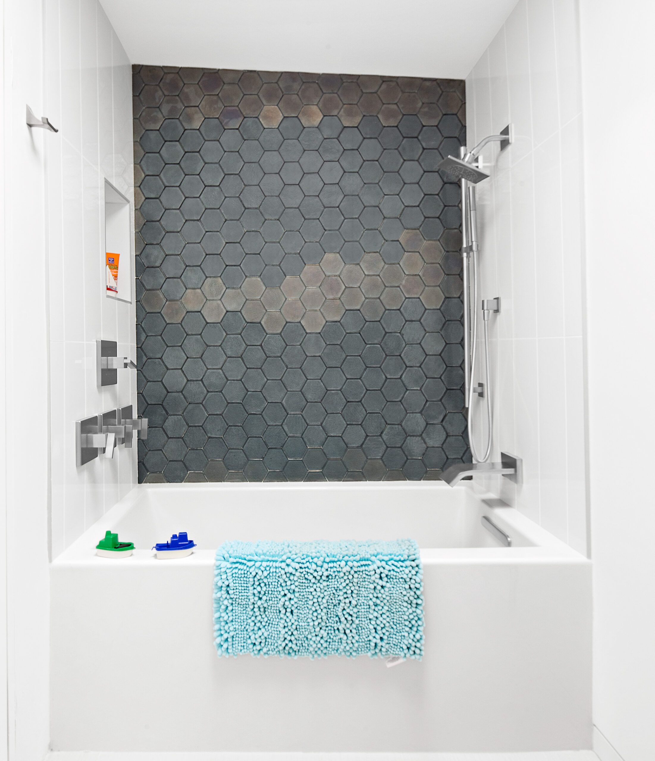
Shown: The en suite bath features hexagonal wall tiles with a reflective metallic finish and simple, contemporary fixtures and fittings.
Bath fan: Panasonic
Tub, tub and shower fittings, and robe hook: Kohler
Tile: Daltile
Guest Suite
For minimalist lighting, they chose trimless square recessed LEDs throughout and a few sculptural pendants in select areas, including the kitchen, dining space, and master bedroom. For the many stairways in the house, they specified a steel-cable rail system with an oak handrail. To provide a clean backdrop, the interior is all white. “We knew we would bring in color with furniture and artwork,” says Sunil, a hobbyist painter, who is planning to create much of the art that will hang on the walls.
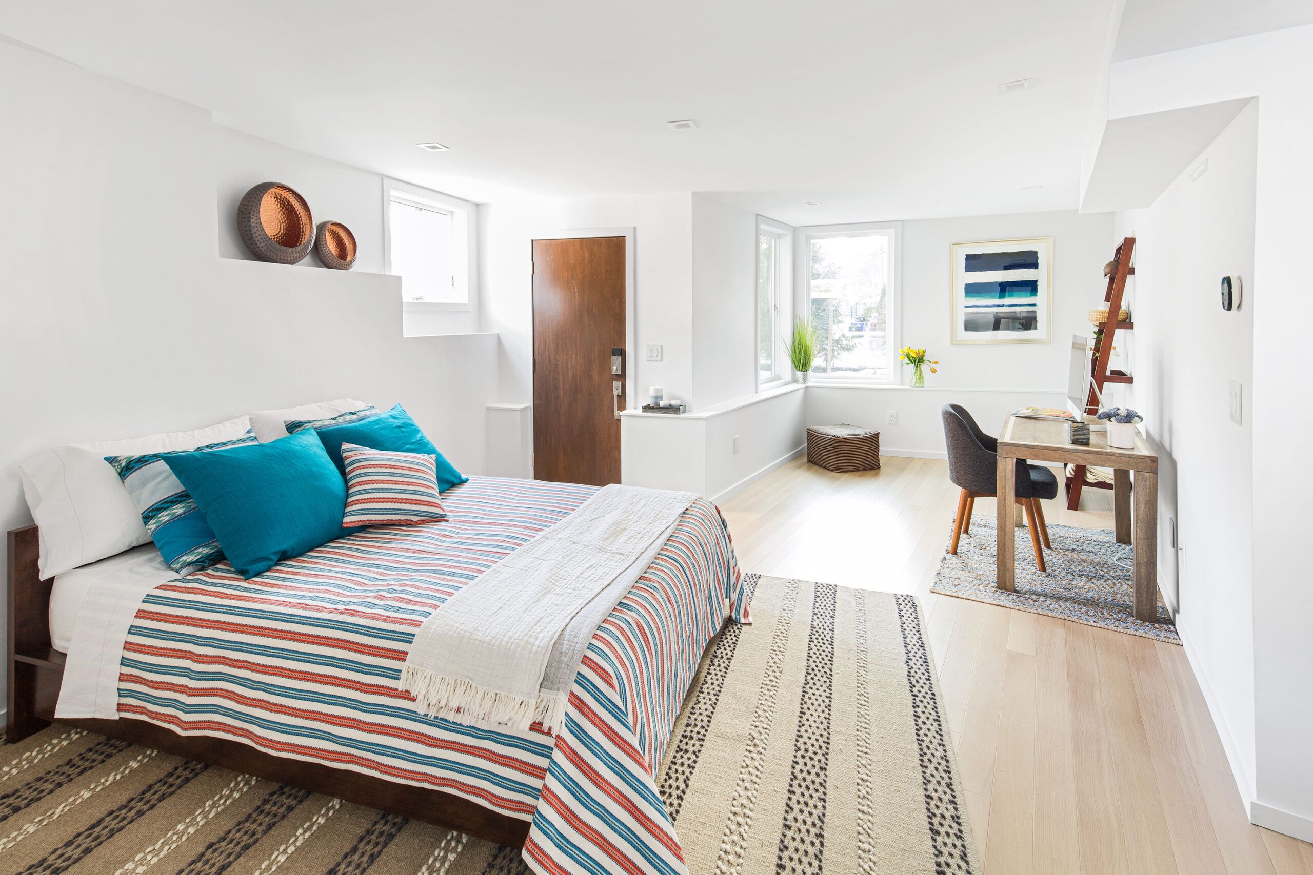
Shown: The guest suite in the south addition has its own entrance, creating a private space for visiting family and friends.
Bed coverings: Malabar
Exterior door: ProVia
Guest Kitchenette
“For Sunil and Neha, the kitchen is really the heart of the home,” says Mariette Barsoum of Divine Design Center, which helped steer their choices. Together they established a theme of matte gray, glossy white, and light wood tones in the kitchen, with the cooktop and sink arranged along a wall of west-facing windows. “The high ceiling and large windows are the real focal points in the kitchen,” says Barsoum, who points out that the high-gloss white lacquer finish on the appliance wall and the low pantry cabinets has a light-reflective quality. Countertops are a glass-porcelain-quartz composite in a dark-gray matte finish chosen for its look and durability. The island, which has oak veneer lining its outward-facing kneehole, provides seating and storage. “We didn’t want the cooktop in the island, for aesthetic reasons,” Sunil says. “We wanted the island mainly as a casual eating area for the three of us.”
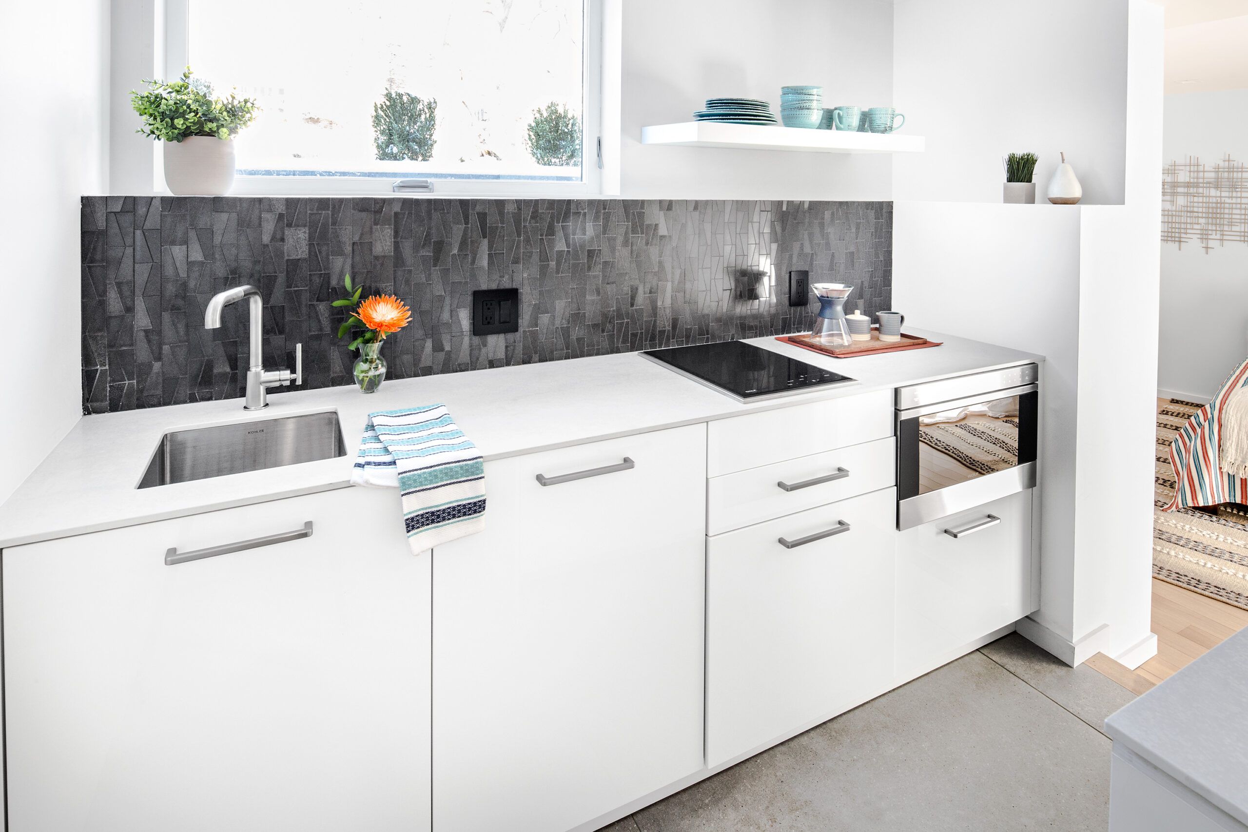
Shown: An adjacent, fully equipped kitchenette allows guests to serve themselves.
Kitchenette appliances: Wolf
Cabinets: LEICHT
Sink and faucet: Kohler
Countertop: Neolith
Backsplash tile: Daltile
Colorful Accent Entry
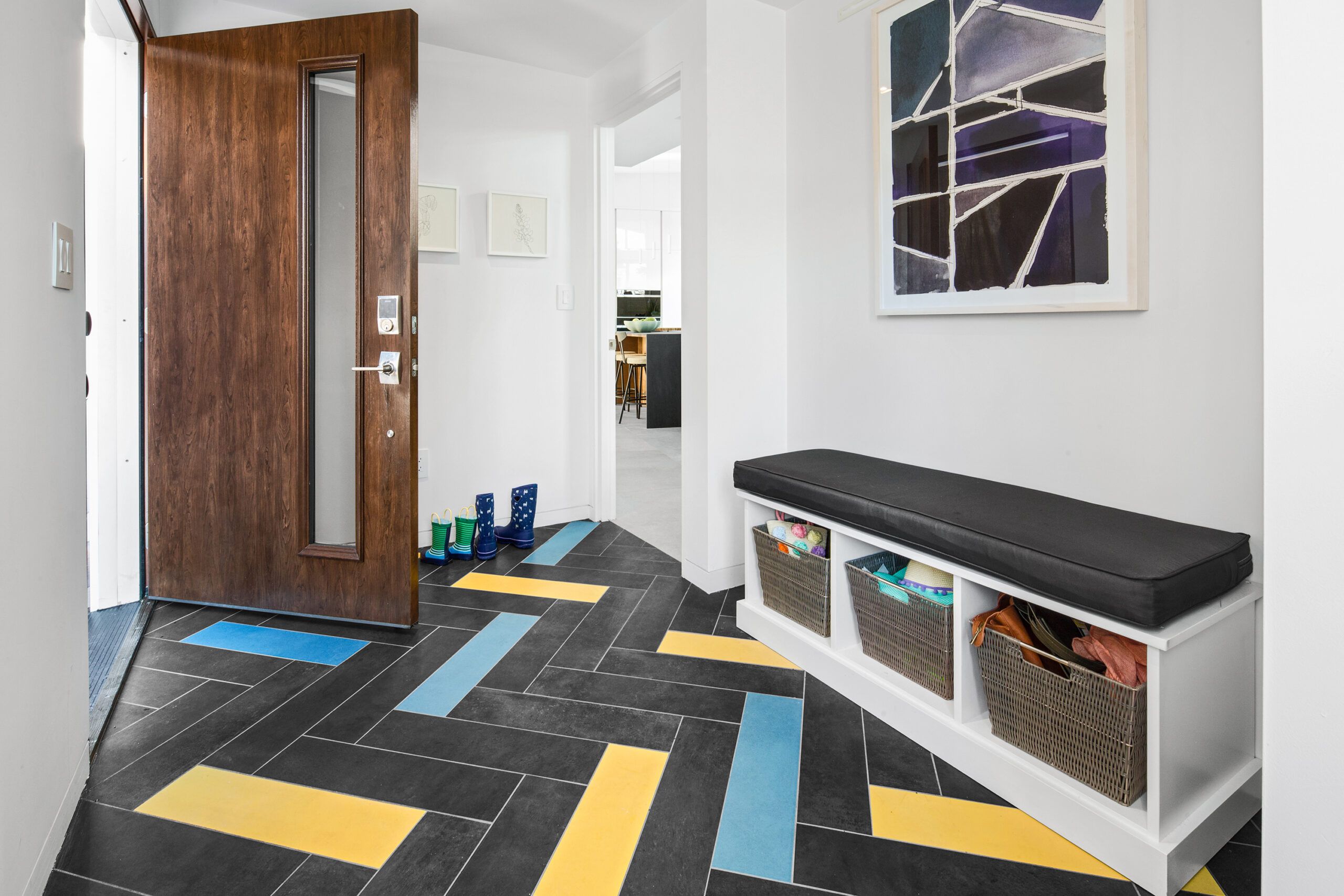
The theme of gray, white, and oak repeats throughout the house, a simple palette that’s in sync with the mid-century modern aesthetic. For flooring, the couple chose large-format, 4-foot-square porcelain tiles to mimic concrete in the kitchen, dining area, and living room. Pale oak flooring warms up the stairs, as well as the bedrooms and the loft area, which is tucked above the living area. The latter addition was Sunil’s idea, a place he sees as offering multiple potential uses, from a home office to a library to an extra spot for overnight guests.
Shown: Colorful accent tiles enliven the charcoal herringbone porcelain-tile floor in the new main entry, giving it a sense of fun befitting a young family. The bench was built by Tom Silva.
Tile: Daltile
Exterior door: ProVia
Living Approaches
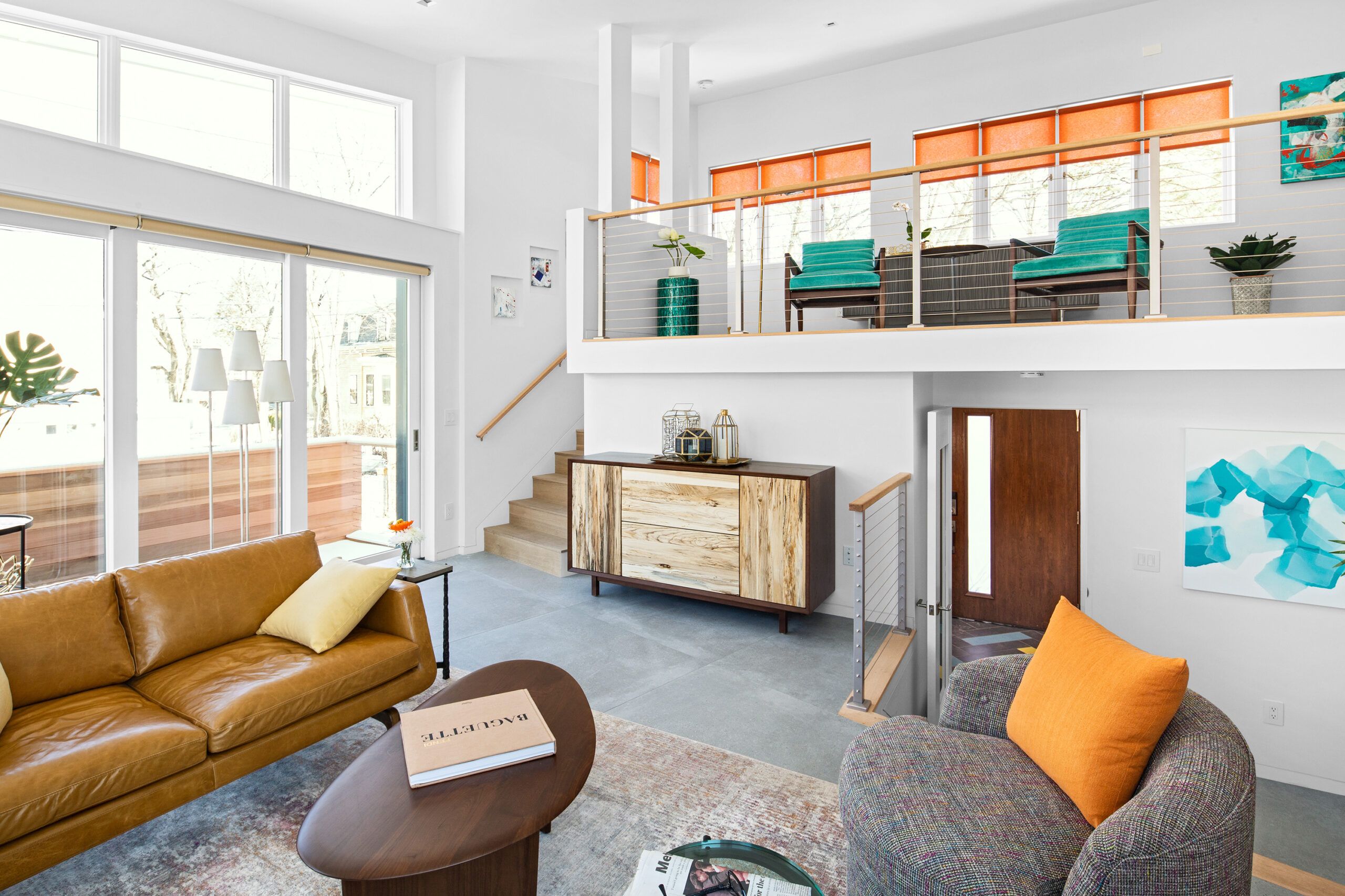
Sunil and Neha wanted each bedroom to have its own bath, and were willing to lose one of the existing four bedrooms to create roomy and private spaces. “In India, it is not uncommon to have a bathroom with every bedroom,” Sunil says. The master suite and their daughter’s suite now occupy the second floor of the south addition; for visiting family and friends, a guest suite is situated on the lower level, complete with a private entrance and a fully equipped kitchenette.
Shown: The living area’s north-facing wall holds a 13-foot-wide series of telescoping doors topped by transom windows. In warm weather, they will open onto a balcony over the garage. A set of stairs leads to the loft, which will likely become a home office. Steps on the right lead down to the new main entry.
Windows and telescoping door system: Marvin
Furniture and rug: Circle Furniture
Elevated Kitchen
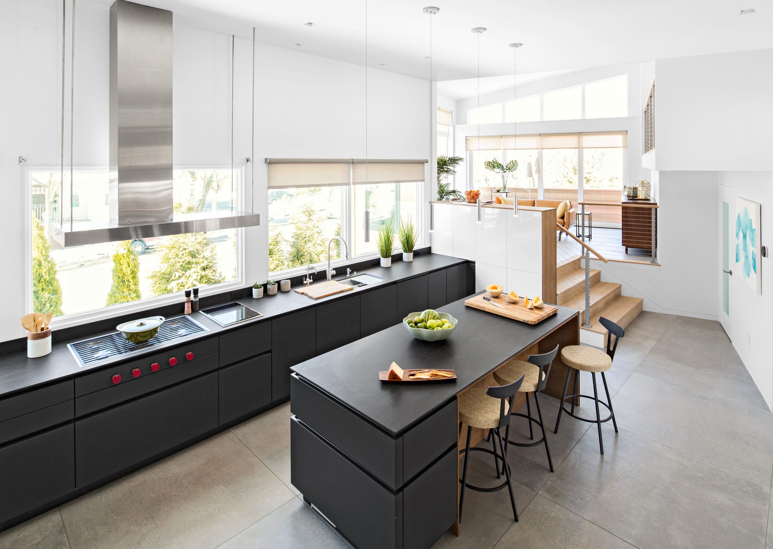
The simplicity of the mid-century modern aesthetic comes through in every space in the house. The open plan and expanses of glass create a dazzling effect—with natural light pouring into the living room through a series of telescoping glass doors that span an opening 13 feet wide, into the dining area through a system of folding and stacking French doors, and into the upper-level baths through skylights. Even the eight split levels—defined by stairways of three to eight steps each, with cable railings—add to the house’s lightness, energy, and visual appeal.
Shown: An elevated view of the kitchen takes in the open connection to the living area. The west-facing wall of windows holds a 20-foot-long run of base cabinets. The custom vent hood was designed to span both the gas cooktop and the single induction cooktop. The homeowners felt it looked less cluttered to float the hood in front of a window and to reserve the island for seating.
Windows: Marvin
Nisa’s Nook
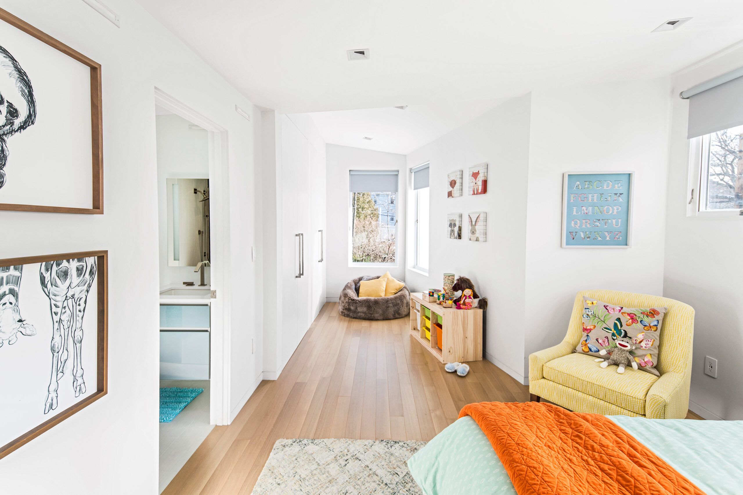
“This is a very fun house for a young family,” says Sunil, noting that daughter Nisa already likes to sit by the large windows—which extend nearly to the floor—and enjoy the view of the park across the street. “We had been looking for a modern house in the middle of Brookline’s many old houses, and finally, that’s where we are.”
Shown: Daughter Nisa’s bedroom and new bath are both in the original part of the house; a wall of closets and a windowed nook are part of the south addition.
Windows: Marvin
Upholstered chair and beanbag chair: Circle Furniture
Herringbone Shower
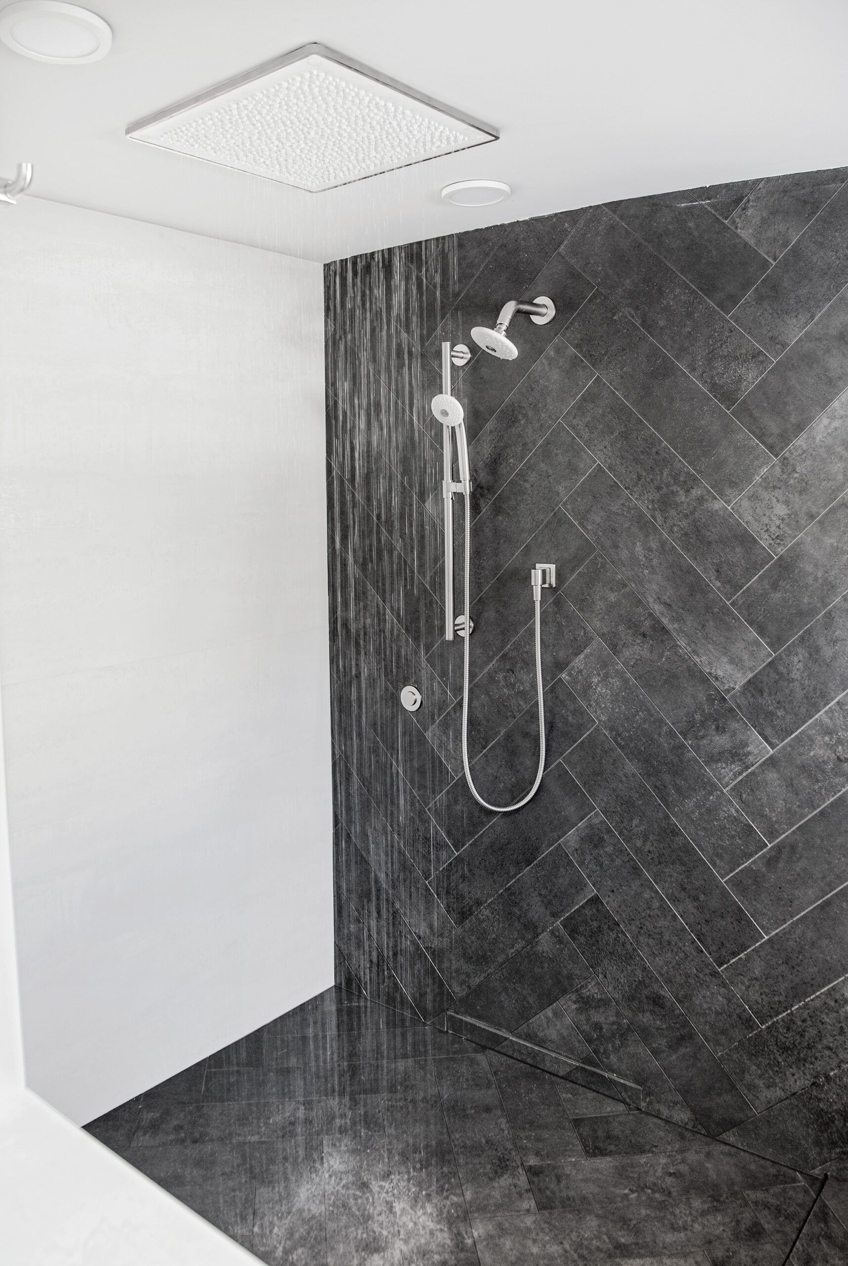
The master bath’s shower continues the dark-gray tile, laid in a herringbone pattern, from the floor to an accent wall. The adjacent wall is clad with a glossy white glass-porcelain-quartz composite. The shower features a low-profile drain design that is built into the lower wall.
Shower drain: QuickDrain
Bath fan: Panasonic
White wall tile: Vogue Bay Bright White; Daltile
Gray wall and floor tile: Oceanside Casa Hexagon, Fleet Blue Blend; Daltile
Nisa’s Bath
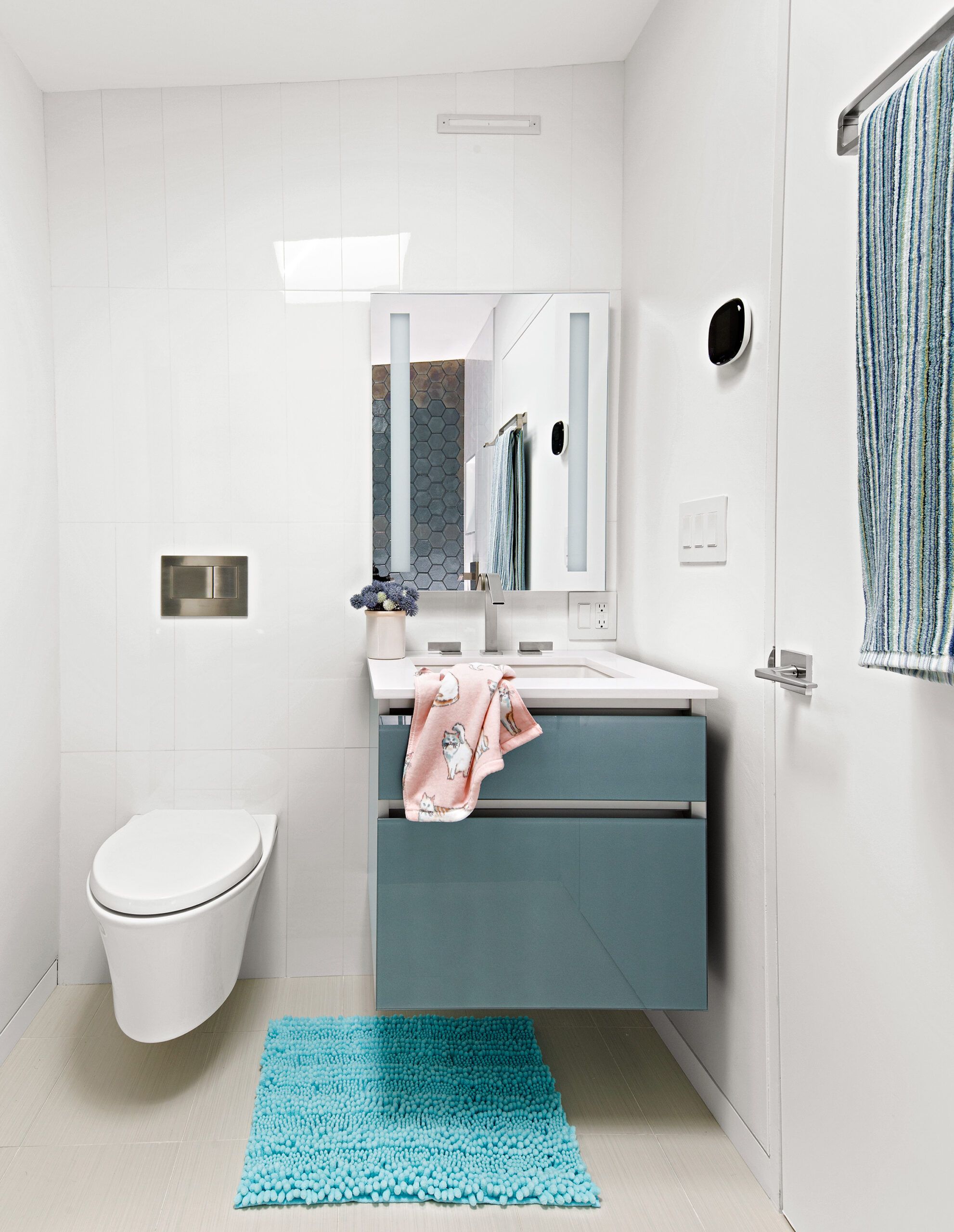
Nisa’s bathroom features a wall-hung toilet, a floating vanity with glossy blue-gray drawer fronts, and a white tile floor and walls.
Bath fan: Panasonic
Vanity and medicine cabinet: Robern
Faucet: Loure; Kohler
Floor tile: Fabrique Blanc Linen; Daltile
Wall tile: Vogue Bay Bright White; Daltile
The New Front
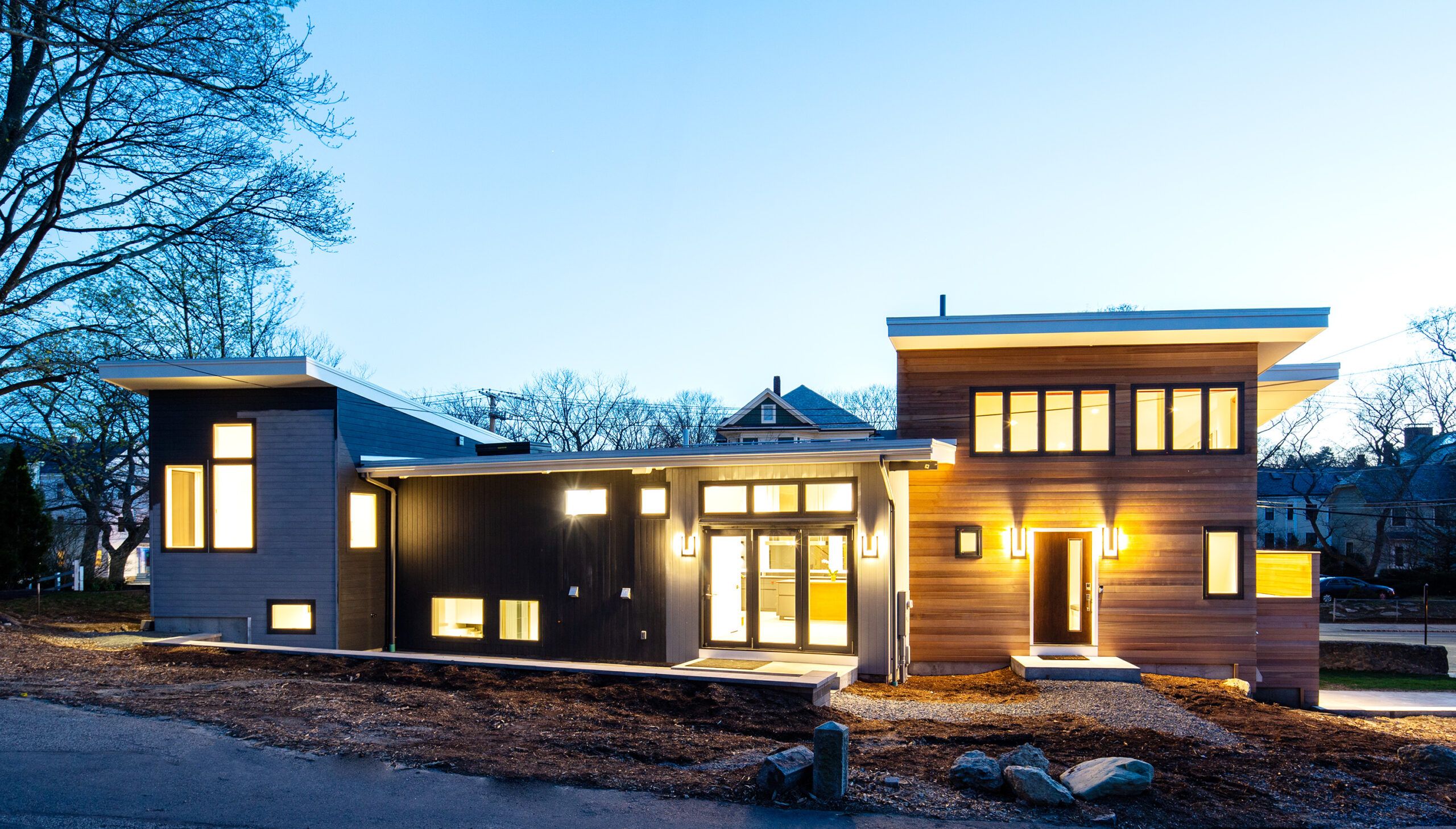
The new front of the house now faces a quiet street. Additions flank the boxy original house, which now holds the kitchen and dining area. The north wing (on the right), clad in horizontal cedar siding, holds the main entry, living area, and loft; the south wing, at the other end of the house, is reserved for the bedroom suites.
Windows: Marvin
Illuminated
“The original house was really only four walls and a shed roof,” says This Old House general contractor Tom Silva of the simple structure that the TOH team encountered. “There wasn’t much worth saving.” Once into the project, hidden problems emerged: The original foundation had no footings; the main sewer line was compromised by tree roots; and a number of materials used in closets and bedrooms contained asbestos—to name a few.
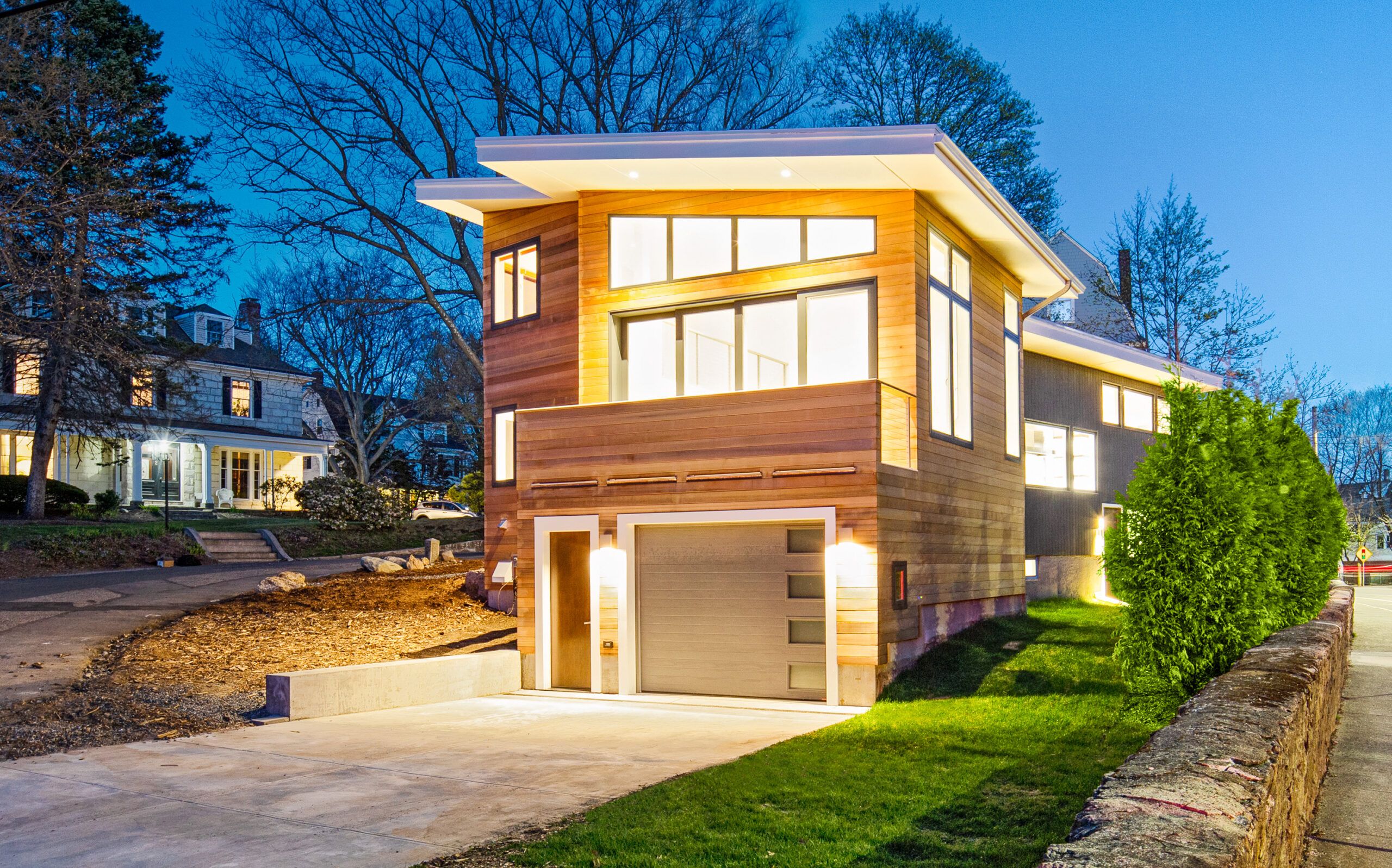
Shown: Illuminated at night, the angular shed-roofed house is a stunning display of mid-century modern style. In the foreground, the north addition features a garage on the lower level, capped by a living area with walls of glass.
Landscape design: Blair Hines, Verdant Landscape Architecture, Brookline, MA
Lighting design: Lisa Hayes, Reflex Lighting, Boston, MA
Windows: Marvin
Pavers and stepping-stones: UNILOCK
Sheathing: ZIP System
Insulation: Rockwool
Soffit trim: AZEK
Garage door: Garaga
Entry door: ProVia
Security system: SimpliSafe
North Addition
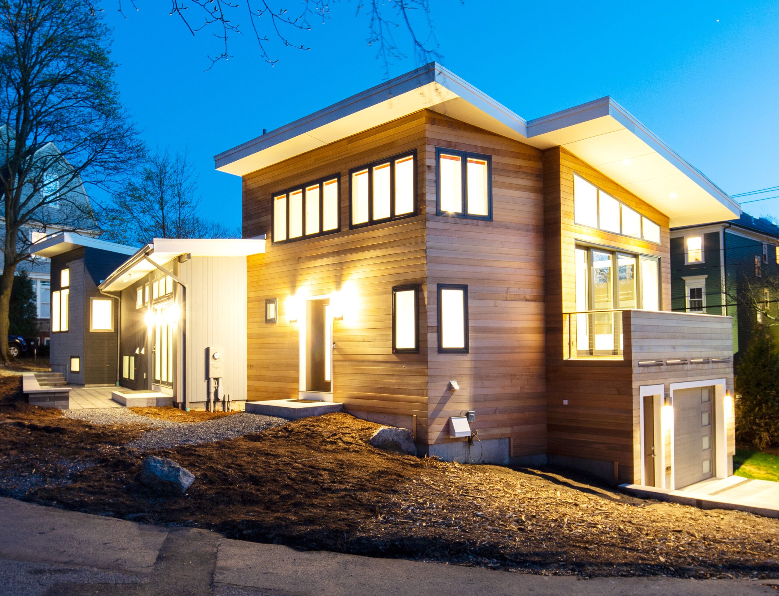
In the north addition, the garage entrance is around the corner from the new front entry. The mid-century modern house stands apart from the prevailing traditional architecture in Brookline’s Pill Hill Historic District.
Windows: Marvin
Floor Plans
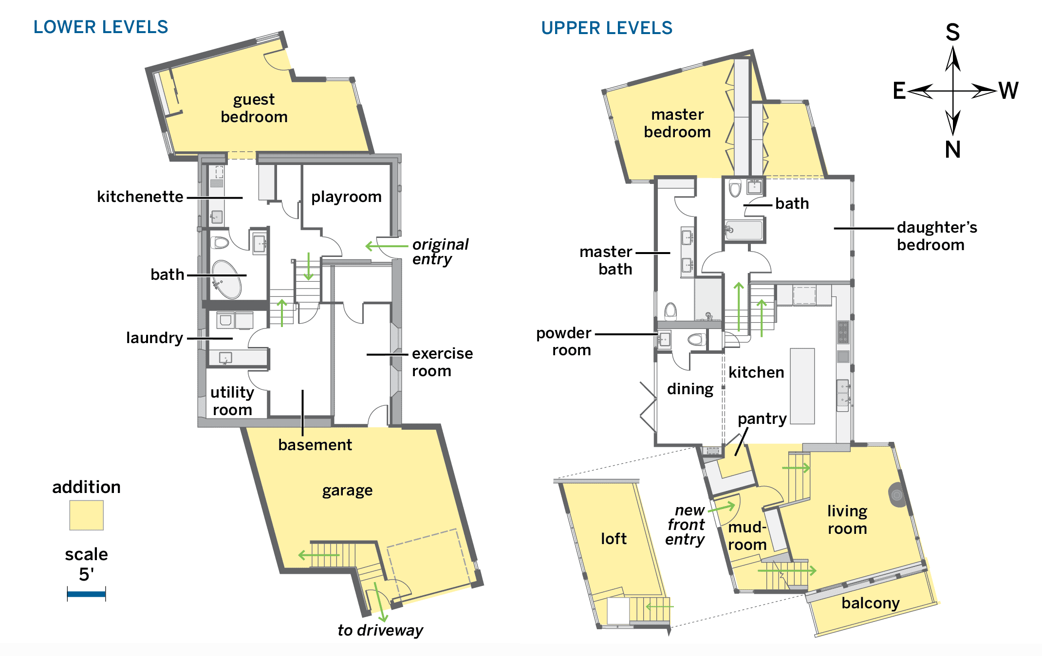
The original 1,400-square-foot box was expanded to 3,200 square feet with two-story additions at either end. The angular six-sided additions are in keeping with mid-century modern’s geometric character and make good use of the sloping corner lot. The resulting eight split levels hold three bedrooms, three and a half baths, a loft over the living area, an attached garage, plus finished basement spaces.
