A Modern Makeover
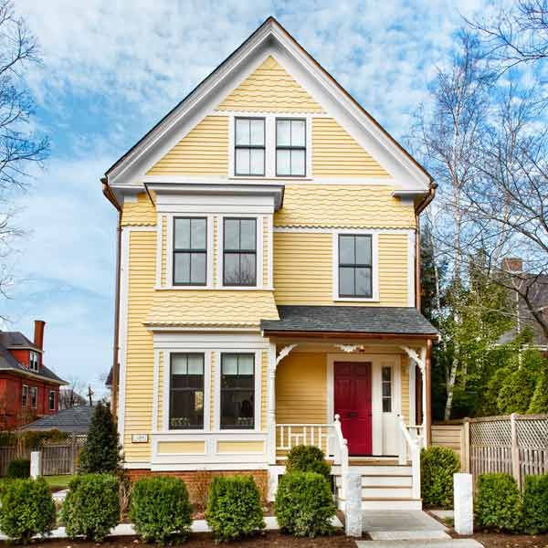
Sentiment has its place in the home, but as a renovation principle, it needs scrutiny. While it’s true that some things never change, day-to-day living has changed quite a lot in the past 100-plus years. As Sally Peterson and John Stone planned the renovation of their 1887 Queen Anne, in Cambridge, Massachusetts, a clearheaded vision of what works for their young family made all the difference and resulted in the best of both worlds: a lovely, historically accurate home on the outside and a storage-loaded, open-layout living space on the inside.
Shown: The exterior sports a period-inspired paint job.
Exterior paint: Benjamin Moore
Windows: Marvin
Before: A Classic Queen Anne
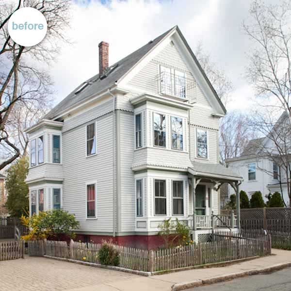
Having lived in Cambridge for more than 10 years, the couple was looking to find more space for their growing family. This 2,400-square-foot three-story house offered a great location—the same school district, a short walk to public transit—but inside, it was a mishmash of rooms, the unfortunate legacy of its past as a two-family dwelling. The kitchen was on the second floor, not exactly convenient for hauling in groceries; an oversize laundry room took up a good chunk of the first floor; and previous renovations had stripped away almost all of the house’s original detail. Structurally there were issues as well. “There was a first-floor partition wall that wasn’t sitting on its girder, so the floors were sagging and new supports were needed,” says TOH general contractor Tom Silva.
Shown: The house before its modern makeover. See a full gallery of the Cambridge project before it’s renovation here.
Simple and Sleek
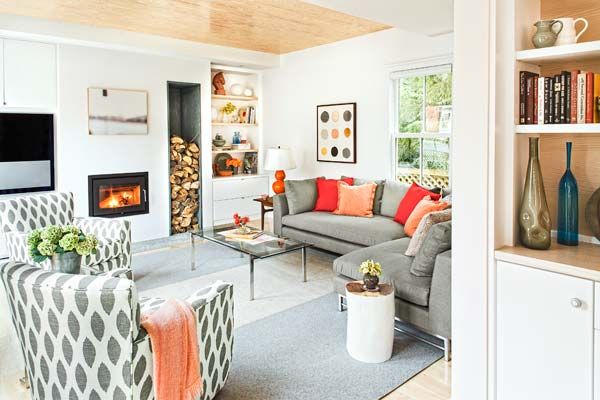
All these challenges gave the couple the chance to go in a new direction. Instead of trying to re-create a room-for-every-function floor plan, they decided to tweak it to better suit how their family lives. “I wanted an airy, sunny layout, almost a beach-house feeling,” says Sally, whose Swedish heritage has led her to favor modern Scandinavian design, a style that emphasizes clean lines, built-in functionality, and a palette of white surfaces warmed by natural wood tones.
Shown: Smart, pared-down design defines the interior of the renovated house. The family room includes niches for firewood and media equipment and a cast-iron fireplace. New maple floors were installed throughout the home.
Interior design: Terrat Elms Interior Design
Chairs and sectional: Crate & Barrel
Rug: FilzFelt
Fireplace: Morsø
TV: Bang & Olufsen
Open Plan
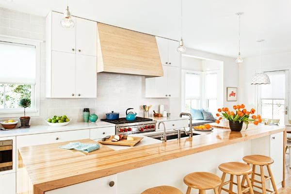
She found a kindred spirit in architect Marcus Gleysteen, who sketched an open first-floor kitchen and family room stretching the length of the house from front to rear. He also designed a wide stairway that ascended in a straight run (versus the two narrow dogleg stairways that were there), a more orderly arrangement of second-floor bedrooms, and a reconfigured third floor devoted to the master suite.
Shown: At the heart of the first-floor layout stands the kitchen, with its 11½-foot-long island topped by maple butcher block, whitewashed southern-yellow-pine vent hood, and white flat-panel wood cabinetry.
Kitchen design: K. Marshall Design
Cabinets and vent hood: Dutch Made
Butcher block: The Grothouse Lumber Company
Refrigerator and range: Wolf
Sink and faucet: Kohler
Backsplash: Roma Tile
Flooring: Lumber Liquidators
Radiant heat: Uponor
Casual Dining
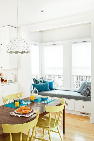
As the renovation proceeded, an outside-inside sleight of hand began to emerge. From the exterior, it appeared as though a classic restoration was in the works: The original siding was repaired, sanded, and repainted, for example, and replacement windows were installed in existing openings to keep the facade looking period-appropriate. But inside, a radical transformation was taking shape. One material in particular visually ties together the three levels of the modernized interior. The whitewashed southern yellow pine used as a ceiling inset in the family room became a design motif for built-in shelving there and in the dining area, for the rounded handrails Tom crafted for the stairways, and for accents in the master bath. Even the kitchen’s vent hood is made from it. “We felt that building the hood from the same butcher block as the island top would have been too contrived,” says kitchen designer Kathy Marshall, who collaborated with Sally on the built-ins.
Shown: Nestled between the kitchen and family room, the dining area includes a generous window seat with deep drawers in an existing bumpout—a perfect daydreaming spot.
Small-duct heating and AC: The Unico System
Cozy Perch
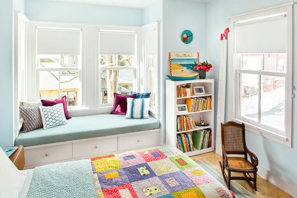
The result is a house with a ship-like efficiency that requires relatively little furniture. The children’s bedrooms need no dressers; a desk area in the kitchen is concealed behind tall doors. “This is definitely a streamlined house,” says interior designer Dee Elms, who, with her colleague Andrew Terrat, guided choices in fabrics, furniture, and color scheme.
Shown: A window seat in a child’s bedroom is stacked over the one in the dining room; here, it doubles as a sleepover berth. Simple trim around the replacement windows reflects the house’s new aesthetic.
Fit for Family Living

Despite the dramatic overhaul inside, John and Sally kept a few reminders of the past. The small foyer has a wall-hung shelf supported by decorative wood brackets that once graced the house’s side porch. And visitors can once again use the original mechanical doorbell—restored by the TOH crew—to announce their arrival: When pulled, a small bronze knob next to the front door triggers a pulley system that rings a bell attached to an interior wall. A sentimental nod to the old house, to be sure, but one that still works for today.
Shown: Homeowners Sally Peterson and John Stone and their daughters on the front steps of they’re newly renovated home.
Hardworking Washroom
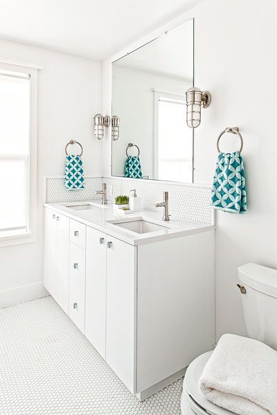
Used by the children and guests, the hall bath was kept spare and straightforward, with a penny-tile floor, subway-tile walls, and nautical-themed light fixtures.
Vanity: Dutch Made
Countertop: Silestone
Faucets and fixtures: Kohler
Sconces: Restoration Hardware
Floor and wall tile: Roma Tile
White on White
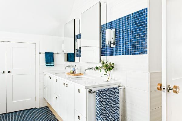
The monochromatic white palette gets a jolt of blue tile, a nod to the homeowners’ love of the ocean. The efficient layout includes a linen closet and double sinks.
Vanity: Dutch Made
Countertop: Silestone
Faucets and fixtures: Kohler
Sconces: Restoration Hardware
Floor and wall tile: Roma Tile
Master Bath
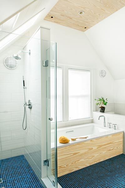
A tub with a view and a shower fit under the sloped ceiling. Southern yellow pine adds a warm touch to the tub surround and the vanity toekick.
Suite Retreat
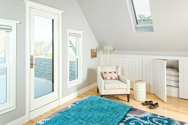
Skylights and a small outdoor space add the sense of a tree-house lair to Sally and John’s third-floor bedroom, where storage is maximized by knee-wall cupboards with touch-latch beadboard doors.
Queen Anne Shell
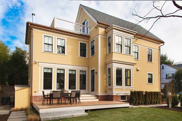
The original facade, seen from the side yard, belies the modern interior. Repaired and repainted siding and period-appropriate replacement windows keep the house looking like a classic 1887 Queen Anne.
Exterior paint: Benjamin Moore
Windows: Marvin
Inside Job: First Floor
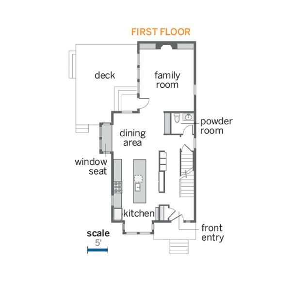
Once a two-family residence, the house suffered from awkward rooms with little original detail. The floor plans were revamped so that all the living spaces are on the first floor.
Inside Job: Second Floor
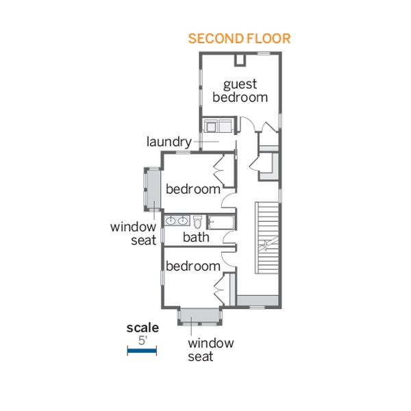
Guest and kid’s bedrooms are tucked into the Second story.
Inside Job: Third Floor
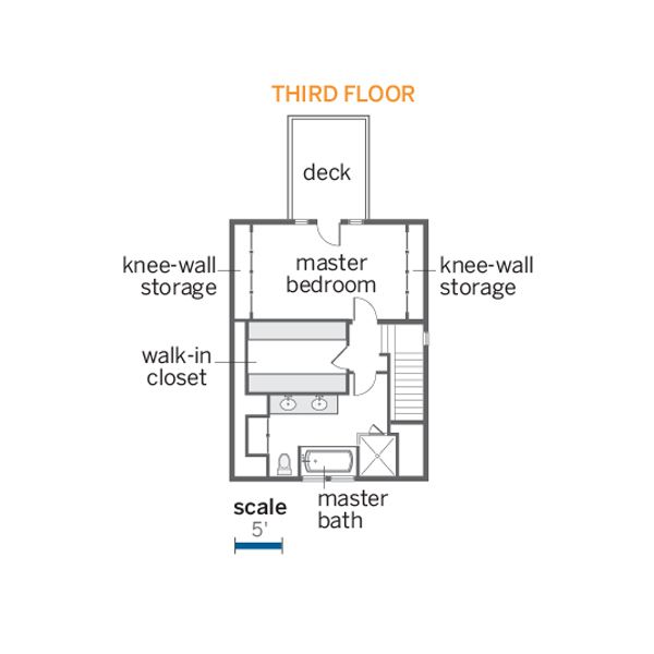
The third-floor master suite icludes a walk-in closet and a walk-out deck.
